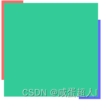
<div class="bruce flex-ct-x" data-title="使用clip描绘蛇形边框">
    <div class="snakelike-border"></div>
</div>
`
 .snakelike-border {
            position: relative;
            width: 190px;
            height: 190px;
            background-color: #3c9;

        }
        .snakelike-border::before,
        .snakelike-border::after {
             position: absolute;
             left: -5px;
             right: -5px;
             top: -5px;
             bottom: -5px;
             border: 5px solid;
             content: "";
             animation: move 5s linear infinite;
         }
        .snakelike-border::before {
             border-color: #f66;
         }
        .snakelike-border::after {
             border-color: #66f;
             animation-delay: -2.5s;
         }
        @keyframes move {
            0%,
            100% {
                clip: rect(0 200px 5px 0);
            }
            25% {
                clip: rect(0 200px 200px 195px);
            }
            50% {
                clip: rect(195px 200px 200px 0);
            }
            75% {
                clip: rect(0 5px 200px 0);
            }
        }``