一、引言
今天给大家介绍的Android基本控件中的两个按钮控件,Button普通按钮和ImageButton图像按钮; 其实ImageButton和Button的用法基本类似,至于与图片相关的则和后面ImageView相同,所以本节 只对Button进行讲解,另外Button是TextView的子类,所以TextView上很多属性也可以应用到Button 上!我们实际开发中对于Button的,无非是对按钮的几个状态做相应的操作,比如:按钮按下的时候 用一种颜色,弹起又一种颜色,或者按钮不可用的时候一种颜色这样!上述实现无非是通过 StateListDrawable这种Drawable资源来实现,即编写一个drawable的资源文件,就说这么多, 直接开始本节内容~
二、在xml布局文件中的使用(属性)
layout_width:宽(=wrap_content or ...)(必要)
layout_height:高(=wrap_content or ...)(必要)
id:建议命名为你个人对Button/ImageButton的缩写_Activity name_功能/数字/字母(如:btn_main_0、ibtn_main_0)
layout_weight:权重-各个控件等高或等宽时要用到
text:文本内容
letterSpacing:文本间的间距(如:0.5)
textColor:文本颜色
textSize:文本字体大小
textStyle:文本风格(normal正常(默认)、bold加粗、italic倾斜)
注:可选多个值(android:textStyle="bold|italic");
gravity:文本的位置(center居中(默认)、……)
background:背景(xml文件、图片)
ellipsize:文字太长时显示省略号(end末尾、start开头、marquee滚动、middle中间、none无)
layout_marginTop:与上边控件的距离
layout_marginBottom:与下边控件的距离:
layout_marginLeft:与左边控件的距离
layout_marginRight:与右边控件的距离
maxWidth:最大宽度
maxHeight:最大高度
maxEms:代码中输入的最多的元素个数
maxLength:代码中输入文本的最大长度(常用)
maxLines:最大行数
minLines:最小行数
minWidth:最小宽度
minHeight:最小高度
padding:文本距离上下左右方向的大小
paddingTop:文本距离上边的大小
paddingBottom:文本距离下边的大小
paddingLeft:文本距离左边的大小
paddingRigh:文本距离右边的大小
三、按钮点击监听事件
Button与ImageButton自身都有一个onClick点击事件,通过自身的.setOnClickListener(OnClickListener)的方法添加点击事件。
所有控件都有一个OnClick事件。通过点击事件的监听可以实现点击后发生什么动作。
监听事件实现的几种方法:
1.匿名内部类
2.独立类的实现
3.接口的形式实现
(1)、匿名内部类的实现Button监听事件
1.初始化控件
2.通过findViewById返回一个view对象,然后转换成Button 赋值给初始化的控件
3.设置Button的监听器,通过监听器实现点Button要操作的事情
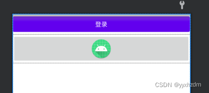
XML代码如下:
<LinearLayout xmlns:android="http://schemas.android.com/apk/res/android"
    android:layout_width="match_parent"
    android:layout_height="match_parent"
    android:orientation="vertical">

    <Button
        android:id="@+id/button1"
        android:layout_width="match_parent"
        android:layout_height="wrap_content"
        android:text="登录" />

    <ImageButton
        android:id="@+id/imageButton1"
        android:layout_width="match_parent"
        android:layout_height="wrap_content"
        android:src="@mipmap/ic_launcher_round" />
</LinearLayout>
效果:
业务逻辑代码:
package com.chinasoftnc.helloword;

import android.os.Bundle;
import android.view.View;
import android.widget.Button;
import android.widget.ImageButton;
import android.widget.Toast;

import androidx.appcompat.app.AppCompatActivity;

public class MainActivity extends AppCompatActivity {
    // 声明按钮控件
    private Button mButton;
    private ImageButton mImageButton;

    @Override
    protected void onCreate(Bundle savedInstanceState) {
        super.onCreate(savedInstanceState);
        setContentView(R.layout.activity_view_main);

        /**
         * 1.初始化所需要的控件
         * 2.通过findViewById返回一个view对象,然后转换成Button
         * 3.设置Button的监听器,通过监听器实现点Button要操作的事情
         * */
        mButton = findViewById(R.id.button1);
        mImageButton = findViewById(R.id.imageButton1);

        /**
         * 监听事件通过内部匿名类实现
         */
        mButton.setOnClickListener(new View.OnClickListener() {
            @Override
            public void onClick(View v) {
                // 在当前方法onClick中监听
                //Tost为监听后的操作
                Toast.makeText(MainActivity.this, "点击Button成功", Toast.LENGTH_SHORT).show();
            }
        });
        mImageButton.setOnClickListener(new View.OnClickListener() {
            @Override
            public void onClick(View v) {
                // 在当前方法onClick中监听
                //Tost为监听后的操作
                Toast.makeText(MainActivity.this, "点击ImageButton成功", Toast.LENGTH_SHORT).show();
            }
        });

    }

}
(2)、独立类实现按钮点击的监听
外部独立类可以把多个监听事件相同的的内容集中到外部类中饭,然后在各各子类可以通过super进行调用外部类的内容,同时可以在自己的类中添加自己按钮独有的内容或操作。
XML代码同上
业务逻辑代码:
package com.chinasoftnc.helloword;

import android.os.Bundle;
import android.view.View;
import android.widget.Button;
import android.widget.ImageButton;
import android.widget.Toast;

import androidx.appcompat.app.AppCompatActivity;

public class MainActivity extends AppCompatActivity {
    // 声明按钮控件
    private Button mButton;
    private ImageButton mImageButton;

    @Override
    protected void onCreate(Bundle savedInstanceState) {
        super.onCreate(savedInstanceState);
        setContentView(R.layout.activity_view_main);

        /**
         * 1.初始化所需要的控件
         * 2.通过findViewById返回一个view对象,然后转换成Button
         * 3.设置Button的监听器,通过监听器实现点Button要操作的事情
         * */
        mButton = findViewById(R.id.button1);
        mImageButton = findViewById(R.id.imageButton1);

        /**
         * 监听事件通过内部匿名类实现
         */
        mButton.setOnClickListener(new MyOnClickListener() {
            @Override
            public void onClick(View v) {
                //调用父类的onClick
                super.onClick(v);
                Toast.makeText(MainActivity.this, "Button要执行的逻辑", Toast.LENGTH_SHORT).show();
            }
        });
        mImageButton.setOnClickListener(new MyOnClickListener() {
            @Override
            public void onClick(View v) {
                //调用父类的onClick
                super.onClick(v);
                Toast.makeText(MainActivity.this, "ImageButton要执行的逻辑", Toast.LENGTH_SHORT).show();
            }
        });

    }

    // 独立类,其中OnClickListener是一个接口
    class MyOnClickListener implements View.OnClickListener {
        @Override
        public void onClick(View v) {
            // 改变button的按钮颜色
            v.setAlpha(0.5f);
        }
    }
}
(3)、通过接口的形式实现监听
让Activity类实现接口OnClickListener的监听事件方法,然后给相应的按钮绑定上监听事件。
XML代码同上
业务逻辑代码:
package com.chinasoftnc.helloword;

import android.os.Bundle;
import android.view.View;
import android.view.View.OnClickListener;
import android.widget.Button;
import android.widget.ImageButton;
import android.widget.Toast;

import androidx.appcompat.app.AppCompatActivity;

public class MainActivity extends AppCompatActivity implements OnClickListener {
    // 声明按钮控件
    private Button mButton;
    private ImageButton mImageButton;

    @Override
    protected void onCreate(Bundle savedInstanceState) {
        super.onCreate(savedInstanceState);
        setContentView(R.layout.activity_view_main);

        /**
         * 1.初始化所需要的控件
         * 2.通过findViewById返回一个view对象,然后转换成Button
         * 3.设置Button的监听器,通过监听器实现点Button要操作的事情
         * */
        mButton = findViewById(R.id.button1);
        mImageButton = findViewById(R.id.imageButton1);

        // 给按钮绑定监听事件
        mButton.setOnClickListener(this);
        mImageButton.setOnClickListener(this);
    }

    /**
     * 通过实现接口的监听事件onClick,实现监听事件
     */
    @Override
    public void onClick(View view) {
        switch (view.getId()) {
            case R.id.button1:
                Toast.makeText(MainActivity.this, "通过接口实现Button点击监听", Toast.LENGTH_SHORT).show();
                break;
            case R.id.imageButton1:
                Toast.makeText(MainActivity.this, "通过接口实现ImageButton点击监听", Toast.LENGTH_SHORT).show();
                break;
            default:
                break;
        }
    }
}
即不同的功能需求选择不同的实现方式。
四、StateListDrawable简介
StateListDrawable是Drawable资源的一种,可以根据不同的状态,设置不同的图片效果,关键节点 < selector >,我们只需要将Button的background属性设置为该drawable资源即可轻松实现,按下 按钮时不同的按钮颜色或背景!
我们可以设置的属性:
- drawable:引用的Drawable位图,我们可以把他放到最前面,就表示组件的正常状态~
- state_focused:是否获得焦点
- state_window_focused:是否获得窗口焦点
- state_enabled:控件是否可用
- state_checkable:控件可否被勾选,eg:checkbox
- state_checked:控件是否被勾选
- state_selected:控件是否被选择,针对有滚轮的情况
- state_pressed:控件是否被按下
- state_active:控件是否处于活动状态,eg:slidingTab
- state_single:控件包含多个子控件时,确定是否只显示一个子控件
- state_first:控件包含多个子控件时,确定第一个子控件是否处于显示状态
- state_middle:控件包含多个子控件时,确定中间一个子控件是否处于显示状态
- state_last:控件包含多个子控件时,确定最后一个子控件是否处于显示状态
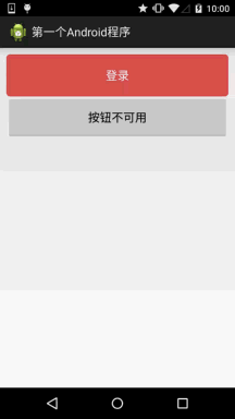
五、实现按钮的按下效果
首先准备三个图片背景,一般我们为了避免按钮拉伸变形都会使用作为按钮的drawable! 先来看下 运行效果图:
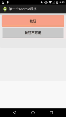
背景xml实现代码btn_bg1:
<?xml version="1.0" encoding="utf-8"?>
<selector xmlns:android="http://schemas.android.com/apk/res/android">

    <item android:drawable="@drawable/ic_course_bg_fen" android:state_pressed="true" />

    <item android:drawable="@drawable/ic_course_bg_pressed" android:state_enabled="false" />

    <item android:drawable="@drawable/ic_course_bg_cheng" />
</selector>
布局xml文件代码:
<LinearLayout xmlns:android="http://schemas.android.com/apk/res/android"
    android:layout_width="match_parent"
    android:layout_height="match_parent"
    android:orientation="vertical">

    <Button
        android:id="@+id/btnOne"
        android:layout_width="match_parent"
        android:layout_height="64dp"
        android:background="@drawable/btn_bg1"
        android:text="按钮" />

    <Button
        android:id="@+id/btnTwo"
        android:layout_width="match_parent"
        android:layout_height="64dp"
        android:text="按钮不可用" />

</LinearLayout>
MainActivity.java中业务逻辑:
public class MainActivity extends Activity {
// 声明组件
private Button btnOne,btnTwo;
@Override
protected void onCreate(Bundle savedInstanceState) {
super.onCreate(savedInstanceState);
setContentView(R.layout.activity_push_act);
// 获取组件
btnOne = (Button) findViewById(R.id.btnOne);
btnTwo = (Button) findViewById(R.id.btnTwo);
// 事件监听
btnTwo.setOnClickListener(new OnClickListener() {
@Override
public void onClick(View v) {
if(btnTwo.getText().toString().equals("按钮不可用")){
btnOne.setEnabled(false);
btnTwo.setText("按钮可用");
}else{
btnOne.setEnabled(true);
btnTwo.setText("按钮不可用");
}
}
});
}
}
六、使用颜色值绘制圆角按钮
很多时候我们不一定会有美工是吧,或者我们不会PS或毁图秀秀,又或者我们懒,不想自己去做图, 这个时候我们可以自己写代码来作为按钮背景,想要什么颜色就什么颜色,下面我们来定制个圆角的 的按钮背景~,这里涉及到另一个drawable资源:ShapeDrawable,这里不详细讲,后面会详细介绍每一个 drawable~这里会用就好,只是EditText修改下Background属性而已,这里只贴drawable资源!
先看下效果图:
buton_danger_rounded.xml:
<?xml version="1.0" encoding="utf-8"?>
<selector xmlns:android="http://schemas.android.com/apk/res/android">

    <item android:state_pressed="true">
        <shape>
            <corners android:radius="@dimen/bbuton_rounded_corner_radius" />
            <solid android:color="@color/bbutton_danger_pressed" />
            <stroke android:width="1dp" android:color="@color/bbutton_danger_edge" />
        </shape>
    </item>

    <item android:state_enabled="false">
        <shape>
            <corners android:radius="@dimen/bbuton_rounded_corner_radius" />
            <solid android:color="@color/bbutton_danger_disabled" />
            <stroke android:width="1dp" android:color="@color/bbutton_danger_disabled_edge" />
        </shape>
    </item>

    <item>
        <shape>
            <corners android:radius="@dimen/bbuton_rounded_corner_radius" />
            <solid android:color="@color/bbutton_danger" />
            <stroke android:width="1dp" android:color="@color/bbutton_danger_edge" />
        </shape>
    </item>

</selector>
color.xml:
<color name="bbutton_danger_pressed">#ffd2322d</color>
<color name="bbutton_danger_edge">#ffd43f3a</color>
<color name="bbutton_danger_disabled">#a5d9534f</color>
<color name="bbutton_danger_disabled_edge">#a5d43f3a</color>
<color name="bbutton_danger">#ffd9534f</color>
<color name="text_font_white">#FFFFFF</color>
dimens.xml:
<dimen name="bbuton_rounded_corner_radius">5dp</dimen>