一、引言
Android开发中,时不时的就有要实现星星的评分效果,比如某宝,某团,相信大家也都见过,当然了我们可以自己去画,也可以用美工给切的图去实现,其实在Android原生的控件中就可以来实现这样的效果,它就是RatingBar。
两种Style类型的星级平分效果代码,只在代码中简单引入:
<?xml version="1.0" encoding="utf-8"?>
<LinearLayout xmlns:android="http://schemas.android.com/apk/res/android"
xmlns:tools="http://schemas.android.com/tools"
android:layout_width="match_parent"
android:layout_height="match_parent"
android:orientation="vertical"
tools:context=".MainActivity">
<RatingBar
android:layout_width="wrap_content"
android:layout_height="wrap_content"
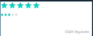
android:rating="5"
style="?android:attr/ratingBarStyleIndicator"/>
<RatingBar
android:layout_width="wrap_content"
android:layout_height="wrap_content"
android:layout_marginTop="16dp"
android:rating="3"
style="?android:attr/ratingBarStyleSmall"/>
</LinearLayout>
效果图:
二、RatingBar简介
RatingBar是基于SeekBar和ProgressBar的扩展,用星型来显示等级评定。使用RatingBar的默认大小时,用户可以触摸/拖动或使用键来设置评分,它有两种样式(小风格用ratingBarStyleSmall,大风格用ratingBarStyleIndicator),其中大的只适合指示,不适合于用户交互。
当使用可以支持用户交互的RatingBar时,无论将控件(widgets)放在它的左边还是右边都是不合适的。
只有当布局的宽被设置为wrap content时,设置的星星数量(通过函数setNumStars(int)或者在XML的布局文件中定义)将显示出来(如果设置为另一种布局宽的话,后果无法预知)。
次级进度一般不应该被修改,因为他仅仅是被当作星型部分内部的填充背景。
三、事件处理
接口:RatingBar.OnRatingBarChangeListener
只需为RatingBar设置OnRatingBarChangeListener事件,然后重写下onRatingChanged()方法即可!
public class MainActivity extends AppCompatActivity {
    private RatingBar rb_normal;
    @Override
    protected void onCreate(Bundle savedInstanceState) {
        super.onCreate(savedInstanceState);
        setContentView(R.layout.activity_main);
        rb_normal = (RatingBar) findViewById(R.id.rb_normal);
        rb_normal.setOnRatingBarChangeListener(new RatingBar.OnRatingBarChangeListener() {
            @Override
            public void onRatingChanged(RatingBar ratingBar, float rating, boolean fromUser) {
                Toast.makeText(MainActivity.this, "rating:" + String.valueOf(rating),
                        Toast.LENGTH_LONG).show();
            }
        });
    }
}
四、属性
android:isIndicator:是否用作指示,用户无法更改,默认false
android:numStars:显示多少个星星,必须为整数
android:rating:默认评分值,必须为浮点数
android:stepSize: 评分每次增加的值,必须为浮点数
除了上面这些,还有两种样式供我们选择咧,但是不建议使用,因为这两种样式都好丑... 他们分别是(上述效果图以及Xml代码中都有体现):
style="?android:attr/ratingBarStyleSmall"
style="?android:attr/ratingBarStyleIndicator"
五、公共方法
5.1、 public int getNumStars ()
返回显示的星型数量
5.2、public RatingBar.OnRatingBarChangeListener getOnRatingBarChangeListener ()
返回值:监听器(可能为空)监听评分改变事件
5.3、public float getRating ()
获取当前的评分(填充的星型的数量)
5.4、public float getStepSize ()
获取评分条的步长
5.5、public boolean isIndicator ()
返回值:判断当前的评分条是否仅仅是一个指示器(注:即能否被修改)
5.6、public void setIsIndicator (boolean isIndicator)
设置当前的评分条是否仅仅是一个指示器(这样用户就不能进行修改操作了)
参数:isIndicator Bool值,是否是一个指示器
5.7、public synchronized void setMax (int max)
设置评分等级的范围,从0到max
参数:max 评分条最大范围。
5.8、public void setNumStars (int numStars)
设置显示的星型的数量。为了能够正常显示它们,建议将当前widget的布局宽度设置为
wrap content
参数:numStars 星型的数量
5.9、public void setOnRatingBarChangeListener (RatingBar.OnRatingBarChangeListener listener)
设置当评分等级发生改变时回调的监听器
参数:listener 监听器
5.10、public void setRating (float rating)
设置分数(星型的数量)
参数:rating 设置的分数
5.11、public void setStepSize (float stepSize)
设置当前评分条的步长(step size)
参数:stepSize 评分条的步进。例如:如果想要半个星星,它的值为0.5。
六、评分条RatingBar自定义设置
6.1、自定义颜色
这种方式也很简单,只需要要定义一个样式即可,两步完成。
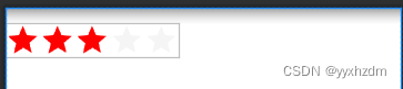
第一步,定义样式,指定背景色 和 进度色。
    <!--自定义RatingBar Color-->
    <style name="RatingBar_CustomColor" parent="@android:style/Widget.Holo.RatingBar.Indicator">
        <!--Background Color-->
        <item name="colorControlNormal">#D7D7D7</item>
        <!--Progress Color-->
        <item name="colorControlActivated">#FF0000</item>
    </style>
第二步,XML中使用该主题。
    <RatingBar
        android:layout_width="wrap_content"
        android:layout_height="wrap_content"
        android:layout_marginTop="16dp"
        android:rating="3"
        style="?android:attr/ratingBarStyleIndicator"
        android:theme="@style/RatingBar_CustomColor"/>
效果图:
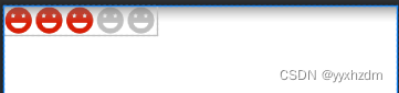
6.2、定制星级评分的背景图


我们可以将默认的星形图标换成上述笑脸形的。
接下来,编写一个layer-list的文件
ratingbar_full.xml:
<?xml version="1.0" encoding="utf-8"?>
<layer-list xmlns:android="http://schemas.android.com/apk/res/android">
    <item android:id="@android:id/background"
        android:drawable="@mipmap/ic_rating_off1" />
    <item android:id="@android:id/secondaryProgress"
        android:drawable="@mipmap/ic_rating_off1" />
    <item android:id="@android:id/progress"
        android:drawable="@mipmap/ic_rating_on1" />
</layer-list>
接着在res/values/themes.xml中自定义下RatingBar Style,在style.xml加上这个:
    <style name="roomRatingBar" parent="@android:style/Widget.RatingBar">
        <item name="android:progressDrawable">@drawable/ratingbar_full</item>
        <item name="android:minHeight">24dip</item>
        <item name="android:minWidth">24dip</item>
    </style>
最后在布局中的Ratingbar组件设置下:
<?xml version="1.0" encoding="utf-8"?>
<LinearLayout xmlns:android="http://schemas.android.com/apk/res/android"
    xmlns:tools="http://schemas.android.com/tools"
    android:layout_width="match_parent"
    android:layout_height="match_parent"
    android:orientation="vertical"
    tools:context=".MainActivity">

    <RatingBar
        android:layout_width="wrap_content"
        android:layout_height="wrap_content"
        android:rating="3"
        style="@style/roomRatingBar"/>

</LinearLayout>
效果图:
好的,效果还可以哈,至于间距问题,就需要对图片进行处理了,就是需要切图的时候在图片左右预留点空格就OK~