前言
本文将会介绍Jetpack Compose中的Modifier。在谷歌官方文档中它的描述是这么一句话:Modifier元素是一个有序、不可变的集合,它可以往Jetpack Compose UI元素中添加修饰或者各种行为。例如,背景、填充和单击事件监听器装饰或添加行为到文本或按钮。
Modifier修饰符的作用是快速的修改组件的显示大小、边距、边框、背景颜色、剪裁、点击等等,Modifier在Compose的全部组件上都有存在,需要熟练的掌握。另外Modifier是可以被扩展函数扩展的,所以此篇博客只举例通用的Modifier,不举例只在某些组件下才能使用的Modifier修饰符(例如Box(align属性)与constraintlayout(constrainAs方法))。
Modifier 可以通过链式调用的写法来为组件应用一系列的样式,每个基础的 Composable 组件都有一个 modifier 属性。
有序性
官方对修饰符定义的这个特性包含两个层面的意思,一是修饰符的使用是链式的它是有先后排列顺序的,二是这些顺序不仅仅是排列上的先后同时也是属性对UI展示效果起作用的先后顺序。接下来举一个例子来说明修饰符的有序的特性。
Box {
  val padding = 16.dp
  val onClick = Unit;
  Box(
      Modifier
          .clickable(onClick = { onClick })
          .padding(padding)
          .align(Alignment.Center)
          .size(50.dp, 50.dp)
          .background(Color.Green)
  )
}
Box {
val padding = 16.dp
val onClick = Unit;
Box(
Modifier
.padding(padding)
.clickable(onClick = { onClick })
.align(Alignment.Center)
.size(50.dp, 50.dp)
.background(Color.Green)
)
}上面两段代码的意思都是在一个绿色背景宽高为50,50的Box控件中设置点击事件和Padding。首先我们可以直观的看到修饰符的使用是链式的符合咱们说的第一个有序性。可以清楚的看到第一张图波纹是作用范围是涵盖了边距的而第二张水波动画的范围仅仅作用在绿色矩形内部。第一段代码是先设置的点击事件而后设置的边距,而第二段代码是先设置边距而后设置了点击事件,就出现了不同的动画表现。我们通过这个例子就可以直观的看到修饰符的第二个有序性,也就是修饰属性对于UI展示作用的有序性,即属性发生作用的先后顺序和设置顺序是一致的。
不可变性
对于修饰符的不可变性笔者认为就是当设置的属性值确定时,被修饰的UI就确定了不会再变了。下面就展示一个位于屏幕中心,背景为绿色,旋转45度,宽度等比例拉伸2倍的正方形。
Box {
  Box(
      Modifier
          .rotate(45f)
          .scale(2f)
          .align(Alignment.Center)
          .size(50.dp, 50.dp)
          .background(Color.Green)
  )
}
如图:

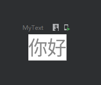
设置背景
设置背景颜色
    @Preview
    @Composable
    fun MyText() {
        Text(
            text = "你好",
            color = Color.Gray,
            modifier = Modifier.background(Color.White)
        )
    }
效果图:
设置圆角背景
    @Preview
    @Composable
    fun MyText() {
        Text(
            text = "你好",
            color = Color.Gray,
            modifier = Modifier.background(Color.White, shape = RoundedCornerShape(10.dp))
        )
    }
效果图:

渐变色背景
    @Preview
    @Composable
    fun MyText() {
        val colors = listOf(Color(0xFF005599),Color(0xFF3FFFED))
        Text(
            text = "你好",
            color = Color.White,
            modifier = Modifier.background(brush = Brush.linearGradient(colors),//设置线性渐变效果
                shape = RoundedCornerShape(10.dp),
                alpha = 1f)//设置透明度
        )
    }
效果图

设置宽高
设置指定宽高
    @Preview
    @Composable
    fun MyText() {
        Text(
            text = "你好",
            color = Color.White,
            modifier = Modifier
                .width(100.dp)
                .height(100.dp)
        )
    }
效果:
填满宽高
    @Preview
    @Composable
    fun MyText() {
        Column(
            modifier = Modifier
                .width(100.dp)
                .height(100.dp)
                .background(Color.Black)
        ) {
            Text(
                text = "你好",
                color = Color.Black,
                modifier = Modifier
                    .background(Color.White)
                    .fillMaxSize()//填满宽高
            )
        }
    }
效果图:
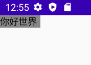
自适应子组件高宽
IntrinsicSize.Min 这个是关键
    @Preview
    @Composable
    fun MyText() {
        Box(
            modifier = Modifier
                .width(IntrinsicSize.Min)
                .height(IntrinsicSize.Min)
                .background(Color.Gray)
        ) {
            Text(
                text = "你好世界",
                modifier = Modifier.width(60.dp)
            )
        }
    }
效果图:
按比例填充宽高
    @Preview
    @Composable
    fun MyText() {
        Column(
            modifier = Modifier
                .width(100.dp)
                .height(100.dp)
                .background(Color.Black)
        ) {
            Text(
                text = "你好",
                color = Color.Black,
                modifier = Modifier
                    .background(Color.White)
                    .fillMaxSize(0.5f)//以50%比例填满宽高
            )
        }
    }
效果:
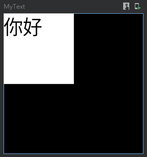
填满宽度或者高度
    @Preview
    @Composable
    fun MyText() {
        Column(
            modifier = Modifier
                .width(100.dp)
                .height(100.dp)
                .background(Color.Black)
        ) {
            Text(
                text = "你好",
                color = Color.Black,
                modifier = Modifier
                    .background(Color.Red)
                    .fillMaxWidth() //填满宽度
            )
            Text(
                text = "世界",
                color = Color.Black,
                modifier = Modifier
                    .background(Color.Yellow)
                    .fillMaxHeight() //填满高度
            )
        }
    }
效果:
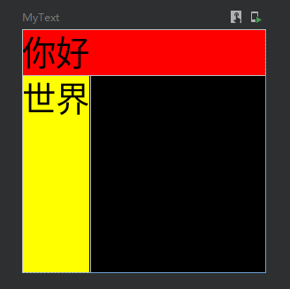
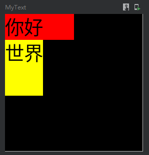
按比例填充宽度与高度
    @Preview
    @Composable
    fun MyText() {
        Column(
            modifier = Modifier
                .width(100.dp)
                .height(100.dp)
                .background(Color.Black)
        ) {
            Text(
                text = "你好",
                color = Color.Black,
                modifier = Modifier
                    .background(Color.Red)
                    .fillMaxWidth(0.5f) //填满宽度
            )
            Text(
                text = "世界",
                color = Color.Black,
                modifier = Modifier
                    .background(Color.Yellow)
                    .fillMaxHeight(0.5f) //填满高度
            )
        }
    }
效果图:
默认最小宽高
    @Preview
    @Composable
    fun MyText() {
        Text(
            text = "你好",
            color = Color.Black,
            modifier = Modifier
                .background(Color.Red)
                .defaultMinSize(minWidth = 50.dp, minHeight = 50.dp)
        )
    }
设置边距
    @Preview
    @Composable
    fun MyText() {
        Column(
            modifier = Modifier
                .width(100.dp)
                .height(150.dp)
                .background(Color.Black)
        ) {
            Text(
                text = "A",
                color = Color.Black,
                modifier = Modifier
                    .background(Color.Red)
                    .padding(5.dp) //设置全部边距
            )

            Text(
                text = "B",
                color = Color.Black,
                modifier = Modifier
                    .background(Color.Green)
                    .padding(horizontal = 20.dp) //设置横向边距
            )

            Text(
                text = "C",
                color = Color.Black,
                modifier = Modifier
                    .background(Color.Yellow)
                    .padding(vertical = 10.dp) //设置竖向边距
            )

            Text(
                text = "D",
                color = Color.Black,
                modifier = Modifier
                    .background(Color.Blue)
                    .padding(0.dp,5.dp,50.dp,0.dp) //设置指定方向边距
            )
        }
    }
效果图:

设置边框
一共有三种重载方法
- fun Modifier.border(border: BorderStroke, shape: Shape = RectangleShape) = border(width = border.width, brush = border.brush, shape = shape)
- fun Modifier.border(width: Dp, color: Color, shape: Shape = RectangleShape) = border(width, SolidColor(color), shape)
- fun Modifier.border(width: Dp, brush: Brush, shape: Shape): Modifier
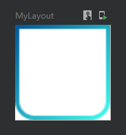
第一种实现渐变色边框
    @Preview
    @Composable
    fun MyLayout() {
        val colors = listOf(Color(0xFF005599), Color(0xFF3FFFED))
        Column(
            modifier = Modifier
                .width(25.dp)
                .height(25.dp)
                .background(Color.White)
                .border(  //设置渐变边框
                    border = BorderStroke(1.dp, Brush.linearGradient(colors)), //设置边框粗细与边框渐变色
                    shape = RoundedCornerShape(5.dp) //圆角形状
                )
        ){ }
    }
效果图:

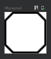
第二种实现单色边框
    @Preview
    @Composable
    fun MyLayout() {
        Column(
            modifier = Modifier
                .width(25.dp)
                .height(25.dp)
                .background(Color.White)
                .border(
                    width = 1.dp, //设置边框粗细
                    color = Color(0xFF000000), //边框颜色
                    shape = CutCornerShape (5.dp,5.dp,5.dp,5.dp) //切角矩形形状
                )
        ){ }
    }
效果图:
第三种实现渐变色边框
其实与第一种差不多,只是没有了BorderStroke包装
    @Preview
    @Composable
    fun MyLayout() {
        val colors = listOf(Color(0xFF005599), Color(0xFF3FFFED))
        Column(
            modifier = Modifier
                .width(25.dp)
                .height(25.dp)
                .background(Color.White)
                .border(
                    width = 1.dp,
                    brush = Brush.linearGradient(colors),
                    shape = RoundedCornerShape(0.dp,0.dp,5.dp,5.dp)
                )
        ){ }
    }
效果图:
偏移位置
offset这个偏移是偏移自身这个组件
    @Preview
    @Composable
    fun MyLayout() {
        Column(
            modifier = Modifier
                .width(100.dp)
                .height(100.dp)
                .background(Color.White)
        ){
            Text(text = "你好", color = Color.Black,
                //相对偏移 这个修改会根据布局方向自动调整水平偏移量(应该是为了阿拉伯语设计的):
                //当布局方向为从左到右时,正x偏移量会将内容向右移动,当布局方向为从右到左时,正x偏移量会将内容向左移动。
                modifier = Modifier.offset(x = 20.dp,y = 25.dp))

            Text(text = "世界", color = Color.Black,
                //绝对偏移 这个修改将不考虑布局方向:正的x偏移总是将内容向右移动
                modifier = Modifier.absoluteOffset(x = 45.dp,y = 20.dp))
        }
    }
效果图:

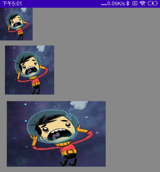
缩放
    @Preview
    @Composable
    fun MyScale() {
        val scale = remember {
            mutableStateOf(1.5f)
        }
        Column(
            modifier = Modifier
                .fillMaxSize()
                .background(Color.Gray)
        ) {
            //默认
            Image(
                painter = painterResource(id = R.mipmap.ic_logo),
                contentDescription = null,
            )
            //比例缩放
            Image(
                painter = painterResource(id = R.mipmap.ic_logo),
                contentDescription = null,
                modifier = Modifier
                    .padding(top = 30.dp, start = 30.dp)
                    .scale(scale.value) //放大1.5倍
            )
            //指定宽高缩放
            Image(
                painter = painterResource(id = R.mipmap.ic_logo),
                contentDescription = null,
                modifier = Modifier
                    .padding(top = 70.dp, start = 90.dp)
                    .scale(3f,2f) //宽高缩放
            )
        }
    }
效果图:
旋转
    @Preview
    @Composable
    fun MyRotate() {
        val rotate = remember { mutableStateOf(180f) }
        Column(
            modifier = Modifier
                .width(300.dp)
                .height(300.dp)
                .background(Color.Gray)
        ) {
            Image(
                painter = painterResource(id = R.mipmap.ic_logo),
                contentDescription = null,
                modifier = Modifier
                    .padding(100.dp)
                    .rotate(rotate.value) //设置旋转
            )
        }
    }
效果图:

旋转与偏移位置的组合
请注意,Modifier一直强调组合的位置不同会出现不同的效果。如果你想实现旋转与拖动功能,那么旋转一定要在前面,否则会出现拖动的时候,实际移动的X轴与Y轴出现相反的问题。
@Composable
fun rotationAndOffset(){
    val rotation = remember { mutableStateOf(0f) }
    val offsetX = remember { mutableStateOf(0f) }
    val offsetY = remember { mutableStateOf(0f) }
    AsyncImage(
        model = if (mIsUrl.value) mUrl.value else mFile.value,
        contentDescription = null,
        modifier = Modifier
            .rotate(rotation.value) //rotate一定要在前面
            .offset { IntOffset(offsetX.value.roundToInt(), offsetY.value.roundToInt()) }
    )
}
输入操作(点击、双击、长按、拖动、触控、滚动)
单指操作_单击、按下、双击、长按、触控
    @OptIn(ExperimentalFoundationApi::class)
    @Preview
    @Composable
    fun MyClick() {
        val isEnableClick = remember {
            mutableStateOf(true)
        }

        Column(
            modifier = Modifier
                .width(100.dp)
                .height(150.dp)
                .background(Color.Black)
        ) {
            //方式一 单击监听
            Text(
                text = "A",
                color = Color.Black,
                modifier = Modifier
                    .background(Color.White)
                    .clickable(isEnableClick.value) { //设置点击
                        Log.e("zh", "A单击")
                    }
            )
            //方式二 组合性点击
            Text(
                text = "B",
                color = Color.Black,
                modifier = Modifier
                    .background(Color.White)
                    .combinedClickable( //注意!此Api是实验性的
                        onClick = {
                            Log.e("zh", "B单击")

                        },
                        onDoubleClick = {
                            Log.e("zh", "B双击")

                        },
                        onLongClick = {
                            Log.e("zh", "B长按")

                        }
                    )
            )
            //方式三 输入监听
            Text(
                text = "C",
                color = Color.Black,
                modifier = Modifier
                    .background(Color.White)
                    .pointerInput(Unit) {

                    detectTapGestures(
                        onPress = {
                            Log.e("zh", "C按下")
                        },
                        onDoubleTap = {
                            Log.e("zh", "C双击")
                        },
                        onLongPress = {
                            Log.e("zh", "C长按")
                        },
                        onTap = {
                            Log.e("zh", "C触控")
                        }
                    )
                }
            )
        }
    }
多指操作_缩放、旋转、拖动
双指缩放
    @Preview
    @Composable
    fun MyScale() {
        val scale = remember {
            mutableStateOf(1f)
        }
        Column(
            modifier = Modifier
                .width(300.dp)
                .height(300.dp)
                .background(Color.Gray)
        ) {
            //多点触控
            Image(
                painter = painterResource(id = R.mipmap.ic_logo),
                contentDescription = null,
                modifier = Modifier
                    .padding(100.dp)
                    .scale(scale.value)
                    .transformable(state = TransformableState { zoomChange, panChange, rotationChange ->
                        scale.value *= zoomChange
                        Log.e("zh", "缩放 ${zoomChange}" )
                        Log.e("zh", "坐标 ${panChange}")
                        Log.e("zh", "旋转 ${rotationChange}" )
                    })
            )
        }
    }
效果图:

双指旋转
    @Preview
    @Composable
    fun MyRotate() {
        val rotate = remember { mutableStateOf(0f) }
        Box(
            modifier = Modifier
                .width(300.dp)
                .height(300.dp)
                .background(Color.Gray),
            contentAlignment = Alignment.Center

        ) {
            Image(
                painter = painterResource(id = R.mipmap.ic_logo),
                contentDescription = null,
                modifier = Modifier
                    .fillMaxSize(0.5f)
                    .rotate(rotate.value) //设置旋转
                    .transformable(state = TransformableState { zoomChange, panChange, rotationChange ->
                        Log.e("zh", "缩放 ${zoomChange}" )
                        Log.e("zh", "坐标 ${panChange}")
                        rotate.value += rotationChange //旋转变化
                        Log.e("zh", "旋转 ${rotationChange}" )
                    })
            )
        }
    }
效果图:

双指拖动
    @Preview
    @Composable
    fun MyOffset() {
        val offsetX = remember { mutableStateOf(0f) }
        val offsetY = remember { mutableStateOf(0f) }
        Box(
            modifier = Modifier
                .width(300.dp)
                .height(300.dp)
                .background(Color.Gray),
            contentAlignment = Alignment.Center

        ) {
            Image(
                painter = painterResource(id = R.mipmap.ic_logo),
                contentDescription = null,
                modifier = Modifier
                    .fillMaxSize(0.5f)
                    .offset { IntOffset(offsetX.value.roundToInt(), offsetY.value.roundToInt()) } //设置偏移
                    .transformable(state = TransformableState { zoomChange, panChange, rotationChange ->
                        Log.e("zh", "缩放 ${zoomChange}" )
                        Log.e("zh", "坐标 ${panChange}")
                        offsetX.value += panChange.x
                        offsetY.value += panChange.y
                        Log.e("zh", "旋转 ${rotationChange}" )
                    })
            )
        }
    }
效果图:

双指多操作组合
同时拖动、旋转、缩放
    @Preview
    @Composable
    fun MyCombination() {
        val scale  = remember { mutableStateOf(1f) }
        val offsetX = remember { mutableStateOf(0f) }
        val offsetY = remember { mutableStateOf(0f) }
        val rotation = remember { mutableStateOf(0f) }
        Box(
            modifier = Modifier
                .width(300.dp)
                .height(300.dp)
                .background(Color.Gray),
            contentAlignment = Alignment.Center

        ) {
            Image(
                painter = painterResource(id = R.mipmap.ic_logo),
                contentDescription = null,
                modifier = Modifier
                    .fillMaxSize(0.5f)
                    .graphicsLayer{
                        scaleX = scale.value
                        scaleY = scale.value
                        translationX = offsetX.value
                        translationY = offsetY.value
                        rotationZ = rotation.value
                    }
                    .transformable(state = TransformableState { zoomChange, panChange, rotationChange ->
                        scale.value *= zoomChange
                        offsetX.value += panChange.x
                        offsetY.value += panChange.y
                        rotation.value += rotationChange
                    })
            )
        }
    }
效果图:
单指拖动
单方向拖动
如果你发现拖动会超出父类布局,但是你希望不超出父类布局,请参考博客下面的 “让子组件不超出当前父组件范围” 内容
    @Preview
    @Composable
    fun MyImage() {
        var offset = remember { mutableStateOf(0f) }
        Column(
            modifier = Modifier
                .width(200.dp)
                .height(200.dp)
                .background(Color.Gray)
        ) {
            Image(
                painter = painterResource(id = R.mipmap.ic_logo),
                contentDescription = null,
                contentScale = ContentScale.None,
                modifier = Modifier
                    .draggable(state = rememberDraggableState() { //设置拖动
                        offset.value += it
                    }, orientation = Orientation.Vertical) //设置方向 还能设置横向Orientation.Horizontal
                    .offset { IntOffset(0, offset.value.roundToInt()) }
            )
        }
    }
效果图:

双方向拖动
    @Preview
    @Composable
    fun MyImage() {
        val offsetX = remember { mutableStateOf(0f) }
        val offsetY = remember { mutableStateOf(0f) }
        Column(
            modifier = Modifier
                .width(200.dp)
                .height(200.dp)
                .background(color = Color.Gray)

        ) {
            Image(
                painter = painterResource(id = R.mipmap.ic_logo),
                contentDescription = null,
                modifier = Modifier
                    .offset { IntOffset(offsetX.value.roundToInt(), offsetY.value.roundToInt()) }
                    .pointerInput(Unit) {
                        //检测拖动手势
                        detectDragGestures { change, dragAmount ->
                            Log.e("zh", "MyImage:检测拖动 当前指针输入数据 = ${change} ")
                            Log.e("zh", "MyImage:检测拖动 每次偏移量 = ${dragAmount} ")
                            offsetX.value += dragAmount.x
                            offsetY.value += dragAmount.y
                        }
                    }
            )
        }
    }
效果图:
设置可滚动
横竖两个方向的滚动
    @Preview
    @Composable
    fun MyScroll() {
        Column(modifier = Modifier.fillMaxSize()) {
            //Row横向排列滚动
            Row(
                modifier = Modifier
                    .fillMaxWidth()
                    .horizontalScroll(rememberScrollState()) //设置横向滚动
            ) {
                for (i in 1..10) {
                    Image(
                        painter = painterResource(id = R.mipmap.ic_logo),
                        contentDescription = null,
                    )
                }
            }
            //Column竖向排列滚动
            Column(
                modifier = Modifier
                    .padding(10.dp)
                    .height(250.dp)
                    .verticalScroll(rememberScrollState()) //设置竖向滚动
            ) {
                for (i in 1..10) {
                    Image(
                        painter = painterResource(id = R.mipmap.ic_logo),
                        contentDescription = null,
                    )
                }
            }
        }
效果图:

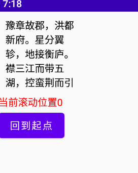
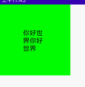
监听滚动偏移量、滚动位置与滚动位置跳转操作
    @Preview
    @Composable
    fun MyScroll() {
        val state = rememberScrollState()
        val position = remember {
            derivedStateOf {
                state.value
            }
        }
        val scope = rememberCoroutineScope() //这个是在Composable调用协程的一种方式

        Column() {
            Text(
                text = "豫章故郡,洪都新府。星分翼轸,地接衡庐。" +
                        "襟三江而带五湖,控蛮荆而引瓯越。" +
                        "物华天宝,龙光射牛斗之墟;" +
                        "人杰地灵,徐孺下陈蕃之榻。" +
                        "雄州雾列,俊采星驰。" +
                        "台隍枕夷夏之交,宾主尽东南之美。" +
                        "都督阎公之雅望,棨戟遥临;" +
                        "宇文新州之懿范,襜帷暂驻。" +
                        "十旬休假,胜友如云;" +
                        "千里逢迎,高朋满座。" +
                        "腾蛟起凤,孟学士之词宗;" +
                        "紫电青霜,王将军之武库。" +
                        "家君作宰,路出名区;" +
                        "童子何知,躬逢胜饯。",
                modifier = Modifier
                    .padding(10.dp)
                    .width(100.dp)
                    .height(100.dp)
                    //监听滚动位置
                    .scrollable(state = rememberScrollableState(consumeScrollDelta = {
                        Log.e("zh", "当前滚动偏移量:${it}")
                        it
                    }), orientation = Orientation.Vertical)
                    .verticalScroll(state)
            )

            Text(
                color = Color.Red,
                text = "当前滚动位置${position.value}",
            )

            Button(onClick = {
                scope.launch {
                    state.scrollTo(0)
                }
            }) {
                Text(text = "回到起点")
            }
        }
    }
效果图:
指针输入
指针输入监听,与上面各色方法类似
    @Preview
    @Composable
    fun MyPointerInput() {
        Box(
            modifier = Modifier
                .width(300.dp)
                .height(300.dp)
                .background(Color.Gray)
        ) {
            Text(
                text = "你好",
                color = Color.Black,
                modifier = Modifier
                    .align(Alignment.Center)
                    .fillMaxSize(0.5f)
                    .background(color = Color.Green)
                    .pointerInput(Unit) {
                        /**
                         * 下面的只能存在一个手势Gestures方法,多了后续的手势方法会不执行,这边是方便观看全部贴出来
                         */
                        detectDragGestures { change, dragAmount ->
                            Log.e("zh", "检测拖动手势: change = $change \n dragAmount = $dragAmount")
                        }
                        detectDragGesturesAfterLongPress { change, dragAmount ->
                            Log.e("zh", "检测长按后的拖拽手势:  change = $change \n dragAmount = $dragAmount")
                        }
                        detectTapGestures {
                            /**
                             * 检测轻按、双击和长按手势,检测到时分别调用onTap、onDoubleTap和onLongPress。当检测到按压和pressgestuscope时调用onPress。
                             * tryAwaitRelease PressGestureScope。awaitRelease可以用来检测指针何时被释放或手势何时被取消。
                             * 第一个向下的指针和最后一个向上的指针被消耗,
                             * 在长按的情况下,检测到长按后的所有更改都被消耗。
                             */
                            Log.e("zh", "检测触控:  Offset = $it \n")
                        }
                        detectTapGestures(
                            onTap = {
                                Log.e("zh", "单击: Offset = $it \n")
                            },
                            onDoubleTap = {
                                Log.e("zh", "双击: Offset = $it \n")
                            },
                            onLongPress = {
                                Log.e("zh", "长按: Offset = $it \n")
                            },
                            onPress = {
                                Log.e("zh", "按下: Offset = $it \n")
                            })

                        detectTransformGestures { centroid, pan, zoom, rotation ->
                            Log.e("zh", "旋转、平移和缩放的手势检测器:  centroid = $centroid \n pan = $pan \n zoom = $zoom rotation = $rotation")

                        }
                        detectHorizontalDragGestures { change, dragAmount ->
                            Log.e("zh", "检测水平拖动手势:  change = $change \n dragAmount = $dragAmount")
                        }
                        detectVerticalDragGestures { change, dragAmount ->
                            Log.e("zh", "检测垂直拖动手势:  change = $change \n dragAmount = $dragAmount")
                        }
                    }
            )
        }
    }
graphicsLayer
graphicsLayer可用于对内容应用效果,如缩放、旋转、不透明度、阴影和剪切。当你的层属性由androidx. composition .runtime. state或动画值支持时,最好使用这个版本,因为读取块中的状态只会导致层属性更新,而不会触发重新组合和重新布局。
@Preview
@Composable
fun MyGraphicsLayer() {
Box(
modifier = Modifier
.width(300.dp)
.height(300.dp)
.background(Color.Gray)
) {
Text(
text = "你好",
color = Color.Black,
modifier = Modifier
.align(Alignment.Center)
.fillMaxSize(0.5f)
.background(color = Color.Green)
.graphicsLayer{
//绘制区域的水平比例尺。默认值为“1”
scaleX = 1f
//绘制区域的垂直比例尺。默认值为“1”。
scaleY = 1f
//绘制区域的alpha。设置为“1”以外的值将导致绘制的内容是半透明的,设置为“0”将使其完全不可见。默认值为' 1 ',取值范围为' 0 ' ~ ' 1 '。
alpha = 1f
//该层相对于其左边界的水平像素偏移量。默认值为' 0 '。
translationX = 0f
//该层相对于其上边界的垂直像素偏移量。默认值为' 0 '
translationY = 0f
//以像素为单位设置阴影的仰角。默认值为“0”,且不能为负值
shadowElevation = 0f
//范围阴影颜色
ambientShadowColor = Color(0xFFFF0000)
//点阴影颜色
spotShadowColor = Color(0xFFFF0000)
//X轴旋转角度
rotationX = 0f
//Y轴旋转角度
rotationY= 0f
//Z轴旋转角度
rotationZ = 0f
//观察相机视角距离
cameraDistance = 0f
//旋转or缩放的中心点
transformOrigin = TransformOrigin.Center
transformOrigin = TransformOrigin(0.1f,0.1f)
//形状
shape = RectangleShape
//设置为' true '将内容剪辑到[shape]。默认值为' false '
clip = false
//渲染效果,比如下面设置的模糊效果
renderEffect = BlurEffect(20f, 0.5f, TileMode.Clamp)
}
)
}
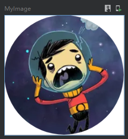
}裁剪
clip的裁剪
    @Preview
    @Composable
    fun MyImage() {
        Column(
            modifier = Modifier
                .width(100.dp)
                .height(100.dp)
                .background(Color.White)
                //clip的剪裁是对当前组件的内部内容进行裁剪,这里使用了CircleShape圆形进行裁剪.
                //也可以使用RectangleShape 或者 RoundedCornerShape() 矩形进行裁剪
                .clip(shape = CircleShape)

        ) {
            Image(
                painter = painterResource(id = R.mipmap.ic_logo),
                contentDescription = null,
                modifier = Modifier.fillMaxSize()
            )
        }
    }
效果图:
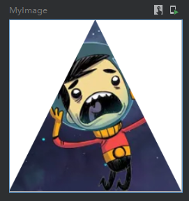
上面是使用常用形状裁剪,这里在举例一个自定义形状的裁剪方式,如下使用path绘制了一个三角形进行裁剪
    /**
     * 裁剪三角形
     */
    @Preview
    @Composable
    fun MyImage() {
        val customShape = object : Shape {
            override fun createOutline(size: Size, layoutDirection: LayoutDirection, density: Density): Outline {
                val path = Path()
                path.moveTo(size.width/2, 0f)
                path.lineTo(0f,size.height)
                path.lineTo(size.width,size.height)
                path.close()
                val outline = Outline.Generic(path)
                return outline
            }
        }
        Column(
            modifier = Modifier
                .width(100.dp)
                .height(100.dp)
                .background(Color.White)
                .clip(shape = customShape)

        ) {
            Image(
                painter = painterResource(id = R.mipmap.ic_logo),
                contentDescription = null,
                modifier = Modifier.fillMaxSize()
            )
        }
    }
效果图:
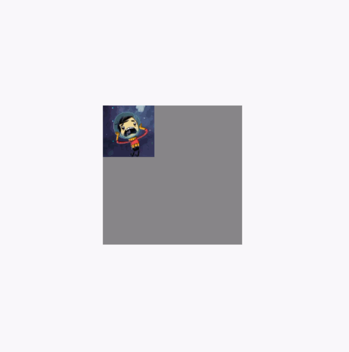
让子组件不超出当前父组件范围
clipToBounds 按照指定的边界裁切内容。强制限制当前布局下的子组件不允许超出到外部。另外这个属性与clip属性无关联。
反面例子代码,下面的代码中注释了clipToBounds
    @Preview
    @Composable
    fun MyImage() {
        var offset  =  remember { mutableStateOf(0f) }
        //必须在套一个布局设置最大范围的父类布局,以展示下面的Image在拖动的时候超出的效果
        Column(modifier = Modifier.fillMaxSize().padding(200.dp)) {
            Column(
                modifier = Modifier
                    .width(200.dp)
                    .height(200.dp)
                    .background(Color.Gray) //这里设置背景色为灰色,以观察布局的大小
//                .clipToBounds()

            ) {
                Image(
                    painter = painterResource(id = R.mipmap.ic_logo),
                    contentDescription = null,
                    contentScale = ContentScale.None,
                    modifier = Modifier
                        .draggable(state = rememberDraggableState() {
                            offset.value += it
                        }, orientation = Orientation.Horizontal)
                        .offset { IntOffset(offset.value.roundToInt(), 0) }
                )
            }
        }
    }
反面例子效果图,图片在拖动的时候可以超出布局范围:
调用clipToBounds 后的效果图(代码就不重复贴了,直接将clipToBounds 注释取消就行):
模糊
注意!blur这个api需要Android版本12 31 API的设备上才能生效
    @Preview
    @Composable
    fun MyBlur() {
        Box(
            modifier = Modifier
                .width(300.dp)
                .height(300.dp)
                .background(Color.Gray)
        ) {
            Image(
                painter = painterResource(id = R.mipmap.ic_logo),
                contentDescription = null,
                modifier = Modifier
                    .align(Alignment.Center)
                    //注意blur这个api需要Android 12 31 API 才能生效
                    .blur(radius = 10.dp, edgeTreatment = BlurredEdgeTreatment.Rectangle) //设置模糊
            )
        }
    }
效果图:
BlurredEdgeTreatment.Rectangle 是矩形边缘清晰中间模糊
BlurredEdgeTreatment.Unbounded 无边界模糊的效果图:

透明度
    @Preview
    @Composable
    fun MyAlpha() {
        Box(
            modifier = Modifier
                .width(300.dp)
                .height(300.dp)
                .background(Color.Gray)
        ) {
            Image(
                painter = painterResource(id = R.mipmap.ic_logo),
                contentDescription = null,
                modifier = Modifier
                    .align(Alignment.Center)
                    .alpha(0.1f) //设置透明度
            )
        }
    }
效果图:
绘制阴影
注意!shadow这个api需要Android版本10的设备上才能生效
    @Preview
    @Composable
    fun MyShadow() {
        Box(
            modifier = Modifier
                .width(300.dp)
                .height(300.dp)
                .background(Color.White)
        ) {
            Image(
                painter = painterResource(id = R.mipmap.ic_logo),
                contentDescription = null,
                modifier = Modifier
                    .align(Alignment.Center)
                    .shadow( //设置阴影,调用此api需要设备Android版本为10
                        elevation = 50.dp, //隐藏长度
                        shape = RectangleShape, //阴影形状
                        ambientColor = Color.Red, //环境颜色
                        spotColor = Color.Red, //阴影颜色
                        clip = true //是否跟随裁剪形状改变阴影形状
                    )
            )
        }
    }
绘制
drawBehind绘制,将增加的绘制内容显示到组件图层的最下层
    @Preview
    @Composable
    fun MyDrawBehind() {
        Box(
            modifier = Modifier
                .width(300.dp)
                .height(300.dp)
                .background(Color.White)
        ) {
            Image(
                painter = painterResource(id = R.mipmap.ic_logo),
                contentDescription = null,
                modifier = Modifier
                    .align(Alignment.Center)
                    .drawBehind { //绘制到最下面的图层
                        val radius = size.width / 3
                        val centerOffset = Offset(size.width, 0f)
                        drawCircle(
                            color = Color.Red,
                            radius = radius,
                            center = centerOffset,
                            style = Fill
                        )
                    }
            )
        }
    }
在下面的效果图里,可以看到红圈在图片的下层:
drawWithContent 人为控制绘制内容的顺序
    @Preview
    @Composable
    fun MyDrawWithContent() {
        Box(
            modifier = Modifier
                .width(300.dp)
                .height(300.dp)
                .background(Color.White)
        ) {
            Image(
                painter = painterResource(id = R.mipmap.ic_logo),
                contentDescription = null,
                modifier = Modifier
                    .align(Alignment.Center)
                    .drawWithContent {
                        /*
                        drawContent()是理解drawWithContent的关键
                        drawContent这个是这个组件本身需要绘制的内容。
                        控制这个方法的位置你就可以控制绘制的顺序。
                         */
                        drawContent()
                        val radius = size.width / 3
                        val centerOffset = Offset(size.width, 0f)
                        drawCircle(
                            color = Color.Red,
                            radius = radius,
                            center = centerOffset,
                            style = Stroke(25f)
                        )
                    }
            )
        }
    }
因为代码中是先绘制了drawContent()然后在绘制圆环,所以下面的效果图圆环在图片的上层:

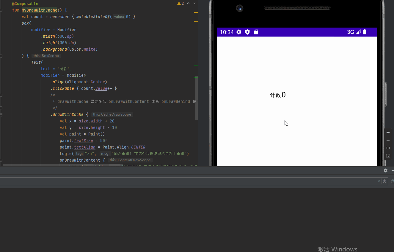
drawWithCache 提供缓存数据避免重组的绘制方式
    @Preview
    @Composable
    fun MyDrawWithCache() {
        val count = remember { mutableStateOf(0) }
        Box(
            modifier = Modifier
                .width(300.dp)
                .height(300.dp)
                .background(Color.White)
        ) {
            Text(
                text = "计数",
                modifier = Modifier
                    .align(Alignment.Center)
                    .clickable { count.value++ }
                    /*
                     * drawWithCache 需要配合 onDrawWithContent 或者 onDrawBehind 使用
                     */
                    .drawWithCache {
                        val x = size.width + 20
                        val y = size.height - 10
                        val paint = Paint()
                        paint.textSize = 50f
                        paint.textAlign = Paint.Align.CENTER
                        Log.e("zh", "触发重组1 在这个代码块里不会发生重组")
                        onDrawWithContent {
                            Log.e("zh", "触发重组2 在这个代码块里发生重组,但是请注意mutableStateOf的数据也要放到这个代码块中")
                            drawIntoCanvas { canvas ->
                                canvas.nativeCanvas.drawText("${count.value}", x, y, paint)
                            }
                            drawContent()
                        }
                    }
            )
        }
    }
效果图:
Painter绘制
绘制图形
    @Preview
    @Composable
    fun MyPaint() {
        Box(
            modifier = Modifier
                .width(100.dp)
                .height(100.dp)
                .background(Color.White)
        ) {
            Text(
                text = "你好",
                modifier = Modifier
                    .align(Alignment.Center)
                    .paint(painter = object : Painter() {
                        override val intrinsicSize: Size
                            get() = Size(50f, 50f)

                        override fun DrawScope.onDraw() {
                            drawLine(
                                color = Color.Red,
                                Offset(0f, 0f),
                                Offset(size.width, size.height),
                                strokeWidth = 10f
                            )
                        }
                    })
            )
        }
    }
效果图:

绘制图像
有一些人会利用这个来绘制组件的背景,的确可以但是个人认为不太妥当...
    @Preview
    @Composable
    fun MyPaint() {
        Box(
            modifier = Modifier
                .width(300.dp)
                .height(300.dp)
                .background(Color.White)
        ) {
            Text(
                text = "你好",
                color = Color.White,
                modifier = Modifier
                    .align(Alignment.Center)
                    .paint(painterResource(id = R.mipmap.ic_logo))
            )
        }
    }
效果图:
组合顺序的影响
Modifier的方法组合顺序是会影响到组件的实际效果的,这里使用两段代码演示(可以根据下面2代码看到点击范围发生了改变):
代码1:
    @Preview
    @Composable
    fun MyText() {
        Text(
            text = "你好世界你好世界",
            color = Color.Black,
            modifier = Modifier
                .background(Color.Green)
                .size(150.dp)
                .clickable { //点击在前
                    Log.e("zh", "MyGraphicsLayer: ")
                }
                .padding(50.dp) //padding在后
        )
    }
效果图:
代码2:
    @Preview
    @Composable
    fun MyText() {
        Text(
            text = "你好世界你好世界",
            color = Color.Black,
            modifier = Modifier
                .background(Color.Green)
                .size(150.dp)
                .padding(50.dp) //padding在前
                .clickable { //点击在后
                    Log.e("zh", "MyGraphicsLayer: ")
                }
        )
    }
效果图:

多个Modifier组合
下面的代码种,分别创建了backgroundModifier 与 borderModifier, 并且使用then将他们组合
    @Preview
    @Composable
    fun MyText() {
        val backgroundModifier = Modifier
            .background(Color.Green)
            .fillMaxSize(0.2f)

        val borderModifier = Modifier
            .border(
                width = 1.dp, //设置边框粗细
                color = Color(0xFF000000), //边框颜色
                shape = RoundedCornerShape(5.dp) //切角矩形形状
            )

        Column {
            Text(
                text = "A",
                color = Color.Black,
                textAlign = TextAlign.Center,
                modifier = Modifier
                    .then(backgroundModifier)
                    .then(borderModifier)
                    .clickable {
                        Log.e("zh", "点击A")
                    }
            )
            Text(
                text = "B",
                color = Color.Black,
                textAlign = TextAlign.Center,
                modifier = Modifier
                    .then(backgroundModifier)
                    .then(borderModifier)
                    .clickable {
                        Log.e("zh", "点击B")
                    }
            )

        }
    }
end.