SVG是一种基于 XML 的图像文件格式,它的英文全称为Scalable Vector Graphics,意思为可缩放的矢量图形。
一、SVG入门案例
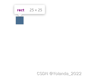
入门案例:绘制矩形、直线、圆形和点
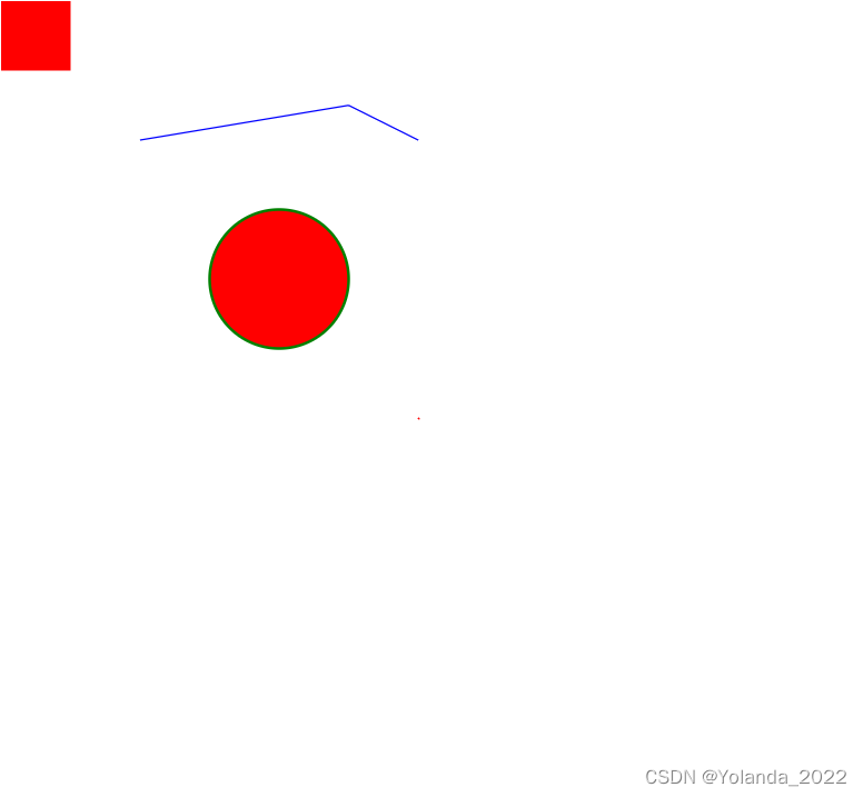
 <svg width="800" height="800">
      <rect
        width="50"
        height="50"
        style="fill:red;stroke-width:0;stroke:rgb(0,0,0);"
      />
      <line
        x1="100"
        y1="100"
        x2="250"
        y2="75"
        style="stroke:blue;stroke-width:1"
      />
      <line
        x1="250"
        y1="75"
        x2="300"
        y2="100"
        style="stroke:blue;stroke-width:1"
      />
      <circle
        cx="0"
        cy="0"
        r="50"
        stroke="green"
        stroke-width="2"
        fill="red"
      />
      <line
        x1="300"
        y1="300"
        x2="301"
        y2="301"
        style="stroke:red;stroke-width:1"
      />
    </svg>
思考: svg 绘图的流程
- 编写 svg 标签,指定宽高
- 编写 svg 绘图标签
- 编写绘图属性和样式
二、SVG进阶
2.1 svg 应用场景
- 绘制 icon
- 绘制动画
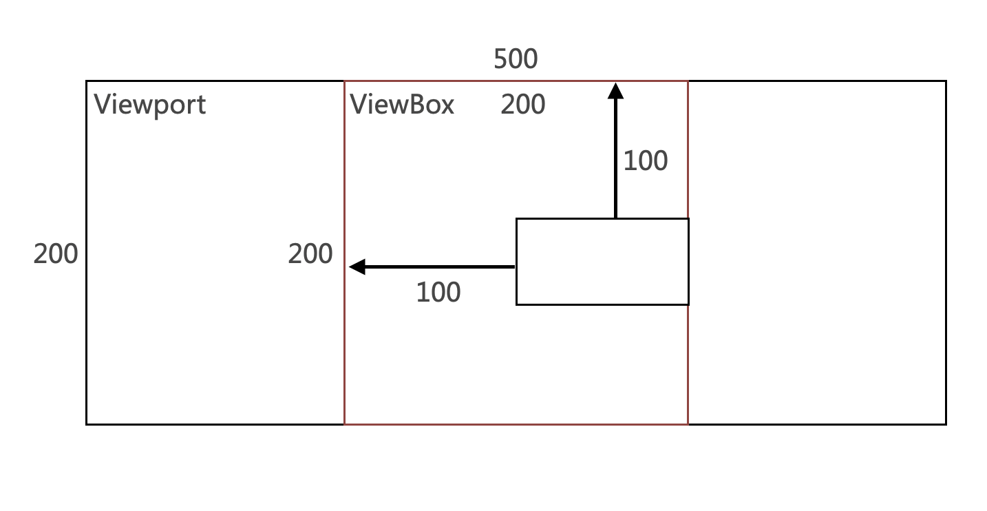
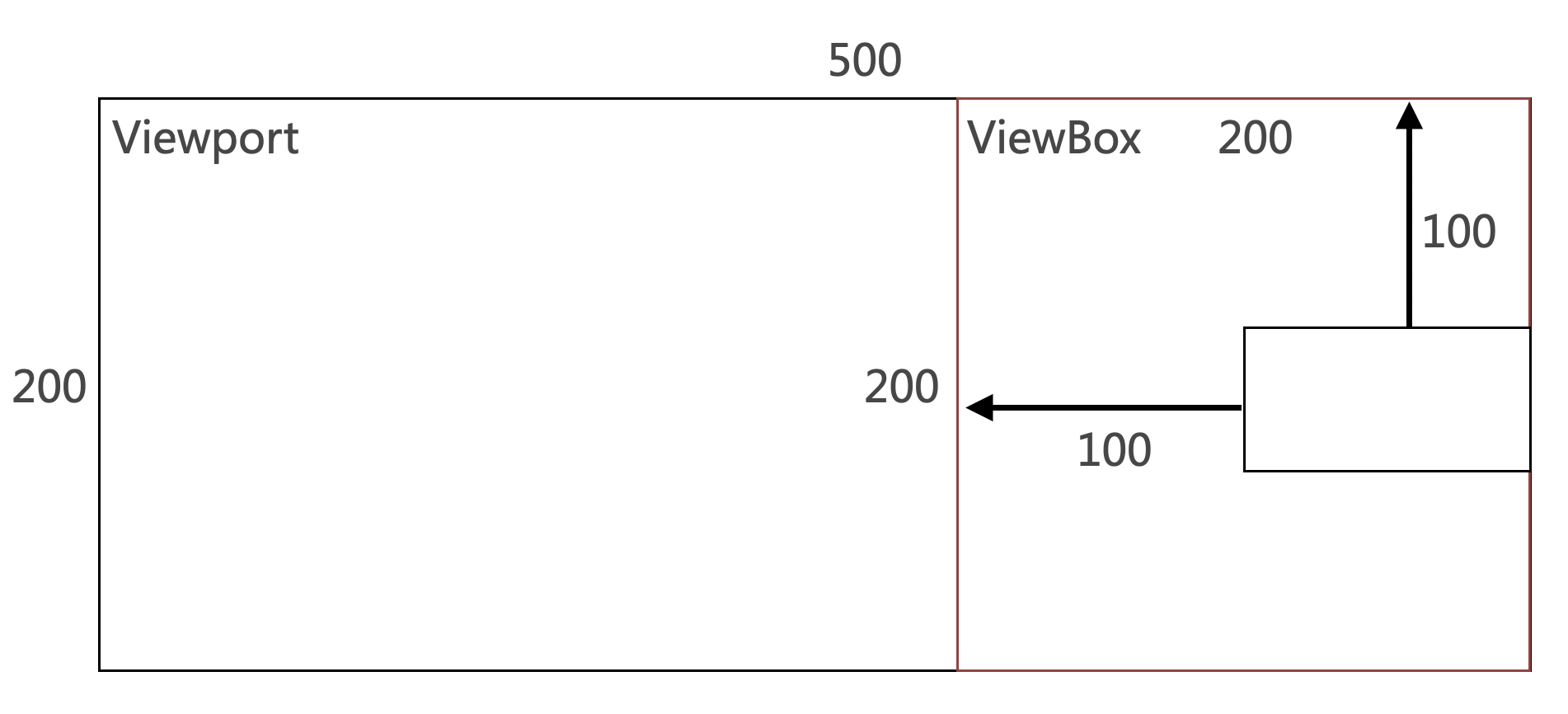
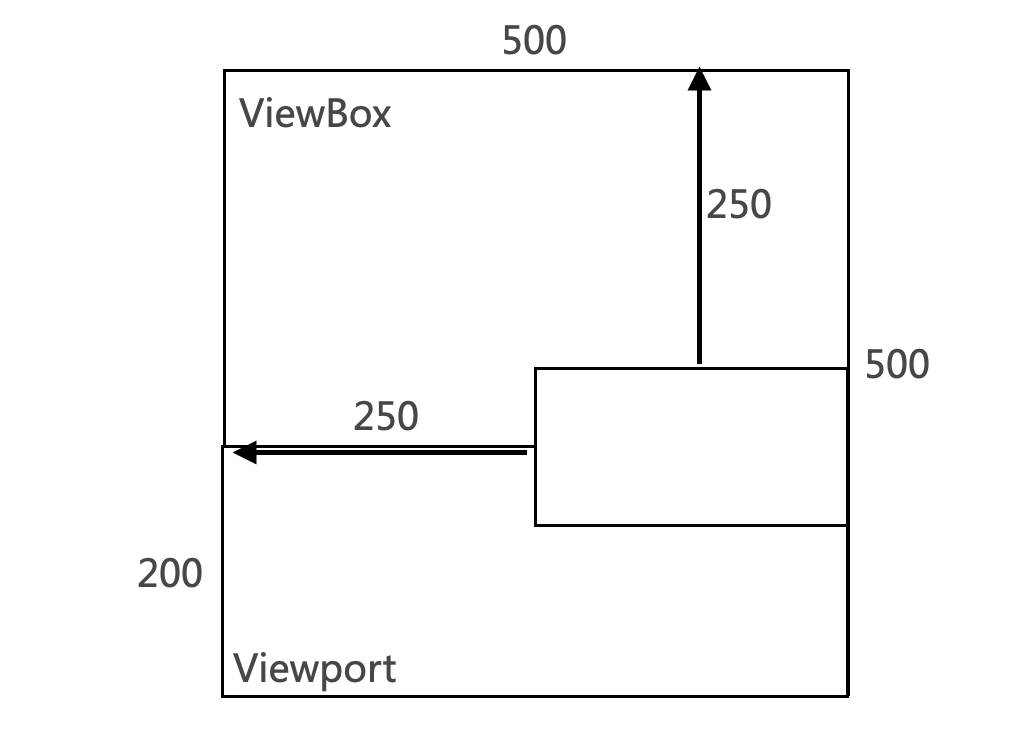
2.2 svg viewport 和 viewBox
- viewport 是 svg 图像的可见区域
- viewBox 是用于在画布上绘制 svg 图形的坐标系统
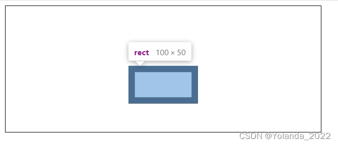
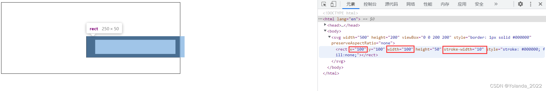
 <svg width="500" height="200" viewBox="0 0 50 20" style="border: 1px solid #000000">
   <rect x="20" y="10" width="10" height="5" style="stroke: #000000; fill:none;"/>
  </svg>
如上,在页面中定义一个 宽500 高200 的窗口,也就是viewport;viewbox=“x, y, width, height”
x 表示相对于svg左上角的横坐标。
y 表示相对于svg左上角的纵坐标。
width 表示截取的视区的宽度(viewbox的宽度)。
height 表示截取的视区的高度(viewbox的高度)。
上述代码实际上是,在width=500,height=200的窗口大小内,在svg的横坐标x=20,纵坐标y=10处,绘制宽度为10,高度为5的矩形。
从svg的横坐标x=0,纵坐标y=0处切割出来viewbox宽度为50,高度为20的方块,然后将这个方块平铺到svg这个500*200的窗口内。
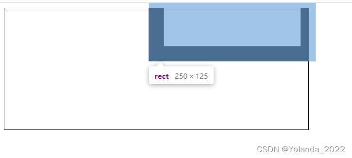
或者因为viewbox的x和y都是0,我们可以这么理解:
viewBox的50是svg的width的十分之一,那么可以将viewBox和rect的属性都放大为原来的十倍去绘制。
上述案例中 viewBox 坐标系中 1 = 10px,上述代码相当于:
<svg width="500" height="200" style="border: 1px solid #000000">
  <rect x="200" y="100" width="100" height="50" stroke-width="10" style="stroke: #000000; fill:none;"/>
</svg>
2.3 svg preserveAspectRatio
preserveAspectRatio 用于当 viewport 和 viewBox 宽高比不相同时,指定这个坐标系在viewport 中是否完全可见,同时也可以指定它在viewport 坐标系统中的位置
preserveAspectRatio 是一个较难理解的概念,它相当于在 viewport 内部绘制了一个虚拟内框,它的默认值为:xMidYMid meet
xMax会将viewBox绘制在svg的最右边,xMin会将viewBox绘制在svg的最左边。
preserveAspectRatio 第二个参数如下:
- meet: 保持宽高比并将viewBox缩放为适合viewport的大小
meet 模式下,svg 将优先采纳压缩比较小的作为最终压缩比,meet 是默认参数
-
slice: 保持宽高比并将所有不在viewport中的viewBox剪裁掉
-
none: 不保存宽高比。缩放图像适合整个viewbox,可能会发生图像变形
none 模式下,svg 将分别计算 x 和 y 轴的压缩比
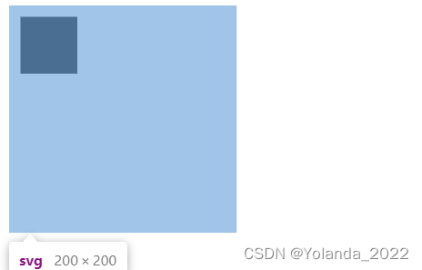
示例1
<svg width="500" height="200" viewBox="0 0 200 200" style="border: 1px solid #000000" preserveAspectRatio="xMidYMid meet">
  <rect x="100" y="100" width="100" height="50" stroke-width="10" style="stroke: #000000; fill:none;"/>
</svg>
因为preserveAspectRatio第二个参数是meet,最终压缩比为min(500/200,200/200),所以最终压缩比是1。
上述配置原理如下:

示例二
<svg width="500" height="200" viewBox="0 0 200 200" style="border: 1px solid #000000" preserveAspectRatio="xMaxYMin meet">
  <rect x="100" y="100" width="100" height="50" stroke-width="10" style="stroke: #000000; fill:none;"/>
</svg>
上述配置原理如下:
示例三
<svg width="500" height="200" viewBox="0 0 200 200" style="border: 1px solid #000000" preserveAspectRatio="xMidYMax slice">
  <rect x="100" y="100" width="100" height="50" stroke-width="10" style="stroke: #000000; fill:none;"/>
</svg>
slice的时候,取压缩比最大的,max(500/200,200/200),所以压缩比是2.5。
那么我们将viewBox放大至500*500,将rect的属性放大至原来的2.5倍。
YMax的时候整个viewport的下沿会和viewbox重合。
最后显示的结果如下:
<svg width="500" height="200" viewBox="0 0 200 200" style="border: 1px solid #000000" preserveAspectRatio="xMaxYMin slice">
  <rect x="100" y="100" width="100" height="50" stroke-width="10" style="stroke: #000000; fill:none;"/>
</svg>
YMin-viewport上沿和viewbox上沿重合。
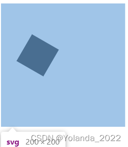
示例四
<svg width="500" height="200" viewBox="0 0 200 200" style="border: 1px solid #000000" preserveAspectRatio="none">
  <rect x="100" y="100" width="100" height="50" stroke-width="10" style="stroke: #000000; fill:none;"/>
</svg>
这里preserveAspectRatio为none,那么横向和纵向上的压缩比分别进行计算。因为500/200=2.5,所以rect的x,width,stroke-width(横向上)的都是乘以2.5,因为200/200 = 1,所以rect的y,height,stroke-width(纵向上)的都是乘以1.
三、SVG动画
1.transform 变换
translate 位移
<svg width="200" height="200" viewBox="0 0 200 200">
  <rect x="0" y="0" width="50" height="50" transform="translate(10,10)" />
</svg>
2. rotate 旋转
<svg width="200" height="200" viewBox="0 0 200 200">
  <rect x="0" y="0" width="50" height="50" transform="translate(50,50) rotate(30)" />
</svg>
3.skewX 和 skewY 斜切
<svg width="200" height="200" viewBox="0 0 200 200">
  <rect x="0" y="0" width="50" height="50" transform="translate(50,50) skewX(30)" />
</svg>
4.scale 缩放
<svg width="200" height="200" viewBox="0 0 200 200">
  <rect x="0" y="0" width="50" height="50" transform="translate(50,50) scale(.5)" />
</svg>
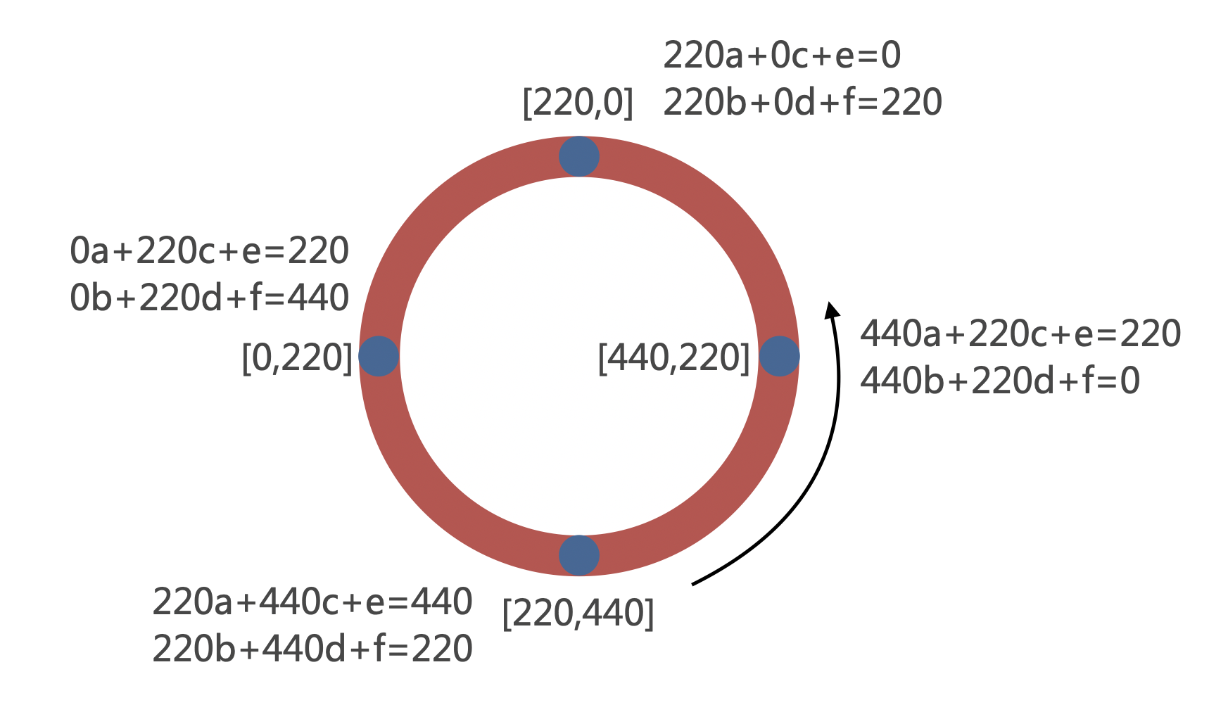
5.matrix 复杂变形
<svg viewBox="0 0 200 200">
  <rect x="10" y="10" width="30" height="20" fill="green" />

  <!--
  In the following example we are applying the matrix:
  [a c e]    [3 -1 30]
  [b d f] => [1  3 40]
  [0 0 1]    [0  0  1]

  which transform the rectangle as such:

  top left corner: oldX=10 oldY=10
  newX = a * oldX + c * oldY + e = 3 * 10 - 1 * 10 + 30 = 50
  newY = b * oldX + d * oldY + f = 1 * 10 + 3 * 10 + 40 = 80

  top right corner: oldX=40 oldY=10
  newX = a * oldX + c * oldY + e = 3 * 40 - 1 * 10 + 30 = 140
  newY = b * oldX + d * oldY + f = 1 * 40 + 3 * 10 + 40 = 110

  bottom left corner: oldX=10 oldY=30
  newX = a * oldX + c * oldY + e = 3 * 10 - 1 * 30 + 30 = 30
  newY = b * oldX + d * oldY + f = 1 * 10 + 3 * 30 + 40 = 140

  bottom right corner: oldX=40 oldY=30
  newX = a * oldX + c * oldY + e = 3 * 40 - 1 * 30 + 30 = 120
  newY = b * oldX + d * oldY + f = 1 * 40 + 3 * 30 + 40 = 170
  -->
  <rect x="10" y="10" width="30" height="20" fill="red"
        transform="matrix(3 1 -1 3 30 40)" />
</svg>
四、svg 动画案例(CSS)
案例1:环形进度条
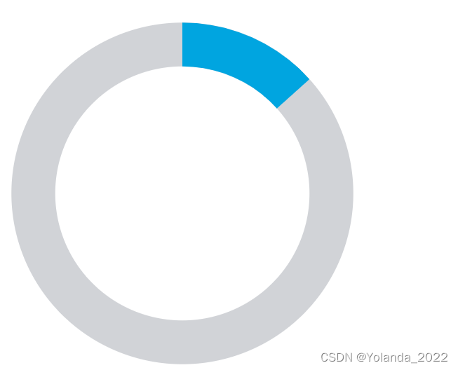
 <style>
        .circle {


          animation: circle 5s linear infinite;
        }

        @keyframes circle {


          from {


            stroke-dasharray: 0 1069;// 2*pi*r
          }
          to {


            stroke-dasharray: 1069 0;
          }
        }
     </style>

   <svg width="440" height="440" viewbox="0 0 440 440">
      <circle cx="220" cy="220" r="170" stroke-width="50" stroke="#D1D3D7" fill="none"></circle>
      <circle
        class="circle"
        cx="220"
        cy="220"
        r="170"
        stroke-width="50"
        stroke="#00A5E0"
        fill="none"
        transform="matrix(0,-1,1,0,0,440)"
      />
    </svg>
transform的matrix是为了让进度条开始的起点在正上方。
matrix计算公式如下:
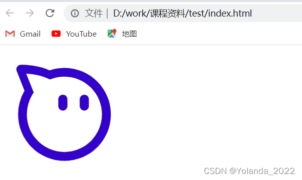
案例2:LOGO 描边
- 下载任意 SVG 格式的 LOGO
- 获取 path 长度
const path = document.getElementById('taobao-logo')
const pathLen = path.getTotalLength() // 6885
- 添加描边样式和动画
.taobao-path {


  fill: none;
  stroke: #333;
  stroke-width: 1;
  animation: taobao 5s linear infinite forwards;
}
@keyframes taobao {


  from {


    stroke-dasharray: 6885;
    stroke-dashoffset: 6885;
  }
  to {


    stroke-dasharray: 6885;
    stroke-dashoffset: 0;
  }
}
以淘宝图标为例:
<!DOCTYPE html>
<html lang="en">
<head>
    <meta charset="UTF-8">
    <meta http-equiv="X-UA-Compatible" content="IE=edge">
    <meta name="viewport" content="width=device-width, initial-scale=1.0">
    <title>Document</title>
    <style>
 .taobao-path {


  fill: none;
  stroke: #333;
  stroke-width: 1;
  animation: taobao 5s linear infinite forwards;
}
@keyframes taobao {


  0% {


    stroke-dasharray: 4727;
    stroke-dashoffset: 4727;
  }
  70% {


    stroke-dasharray: 4727;
    stroke-dashoffset: 0;
  }
  80%{


    fill: red;
  }
  100%{


    fill:blue;
  }
}
     </style>
</head>
<body>
    <svg t="1676476354796" class="taobao-path" viewBox="0 0 1024 1024"  width="200" height="200"><path id="taobao-logo"  d="M868.2 377.4c-18.9-45.1-46.3-85.6-81.2-120.6-34.7-34.8-75.4-62.1-120.5-81.2-46.7-19.8-96.3-29.8-147.5-29.8-41.9 0-82.9 6.7-121.9 20C306 123.3 200.8 120 170.6 120c-2.2 0-7.4 0-9.4 0.2-11.9 0.4-22.8 6.5-29.2 16.4-6.5 9.9-7.7 22.4-3.4 33.5l64.3 161.6c-34.6 58.3-52.8 125.1-52.8 193.2 0 51.4 10 101 29.8 147.6 18.9 45 46.2 85.6 81.2 120.5 34.7 34.8 75.4 62.1 120.5 81.2C418.3 894 467.9 904 519 904c51.3 0 100.9-10.1 147.7-29.8 44.9-18.9 85.5-46.3 120.4-81.2 34.7-34.8 62.1-75.4 81.2-120.6 19.8-46.7 29.8-96.5 29.8-147.6-0.2-51.2-10.1-100.8-29.9-147.4z m-66.4 266.5c-15.5 36.8-37.7 69.7-65.9 98-28.4 28.5-61.3 50.7-97.7 65.9h-0.1c-38 16-78.3 24.2-119.9 24.2-41.6 0-81.8-8.2-119.7-24.2-36.7-15.5-69.6-37.8-97.8-66-28.4-28.5-50.6-61.4-65.8-97.8v-0.1c-16-37.8-24.1-78.2-24.1-119.9 0-55.4 14.8-109.7 42.8-157l13.2-22.1-9.5-23.9L206 192c14.9 0.6 35.9 2.1 59.7 5.6 43.8 6.5 82.5 17.5 114.9 32.6l19 8.9 19.9-6.8c31.5-10.8 64.8-16.2 98.9-16.2 41.6 0 81.9 8.2 119.7 24.2 36.7 15.5 69.6 37.8 97.8 66 28.4 28.5 50.6 61.4 65.8 97.8l0.1 0.1 0.1 0.1c16 37.6 24.1 78 24.2 119.8-0.1 41.7-8.3 82-24.3 119.8z" p-id="2775"></path><path d="M681.1 364.2c-20.4 0-37.1 16.7-37.1 37.1v55.1c0 20.4 16.6 37.1 37.1 37.1s37.1-16.7 37.1-37.1v-55.1c0-20.5-16.7-37.1-37.1-37.1zM505.9 364.2c-20.5 0-37.1 16.7-37.1 37.1v55.1c0 20.4 16.7 37.1 37.1 37.1 20.5 0 37.1-16.7 37.1-37.1v-55.1c0-20.5-16.7-37.1-37.1-37.1z" ></path></svg>

    <script>
        const path = document.getElementById('taobao-logo')
        const pathLen = path.getTotalLength()
        console.log('pathlen',pathLen)
    </script>
</body>
</html>
参考资料
https://zhuanlan.zhihu.com/p/422609203