文章目录
母亲节,除了赠送一些妈妈喜欢的礼物外,应该也要准备一个贺卡在朋友圈或者家庭群里,以示祝贺,那么电子贺卡怎么实现呢?
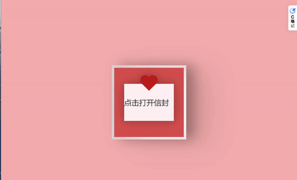
先看效果图:
<!DOCTYPE html>
<html lang="en">
<head>
    <meta charset="UTF-8">
    <title>open</title>
    <style>
		@import url('https://fonts.googleapis.com/css2?family=Mochiy+Pop+P+One&display=swap');

		body {


		    height: 100vh;
		    display: flex;
		    justify-content: center;
		    align-items: center;
		    background-color: #f2acac;
		    font-family: 'Mochiy Pop P One', sans-serif;
		}

		input#open {


		    display: none;
		}

		.valentines-day-card {


		    position: relative;
		    width: 300px;
		    height:300px;
		    transform-style: preserve-3d;
		    transform: perspective(2500px);
		    transition: .3s;
		}

		.card-front {


		    position: relative;
		    background-color: #fff0f3;
		    width: 300px;
		    height:300px;
		    transform-origin: left;
		    box-shadow: inset 100px 20px 100px rgba(0,0,0,.15), 30px 0 50px rgba(0,0,0,0.3);
		    transition: .3s;
		}

		.card-front:before {


		    content:"";
		    position: absolute;
		    width: 280px;
		    height: 280px;
		    background-color: #d04e4e;
		    top: 10px;
		    left: 10px;
		}

		.card-inside {


		    position: absolute;
		    background-color: #fff0f3;
		    width: 300px;
		    height:300px;
		    z-index:-1;
		    left:0;
		    top:0;
		    box-shadow: inset 100px 20px 100px rgba(0,0,0,0.22), 100px 20px 100px rgba(0,0,0,0.1);
		}

		.open {


		    position: absolute;
		    width: 300px;
		    height:300px;
		    left:0;
		    top:0;
		    background-color: transparent;
		    z-index:6;
		    cursor: pointer;
		}

		#open:checked ~ .card-front {


		    transform: rotateY(-155deg);
		    box-shadow: inset 100px 20px 100px rgba(0,0,0,.13), 30px 0 50px rgba(0,0,0,0.1);
		}

		#open:checked ~ .card-front:before {


		    z-index:5;
		    background-color: #fff0f3;
		    width:300px;
		    height:300px;
		    top:0;
		    left:0;
		    box-shadow: inset 100px 20px 100px rgba(0,0,0,.1), 30px 0 50px rgba(0,0,0,0.1);
		}

		.note {


		    position: relative;
		    width: 200px;
		    height: 150px;
		    background-color: #fff0f3;
			font-family: 'Segoe UI', Tahoma, Geneva, Verdana, sans-serif;
		    top:75px;
		    left:50px;
		    color: #333;
		    font-size:30px;
		    display: flex;
		    align-items: center;
		    text-align: center;
		    filter: drop-shadow(0 0 20px rgba(0,0,0,0.3));
		}

		.note:before, .note:after {


		    position: absolute;
		    content:"";
		    background-color: #ba1c1c;
		    width: 40px;
		    height:40px;
		}

		.note:before {


		    transform: rotate(-45deg);
		    top:-20px;
		    left:80px;
		}

		.note:after {


		    border-radius:50%;
		    top:-35px;
		    left:65px;
		    box-shadow:30px 0 #ba1c1c;
		}


		.text-one {


		    position: absolute;
		    color: #333;
		    font-size: 30px;
		    top:30px;
		    width:300px;
		    text-align: center;
		}

		.text-one:before, .text-one:after {


		    position: absolute;
		    left:5px;
		    text-align: center;
		    width:300px;
		}

		.text-one:before {


		    content:"Mother's Day";
		    top:30px;
		    color: #d04e4e;
		}

		.text-one:after {


		    content:"母亲节快乐";
			font-family: 楷体;
		    top:70px;
		}

		.heart {


		    position: relative;
		    background-color: #d04e4e;
		    height: 60px;
		    width:60px;
		    top:180px;
		    left:120px;
		    transform: rotate(-45deg);
		    animation: .8s beat infinite;
		}

		.heart:before, .heart:after {


		    content:"";
		    background-color: #d04e4e;
		    border-radius:50%;
		    height: 60px;
		    width: 60px;
		    position: absolute;
		}

		.heart:before {


		    top:-30px;
		    left:0;
		}

		.heart:after {


		    left:30px;
		    top:0;
		}

		.smile {


		    position: absolute;
		    width:30px;
		    height:15px;
		    background-color: #333;
		    z-index:1;
		    border-radius: 0 0 100px 100px;
		    top:200px;
		    left:135px;
		    overflow: hidden;
		}

		.smile:before {


		    content:"";
		    position: absolute;
		    border-radius:50%;
		    width:20px;
		    height:20px;
		    background-color: #030202;
		    top:5px;
		    left:5px;
		}

		.eyes {


		    position: absolute;
		    border-radius: 50%;
		    background-color: #333;
		    width:10px;
		    height:10px;
		    z-index:1;
		    top:190px;
		    left:165px;
		    box-shadow: -40px 0 #333;
		    transform-origin: 50%;
		    animation: close 2s infinite;
		}

		@keyframes close {


		    0%, 100% {


		        transform: scale(1, .05);
		    }
		    5%, 95% {


		        transform: scale(1, 1);
		    }
		}

		@keyframes beat {


		    0%, 40%, 100% {


		        transform: scale(1) rotate(-45deg);
		    }
		    25%, 60% {


		        transform: scale(1.1) rotate(-45deg);
		    }
		}

	</style>
</head>
<body>
<div class="valentines-day-card">
    <input id="open" type="checkbox">
    <label class="open" for="open"></label>
    <div class="card-front">
        <div class="note" >点击打开信封</div>
    </div>

    <div class="card-inside">
        <div class="text-one">Happy
        </div>
        <div class="heart"></div>

        <div class="smile"></div>

        <div class="eyes"></div>
    </div>
</div>
</body>
</html>
小白教程:可以复制上面的代码,在桌面新建一个txt文本,然后粘贴代码,保存后,将txt格式修改为html,就可以发给你的母亲了,快来试试吧!