- Button介绍:
Button(按钮)继承自TextView,在Android开发中,Button是常用的控件,用起来也很简单,你可以在界面xml描述文档中定义,也可以在程序中创建后加入到界面中,其效果都是一样的。不过最好是在xml文档中定义,因为一旦界面要改变是话,直接修改一下xml就行了,不用修改Java程序,并且在xml中定义层次分明,一目了然。
- Button的创建和使用
1.在布局文件xxx.xml文件中定义Button控件(widget),设置Button支持的xml属性;
2.在xxx.java文件中定义Button控件(widget)的点击事件。
- Button 支持的 XML attributes
Inherited XML Attributes from classandroid.widget.TextView and android.view.View.
XML 属性相关方法说明android:clickablesetClickable(boolean clickable)设置是否允许点击。
clickable=true:允许点击
clickable=false:禁止点击android:backgroundsetBackgroundResource(int resid)通过资源文件设置背景色。
resid:资源xml文件ID
按钮默认背景为android.R.drawable.btn_defaultandroid:textsetText(CharSequence text)设置文字android:textColorsetTextColor(int color)设置文字颜色android:onClicksetOnClickListener(OnClickListener l)设置点击事件
下面通过实例来给大家介绍Button的常用效果。
实例:Button点击事件写法1、写法2、设置背景图片、设置背景颜色、设置背景shape、V7包按钮样式
我们首先来看一下布局文件:activity_main.xml
<?xml version="1.0" encoding="utf-8"?>
<LinearLayout xmlns:android="http://schemas.android.com/apk/res/android"
    android:layout_width="match_parent"
    android:layout_height="match_parent"
    android:layout_marginLeft="10dp"
    android:orientation="vertical">

    <Button
        android:id="@+id/btn_click_one"
        android:layout_width="wrap_content"
        android:layout_height="wrap_content"
        android:text="Button点击事件写法1" />

    <Button
        android:id="@+id/btn_click_two"
        android:layout_width="wrap_content"
        android:layout_height="wrap_content"
        android:onClick="click"
        android:text="Button点击事件写法2" />

    <Button
        android:layout_width="wrap_content"
        android:layout_height="wrap_content"
        android:layout_marginTop="10dp"
        android:background="@mipmap/icon_button_bg"
        android:padding="10dp"
        android:text="Button设置背景图片" />

    <Button
        android:layout_width="wrap_content"
        android:layout_height="wrap_content"
        android:layout_marginTop="10dp"
        android:background="@android:color/holo_red_dark"
        android:padding="10dp"
        android:text="Button设置背景颜色" />

    <Button
        android:layout_width="wrap_content"
        android:layout_height="wrap_content"
        android:layout_marginTop="10dp"
        android:background="@drawable/shape_button_test"
        android:padding="10dp"
        android:text="Button设置shape" />

    <TextView
        style="@style/Widget.AppCompat.Button.Colored"
        android:layout_width="match_parent"
        android:layout_height="50dp"
        android:layout_marginLeft="20dp"
        android:layout_marginRight="20dp"
        android:layout_marginTop="10dp"
        android:text="V7包按钮样式"
        android:textColor="#ffffffff"
        android:textSize="20sp" />

</LinearLayout>
布局文件对应的效果图如下:
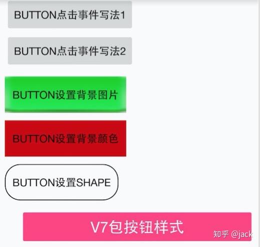
上面布局文件中定义了6个Button,它们指定的规则如下。
1.给Button指定了android:id="@+id/btn_click_one",在MainActivity.xml根据id进行查找并且设置点击事件。
//给第一个按钮设置点击事件
findViewById(R.id.btn_click_one).setOnClickListener(onClickListener);
点击之后进行Toast提示。
private View.OnClickListener onClickListener=new View.OnClickListener() {
        @Override
        public void onClick(View v){
            Toast.makeText(MainActivity.this,"Button点击事件1",Toast.LENGTH_LONG).show();
        }
    };
2.给xml中给button增加了android:onClick="click"属性,然后在该布局文件对应的Acitivity中实现该方法。需要注意的是这个方法必须符合三个条件:
1).方法的修饰符是 public
2).返回值是 void 类型
3).只有一个参数View,这个View就是被点击的这个控件。
public void click(View v){
        switch (v.getId()){
            case R.id.btn_click_two:
                Toast.makeText(MainActivity.this,"Button点击事件2",Toast.LENGTH_LONG).show();
                break;
        }
    }
3.设置一张背景图片
android:background="@mipmap/icon_button_bg"
4.设置背景颜色
android:background="@android:color/holo_red_dark"
5.设置背景shape,android:background="@drawable/shape_button_test",可以自定义Button的外观,从效果图中我们可以看到Button背景透明,有边框,有弧度。
shape_button_test.xml文件如下:
<?xml version="1.0" encoding="utf-8"?>
<shape xmlns:android="http://schemas.android.com/apk/res/android" >
    <!--     默认背景色 -->
    <solid android:color="@android:color/transparent"/>
    <!-- 边框 -->
    <stroke
        android:width="1dp"
        android:color="@android:color/black" />
    <!--     设置弧度 -->
    <corners
        android:radius="20dp"/>
</shape>
6.设置按钮的样式
style="@style/Widget.AppCompat.Button.Colored"
这是V7包里面自带的style样式。按钮的颜色是ButtonTest/app/src/main/res/values/colors.xml下name="colorAccent"的颜色。
Button使用注意事项:
1.Button的setOnClickListener优先级比xml中android:onClick高,如果同时设置点击事件,只有setOnClickListener有效。