1.父容器用position:relative定位,子容器用position:absolute定位 。父容器不能高度自适应 ,解决办法:
要子容器自适应高度,就不能用position:absolute;所以用(position:relative;)来确定子容器的位置。
2. 块级元素文字超出显示省略号:
.div{width: 160px; overflow: hidden; text-overflow:ellipsis; white-space: nowrap;}
说明:
white-space: nowrap 保证文本内容不会自动换行,如果多余的内容会在水平方向撑破单元格。
overflow: hidden 隐藏超出单元格的部分。
text-overflow: ellipsis 将被隐藏的那部分用省略号代替。
3.移动端 解决ios滑动卡死,定位方法,依据vue路由项目
vue模板部分:
<template>
  <div id="app">
    <!-- route.meta.keepAlive为true 会缓存页面 -->
    <transition
      :name="transitionName"
      @after-enter="afterEnter"
      @before-leave="beforeLeave"
    >
      <keep-alive>
        <router-view class="router-view" v-if="$route.meta.keepAlive"></router-view>
      </keep-alive>
    </transition>
    <!-- route.meta.keepAlive为false 则不会缓存页面 -->
    <transition
      :name="transitionName"
      @after-enter="afterEnter"
      @before-leave="beforeLeave"
    >
      <router-view class="router-view" v-if="!$route.meta.keepAlive"></router-view>
    </transition>
    <!-- 全局loading -->
    <toast :show="load.show" :text="load.text">
      <div slot="icon">
        <spinner color="white"></spinner>
      </div>
    </toast>
  </div>
</template>
html, body { font-family: 'PingFangSC-Light',Arial,Helvetica,sans-serif,"Hiragino Sans GB" !important; height: 100%; width: 100%; overflow-x: hidden; } #app { position: relative; width: 100%; height: 100%; } .router-view { position: absolute; top: 0; right: 0; bottom: 0; left: 0; overflow-x: hidden; overflow-y:auto; -webkit-overflow-scrolling: touch; }非vue项目布局定位是一样的
4.input去掉默认边框阴影样式
input, textarea, keygen, select, button {
  outline:none;
}
5.修改input里placeholder颜色
input::-webkit-input-placeholder, textarea::-webkit-input-placeholder {
  color: #666;
}
input:-moz-placeholder, textarea:-moz-placeholder {
 color: #666;
}
input::-moz-placeholder, textarea::-moz-placeholder {
  color: #666;
}
input:-ms-input-placeholder, textarea:-ms-input-placeholder {
  color: #666;
}
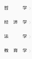
6.设置多行文本宽度对齐,或者叫文字平均分配在框里
<span class="inline-title">哲学</span>
<span class="inline-title">经济学</span>
.inline-title{display:inline-block;width: 74px;height:24px;line-height:24px;text-align: justify;text-justify: distribute-all-lines;text-align-last: justify;-moz-text-align-last: justify; -webkit-text-align-last: justify;overflow: hidden;}
.inline-title:after{content:"";width:100%;display: inline-block;height: 40px;}
效果如下:
7.pc端,footer自适应在网页底部
<body>
    <div id="web-container">
        <div id="web-nav">
        </div>
        <div id="web-content">
        </div>
        <div id="footer">
            <div class="line">
            </div>
            <div id="bottom">
            </div>
        </div>
    </div>
</body>
*{margin:0px;padding:0px;}
html{max-width:100%;overflow: auto;height:auto;min-width: 1200px;-webkit-overflow-scrolling: touch;height: 100%;overflow-y: scroll}
body{overflow:hidden;padding-right: 0px !important;min-height: 100%;height:auto;position: relative;}
#web-container{width:100%;height:auto;}
#web-nav{z-index: 1000; background:#fff;height:100px;position: fixed;top: 0px;width: 100%;border-bottom:1px solid #d6d6d6;}
#web-content{width:100%;margin-top: 0px;overflow: hidden;margin:0 auto;}
#footer{width:100%;height:100px;overflow:hidden;background:#fff;color:white;bottom: 0px;left: 0px;position: absolute;}
#bottom{width:1200px;margin:0 auto;overflow: auto;margin-top:0px;}
#footer .line{width:100%;height: 40px;background:rgba(245,245,245,0.5);min-width:1200px;}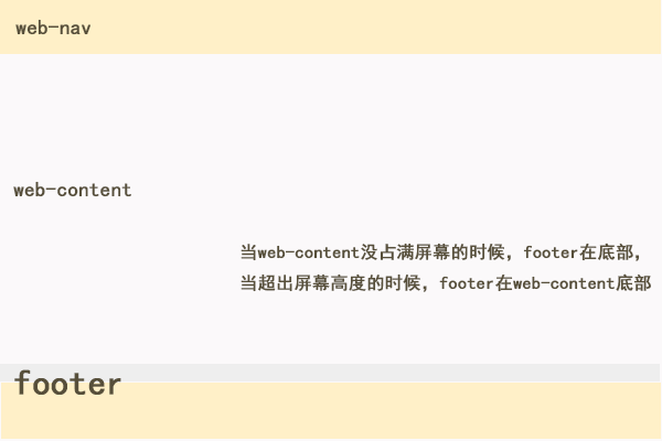
8.图片和文字的各种对齐 仿妹子UIdemo

<!DOCTYPE html>
<html>
<head>
	<title></title>
</head>
<body>
	<div class="doc-example">
		<div class="am-g">
			<div class="am-u-md-4">
				<img src="http://s.amazeui.org/media/i/demos/bw-2014-06-19.jpg?imageView/1/w/120/h/120" alt="" width="48" height="48">
				<span class="am-text-top">顶部对齐</span>
			</div>
			<div class="am-u-md-4">
				<img src="http://s.amazeui.org/media/i/demos/bw-2014-06-19.jpg?imageView/1/w/120/h/120" alt="" width="48" height="48">
				<span class="am-text-middle">居中对齐</span>
			</div>
			<div class="am-u-md-4">
				<img src="http://s.amazeui.org/media/i/demos/bw-2014-06-19.jpg?imageView/1/w/120/h/120" alt="" width="48" height="48">
				<span class="am-text-bottom">底部对齐</span>
			</div>
		</div>
	</div>
</body>
<style type="text/css"> *, :after, :before { -webkit-box-sizing: border-box; box-sizing: border-box; } .doc-example { border: 1px solid #eee; border-top-right-radius: 0; border-top-left-radius: 0; padding: 0 15px 15px; } .doc-example::before { content: "Demo"; display: block; color: rgb(187, 187, 187); text-transform: uppercase; font-size: 12px; margin: 0px -15px 15px; padding: 4px 10px; } .am-g .am-g { margin-left: -1.5rem; margin-right: -1.5rem; } .am-g:after, .am-g:before { content: " "; display: table; } .am-u-md-4 { width: 33.33333333%; float: left; position: relative; } img { width: 48px; height: 48px; -webkit-box-sizing: border-box; box-sizing: border-box; vertical-align: middle; border: 0; } .am-text-top { vertical-align: top!important; } .am-text-middle { vertical-align: middle!important; } .am-text-bottom { vertical-align: bottom!important; } .am-g:after { clear: both; } .am-g:after, .am-g:before { content: " "; display: table; } </style>