<!DOCTYPE html>
<html lang="en">
<head>
<meta charset="UTF-8">
<meta name="viewport" content="width=device-width, initial-scale=1.0">
<title>霓虹灯-button</title>
<style>
html,body {
margin: 0;padding: 0;}
body {
overflow: hidden;
display: flex;
flex-direction: row;
justify-content: center;
align-items: center;
flex-wrap: wrap;
min-height: 100vh;
background-color: #000000;
}
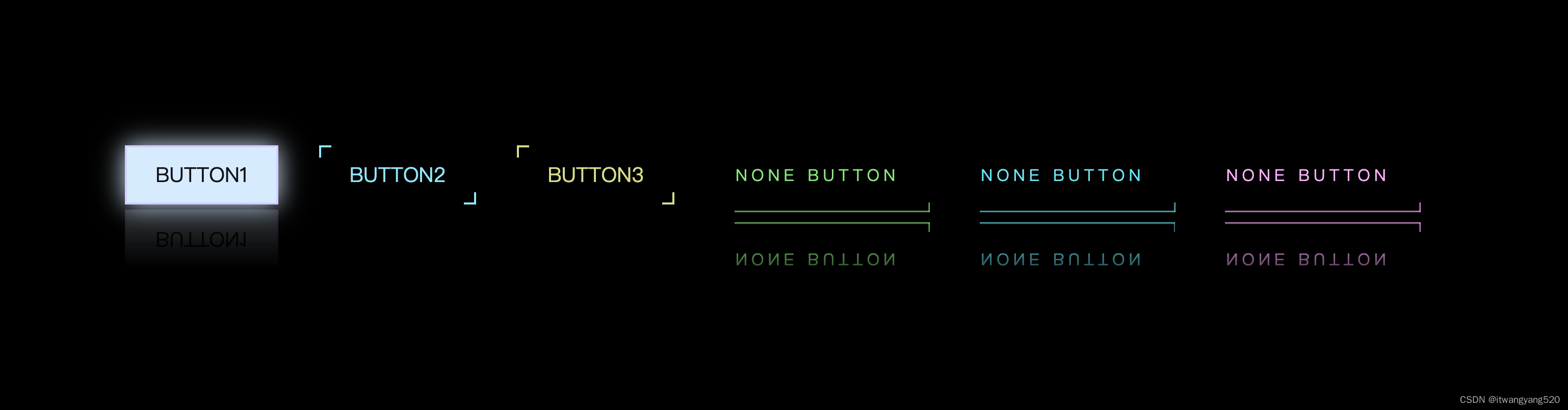
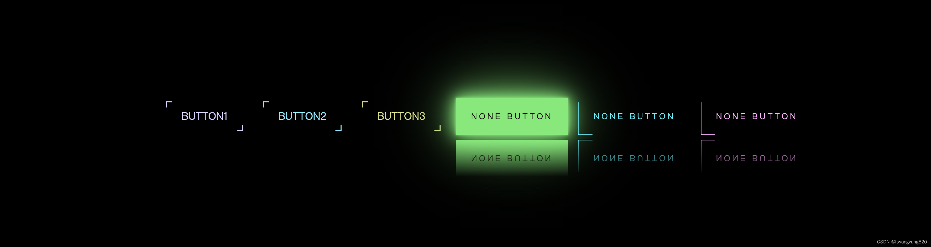
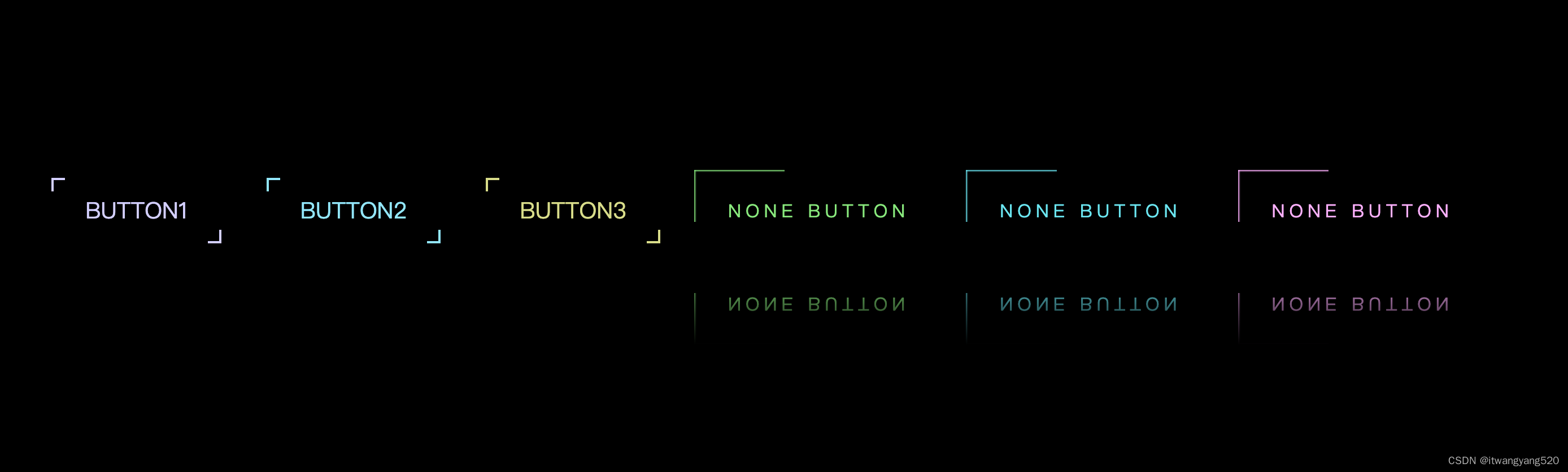
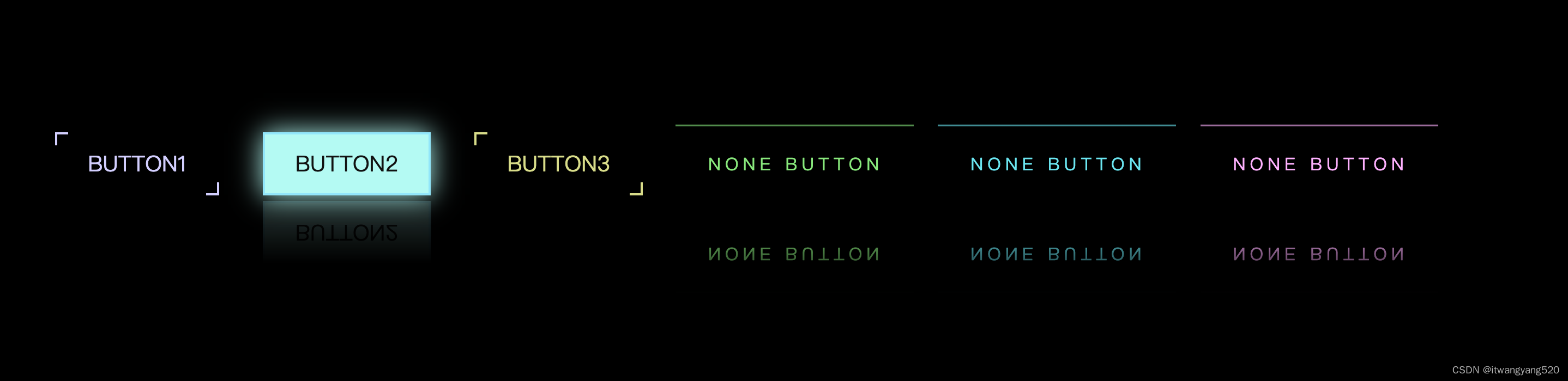
.btn {
overflow: hidden;
position: relative;
padding: 15px 30px;
margin: 0 20px;
color: #74e9fd;
font-size: 20px;
text-decoration: none;
text-transform: uppercase;
transition: all .3s;
/* -webkit-box-reflect: below 1px linear-gradient(transparent, #0003); */
}
.btn:nth-child(1) {
filter: hue-rotate(60deg);
}
.btn:nth-child(3) {
filter: hue-rotate(240deg);
}
.btn::before,
.btn::after {
position: absolute;
content: "";
width: 10px;
height: 10px;
transition: all .3s;
transition-delay: 0.3s;
}
.btn::before {
top: 0;
left: 0;
border-top: 2px solid #74e9fd;
border-left: 2px solid #74e9fd;
}
.btn::after {
bottom: 0;
right: 0;
border-bottom: 2px solid #74e9fd;
border-right: 2px solid #74e9fd;
}
.btn:hover {
color: #111;
background-color: #9efcf4;
box-shadow: 0 0 25px #9efcf4;
transition-delay: 0.3s;
-webkit-box-reflect: below 5px linear-gradient(transparent, #0003);
}
.btn:hover::before,
.btn:hover::after {
width: 100%;
height: 100%;
transition-delay: 0s;
}
/* auto-animate */
.auto-animate {
overflow: hidden;
position: relative;
display: inline-block;
padding: 25px 30px;
margin: 50px 10px;
text-decoration: none;
color: #03e9f4;
transition: 0.5s;
letter-spacing: 4px;
-webkit-box-reflect: below 10px linear-gradient(transparent, #000500);
}
.auto-animate:nth-child(4) {
filter: hue-rotate(290deg);
}
.auto-animate:nth-child(6) {
filter: hue-rotate(110deg);
}
.auto-animate:hover {
color: #050801;
background-color: #03e9f4;
box-shadow: 0 0 5px #03e9f4,
0 0 25px #03e9f4,
0 0 50px #03e9f4,
0 0 200px #03e9f4;
/* -webkit-box-reflect: below 10px linear-gradient(transparent, #000500); */
}
.auto-animate span {
display: block;
position: absolute;
}
.auto-animate span:nth-child(1) {
top: 0;
left: 0;
width: 100%;
height: 2px;
background: linear-gradient(0deg, transparent, #03e9f4);
animation: animate1 1s linear infinite;
}
@keyframes animate1 {
0% {
left: -100%;
}
50%, 100% {
left: 100%;
}
}
.auto-animate span:nth-child(2) {
top: 0;
right: 0;
width: 2px;
height: 100%;
background: linear-gradient(90deg, transparent, #03e9f4);
animation: animate2 1s linear infinite;
animation-delay: 0.25s;
}
@keyframes animate2 {
0% {
top: -100%;
}
50%, 100% {
top: 100%;
}
}
.auto-animate span:nth-child(3) {
right: 0;
bottom: 0;
width: 100%;
height: 2px;
background: linear-gradient(180deg, transparent, #03e9f4);
animation: animate3 1s linear infinite;
animation-delay: 0.5s;
}
@keyframes animate3 {
0% {
right: -100%;
}
50%, 100% {
right: 100%;
}
}
.auto-animate span:nth-child(4) {
left: 0;
bottom: 0;
width: 2px;
height: 100%;
background: linear-gradient(270deg, transparent, #03e9f4);
animation: animate4 1s linear infinite;
animation-delay: 0.75s;
}
@keyframes animate4 {
0% {
bottom: -100%;
}
50%, 100% {
bottom: 100%;
}
}
</style>
</head>
<body>
<a href="javascript:;" class="btn">button1</a>
<a href="javascript:;" class="btn">button2</a>
<a href="javascript:;" class="btn">button3</a>
<a href="javascript:;" class="auto-animate">
<span></span>
<span></span>
<span></span>
<span></span>
NONE BUTTON
</a>
<a href="javascript:;" class="auto-animate">
<span></span>
<span></span>
<span></span>
<span></span>
NONE BUTTON
</a>
<a href="javascript:;" class="auto-animate">
<span></span>
<span></span>
<span></span>
<span></span>
NONE BUTTON
</a>
</body>
</html>