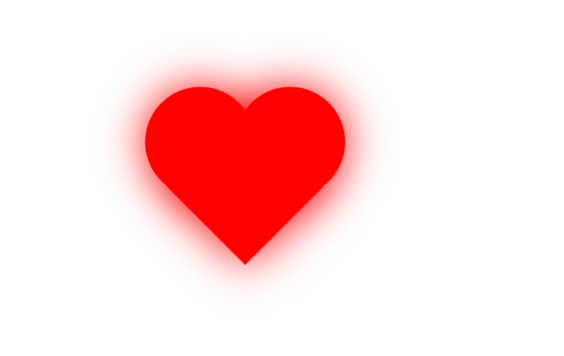
首先做两个圆,给两个圆添加定位使一部分重叠其形成如下形状。

在做一个正方形,给它做旋转和定位,与上面两个圆组合成如下形状。

最后给这个心添加动画就可以了。
具体代码如下:
<!DOCTYPE html>
<html lang="zh">
<head>
	<meta charset="UTF-8">
	<meta name="viewport" content="width=device-width, initial-scale=1.0">
	<meta http-equiv="X-UA-Compatible" content="ie=edge">
	<title></title>
	<style type="text/css">
		body{
			padding: 100px;
		}
		/*两个圆*/
		.love{
			width: 150px;
			height: 150px;
			background-color: red;
			float: left;
			border-radius: 50%;
			animation: animate 1s infinite;
		}
		.love-left{
			position: relative;
			left: 50px;
		}
		/*做一个正方体与两个圆组合成心形*/
		.sq{
			width: 150px;
			height: 150px;
			background-color: red;
			transform: rotate(45deg);
			animation: animate 1s infinite;
			position: relative;
			top: 50px;
			left: 100px;
		}
		/*定义动画*/
		@keyframes animate{
			0%{
				transform: scale(0.8) rotate(45deg);
				box-shadow: 0 0 100px red;		/*阴影*/
			}
			50%{
				transform: scale(1) rotate(45deg);
				box-shadow: 0 0 100px red;		/*阴影*/
			}
			100%{
				transform: scale(0.8) rotate(45deg);
				box-shadow: 0 0 100px red;		/*阴影*/
			}
		}
	</style>
</head>
<body>
	<div>
		<div class="love love-left"></div>
		<div class="love "></div>
		<div class="sq"></div>
	</div>

</body>
</html>