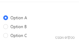
Ant Design radio组件默认样式:
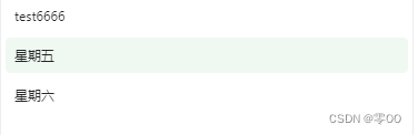
自定义样式:
使用方法:
import React, { useState } from 'react';
import type { RadioChangeEvent } from 'antd';
import { Input, Radio, Space } from 'antd';

const App: React.FC = () => {
  const [value, setValue] = useState(1);

  const onChange = (e: RadioChangeEvent) => {
    console.log('radio checked', e.target.value);
    setValue(e.target.value);
  };

  return (
    <Radio.Group onChange={
        onChange} value={value}>
      <Space direction="vertical">
        <Radio value={1}>Option A</Radio>
        <Radio value={2}>Option B</Radio>
        <Radio value={3}>Option C</Radio>
      </Space>
    </Radio.Group>
  );
};

export default App;
修改方法:
①去掉选项前的圆圈
.ant-radio-inner {


    display: none;
  }
②设置每个选项之间的将距离:
.ant-space-vertical {


    gap: 4px;
  }
不生效的话,可以加 ‘ !important ’:
.ant-space-vertical {


    gap: 4px !important;
  }
③修改文字元素字号及大小
span.ant-radio + * {


    display: block;
    padding: 10px 8px;
    font-size: 12px;
    line-height: 1;
  }
④设置选项宽度和父级元素宽度一致
.ant-radio-group,
  .ant-space-vertical,
  .ant-space-item,
  .ant-radio-wrapper {


    width: 100%;
  }
⑤设置选中和悬浮的元素背景色
.ant-space-item:hover,
.ant-radio-wrapper-checked {


      color: #00b357;
      background: #00b35714;
      border-radius: 4px;
}
具体样式可根据实际进行修改~
更多操作可查阅官网:https://ant.design/components/radio-cn