这主要是基于uni-app开发的,所以,请多看uni-app文档,了解一些标签、属性,可以更好的使用该组件
目录

交互组件
Bar操作条
底部操作条
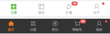
我们可以使用Bar操作条自定义小程序底部的tabBar,就拿官方示例代码来说吧。
当我们要自定义tabBar的时候,pages.json文件中的tabBar配置就不写了,直接在首页上代码,pages.json文件中的pages数组中第一项表示应用启动页,即首页。示例中通过变量PageCur来切换不同tabBar页面,控制tabBar图标文字的样式切换。
底部操作条包括底部的tabBar和商场小程序加入购物车的操作条,底部操作条中cu-bar和tabbar是必备的class,foot则设置该操作条固定在页面底部。
<template>
	<view>
		<basics v-if="PageCur=='basics'"></basics>
		<components v-if="PageCur=='component'"></components>
		<plugin v-if="PageCur=='plugin'"></plugin>
		<view class="cu-bar tabbar bg-white shadow foot">
			<view class="action" @click="NavChange" data-cur="basics">
				<view class='cuIcon-cu-image'>
					<image :src="'/static/tabbar/basics' + [PageCur=='basics'?'_cur':''] + '.png'"></image>
				</view>
				<view :class="PageCur=='basics'?'text-green':'text-gray'">元素</view>
			</view>
			<view class="action" @click="NavChange" data-cur="component">
				<view class='cuIcon-cu-image'>
					<image :src="'/static/tabbar/component' + [PageCur == 'component'?'_cur':''] + '.png'"></image>
				</view>
				<view :class="PageCur=='component'?'text-green':'text-gray'">组件</view>
			</view>
			<view class="action" @click="NavChange" data-cur="plugin">
				<view class='cuIcon-cu-image'>
					<image :src="'/static/tabbar/plugin' + [PageCur == 'plugin'?'_cur':''] + '.png'"></image>
				</view>
				<view :class="PageCur=='plugin'?'text-green':'text-gray'">扩展</view>
			</view>
		</view>
	</view>
</template>

<script>
	export default {
		data() {
		return {
				PageCur: 'basics'
			}
		},
		methods: {
			NavChange: function(e) {
				this.PageCur = e.currentTarget.dataset.cur
			}
		}
	}
</script>
操作条中的图标,可以是自定义引入的图片,也可以是这个组件中的图标,加角标就是上一章在基础元素中介绍的标签组件cu-tag、badge,背景颜色以及文字图标颜色都可以添加相应的颜色class进行自定义
<view class="cu-bar tabbar bg-white">
	<view class="action">
		<view class="cuIcon-cu-image">
			<image src="/static/tabbar/basics_cur.png"></image>
		</view>
		<view class="text-green">元素</view>
	</view>
	<view class="action">
		<view class="cuIcon-cu-image">
			<image src="/static/tabbar/component.png"></image>
		</view>
		<view class="text-gray">组件</view>
	</view>
	<view class="action">
		<view class="cuIcon-cu-image">
			<image src="/static/tabbar/plugin.png"></image>
			<view class="cu-tag badge">99</view>
		</view>
		<view class="text-gray">扩展</view>
	</view>
	<view class="action">
		<view class="cuIcon-cu-image">
			<image src="/static/tabbar/about.png"></image>
			<view class="cu-tag badge"></view>
		</view>
		<view class="text-gray">关于</view>
	</view>
</view>

<view class="cu-bar tabbar margin-bottom-xl bg-black">
	<view class="action text-orange">
		<view class="cuIcon-homefill"></view> 首页
	</view>
	<view class="action text-gray">
		<view class="cuIcon-similar"></view> 分类
	</view>
	<view class="action text-gray">
		<view class="cuIcon-recharge"></view>
		积分
	</view>
	<view class="action text-gray">
		<view class="cuIcon-cart">
			<view class="cu-tag badge">99</view>
		</view>
		购物车
	</view>
	<view class="action text-gray">
		<view class="cuIcon-my">
			<view class="cu-tag badge"></view>
		</view>
		我的
	</view>
</view>
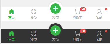
这种操作条就是中间设置了一个midButton,只需在中间的view上添加class add-action,其他设置同上,不赘述
<view class="cu-bar tabbar margin-bottom-xl bg-white">
	<view class="action text-green">
		<view class="cuIcon-homefill"></view> 首页
	</view>
	<view class="action text-gray">
		<view class="cuIcon-similar"></view> 分类
	</view>
	<view class="action text-gray add-action">
		<button class="cu-btn cuIcon-add bg-green shadow"></button>
		发布
	</view>
	<view class="action text-gray">
		<view class="cuIcon-cart">
			<view class="cu-tag badge">99</view>
		</view>
		购物车
	</view>
	<view class="action text-gray">
		<view class="cuIcon-my">
			<view class="cu-tag badge"></view>
		</view>
		我的
	</view>
</view>
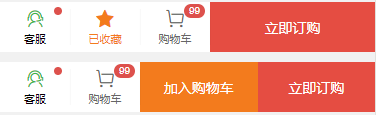
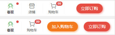
加入购物车的操作条增加了shop类名,但是我不清楚,加不加shop有什么区别,我删了他,样式好像也没变,有大佬懂得望指教。submit类名用于加入购物车和立即购买等操作,样式可以撑开占满。
<view class="cu-bar bg-white tabbar border shop">
	<button class="action" open-type="contact">
		<view class="cuIcon-service text-green">
			<view class="cu-tag badge"></view>
		</view>
		客服
	</button>
	<view class="action text-orange">
		<view class="cuIcon-favorfill"></view> 已收藏
	</view>
	<view class="action">
		<view class="cuIcon-cart">
			<view class="cu-tag badge">99</view>
		</view>
		购物车
	</view>
	<view class="bg-red submit">立即订购</view>
</view>
这种样式就是把上面那种换成了button标签,设置成round圆形
<view class="cu-bar bg-white tabbar border shop">
	<button class="action" open-type="contact">
		<view class="cuIcon-service text-green">
			<view class="cu-tag badge"></view>
		</view> 客服
	</button>
	<view class="action">
		<view class="cuIcon-cart">
			<view class="cu-tag badge">99</view>
		</view>
		购物车
	</view>
	<view class="btn-group">
		<button class="cu-btn bg-orange round shadow-blur">加入购物车</button>
		<button class="cu-btn bg-red round shadow-blur">立即订购</button>
	</view>
</view>
标题操作条
看下面代码注释吧,一条对应一条,清晰一点


<view class="box">
//第一种和第二种都是标题和类似边框的组合样式,添加border-title类名, 底部样式是text标签的last-child选择器设置的,可以自定义颜色和长度
	<view class="cu-bar bg-white">
		<view class="action border-title">
			<text class="text-xl text-bold">关于我们</text>
			<text class="bg-grey" style="width:2rem"></text>
		</view>
	</view>
	<view class="cu-bar bg-white">
		<view class="action border-title">
			<text class="text-xl text-bold text-blue">关于我们</text>
			<text class="bg-gradual-blue" style="width:3rem"></text>
		</view>
	</view>
//下面这两种和上面的原理相同,添加的是sub-title类名,底部可以设置文字
	<view class="cu-bar bg-white">
		<view class="action sub-title">
			<text class="text-xl text-bold text-green">关于我们</text>
			<text class="bg-green"></text>
		</view>
	</view>
	<view class="cu-bar bg-white">
		<view class="action sub-title">
			<text class="text-xl text-bold text-blue">关于我们</text>
			<text class="text-ABC text-blue">about</text>
		</view>
	</view>
//这一种主要是类名self-end,设置了最后一行字的位置,就是css属性align-self: flex-end;详情可以去看看flex布局
	<view class="cu-bar bg-white">
		<view class="action">
			<text class="text-xl text-bold">关于我们</text>
			<text class="text-Abc text-gray self-end margin-left-sm">about</text>
		</view>
	</view>
//最后这两种就是简单的添加了两个图标,没什么好说的
	<view class="cu-bar bg-white">
		<view class="action">
			<text class="cuIcon-title text-green"></text>
			<text class="text-xl text-bold">关于我们</text>
		</view>
	</view>
	<view class="cu-bar bg-white">
		<view class="action">
			<text class="cuIcon-titles text-green"></text>
			<text class="text-xl text-bold">关于我们</text>
		</view>
	</view>
</view>
顶部操作条
顶部操作条具体设置方法请移步上一章自定义导航栏,以下几种样式可以参考,就不详解了。
<view class="box">
<view class="cu-bar bg-white">
<view class="action">
<text class="cuIcon-back text-gray"></text> 返回
</view>
<view class="content text-bold">操作条 </view>
</view>
<view class="cu-bar bg-white">
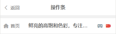
<view class="action">
<text class="cuIcon-homefill text-gray"></text> 首页
</view>
<view class="content text-bold">鲜亮的高饱和色彩,专注视觉的小程序组件库</view>
<view class="action">
<text class="cuIcon-cardboardfill text-grey"></text>
<text class="cuIcon-recordfill text-red"></text>
</view>
</view>
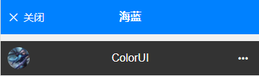
<view class="cu-bar bg-blue">
<view class="action">
<text class="cuIcon-close"></text>关闭
</view>
<view class="content text-bold">海蓝</view>
</view>
<view class="cu-bar bg-black search">
<view class="cu-avatar round" style="background-image:url(https://ossweb-img.qq.com/images/lol/web201310/skin/big91012.jpg);"></view>
<view class="content">ColorUI</view>
<view class="action">
<text class="cuIcon-more"></text>
</view>
</view>
</view>
搜索操作条
搜索操作条主要就是search-form,配合round和radius设置input框的样式(越写我越发现,新的东西不多,都是基础元素拼凑出来的,示例就是一个参考样式,耐心仔细看,很简单)
<view class="box">
<view class="cu-bar search bg-white">
<view class="search-form round">
<text class="cuIcon-search"></text>
<input @focus="InputFocus" @blur="InputBlur" :adjust-position="false" type="text" placeholder="搜索图片、文章、视频"
confirm-type="search"></input>
</view>
<view class="action">
<button class="cu-btn bg-green shadow-blur round">搜索</button>
</view>
</view>
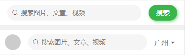
<view class="cu-bar search bg-white">
<view class="cu-avatar round" style="background-image:url(https://ossweb-img.qq.com/images/lol/web201310/skin/big11010.jpg"></view>
<view class="search-form round">
<text class="cuIcon-search"></text>
<input @focus="InputFocus" @blur="InputBlur" :adjust-position="false" type="text" placeholder="搜索图片、文章、视频"
confirm-type="search"></input>
</view>
<view class="action">
<text>广州</text>
<text class="cuIcon-triangledownfill"></text>
</view>
</view>
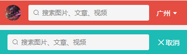
<view class="cu-bar bg-red search">
<view class="cu-avatar round" style="background-image:url(https://ossweb-img.qq.com/images/lol/web201310/skin/big114004.jpg);"></view>
<view class="search-form radius">
<text class="cuIcon-search"></text>
<input @focus="InputFocus" @blur="InputBlur" :adjust-position="false" type="text" placeholder="搜索图片、文章、视频"
confirm-type="search"></input>
</view>
<view class="action">
<text>广州</text>
<text class="cuIcon-triangledownfill"></text>
</view>
</view>
<view class="cu-bar bg-cyan search">
<view class="search-form radius">
<text class="cuIcon-search"></text>
<input @focus="InputFocus" @blur="InputBlur" :adjust-position="false" type="text" placeholder="搜索图片、文章、视频"
confirm-type="search"></input>
</view>
<view class="action">
<text class="cuIcon-close"></text>
<text>取消</text>
</view>
</view>
</view>
按钮组操作条
这就是几个按钮,cu-bar操作条类名就是为这个按钮组设置了平铺的样式,你看第二组按钮,我删除了cu-bar类名,效果对比就很明显。
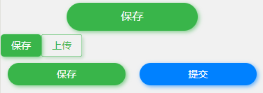
<view class="box">
	<view class="cu-bar btn-group">
		<button class="cu-btn bg-green shadow-blur round lg">保存</button>
	</view>
	<view class="btn-group">
		<button class="cu-btn bg-green shadow-blur">保存</button>
		<button class="cu-btn text-green line-green shadow">上传</button>
	</view>
	<view class="cu-bar btn-group">
		<button class="cu-btn bg-green shadow-blur round">保存</button>
		<button class="cu-btn bg-blue shadow-blur round">提交</button>
	</view>
</view>
输入操作条
主要由cu-bar和input设置出大体样式,内部填充自定义,以下样式供参考
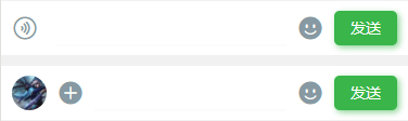
<view class="box">
	<view class="cu-bar input">
		<view class="action">
			<text class="cuIcon-sound text-grey"></text>
		</view>
		<input @focus="InputFocus" @blur="InputBlur" :adjust-position="false" class="solid-bottom" :focus="false" maxlength="300"
		 cursor-spacing="10"></input>
		<view class="action">
			<text class="cuIcon-emojifill text-grey"></text>
		</view>
		<button class="cu-btn bg-green shadow-blur">发送</button>
	</view>

	<view class="cu-bar input">
		<view class="cu-avatar round" style="background-image:url(https://ossweb-img.qq.com/images/lol/web201310/skin/big91012.jpg);"></view>
		<view class="action">
			<text class="cuIcon-roundaddfill text-grey"></text>
		</view>
		<input @focus="InputFocus" @blur="InputBlur" :adjust-position="false" class="solid-bottom" maxlength="300"
		 cursor-spacing="10"></input>
		<view class="action">
			<text class="cuIcon-emojifill text-grey"></text>
		</view>
		<button class="cu-btn bg-green shadow-blur">发送</button>
	</view>
</view>
操作条相关class
| class | 说明 | 可选值 |
|---|---|---|
| cu-bar | 底部操作条必选值 | —— |
| tabbar | 底部操作条必选值 | —— |
| foot | 固定定位在页面底部 | —— |
| add-action | 小程序tabBar的midButton | —— |
| shop | 购物操作条必选值 | —— |
| submit | 提交按钮 | —— |
| border-title | 带下边框样式的标题 | —— |
| sub-title | 带副标题样式的标题 | —— |
| self-end | css属性align-self: flex-end; | —— |
| search-form | 搜索框 | —— |
| input | 输入框样式 | —— |
Nav导航栏
nav导航栏是结合uni-app的scroll-view标签设计出来的,使用的时候一些属性可以参考一下uni-app的文档https://uniapp.dcloud.io/component/scroll-view,类名nav和cu-item是必选值
默认
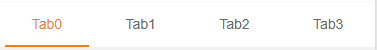
不知道咋解释,看代码很简单,就是通过index值进行切换每个tab,及其字体边框样式,我就不赘述了
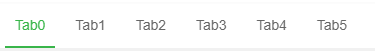
<scroll-view scroll-x class="bg-white nav" scroll-with-animation :scroll-left="scrollLeft">
	<view class="cu-item" :class="index==TabCur?'text-green cur':''" v-for="(item,index) in 10" :key="index" @tap="tabSelect" :data-id="index">
		Tab{

   {index}}
	</view>
</scroll-view>

<script>
	export default {
		data() {
			return {
				TabCur: 0,
				scrollLeft: 0
			};
		},
		methods: {
			tabSelect(e) {
				this.TabCur = e.currentTarget.dataset.id;
				this.scrollLeft = (e.currentTarget.dataset.id - 1) * 60
			}
		}
	}
</script>
居中
通过text-center居中
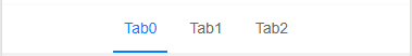
<scroll-view scroll-x class="bg-white nav text-center">
	<view class="cu-item" :class="index==TabCur?'text-blue cur':''" v-for="(item,index) in 3" :key="index" @tap="tabSelect" :data-id="index">
		Tab{

   {index}}
	</view>
</scroll-view>
平分
设置flex和flex-sub实现弹性布局,flex-sub就是css属性flex:1,将弹性盒子内子元素按照1:1:1:1来分配空间
<scroll-view scroll-x class="bg-white nav">
	<view class="flex text-center">
		<view class="cu-item flex-sub" :class="index==TabCur?'text-orange cur':''" v-for="(item,index) in 4" :key="index" @tap="tabSelect" :data-id="index">
			Tab{

   {index}}
		</view>
	</view>
</scroll-view>
背景
bg-{ {color}},参考背景色
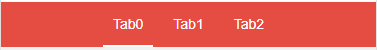
<scroll-view scroll-x class="bg-red nav text-center">
	<view class="cu-item" :class="index==TabCur?'text-white cur':''" v-for="(item,index) in 3" :key="index" @tap="tabSelect" :data-id="index">
		Tab{

   {index}}
	</view>
</scroll-view>
图标
cuIcon-{ {icon}},参考图标
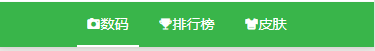
<scroll-view scroll-x class="bg-green nav text-center">
	<view class="cu-item" :class="0==TabCur?'text-white cur':''" @tap="tabSelect" data-id="0">
		<text class="cuIcon-camerafill"></text> 数码
	</view>
	<view class="cu-item" :class="1==TabCur?'text-white cur':''" @tap="tabSelect" data-id="1">
		<text class="cuIcon-upstagefill"></text> 排行榜
	</view>
	<view class="cu-item" :class="2==TabCur?'text-white cur':''" @tap="tabSelect" data-id="2">
		<text class="cuIcon-clothesfill"></text> 皮肤
	</view>
</scroll-view>
导航栏相关class
| class | 说明 | 可选值 |
|---|---|---|
| nav | 导航栏必选值 | —— |
| cu-item | 导航栏子元素 | —— |
| flex | flex布局 | —— |
| flex-sub | flex:1,平分 | —— |
| text-center | 居中 | —— |
List列表
cu-list和cu-item配合使用
宫格列表
宫格列表就是列表结合grid布局设计出的样式,通过col-{ {number}}设置每行的个数,number取值1~5,默认有边框,可以加类名no-border去除边框
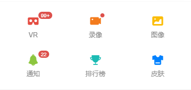

<view class="cu-list grid" :class="['col-' + gridCol,gridBorder?'':'no-border']">
	<view class="cu-item" v-for="(item,index) in cuIconList" :key="index" v-if="index<gridCol*2">
		<view :class="['cuIcon-' + item.cuIcon,'text-' + item.color]">
			<view class="cu-tag badge" v-if="item.badge!=0">
				<block v-if="item.badge!=1">{

   {item.badge>99?'99+':item.badge}}</block>
			</view>
		</view>
		<text>{

   {item.name}}</text>
	</view>
</view>

data() {
	return {
		cuIconList: [{cuIcon: 'cardboardfill',color: 'red',badge: 120,name: 'VR'},
		{cuIcon: 'recordfill',color: 'orange',badge: 1,name: '录像'},
		{cuIcon: 'picfill',color: 'yellow',badge: 0,name: '图像'},
		{cuIcon: 'noticefill',color: 'olive',badge: 22,name: '通知'},
		{cuIcon: 'upstagefill',color: 'cyan',badge: 0,name: '排行榜'	},
		{cuIcon: 'clothesfill',color: 'blue',badge: 0,name: '皮肤'},
		{cuIcon: 'discoverfill',color: 'purple',badge: 0,name: '发现'},
		{cuIcon: 'questionfill',color: 'mauve',badge: 0,name: '帮助'},
		{cuIcon: 'commandfill',color: 'purple',badge: 0,name: '问答'},
		{cuIcon: 'brandfill',color: 'mauve',badge: 0,name: '版权'}],
        gridCol: 3,
		gridBorder: false
	};
},
菜单列表
菜单列表就是列表结合类名menu设计出的样式,可以通过sm-border设置每一行的短边框,通过card-menu将列表设置成卡片样式,通过在列表子元素上添加arrow设置箭头,变化样式效果可以由以下两图对比


<view class="cu-list menu" :class="[menuBorder?'sm-border':'',menuCard?'card-menu margin-top':'']">
	<view class="cu-item" :class="menuArrow?'arrow':''">
		<view class="content">
			<text class="cuIcon-circlefill text-grey"></text>
			<text class="text-grey">图标 + 标题</text>
		</view>
	</view>
	<view class="cu-item" :class="menuArrow?'arrow':''">
		<view class="content">
			<image src="/static/logo.png" class="png" mode="aspectFit"></image>
			<text class="text-grey">图片 + 标题</text>
		</view>
	</view>
	<view class="cu-item" :class="menuArrow?'arrow':''">
		<button class="cu-btn content" open-type="contact">
			<text class="cuIcon-btn text-olive"></text>
			<text class="text-grey">Open-type 按钮</text>
		</button>
	</view>
	<view class="cu-item" :class="menuArrow?'arrow':''">
		<navigator class="content" hover-class="none" url="../list/list" open-type="redirect">
			<text class="cuIcon-discoverfill text-orange"></text>
			<text class="text-grey">Navigator 跳转</text>
		</navigator>
	</view>
	<view class="cu-item" :class="menuArrow?'arrow':''">
		<view class="content">
			<text class="cuIcon-emojiflashfill text-pink"></text>
			<text class="text-grey">头像组</text>
		</view>
		<view class="action">
			<view class="cu-avatar-group">
				<view class="cu-avatar round sm" style="background-image:url(https://ossweb-img.qq.com/images/lol/web201310/skin/big10001.jpg);"></view>
				<view class="cu-avatar round sm" style="background-image:url(https://ossweb-img.qq.com/images/lol/web201310/skin/big81005.jpg);"></view>
				<view class="cu-avatar round sm" style="background-image:url(https://ossweb-img.qq.com/images/lol/web201310/skin/big25002.jpg);"></view>
				<view class="cu-avatar round sm" style="background-image:url(https://ossweb-img.qq.com/images/lol/web201310/skin/big91012.jpg);"></view>
			</view>
			<text class="text-grey text-sm">4 人</text>
		</view>
	</view>
	<view class="cu-item" :class="menuArrow?'arrow':''">
		<view class="content">
			<text class="cuIcon-btn text-green"></text>
			<text class="text-grey">按钮</text>
		</view>
		<view class="action">
			<button class="cu-btn round bg-green shadow">
				<text class="cuIcon-upload"></text> 上传</button>
		</view>
	</view>
	<view class="cu-item" :class="menuArrow?'arrow':''">
		<view class="content">
			<text class="cuIcon-tagfill text-red  margin-right-xs"></text>
			<text class="text-grey">标签</text>
		</view>
		<view class="action">
			<view class="cu-tag round bg-orange light">音乐</view>
			<view class="cu-tag round bg-olive light">电影</view>
			<view class="cu-tag round bg-blue light">旅行</view>
		</view>
	</view>
	<view class="cu-item" :class="menuArrow?'arrow':''">
		<view class="content">
			<text class="cuIcon-warn text-green"></text>
			<text class="text-grey">文本</text>
		</view>
		<view class="action">
			<text class="text-grey text-sm">小目标还没有实现!</text>
		</view>
	</view>
	<view class="cu-item">
		<view class="content padding-tb-sm">
			<view>
				<text class="cuIcon-clothesfill text-blue margin-right-xs"></text> 多行Item</view>
			<view class="text-gray text-sm">
				<text class="cuIcon-infofill margin-right-xs"></text> 小目标还没有实现!</view>
		</view>
		<view class="action">
			<switch class="switch-sex" @change="SwitchSex" :class="skin?'checked':''" :checked="skin?true:false"></switch>
		</view>
	</view>
</view>

<script>
	export default {
		data() {
			return {
				menuBorder: false,
				menuArrow: false,
				menuCard: false,
				skin: false
			};
		}
	}
</script>
消息列表
消息列表类似于QQ消息微信消息的列表,基本组成为头像和内容,有点像带头像的菜单列表。基本格式如下:
<view class="cu-list menu-avatar">
	<view class="cu-item">
		<view class="cu-avatar">头像</view>
		<view class="content">消息内容</view>
	</view>
</view>
具体实例请看下面的代码:

<view class="cu-list menu-avatar">
	<view class="cu-item">
		<view class="cu-avatar round lg" style="background-image:url(https://ossweb-img.qq.com/images/lol/web201310/skin/big10001.jpg);"></view>
		<view class="content">
			<view class="text-grey">凯尔</view>
			<view class="text-gray text-sm flex">
				<view class="text-cut">
					<text class="cuIcon-infofill text-red  margin-right-xs"></text>
					我已天理为凭,踏入这片荒芜,不再受凡人的枷锁遏制。我已天理为凭,踏入这片荒芜,不再受凡人的枷锁遏制。
				</view> </view>
		</view>
		<view class="action">
			<view class="text-grey text-xs">22:20</view>
			<view class="cu-tag round bg-grey sm">5</view>
		</view>
	</view>
	<view class="cu-item">
		<view class="cu-avatar round lg" style="background-image:url(https://ossweb-img.qq.com/images/lol/img/champion/Taric.png);">
			<view class="cu-tag badge">99+</view>
		</view>
		<view class="content">
			<view class="text-grey">
				<view class="text-cut">瓦洛兰之盾-塔里克</view>
				<view class="cu-tag round bg-orange sm">战士</view>
			</view>
			<view class="text-gray text-sm flex">
				<view class="text-cut">
					塔里克是保护者星灵,用超乎寻常的力量守护着符文之地的生命、仁爱以及万物之美。塔里克由于渎职而被放逐,离开了祖国德玛西亚,前去攀登巨神峰寻找救赎,但他找到的却是来自星界的更高层的召唤。现在的塔里克与古代巨神族的神力相融合,以瓦洛兰之盾的身份,永不疲倦地警惕着阴险狡诈的虚空腐化之力。
				</view>
			</view>
		</view>
		<view class="action">
			<view class="text-grey text-xs">22:20</view>
			<view class="cuIcon-notice_forbid_fill text-gray"></view>
		</view>
	</view>
	<view class="cu-item ">
		<view class="cu-avatar radius lg" style="background-image:url(https://ossweb-img.qq.com/images/lol/img/champion/Morgana.png);"></view>
		<view class="content">
			<view class="text-pink"><view class="text-cut">莫甘娜</view></view>
			<view class="text-gray text-sm flex"> <view class="text-cut">凯尔,你被自己的光芒变的盲目!</view></view>
		</view>
		<view class="action">
			<view class="text-grey text-xs">22:20</view>
			<view class="cu-tag round bg-red sm">5</view>
		</view>
	</view>
	<view class="cu-item grayscale">
		<view class="cu-avatar radius lg" style="background-image:url(https://ossweb-img.qq.com/images/lol/web201310/skin/big81007.jpg);"></view>
		<view class="content">
			<view><view class="text-cut">伊泽瑞尔</view>
				<view class="cu-tag round bg-orange sm">断开连接...</view>
			</view>
			<view class="text-gray text-sm flex"> <view class="text-cut"> 等我回来一个打十个</view></view>
		</view>
		<view class="action">
			<view class="text-grey text-xs">22:20</view>
			<view class="cu-tag round bg-red sm">5</view>
		</view>
	</view>
	<view class="cu-item cur">
		<view class="cu-avatar radius lg" style="background-image:url(https://ossweb-img.qq.com/images/lol/web201310/skin/big81020.jpg);">
			<view class="cu-tag badge"></view>
		</view>
		<view class="content">
			<view>
				<view class="text-cut">瓦罗兰大陆-睡衣守护者-新手保护营</view>
				<view class="cu-tag round bg-orange sm">6人</view>
			</view>
			<view class="text-gray text-sm flex">
				<view class="text-cut"> 伊泽瑞尔:<text class="cuIcon-locationfill text-orange margin-right-xs"></text> 传送中...</view></view>
		</view>
		<view class="action">
			<view class="text-grey text-xs">22:20</view>
			<view class="cuIcon-notice_forbid_fill text-gray"></view>
		</view>
	</view>
</view>
列表左滑
用户开始触摸时,获取触摸点到盒子左侧的距离,根据触摸结束时的距离与开始距离作比较,判断出用户滑动的方向,如果是左滑,则添加类名move-cur,就是将该项左移260upx,右滑则回到原位不变。

<view class="cu-list menu-avatar">
	<view class="cu-item" :class="modalName=='move-box-'+ index?'move-cur':''" v-for="(item,index) in 4" :key="index"
	 @touchstart="ListTouchStart" @touchmove="ListTouchMove" @touchend="ListTouchEnd" :data-target="'move-box-' + index">
		<view class="cu-avatar round lg" :style="[{backgroundImage:'url(https://ossweb-img.qq.com/images/lol/web201310/skin/big2100'+ (index+2) +'.jpg)'}]"></view>
		<view class="content">
			<view class="text-grey">文晓港</view>
			<view class="text-gray text-sm">
				<text class="cuIcon-infofill text-red  margin-right-xs"></text> 消息未送达</view>
		</view>
		<view class="action">
			<view class="text-grey text-xs">22:20</view>
			<view class="cu-tag round bg-grey sm">5</view>
		</view>
		<view class="move">
			<view class="bg-grey">置顶</view>
			<view class="bg-red">删除</view>
		</view>
	</view>
</view>

<script>
	export default {
		data() {
			return {
				modalName: null,
				listTouchStart: 0,
				listTouchDirection: null,
			};
		},
		methods: {
			// ListTouch触摸开始,获取触摸点距盒子左侧的距离
			ListTouchStart(e) {
				this.listTouchStart = e.touches[0].pageX
			},
			// ListTouch计算方向,
			ListTouchMove(e) {
				this.listTouchDirection = e.touches[0].pageX - this.listTouchStart > 0 ? 'right' : 'left'
			},
			// ListTouch计算滚动
			ListTouchEnd(e) {
				if (this.listTouchDirection == 'left') {
					this.modalName = e.currentTarget.dataset.target
				} else {
					this.modalName = null
				}
				this.listTouchDirection = null
			}
		}
	}
</script>
列表相关class
| class | 说明 | 可选值 |
|---|---|---|
| cu-list | 列表必选值 | —— |
| cu-item | 列表子元素 | —— |
| no-border | 无边框 | —— |
| menu | 菜单列表 | —— |
| sm-border | 短边框 | —— |
| card-menu | 卡片样式的菜单列表 | —— |
| arrow | 右箭头 | —— |
| menu-avatar | 消息列表(带头像) | —— |
| cu-avatar | 头像 | —— |
| content | 内容 | —— |
| grayscale | 灰度(background-color: #f5f5f5) | —— |
| cur | background-color: #fcf7e9 | |
| move-cur | 左移(transform: translateX(-260upx)) |
Card卡片
cu-card卡片必选值
案例类卡片
cu-card和case结合,在配合子元素的cu-item类名,写出案例类的样式,内部其他样式可以根据其他类名自行设置,cu-item自带margin:30px;可以通过类名no-card去除

<view class="cu-card case" :class="isCard?'no-card':''">
	<view class="cu-item shadow">
		<view class="image">
			<image src="https://ossweb-img.qq.com/images/lol/web201310/skin/big10006.jpg"
			 mode="widthFix"></image>
			<view class="cu-tag bg-blue">史诗</view>
			<view class="cu-bar bg-shadeBottom"> <text class="text-cut">我已天理为凭,踏入这片荒芜,不再受凡人的枷锁遏制。我已天理为凭,踏入这片荒芜,不再受凡人的枷锁遏制。</text></view>
		</view>
		<view class="cu-list menu-avatar">
			<view class="cu-item">
				<view class="cu-avatar round lg" style="background-image:url(https://ossweb-img.qq.com/images/lol/web201310/skin/big10006.jpg);"></view>
				<view class="content flex-sub">
					<view class="text-grey">正义天使 凯尔</view>
					<view class="text-gray text-sm flex justify-between">
						十天前
						<view class="text-gray text-sm">
							<text class="cuIcon-attentionfill margin-lr-xs"></text> 10
							<text class="cuIcon-appreciatefill margin-lr-xs"></text> 20
							<text class="cuIcon-messagefill margin-lr-xs"></text> 30
						</view>
					</view>
				</view>
			</view>
		</view>
	</view>
</view>
动态类卡片
该样式类似于QQ动态,由cu-card和dynamic结合,再配合子元素cu-item编写而成,动态下方的评论需要添加类名comment

<view class="cu-card dynamic" :class="isCard?'no-card':''">
	<view class="cu-item shadow">
		<view class="cu-list menu-avatar">
			<view class="cu-item">
				<view class="cu-avatar round lg" style="background-image:url(https://ossweb-img.qq.com/images/lol/web201310/skin/big10006.jpg);"></view>
				<view class="content flex-sub">
					<view>凯尔</view>
					<view class="text-gray text-sm flex justify-between">
						2019年12月3日
					</view>
				</view>
			</view>
		</view>
		<view class="text-content">
			折磨生出苦难,苦难又会加剧折磨,凡间这无穷的循环,将有我来终结!
		</view>
		<view class="grid flex-sub padding-lr" :class="isCard?'col-3 grid-square':'col-1'">
			<view class="bg-img " :class="isCard?'':'only-img'" style="background-image:url(https://ossweb-img.qq.com/images/lol/web201310/skin/big10006.jpg);"
			 v-for="(item,index) in isCard?9:1" :key="index">
			</view>
		</view>
		<view class="text-gray text-sm text-right padding">
			<text class="cuIcon-attentionfill margin-lr-xs"></text> 10
			<text class="cuIcon-appreciatefill margin-lr-xs"></text> 20
			<text class="cuIcon-messagefill margin-lr-xs"></text> 30
		</view>

		<view class="cu-list menu-avatar comment solids-top">
			<view class="cu-item">
				<view class="cu-avatar round" style="background-image:url(https://ossweb-img.qq.com/images/lol/img/champion/Morgana.png);"></view>
				<view class="content">
					<view class="text-grey">莫甘娜</view>
					<view class="text-gray text-content text-df">
						凯尔,你被自己的光芒变的盲目。
					</view>
					<view class="bg-grey padding-sm radius margin-top-sm  text-sm">
						<view class="flex">
							<view>凯尔:</view>
							<view class="flex-sub">妹妹,你在帮他们给黑暗找借口吗?</view>
						</view>
					</view>
					<view class="margin-top-sm flex justify-between">
						<view class="text-gray text-df">2018年12月4日</view>
						<view>
							<text class="cuIcon-appreciatefill text-red"></text>
							<text class="cuIcon-messagefill text-gray margin-left-sm"></text>
						</view>
					</view>
				</view>
			</view>
        </view>
    </view>
</view>
文章类卡片
该卡片由cu-card和article结合,再配合子元素cu-item
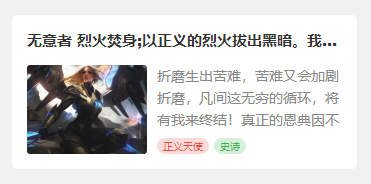
<view class="cu-card article" :class="isCard?'no-card':''">
	<view class="cu-item shadow">
		<view class="title"><view class="text-cut">无意者 烈火焚身;以正义的烈火拔出黑暗。我有自己的正义,见证至高的烈火吧。</view></view>
		<view class="content">
			<image src="https://ossweb-img.qq.com/images/lol/web201310/skin/big10006.jpg"
			 mode="aspectFill"></image>
			<view class="desc">
				<view class="text-content"> 折磨生出苦难,苦难又会加剧折磨,凡间这无穷的循环,将有我来终结!真正的恩典因不完整而美丽,因情感而真诚,因脆弱而自由!</view>
				<view>
					<view class="cu-tag bg-red light sm round">正义天使</view>
					<view class="cu-tag bg-green light sm round">史诗</view>
				</view>
			</view>
		</view>
	</view>
</view>
卡片相关class
| class | 说明 | 可选值 |
|---|---|---|
| cu-card | 卡片必选值 | —— |
| case | 案例类卡片 | —— |
| dynamic | 动态类卡片 | —— |
| article | 文章类卡片 | —— |
| comment | 评论 | —— |
| no-card | 配合cu-card,去除子元素cu-item的margin和border | —— |
| desc | 纵向的flex布局 | —— |
Form表单
input输入框
form表单是用form标签包裹,每一个子元素添加类名cu-form-group,行内自定义,title类名用于设置每行的文字说明,如果想统一宽度,像示例一样,需要自定义宽度

<form>
    <view class="cu-form-group margin-top">
		<view class="title">邮件</view>
		<input placeholder="两字短标题" name="input"></input>
	</view>
	<view class="cu-form-group">
		<view class="title">输入框</view>
		<input placeholder="三字标题" name="input"></input>
	</view>
	<view class="cu-form-group">
		<view class="title">收货地址</view>
		<input placeholder="统一标题的宽度" name="input"></input>
	</view>
	<view class="cu-form-group">
		<view class="title">收货地址</view>
		<input placeholder="输入框带个图标" name="input"></input>
		<text class='cuIcon-locationfill text-orange'></text>
	</view>
	<view class="cu-form-group">
		<view class="title">验证码</view>
		<input placeholder="输入框带个按钮" name="input"></input>
		<button class='cu-btn bg-green shadow'>验证码</button>
	</view>
	<view class="cu-form-group">
		<view class="title">手机号码</view>
		<input placeholder="输入框带标签" name="input"></input>
		<view class="cu-capsule radius">
			<view class='cu-tag bg-blue '>+86</view>
			<view class="cu-tag line-blue">中国大陆</view>
		</view>
	</view>
</form>

<style>
	.cu-form-group .title {
		min-width: calc(4em + 15px);
	}
</style>
picker选择器
对于表单中从底部谈起的选择器,写法与上述简单的input相同,而选择器picker的使用,建议查看官方文档

<form>
	<view class="cu-form-group margin-top">
		<view class="title">普通选择</view>
		<picker @change="PickerChange" :value="index" :range="picker">
			<view class="picker">
				{

   {index>-1?picker[index]:'禁止换行,超出容器部分会以 ... 方式截断'}}
			</view>
		</picker>
	</view>
	<!-- #ifndef MP-ALIPAY -->
	<view class="cu-form-group">
		<view class="title">多列选择</view>
		<picker mode="multiSelector" @change="MultiChange" @columnchange="MultiColumnChange" :value="multiIndex" :range="multiArray">
			<view class="picker">
				{

   {multiArray[0][multiIndex[0]]}},{

   {multiArray[1][multiIndex[1]]}},{

   {multiArray[2][multiIndex[2]]}}
			</view>
		</picker>
	</view>
	<!-- #endif -->
	<view class="cu-form-group">
		<view class="title">时间选择</view>
		<picker mode="time" :value="time" start="09:01" end="21:01" @change="TimeChange">
			<view class="picker">
				{

   {time}}
			</view>
		</picker>
	</view>
	<view class="cu-form-group">
		<view class="title">日期选择</view>
		<picker mode="date" :value="date" start="2015-09-01" end="2020-09-01" @change="DateChange">
			<view class="picker">
				{

   {date}}
			</view>
		</picker>
	</view>
	<!-- #ifndef H5 || APP-PLUS || MP-ALIPAY -->
	<view class="cu-form-group">
		<view class="title">地址选择</view>
		<picker mode="region" @change="RegionChange" :value="region">
			<view class="picker">
				{

   {region[0]}},{

   {region[1]}},{

   {region[2]}}
			</view>
		</picker>
	</view>
	<!-- #endif -->
</form>
switch开关
对于开关的样式,参考switch官方文档,需要注意的阿里小程序的不同,我没有用阿里测试,我测的是微信小程序,在微信小程序上,switch的color属性不生效,想要更改开关颜色,可以用颜色类名,直接写颜色就可以,颜色的取值可以参考上一章背景色

<form>
	<view class="cu-form-group margin-top">
		<view class="title">开关选择</view>
		<switch @change="SwitchA" :class="switchA?'checked':''" :checked="switchA?true:false"></switch>
	</view>
	<view class="cu-form-group">
		<view class="title">定义颜色</view>
		<!-- #ifdef MP-ALIPAY -->
		<switch class='red' @change="SwitchB" :class="switchB?'checked':''" :checked="switchB?true:false" color="#e54d42"></switch>
		<!-- #endif -->

		<!-- #ifndef MP-ALIPAY -->
		<switch class='red' @change="SwitchB" :class="switchB?'checked':''" :checked="switchB?true:false"></switch>
		<!-- #endif -->
	</view>
	<view class="cu-form-group">
		<view class="title">定义图标</view>
		<switch class='switch-sex' @change="SwitchC" :class="switchC?'checked':''" :checked="switchC?true:false"></switch>
	</view>
	<!-- #ifndef MP-ALIPAY -->
	<view class="cu-form-group">
		<view class="title">方形开关</view>
		<switch class='orange radius' @change="SwitchD" :class="switchD?'checked':''" :checked="switchD?true:false"></switch>
	</view>
	<!-- #endif -->
</form>
radio单选框
radio官方文档先奉上,更改颜色同上,使用提供的颜色类名即可,其默认样式是圆形全色中间有个√,可以通过类名radio更改形状为镂空中间一个点
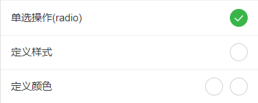
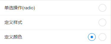
<form>
	<radio-group class="block" @change="RadioChange">
		<view class="cu-form-group margin-top">
			<view class="title">单选操作(radio)</view>
			<radio :class="radio=='A'?'checked':''" :checked="radio=='A'?true:false" value="A"></radio>
		</view>
		<!-- #ifndef MP-ALIPAY -->
		<view class="cu-form-group">
			<view class="title">定义样式</view>
			<radio class='radio' :class="radio=='B'?'checked':''" :checked="radio=='B'?true:false" value="B"></radio>
		</view>
		<view class="cu-form-group">
			<view class="title">定义颜色</view>
			<view>
				<radio class='blue radio' :class="radio=='C'?'checked':''" :checked="radio=='C'?true:false" value="C"></radio>
				<radio class='red margin-left-sm' :class="radio=='D'?'checked':''" :checked="radio=='D'?true:false" value="D"></radio>
			</view>
		</view>
		<!-- #endif -->
	</radio-group>
</form>
checkbox复选框
CheckBox官方文档 ,更改颜色同上,使用提供的颜色类名即可,其默认样式是方形,可以通过类名round更改形状为圆形
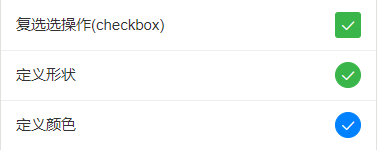
<form>
<checkbox-group class="block" @change="CheckboxChange">
<view class="cu-form-group margin-top">
<view class="title">复选选操作(checkbox)</view>
<checkbox :class="checkbox[0].checked?'checked':''" :checked="checkbox[0].checked?true:false" value="A"></checkbox>
</view>
<!-- #ifndef MP-ALIPAY -->
<view class="cu-form-group">
<view class="title">定义形状</view>
<checkbox class='round' :class="checkbox[1].checked?'checked':''" :checked="checkbox[1].checked?true:false" value="B"></checkbox>
</view>
<view class="cu-form-group">
<view class="title">定义颜色</view>
<checkbox class='round blue' :class="checkbox[2].checked?'checked':''" :checked="checkbox[2].checked?true:false"
value="C"></checkbox>
</view>
<!-- #endif -->
</checkbox-group>
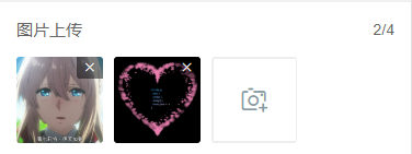
</form>图片上传
图片相关操作的API,自己看一下哈,我没什么好说的
<form>
<view class="cu-form-group">
<view class="grid col-4 grid-square flex-sub">
<view class="bg-img" v-for="(item,index) in imgList" :key="index" @tap="ViewImage" :data-url="imgList[index]">
<image :src="imgList[index]" mode="aspectFill"></image>
<view class="cu-tag bg-red" @tap.stop="DelImg" :data-index="index">
<text class='cuIcon-close'></text>
</view>
</view>
<view class="solids" @tap="ChooseImage" v-if="imgList.length<4">
<text class='cuIcon-cameraadd'></text>
</view>
</view>
</view>
</form>
<script>
export default {
data() {
return {
index: -1,
imgList: []
};
},
methods: {
ChooseImage() {
uni.chooseImage({
count: 4, //默认9
sizeType: ['original', 'compressed'], //可以指定是原图还是压缩图,默认二者都有
sourceType: ['album'], //从相册选择
success: (res) => {
if (this.imgList.length != 0) {
this.imgList = this.imgList.concat(res.tempFilePaths)
} else {
this.imgList = res.tempFilePaths
}
}
});
},
ViewImage(e) {
uni.previewImage({
urls: this.imgList,
current: e.currentTarget.dataset.url
});
},
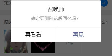
DelImg(e) {
uni.showModal({
title: '召唤师',
content: '确定要删除这段回忆吗?',
cancelText: '再看看',
confirmText: '再见',
success: res => {
if (res.confirm) {
this.imgList.splice(e.currentTarget.dataset.index, 1)
}
}
})
}
}
}
</script>头像
这个样式可以用于用户修改个人资料中,修改头像
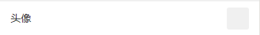
<form>
	<view class="cu-form-group margin-top">
		<view class="title">头像</view>
		<view class="cu-avatar radius bg-gray"></view>
	</view>
</form>
多行文本
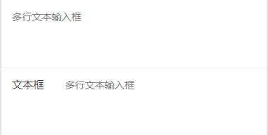
<form>
	<!-- !!!!! placeholder 在ios表现有偏移 建议使用 第一种样式 -->
	<view class="cu-form-group margin-top">
		<textarea maxlength="-1" :disabled="modalName!=null" @input="textareaAInput" placeholder="多行文本输入框"></textarea>
	</view>
	<view class="cu-form-group align-start">
		<view class="title">文本框</view>
		<textarea maxlength="-1" :disabled="modalName!=null" @input="textareaBInput" placeholder="多行文本输入框"></textarea>
	</view>
</form>
表单相关class
| class | 说明 | 可选值 |
|---|---|---|
| cu-form-group | 表单子元素 | —— |
| title | 标题(自定义宽度) | —— |
TimeLine时间轴
默认
时间轴默认结构如下代码,由cu-timeline包裹cu-time和cu-item,在item内编写内容,由content包裹
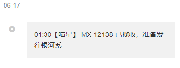
<view class="cu-timeline">
	<view class="cu-time">06-17</view>
	<view class="cu-item">
		<view class="content">
			<text>01:30</text> 【喵星】 MX-12138 已揽收,准备发往银河系
		</view>
	</view>
</view>
多彩时间轴
这个与默认的基本格式相同,只是自定义了内容框颜色和图标,结合基础元素的样式,你可以写个彩虹

<view class="cu-timeline">
	<view class="cu-time">昨天</view>
	<view class="cu-item cur cuIcon-noticefill">
		<view class="content bg-green shadow-blur">
			<text>22:22</text> 【广州市】快件已到达地球
		</view>
	</view>
	<view class="cu-item text-red cuIcon-attentionforbidfill">
		<view class="content bg-red shadow-blur">
			这是第一次,我家的铲屎官走了这么久。久到足足有三天!!
		</view>
	</view>
	<view class="cu-item text-grey cuIcon-evaluate_fill">
		<view class="content bg-grey shadow-blur">
			这是第一次,我家的铲屎官走了这么久。
		</view>
	</view>
	<view class="cu-item text-blue">
		<view class="bg-blue content">
			<text>20:00</text> 【月球】快件已到达月球,准备发往地球
		</view>
		<view class="bg-cyan content">
			<text>10:00</text> 【银河系】快件已到达银河系,准备发往月球
		</view>
	</view>
</view>
自定义
上一个是简单的修改了颜色图标,这一个则是稍微复杂一点,结合之前的标签、列表等,丰富了内容

<view class="cu-timeline">
	<view class="cu-time">06-17</view>
	<view class="cu-item">
		<view class="content">
			<view class="cu-capsule radius">
				<view class="cu-tag bg-cyan">上午</view>
				<view class="cu-tag line-cyan">10:00</view>
			</view>
			<view class="margin-top">这是第一次,我家的铲屎官走了这么久。久到足足有三天!! 在听到他的脚步声响在楼梯间的那一刻,我简直想要破门而出,对着他狠狠地吼上10分钟,然后再看心情要不要他进门。</view>
		</view>
	</view>
	<view class="cu-item text-blue">
		<view class="bg-blue shadow-blur content">
			<view class="cu-list menu-avatar radius">
				<view class="cu-item">
					<view class="cu-avatar round lg" style="background-image:url(https://ossweb-img.qq.com/images/lol/web201310/skin/big10006.jpg);"></view>
					<view class="content">
						<view class="text-grey">文晓港</view>
						<view class="text-gray text-sm">
							<text class="cuIcon-infofill text-red"></text> 消息未送达</view>
					</view>
					<view class="action">
						<view class="text-grey text-xs">22:20</view>
						<view class="cu-tag round bg-grey sm">5</view>
					</view>
				</view>
				<view class="cu-item">
					<view class="cu-avatar round lg" style="background-image:url(https://ossweb-img.qq.com/images/lol/web201310/skin/big10006.jpg);">
						<view class="cu-tag badge">99+</view>
					</view>
					<view class="content">
						<view class="text-grey">文晓港
							<view class="cu-tag round orange sm">SVIP</view>
						</view>
						<view class="text-gray text-sm">
							<text class="cuIcon-redpacket_fill text-red"></text> 收到红包</view>
					</view>
					<view class="action">
						<view class="text-grey text-xs">22:20</view>
						<text class="cuIcon-notice_forbid_fill text-gray"></text>
					</view>
				</view>
			</view>
		</view>
	</view>
</view>
时间轴相关class
| class | 说明 | 可选值 |
|---|---|---|
| cu-timeline | 时间轴必选值 | —— |
| cu-time | 时间 | —— |
| cu-item | 子元素 | —— |
| content | 内容信息 | —— |
Chat聊天
cu-chat聊天必选值
基本样式
聊天的外部大框架是cu-chat,cu-item包裹某人的聊天信息,self表示右侧自己的聊天样式,main包含聊天内容,date表示消息时间,cu-info表示提示词

<view class="cu-chat">
	<view class="cu-item self">
		<view class="main">
			<view class="content bg-green shadow">
				<text>喵喵喵!喵喵喵!喵喵喵!喵喵!喵喵!!喵!喵喵喵!</text>
			</view>
		</view>
		<view class="cu-avatar radius" style="background-image:url(https://ossweb-img.qq.com/images/lol/web201310/skin/big107000.jpg);"></view>
		<view class="date">2018年3月23日 13:23</view>
	</view>
	<view class="cu-info round">对方撤回一条消息!</view>
	<view class="cu-item">
		<view class="cu-avatar radius" style="background-image:url(https://ossweb-img.qq.com/images/lol/web201310/skin/big143004.jpg);"></view>
		<view class="main">
			<view class="content shadow">
				<text>喵喵喵!喵喵喵!</text>
			</view>
		</view>
		<view class="date "> 13:23</view>
	</view>
	<view class="cu-info">
		<text class="cuIcon-roundclosefill text-red "></text> 对方拒绝了你的消息
	</view>
	<view class="cu-info">
		对方开启了好友验证,你还不是他(她)的好友。请先发送好友验证请求,对方验证通过后,才能聊天。
		<text class="text-blue">发送好友验证</text>
	</view>
</view>
其他聊天内容
聊天内容除了语句,还有图片,语音消息,地理位置消息等 ,main包含的聊天内容不止是消息框里的,还有消息框旁边的提示图标文字等,消息框里的内容由content包裹

<view class="cu-chat">
	<view class="cu-item self">
		<view class="main">
			<image src="https://ossweb-img.qq.com/images/lol/web201310/skin/big10006.jpg" class="radius" mode="widthFix"></image>
		</view>
		<view class="cu-avatar radius" style="background-image:url(https://ossweb-img.qq.com/images/lol/web201310/skin/big107000.jpg);"></view>
		<view class="date"> 13:23</view>
	</view>
	<view class="cu-item self">
		<view class="main">
			<view class="action text-bold text-grey">
				3"
			</view>
			<view class="content shadow">
				<text class="cuIcon-sound text-xxl padding-right-xl"> </text>
			</view>
		</view>
		<view class="cu-avatar radius" style="background-image:url(https://ossweb-img.qq.com/images/lol/web201310/skin/big107000.jpg);"></view>
		<view class="date">13:23</view>
	</view>
	<view class="cu-item self">
		<view class="main">
			<view class="action">
				<text class="cuIcon-locationfill text-orange text-xxl"></text>
			</view>
			<view class="content shadow">
				喵星球,喵喵市
			</view>
		</view>
		<view class="cu-avatar radius" style="background-image:url(https://ossweb-img.qq.com/images/lol/web201310/skin/big107000.jpg);"></view>
		<view class="date">13:23</view>
	</view>
	<view class="cu-item">
		<view class="cu-avatar radius" style="background-image:url(https://ossweb-img.qq.com/images/lol/web201310/skin/big143004.jpg);"></view>
		<view class="main">
			<view class="content shadow">
				@#$^&**
			</view>
			<view class="action text-grey">
				<text class="cuIcon-warnfill text-red text-xxl"></text> <text class="text-sm margin-left-sm">翻译错误</text>
			</view>
		</view>
		<view class="date">13:23</view>
	</view>
</view>
发送框
发送框就是之前的操作条,相关内容看最上面操作条的讲解
<view class="cu-bar foot input" :style="[{bottom:InputBottom+'px'}]">
	<view class="action">
		<text class="cuIcon-sound text-grey"></text>
	</view>
	<input class="solid-bottom" :adjust-position="false" :focus="false" maxlength="300" cursor-spacing="10"
	 @focus="InputFocus" @blur="InputBlur"></input>
	<view class="action">
		<text class="cuIcon-emojifill text-grey"></text>
	</view>
	<button class="cu-btn bg-green shadow">发送</button>
</view>
聊天相关class
| class | 说明 | 可选值 |
|---|---|---|
| cu-chat | 聊天必选值 | —— |
| cu-item | 子元素 | —— |
| self | 右侧本人的聊天样式 | —— |
| main | 聊天内容 | —— |
| content | 消息框内容 | —— |
| date | 消息日期 | —— |
| cu-info | 提示词 | —— |
Swiper轮播图
全屏限高轮播
这是最常见的轮播图,添加类名screen-swiper,宽度为全屏,高度自定义,请直接参考swiper官方文档,可以通过类名square-dot和round-dot定义小圆点样式
<template>
	<view>
		<swiper class="screen-swiper" :class="dotStyle?'square-dot':'round-dot'" :indicator-dots="true" :circular="true"
		 :autoplay="true" interval="5000" duration="500">
			<swiper-item v-for="(item,index) in swiperList" :key="index">
				<image :src="item.url" mode="aspectFill" v-if="item.type=='image'"></image>
				<video :src="item.url" autoplay loop muted :show-play-btn="false" :controls="false" objectFit="cover" v-if="item.type=='video'"></video>
			</swiper-item>
		</swiper>
	</view>
</template>

<script>
	export default {
		data() {
			return {
				swiperList: [{
					id: 0,
					type: 'image',
					url: 'https://ossweb-img.qq.com/images/lol/web201310/skin/big84000.jpg'
				}, {
					id: 1,
					type: 'image',
					url: 'https://ossweb-img.qq.com/images/lol/web201310/skin/big37006.jpg',
				}, {
					id: 2,
					type: 'image',
					url: 'https://ossweb-img.qq.com/images/lol/web201310/skin/big39000.jpg'
				}, {
					id: 3,
					type: 'image',
					url: 'https://ossweb-img.qq.com/images/lol/web201310/skin/big10001.jpg'
				}],
				dotStyle: true
			};
		}
	}
</script>
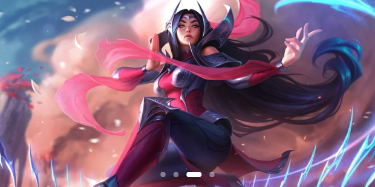
卡片式轮播
在swiper标签上添加类名card-swiper,在swiper-item标签内的子元素上添加类名swiper-item,示例中cardSwiper函数的主要作用是切换类名cur,cur的作用是实现轮播图片中间大,两边小的效果,就是transform的scale()

<swiper class="card-swiper" :class="dotStyle?'square-dot':'round-dot'" :indicator-dots="true" :circular="true"
 :autoplay="true" interval="5000" duration="500" @change="cardSwiper" indicator-color="#8799a3"
 indicator-active-color="#0081ff">
	<swiper-item v-for="(item,index) in swiperList" :key="index" :class="cardCur==index?'cur':''">
		<view class="swiper-item">
			<image :src="item.url" mode="aspectFill" v-if="item.type=='image'"></image>
			<video :src="item.url" autoplay loop muted :show-play-btn="false" :controls="false" objectFit="cover" v-if="item.type=='video'"></video>
		</view>
	</swiper-item>
</swiper>

cardSwiper(e) {
    this.cardCur = e.detail.current
},
堆叠式轮播
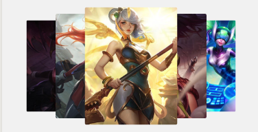
堆叠轮播是原生写的,注意类名tower-swiper、tower-item以及swiper-item的配合使用,这主要是通过层级的高低来显示图片的,使用时需要配合js和css。(这种轮播图初始化展示效果如图二,需要触动一下才会展示如图一的效果,可以通过在onload()函数中给变量direction赋值解决)

<template>
	<view>
		<view class="tower-swiper" @touchmove="TowerMove" @touchstart="TowerStart" @touchend="TowerEnd">
			<view class="tower-item" :class="item.zIndex==1?'none':''" v-for="(item,index) in swiperList" :key="index" :style="[{'--index': item.zIndex,'--left':item.mLeft}]" :data-direction="direction">
				<view class="swiper-item">
					<image :src="item.url" mode="aspectFill" v-if="item.type=='image'"></image>
					<video :src="item.url" autoplay loop muted :show-play-btn="false" :controls="false" objectFit="cover" v-if="item.type=='video'"></video>
				</view>
			</view>
		</view>
	</view>
</template>

<script>
	export default {
		data() {
			return {
				swiperList: [{
					id: 0,
					type: 'image',
					url: 'https://ossweb-img.qq.com/images/lol/web201310/skin/big84000.jpg'
				}, {
					id: 1,
					type: 'image',
					url: 'https://ossweb-img.qq.com/images/lol/web201310/skin/big37006.jpg',
				}, {
					id: 2,
					type: 'image',
					url: 'https://ossweb-img.qq.com/images/lol/web201310/skin/big39000.jpg'
				}, {
					id: 3,
					type: 'image',
					url: 'https://ossweb-img.qq.com/images/lol/web201310/skin/big10001.jpg'
				}, {
					id: 4,
					type: 'image',
					url: 'https://ossweb-img.qq.com/images/lol/web201310/skin/big25011.jpg'
				}, {
					id: 5,
					type: 'image',
					url: 'https://ossweb-img.qq.com/images/lol/web201310/skin/big21016.jpg'
				}, {
					id: 6,
					type: 'image',
					url: 'https://ossweb-img.qq.com/images/lol/web201310/skin/big99008.jpg'
				}],
				towerStart: 0,
				direction: ''
			};
		},
		onLoad() {
			this.TowerSwiper('swiperList');
                        this.direction = 'left';
			// 初始化towerSwiper 传已有的数组名即可
		},
		methods: {
			// 初始化towerSwiper
			TowerSwiper(name) {
				let list = this[name];
				console.log(list)
				for (let i = 0; i < list.length; i++) {
					list[i].zIndex = parseInt(list.length / 2) + 1 - Math.abs(i - parseInt(list.length / 2))
					list[i].mLeft = i - parseInt(list.length / 2)
				}
				this.swiperList = list
			},
			// towerSwiper触摸开始
			TowerStart(e) {
				console.log(e)
				this.towerStart = e.touches[0].pageX
			},
			// towerSwiper计算方向
			TowerMove(e) {
				this.direction = e.touches[0].pageX - this.towerStart > 0 ? 'right' : 'left'
			},
			// towerSwiper计算滚动
			TowerEnd(e) {
				let direction = this.direction;
				let list = this.swiperList;
				if (direction == 'right') {
					let mLeft = list[0].mLeft;
					console.log(list[0])
					let zIndex = list[0].zIndex;
					for (let i = 1; i < this.swiperList.length; i++) {
						this.swiperList[i - 1].mLeft = this.swiperList[i].mLeft
						this.swiperList[i - 1].zIndex = this.swiperList[i].zIndex
					}
					this.swiperList[list.length - 1].mLeft = mLeft;
					this.swiperList[list.length - 1].zIndex = zIndex;
				} else {
					let mLeft = list[list.length - 1].mLeft;
					let zIndex = list[list.length - 1].zIndex;
					for (let i = this.swiperList.length - 1; i > 0; i--) {
						this.swiperList[i].mLeft = this.swiperList[i - 1].mLeft
						this.swiperList[i].zIndex = this.swiperList[i - 1].zIndex
					}
					this.swiperList[0].mLeft = mLeft;
					this.swiperList[0].zIndex = zIndex;
				}
				this.direction = ""
				this.swiperList = this.swiperList
			},
		}
	}
</script>

<style>
	.tower-swiper .tower-item {
		transform: scale(calc(0.5 + var(--index) / 10));
		margin-left: calc(var(--left) * 100upx - 150upx);
		z-index: var(--index);
	}
</style>
轮播图相关class
| class | 说明 | 可选值 |
|---|---|---|
| screen-swiper | 全屏限高轮播 | —— |
| square-dot | 方形指示点 | —— |
| round-dot | 圆形指示点 | —— |
| card-swiper | 卡片式轮播 | —— |
| swiper-item | 滑动切换区域(具体看示例) | —— |
| tower-swiper | 堆叠式轮播 | —— |
| tower-item | 堆叠式轮播子元素 | —— |
Modal模态框
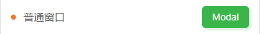
cu-modal和cu-dialog为模态框必选值,所有模态框的大体框架都是cu-modal包裹cu-dialog,cu-dialog内部填充操作部分和信息展示部分,操作部分可以用cu-bar操作条来布局,信息展示就直接写。弹框的显示隐藏是通过添加或移除类名show来实现的,示例中隐藏弹框是绑定tap调用hideModal事件,hideModal函数内执行的语句就是将变量modalName赋值为null,从而移除类名show,你想让用户点击哪里隐藏弹框,就可以把hideModal事件绑定在哪里(比如设置点击遮罩层隐藏弹框,就把hideModal事件绑定在有类名cu-modal的标签上)
普通窗口
普通窗口就是cu-modal包裹cu-dialog,只做信息的展示,没有交互效果
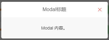
<view class="cu-modal" :class="modalName=='Modal'?'show':''">
	<view class="cu-dialog">
		<view class="cu-bar bg-white justify-end">
			<view class="content">Modal标题</view>
			<view class="action" @tap="hideModal">
				<text class="cuIcon-close text-red"></text>
			</view>
		</view>
		<view class="padding-xl">
			Modal 内容。
		</view>
	</view>
</view>
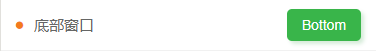
底部窗口
cu-modal结合bottom-modal实现底部弹窗
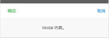
<view class="cu-modal bottom-modal" :class="modalName=='bottomModal'?'show':''">
	<view class="cu-dialog">
		<view class="cu-bar bg-white">
			<view class="action text-green">确定</view>
			<view class="action text-blue" @tap="hideModal">取消</view>
		</view>
		<view class="padding-xl">
			Modal 内容。
		</view>
	</view>
</view>
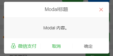
对话窗口
对话窗口相较于普通窗口底部多了一些用户交互的操作
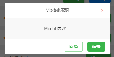
//示例一
<view class="cu-modal" :class="modalName=='DialogModal1'?'show':''">
	<view class="cu-dialog">
		<view class="cu-bar bg-white justify-end">
			<view class="content">Modal标题</view>
			<view class="action" @tap="hideModal">
				<text class="cuIcon-close text-red"></text>
			</view>
		</view>
		<view class="padding-xl">
			Modal 内容。
		</view>
		<view class="cu-bar bg-white justify-end">
			<view class="action">
				<button class="cu-btn line-green text-green" @tap="hideModal">取消</button>
				<button class="cu-btn bg-green margin-left" @tap="hideModal">确定</button>
			</view>
		</view>
	</view>
</view>
//示例二
<view class="cu-modal" :class="modalName=='DialogModal2'?'show':''">
	<view class="cu-dialog">
		<view class="cu-bar bg-white justify-end">
			<view class="content">Modal标题</view>
			<view class="action" @tap="hideModal">
				<text class="cuIcon-close text-red"></text>
			</view>
		</view>
		<view class="padding-xl">
			Modal 内容。
		</view>
		<view class="cu-bar bg-white">
			<view class="action margin-0 flex-sub text-green " @tap="hideModal">
				<text class="cuIcon-moneybag"></text>微信支付</view>
			<view class="action margin-0 flex-sub text-green solid-left" @tap="hideModal">取消</view>
			<view class="action margin-0 flex-sub  solid-left" @tap="hideModal">确定</view>
		</view>
	</view>
</view>
图片窗口
图片窗口用于图片的展示,也可自定义操作

<view class="cu-modal" :class="modalName=='Image'?'show':''">
	<view class="cu-dialog">
		<view class="bg-img" style="background-image: url('https://ossweb-img.qq.com/images/lol/web201310/skin/big91012.jpg');height:200px;">
			<view class="cu-bar justify-end text-white">
				<view class="action" @tap="hideModal">
					<text class="cuIcon-close "></text>
				</view>
			</view>
		</view>
		<view class="cu-bar bg-white">
			<view class="action margin-0 flex-sub  solid-left" @tap="hideModal">我知道了</view>
		</view>
	</view>
</view>
单选窗口
单选窗口是普通窗口内部结合radio标签编写的
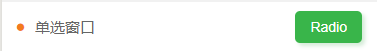

<view class="cu-modal" :class="modalName=='RadioModal'?'show':''" @tap="hideModal">
	<view class="cu-dialog" @tap.stop="">
		<radio-group class="block" @change="RadioChange">
			<view class="cu-list menu text-left">
				<view class="cu-item" v-for="(item,index) in 5" :key="index">
					<label class="flex justify-between align-center flex-sub">
						<view class="flex-sub">Item {

   {index +1}}</view>
						<radio class="round" :class="radio=='radio' + index?'checked':''" :checked="radio=='radio' + index?true:false"
						 :value="'radio' + index"></radio>
					</label>
				</view>
			</view>
		</radio-group>
	</view>
</view>
多选窗口
多选窗口的内容是配合grid布局自定义的
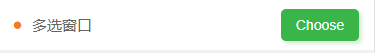
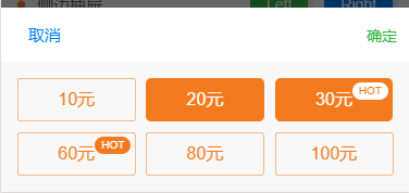
<view class="cu-modal bottom-modal" :class="modalName=='ChooseModal'?'show':''" @tap="hideModal">
	<view class="cu-dialog" @tap.stop="">
		<view class="cu-bar bg-white">
			<view class="action text-blue" @tap="hideModal">取消</view>
			<view class="action text-green" @tap="hideModal">确定</view>
		</view>
		<view class="grid col-3 padding-sm">
			<view v-for="(item,index) in checkbox" class="padding-xs" :key="index">
				<button class="cu-btn orange lg block" :class="item.checked?'bg-orange':'line-orange'" @tap="ChooseCheckbox"
				 :data-value="item.value"> {

   {item.name}}
					<view class="cu-tag sm round" :class="item.checked?'bg-white text-orange':'bg-orange'" v-if="item.hot">HOT</view>
				</button>
			</view>
		</view>
	</view>
</view>
<script>
	export default {
		data() {
			return {
				modalName: null,
				checkbox: [{value: 0,name: '10元',checked: false,hot: false,},
                           {value: 1,name: '20元',checked: true,hot: false,},
                           {value: 2,name: '30元',checked: true,hot: true,},
                           {value: 3,name: '60元',checked: false,hot: true,},
                           {value: 4,name: '80元',checked: false,hot: false,},
                           {value: 5,name: '100元',checked: false,hot: false,}
                          ]
			};
		},
		methods: {
			showModal(e) {
				this.modalName = e.currentTarget.dataset.target
			},
			hideModal(e) {
				this.modalName = null
			},
			ChooseCheckbox(e) {
				let items = this.checkbox;
				let values = e.currentTarget.dataset.value;
				for (let i = 0, lenI = items.length; i < lenI; ++i) {
					if (items[i].value == values) {
						items[i].checked = !items[i].checked;
						break
					}
				}
			}
		}
	}
</script>
侧边抽屉
cu-modal结合drawer-modal,由justify-start和justify-end决定抽屉方向
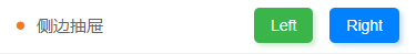


//左侧抽屉
<view class="cu-modal drawer-modal justify-start" :class="modalName=='DrawerModalL'?'show':''" @tap="hideModal">
	<view class="cu-dialog basis-lg" @tap.stop="">
		<view class="cu-list menu text-left">
			<view class="cu-item arrow" v-for="(item,index) in 5" :key="index">
				<view class="content">
					<view>Item {

   {index +1}}</view>
				</view>
			</view>
		</view>
	</view>
</view>
//右侧抽屉
<view class="cu-modal drawer-modal justify-end" :class="modalName=='DrawerModalR'?'show':''" @tap="hideModal">
	<view class="cu-dialog basis-lg" @tap.stop="" >
		<view class="cu-list menu text-left">
			<view class="cu-item arrow" v-for="(item,index) in 5" :key="index">
				<view class="content">
					<view>Item {

   {index +1}}</view>
				</view>
			</view>
		</view>
	</view>
</view>
模态框相关class
| class | 说明 | 可选值 |
|---|---|---|
| cu-modal | 模态框必选值 | —— |
| cu-dialog | 模态框子元素 | —— |
| bottom-modal | 底部弹框 | —— |
| drawer-modal | 侧边弹框 | —— |
| show | 显示弹框 | —— |
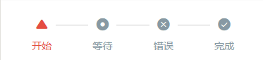
Steps步骤条
cu-steps步骤条必选值
默认
cu-steps和cu-item配合使用
<view class="bg-white padding">
	<view class="cu-steps">
		<view class="cu-item" :class="index>basics?'':'text-red'" v-for="(item,index) in basicsList" :key="index">
			<text :class="'cuIcon-' + item.cuIcon"></text> {

   {item.name}}
		</view>
	</view>
</view>

<script>
	export default {
		data() {
			return {
				basicsList: [{cuIcon: 'usefullfill',name: '开始'},
                                    {cuIcon: 'radioboxfill',name: '等待'},
                                    {cuIcon: 'roundclosefill',name: '错误'},
                                    {cuIcon: 'roundcheckfill',name: '完成'
				}],
				basics: 0
			};
		},
		methods: {
			BasicsSteps() {
				this.basics= this.basics == this.basicsList.length - 1 ? 0 : this.basics + 1
			}
		}
	}
</script>
步骤条的颜色和图标都可以自定义
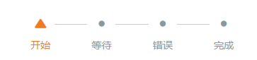
<view class="bg-white padding margin-top-xs">
	<view class="cu-steps">
		<view class="cu-item" :class="index>basics?'':'text-orange'" v-for="(item,index) in basicsList" :key="index">
			<text :class="index>basics?'cuIcon-title':'cuIcon-' + item.cuIcon"></text> {

   {item.name}}
		</view>
	</view>
</view>
步骤之间的连接默认是横线,也可以通过类名steps-arrow换成箭头
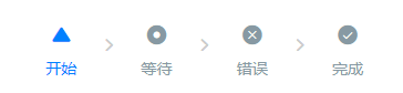
<view class="bg-white padding  margin-top-xs">
	<view class="cu-steps steps-arrow">
		<view class="cu-item" :class="index>basics?'':'text-blue'" v-for="(item,index) in basicsList" :key="index">
			<text :class="'cuIcon-' + item.cuIcon"></text> {

   {item.name}}
		</view>
	</view>
</view>
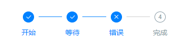
数字完成
通过类名num可以设置默认图标为数字,已完成且正确的图标为勾,已完成但错误的图标由类名err定义
<view class="bg-white padding">
	<view class="cu-steps">
		<view class="cu-item" :class="index>num?'':'text-blue'" v-for="(item,index) in numList" :key="index">
			<text class="num" :class="index==2?'err':''" :data-index="index + 1"></text> {

   {item.name}}
		</view>
	</view>
</view>
多级显示
多级显示需要配合scroll-view标签使用 ,并增加类名steps-bottom
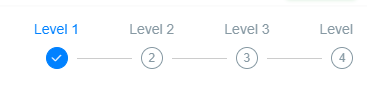
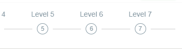
<scroll-view scroll-x class="bg-white padding response cu-steps steps-bottom" :scroll-into-view="'scroll-' + scroll"
 scroll-with-animation>
	<view class="cu-item padding-lr-xl" :class="index>scroll?'':'text-blue'" v-for="(item,index) in 10" :key="index" :id="'scroll-' + index">
		Level {

   {index + 1}} <text class="num" :data-index="index + 1"></text>
	</view>
</scroll-view>

<script>
	export default {
		data() {
			return {
				scroll: 0
			};
		},
		methods: {
			ScrollSteps() {
				this.scroll= this.scroll == 9 ? 0 : this.scroll + 1
			}
		}
	}
</script>
步骤条相关class
| class | 说明 | 可选值 |
|---|---|---|
| cu-steps | 步骤条必选值 | —— |
| cu-item | 步骤条子元素 | —— |
| num | 数字步骤条未完成图标 | —— |
| err | 错误图标 | —— |
| steps-arrow | 步骤条连接箭头 | —— |
| steps-bottom | 配合多级步骤条使用(图标在下,文字在上,放在其他步骤条样式会错乱) | —— |
扩展插件
交互组件就到此为止了,不足之处请多多指教,便于我及时更正,承接上一篇基础元素的博客,扩展插件部分我们就在再另写一篇,ColorUI组件库简易教程之扩展插件