前言
学习使用elementui 中的各种控件使用
一、树形控件el-tree
(1)Attributes
<el-tree
ref="tree"
:data="data"
:props="props"
show-checkbox
default-expand-all
:default-checked-keys="defaultCheckedKeys"
:default-expanded-keys="defaultExpandedKeys"
node-key="id"
/>
export default {
data() {
return {
defaultCheckedKeys:[1,2,3],// 默认选中的值 数组中的值对应data中的id值
defaultExpandedKeys:[1], // 默认展开第一个 一级 1
};
},
1.data [] 展示数据
示例:
data: [
{
id: 1,
label: '一级 1',
children: [{
id: 4,
label: '二级 1-1',
children: [{
id: 9,
label: '三级 1-1-1'
}, {
id: 10,
label: '三级 1-1-2'
}]
}]},
{
id: 2,
label: '一级 2',
children: [{
id: 5,
label: '二级 2-1'
}, {
id: 6,
label: '二级 2-2'
}]},
{
id: 3,
label: '一级 3',
}],
2.props 配置选项, props中的children属性与data的children字段对应,props中的label属性与data的label字段对应,用来展示标签
示例:
props: {
children: 'children',
label: 'label'
}
3.show-checkbox 节点是否可被选择,默认false 不可被选择


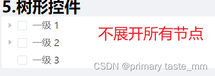
4. default-expand-all 是否默认展开所有节点,默认false 不展开所有节点

5.:default-checked-keys 默认选中的节点的 key 的数组,注意要加属性:node-key="id" id对应data中的属性id

6.default-expanded-keys 默认展开的节点的 key 的数组,注意要去掉属性default-expand-all,要加属性node-key="id" id对应data中的属性id

(2)Tree上的方法
1.getCheckedNodes()
getCheckedNodes() {
console.log(this.$refs.tree.getCheckedNodes());
// 选中的所有节点, 如选中 一级 3
// 得到的结果是:
// {
// id: 3,
// label: '一级 3',
// }
},
2.getCheckedKeys()
getCheckedKeys() {
console.log(this.$refs.tree.getCheckedKeys());
//选中的所有节点的key值 如选中 一级 3
// 得到的结果是: [3]
},
3.setCheckedNodes()
// 设置选中的节点,将下方节点选中 二级 2-1 三级 1-1-1'
setCheckedNodes() {
this.$refs.tree.setCheckedNodes([{
id: 5,
label: '二级 2-1'
}, {
id: 9,
label: '三级 1-1-1'
}]);
},
4.setCheckedKeys()
// 通过key值进行选中
setCheckedKeys() {
this.$refs.tree.setCheckedKeys([3]);
},
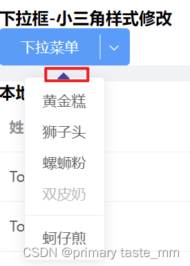
二、下拉菜单-el-dropdown
下拉菜单的小三角样式修改
修改前->修改后的

(1)首先给el-dropdown-menu添加类名 class="header-new-drop"
<el-dropdown @command="handleCommand" size="medium" split-button type="primary"
placement="bottom" trigger="click">
<span class="el-dropdown-link">
下拉菜单
<!-- <i class="el-icon-arrow-down el-icon--right"></i> -->
</span>
<el-dropdown-menu slot="dropdown" class="header-new-drop">
<el-dropdown-item command="a">黄金糕</el-dropdown-item>
<el-dropdown-item command="b">狮子头</el-dropdown-item>
<el-dropdown-item command="c">螺蛳粉</el-dropdown-item>
<el-dropdown-item command="d" disabled>双皮奶</el-dropdown-item>
<el-dropdown-item command="e" divided>蚵仔煎</el-dropdown-item>
</el-dropdown-menu>
</el-dropdown>
(2)其次在style样式中修改样式 注意不要加scoped 不然没有效果
<style lang="scss">
.header-new-drop[x-placement^=bottom] .popper__arrow{
border-bottom-color: #3E44A7 !important;
}
.header-new-drop[x-placement^=bottom] .popper__arrow::after{
border-bottom-color: #3E44A7 !important;
}
</style>