1 邂逅 ECharts
2 EChars5初体验
3 ECharts 组件和配置
4 ECharts 图表实战
5 ECharts其它补充
一、初体验echarts5
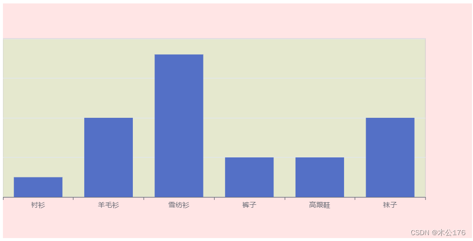
1、模板
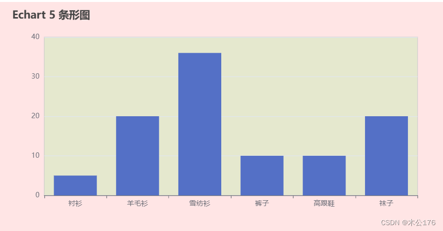
<!DOCTYPE html>
<html lang="en">
<head>
  <meta charset="UTF-8">
  <meta http-equiv="X-UA-Compatible" content="IE=edge">
  <meta name="viewport" content="width=device-width, initial-scale=1.0">
  <title>Document</title>
</head>
<body>

  <!-- 4.ECharts 的容器( 必须要有高度,宽度是可选的 ) -->
  <div id="main" style="height: 400px"></div>

  <!--
    window.echarts =
   -->
  <script src="https://cdnjs.cloudflare.com/ajax/libs/echarts/5.4.1/echarts.min.js"></script>
  <script>
    window.onload = function() {
       // 1.基于准备好的dom,初始化 echarts实例
       var myChart = echarts.init(document.getElementById('main'));

      // 2.指定图表的配置项和数据
      var option = {
        title: {
          text: 'ECharts 入门示例'
          // ...
        },
        tooltip: {},
        legend: {
          data: ['销量']
        },
        xAxis: {
          data: ['衬衫', '羊毛衫', '雪纺衫', '裤子', '高跟鞋', '袜子']
        },
        yAxis: {},
        series: [
          {
            name: '销量',
            type: 'bar',
            data: [5, 20, 36, 10, 10, 20]
          }
        ]
      };

      // 3.使用刚指定的配置项和数据显示图表。
      myChart.setOption(option);

    }
  </script>
</body>
</html>
2、精简版
<!DOCTYPE html>
<html lang="en">
<head>
  <meta charset="UTF-8">
  <meta http-equiv="X-UA-Compatible" content="IE=edge">
  <meta name="viewport" content="width=device-width, initial-scale=1.0">
  <title>Document</title>
</head>
<body>

  <div id="main" style="height: 400px"></div>
  <script src="https://cdnjs.cloudflare.com/ajax/libs/echarts/5.4.1/echarts.min.js"></script>
  <script>
    window.onload = function() {
      let myChart = echarts.init(document.getElementById('main'));
      let option = {
        xAxis: {
          data: ['衬衫', '羊毛衫', '雪纺衫', '裤子', '高跟鞋', '袜子']
        },
        yAxis: {},
        series: [
          {
            type: 'bar',
            data: [5, 20, 36, 10, 10, 20]
          }
        ]
      };
      myChart.setOption(option);
    }
  </script>
</body>
</html>
3、切换ECharts-渲染器
<!DOCTYPE html>
<html lang="en">
<head>
  <meta charset="UTF-8">
  <meta http-equiv="X-UA-Compatible" content="IE=edge">
  <meta name="viewport" content="width=device-width, initial-scale=1.0">
  <title>Document</title>
</head>
<body>

  <div id="main" style="height: 400px"></div>
  <script src="https://cdnjs.cloudflare.com/ajax/libs/echarts/5.4.1/echarts.min.js"></script>
  <script>
    window.onload = function() {
      // 切换为svg的渲染器( 默认是canvas )
      let myChart = echarts.init(document.getElementById('main'), null, { renderer: 'svg' });
      let option = {
        xAxis: {
          data: ['衬衫', '羊毛衫', '雪纺衫', '裤子', '高跟鞋', '袜子']
        },
        yAxis: {},
        series: [
          {
            type: 'bar',
            data: [5, 20, 36, 10, 10, 20]
          }
        ]
      };
      myChart.setOption(option);
    }
  </script>
</body>
</html>
二、ECharts的组件和配置
1、Grid-组件-配置 图表表格的配置
<!DOCTYPE html>
<html lang="en">
<head>
  <meta charset="UTF-8">
  <meta http-equiv="X-UA-Compatible" content="IE=edge">
  <meta name="viewport" content="width=device-width, initial-scale=1.0">
  <title>Document</title>
</head>
<body>

  <div id="main" style="height: 400px"></div>
  <script src="https://cdnjs.cloudflare.com/ajax/libs/echarts/5.4.1/echarts.min.js"></script>
  <script>
    window.onload = function() {
      let myChart = echarts.init(document.getElementById('main'));
      let option = {
        // ECharts的背景
        backgroundColor: 'rgba(255, 0, 0, 0.1)',

        // grid 网格组件( 绘图区域 )
        grid: {
          show: true,
          backgroundColor: 'rgba(0, 255, 0, 0.1)',
          // top: 0,
          // bottom: 0,
          left: 0,
          // right: 0,
	    //是否显示xy轴的值
          containLabel: false,
        },

        xAxis: {
          data: ['衬衫', '羊毛衫', '雪纺衫', '裤子', '高跟鞋', '袜子']
        },
        yAxis: {},
        series: [
          {
            type: 'bar',
            data: [5, 20, 36, 10, 10, 20]
          }
        ]
      };
      myChart.setOption(option);
    }
  </script>
</body>
</html>
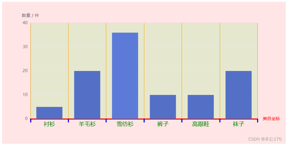
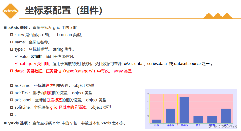
2、xAxis-坐标系组件-配置 x轴的配置
<!DOCTYPE html>
<html lang="en">
<head>
  <meta charset="UTF-8">
  <meta http-equiv="X-UA-Compatible" content="IE=edge">
  <meta name="viewport" content="width=device-width, initial-scale=1.0">
  <title>Document</title>
</head>
<body>

  <div id="main" style="height: 400px"></div>
  <script src="https://cdnjs.cloudflare.com/ajax/libs/echarts/5.4.1/echarts.min.js"></script>
  <script>
    window.onload = function() {
      let myChart = echarts.init(document.getElementById('main'));
      let option = {
        backgroundColor: 'rgba(255, 0, 0, 0.1)',
        grid: {
          show: true,
          backgroundColor: 'rgba(0, 255, 0, 0.1)',
        },


        xAxis: {
          show: true,
          //x坐标最右边显示的
          name: "类目坐标",

          type: "category", // 类目坐标才有data选项 ,也可以写值value,只能写数字
          data: ['衬衫', '羊毛衫', '雪纺衫', '裤子', '高跟鞋', '袜子'],

          axisLine: { // 坐标轴轴线相关设置。
            show: true,
            lineStyle: {
              color: "red",
              width: 3,
            },
          },

          axisLabel: { // 坐标轴刻度标签的相关设置。
            show: true,
            color: "green",
            fontSize: 16,
          },

          axisTick: {  // 坐标轴刻度相关设置。
            show: true,
            length: 10,
            lineStyle: {
              color: "blue",
              width: 3,
            },
          },

          splitLine: { // 坐标轴在 grid 区域中的分隔线。
            show: true,
            lineStyle: {
              color: "orange",
              width: 1,
            },
          },


        },
        yAxis: {
          name: '数量 / 件'
          // type: "value",
        },
        series: [
          {
            type: 'bar',
            data: [5, 20, 36, 10, 10, 20]
          }
        ]
      };
      myChart.setOption(option);
    }
  </script>
</body>
</html>
3、ECharts-series-系列图-data data的写法推荐,一般使用对象的写法,如果是地图的data,也是差不多,但是多个参数。
<!DOCTYPE html>
<html lang="en">
<head>
  <meta charset="UTF-8">
  <meta http-equiv="X-UA-Compatible" content="IE=edge">
  <meta name="viewport" content="width=device-width, initial-scale=1.0">
  <title>Document</title>
</head>
<body>

  <div id="main" style="height: 400px"></div>
  <script src="https://cdnjs.cloudflare.com/ajax/libs/echarts/5.4.1/echarts.min.js"></script>
  <script>
    window.onload = function() {
      let myChart = echarts.init(document.getElementById('main'));
      let option = {
        backgroundColor: 'rgba(255, 0, 0, 0.1)',
        grid: {
          show: true,
          backgroundColor: 'rgba(0, 255, 0, 0.1)',
        },


        xAxis: {
          data: ['衬衫', '羊毛衫', '雪纺衫', '裤子', '高跟鞋', '袜子']
        },
        yAxis: {},
        series: [
          {
            type: 'bar',
            label: {
              show: true
            },
            // 方式一
            // data: [5, 20, 36, 10, 10, 20],


            // 方式二
            // data: [
            //   // x index ,  y value
            //   [2, 36],
            //   [3, 10],
            //   [4, 10],
            //   [5, 20],
            //   [0, 5],
            //   [1, 20],
            // ],

            // 方式三(推荐)
            // data: [
            //   {
            //     value: 5,
            //     name: "衬衫", // 数据项名称, 比如pie系列 tooltip 需要用到
            //     // ....
            //     // ....
            //   },
            //   {
            //     value: 20,
            //     name: "羊毛衫",
            //   },
            //   {
            //     value: 36,
            //     name: "雪纺衫",
            //   },
            //   {
            //     value: 10,
            //     name: "裤子",
            //   },
            //   {
            //     value: 10,
            //     name: "高跟鞋",
            //   },
            //   {
            //     value: 20,
            //     name: "袜子",
            //   },
            // ],


            // 方式四
            // data: [
            //   {
            //     value: [0, 5], // 数组第一项为x轴值,第二项为y轴值
            //     name: "衬衫", // 数据项名称, 比如pie系列 tooltip 需要用到
            //   },
            //   {
            //     value: [1, 20],
            //     name: "羊毛衫",
            //   },
            //   {
            //     value: [2, 36],
            //     name: "雪纺衫",
            //   },
            //   {
            //     value: [3, 10],
            //     name: "裤子",
            //   },
            //   {
            //     value: [4, 10],
            //     name: "高跟鞋",
            //   },
            //   {
            //     value: [5, 20],
            //     name: "袜子",
            //   },
            // ],


            // 方式五(地理坐标系推荐)
   			    data: [
              {
                value: [0, 5, 500], // 第一项为x轴或纬度值,第二项为y或维度轴值,第三项以后为扩展值
                name: "衬衫", // 数据项名称, 比如pie系列 tooltip 需要用到
              },
              {
                value: [1, 20, 400],
                name: "羊毛衫",
              },
              {
                value: [2, 36, 200],
                name: "雪纺衫",
              },
              {
                value: [3, 10, 100],
                name: "裤子",
              },
              {
                value: [4, 10, 600],
                name: "高跟鞋",
              },
              {
                value: [5, 20, 300],
                name: "袜子",
              },
            ],
          }
        ]
      };
      myChart.setOption(option);
    }
  </script>
</body>
</html>
4、ECharts-series-系列图-type type的参数可以设置展示的图形是柱状图还饼图、折线图等。在series里面配置type
<!DOCTYPE html>
<html lang="en">
<head>
  <meta charset="UTF-8">
  <meta http-equiv="X-UA-Compatible" content="IE=edge">
  <meta name="viewport" content="width=device-width, initial-scale=1.0">
  <title>Document</title>
</head>
<body>

  <div id="main" style="height: 400px"></div>
  <script src="https://cdnjs.cloudflare.com/ajax/libs/echarts/5.4.1/echarts.min.js"></script>
  <script>
    window.onload = function() {
      let myChart = echarts.init(document.getElementById('main'));
      let option = {
        backgroundColor: 'rgba(255, 0, 0, 0.1)',
        grid: {
          show: true,
          backgroundColor: 'rgba(0, 255, 0, 0.1)',
        },


        xAxis: {
          data: ['衬衫', '羊毛衫', '雪纺衫', '裤子', '高跟鞋', '袜子']
        },
        yAxis: {},
        series: [
          {
            type: 'scatter', // line bar scatter pie
            label: {
              show: true
            },
            // 方式一
            // data: [5, 20, 36, 10, 10, 20],

            // 方式三(推荐)
            data: [
              {
                value: 5,
                name: "衬衫", // 数据项名称, 比如pie系列 tooltip 需要用到
              },
              {
                value: 20,
                name: "羊毛衫",
              },
              {
                value: 36,
                name: "雪纺衫",
              },
              {
                value: 10,
                name: "裤子",
              },
              {
                value: 10,
                name: "高跟鞋",
              },
              {
                value: 20,
                name: "袜子",
              },
            ],


          }
        ]
      };
      myChart.setOption(option);
    }
  </script>
</body>
</html>
5、ECharts-series-系列图-type-pie 饼图 可以在series里面调整饼图内半径,外半径和图形样式(玫瑰图或者圆形)。
<!DOCTYPE html>
<html lang="en">
<head>
  <meta charset="UTF-8">
  <meta http-equiv="X-UA-Compatible" content="IE=edge">
  <meta name="viewport" content="width=device-width, initial-scale=1.0">
  <title>Document</title>
</head>
<body>

  <div id="main" style="height: 400px"></div>
  <script src="https://cdnjs.cloudflare.com/ajax/libs/echarts/5.4.1/echarts.min.js"></script>
  <script>
    window.onload = function() {
      let myChart = echarts.init(document.getElementById('main'));
      let option = {
        backgroundColor: 'rgba(255, 0, 0, 0.1)',
        grid: {
          show: true,
          backgroundColor: 'rgba(0, 255, 0, 0.1)',
        },

        xAxis: {
          show: false,
          data: ['衬衫', '羊毛衫', '雪纺衫', '裤子', '高跟鞋', '袜子']
        },
        yAxis: {},
        series: [
          {
            type: 'pie', // line bar scatter pie
            label: {
              show: true
            },
          // 设置成百分比时第一项是相对于容器宽度,第二项是相对于容器高度。
          // center: ["50%", "50%"], // 饼图的中心(圆心)坐标,数组的第一项是横坐标,第二项是纵坐标。

            // 百分比是参照容器高宽中较小一项( 感觉是直径 )
            radius: ["0%", "80%"], // 饼图的半径。数组的第一项是内半径,第二项是外半径。
            roseType: "area", //area玫瑰图(南丁格尔图)。 圆心角一样,通过半径展现数据大小(默认false)


            // 方式三(推荐)
            data: [
              {
                value: 5,
                name: "衬衫", // 数据项名称, 比如pie系列 tooltip 需要用到
              },
              {
                value: 20,
                name: "羊毛衫",
              },
              {
                value: 36,
                name: "雪纺衫",
              },
              {
                value: 10,
                name: "裤子",
              },
              {
                value: 10,
                name: "高跟鞋",
              },
              {
                value: 20,
                name: "袜子",
              },
            ],


          }
        ]
      };
      myChart.setOption(option);
    }
  </script>
</body>
</html>
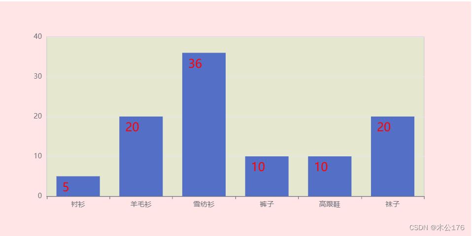
6、ECharts-series-系列图-label 用来设置图形上显示的值的样式
<!DOCTYPE html>
<html lang="en">
<head>
  <meta charset="UTF-8">
  <meta http-equiv="X-UA-Compatible" content="IE=edge">
  <meta name="viewport" content="width=device-width, initial-scale=1.0">
  <title>Document</title>
</head>
<body>

  <div id="main" style="height: 400px"></div>
  <script src="https://cdnjs.cloudflare.com/ajax/libs/echarts/5.4.1/echarts.min.js"></script>
  <script>
    window.onload = function() {
      let myChart = echarts.init(document.getElementById('main'));
      let option = {
        backgroundColor: 'rgba(255, 0, 0, 0.1)',
        grid: {
          show: true,
          backgroundColor: 'rgba(0, 255, 0, 0.1)',
        },


        xAxis: {
          data: ['衬衫', '羊毛衫', '雪纺衫', '裤子', '高跟鞋', '袜子']
        },
        yAxis: {},
        series: [
          {
            name: "产品销量柱形图",
            type: "bar",

            label: { // 系列图形上的文本标签
              show: true,
              position: [10, 10], // 支持的类型可以查文档,不同type的position的值会有些差异
              color: "red",
              fontSize: 20,
            },

            data: [5, 20, 36, 10, 10, 20]
          }
        ]
      };
      myChart.setOption(option);
    }
  </script>
</body>
</html>
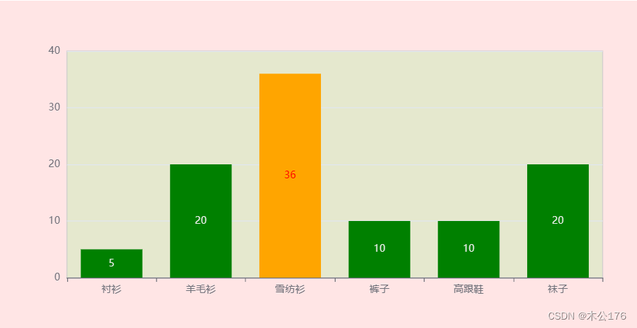
7、ECharts-series-系列图-itemStyle 这个可以写在series里面控制全部的柱状的样式也可以写在data的某个参数里面做到单独控制。
<!DOCTYPE html>
<html lang="en">
<head>
  <meta charset="UTF-8">
  <meta http-equiv="X-UA-Compatible" content="IE=edge">
  <meta name="viewport" content="width=device-width, initial-scale=1.0">
  <title>Document</title>
</head>
<body>

  <div id="main" style="height: 400px"></div>
  <script src="https://cdnjs.cloudflare.com/ajax/libs/echarts/5.4.1/echarts.min.js"></script>
  <script>
    window.onload = function() {
      let myChart = echarts.init(document.getElementById('main'));
      let option = {
        backgroundColor: 'rgba(255, 0, 0, 0.1)',
        grid: {
          show: true,
          backgroundColor: 'rgba(0, 255, 0, 0.1)',
        },


        xAxis: {
          data: ['衬衫', '羊毛衫', '雪纺衫', '裤子', '高跟鞋', '袜子']
        },
        yAxis: {},
        series: [
          {
            name: "产品销量柱形图",
            type: "bar",

            itemStyle: { // 系列图形的样式
              color: "green",
              // borderColor: "orange",
              // borderWidth: 4,
              // opacity: 0.4,
            },

             // 方式三(推荐)
            data: [
              {
                value: 5,
                name: "衬衫", // 数据项名称, 比如pie系列 tooltip 需要用到
                // label ....
                itemStyle: { // 系列图形的样式
                  color: "red",
                },
              },
              {
                value: 20,
                name: "羊毛衫",
                itemStyle: { // 系列图形的样式
                  color: "orange",
                },
              },
              {
                value: 36,
                name: "雪纺衫",
                itemStyle: { // 系列图形的样式
                  color: "pink",
                },
              },
              {
                value: 10,
                name: "裤子",
              },
              {
                value: 10,
                name: "高跟鞋",
              },
              {
                value: 20,
                name: "袜子",
              },
            ],

          }
        ]
      };
      myChart.setOption(option);
    }
  </script>
</body>
</html>
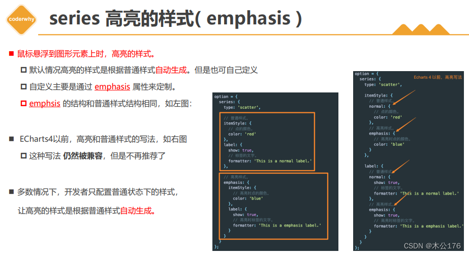
8、-ECharts-series-系列图-emphasis 和css的hover类似,鼠标移入会触发事件改变颜色什么的。可以写在series或者data里面。
<!DOCTYPE html>
<html lang="en">
<head>
  <meta charset="UTF-8">
  <meta http-equiv="X-UA-Compatible" content="IE=edge">
  <meta name="viewport" content="width=device-width, initial-scale=1.0">
  <title>Document</title>
</head>
<body>

  <div id="main" style="height: 400px"></div>
  <script src="https://cdnjs.cloudflare.com/ajax/libs/echarts/5.4.1/echarts.min.js"></script>
  <script>
    window.onload = function() {
      let myChart = echarts.init(document.getElementById('main'));
      let option = {
        backgroundColor: 'rgba(255, 0, 0, 0.1)',
        grid: {
          show: true,
          backgroundColor: 'rgba(0, 255, 0, 0.1)',
        },


        xAxis: {
          data: ['衬衫', '羊毛衫', '雪纺衫', '裤子', '高跟鞋', '袜子']
        },
        yAxis: {},
        series: [
          {
            name: "产品销量柱形图",
            type: "bar",

            label: {
              show: true,
            },
            itemStyle: {
              color: 'green'
            },
            emphasis: { // 图形高亮( label、labelLine、itemStyle、lineStyle、areaStyle... )
              label: {
                show: true,
                color: 'red'
              },
              itemStyle: {
                color: 'orange'
              },
              // .....
            },

             // 方式三(推荐)
            data: [
              {
                value: 5,
                name: "衬衫", // 数据项名称, 比如pie系列 tooltip 需要用到

                emphasis: { // 图形高亮( label、labelLine、itemStyle、lineStyle、areaStyle... )
                  label: {
                    show: true,
                    color: 'blue'
                  },
                  itemStyle: {
                    color: 'pink'
                  },
                },

              },
              {
                value: 20,
                name: "羊毛衫",
              },
              {
                value: 36,
                name: "雪纺衫",
              },
              {
                value: 10,
                name: "裤子",
              },
              {
                value: 10,
                name: "高跟鞋",
              },
              {
                value: 20,
                name: "袜子",
              },
            ],

          }
        ]
      };
      myChart.setOption(option);
    }
  </script>
</body>
</html>
9、ECharts-title-标题组件 设置左上角那行字的,还可以设置副标题。位置不一定设置在左上角,可以通过left、top、right、bottom控制位置。
<!DOCTYPE html>
<html lang="en">
<head>
  <meta charset="UTF-8">
  <meta http-equiv="X-UA-Compatible" content="IE=edge">
  <meta name="viewport" content="width=device-width, initial-scale=1.0">
  <title>Document</title>
</head>
<body>

  <div id="main" style="height: 400px"></div>
  <script src="https://cdnjs.cloudflare.com/ajax/libs/echarts/5.4.1/echarts.min.js"></script>
  <script>
    window.onload = function() {
      let myChart = echarts.init(document.getElementById('main'));
      let option = {
        backgroundColor: 'rgba(255, 0, 0, 0.1)',
        grid: {
          show: true,
          backgroundColor: 'rgba(0, 255, 0, 0.1)',
        },

        title: {
          show: true,
          text: "Echart 5 条形图",
          left: 20,
          top: 10,
          // subtext: '第二个标题'
          // ....
        },


        xAxis: {
          data: ['衬衫', '羊毛衫', '雪纺衫', '裤子', '高跟鞋', '袜子']
        },
        yAxis: {},
        series: [
          {
            name: "产品销量柱形图",
            type: "bar",

            data: [5, 20, 36, 10, 10, 20]
          }
        ]
      };
      myChart.setOption(option);
    }
  </script>
</body>
</html>
10、ECharts-legend-图例组件 用来设置图例的样式,正方形,长方形,长度以及旁边跟着的文字,文字可以通过formatter函数和富文本来设置需要的位置和字体什么的
<!DOCTYPE html>
<html lang="en">
<head>
  <meta charset="UTF-8">
  <meta http-equiv="X-UA-Compatible" content="IE=edge">
  <meta name="viewport" content="width=device-width, initial-scale=1.0">
  <title>Document</title>
</head>
<body>

  <div id="main" style="height: 400px"></div>
  <script src="https://cdnjs.cloudflare.com/ajax/libs/echarts/5.4.1/echarts.min.js"></script>
  <script>
    window.onload = function() {
      let myChart = echarts.init(document.getElementById('main'));
      let option = {
        backgroundColor: 'rgba(255, 0, 0, 0.1)',
        grid: {
          show: true,
          backgroundColor: 'rgba(0, 255, 0, 0.1)',
        },
        legend: {
          show: true,
          // width: 100,
          // itemWidth: 20
          icon: 'circle',  // round circle ...

          // formatter: 'liu-{name}'
          formatter: function(name) {
            console.log(name)
            // 富文本的语法: {style_name|content}
            return name + '{percentageStyle| 40%}'
          },
          textStyle: {
            rich: { // 给富文本添加样式
              percentageStyle: {
                color: 'red',
                fontSize: 12
                // css 样式
              }
            }
          }

        },
        xAxis: {
          show: false,
          data: ['衬衫', '羊毛衫', '雪纺衫', '裤子', '高跟鞋', '袜子']
        },
        yAxis: {},
        series: [
          {
            type: 'pie', // line bar scatter pie
            label: {
              show: true
            },

            // 方式三(推荐)
            data: [
              {
                value: 5,
                name: "衬衫", // 数据项名称, 比如pie系列 tooltip 需要用到
              },
              {
                value: 20,
                name: "羊毛衫",
              },
              {
                value: 36,
                name: "雪纺衫",
              },
              {
                value: 10,
                name: "裤子",
              },
              {
                value: 10,
                name: "高跟鞋",
              },
              {
                value: 20,
                name: "袜子",
              },
            ],


          }
        ]
      };
      myChart.setOption(option);
    }
  </script>
</body>
</html>
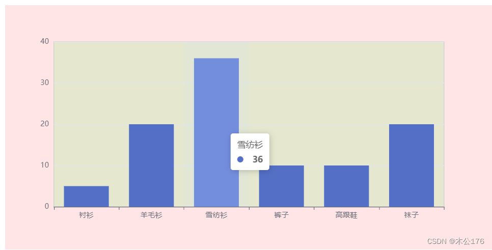
11、ECharts-tooltip-提示框组件
<!DOCTYPE html>
<html lang="en">
<head>
  <meta charset="UTF-8">
  <meta http-equiv="X-UA-Compatible" content="IE=edge">
  <meta name="viewport" content="width=device-width, initial-scale=1.0">
  <title>Document</title>
</head>
<body>

  <div id="main" style="height: 400px"></div>
  <script src="https://cdnjs.cloudflare.com/ajax/libs/echarts/5.4.1/echarts.min.js"></script>
  <script>
    window.onload = function() {
      let myChart = echarts.init(document.getElementById('main'));
      let option = {
        backgroundColor: 'rgba(255, 0, 0, 0.1)',
        grid: {
          show: true,
          backgroundColor: 'rgba(0, 255, 0, 0.1)',
        },

        tooltip: {
          show: true,
          // 使用了 trigger ,一般也结合 axisPointer
          trigger: "axis",  // 默认是 item
          axisPointer: {
            type: "shadow", //  (默认是竖线 line)  (横线 + 竖线 cross)  (横线 + 竖线 shadow)
          },
          // formatter: '<div style="color:red">haha</div>'
        },

        xAxis: {
          data: ['衬衫', '羊毛衫', '雪纺衫', '裤子', '高跟鞋', '袜子']
        },
        yAxis: {},
        series: [
          {
            type: 'bar',
            data: [5, 20, 36, 10, 10, 20]
          }
        ]
      };
      myChart.setOption(option);
    }
  </script>
</body>
</html>
12、ECharts-图形-渐变色 可以在series里面设置也可以在data单独给某个添加渐变。有两种写法
<!DOCTYPE html>
<html lang="en">
<head>
  <meta charset="UTF-8">
  <meta http-equiv="X-UA-Compatible" content="IE=edge">
  <meta name="viewport" content="width=device-width, initial-scale=1.0">
  <title>Document</title>
</head>
<body>

  <div id="main" style="height: 400px"></div>
  <script src="https://cdnjs.cloudflare.com/ajax/libs/echarts/5.4.1/echarts.min.js"></script>
  <script>
    window.onload = function() {
      let myChart = echarts.init(document.getElementById('main'));
      let option = {
        backgroundColor: 'rgba(255, 0, 0, 0.1)',
        grid: {
          show: true,
          backgroundColor: 'rgba(0, 255, 0, 0.1)',
        },

        tooltip: {
          show: true,
          // 使用了 trigger ,一般也结合 axisPointer
          trigger: "axis",  // 默认是 item
          axisPointer: {
            type: "shadow", //  (默认是竖线 line)  (横线 + 竖线 cross)  (横线 + 竖线 shadow)
          },
          // formatter: '<div style="color:red">haha</div>'
        },

        xAxis: {
          data: ['衬衫', '羊毛衫', '雪纺衫', '裤子', '高跟鞋', '袜子']
        },
        yAxis: {},
        series: [
          {
            type: 'bar',
            // 图形的颜色
            itemStyle: {
              color: {
                // 渐变
                type: "linear",
                x: 0,
                y: 0,
                x2: 0,
                y2: 1,
                colorStops: [
                  {
                    offset: 0,
                    color: "red",
                  },
                  {
                    offset: 1,
                    color: "blue",
                  },
                ],
              }
            },
             data: [
              {
                value: 5,
                name: "衬衫", // 数据项名称, 比如pie系列 tooltip 需要用到
                 // 图形的颜色
                itemStyle: {
                 color: new echarts.graphic.LinearGradient(
                    0,
                    0,
                    0,
                    1,
                    [
                      {
                        offset: 0,
                        color: "#20FF89",
                      },
                      {
                        offset: 1,
                        color: "rgba(255, 255, 255, 0)",
                      },
                    ],
                    false
                  ),
                },
              },
              {
                value: 20,
                name: "羊毛衫",
              },
              {
                value: 36,
                name: "雪纺衫",
              },
              {
                value: 10,
                name: "裤子",
              },
              {
                value: 10,
                name: "高跟鞋",
              },
              {
                value: 20,
                name: "袜子",
              },
            ],

          }
        ]
      };
      myChart.setOption(option);
    }
  </script>
</body>
</html>
三、ECharts图表实战
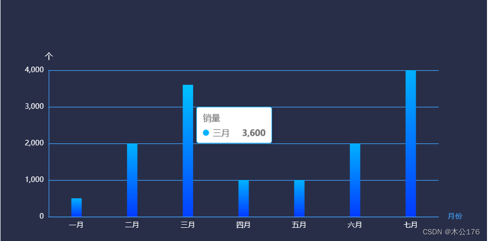
1、柱状图
<!DOCTYPE html>
<html lang="en">
<head>
  <meta charset="UTF-8">
  <meta http-equiv="X-UA-Compatible" content="IE=edge">
  <meta name="viewport" content="width=device-width, initial-scale=1.0">
  <title>Document</title>
</head>
<body>

  <div id="main" style="height: 400px"></div>
  <script src="https://cdnjs.cloudflare.com/ajax/libs/echarts/5.4.1/echarts.min.js"></script>
  <script>
    window.onload = function() {
      let myChart = echarts.init(document.getElementById('main'));

      var option = {
        backgroundColor: "rgb(40,46,72)",
        grid: {
          left: "5%",
          right: "10%",
          top: "30%",
          bottom: "5%",
          containLabel: true, // grid 区域是否包含坐标轴的刻度标签
        },
        tooltip: {},

        xAxis: {
          name: "月份",
          axisLine: {
            show: true,
            lineStyle: {
              color: "#42A4FF",
            },
          },
          axisTick: {
            show: false,
          },
          axisLabel: {
            color: "white",
          },
          type: 'category',
          data: ["一月", "二月", "三月", "四月", "五月", "六月", "七月"],
        },
        yAxis: {
          name: "个",
          nameTextStyle: {
            color: "white",
            fontSize: 13,
          },
          axisLine: {
            show: true,
            lineStyle: {
              color: "#42A4FF",
            },
          },
          axisTick: {
            show: false,
          },
          splitLine: {
            show: true,
            lineStyle: {
              color: "#42A4FF",
            },
          },
          axisLabel: {
            color: "white",
          },
        },
        series: [
          {
            name: "销量",
            type: "bar",
            barWidth: 17,
            itemStyle: {
              color: {
                type: "linear",
                x: 0,
                y: 0,
                x2: 0,
                y2: 1,
                colorStops: [
                  {
                    offset: 0,
                    color: "#01B1FF", // 0% 处的颜色
                  },
                  {
                    offset: 1,
                    color: "#033BFF", // 100% 处的颜色
                  },
                ]
              },
            },
            data: [500, 2000, 3600, 1000, 1000, 2000, 4000],
          },
        ],
      };

      myChart.setOption(option);
    }
  </script>
</body>
</html>
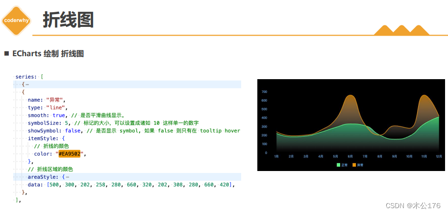
2、折线图
<!DOCTYPE html>
<html lang="en">
<head>
  <meta charset="UTF-8">
  <meta http-equiv="X-UA-Compatible" content="IE=edge">
  <meta name="viewport" content="width=device-width, initial-scale=1.0">
  <title>Document</title>
</head>
<body>

  <div id="main" style="height: 400px"></div>
  <script src="https://cdnjs.cloudflare.com/ajax/libs/echarts/5.4.1/echarts.min.js"></script>
  <script>
    window.onload = function() {
      let myChart = echarts.init(document.getElementById('main'), 'dark');

      let option = {
        grid: {
          left: "5%",
          right: "1%",
          top: "20%",
          bottom: "15%",
          containLabel: true, // grid 区域是否包含坐标轴的刻度标签
        },
        legend: {
          bottom: "5%",

          itemGap: 40,
          itemWidth: 30,
          itemHeigth: 12,

          textStyle: {
            color: "#64BCFF",
          },
          icon: "rect",
        },
        tooltip: {
          trigger: "axis",
          axisPointer: {
            type: "line",
            lineStyle: {
              color: "#20FF89",
            },
          },
        },
        xAxis: [
          {
            type: "category",
            axisLine: {
              show: false,
            },
            axisLabel: {
              color: "#64BCFF",
            },
            splitLine: {
              show: false,
            },
            axisTick: {
              show: false,
            },
            data: [
              "1月",
              "2月",
              "3月",
              "4月",
              "5月",
              "6月",
              "7月",
              "8月",
              "9月",
              "10月",
              "11月",
              "12月",
            ],
          },
        ],
        yAxis: [
          {
            type: "value",
            splitLine: {
              show: false,
            },
            axisLine: {
              show: false,
            },
            axisLabel: {
              show: true,
              color: "#64BCFF",
            },
          },
        ],
        series: [
          // 第一条折线图
          {
            name: "正常",
            type: "line",
            smooth: true,  // 是否平滑曲线显示。
            symbolSize: 5, // 标记的大小
            showSymbol: false,

            itemStyle: {
              color: "#20FF89",
            },
            // 区域填充样式。设置后显示成区域面积图。
            areaStyle: {
              color: new echarts.graphic.LinearGradient(
                0,
                0,
                0,
                1,
                [
                  {
                    offset: 0,
                    color: "#20FF89",
                  },
                  {
                    offset: 1,
                    color: "rgba(255, 255, 255, 0)",
                  },
                ],
                false
              ),
            },
            data: [200, 200, 191, 234, 290, 330, 310, 201, 154, 190, 330, 410],
          },

          // 第二条折线图 (  n 个系列图 )
          {
            name: "异常",
            type: "line",
            smooth: true, // 是否平滑曲线显示。
            symbolSize: 5, // 标记的大小,可以设置成诸如 10 这样单一的数字
            showSymbol: false, // 是否显示 symbol, 如果 false 则只有在 tooltip hover 的时候显示。
            itemStyle: {
              // 折线的颜色
              color: "#EA9502",
            },
            // 折线区域的颜色
            areaStyle: {
              color: {
                type: "linear",
                x: 0,
                y: 0,
                x2: 0,
                y2: 1,
                colorStops: [
                  {
                    offset: 0,
                    color: "#EA9502",
                  },
                  {
                    offset: 1,
                    color: "rgba(255, 255, 255, 0)",
                  },
                ],
              },
            },
            data: [500, 300, 202, 258, 280, 660, 320, 202, 308, 280, 660, 420],
          },
        ],
      };


      myChart.setOption(option);
    }
  </script>
</body>
</html>
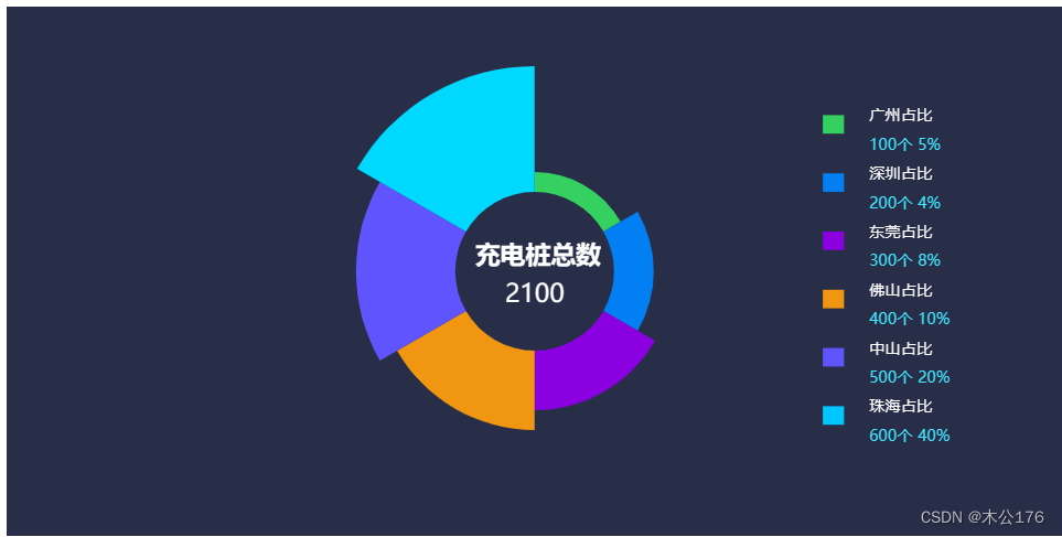
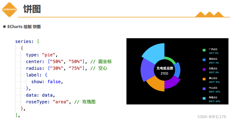
3、饼图
<!DOCTYPE html>
<html lang="en">
<head>
  <meta charset="UTF-8">
  <meta http-equiv="X-UA-Compatible" content="IE=edge">
  <meta name="viewport" content="width=device-width, initial-scale=1.0">
  <title>Document</title>
</head>
<body>

  <div id="main" style="height: 400px"></div>
  <script src="https://cdnjs.cloudflare.com/ajax/libs/echarts/5.4.1/echarts.min.js"></script>
  <script>
    window.onload = function() {
      let myChart = echarts.init(document.getElementById('main'));

      // =====准备数据=====
      let pieDatas = [
        {
          value: 100,
          name: "广州占比",
          percentage: "5%",
          color: "#34D160",
        },
        {
          value: 200,
          name: "深圳占比",
          percentage: "4%",
          color: "#027FF2",
        },
        {
          value: 300,
          name: "东莞占比",
          percentage: "8%",
          color: "#8A00E1",
        },
        {
          value: 400,
          name: "佛山占比",
          percentage: "10%",
          color: "#F19610",
        },
        {
          value: 500,
          name: "中山占比",
          percentage: "20%",
          color: "#6054FF",
        },
        {
          value: 600,
          name: "珠海占比",
          percentage: "40%",
          color: "#00C6FF",
        },
      ];

      // 将 pieDatas 格式的 数据映射为 系列图所需要的数据格式
      let data = pieDatas.map((item) => {
        return {
          value: item.value,
          name: item.name,
          itemStyle: {
            color: item.color,
          },
        };
      });

      // 求出总数
      let total = pieDatas.reduce((a, b) => {
        return a + b.value * 1;
      }, 0);
      // =====准备数据=====

      // 2.指定图表的配置项和数据
      var option = {
        backgroundColor: "rgb(40,46,72)",
        // 标题组件
        title: {
          text: `充电桩总数`,
          top: "50%",
          left: "50%",
          padding: [-20, 0, 0, -45],
          textStyle: {
            fontSize: 19,
            color: "white",
          },

          // subtext: `2100`,
          // subtextStyle : {
          //   color: 'red'
          // },

          // 副标题使用-富文本语法:{style_name|value}, 注意不能有空格
          subtext: `{totalSty|${total}}`,
          subtextStyle: {
            rich: {
              totalSty: {
                fontSize: 19,
                color: "white",
                width: 90,
                align: "center",
              },
            },
          },
        },

        legend: {
          orient: "vertical",
          right: "10%",
          top: "18%",

          itemGap: 10,
          itemWidth: 16,
          itemHeigth: 16,
          icon: "rect",

          // 自定义图例的名称
          formatter: function (name) {
            // 图例文本格式化 + 富文本定制样式
            var currentItem = pieDatas.find((item) => item.name === name);
            return (
              "{nameSty|" +
              currentItem.name +
              "}\n" +
              "{numberSty|" +
              currentItem.value +
              "个 }" +
              "{preSty|" +
              currentItem.percentage +
              "}"
            );
          },
          textStyle: {
            rich: {
              nameSty: {
                fontSize: 12,
                color: "#FFFFFF",
                padding: [10, 14],
              },
              numberSty: {
                fontSize: 12,
                color: "#40E6ff",
                padding: [0, 0, 0, 14],
              },
              preSty: {
                fontSize: 12,
                color: "#40E6ff",
              },
            },
          },
        },
        series: [
          {
            type: "pie",
            center: ["50%", "50%"], // 饼图的中心(圆心)坐标,数组的第一项是横坐标,第二项是纵坐标。
            radius: ["30%", "75%"], // 饼图的半径。数组的第一项是内半径,第二项是外半径。
            label: {
              show: false,
            },
            // data: [  { name: '',   value: '',   itemStyle }  ],
            data: data,
            roseType: "area", //  area 玫瑰图, 圆心角一样,通过半径展现数据大小( 默认为false )
          },
        ],
      };


      myChart.setOption(option);
    }
  </script>
</body>
</html>
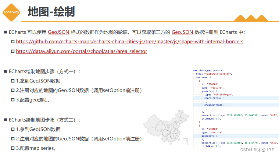
四、echarts地图 需要导入地图的js或者json文件。
json文件和js文件的不同之处是,js文件里面有注册,json文件没有注册地图,在页面显示的时候需要手动注册地图。js文件里面注册地图的名字,在使用的时候需要知道。
1、初体验中国地图-js
<!DOCTYPE html>
<html lang="en">
<head>
  <meta charset="UTF-8">
  <meta http-equiv="X-UA-Compatible" content="IE=edge">
  <meta name="viewport" content="width=device-width, initial-scale=1.0">
  <title>Document</title>
</head>
<body>

  <div id="main" style="height: 400px"></div>
  <script src="https://cdnjs.cloudflare.com/ajax/libs/echarts/5.4.1/echarts.min.js"></script>
  <!--
    1.导入了一个中国的 geo json
    window.china_geojson = {}
  -->
  <script src="./geojson/china.js"></script>
  <script>
    window.onload = function() {
      // 2.注册一下中国地图的 geo json ( 需要在setOption之前调用 )
      // echarts.registerMap('中国', { geoJSON: china_geojson })
      let myChart = echarts.init(document.getElementById('main'));
      let option = {
        // 3.在 echarts 中展示中国地图
        geo: {
          //根据js文件注册的名字来写
          map: 'china'
        },
      };
      myChart.setOption(option);
    }
  </script>
</body>
</html>
2、方式一-初体验中国地图-json 格式化之后的json文件 在geo设置地图
<!DOCTYPE html>
<html lang="en">
<head>
  <meta charset="UTF-8">
  <meta http-equiv="X-UA-Compatible" content="IE=edge">
  <meta name="viewport" content="width=device-width, initial-scale=1.0">
  <title>Document</title>
</head>
<body>

  <div id="main" style="height: 400px"></div>
  <script src="https://cdnjs.cloudflare.com/ajax/libs/echarts/5.4.1/echarts.min.js"></script>
  <!--
    1.导入了一个中国的 geo json
    window.china_geojson = {}
  -->
  <script src="./geojson/china_geojson.js"></script>
  <script>
    window.onload = function() {
      // 2.注册一下中国地图的 geo json ( 需要在setOption之前调用 )
      echarts.registerMap('中国', { geoJSON: china_geojson })
      let myChart = echarts.init(document.getElementById('main'));
      let option = {
        // 3.在 echarts 中展示中国地图
        geo: {
          map: '中国'
        },
      };
      myChart.setOption(option);
    }
  </script>
</body>
</html>
3、方式二-初体验中国地图-json 在series里面设置地图样式
<!DOCTYPE html>
<html lang="en">
<head>
  <meta charset="UTF-8">
  <meta http-equiv="X-UA-Compatible" content="IE=edge">
  <meta name="viewport" content="width=device-width, initial-scale=1.0">
  <title>Document</title>
</head>
<body>

  <div id="main" style="height: 400px"></div>
  <script src="../libs/echarts-5.3.3.js"></script>
  <!--
    1.导入了一个中国的 geo json
    window.china_geojson = {}
  -->
  <script src="./geojson/china_geojson.js"></script>
  <script>
    window.onload = function() {
      // 2.注册一下中国地图的 geo json ( 需要在setOption之前调用 )
      echarts.registerMap('中国', { geoJSON: china_geojson })

      let myChart = echarts.init(document.getElementById('main'));
      let option = {
        // 3.在 echarts 中展示中国地图
        series: [
          {
            type: 'map', // 系列图是 地图
            map: '中国' // 展示中国地图( 因为只注册一个中国地图 )
          }
        ]
      };
      myChart.setOption(option);
    }
  </script>
</body>
</html>
4、geo地图和series地图区别 两者都会创建一个地图
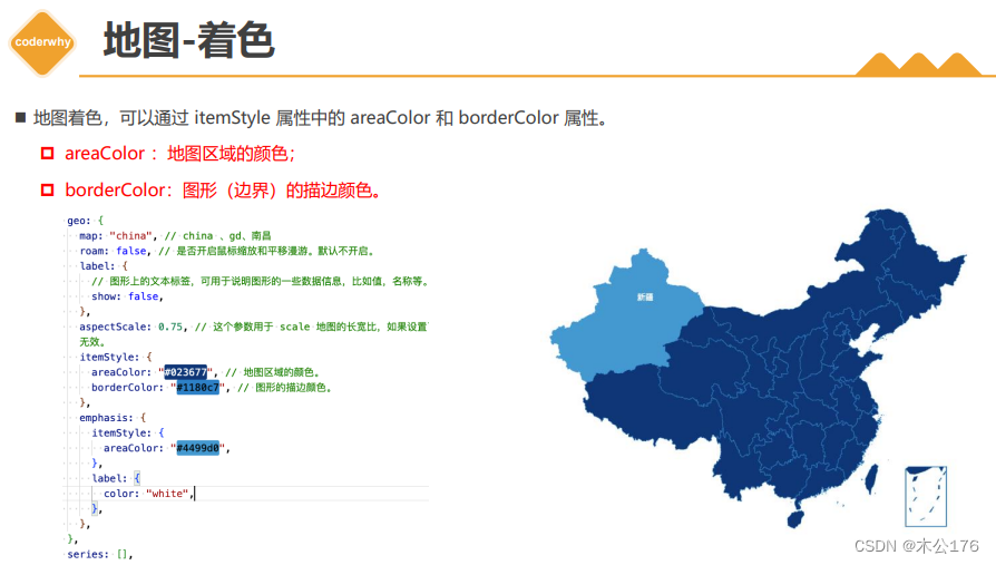
<!DOCTYPE html>
<html lang="en">
<head>
  <meta charset="UTF-8">
  <meta http-equiv="X-UA-Compatible" content="IE=edge">
  <meta name="viewport" content="width=device-width, initial-scale=1.0">
  <title>Document</title>
</head>
<body>

  <div id="main" style="height: 400px"></div>
  <script src="https://cdnjs.cloudflare.com/ajax/libs/echarts/5.4.1/echarts.min.js"></script>
  <!--
    1.导入了一个中国的 geo json
    window.china_geojson = {}
  -->
  <script src="./geojson/china_geojson.js"></script>
  <script>
    window.onload = function() {
      // 2.注册一下中国地图的 geo json ( 需要在setOption之前调用 )
      echarts.registerMap('中国', { geoJSON: china_geojson })

      let myChart = echarts.init(document.getElementById('main'));
      let option = {
        // 3.在 echarts 中展示中国地图
        geo: [
          {
            map: '中国', // 全局的地图( 创建一个地理坐标系统, 供其它系列复用该坐标系 )
            roam: true,
          }
        ],

        series: [
          {
            type: 'map', // 系列图是 地图(创建一个地理坐标系统, 用来展示数据 )
            map: '中国', //
            roam: true,

          }
        ]
      };
      myChart.setOption(option);
    }
  </script>
</body>
</html>
5、中国地图着色 地图板块上色 只有series的可以设置
<!DOCTYPE html>
<html lang="en">
<head>
  <meta charset="UTF-8">
  <meta http-equiv="X-UA-Compatible" content="IE=edge">
  <meta name="viewport" content="width=device-width, initial-scale=1.0">
  <title>Document</title>
</head>
<body>

  <div id="main" style="height: 400px"></div>
  <script src="https://cdnjs.cloudflare.com/ajax/libs/echarts/5.4.1/echarts.min.js"></script>
  <!--
    1.导入了一个中国的 geo json
    window.china_geojson = {}
  -->
  <script src="./geojson/china_geojson.js"></script>
  <script>
    window.onload = function() {
      // 2.注册一下中国地图的 geo json ( 需要在setOption之前调用 )
      echarts.registerMap('中国', { geoJSON: china_geojson })
      let myChart = echarts.init(document.getElementById('main'));
      let option = {
        tooltip: {},
        // 3.在 echarts 中展示中国地图
        // geo: {
        //   map: '中国',
        //   // =======地图着色=========
        //   itemStyle: {
        //     areaColor: "#023677", // 地图区域的颜色。
        //     borderColor: "#1180c7", // 图形的描边颜色。
        //   },

        //   emphasis: {
        //     itemStyle: {
        //       areaColor: "#4499d0",
        //     },
        //     label: {
        //       color: "white",
        //     },
        //   },
        //   // =======地图着色=========
        // },

        series: [
          {

            type: 'map', // 系列图是 地图(创建一个地理坐标系统, 用来展示数据 )
            map: '中国', //
            roam: true,
            // =======地图着色=========
            itemStyle: {
              areaColor: "#023677", // 地图区域的颜色。
              borderColor: "#1180c7", // 图形的描边颜色。
            },

            emphasis: {
              itemStyle: {
                areaColor: "#4499d0",
              },
              label: {
                color: "white",
              },
            },
              // =======地图着色=========
          }
        ]
      };
      myChart.setOption(option);
    }
  </script>
</body>
</html>
6、中国地图-填充数据 地图data设置有不同,有在data里面设置了参数name和value 的话,在鼠标移动到地图上的时候会有提示
<!DOCTYPE html>
<html lang="en">
  <head>
    <meta charset="UTF-8" />
    <meta http-equiv="X-UA-Compatible" content="IE=edge" />
    <meta name="viewport" content="width=device-width, initial-scale=1.0" />
    <title>Document</title>
    <style></style>
  </head>
  <body>
    <div id="main" style="height: 600px"></div>

    <script src="https://cdnjs.cloudflare.com/ajax/libs/echarts/5.4.1/echarts.min.js"></script>
    <script src="./geojson/china_geojson.js"></script>
    <script>
      // 注册地图
      echarts.registerMap("中国", { geoJSON: china_geojson });
      // 1.基于准备好的dom,初始化echarts实例
      var myChart = echarts.init(document.getElementById("main"), null, {
        renderer: "svg",
      });

      var data = [
        { name: "北京", value: 199 },
        { name: "天津", value: 42 },
        { name: "河北", value: 102 },
        { name: "山西", value: 81 },
        { name: "内蒙古", value: 47 },
        { name: "辽宁", value: 67 },
        { name: "吉林", value: 82 },
        { name: "黑龙江", value: 123 },
        { name: "上海", value: 24 },
        { name: "江苏", value: 92 },
        { name: "浙江", value: 114 },
        { name: "安徽", value: 109 },
        { name: "福建", value: 116 },
        { name: "江西", value: 91 },
        { name: "山东", value: 119 },
        { name: "河南", value: 137 },
        { name: "湖北", value: 116 },
        { name: "湖南", value: 114 },
        { name: "重庆", value: 91 },
        { name: "四川", value: 125 },
        { name: "贵州", value: 62 },
        { name: "云南", value: 83 },
        { name: "西藏", value: 9 },
        { name: "陕西", value: 80 },
        { name: "甘肃", value: 56 },
        { name: "青海", value: 10 },
        { name: "宁夏", value: 18 },
        { name: "新疆", value: 180 },
        { name: "广东", value: 123 },
        { name: "广西", value: 59 },
        { name: "海南", value: 14 },
      ];


      // 2.指定图表的配置项和数据
      var option = {

        tooltip: {},
        grid: {},


        // 1.视觉数据映射
        visualMap: [
          {
            // type: "continuous", // 连续型视觉映射组件 (默认)
            // type: "piecewise", // 分段型视觉映射组件
            left: "20%",
            seriesIndex: [0], // 指定取哪个系列的数据
            // 定义 在选中范围中 的视觉元素, 对象类型。
            inRange: {
              color: ["#04387b", "#467bc0"], // 映射组件和地图的颜色(一般和地图色相近)
            },
          },
        ],


        series: [
          {
            name: "中国地图",
            type: "map",
            map: "中国",
            data,
            // data: [
            //   { name: "广东", value: 123 },
            //   { name: "广西", value: 59 },
            //   { name: "海南", value: 14 },
            //   // ....
            //   // ...
            // ],
            itemStyle: {
              areaColor: "#023677",
              borderColor: "#1180c7",
            },
            emphasis: {
              itemStyle: { areaColor: "#4499d0" },
              label: { color: "white" },
            },
            select: {
              label: { color: "white" },
              itemStyle: { areaColor: "#4499d0" },
            },
          },
        ],
      };
      myChart.setOption(option);
    </script>
  </body>
</html>
7、中国地图+散点图 制作地图某块地方会显示涟漪的圆形
<!DOCTYPE html>
<html lang="en">
<head>
  <meta charset="UTF-8">
  <meta http-equiv="X-UA-Compatible" content="IE=edge">
  <meta name="viewport" content="width=device-width, initial-scale=1.0">
  <title>Document</title>
</head>
<body>

  <div id="main" style="height: 400px"></div>
  <script src="https://cdnjs.cloudflare.com/ajax/libs/echarts/5.4.1/echarts.min.js"></script>
  <!--
    1.导入了一个中国的 geo json
    window.china_geojson = {}
  -->
  <script src="./geojson/china_geojson.js"></script>
  <script>
    window.onload = function() {
      // 2.注册一下中国地图的 geo json ( 需要在setOption之前调用 )
      echarts.registerMap('中国', { geoJSON: china_geojson })

      let myChart = echarts.init(document.getElementById('main'));
      let option = {
        // 3.在 echarts 中展示中国地图
       geo: [
        {
          map: '中国'
        }
       ],
       series: [
        {
          name: "散点图",
          type: "effectScatter",

          geoIndex: 0, // geo 支持数组,默认是 0
          coordinateSystem: "geo", // 使用地理坐标系,通过 geoIndex 指定相应的地理坐标系组件。
          data: [
            {
              name: "广东",
              value: [113.280637, 23.125178, 93],
            },
            {
              name: "北京",
              value: [116.405285, 39.904989, 199],
            },
            // {
            //   name: "天津",
            //   value: [117.190182, 39.125596, 99],
            // },
          ],


           // ====== 散点大小和着色========
           symbolSize: function (val) {
            console.log(val)
              return val[2] / 10;  // 控制散点图的大小
           },

            itemStyle: {
              color: "green",
              shadowBlur: 10,
              shadowColor: "yellow",
            },
           // ====== 散点大小和着色========

        }
       ]
      };
      myChart.setOption(option);
    }
  </script>
</body>
</html>
8、中国地图+散点图-最终案例
<!DOCTYPE html>
<html lang="en">
<head>
  <meta charset="UTF-8">
  <meta http-equiv="X-UA-Compatible" content="IE=edge">
  <meta name="viewport" content="width=device-width, initial-scale=1.0">
  <title>Document</title>
</head>
<body>

  <div id="main" style="height: 400px"></div>
  <script src="https://cdnjs.cloudflare.com/ajax/libs/echarts/5.4.1/echarts.min.js"></script>
  <!--
    1.导入了一个中国的 geo json
    window.china_geojson = {}
  -->
  <script src="./geojson/china_geojson.js"></script>
  <script>
    window.onload = function() {
      let mapName = '中国'
      // 2.注册一下中国地图的 geo json ( 需要在setOption之前调用 )
      echarts.registerMap(mapName, { geoJSON: china_geojson })

      let myChart = echarts.init(document.getElementById('main'));

      var data = [
        { name: "北京", value: 199 },
        { name: "天津", value: 42 },
        { name: "河北", value: 102 },
        { name: "山西", value: 81 },
        { name: "内蒙古", value: 47 },
        { name: "辽宁", value: 67 },
        { name: "吉林", value: 82 },
        { name: "黑龙江", value: 123 },
        { name: "上海", value: 154 },
        { name: "江苏", value: 102 },
        { name: "浙江", value: 114 },
        { name: "安徽", value: 109 },
        { name: "福建", value: 116 },
        { name: "江西", value: 91 },
        { name: "山东", value: 119 },
        { name: "河南", value: 137 },
        { name: "湖北", value: 116 },
        { name: "湖南", value: 114 },
        { name: "重庆", value: 101 },
        { name: "四川", value: 125 },
        { name: "贵州", value: 62 },
        { name: "云南", value: 83 },
        { name: "西藏", value: 9 },
        { name: "陕西", value: 80 },
        { name: "甘肃", value: 56 },
        { name: "青海", value: 10 },
        { name: "宁夏", value: 18 },
        { name: "新疆", value: 120 },
        { name: "广东", value: 193 },
        { name: "广西", value: 59 },
        { name: "海南", value: 14 },
      ];

      var geoCoordMap = {};
      /*获取地图数据*/
      myChart.showLoading();
      // console.log(echarts.getMap(mapName));

      // 1.先拿到地图的 geo json 对象
      var mapFeatures = echarts.getMap(mapName).geoJson.features;
      mapFeatures.forEach(function (v) {
        // 地区名称
        var name = v.properties.name;
        // 地区经纬度
        geoCoordMap[name] = v.properties.cp;
      });
      myChart.hideLoading();
      console.log("data=>", data);
      console.log("geoCoordMap=>", geoCoordMap);

      var convertData = function (data) {
        var res = [];
        for (var i = 0; i < data.length; i++) {
          var geoCoord = geoCoordMap[data[i].name];
          if (geoCoord) {
            res.push({
              name: data[i].name,
              value: [...geoCoord, data[i].value],
            });
          }
        }
        console.log("res=>", res);
        return res;
      };


      // 2.指定图表的配置项和数据
      var option = {
        tooltip: {}, // 提示框

        // visualMap: {  // 视觉映射组件
        //   left: "20%",
        //   seriesIndex: [0],
        //   inRange: {
        //     color: ["#04387b", "#467bc0"], // 蓝绿
        //   },
        // },

        geo: {  // 注册一个地理坐标系组件( 给散点图用 )
          map: "中国",
          roam: false,
          label: { show: false },
          aspectScale: 0.75,  // 缩放地图
          itemStyle: {
            areaColor: "#023677",
            borderColor: "#1180c7",
          },
          emphasis: {
            itemStyle: { areaColor: "#4499d0" },
            label: { color: "white" },
          },
        },
        series: [
          {
            name: "中国地图",
            type: "map",
            map: "中国",
            data,  // 给地图填充数据

            // 地图样式
            itemStyle: {
              areaColor: "#023677",
              borderColor: "#1180c7",
            },
            emphasis: {
              itemStyle: { areaColor: "#4499d0" },
              label: { color: "white" },
            },
            select: {
              label: { color: "white" },
              itemStyle: { areaColor: "#4499d0" },
            },
            // 地图样式
          },

          {
            name: "散点图充电桩",
            type: "effectScatter",

            // 散点图使用的坐标系: geo定义的坐标系组件
            geoIndex: 0,
            coordinateSystem: "geo", // 使用地理坐标系,通过 geoIndex 指定相应的地理坐标系组件。


            data: convertData(data),

            symbolSize: function (val) {
              return val[2] / 10;
            },

            itemStyle: {
              color: "yellow",
              shadowBlur: 10,
              shadowColor: "yellow",
            },
            tooltip: {
              show: true,
              trigger: "item",
              formatter: function (params) {
                console.log(params);
                var data = params.data;
                return `${params.seriesName} <div style="margin:5px 0px;"/> ${data.name} ${data.value[2]}`;
              },
            },
          },
        ],
      };


      myChart.setOption(option);
    }
  </script>
</body>
</html>
五、ECharts的补充API
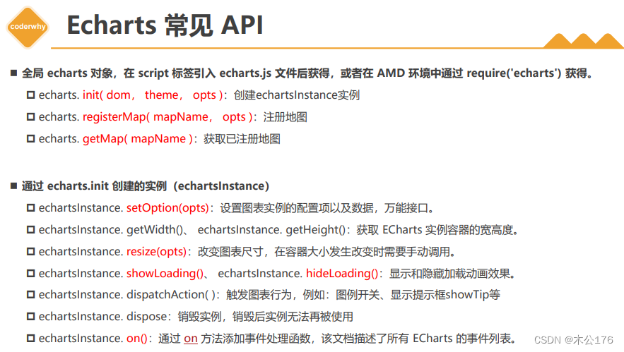
1、响应式图表
<!DOCTYPE html>
<html lang="en">
<head>
  <meta charset="UTF-8">
  <meta http-equiv="X-UA-Compatible" content="IE=edge">
  <meta name="viewport" content="width=device-width, initial-scale=1.0">
  <title>Document</title>
</head>
<body>

  <div id="main" style="height: 400px"></div>
  <script src="https://cdnjs.cloudflare.com/ajax/libs/echarts/5.4.1/echarts.min.js"></script>
  <script>
    window.onload = function() {
      let myChart = echarts.init(document.getElementById('main'));
      let option = {
        backgroundColor: 'rgba(255, 0, 0, 0.1)',
        grid: {
          show: true,
          backgroundColor: 'rgba(0, 255, 0, 0.1)',
        },


        xAxis: {
          data: ['衬衫', '羊毛衫', '雪纺衫', '裤子', '高跟鞋', '袜子']
        },
        yAxis: {},
        series: [
          {
            type: 'bar',
            data: [5, 20, 36, 10, 10, 20]
          }
        ]
      };
      myChart.setOption(option);

      // 1.响应式图表
      window.addEventListener('resize', function() {
        myChart.resize()
      })
    }
  </script>
</body>
</html>
2、自动触发Action实现提示框轮播
<!DOCTYPE html>
<html lang="en">
<head>
  <meta charset="UTF-8">
  <meta http-equiv="X-UA-Compatible" content="IE=edge">
  <meta name="viewport" content="width=device-width, initial-scale=1.0">
  <title>Document</title>
</head>
<body>

  <div id="main" style="height: 400px"></div>
  <script src="https://cdnjs.cloudflare.com/ajax/libs/echarts/5.4.1/echarts.min.js"></script>
  <script>
    window.onload = function() {
      let myChart = echarts.init(document.getElementById('main'));
      let option = {
        backgroundColor: 'rgba(255, 0, 0, 0.1)',
        grid: {
          show: true,
          backgroundColor: 'rgba(0, 255, 0, 0.1)',
        },

        tooltip: {
          position: 'top', // top
        },
        xAxis: {
          data: ['衬衫', '羊毛衫', '雪纺衫', '裤子', '高跟鞋', '袜子']
        },
        yAxis: {},
        series: [
          {
            type: 'bar',
            data: [5, 20, 36, 10, 10, 20]
          }
        ]
      };
      myChart.setOption(option);

      // 1.实现提示框轮播的功能
      setInterval(function () {
        autoToolTip();
      }, 1000);

      let index = 0; // 0-5

      function autoToolTip() {
        index++;
        if (index > 5) {
          index = 0;
        }
        // 1.显示提示框
        myChart.dispatchAction({
          type: "showTip", // 触发的action type
          seriesIndex: 0, // 系列的 索引
          dataIndex: index,// 数据项的 索引
          position: "top", // top
        });
      }
    }
  </script>
</body>
</html>
3、地图-下钻
<!DOCTYPE html>
<html lang="en">
<head>
  <meta charset="UTF-8">
  <meta http-equiv="X-UA-Compatible" content="IE=edge">
  <meta name="viewport" content="width=device-width, initial-scale=1.0">
  <title>Document</title>
</head>
<body>
   <button onclick="back()"> 返回 > 中国地图</button>
  <div id="main" style="height: 400px"></div>
  <script src="https://cdnjs.cloudflare.com/ajax/libs/echarts/5.4.1/echarts.min.js"></script>
  <!--
    1.导入了一个中国的 geo json
    window.china_geojson = {}
  -->
  <script src="./geojson/china_geojson.js"></script>
  <script src="./geojson/guangdong_geojson.js"></script>

  <script>
    let myChart = null
    let option = {}
    window.onload = function() {
      // 2.注册一下中国地图的 geo json ( 需要在setOption之前调用 )
      echarts.registerMap('中国', { geoJSON: china_geojson })

       myChart = echarts.init(document.getElementById('main'));
       option = {
        // 3.在 echarts 中展示中国地图
        series: [
          {
            type: 'map', // 系列图是 地图
            map: '中国', // 展示中国地图( 因为只注册一个中国地图 )
            roam: true
          }
        ]
      };
      myChart.setOption(option);


      // 1.地图下钻的功能
      myChart.on('click', function(event) {
        // console.log(event)
        // event.name == 广东
        if(event.name === '广东'){
          if(!echarts.getMap(event.name)){
            console.log('注册地图')
            echarts.registerMap(event.name, { geoJSON: guangdong_geojson})
          }
          option.series[0].map = event.name // 将中国地图切换为广东地图
          myChart.setOption(option)
        }
      })
    }
    function back() {
      option.series[0].map ='中国'
      myChart.setOption(option)
    }

  </script>
</body>
</html>