1、安装插件,全局引入,页面布局结构如下图。
# echarts 底层依赖 ZRender(ZRender基于canvas),一个轻量级的二维绘制库
npm install [email protected] // 安装
main.js文件引入使用:使用1还是2由vue版本决定,vue2跟echarts现在最新的版本5字头在一起都会报错,所以可以降低版本
① import echarts from 'echarts'
② import * as echarts from 'echarts';
Vue.prototype.$echarts = echarts
1、折线图


封装后端请求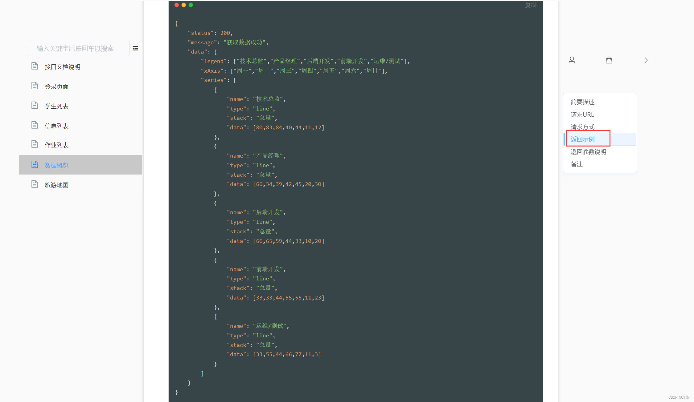
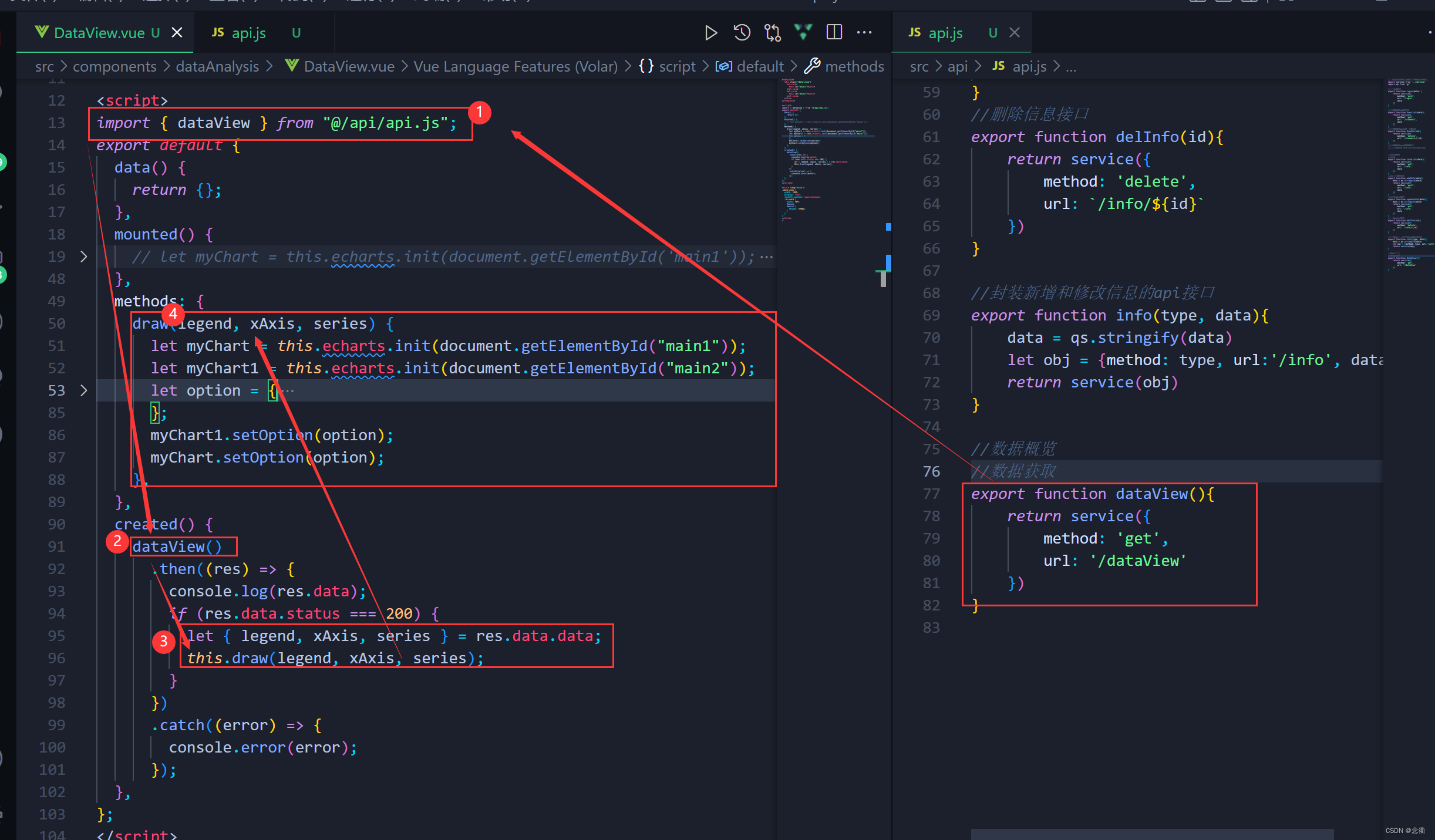
//数据概览
//数据获取
export function dataView(){
    return service({
        method: 'get',
        url: '/dataView'
    })
}
<template>
<div class="data-view">
<el-card>
<div id="main1"></div>
</el-card>
<el-card>
<div id="main2"></div>
</el-card>
</div>
</template>
<script>
import { dataView } from "@/api/api.js";
export default {
data() {
return {};
},
mounted() {
// let myChart = this.echarts.init(document.getElementById('main1'));
// myChart.setOption({
// title: {
// text: "数据概览",
// },
// tooltip: {},
// legend: {
// data: ["Email", "Union Ads", "Video Ads", "Direct", "Search Engine"],
// },
// grid: {
// left: "3%",
// right: "4%",
// bottom: "3%",
// containLabel: true,
// },
// toolbox: {
// feature: {
// saveAsImage: {},
// },
// },
// xAxis: {
// type: "category",
// boundaryGap: false,
// data: ["Mon", "Tue", "Wed", "Thu", "Fri", "Sat", "Sun"],
// },
// yAxis: {
// type: "value",
// },
// });
},
methods: {
draw(legend, xAxis, series) {
let myChart = this.echarts.init(document.getElementById("main1"));
let myChart1 = this.echarts.init(document.getElementById("main2"));
let option = {
title: {
text: "数据概览",
},
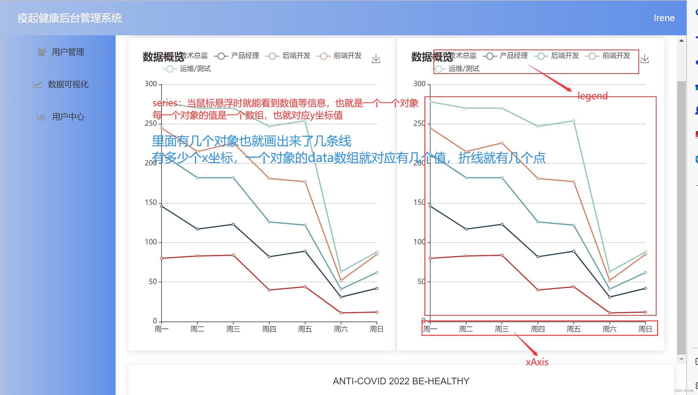
tooltip: {
trigger: "axis", //触发:鼠标悬浮于上
},
legend: {
data: legend,
},
xAxis: {
type: "category",
boundaryGap: false,
data: xAxis,
},
yAxis: {
type: "value",
},
series: series,
toolbox: {
feature: {
saveAsImage: {},
},
},
//样式
grid: {
left: "2%",
right: "3%",
bottom: "2%",
containLabel: true,
},
};
myChart1.setOption(option);
myChart.setOption(option);
},
},
created() {
dataView()
.then((res) => {
console.log(res.data);
if (res.data.status === 200) {
let { legend, xAxis, series } = res.data.data;
this.draw(legend, xAxis, series);
}
})
.catch((error) => {
console.error(error);
});
},
};
</script>
<style lang="scss">
.data-view {
width: 100%;
display: flex;
justify-content: space-between;
.el-card {
width: 50%;
#main1,
#main2 {
height: 500px;
}
}
}
</style>
>
2、地图


重点是地图注册以及数据,至于地图geo组件配置 ,参考官方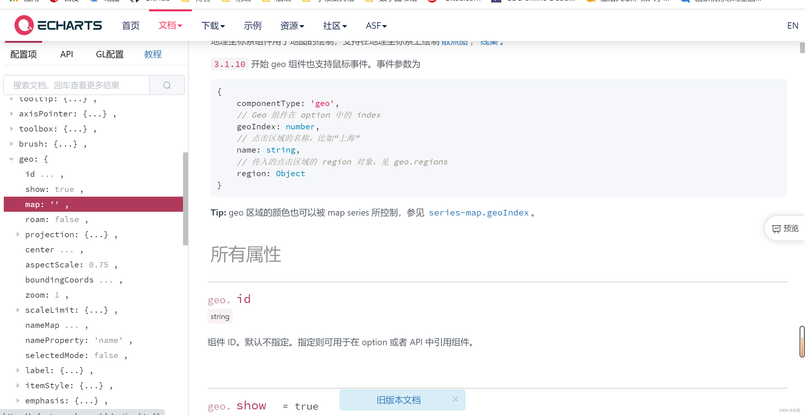
debugg:南海诸岛不显示,国家主权问题,有点危险 ,如果隐藏还可以参考博文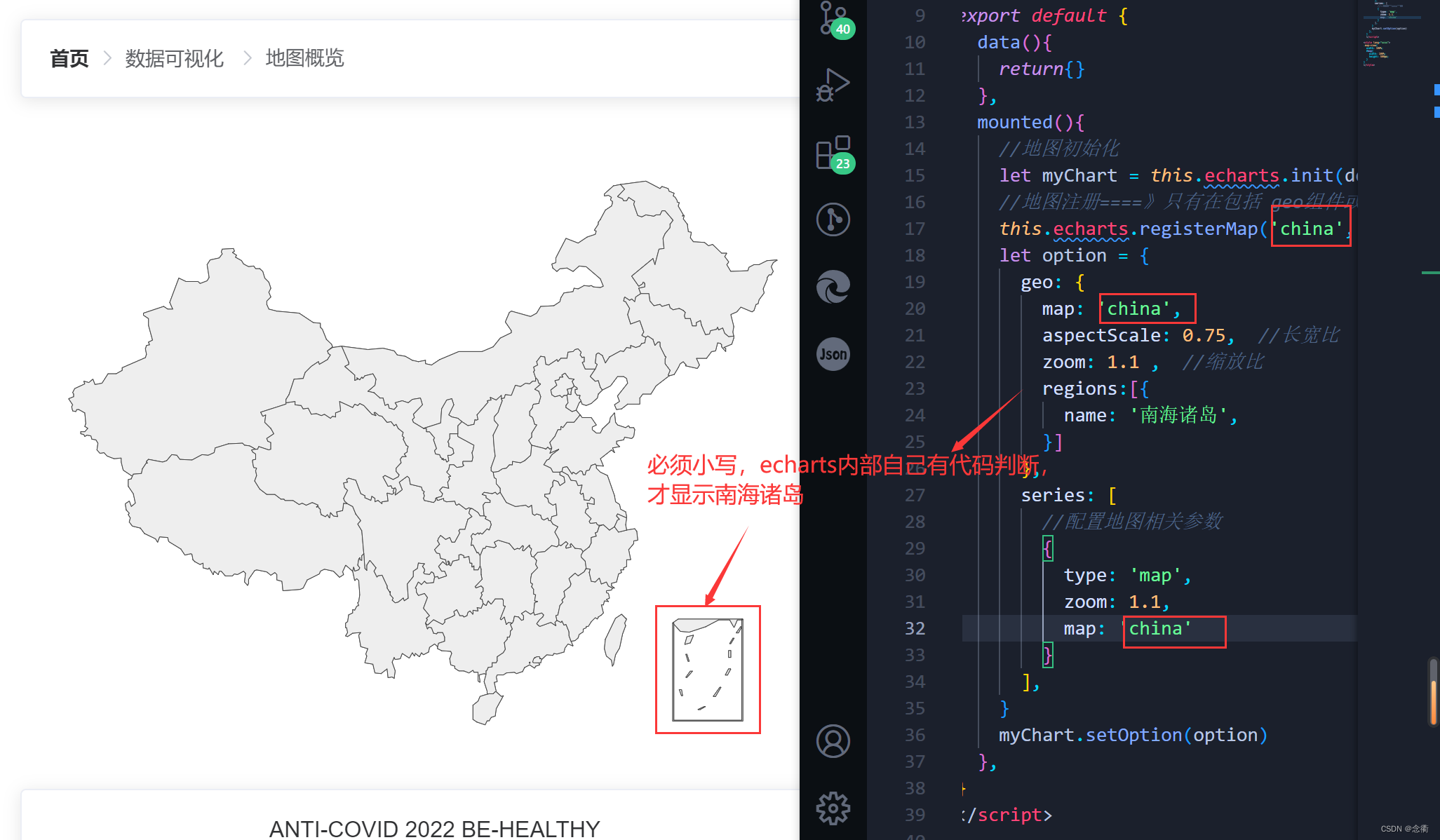
<template>
  <div class="map-view">
    <div id="map"></div>
  </div>
</template>

<script>
import geoJson from "@/assets/data.json";
export default {
  data() {
    return {};
  },
  mounted() {
    //地图初始化
    let myChart = this.echarts.init(document.getElementById("map"));
    //地图注册====》只有在包括 geo组件或者map图表类型的时候才可以使用
    this.echarts.registerMap("china", geoJson);
    let option = {
      backgroundColor: "rgb(121, 145, 209)",
      geo: {
        map: "china",
        aspectScale: 0.75, // scale地图长宽比
        zoom: 1.1,
        itemStyle: {
          normal: {
            areaColor: {
              type: "radial",
              x: 0.5,
              y: 0.5,
              r: 0.8,
              colorStops: [
                {
                  offset: 0,
                  color: "#09132c", // 0%处的颜色
                },
                {
                  offset: 1,
                  color: "#274d68", // 100%处的颜色
                },
              ],
              globalCoord: true,
            },
            shadowColor: "rgb(58, 115, 192)",
            shadowOffsetX: 10,
            shadowOffsetY: 11,
          },
        },
        regions: [
          {
            name: "南海诸岛",
            itemStyle: {
              opacity: 0,   //透明度
            },
          },
        ],
      },
      series: [
        {
          // 配置地图相关参数,绘制地图,这个对象是关于地图图表的相关设置
          type: "map",
          //图形上的文本标签
          label: {
            normal: {
              show: true,
              textStyle: {
                color: "#1DE9B6",
              },
            },
            emphasis: {
              textStyle: {
                color: "rgb(183, 185, 14)",
              },
            },
          },
          zoom: 1.1,
          map: "china",
          itemStyle: {
            normal: {
              backgroundColor: "rgb(147, 235, 248)",
              borderWidth: 1,
              areaColor: {
                type: "radial",
                x: 0.5,
                y: 0.5,
                r: 0.8,
                colorStops: [
                  {
                    offset: 0,
                    color: "rgb(31, 54, 150)", // 0%处的颜色
                  },
                  {
                    offset: 1,
                    color: "rgb(89, 128, 142)", // 100%处的颜色
                  },
                ],
                globalCoord: true,
              },
            },
            emphasis: {
              areaColor: "rgb(46, 229, 206)",
              borderWidth: 0.1,
            },
          },
        },
      ],
    };
    myChart.setOption(option);
  },
};
</script>

<style lang="scss">
.map-view {
  width: 100%;
  #map {
    width: 100%;
    height: 500px;
  }
}
</style>