文章目录
前言
一、shape 是什么?
控件的形状,我们可以通过该shape来定制widget 的形状,来达到自己想还要的形状效果
二、不同的形状
下面的例子以card来给一个card 设置不同的形状
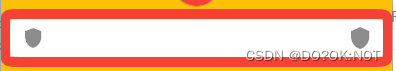
1.BeveledRectangleBorder
矩形边框:
通过调节circular 圆角半径
    return Scaffold(
        backgroundColor: Colors.amber,
        appBar: AppBar(
          // Here we take the value from the MyHomePage object that was created by
          // the App.build method, and use it to set our appbar title.
          title: Text(widget.title),
        ),
        body: const Center(
            child: Card(
              // 矩形边框 side 设置边框的颜色和厚度
          shape: BeveledRectangleBorder(
              borderRadius: BorderRadius.all(Radius.circular(15)),
              side: BorderSide(color: Colors.green, width: 1)),
          child: ListTile(
            trailing: Icon(Icons.shield),
            leading: Icon(Icons.shield_sharp),
          ),
        )));
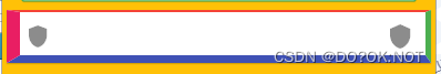
2.Border
代码如下(示例):
可以设置方向的边框颜色和厚度
shape: Border(
          top: BorderSide(color: Colors.red, width: 2),
          right: BorderSide(color: Colors.green, width: 5),
          bottom: BorderSide(color: Colors.indigo, width: 7),
          left: BorderSide(color: Colors.pink, width: 12)),
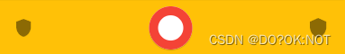
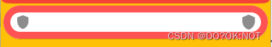
3.CircleBorder圆形
  Card(
      // 圆形
      shape:
          CircleBorder(side: BorderSide(color: Colors.red, width: 10)),
      child: ListTile(
        trailing: Icon(Icons.shield),
        leading: Icon(Icons.shield_sharp),
      ),
    )
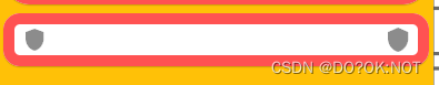
4.ContinuousRectangleBorder连续圆角
  Card(
     // 连续的圆角矩形
     shape: ContinuousRectangleBorder(
         borderRadius: BorderRadius.all(Radius.circular(15)),
         side: BorderSide(color: Colors.red, width: 10)),
     child: ListTile(
       trailing: Icon(Icons.shield),
       leading: Icon(Icons.shield_sharp),
     ),
   )
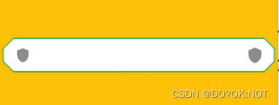
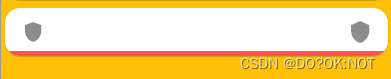
5.StadiumBorder 体育场边界 ,药丸形状
          Card(
              // 药丸形状
              shape: StadiumBorder(
                  side: BorderSide(color: Colors.redAccent, width: 10)),
              child: ListTile(
                trailing: Icon(Icons.shield),
                leading: Icon(Icons.shield_sharp),
              ),
            )
6.OutlineInputBorder外边框可以定制圆角
        Card(
          // 外边框可以定制圆角
          shape: OutlineInputBorder(
              borderRadius: BorderRadius.all(Radius.circular(15)),
              borderSide: BorderSide(color: Colors.redAccent, width: 10)),
          child: ListTile(
            trailing: Icon(Icons.shield),
            leading: Icon(Icons.shield_sharp),
          ),
        )
7.UnderlineInputBorder下划线
       Card(
              // 下划线
              shape: UnderlineInputBorder(
                  borderRadius: BorderRadius.all(Radius.circular(15)),
                  borderSide: BorderSide(color: Colors.redAccent, width: 10)),
              child: ListTile(
                trailing: Icon(Icons.shield),
                leading: Icon(Icons.shield_sharp),
              ),
            )
总结
import 'package:flutter/material.dart';
void main() {
runApp(const MyApp());
}
class MyApp extends StatelessWidget {
const MyApp({
super.key});
// This widget is the root of your application.
Widget build(BuildContext context) {
return MaterialApp(
title: 'Flutter Demo',
theme: ThemeData(
// This is the theme of your application.
//
// Try running your application with "flutter run". You'll see the
// application has a blue toolbar. Then, without quitting the app, try
// changing the primarySwatch below to Colors.green and then invoke
// "hot reload" (press "r" in the console where you ran "flutter run",
// or simply save your changes to "hot reload" in a Flutter IDE).
// Notice that the counter didn't reset back to zero; the application
// is not restarted.
primarySwatch: Colors.blue,
),
home: const MyHomePage(title: 'Flutter Demo Home Page'),
);
}
}
class MyHomePage extends StatefulWidget {
const MyHomePage({
super.key, required this.title});
// This widget is the home page of your application. It is stateful, meaning
// that it has a State object (defined below) that contains fields that affect
// how it looks.
// This class is the configuration for the state. It holds the values (in this
// case the title) provided by the parent (in this case the App widget) and
// used by the build method of the State. Fields in a Widget subclass are
// always marked "final".
final String title;
State<MyHomePage> createState() => _MyHomePageState();
}
class _MyHomePageState extends State<MyHomePage> {
Widget build(BuildContext context) {
return Scaffold(
backgroundColor: Colors.amber,
appBar: AppBar(
// Here we take the value from the MyHomePage object that was created by
// the App.build method, and use it to set our appbar title.
title: Text(widget.title),
),
body: Center(
child: Column(
children: const [
Card(
// 矩形边框 side 设置边框的颜色和厚度
shape: BeveledRectangleBorder(
borderRadius: BorderRadius.all(Radius.circular(15)),
side: BorderSide(color: Colors.green, width: 1)),
child: ListTile(
trailing: Icon(Icons.shield),
leading: Icon(Icons.shield_sharp),
),
),
Card(
// 矩形边框 side 设置边框的颜色和厚度
shape: Border(
top: BorderSide(color: Colors.red, width: 2),
right: BorderSide(color: Colors.green, width: 5),
bottom: BorderSide(color: Colors.indigo, width: 7),
left: BorderSide(color: Colors.pink, width: 12)),
child: ListTile(
trailing: Icon(Icons.shield),
leading: Icon(Icons.shield_sharp),
),
),
Card(
// 圆形
shape:
CircleBorder(side: BorderSide(color: Colors.red, width: 10)),
child: ListTile(
trailing: Icon(Icons.shield),
leading: Icon(Icons.shield_sharp),
),
),
Card(
// 连续的圆角矩形
shape: ContinuousRectangleBorder(
borderRadius: BorderRadius.all(Radius.circular(15)),
side: BorderSide(color: Colors.red, width: 10)),
child: ListTile(
trailing: Icon(Icons.shield),
leading: Icon(Icons.shield_sharp),
),
),
Card(
// 药丸形状
shape: StadiumBorder(
side: BorderSide(color: Colors.redAccent, width: 10)),
child: ListTile(
trailing: Icon(Icons.shield),
leading: Icon(Icons.shield_sharp),
),
),
Card(
// 外边框可以定制圆角
shape: OutlineInputBorder(
borderRadius: BorderRadius.all(Radius.circular(15)),
borderSide: BorderSide(color: Colors.redAccent, width: 10)),
child: ListTile(
trailing: Icon(Icons.shield),
leading: Icon(Icons.shield_sharp),
),
),
Card(
// 下划线
shape: UnderlineInputBorder(
borderRadius: BorderRadius.all(Radius.circular(15)),
borderSide: BorderSide(color: Colors.redAccent, width: 10)),
child: ListTile(
trailing: Icon(Icons.shield),
leading: Icon(Icons.shield_sharp),
),
)
],
)));
}
}
欢迎关注,留言,咨询,交流!