Flutter 的 Decoration 就是 android 的 shape,可以设置:背景色 背景图 边框 圆角 阴影 渐变色 的等属性,Decoration 是基类,我们一般都是用 Decoration 的子类:BoxDecoration
BoxDecoration属性
Flutter 里我们看一个 Weight 有什么属性的话直接看构造函数就行,BoxDecoration 支持的属性如下:
const BoxDecoration({
this.color,//背景色
this.image,//图片
this.border,//描边
this.borderRadius,//圆角大小
this.boxShadow,//阴影
this.gradient,//渐变色
this.backgroundBlendMode,//图像混合模式,具体去百度
this.shape = BoxShape.rectangle,//形状,BoxShape.circle和borderRadius不能同时使用
})
复制代码
Decoration 常用属性如下,一看就懂,我就不详细展开了,下面我介绍一些生僻、容易忘的
      decoration: BoxDecoration(
        // 背景色
        color: Colors.lightBlueAccent,
        // 边框,
        border: Border.all(color: Colors.yellowAccent, style: BorderStyle.solid, width: 5),
        // 背景图
        image: new DecorationImage(
            image: new NetworkImage(
                'XXXUrl'
                fit: BoxFit.cover),
        ),
        // 边框圆角
        borderRadius: BorderRadius.all(Radius.circular(30)),
        // 子 weight
        child: Text("AAAAAA"),
    );
复制代码
boxShadow 阴影
Decoration 可以添加多个阴影,因为 this.boxShadow 属性接收多个参数,这是要闹啥啊...真不懂啊
BoxShadow 有4 个参数:
- color - 阴影颜色
- offset - 阴影相偏移量
- blurRadius - 高斯模糊数值
- spreadRadius - 阴影膨胀量,这个值我是真不知有啥用,没场景啊,一般不写这个值
boxShadow: [
          BoxShadow(
            color: Colors.redAccent,
            offset: Offset(20, 20),
            blurRadius: 10,
          ),
        ]
复制代码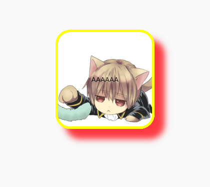
上面的例子很难看,因为我们可能不知道阴影实际应该设置多大,这点可以参考官方文档的例子:
 DecoratedBox(
    decoration: BoxDecoration(
      gradient: LinearGradient(colors:[Colors.red,Colors.orange[700]]), //背景渐变
      borderRadius: BorderRadius.circular(3.0), //3像素圆角
      boxShadow: [ //阴影
        BoxShadow(
            color:Colors.black54,
            offset: Offset(2.0,2.0),
            blurRadius: 4.0
        )
      ]
    ),
  child: Padding(padding: EdgeInsets.symmetric(horizontal: 80.0, vertical: 18.0),
    child: Text("Login", style: TextStyle(color: Colors.white),),
  )
)
复制代码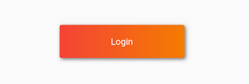
gradient 渐变
这部分和 android shape 的渐变差不多,区别是设置不同罢了,android shape 可以看:xml_绘图: shape 篇
Decoration 支持2种渐变:LinearGradient线性渐变 和 RadialGradient扫描渐变
- begin - 渐变开始的位置
- end - 渐变结束的位置
- colors - 渐变颜色,是数组
- stops - 值列表,装有0.0到1.0的数值
- tileMode - 平铺模式
- 基本设置:
gradient: LinearGradient(colors: [
    Colors.red,
    Colors.white,
    Colors.blue,
]),
复制代码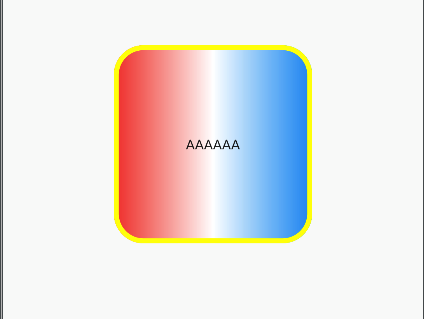
- 控制渐变方向
begin、end 3个参数可以控制渐变方向,默认都是左 -> 右,这里我们来个 右 -> 左
gradient: LinearGradient(colors: [
    Colors.red,
    Colors.white,
    Colors.blue,
  ],
  begin: Alignment.centerRight,
  end: Alignment.centerLeft,
),
复制代码
另外写数值也可以,比如:
end: Alignment(0.6,0.0)
复制代码
0.6 表示的是百分比,1 最大

- TileMode 平铺
TileMode 平铺就是如何重重复渐变色:
- TileMode.clamp - 默认,没效果
- TileMode.mirror - 镜面反射
- TileMode.repeated - 重复
具体效果大家看图:

- stops 渐变分割
stops 这个渐变分割可以理解成每段渐变占的百分比,stops 也是一个数组,个数必须和 colors 中颜色值个数匹配,要不显示不出来,其次 stops 里的数值综合最好 = 1,否则显示有偏差,最后 stops 里的数值必须是升序的...要不一样显示不出来
gradient: LinearGradient(
    colors: [
      Colors.red,
      Colors.white,
      Colors.blue,
    ],
    begin: Alignment.centerRight,
    end: Alignment.centerLeft,
    stops: [0.1,0.3,0.7],
),
复制代码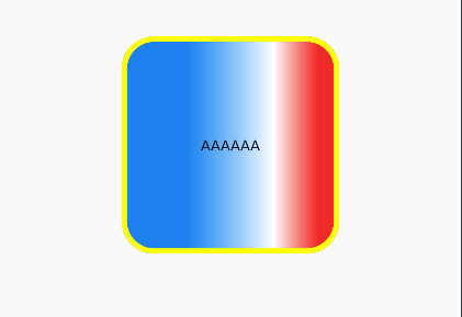
center - 渐变中心 radius - 渐变半径,浮点数 colors - 渐变颜色,是数组 stops - 渐变分割 tileMode - 平铺模式
看了上面线性渐变,这些属性大家应该都清楚了,RadialGradient 默认就是中心点的,所以 center 的值都是在中心点上的偏移了,要是想从中心点开始,那就用 Alignment(0.0,0.0)。radius 半径用的是 0-1 的小数,表示百分比
gradient: RadialGradient(
    colors: [
      Colors.red,
      Colors.blue,
    ],
    center: Alignment(0.0,0.0),
    radius: 0.5,
),
复制代码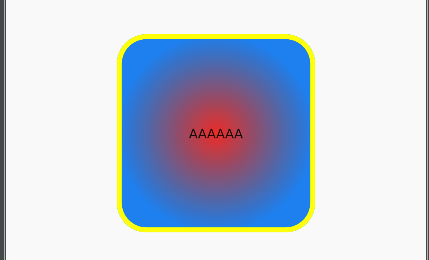
一个很有借鉴意义的 RadialGradient 例子
Container(
  margin: EdgeInsets.only(top: 50.0, left: 120.0), //容器外补白
  constraints: BoxConstraints.tightFor(width: 200.0, height: 150.0), //卡片大小
  decoration: BoxDecoration(//背景装饰
      gradient: RadialGradient( //背景径向渐变
          colors: [Colors.red, Colors.orange],
          center: Alignment.topLeft,
          radius: .98
      ),
      boxShadow: [ //卡片阴影
        BoxShadow(
            color: Colors.black54,
            offset: Offset(2.0, 2.0),
            blurRadius: 4.0
        )
      ]
  ),
  transform: Matrix4.rotationZ(.2), //卡片倾斜变换
  alignment: Alignment.center, //卡片内文字居中
  child: Text( //卡片文字
    "5.20", style: TextStyle(color: Colors.white, fontSize: 40.0),
  ),
);
复制代码
shape 形状
和 android 一样,shape 都是北京形状,Flutter 少了圆环,只能是:rectangle矩形或是circle圆形,BoxShape.circle 和 borderRadius 圆角冲突,只能使用一个
      decoration: BoxDecoration(
          border: Border.all(
              color: Colors.yellowAccent, style: BorderStyle.solid, width: 5),
          image: new DecorationImage(
              image: new NetworkImage('xxx'),
              fit: BoxFit.cover),
          shape: BoxShape.circle
          child: Text("AAAAAA"),
    );
复制代码