Flutter 里有很多的 Button 组件很多,常见的按钮组件有:ElevatedButton、TextButton、IconButton、OutlinedButton、ButtonBar、FloatingActionButton 等。
ElevatedButton(旧版本的RaisedButton) :凸起的按钮,其实就是 Material Design 风格的 Button,较RaisedButton,ElevatedButton会自带背景色
OutlinedButton(旧版本OutlineButton):线框按钮,默认有一个边框,不带阴影且背景透明.按下后,边框颜色会变亮、同时出现背景和阴影(通过side配置边框);
TextButton(旧版本FlatButton):文本按钮,默认背景透明并不带阴影.按下后,会有背景色
IconButton :图标按钮,是一个可点击的Icon,不包括文字,默认没有背景,点击后会出现背景,默认用于导航条;
ButtonBar:按钮组,可以默认实现一个按钮组,通过 children 属性可以传入多个 Button。
FloatingActionButton:浮动按钮,我们会单独拎出来演示
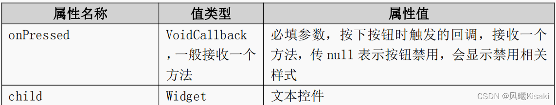
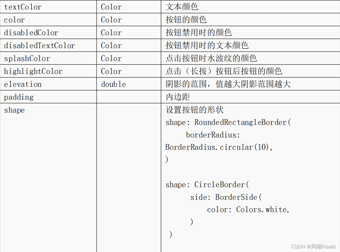
常用属性:
新增的三个Button组件:ElevatedButton,OutlinedButton,TextButton三者用法基本一致,所以三者基本只演示了ElevatedButton,想详细了解的可以看看这个博主的*Flutter的button的按钮ElevatedButton ,总结的非常详细
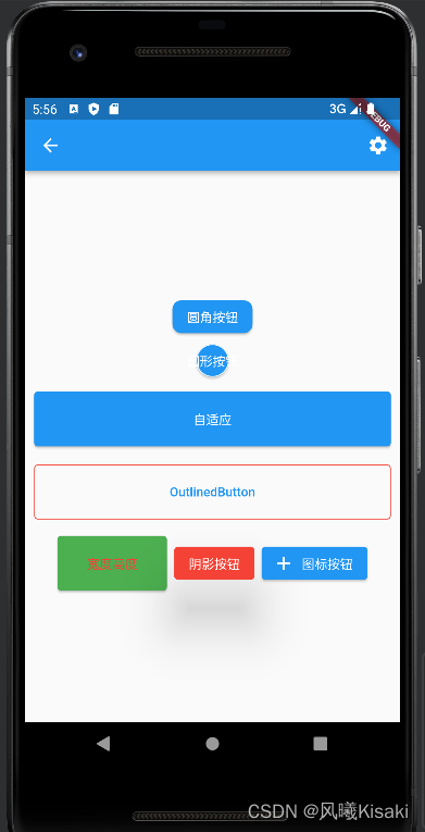
基本按钮组件及样式演示:
import 'package:flutter/material.dart';

class ButtonDemoPage extends StatelessWidget {


  const ButtonDemoPage({

    Key? key}) : super(key: key);

  @override
  Widget build(BuildContext context) {


    return Scaffold(
      appBar: AppBar(
        actions: [IconButton(onPressed: () {

    }, icon: Icon(Icons.settings))],
      ),
      body: Column(
        mainAxisAlignment: MainAxisAlignment.center,
        crossAxisAlignment: CrossAxisAlignment.center,
        children: [
          ElevatedButton(
            onPressed: () {

    },
            child: Text('圆角按钮'),
            style: ButtonStyle(
                shape: MaterialStateProperty.all(RoundedRectangleBorder(
                    borderRadius: BorderRadius.circular(10)))),
          ),
          ElevatedButton(
            onPressed: () {

    },
            child: Text('圆形按钮'),
            style: ButtonStyle(
                shape: MaterialStateProperty.all(CircleBorder(
                    side: BorderSide(color: Colors.white)
                ))),
          ),
          Row(
            mainAxisAlignment: MainAxisAlignment.center,
            children: [
              Expanded(
                  child: Container(
                    height: 60,
                    margin: EdgeInsets.all(10),
                    child: ElevatedButton(
                      onPressed: () {

    },
                      child: Text('自适应'),
                    ),
                  )
              ),
            ],
          ),
          Row(
            mainAxisAlignment: MainAxisAlignment.center,
            children: [
              Expanded(
                  child: Container(
                    height: 60,
                    margin: EdgeInsets.all(10),
                    child: OutlinedButton(
                      onPressed: () {

    },
                      child: Text('OutlinedButton'),
                      style: ButtonStyle(
                        side: MaterialStateProperty.all(BorderSide(width: 1,color: Colors.red))
                      ),
                    ),
                  )
              ),
            ],
          ),
          Row(
            mainAxisAlignment: MainAxisAlignment.center,
            children: [
              ButtonBar(
                children: [
                  Container(
                    height: 60,
                    width: 120,
                    child: ElevatedButton(
                      onPressed: () {

    },
                      child: Text('宽度高度'),
                      style: ButtonStyle(
                          backgroundColor:
                              MaterialStateProperty.all(Colors.green), //背景色
                          foregroundColor:
                              MaterialStateProperty.all(Colors.red) //字体色
                          ),
                    ),
                  ),
                  ElevatedButton(
                    onPressed: () {

    },
                    child: Text('阴影按钮'),
                    style: ButtonStyle(
                        backgroundColor: MaterialStateProperty.all(Colors.red),
                        foregroundColor:
                            MaterialStateProperty.all(Colors.white),
                        elevation: MaterialStateProperty.all(50) //阴影
                        ),
                  ),
                  ElevatedButton.icon(
                      onPressed: () {

    },
                      icon: Icon(Icons.add),
                      label: Text('图标按钮')),
                ],
              )
            ],
          )
        ],
      ),
    );
  }
}
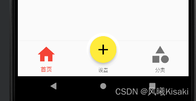
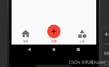
FloatingActionButton浮动按钮
FloatingActionButton 简称 FAB ,可以实现浮动按钮,也可以实现类似闲鱼 app 的地步凸起导航,与appbar同级
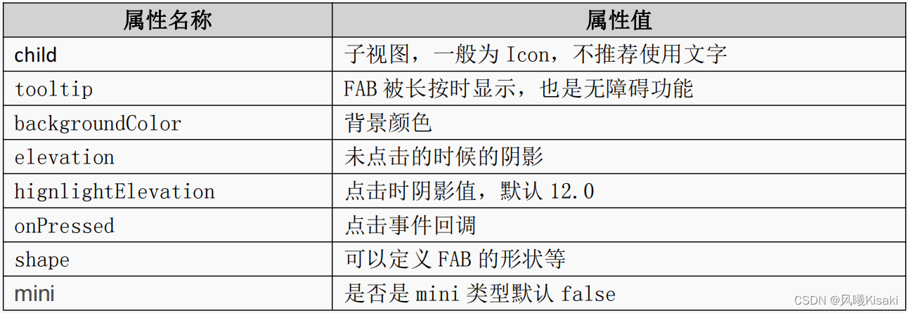
常用属性:
实现类似闲鱼底部凸起导航按钮的思路:因为FloatingActionButton本身没有给调整按钮大小的组件,所以我们可以将它套入一个Container中,利用容器的属性来调整按钮的大小
      floatingActionButton: Container(
        width: 80,
        height: 80,
        padding: EdgeInsets.all(8),
        margin: EdgeInsets.only(top: 40),
        decoration: BoxDecoration(
          borderRadius: BorderRadius.circular(40),
          color: Colors.white,
        ),
        //实现圆形白边
        child: FloatingActionButton(
          onPressed: () {


            setState(() {


              _currentIndex=1;
            });
          },//按下按钮跳转到索引值为1的页面
          child: Icon(
            Icons.add,
            color: Colors.black,
            size: 40,
          ),
          backgroundColor: this._currentIndex==1?Colors.red:Colors.yellow,//点击改变背景色
        ),
      ),
      floatingActionButtonLocation: FloatingActionButtonLocation.centerDocked,
自定义按钮组件:
class RaisedButton extends StatelessWidget {


  final text;
  final pressed;
  final width;
  final height;
  const RaisedButton({

    this.text='',this.pressed=null,this.width=80,this.height=30,});

  @override
  Widget build(BuildContext context) {


    return Container(
      width: this.width,
      height: this.height,

      child: ElevatedButton(onPressed: (){

    }, child: Text(this.text)),
    );
  }
}
这里,我们自定义的按钮组件就完成了。因为flutter更新也比较快,废弃的组件也比较多,如果特别喜欢使用用某种已废弃组件,那么可以通过这种方式来创建它