分享一个大佬的自定义组件demo。
更多demo请移步github:
 https://github.com/shang1219178163/flutter_templet_projec
数量计步器 NumberStepper

//...
              NumberStepper(
                minValue: 1,
                maxValue: 1000,
                stepValue: 100,
                iconSize: 60,
                value: 1000,
                color: Colors.blue,
                style: NumberStepperStyle.system,
                block: (value){
                  DDLog(value);
                },
              ),

              SizedBox(height: 20,),
              NumberStepper(
                minValue: 1,
                maxValue: 1000,
                stepValue: 100,
                iconSize: 40,
                value: 1000,
                color: Colors.blue,
                style: NumberStepperStyle.outlined,
                block: (value){
                  DDLog(value);
                },
            ),

//...
如果打不开,这里是源码:
//
// NumberStepper.dart
// flutter_templet_project
//
// Created by shang on 6/13/21 6:23 AM.
// Copyright © 6/13/21 shang. All rights reserved.
//
// ignore: must_be_immutable
import 'package:flutter/cupertino.dart';
import 'package:flutter/material.dart';
import 'package:flutter_templet_project/extensions/ddlog.dart';
enum NumberStepperStyle {
system,
outlined,
textfield,
}
///自定义数值增减 Stepper
class NumberStepper extends StatefulWidget {
NumberStepper({
required this.minValue,
required this.maxValue,
required this.stepValue,
this.iconSize = 24,
required this.value,
this.color = Colors.blue,
this.style = NumberStepperStyle.system,
this.radius = 5.0,
this.wraps = true,
required this.block,
});
final int minValue;
final int maxValue;
final int stepValue;
final double iconSize;
int value;
final bool wraps;
final Color color;
final NumberStepperStyle style;
final double radius;
void Function(int value) block;
@override
_NumberStepperState createState() => _NumberStepperState();
}
class _NumberStepperState extends State<NumberStepper> {
// 控制器
final _textController = TextEditingController();
// 焦点
final focusNode1 = FocusNode();
@override
void initState() {
// TODO: implement initState
_textController.text = "${widget.value}";
ddlog(_textController.text);
super.initState();
}
@override
Widget build(BuildContext context) {
// return buildOther(context);
switch (widget.style) {
case NumberStepperStyle.outlined:
return buildOutlinedStyle(context);
break;
case NumberStepperStyle.textfield:
return buildTexfieldStyle(context);
default:
break;
}
return buildSystemStyle(context);
}
Widget buildSystemStyle(BuildContext context) {
return Row(
mainAxisAlignment: MainAxisAlignment.center,
children: [
Container(
width: widget.iconSize,
height: widget.iconSize,
decoration: BoxDecoration(
color: widget.color,
borderRadius: BorderRadius.circular(widget.radius),
border: Border.all(color: widget.color, width: 1), // 边色与边宽度
),
child: IconButton(
icon: Icon(Icons.remove, size: widget.iconSize),
// iconSize: widget.iconSize,
padding: EdgeInsets.zero,
color: Colors.white,
onPressed: () {
go(-widget.stepValue);
},
),
),
Container(
width: widget.value.toString().length*18*widget.iconSize/30,
// width: widget.iconSize + 20,
child: Text('${widget.value}',
style: TextStyle(
fontSize: widget.iconSize * 0.8,
),
textAlign: TextAlign.center,
),
),
Container(
width: widget.iconSize,
height: widget.iconSize,
decoration: BoxDecoration(
color: widget.color,
borderRadius: BorderRadius.circular(widget.radius),
border: Border.all(color: widget.color, width: 1), // 边色与边宽度
),
child: IconButton(
icon: Icon(Icons.add, size: widget.iconSize,),
// iconSize: widget.iconSize,
padding: EdgeInsets.zero,
color: Colors.white,
onPressed: () {
setState(() {
go(widget.stepValue);
});
},
),
),
],
);
}
Widget buildOutlinedStyle(BuildContext context) {
return Row(
mainAxisAlignment: MainAxisAlignment.center,
children: [
Container(
width: widget.iconSize,
height: widget.iconSize,
// color: Theme.of(context).primaryColor,
decoration: BoxDecoration(
color: Colors.white,
borderRadius: BorderRadius.circular(widget.radius),
border: Border.all(color: widget.color, width: 1), // 边色与边宽度
),
child: IconButton(
icon: Icon(Icons.remove, size: widget.iconSize),
// iconSize: widget.iconSize,
padding: EdgeInsets.zero,
color: widget.color,
onPressed: () {
go(-widget.stepValue);
},
),
),
Container(
width: widget.value.toString().length*18*widget.iconSize/30,
// width: widget.iconSize + 20,
child: Text('${widget.value}',
style: TextStyle(
fontSize: widget.iconSize * 0.8,
),
textAlign: TextAlign.center,
),
),
Container(
width: widget.iconSize,
height: widget.iconSize,
// color: Theme.of(context).primaryColor,
decoration: BoxDecoration(
color: Colors.white,
borderRadius: BorderRadius.circular(widget.radius),
border: Border.all(color: widget.color, width: 1), // 边色与边宽度
),
child: IconButton(
icon: Icon(Icons.add, size: widget.iconSize),
// iconSize: widget.iconSize,
padding: EdgeInsets.zero,
color: widget.color,
onPressed: () {
setState(() {
go(widget.stepValue);
});
},
),
),
],
);
}
Widget buildTexfieldStyle(BuildContext context) {
return Row(
mainAxisAlignment: MainAxisAlignment.center,
children: [
Expanded(
child: TextField(
enableInteractiveSelection: false,
toolbarOptions: ToolbarOptions(
copy:false,
paste: false,
cut: false,
selectAll: false,
//by default all are disabled 'false'
),
controller: _textController,
decoration: InputDecoration(
// labelText: "请输入内容",//输入框内无文字时提示内容,有内容时会自动浮在内容上方
// helperText: "随便输入文字或数字", //输入框底部辅助性说明文字
prefixIcon:IconButton(
icon: Icon(
Icons.remove,
size: widget.iconSize,
),
onPressed: (){
// go(-widget.stepValue);
setState(() {
go(-widget.stepValue);
_textController.text = "${widget.value}";
});
},
),
border: OutlineInputBorder(
borderRadius: BorderRadius.circular(4.0) //圆角大小
),
suffixIcon: IconButton(
icon: Icon(
Icons.add,
size: widget.iconSize,
),
onPressed: (){
// go(widget.stepValue);
setState(() {
// FocusScope.of(context).requestFocus(FocusNode());
go(widget.stepValue);
_textController.text = "${widget.value}";
});
},
),
contentPadding: const EdgeInsets.only(bottom:8)
),
keyboardType: TextInputType.number,
),
),
],
);
}
void go(int stepValue) {
setState(() {
if (stepValue < 0 && (widget.value == widget.minValue || widget.value + stepValue < widget.minValue)) {
ddlog("it's minValue!");
if (widget.wraps) widget.value = widget.maxValue;
widget.block(widget.value);
return;
}
if (stepValue > 0 && (widget.value == widget.maxValue || widget.value + stepValue > widget.maxValue)) {
ddlog("it's maxValue!");
if (widget.wraps) widget.value = widget.minValue;
widget.block(widget.value);
return;
}
widget.value += stepValue;
});
widget.block(widget.value);
}
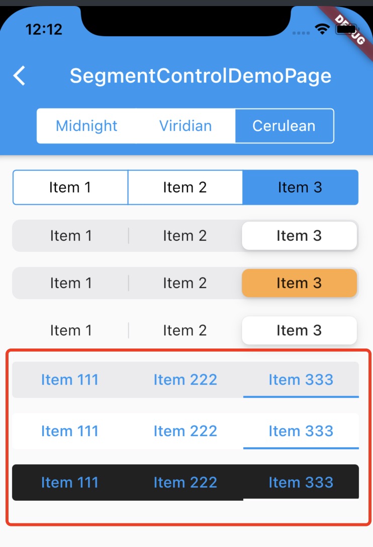
}LineSegmentControl / 线条指示器分段组件
扫描二维码关注公众号,回复:
14338204 查看本文章

//...
        SizedBox(height: 15),
        buildLineSegmentControl(null, lineColor: Colors.blue),

        SizedBox(height: 15),
        buildLineSegmentControl(Colors.white, lineColor: Colors.blue),

        SizedBox(height: 15),
        buildLineSegmentControl(Colors.black87, lineColor: Colors.white),
//...
  Widget buildLineSegmentControl(Color? backgroundColor, {required Color lineColor}) {
    final Map<int, Widget> children = const <int, Widget>{
      0: Text("Item 111", style: TextStyle(fontSize: 15), textAlign: TextAlign.center,),
      1: Text("Item 222", style: TextStyle(fontSize: 15), textAlign: TextAlign.center,),
      2: Text("Item 333", style: TextStyle(fontSize: 15), textAlign: TextAlign.center,),
    };

    if (backgroundColor != null) {
      return LineSegmentControl(
        groupValue: groupValue,
        children: children,
        backgroundColor: backgroundColor,
        lineColor: lineColor,
        onValueChanged: (i){
          setState(() {
            groupValue = int.parse("$i");
          });
          DDLog(groupValue);
        },
      );
    }
    return LineSegmentControl(
      groupValue: groupValue,
      children: children,
      // backgroundColor: backgroundColor,
      lineColor: lineColor,
      onValueChanged: (i){
        setState(() {
          groupValue = int.parse("$i");
        });
        DDLog(groupValue);
      },
    );
  }
//
//  LineSegmentWidget.dart
//  fluttertemplet
//
//  Created by shang on 6/14/21 8:47 AM.
//  Copyright © 6/14/21 shang. All rights reserved.
//

import 'dart:ui';

import 'package:flutter/cupertino.dart';
import 'package:flutter/material.dart';
import 'package:flutter/widgets.dart';
import 'package:fluttertemplet/dartExpand/DDLog.dart';


enum LineSegmentStyle {
  top,
  bottom,
}

///线条指示器分段组件
class LineSegmentControl<T> extends StatefulWidget {

  final Map<T, Widget> children;

  T? groupValue;

  final EdgeInsetsGeometry padding;
  final EdgeInsetsGeometry margin;

  final LineSegmentStyle style;

  final Color? backgroundColor;
  final Color lineColor;

  final double height;

  final Radius radius;

  void Function(T value) onValueChanged;

  LineSegmentControl({
    Key? key,
    required this.children,
    required this.groupValue,
    this.style = LineSegmentStyle.bottom,
    this.backgroundColor = CupertinoColors.tertiarySystemFill,
    this.lineColor = Colors.blue,
    this.height = 36,
    this.padding = const EdgeInsets.symmetric(horizontal: 0),
    this.margin = const EdgeInsets.symmetric(horizontal: 15),
    this.radius = const Radius.circular(4),
    required this.onValueChanged,
  }) : super(key: key);


  @override
  _LineSegmentControlState createState() => _LineSegmentControlState();
}

class _LineSegmentControlState extends State<LineSegmentControl> {

  @override
  Widget build(BuildContext context) {
    double screenWidth = MediaQuery.of(context).size.width;

    double contentWidth = screenWidth - widget.margin.horizontal - widget.padding.horizontal;
    double itemWidth = contentWidth / widget.children.values.length;

    return Container(
      margin: widget.margin,
      padding: widget.padding,
      decoration: BoxDecoration(
        color: widget.backgroundColor,
        borderRadius: BorderRadius.all(widget.radius),
      ),
      child: Stack(
        children: [
          Row(
            children: widget.children.values.map((e) => Column(
              crossAxisAlignment: CrossAxisAlignment.center,
              mainAxisSize: MainAxisSize.min,
              children: <Widget>[
                Container(
                  height: widget.height,
                  width: itemWidth,
                  child: TextButton(
                    child: e,
                    onPressed: (){
                      DDLog(e);
                      setState(() {
                        widget.groupValue = widget.children.values.toList().indexOf(e);
                      });
                      widget.onValueChanged(widget.groupValue);
                    },
                  ),
                ),
              ],
            ),
            ).toList(),
          ),
          AnimatedPositioned(
            duration: Duration(milliseconds: 200),
            top: widget.style == LineSegmentStyle.top ? 0 : widget.height - 2,
            left: widget.groupValue*itemWidth,
            child: Container(
              height: 2,
              width: itemWidth,
              color: widget.lineColor,
              // decoration: BoxDecoration(
              //   borderRadius: BorderRadius.circular(4),
              //   color: widget.lineColor,
              // ),
            ),
          ),
        ],
      ),
    );
  }
}