1.HTML+CSS+jquery 实现环形比例图效果
2.AngularJS+css实现环形比例图效果

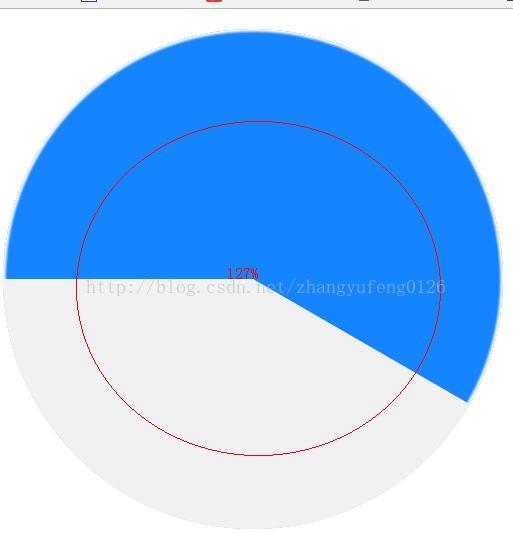
1. HTML+CSS+jquery 实现环形比例图效果
HMTL代码
<!doctype html>
<html>
<head>
    <meta http-equiv="Content-Type" content="text/html; charset=utf-8">
    <title>百分比</title>
    <style type="text/css">
        .yuan{ width:200px; height:200px; margin:0 auto; box-sizing:border-box; padding-top:20px; text-align:center; background-color:#f1f1f1; border-radius:50%; position:relative;}
        .yuan_bl1 , .yuan_bl2 , .yuan_bl3 , .yuan_bl4{ width:100%; height:100%; border-radius:50%; position:absolute; left:0; top:0;}
        .yuan_bl1 , .yuan_bl2{ background-color:#1585ff; -webkit-box-shadow:0 0 1px 1px #fff inset; box-shadow:0 0 1px 1px #fff inset;}
        .yuan_bl3 , .yuan_bl4{ background-color:#f1f1f1;}
        .yuan_bl1 , .yuan_bl3{ clip:rect(0 200px 200px 100px);}
        .yuan_bl2 , .yuan_bl4{ clip:rect(0 100px 200px 0);}
        .yuan_text{ width:180px; height:180px;  line-height:180px; box-sizing:border-box; padding-left:5px; margin:-10px auto; color:#1585ff; font-size:36px; font-family:"PingFangSC-Thin","sans-serif","STHeitiSC-Light","微软雅黑","Microsoft YaHei"; background-color:#fff; border-radius:50%; position:relative;}
    </style>
    <script type="text/javascript" src="js/jquery.js"></script>
</head>
<body>
<div class="yuan">
   <div class="yuan_bl1">
      <div class="yuan_bl3" style="-webkit-transform:rotate(50deg);transform:rotate(50deg);"></div>

    </div>
   <!-- <div class="yuan_bl2">
    <div class="yuan_bl4" style="-webkit-transform:rotate(30deg);transform:rotate(30deg);"></div>
    </div>-->
    <div class="yuan_text">270.8°</div>
</div>
<script>
   /* $(function(){
        //初始化
        var bl = parseInt($('.yuan_text').html());
        var rotatenum = bl;
        if(bl > 180){
            var blhtml = '';
            rotatenum = bl - 180;
            blhtml += '<div class="yuan_bl2">';
            blhtml += '<div class="yuan_bl4" style="-webkit-transform:rotate(' + rotatenum + 'deg);transform:rotate(' + rotatenum + 'deg);"></div>';
            blhtml += '</div>';
            //$('.yuan_bl1').remove($('.yuan_bl3'));
            $('.yuan_bl1').after(blhtml);
        }else{
            var blhtml = '';
            blhtml += '<div class="yuan_bl3" style="-webkit-transform:rotate(' + rotatenum + 'deg);transform:rotate(' + rotatenum + 'deg);"></div>';
            $('.yuan_bl1').append(blhtml);
        }
    })*/
</script>
</body>
</html>
2.AngularJS+css实现环形比例图效果
代码:
        <div class="hlyw-yh-r">
           <div class="hlyw-yuanhuan">
               <div class="yuan">
                   <div class="yuan_bl1">
                      <div ng-if="(x.discRate|number:1)*3.6<180" class="yuan_bl3" style="-webkit-transform:rotate({{x.discRate*3.6}}deg);transform:rotate({{x.discRate*3.6}}deg);"></div>

                   </div>
                   <div class="yuan_bl2" ng-if="(x.discRate|number:1)*3.6>180">
                       <div class="yuan_bl4" style="-webkit-transform:rotate({{x.discRate*3.6-180}}deg);transform:rotate({{x.discRate*3.6-180}}deg);"></div>
                   </div>
                   <div class="yuan_text">{{x.discRate|number:1}}<span class="span-color-size-L">%</span></div>
               </div>
           </div>
         <div class="hlyw-yuanhuan-x">
             离散率
         </div>
        </div>
.hlyw-yh-r{
    width:80px;
    height: 105px;
    float: left;
}
.hlyw-yuanhuan{
    width:80px;
    height: 80px;
}
.hlyw-yuanhuan-x{
    width:80px;
    height: 25px;
    text-align: center;
    line-height: 25px;
    font-size: 18px;
    color: #8c8c9d;
}

/* div 百分比圆环*/
.yuan{ width:80px; height:80px; margin:0 auto; box-sizing:border-box; padding-top:20px; text-align:center; background-color:#f1f1f1; border-radius:50%; position:relative;}
.yuan_bl1 , .yuan_bl2 , .yuan_bl3 , .yuan_bl4{ width:100%; height:100%; border-radius:50%; position:absolute; left:0; top:0;}
.yuan_bl1 , .yuan_bl2{ background-color:#1585ff; -webkit-box-shadow:0 0 1px 1px #fff inset; box-shadow:0 0 1px 1px #fff inset;}
.yuan_bl3 , .yuan_bl4{ background-color:#f1f1f1;}
.yuan_bl1 , .yuan_bl3{ clip:rect(0 80px 80px 40px);}
.yuan_bl2 , .yuan_bl4{ clip:rect(0 40px 80px 0);}
.yuan_text{ width:62px; height:62px;  line-height:62px; box-sizing:border-box; padding-left:5px; margin:-10px auto; color:#1585ff; font-size:18px; font-family:"PingFangSC-Thin","sans-serif","STHeitiSC-Light","微软雅黑","Microsoft YaHei"; background-color:#fff; border-radius:50%; position:relative;}