效果演示
未添加高斯模糊的效果:
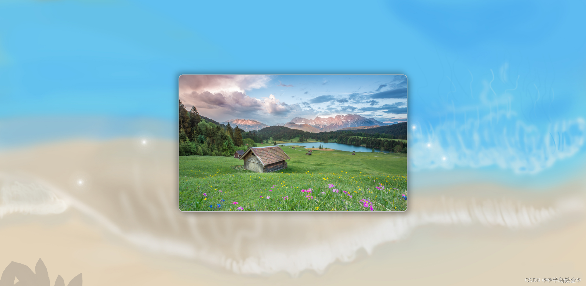
代码:
body {
    background: url(./images/bg.jpg);
    background-size: cover;
}添加了高斯模糊的效果:
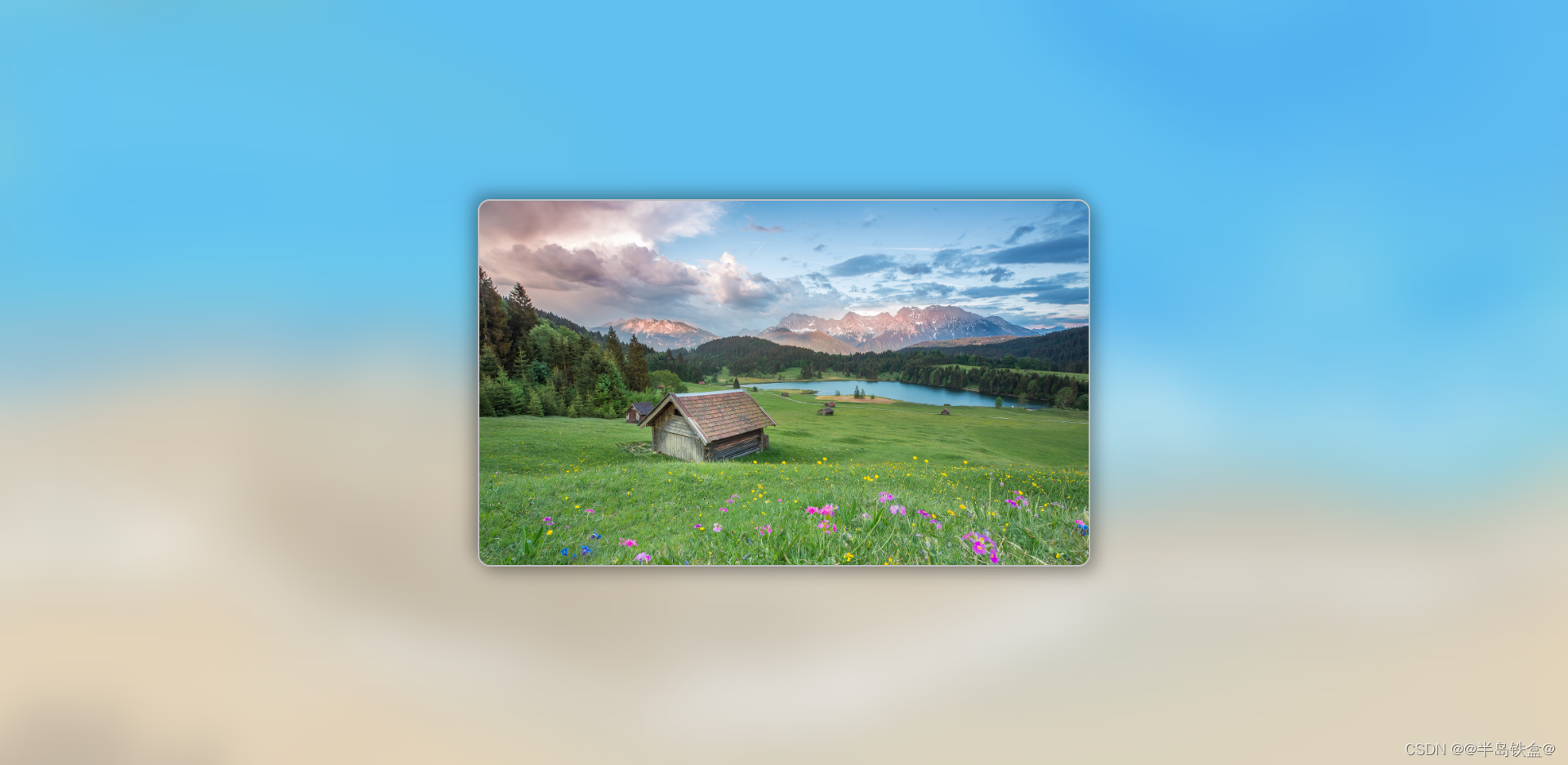
代码:
body {
    /* 省略部分代码 */
}
body::before {
    content: "";
    position: absolute; /* 一定要用绝对定位 */
    width: 100%;
    height: 100%;
    backdrop-filter: blur(30px); /* 模糊半径 */
}
这里是通过 ::before 伪元素实现,原理就是给 body 添加了一个拥有高斯模糊的遮罩层。
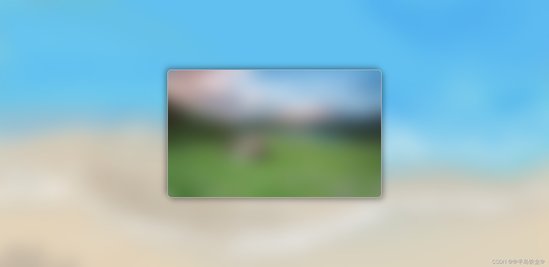
当然也适用于其他元素,举个例子:
扫描二维码关注公众号,回复:
14660100 查看本文章

代码:
.img-show {
    /* 省略部分代码 */
}
.img-show::before {
    content: "";
    position: absolute; /* 一定要用绝对定位 */
    width: 100%;
    height: 100%;
    border-radius: 15px; /* 这里记得给遮罩层加一个圆角!!! */
    backdrop-filter: blur(30px); /* 模糊半径 */
}
源代码
<!DOCTYPE html>
<head>
    <meta charset="UTF-8">
    <title>高斯模糊效果</title>
    <style>
        * {
            margin: 0;
            padding: 0;
            box-sizing: border-box;
        }
        body {
            background: url(./images/bg.jpg);
            background-size: cover;
        }
        body::before {
            content: "";
            position: absolute; /* 一定要用绝对定位 */
            width: 100%;
            height: 100%;
            backdrop-filter: blur(30px); /* 模糊半径 */
        }
        .img-show {
            position: absolute;
            top: 50%;
            left: 50%;
            transform: translate(-50%, -50%);
            width: 750px;
            height: 450px;
            border: 2px solid #bebebe;
            border-radius: 15px;
            box-shadow: 8px 8px 20px rgba(0, 0, 0, .3), -8px -8px 20px rgba(0, 0, 0, .3);
            background: url(./images/show.jpg);
            background-size: cover;
        }
    </style>
</head>
<body>
    <div class="img-show"></div>
</body>
</html>