简介
描述绘制文本的不可变样式。
基础属性
- background 背景色
- backgroundColor 背景色缩写(与background只能存在一个)
- color 文字颜色
- debugLabel 调试描述
- decoration 文本附近的装饰
- decorationColor 装饰颜色
- decorationStyle 装饰样式(如:虚线)
- decorationThickness 装饰笔划的粗细(相对字体定义的粗细的倍数)
- fontFamily 字体
- fontFamilyFallback 备选字体列表
- fontFeatures 选中字体的字型列表
- fontSize 字体大小(以
逻辑像素为单位,默认14) - fontStyle 字体样式(如:斜体)
- fontVariations 可变字体呈现方式列表
- fontWeight 加粗
- foreground 前景色 (与color只能存在一个)
- hashCode
- height 文本高度
- inherit 继承(默认是true)
- leadingDistribution 文本上下的垂直空间分布方式
- letterSpacing 字符间距,可以为负数
- locale 用于选择区域特定字形的语言环境(很少用)
- overflow 文本溢出
- shadows 阴影列表
- textBaseline 文本基线对齐方式
- wordSpacing 单词间距
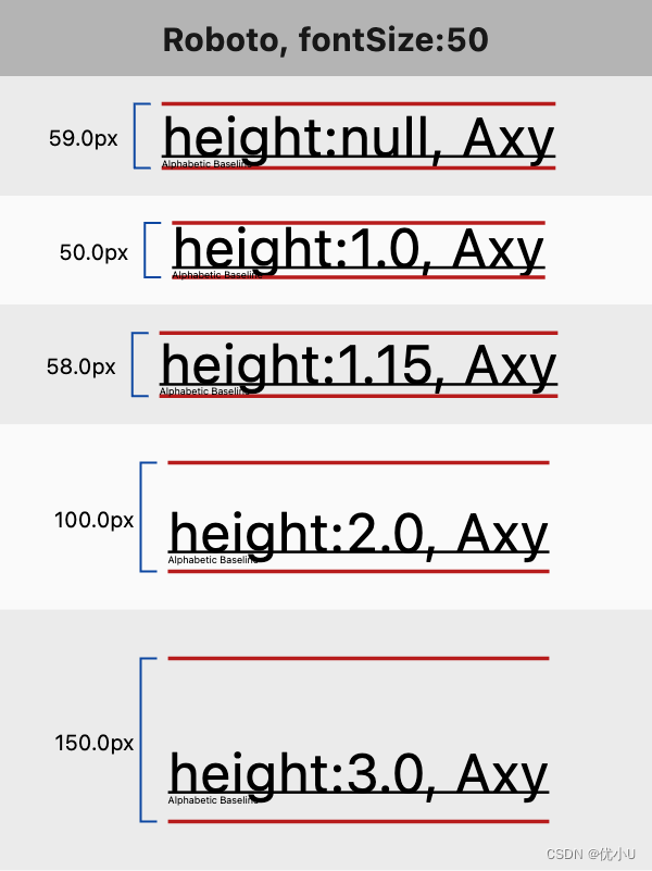
文字高度:height 表现
import 'dart:ui';
import 'package:flutter/material.dart';
void main() {
runApp(const MyApp());
}
class MyApp extends StatelessWidget {
const MyApp({
super.key});
Widget build(BuildContext context) {
return MaterialApp(
home: Scaffold(
appBar: AppBar(
title: const Text('Text 组件 - TextStyle'),
),
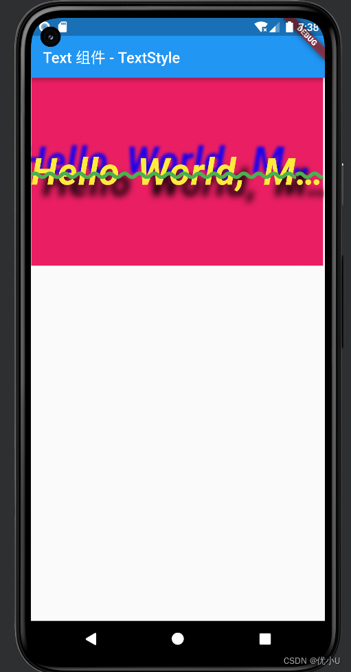
body: Text('Hello World, My name is Flutter!', style: TextStyle(
background: Paint()..color=Colors.pink,
// backgroundColor: Colors.red,
color: Colors.yellow,
decoration: TextDecoration.lineThrough,
decorationColor: Colors.green,
decorationStyle: TextDecorationStyle.wavy,
decorationThickness: 2,
fontFamily: "Roboto",
fontFamilyFallback: const ['AppleColorEmoji'],
fontFeatures: const <FontFeature>[FontFeature.alternativeFractions()],
fontSize: 50,
fontStyle: FontStyle.italic,
fontVariations: const <FontVariation>[FontVariation('wght', 900.0)],
fontWeight: FontWeight.bold,
// foreground: Paint()..color=Colors.black
height: 5,
leadingDistribution: TextLeadingDistribution.even,
letterSpacing: 1,
overflow: TextOverflow.ellipsis,
shadows: const <Shadow>[
Shadow(
offset: Offset(15.0, 15.0),
blurRadius: 20,
color: Color.fromARGB(255, 0, 0, 0)
),
Shadow(
offset: Offset(-15.0, -15.0),
blurRadius: 8,
color: Color.fromARGB(225, 0, 0, 255)
)
],
textBaseline: TextBaseline.alphabetic,
wordSpacing: 10
)),
)
);
}
}
模拟器显示效果:
文字边框和描边 (Foreground)
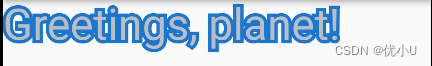
Stack(
  children: <Widget>[
    // Stroked text as border.
    Text(
      'Greetings, planet!',
      style: TextStyle(
        fontSize: 40,
        foreground: Paint()
          ..style = PaintingStyle.stroke
          ..strokeWidth = 6
          ..color = Colors.blue[700]!,
      ),
    ),
    // Solid text as fill.
    Text(
      'Greetings, planet!',
      style: TextStyle(
        fontSize: 40,
        color: Colors.grey[300],
      ),
    ),
  ],
)
文字渐变(Foreground)
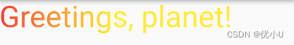
Text("Greetings, planet!", style: TextStyle(
  fontSize: 40,
  foreground: Paint()
    ..shader = ui.Gradient.linear(
      const Offset(0, 20),
      const Offset(150, 20),
      <Color>[
        Colors.red,
        Colors.yellow,
      ],)
),)
从主题获取文本样式
有时候在主题定义的全局样式可以获取直接拿来用,达到全局设置的目的
Text("Greetings, planet!", style: Theme.of(context).textTheme.headlineLarge)

// 覆盖主题属性
Text("Greetings, planet!", style: Theme.of(
    context
).textTheme.headlineLarge?.copyWith(
    color: Colors.red
))