放假了,不想到处走亲戚。
窝在家里 coding 玩儿~
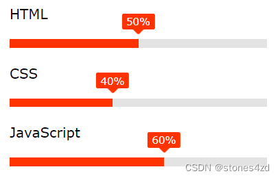
看到一个很不错的进度条效果,很简单,但是很好看,就写写练练手。
HTML 结构:
<!-- 进度条   -->
	<div class="jdt">
		<div class="jd_title">HTML</div>
		<!-- 进度 -->
		<div class="jdbar">
			<div class="jdper" per="50%" style="max-width: 50%; "></div>
		</div>
		<!-- 进度 end -->

		<div class="jd_title">CSS</div>
		<!-- 进度 -->
		<div class="jdbar">
			<div class="jdper" per="40%" style="max-width: 40%; "></div>
		</div>
		<!-- 进度 end -->

		<div class="jd_title">JavaScript</div>
		<!-- 进度 -->
		<div class="jdbar">
			<div class="jdper" per="60%" style="max-width: 60%; "></div>
		</div>
		<!-- 进度 end -->

	</div>
	<!-- 进度条   end -->
CSS:
.jdt {
	margin-left: 100px;
}

.jd_title {
	margin-top: 20px;
	margin-bottom: 20px;
}

.jdbar {
	background: rgb(227, 227, 227);
	height: 10px;
	width: 300px;
}

.jdper {
	height: 10px;
	background: #f30;
	max-width: 80%;
	width: 100%;
	position: relative;
	animation: aniBar 1s;
}

.jdper::before {
	position: absolute;
	content: attr(per);
	background: #f30;
	padding: 2px 5px;
	border-radius: 2px;
	font-size: 12px;
	right: 0;
	top: -30px;
	color: #fff;
	transform: translateX(50%);
}

.jdper::after {
	content: "";
	width: 10px;
	height: 10px;
	display: inline-block;
	background: #f30;
	position: absolute;
	right: 0;
	top: -18px;
	z-index: -1;
	border-radius: 2px;
	transform: translateX(50%) rotate(45deg);
}

@keyframes aniBar {
	0% {
		width: 0;
	}

	100% {
		width: 100%;
	}
}
用到的关键样式:
1. 绝对定位和相对定位:实现数字定位。
2. transform: translate( 百分比 ); 这是相对标签本身自己宽度的百分比,做位移。
3. 伪标签的 content:attr( ) 可以获取标签属性的内容作为伪标签的内容。