1.ImageView(图像视图)
1.1imageView的基本使用
ImageView 见名知意,就是用来显示图像的一个View或者说控件
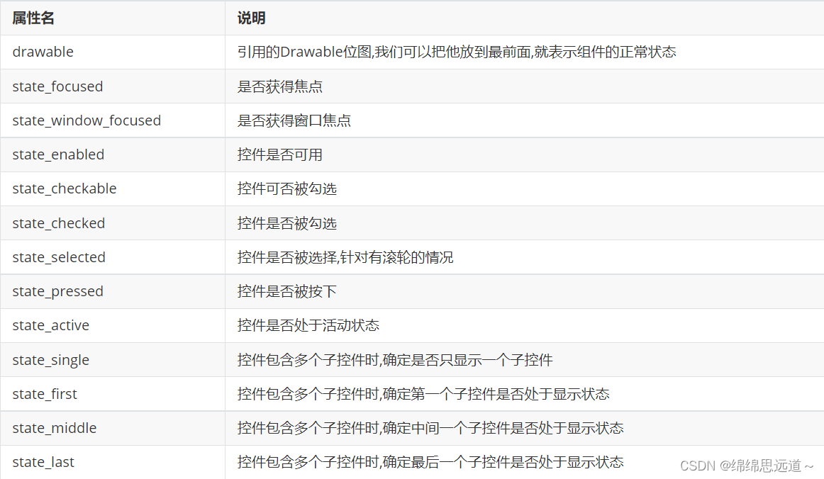
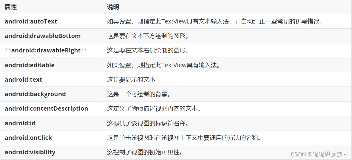
基本属性:

1.2 src属性和backgroud属性的区别
在API文档中我们发现ImageView有两个可以设置图片的属性,分别是:src和background 常识: ① background通常指的都是背景,而src指的是内容!! ② 当使用src填入图片时,是按照图片大小直接填充,并不会进行拉伸,而使用background填入图 片,则是会根据ImageView给定的宽度来进行拉伸
例如:
<LinearLayout
xmlns:android="http://schemas.android.com/apk/res/android"
  xmlns:tools="http://schemas.android.com/tools"
  android:id="@+id/LinearLayout1"
  android:layout_width="match_parent"
  android:layout_height="match_parent"
  android:orientation="vertical"
  tools:context="com.jay.example.imageviewdemo.MainActivity" >
  <ImageView
    android:layout_width="wrap_content"
    android:layout_height="wrap_content"
    android:background="@drawable/pen" />
  <ImageView
    android:layout_width="200dp"
    android:layout_height="wrap_content"
    android:background="@drawable/pen" />
  <ImageView
    android:layout_width="wrap_content"
    android:layout_height="wrap_content"
    android:src="@drawable/pen" />
  <ImageView
    android:layout_width="200dp"
    android:layout_height="wrap_content"
    android:src="@drawable/pen" />
</LinearLayout>
Java代码中设置blackground和src属性:
前景(对应src属性):setImageDrawable();
背景(对应background属性):setBackgroundDrawable();
二者结合妙用
<ImageView
    android:layout_gravity="center"
    android:padding="20dp"
    android:layout_width="200dp"
    android:layout_height="200dp"
    android:background="@drawable/shape_bg"
    android:src="@mipmap/pen" />
2.3 scaleType属性 android:scaleType
-
android:scaleType用于设置显示的图片如何缩放或者移动以适应ImageView的大小 Java代码中可以通过imageView.setScaleType(ImageView.ScaleType.CENTER);来设置。
-
scaleType可选值如下:
-
fitXY:对图像的横向与纵向进行独立缩放,使得该图片完全适应ImageView,但是图片的横纵比可能会发生改变
-
fitStart:保持纵横比缩放图片,知道较长的边与Image的编程相等,缩放完成后将图片放在ImageView的左上角
-
fitCenter:同上,缩放后放于中间;
-
fitEnd:同上,缩放后放于右下角;
-
center:保持原图的大小,显示在ImageView的中心。当原图的size大于ImageView的size,超过部分裁剪处理。
-
centerCrop:保持横纵比缩放图片,知道完全覆盖ImageView,可能会出现图片的显示不完全
-
centerInside:保持横纵比缩放图片,直到ImageView能够完全地显示图片
-
matrix:默认值,不改变原图的大小,从ImageView的左上角开始绘制原图, 原图超过ImageView的部分作裁剪处理
-
-
fitEnd , fitStart , fitCenter,fitXY
带有“fit”字样的,会显示图片的全部内容。
fitStart,fitCenter,fitEnd 图片会按原比例显示。图片会往指定的方向靠拢。
fitXY会拉伸图片,铺满整个ImageView。
<ImageView
    android:background="#ffc"
    android:layout_width="300dp"
    android:layout_height="wrap_content"
    android:layout_gravity="center"
    android:scaleType="fitStart"
android:src="@mipmap/ic_launcher" />-
centerCrop 与 centerInside
centerCrop:按横纵比缩放,直接完全覆盖整个ImageView centerInside:按横纵比缩放,使得ImageView能够完全显示这个图片
-
fitXY
不按比例缩放图片,目标是把图片塞满整个View
-
matrix
从ImageView的左上角开始绘制原图,原图超过ImageView的部分作裁剪处理
-
center
保持原图的大小,显示在ImageView的中心。当原图的size大于ImageView的size,超过部分裁剪处理
2.4 alpha设置图片透明度
设置 alpha 值,能改变整个 ImageView 的透明度
<ImageView
   style="@style/IvDemo1"
   android:layout_marginStart="20dp"
   android:alpha="0.9"
   android:scaleType="fitCenter"
   android:src="@drawable/pic_2_robots" />
3.Button
Button 控件继承 TextView ,拥有 TextView 的属性
3.1Button的基本使用
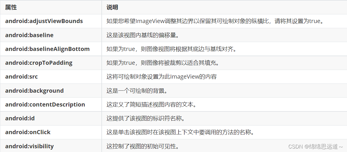
常用属性:

3.2StateListDrawable简介
StateListDrawable 是Drawable资源的一种,可以根据不同的状态,设置不同的图片效果,关键节点 < selector > ,我们只需要将Button的 background 属性设置为该drawable资源即可轻松实现,按下按钮时不同的按钮颜色或背景!
例如:
btn_bg1.xml
<?xml version="1.0" encoding="utf-8"?>
<selector xmlns:android="http://schemas.android.com/apk/res/android">
  <item android:drawable="@color/color1" android:state_pressed="true"/>
  <item android:drawable="@color/color4" android:state_enabled="false"/>
  <item android:drawable="@color/color3" />
</selector>
layout_btn.xml
<?xml version="1.0" encoding="utf-8"?>
<LinearLayout
xmlns:android="http://schemas.android.com/apk/res/android"
  android:layout_width="match_parent"
  android:layout_height="match_parent"
  android:orientation="vertical"
  android:paddingTop="50dp">
  <Button
    android:id="@+id/btnOne"
    android:layout_width="match_parent"
    android:layout_height="64dp"
    android:background="@drawable/btn_bg1"
    android:text="按钮"
    android:textColor="#ffffff"
    android:textSize="20sp"
    android:textStyle="bold" />
  <Button
    android:id="@+id/btnTwo"
    android:layout_width="match_parent"
    android:layout_height="64dp"
    android:text="按钮不可用"
    android:textColor="#000000"
    android:textSize="20sp"
    android:textStyle="bold" />
</LinearLayout>
MainActivity.java
public class MainActivity extends Activity {
  private Button btnOne,btnTwo;
  @Override
  protected void onCreate(Bundle savedInstanceState) {
    super.onCreate(savedInstanceState);
    setContentView(R.layout.activity_main);
    btnOne = findViewById(R.id.btnOne);
    btnTwo = findViewById(R.id.btnTwo);
    btnTwo.setOnClickListener(new OnClickListener() {  //按钮绑定点击事件
      @Override
      public void onClick(View v) {
        if(btnTwo.getText().toString().equals("按钮不可用")){
          btnOne.setEnabled(false);
          btnTwo.setText("按钮可用");
       }else{
          btnOne.setEnabled(true);
          btnTwo.setText("按钮不可用");
       }
     }
   });
 }
}
3.3按钮的分类
3.3.1 ImageButton(图标按钮)
ImageButton显示了带有图像(而不是文本)的按钮,用户可以按下或单击该按钮。
属性:
例如:
 <ImageButton 						//使用ImageButton标签
     android:id="@+id/img_button"   // ImageButton的ID,和Button的ID一样
     android:layout_height="wrap_content" //ImageButton的宽和高属性,
     android:layout_width="wrap_content"
     android:src=@drawable/img_name >

   //ImageButton上显示的图片,表示从图片资源文件中读取名字为img_name的图片
3.3.2单选按钮
-
RadioButton为单选框,存在多个选项情况下,需要将RadioButton放到RadioGroup组中使用,从而实现单选功能。 -
RadioGroup中可以通过orientation来控制排列方式,水平还是垂直。
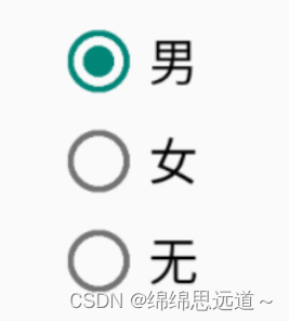
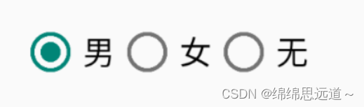
RadioGroup 常用属性:

RadioButton 常用属性 :

例如:
<!-- RadioGroup -->
<RadioGroup
    android:id="@+id/radioGroup"
    android:layout_width="wrap_content"
    android:layout_height="wrap_content"
    android:orientation="vertical"
    android:checkedButton="@id/man">
    <!-- RadioButton -->
    <RadioButton
        android:id="@+id/man"
        android:layout_width="wrap_content"
        android:layout_height="wrap_content"
        android:text="男"
        android:textSize="16sp"/>
    <!-- RadioButton -->
    <RadioButton
        android:id="@+id/woman"
        android:layout_width="wrap_content"
        android:layout_height="wrap_content"
        android:text="女"
        android:textSize="16sp"/>
    <!-- RadioButton -->
    <RadioButton
        android:id="@+id/none"
        android:layout_width="wrap_content"
        android:layout_height="wrap_content"
        android:text="无"
        android:textSize="16sp"/>
</RadioGroup>
3.4点击事件
RadioGroup radgroup = (RadioGroup) findViewById(R.id.radioGroup);
    //第一种获得单选按钮值的方法
    //为radioGroup设置一个监听器:setOnCheckedChanged()
    radgroup.setOnCheckedChangeListener(new OnCheckedChangeListener() {
      @Override
      public void onCheckedChanged(RadioGroup group, int checkedId) {
        RadioButton radbtn = (RadioButton) findViewById(checkedId);
        Toast.makeText(getApplicationContext(), "按钮组值发生改变,你选了" + radbtn.getText(), 		Toast.LENGTH_LONG).show();
     }
  });
3.5CheckBok
-
Android CheckBox 是可以由用户切换的开/关开关。为用户提供一组互不排斥(多选)的可选选项时,应使用CheckBox。
3.5.1属性:
案例:
<CheckBox
       android:id="@+id/checkbox1"
       android:layout_width="wrap_content"
       android:layout_height="wrap_content"
       android:layout_above="@+id/button1"
       android:layout_alignLeft="@+id/linearLayout1"
       android:text="牛仔" />
3.5.2:点击事件
<CheckBox
        android:id="@+id/cb_one"
        android:layout_width="wrap_content"
        android:layout_height="wrap_content"
        android:layout_above="@+id/button1"
        android:layout_alignLeft="@+id/linearLayout1"
        android:text="牛仔"/>

<CheckBox
        android:id="@+id/cb_two"
        android:layout_width="wrap_content"
        android:layout_height="wrap_content"
        android:layout_alignBaseline="@+id/checkbox3"
        android:layout_alignBottom="@+id/checkbox3"
        android:layout_marginLeft="27dp"
        android:layout_toRightOf="@+id/checkbox3"
        android:text="面包" />

<CheckBox
        android:id="@+id/cb_three"
        android:layout_width="wrap_content"
        android:layout_height="wrap_content"
        android:layout_alignBaseline="@+id/checkbox1"
        android:layout_alignBottom="@+id/checkbox1"
        android:layout_toRightOf="@+id/button1"
        android:text="黄油" />
public class MainActivity extends AppCompatActivity implements CompoundButton.OnCheckedChangeListener{
private CheckBox cb_one;
private CheckBox cb_two;
private CheckBox cb_three;
@Override
protected void onCreate(Bundle savedInstanceState) {
super.onCreate(savedInstanceState);
setContentView(R.layout.activity_main);
cb_one = (CheckBox) findViewById(R.id.cb_one);
cb_two = (CheckBox) findViewById(R.id.cb_two);
cb_three = (CheckBox) findViewById(R.id.cb_three);
cb_one.setOnCheckedChangeListener(this);
cb_two.setOnCheckedChangeListener(this);
cb_three.setOnCheckedChangeListener(this);
}
@Override
public void onCheckedChanged(CompoundButton compoundButton, boolean b){
if(compoundButton.isChecked())
Toast.makeText(this,compoundButton.getText().toString(),Toast.LENGTH_SHORT).show();
}
}