基于微信小程序的抽屉菜单特效
前言:随着每个应用复杂程度的增加以及逐渐变大的手机屏幕,如果一直要通过各个角落的按钮来访问不同的菜单,这就明显不如能直接在屏幕中间使用的抽屉功能方便。
一、功能介绍
抽屉菜单是现在移动端网页、App都很常见的设计,这里将用小程序来实现这一效果。小程序提供了一系列触摸触发的事件,我们可以在这些事件上绑定自定义的响应,即可达到打开关闭菜单的操作效果。
二、小程序效果图


三、实现步骤
1、首先在wxml中定义两个scroll-view,一个是默认显示的区域,另一个是触发事件后显示的区域,滑动时主题内容右滑,抽屉菜单在上层显示。
- 在wxml定义scroll-view标签,设置允许纵向滚动,同时设置页面高度为获取屏幕高度且不允许下拉刷新,这样用户所有的操作都会在我们所定义的区域内完成。
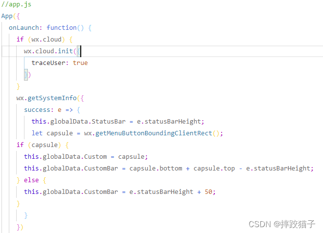
图片3.1,在App.js中获取屏幕高度
2、在wxml中的两个容器之间增加一个view标签,它在这里起到一个遮罩层的作用。
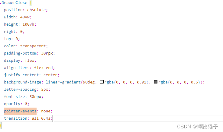
- 遮罩层关键属性pointer-events,我们将其设置为none,这样我们的动作就会穿透这个view达到下层的scroll-view,如果不加这个属性,所有对左侧抽屉菜单的操作都会作用到右侧上面,那相当于是一个无效样式。
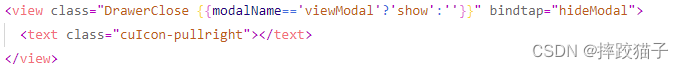
图片3.2,定义遮罩层
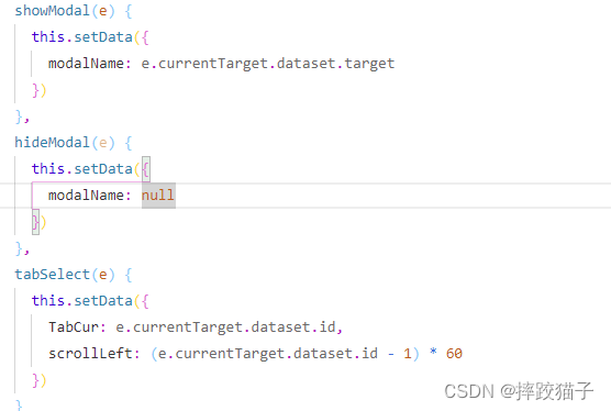
3、通过响应事件给对应的scroll以及view设置不同的class并响应渲染。
四、完整代码
<scroll-view scroll-y class="DrawerPage {
{modalName=='viewModal'?'show':''}}">
<cu-custom bgColor="bg-gradual-blue" isBack="{
{true}}"><view slot="backText">返回</view>
<view slot="content">全屏抽屉</view>
</cu-custom>
<view class='cu-btn bg-green lg block shadow radius margin-xl' bindtap="showModal" data-target="viewModal">
打开抽屉
</view>
<view class="cu-list menu card-menu margin-top-xl margin-bottom-xl shadow-lg">
<view class="cu-item arrow" wx:for="{
{10}}" wx:key="index">
<view class="content">
<text class="cuIcon-similar text-grey"></text>
<text class="text-grey">{
{index +1}}</text>
</view>
</view>
</view>
</scroll-view>
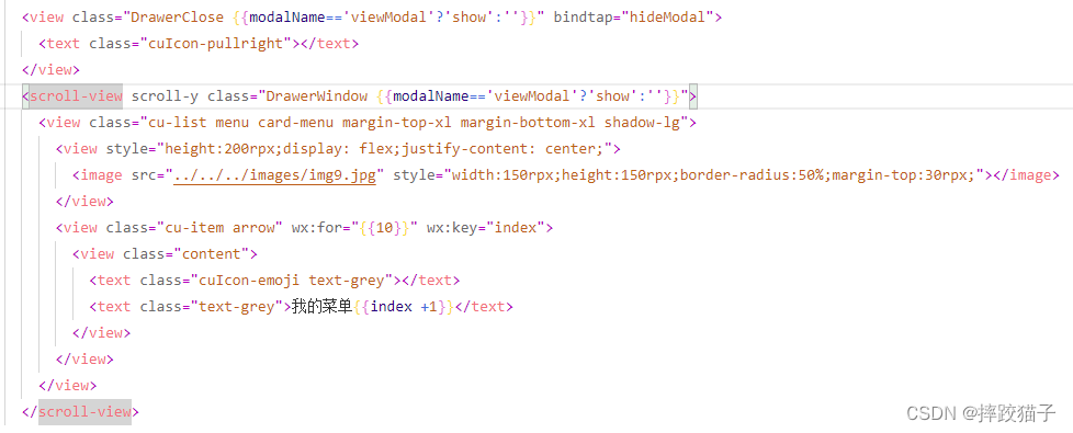
<view class="DrawerClose {
{modalName=='viewModal'?'show':''}}" bindtap="hideModal">
<text class="cuIcon-pullright"></text>
</view>
<scroll-view scroll-y class="DrawerWindow {
{modalName=='viewModal'?'show':''}}">
<view class="cu-list menu card-menu margin-top-xl margin-bottom-xl shadow-lg">
<view style="height:200rpx;display: flex;justify-content: center;">
<image src="../../../images/img9.jpg" style="width:150rpx;height:150rpx;border-radius:50%;margin-top:30rpx;"></image>
</view>
<view class="cu-item arrow" wx:for="{
{10}}" wx:key="index">
<view class="content">
<text class="cuIcon-emoji text-grey"></text>
<text class="text-grey">我的菜单{
{index +1}}</text>
</view>
</view>
</view>
</scroll-view>
page {


  background-image: var(--gradualBlue);
  width: 100vw;
  overflow: hidden;
}

.DrawerPage {


  position: fixed;
  width: 100vw;
  height: 100vh;
  left: 0vw;
  background-color: #f1f1f1;
  transition: all 0.4s;
}

.DrawerPage.show {


  transform: scale(0.9, 0.9);
  left: 85vw;
  box-shadow: 0 0 60rpx rgba(0, 0, 0, 0.2);
  transform-origin: 0;
}

.DrawerWindow {


  position: absolute;
  width: 85vw;
  height: 100vh;
  left: 0;
  top: 0;
  transform: scale(0.9, 0.9) translateX(-100%);
  opacity: 0;
  pointer-events: none;
  transition: all 0.4s;
}

.DrawerWindow.show {


  transform: scale(1, 1) translateX(0%);
  opacity: 1;
  pointer-events: all;
}

.DrawerClose {


  position: absolute;
  width: 40vw;
  height: 100vh;
  right: 0;
  top: 0;
  color: transparent;
  padding-bottom: 30rpx;
  display: flex;
  align-items: flex-end;
  justify-content: center;
  background-image: linear-gradient(90deg, rgba(0, 0, 0, 0.01), rgba(0, 0, 0, 0.6));
  letter-spacing: 5px;
  font-size: 50rpx;
  opacity: 0;
  pointer-events: none;
  transition: all 0.4s;
}

.DrawerClose.show {


  opacity: 1;
  pointer-events: all;
  width: 15vw;
  color: #fff;
}

.DrawerPage .cu-bar.tabbar .action button.icon {


  width: 64rpx;
  height: 64rpx;
  line-height: 64rpx;
  margin: 0;
  display: inline-block;
}

.DrawerPage .cu-bar.tabbar .action .cu-avatar {


  margin: 0;
}

.DrawerPage .nav {


  flex: 1;
}

.DrawerPage .nav .cu-item.cur {


  border-bottom: 0;
  position: relative;
}

.DrawerPage .nav .cu-item.cur::after {


  content: "";
  width: 10rpx;
  height: 10rpx;
  background-color: currentColor;
  position: absolute;
  bottom: 10rpx;
  border-radius: 10rpx;
  left: 0;
  right: 0;
  margin: auto;
}

.DrawerPage .cu-bar.tabbar .action {


  flex: initial;
}
   showModal(e) {


    this.setData({


      modalName: e.currentTarget.dataset.target
    })
  },
  hideModal(e) {


    this.setData({


      modalName: null
    })
  },
  tabSelect(e) {


    this.setData({


      TabCur: e.currentTarget.dataset.id,
      scrollLeft: (e.currentTarget.dataset.id - 1) * 60
    })
  }