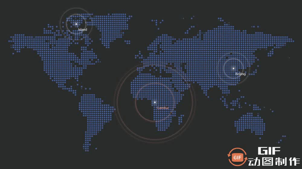
一:案例效果
本次案例我们分析一下数据可视化页面最常见的热点图是如何实现的,其原理并不复杂,只需要用到CSS3动画属性 animation 以及 @keyframe 关键帧即可,重点是向外扩散的环如何布局比较合适,以及每个环怎么扩散何时扩散比较合适。
二:源码获取
源码我已经上传到了资源里,想拿来学习引用的小伙伴直接下载即可,没有会员的可以私聊我 “大数据热点图” 免费获取,下方是源码的资源链接
三:原理分析
原理分析我们分为热点的布局分析与热点向外扩散的动画实现的分析
3.1 布局分析
- 布局我们那单独的一个城市分析,例如地图中北京的 ,其由一个类名为city1的最外层盒子来添加定位以定到目标城市位置,其不设置宽高,大小完全由中心点撑起(即第二个类名为center的盒子) ,波纹其实是有三个圈圈组成的,最开始是完全重合的,用中心小算法来保证其永远是围绕center来扩散的。
       <div class="city1">
            <div class="center1"></div>
            <p class="bj">Beijing</p>
            <div class="bw1"></div>
            <div class="bw2"></div>
            <div class="bw3"></div>
        </div>
- 波纹的样式添加我们采用了属性选择器 .city1 div[class^="bw"],即选择父类city1里面类名以bw开头的所有子div标签
.city1{
            position: absolute;
            top: 370px;
            right: 403px;
            color: aliceblue;
        }
        .center1{
            width: 5px;
            height: 5px;
            background-color: rgb(255, 255, 255);
            box-shadow: 0 0 12px 2px #fff;
            border-radius: 50%;
        }
        .city1 div[class^="bw"]{
            position: absolute;
            top: 50%;
            left: 50%;
            transform: translate(-50%,-50%);
             width: 5px;
             height: 5px;
             box-shadow: 0 0 7px  #fff;
             border-radius: 50%;
             animation: scla 3s linear infinite;
        }
        .map .city1 div.bw2{
            animation-delay: 1s;
        }
        .map .city1 div.bw3{
            animation-delay: 2s;
        }
3.2 动画分析
- 本次添加的关键帧为:0%的时候波纹是完全不透明的,50%的时候宽高均变大为105px,即圈圈在总动画时间50%的时候要从宽高5px扩散到宽高105px,然后变为半透明状态。再下一个是100%的时候,扩散到宽高150px,并变成完全不透明。要给波纹添加属性:animation: scla 3s linear infinite; 含义为3s做完动画,匀速,并且无限循环
- 为了呈现出波纹一个接一个往外扩散而不是一起扩散,需要给第一个圈圈直接开始扩散,第二个圈圈第三个圈圈设置不同的 animation-delay 动画延迟,第二个设置为1s,第二个设置为2s,这样就可以呈现出一个接一个往外扩散了
   /* @keyframes关键帧动画 */
        @keyframes scla{
            0% {
                opacity: 1;
            }
            50% {
                width: 105px;
                height: 105px;
                opacity: 0.5;
            }
            100% {
                width: 150px;
                height: 150px;
                opacity: 0;
            }
        }
       .city3 div[class^="bw"]{
            position: absolute;
            top: 50%;
            left: 50%;
            transform: translate(-50%,-50%);
             width: 5px;
             height: 5px;
             box-shadow: 0 0 7px  #fff;
             border-radius: 50%;
             animation: scla 3s linear infinite;
        }
        .map .city3 div.bw2{
            animation-delay: 1s;
        }
        .map .city3 div.bw3{
            animation-delay: 2s;
        }
四:主要代码
<style>
        *{
            margin: 0;
            padding: 0;
            box-sizing: border-box;
        }
        body{
            background-color: rgb(45, 45, 45);
        }
        .map{
            position: relative;
            width: 1400px;
            height: 830px;
            background-image: url(./img/QX3OPNW5qY.png);
            background-repeat: no-repeat;
            background-size: 100%;
            margin: 0 auto;
        }
        .bj{
            position: absolute;
            top: 15px;
            left: 10px;
            font-size: 10px;
        }
        .Gambia{
            position: absolute;
            top: 15px;
            left: 10px;
            font-size: 10px;
            color:rgb(255, 153, 153)
        }
        .Island{
            position: absolute;
            top: 15px;
            left: 10px;
            font-size: 10px;
        }
        /* 城市1 */
        .city1{
            position: absolute;
            top: 370px;
            right: 403px;
            color: aliceblue;
        }
        .center1{
            width: 5px;
            height: 5px;
            background-color: rgb(255, 255, 255);
            box-shadow: 0 0 12px 2px #fff;
            border-radius: 50%;
        }
        .city1 div[class^="bw"]{
            position: absolute;
            top: 50%;
            left: 50%;
            transform: translate(-50%,-50%);
             width: 5px;
             height: 5px;
             box-shadow: 0 0 7px  #fff;
             border-radius: 50%;
             animation: scla 3s linear infinite;
        }
        .map .city1 div.bw2{
            animation-delay: 1s;
        }
        .map .city1 div.bw3{
            animation-delay: 2s;
        }
        /* 城市2 */
        .city2{
            position: absolute;
            top: 500px;
            right: 703px;
            color: aliceblue;
        }
        .center2{
            width: 5px;
            height: 5px;
            background-color: rgb(255, 255, 255);
            box-shadow: 0 0 12px 2px #fff;
            border-radius: 50%;
        }
        .city2 div[class^="bw"]{
            position: absolute;
            top: 50%;
            left: 50%;
            transform: translate(-50%,-50%);
             width: 5px;
             height: 5px;
             box-shadow: 0 0 7px  rgb(255, 149, 149);
             border-radius: 50%;
             animation: scla1 3s linear infinite;
        }
        .map .city2 div.bw2{
            animation-delay: 0.75s;
        }
        .map .city2 div.bw3{
            animation-delay: 1.5s;
        }
        .map .city2 div.bw4{
            animation-delay: 2.25s;
        }
        /* 城市3 */
        .city3{
            position: absolute;
            top: 200px;
            right: 1003px;
            color: aliceblue;
        }
        .center3{
            width: 5px;
            height: 5px;
            background-color: rgb(255, 255, 255);
            box-shadow: 0 0 12px 2px #fff;
            border-radius: 50%;
        }
        /* 属性选择器 正则表达式筛选bw开头类名 */
        .city3 div[class^="bw"]{
            position: absolute;
            top: 50%;
            left: 50%;
            transform: translate(-50%,-50%);
             width: 5px;
             height: 5px;
             box-shadow: 0 0 7px  #fff;
             border-radius: 50%;
             animation: scla 3s linear infinite;
        }
        .map .city3 div.bw2{
            animation-delay: 1s;
        }
        .map .city3 div.bw3{
            animation-delay: 2s;
        }
        /* @keyframes关键帧动画 */
        @keyframes scla{
            0% {
                opacity: 1;
            }
            50% {
                width: 105px;
                height: 105px;
                opacity: 0.5;
            }
            100% {
                width: 150px;
                height: 150px;
                opacity: 0;
            }
        }
        @keyframes scla1{
            0% {
                opacity: 1;
            }
            50% {
                width: 285px;
                height: 285px;
                opacity: 0.5;
            }
            100% {
                width: 330px;
                height: 330px;
                opacity: 0;
            }
        }
    </style>
</head>
<body>
    <div class="map">
        <div class="city1">
            <div class="center1"></div>
            <p class="bj">Beijing</p>
            <div class="bw1"></div>
            <div class="bw2"></div>
            <div class="bw3"></div>
        </div>
        <div class="city2">
            <div class="center2"></div>
            <p class="Gambia">Gambia</p>
            <div class="bw1"></div>
            <div class="bw2"></div>
            <div class="bw3"></div>
            <div class="bw4"></div>
        </div>
        <div class="city3">
            <div class="center3"></div>
            <p class="Island">Island</p>
            <div class="bw1"></div>
            <div class="bw2"></div>
            <div class="bw3"></div>
        </div>
    </div>
</body>