参考
文本组件
Text(文本)
Text文本组件, 用于显示简单样式文本。
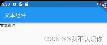
基本使用
class YcHomeBody extends StatelessWidget {


  const YcHomeBody({

    Key? key}) : super(key: key);
  @override
  Widget build(BuildContext context) {


    return const Text("文本组件");
  }
}
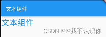
设置样式
TextStyle,用于指定文本显示的样式如颜色、字体、粗细、背景等
return const Text("文本组件",style: TextStyle(color:Colors.blue,fontSize: 30),);
其他属性
text文本组件的属性挺多的,我们可以通过查看源码的方式来知道可以使用哪些属性
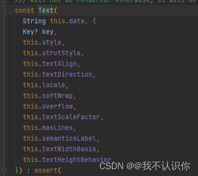
然后在通过属性的源码,来知道属性需要什么样的参数,以此类推
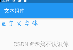
自定义字体
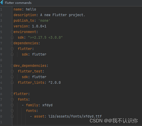
- 下载字体,可以使用 站长字体,比如 幸福的圆蛋字体
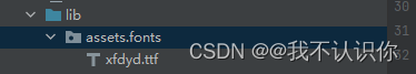
- 将字体文件拷贝的项目中,一般目录是:lib/assets/fonts/,assets和fonts都需要手动创建,此目录不是必须的,而是约定俗成,资源一般都放在assets目录下。
- 配置pubspec.yaml
flutter:
  fonts:
    - family: xfdyd
      fonts:
        - asset: lib/assets/fonts/xfdyd.ttf
- 使用
return const Text("自定义字体",style: TextStyle(color:Colors.blue,fontSize: 30,fontFamily: 'xfdyd'),);
上面两本电子书中都没有加lib,但是根本不生效,反而是加上lib生效了,如下图:
RichText(富文本)
通常情况下Text组件可以完成绝大多数需求,它可以显示不同大小的文字、字体、颜色等,如果想在一句话或者一段文字里面显示不同样式的文字,Text组件无法满足我们的需求,这个时候需要使用RichText。
RichText 组件的text属性是TextSpan,TextSpan中的style样式需要设置属性
class YcHomeBody extends StatelessWidget {
const YcHomeBody({
Key? key}) : super(key: key);
@override
Widget build(BuildContext context) {
// return const Text("自定义字体",style: TextStyle(color:Colors.blue,fontSize: 30,fontFamily: 'xfdyd'),);
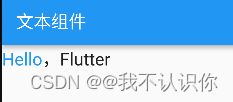
return const Text.rich(
TextSpan(
style: TextStyle(fontSize: 20),
children: [
TextSpan(text: 'Hello',style: TextStyle(color: Colors.blue)),
TextSpan(text: ','),
TextSpan(text: 'Flutter'),
]),
);
}
}
注:
-
TextSpan不是widget,因此不能直接在build方法中return -
除此之外
TextSpan还可以通过recognizer属性指定手势交互,类型是GestureRecognizer,GestureRecognizer是抽象类,一般使用其子类TapGestureRecognizer实现点击交互。
TextField(文本输入组件)
参考:TextField
基本(无参)
TextField();
上面的代码可以直接显示一个输入框,获取焦点后可以唤起键盘
decoration
decoration是TextField组件的装饰(外观)参数,类型是InputDecoration。
图标
配置文件pubspec.yaml 中必须有下面的配置,才能够使用flutter默认的图标
flutter:
  uses-material-design: true
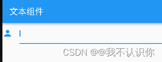
return const TextField(
     decoration:InputDecoration(
       icon:Icon(Icons.person)
     )
 );
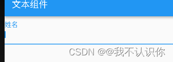
labelText 和 labelStyle
return const TextField(
        decoration: InputDecoration(
            labelText: '姓名', labelStyle: TextStyle(color: Colors.blue,fontSize: 20)));
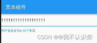
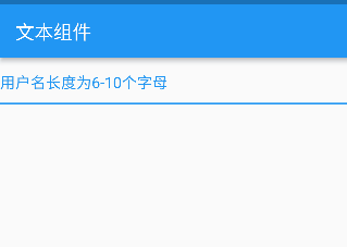
helperText 和 helperStyle
helperText显示在输入框的左下部,用于提示用户,helperStyle参数表示文本样式
 return const TextField(
     decoration: InputDecoration(
         helperText: '用户名长度为6-10个字母',
         helperStyle: TextStyle(color: Colors.blue),
         helperMaxLines: 1));
}
hintText
hintText是当输入框为空时的提示,不为空时不在显示,
return const TextField(
     decoration: InputDecoration(
         hintText: '用户名长度为6-10个字母',
         hintStyle: TextStyle(color: Colors.blue),
         hintMaxLines: 1));
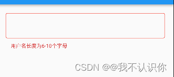
errorText
errorText显示在输入框的左下部,默认字体为红色
Widget build(BuildContext context) {


    return Container(
      padding: const EdgeInsets.all(20),
      child: const TextField(
          decoration: InputDecoration(
              errorText: '用户名长度为6-10个字母',
              errorMaxLines: 1,
              errorBorder: OutlineInputBorder(
                  borderSide: BorderSide(color: Colors.red)))),
    );
  }
prefix 和 suffix
prefix系列的组件是输入框前面的部分,suffix和prefix相反,suffix在输入框的尾部
注意prefix和icon的区别,icon是在输入框边框的外部,而prefix在里面。
TextField(
  decoration: InputDecoration(
    prefixIcon: Icon(Icons.person)
  ),
)
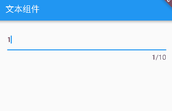
counter
counter组件统计输入框文字的个数,counter仅仅是展示效果,不具备自动统计字数的功能, 自动统计字数代码如下:
import 'package:flutter/material.dart';

//使用箭头函数简写
main() => runApp(const MyApp());

class MyApp extends StatelessWidget {


  //创建widget的唯一标识
  const MyApp({

    Key? key}) : super(key: key);

  //重写build方法
  @override
  Widget build(BuildContext context) {


    //返回一个material类型的app
    return const MaterialApp(
      //指定显示哪一个页面
      home: YcHomePage(),
    );
  }
}

//app的主页面
class YcHomePage extends StatelessWidget {


  const YcHomePage({

    Key? key}) : super(key: key);

  @override
  Widget build(BuildContext context) {


    //首页需要有导航和内容,这里借助Scaffold来快速创建
    return Scaffold(
      //导航条
      appBar: AppBar(
        title: const Text("文本组件", style: TextStyle(color: Colors.white)),
      ),
      //页面主题内容
      body: const YcHomeBody(),
    );
  }
}

class YcHomeBody extends StatefulWidget {


  const YcHomeBody({

    Key? key}) : super(key: key);
  @override
  State<YcHomeBody> createState() => _YcHomeBodyState();
}

class _YcHomeBodyState extends State<YcHomeBody> {


  String _textFieldValue = '';
  @override
  Widget build(BuildContext context) {


    return Container(
        padding: const EdgeInsets.all(20),
        child: TextField(
            decoration: InputDecoration(
                counterText: '${_textFieldValue.length}/10',
                counterStyle: const TextStyle(fontSize: 16)),
            onChanged: (value) {


              setState(() {


                _textFieldValue = value;
              });
            }));
  }
}
除了使用上面介绍的方法外,还可以使用buildCounter,建议使用此方法,用法如下:
TextField(
  maxLength: 100,
  buildCounter: (
    BuildContext context, {


    int currentLength,
    int maxLength,
    bool isFocused,
  }) {


    return Text(
      '$currentLength/$maxLength',
    );
  },
)
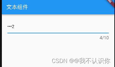
obscureText 密码框
return Container(
    padding: const EdgeInsets.all(20),
    child: TextField(
        obscureText: true,
        decoration: InputDecoration(
            counterText: '${_textFieldValue.length}/10',
            counterStyle: const TextStyle(fontSize: 16)),
        onChanged: (value) {


          setState(() {


            _textFieldValue = value;
          });
        }));
inputFormatters 限制用户输入的内容
比如只想让用户输入字符
TextField(
  inputFormatters: [
    WhitelistingTextInputFormatter(RegExp("[a-zA-Z]")),
  ],
)
事件
onChanged是当内容发生变化时回调,onSubmitted是点击回车或者点击软键盘上的完成回调,onTap点击输入框时回调
文本组件五大案例
案例来源:文本组件五大案例
过渡颜色的文字
涉及其他知识暂放
带前后置标签的文本
涉及其他知识暂放
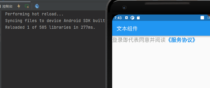
服务协议
 Widget build(BuildContext context) {


    return Text.rich(
      TextSpan(
          text: '登录即代表同意并阅读',
          style: const TextStyle(fontSize: 20,color: Color(0xFF999999)),
          children: [
            TextSpan(
                text: '《服务协议》',
                style: const TextStyle(
                    color: Colors.blue, fontWeight: FontWeight.bold),
                recognizer: TapGestureRecognizer()
                  ..onTap = () => {

    print("点击了协议")}),
          ]),
    );
  }
密码输入框
Widget build(BuildContext context) {


    return TextField(
      decoration: const InputDecoration(
        fillColor: Color(0x30cccccc),
        filled: true,
        enabledBorder: OutlineInputBorder(
            borderSide: BorderSide(color: Color(0x00FF0000)),
            borderRadius: BorderRadius.all(Radius.circular(100))),
        hintText: '输入密码',
        focusedBorder: OutlineInputBorder(
            borderSide: BorderSide(color: Color(0x00000000)),
            borderRadius: BorderRadius.all(Radius.circular(100))),

      ),
      textAlign: TextAlign.center,
      obscureText: true,
      onChanged: (value) {


      },
    );
  }
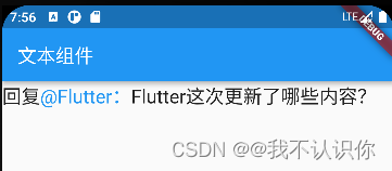
回复
Widget build(BuildContext context) {


    return  Text.rich(
      TextSpan(
         text: '回复',
          style: const TextStyle(fontSize: 20),
          children:[
            TextSpan(
              text: "@Flutter:",
              style: const TextStyle(color: Colors.blue),
                recognizer:TapGestureRecognizer()
                ..onTap=()=>print("点击了")
            ),
            const TextSpan(
              text: 'Flutter这次更新了哪些内容?'
            )
          ]
      )
    );
  }