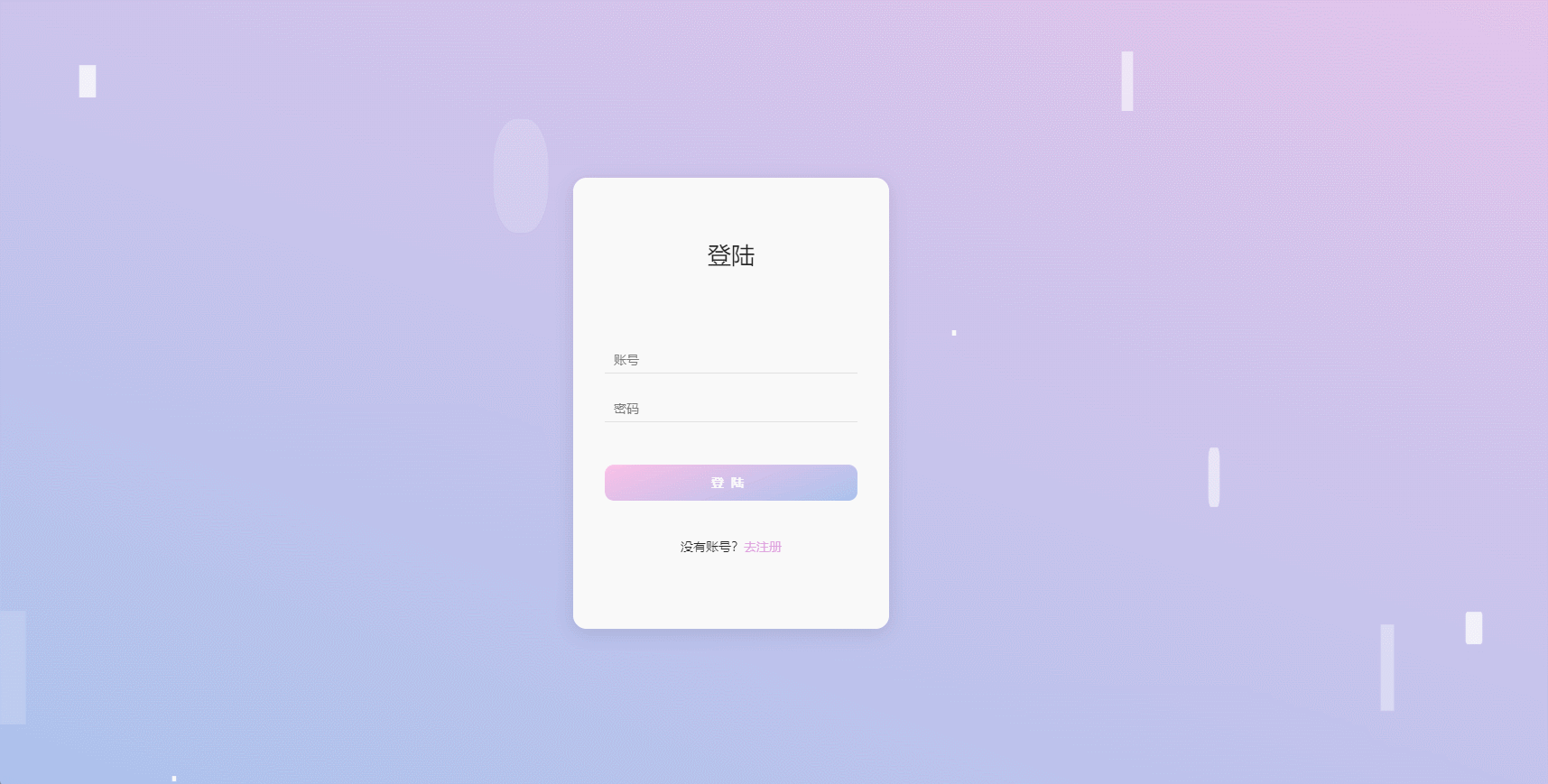
效果图
JS
import styles from './style.less'
const index = () =>
{


    return (
        <div className={

    styles.wrap}>
            <div className={

    styles.container}>
                <div className={

    styles.title}>登陆</div>
                <input type="text" placeholder='账号' />
                <input type="password" placeholder='密码' />
                <button>登陆</button>
                <span>没有账号?<a href="JavaScript:;">去注册</a></span>
            </div>
            <div className={

    styles.square}>
                <ul >
                    <li></li>
                    <li></li>
                    <li></li>
                    <li></li>
                    <li></li>
                </ul>
            </div>
            <div className={

    styles.circle}>
                <ul >
                    <li></li>
                    <li></li>
                    <li></li>
                    <li></li>
                    <li></li>
                </ul>
            </div>
        </div>
    );
};
export default index
.wrap {


  width: 100%;
  height: 100%;
  position: relative;
  // 窗口高度
  height: 100vh;
  display: flex;
  // 弹性布局 居中
  justify-content: center;
  align-items: center;
  // 背景渐变
  background: linear-gradient(200deg, #e3c5eb, #a9c1ed);
  // 溢出隐藏
  overflow: hidden;

  .container {


    // 相对定位
    position: relative;
    display: flex;
    flex-direction: column;
    align-items: center;
    width: 350px;
    height: 500px;
    background-color: white;
    border-radius: 15px;
    // 阴影
    box-shadow: 0 5px 20px rgba(0, 0, 0, .1);
    z-index: 1;

    .title {


      font-size: 26px;
      margin: 65px auto 70px auto;
    }

    input {


      width: 280px;
      height: 30px;
      text-indent: 8px;
      border: none;
      border-bottom: 1px solid #ddd;
      outline: none;
      margin: 12px auto;
    }

    button {


      width: 280px;
      height: 40px;
      margin: 35px auto 40px auto;
      border: none;
      background: linear-gradient(-200deg, #fac0e7, #aac2ee);
      color: #fff;
      font-weight: bold;
      letter-spacing: 8px;
      border-radius: 10px;
      cursor: pointer;
      // 动画过度
      transition: .5s;

      &:hover {


        background: linear-gradient(-200deg, #aac2ee, #f2c0e7);
        background-position-x: -280px;
      }
    }

    span {


      font-size: 14px;

      a {


        color: plum;
        text-decoration: none;
      }
    }


  }

  ul li {


    position: absolute;
    border: 1px solid #fff;
    background-color: #fff;
    width: 30px;
    height: 30px;
    list-style: none;
    // opacity: 0;
  }

  .square li {


    top: 40vh;
    left: 60vw;
    // 执行动画 动画名称 时长 线性 无限次
    animation: square 10s linear infinite;
  }

  .square li:nth-child(2) {


    top: 80vh;
    left: 10vh;
    // 动画延时时间
    animation-delay: 2s;
  }

  .square li:nth-child(3) {


    top: 80vh;
    left: 85vw;
    // 动画延时时间
    animation-delay: 4s;
  }

  .square li:nth-child(4) {


    top: 10vh;
    left: 70vw;
    // 动画延时时间
    animation-delay: 6s;
  }

  .square li:nth-child(5) {


    top: 10vh;
    left: 10vw;
    // 动画延时时间
    animation-delay: 8s;
  }

  .circle li {


    bottom: 0;
    left: 15vw;
    // 执行动画
    animation: circle 10s linear infinite;
  }

  .circle li:nth-child(2) {


    left: 35vw;
    // 动画延时时间
    animation-delay: 2s;
  }

  .circle li:nth-child(3) {


    left: 55vw;
    // 动画延时时间
    animation-delay: 4s;
  }

  .circle li:nth-child(4) {


    left: 75vw;
    // 动画延时时间
    animation-delay: 6s;
  }

  .circle li:nth-child(5) {


    left: 90vw;
    // 动画延时时间
    animation-delay: 8s;
  }

  // 定义动画
  @keyframes square {


    0% {


      transform: scale(0) rotateY(0deg);
      opacity: 1;
    }

    100% {


      transform: scale(5) rotateY(1000deg);
      opacity: 0;
    }
  }

  @keyframes circle {


    0% {


      transform: scale(0) rotateY(0deg);
      opacity: 1;
      bottom: 0;
      border-radius: 0;
    }

    100% {


      transform: scale(5) rotateY(1000deg);
      opacity: 0;
      bottom: 90vh;
      border-radius: 50%;
    }
  }

}