前言
上百个pokemon icon,纯html+css绘制,分享给大家!
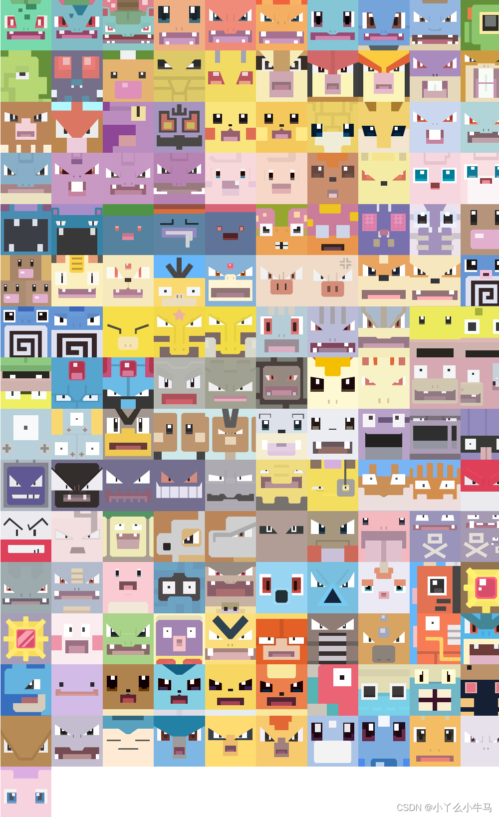
文章目录
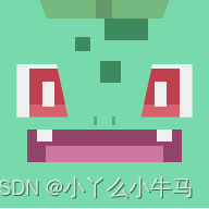
一、皮卡丘
1.皮卡丘

pikachu.html
<!DOCTYPE html>
<html lang="en">
<head>
    <meta charset="UTF-8">
    <title>pikachu</title>
    <link rel="stylesheet" href="pikachu.css">
</head>
<body>

<div class='pokemon'>
    <div class='electric' id='pikachu'>
        <div></div>
        <div></div>
        <div>
            <div></div>
        </div>
    </div>
</div>

</body>
</html>
pikachu.css
@charset "UTF-8";
*, *:before, *:after {


    box-sizing: border-box; }

html, body {


    min-height: 100%; }

::selection {


    background: none; }

body {


    display: flex;
    align-items: center;
    font-family: -apple-system, BlinkMacSystemFont, "Segoe UI", Roboto, Oxygen-Sans, Ubuntu, Cantarell, "Helvetica Neue", Helvetica, Arial, sans-serif;
    font-size: 18px;
    overflow-x: hidden; }

main {


    display: none; }

.pokemon {


    display: flex;
    flex-flow: row wrap;
    align-items: center;
    align-content: center;
    justify-content: center;
    width: 100vw;
}


.pokemon > div {


    position: relative;
    flex-wrap: wrap;
    align-items: center;
    align-content: center;
    justify-content: center;
    width: calc(100vw / 10);
    height: calc(100vw / 10);
    overflow: hidden;
    background: #f1f1f1;
    }

.pokemon > div:before, .pokemon > div:after, .pokemon > div div:before, .pokemon > div div:after {


    content: "";
    display: block; }

#pikachu {


    background: #fae57c; }
#pikachu:before, #pikachu:after {


    width: 19.53%;
    height: 22.66%;
    background: #e06c51; }
#pikachu:before {


    left: 0; }
#pikachu:after {


    right: 0; }
#pikachu:before, #pikachu:after {


    position: absolute;
    top: 51.56%; }
#pikachu > div:nth-child(1) {


    position: absolute;
    top: 23.44%;
    width: 16.8%;
    height: 19.53%;
    background: #1a1312; }
#pikachu > div:nth-child(1):before {


    position: absolute;
    top: 6%;
    width: 41.86%;
    height: 36%;
    background: white; }
#pikachu > div:nth-child(1):after {


    position: absolute;
    bottom: 0;
    width: 100%;
    height: 20%;
    background: #3a322a; }
#pikachu > div:nth-child(2) {


    position: absolute;
    top: 23.44%;
    width: 16.8%;
    height: 19.53%;
    background: #1a1312; }
#pikachu > div:nth-child(2):before {


    position: absolute;
    top: 6%;
    width: 41.86%;
    height: 36%;
    background: white; }
#pikachu > div:nth-child(2):after {


    position: absolute;
    bottom: 0;
    width: 100%;
    height: 20%;
    background: #3a322a; }
#pikachu > div:nth-child(1) {


    left: 16.41%; }
#pikachu > div:nth-child(2) {


    right: 16.41%; }
#pikachu > div:nth-child(1):before {


    left: 37.21%; }
#pikachu > div:nth-child(2):before {


    right: 37.21%; }
#pikachu > div:nth-child(3) {


    position: absolute;
    top: 0;
    width: 100%;
    height: 100%; }
#pikachu > div:nth-child(3):after {


    position: absolute;
    top: 44.53%;
    left: 46.485%;
    width: 7.03%;
    height: 3.91%;
    background: #1a1312; }
#pikachu > div:nth-child(3) div {


    position: absolute;
    top: 50.78%;
    left: 31.25%;
    width: 37.5%;
    height: 26.56%;
    background: #96606d;
    padding: 17.58% 5.08% 0;
    clip-path: polygon(50% 0, 64.58% 25%, 100% 25%, 100% 100%, 0 100%, 0 25%, 35.42% 25%); }
#pikachu > div:nth-child(3) div:before {


    position: relative;
    width: 100%;
    height: 100%;
    background: #d49ab3; }
运行效果:

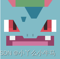
2.雷丘

raichu.html
<!DOCTYPE html>
<html lang="en">
<head>
    <meta charset="UTF-8">
    <title>raichu</title>
    <link rel="stylesheet" href="raichu.css">
</head>
<body>

<div class='pokemon'>
    <div class='electric' id='raichu'>
        <div></div>
        <div></div>
        <div>
            <div></div>
        </div>
    </div>
</div>

</body>
</html>
raichu.css
@charset "UTF-8";
*, *:before, *:after {


    box-sizing: border-box; }

html, body {


    min-height: 100%; }

::selection {


    background: none; }

body {


    display: flex;
    align-items: center;
    font-family: -apple-system, BlinkMacSystemFont, "Segoe UI", Roboto, Oxygen-Sans, Ubuntu, Cantarell, "Helvetica Neue", Helvetica, Arial, sans-serif;
    font-size: 18px;
    overflow-x: hidden; }

main {


    display: none; }

.pokemon {


    display: flex;
    flex-flow: row wrap;
    align-items: center;
    align-content: center;
    justify-content: center;
    width: 100vw;
}


.pokemon > div {


    position: relative;
    flex-wrap: wrap;
    align-items: center;
    align-content: center;
    justify-content: center;
    width: calc(100vw / 10);
    height: calc(100vw / 10);
    overflow: hidden;
    background: #f1f1f1;
    }

.pokemon > div:before, .pokemon > div:after, .pokemon > div div:before, .pokemon > div div:after {


    content: "";
    display: block; }

#raichu {


    background: #f4c85a; }
#raichu:before, #raichu:after {


    width: 22.27%;
    height: 26.95%;
    background: #fee986; }
#raichu:before {


    left: 0; }
#raichu:after {


    right: 0; }
#raichu:before, #raichu:after {


    position: absolute;
    top: 50%; }
#raichu > div:nth-child(1) {


    position: absolute;
    top: 23.44%;
    width: 16.41%;
    height: 20.31%;
    background: #1c0f0c; }
#raichu > div:nth-child(1):before {


    position: absolute;
    top: 5.77%;
    width: 42.86%;
    height: 32.69%;
    background: white; }
#raichu > div:nth-child(1):after {


    position: absolute;
    bottom: 0;
    width: 100%;
    height: 21.43%;
    background: #4e3d34; }
#raichu > div:nth-child(2) {


    position: absolute;
    top: 23.44%;
    width: 16.41%;
    height: 20.31%;
    background: #1c0f0c; }
#raichu > div:nth-child(2):before {


    position: absolute;
    top: 5.77%;
    width: 42.86%;
    height: 32.69%;
    background: white; }
#raichu > div:nth-child(2):after {


    position: absolute;
    bottom: 0;
    width: 100%;
    height: 21.43%;
    background: #4e3d34; }
#raichu > div:nth-child(1) {


    left: 16.8%; }
#raichu > div:nth-child(2) {


    right: 16.8%; }
#raichu > div:nth-child(1):before {


    left: 35.71%; }
#raichu > div:nth-child(2):before {


    right: 35.71%; }
#raichu > div:nth-child(3) {


    position: absolute;
    top: 0;
    width: 100%;
    height: 100%; }
#raichu > div:nth-child(3):after {


    position: absolute;
    top: 44.14%;
    left: 45.705%;
    width: 8.59%;
    height: 5.08%;
    background: #302a24; }
#raichu > div:nth-child(3) div {


    position: absolute;
    top: 51.56%;
    left: 30.86%;
    width: 38.28%;
    height: 20.7%;
    background: #96606d;
    padding: 12.5% 7.03% 0;
    clip-path: polygon(50% 0, 63.27% 24.53%, 100% 24.53%, 100% 100%, 0 100%, 0 24.53%, 36.73% 24.53%); }
#raichu > div:nth-child(3) div:before {


    position: relative;
    width: 100%;
    height: 100%;
    background: #d49ab3; }
运行效果:

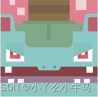
二、妙蛙种子
1.妙蛙种子

bulbasaur.html
<!DOCTYPE html>
<html lang="en">
<head>
    <meta charset="UTF-8">
    <title>bulbasaur</title>
    <link rel="stylesheet" href="bulbasaur.css">
</head>
<body>

<div class='pokemon'>
    <div class='grass poison' id='bulbasaur'>
        <div></div>
        <div></div>
        <div></div>
        <div></div>
    </div>
</div>

</body>
</html>
bulbasaur.css
@charset "UTF-8";
*, *:before, *:after {


    box-sizing: border-box; }

html, body {


    min-height: 100%; }

::selection {


    background: none; }

body {


    display: flex;
    align-items: center;
    font-family: -apple-system, BlinkMacSystemFont, "Segoe UI", Roboto, Oxygen-Sans, Ubuntu, Cantarell, "Helvetica Neue", Helvetica, Arial, sans-serif;
    font-size: 18px;
    overflow-x: hidden; }

main {


    display: none; }

.pokemon {


    display: flex;
    flex-flow: row wrap;
    align-items: center;
    align-content: center;
    justify-content: center;
    width: 100vw;
}


.pokemon > div {


    position: relative;
    flex-wrap: wrap;
    align-items: center;
    align-content: center;
    justify-content: center;
    width: calc(100vw / 10);
    height: calc(100vw / 10);
    overflow: hidden;
    background: #f1f1f1;
    }

.pokemon > div:before, .pokemon > div:after, .pokemon > div div:before, .pokemon > div div:after {


    content: "";
    display: block; }


#bulbasaur {


    background: #78d9ad; }
#bulbasaur:before {


    position: relative;
    width: 62.5%;
    margin-left: auto;
    margin-right: auto;
    height: 9.38%;
    background: linear-gradient(to right, #75b87e 43.75%, #639868 43.75%, #639868 56.25%, #75b87e 56.25%);
    clip-path: polygon(0 0, 100% 0, 94.38% 100%, 5.63% 100%); }
#bulbasaur:after {


    position: absolute;
    top: 56.25%;
    left: 45%;
    width: 10%;
    height: 4%;
    background: linear-gradient(to right, #5aaa84 16%, transparent 16%, transparent 84%, #5aaa84 84%); }
#bulbasaur > div:nth-child(1) {


    position: absolute;
    top: 9.38%;
    left: 50%;
    width: 21.09%;
    height: 10.16%;
    background: #3c8a5d; }
#bulbasaur > div:nth-child(1):before {


    position: absolute;
    top: 84.62%;
    left: -66.67%;
    width: 33.33%;
    height: 69.23%;
    background: #3c8a5d; }
#bulbasaur > div:nth-child(1):after {


    position: absolute;
    top: 200%;
    left: -11.11%;
    width: 48.15%;
    height: 100%;
    background: #3c8a5d; }
#bulbasaur > div:nth-child(2) {


    position: absolute;
    top: 31.25%;
    width: 24.61%;
    height: 25.39%;
    background: #EFEFEF;
    padding-top: 2.34%; }
#bulbasaur > div:nth-child(2):before {


    position: relative;
    width: 100%;
    height: 100%;
    background: linear-gradient(#bd414f 73.33%, #d6616d 73.33%); }
#bulbasaur > div:nth-child(2):after {


    position: absolute;
    top: 32.31%;
    width: 23.81%;
    height: 47.69%;
    background: #EFEFEF; }
#bulbasaur > div:nth-child(3) {


    position: absolute;
    top: 31.25%;
    width: 24.61%;
    height: 25.39%;
    background: #EFEFEF;
    padding-top: 2.34%; }
#bulbasaur > div:nth-child(3):before {


    position: relative;
    width: 100%;
    height: 100%;
    background: linear-gradient(#bd414f 73.33%, #d6616d 73.33%); }
#bulbasaur > div:nth-child(3):after {


    position: absolute;
    top: 32.31%;
    width: 23.81%;
    height: 47.69%;
    background: #EFEFEF; }
#bulbasaur > div:nth-child(2) {


    left: 8%; }
#bulbasaur > div:nth-child(3) {


    right: 8%; }
#bulbasaur > div:nth-child(2) {


    padding-left: 6.25%; }
#bulbasaur > div:nth-child(3) {


    padding-right: 6.25%; }
#bulbasaur > div:nth-child(2) {


    clip-path: polygon(0 0, 77.78% 0, 100% 100%, 0 100%); }
#bulbasaur > div:nth-child(3) {


    clip-path: polygon(22.22% 0, 100% 0, 100% 100%, 0 100%); }
#bulbasaur > div:nth-child(2):after {


    left: 49.21%; }
#bulbasaur > div:nth-child(3):after {


    right: 49.21%; }
#bulbasaur > div:nth-child(4) {


    position: absolute;
    top: 62.5%;
    left: 12.89%;
    width: 74.22%;
    height: 15.63%;
    background: #944368;
    padding: 7.81% 8.98% 0; }
#bulbasaur > div:nth-child(4):before {


    position: absolute;
    top: 0;
    left: 6.315%;
    width: 87.37%;
    height: 35%;
    background: linear-gradient(to right, #EFEFEF 11.45%, transparent 11.45%, transparent 88.55%, #EFEFEF 88.55%); }
#bulbasaur > div:nth-child(4):after {


    position: relative;
    width: 100%;
    height: 100%;
    background: #ce779f; }
运行效果:
2.妙蛙草

ivysaur.html
<!DOCTYPE html>
<html lang="en">
<head>
    <meta charset="UTF-8">
    <title>ivysaur</title>
    <link rel="stylesheet" href="ivysaur.css">
</head>
<body>

<div class='pokemon'>
    <div class='grass poison' id='ivysaur'>
        <div></div>
        <div></div>
        <div></div>
        <div></div>
        <div></div>
    </div>
</div>

</body>
</html>
ivysaur.css
@charset "UTF-8";
*, *:before, *:after {


    box-sizing: border-box; }

html, body {


    min-height: 100%; }

::selection {


    background: none; }

body {


    display: flex;
    align-items: center;
    font-family: -apple-system, BlinkMacSystemFont, "Segoe UI", Roboto, Oxygen-Sans, Ubuntu, Cantarell, "Helvetica Neue", Helvetica, Arial, sans-serif;
    font-size: 18px;
    overflow-x: hidden; }

main {


    display: none; }

.pokemon {


    display: flex;
    flex-flow: row wrap;
    align-items: center;
    align-content: center;
    justify-content: center;
    width: 100vw;
}


.pokemon > div {


    position: relative;
    flex-wrap: wrap;
    align-items: center;
    align-content: center;
    justify-content: center;
    width: calc(100vw / 10);
    height: calc(100vw / 10);
    overflow: hidden;
    background: #f1f1f1;
    }

.pokemon > div:before, .pokemon > div:after, .pokemon > div div:before, .pokemon > div div:after {


    content: "";
    display: block; }

#ivysaur {


    background: #81bbc6; }
#ivysaur:before {


    position: relative;
    width: 75%;
    margin-left: auto;
    margin-right: auto;
    height: 11.5%;
    background: #d87289;
    clip-path: polygon(0 0, 100% 0, 89.5% 100%, 10.5% 100%); }
#ivysaur:after {


    position: absolute;
    top: 0;
    left: 25.78%;
    width: 48.44%;
    height: 11.5%;
    background: #6ba470; }
#ivysaur > div:nth-child(1) {


    position: absolute;
    top: 11.5%;
    left: 40.63%;
    width: 31.25%;
    height: 19.92%;
    z-index: 2; }
#ivysaur > div:nth-child(1):before {


    position: absolute;
    width: 100%;
    height: 100%;
    background: #317d94;
    clip-path: polygon(0 0, 100% 0, 63.75% 100%, 36.25% 100%); }
#ivysaur > div:nth-child(1):after {


    position: absolute;
    top: 84.31%;
    left: -20%;
    width: 30%;
    height: 43.14%;
    background: #317d94;
    clip-path: polygon(0 0, 100% 0, 71% 100%, 29% 100%); }
#ivysaur > div:nth-child(2) {


    position: absolute;
    top: 33.2%;
    left: 21.485%;
    width: 57.03%;
    height: 31.64%;
    background: #81bbc6;
    z-index: 1;
    clip-path: polygon(0 0, 100% 0, 68% 100%, 32% 100%); }
#ivysaur > div:nth-child(2):before, #ivysaur > div:nth-child(2):after {


    width: 3.42%;
    height: 12.35%;
    background: #6b9aa5; }
#ivysaur > div:nth-child(2):before {


    left: 40.41%; }
#ivysaur > div:nth-child(2):after {


    right: 40.41%; }
#ivysaur > div:nth-child(2):before, #ivysaur > div:nth-child(2):after {


    position: absolute;
    top: 76.54%; }
#ivysaur > div:nth-child(3) {


    position: absolute;
    top: 33.59%;
    width: 27.34%;
    height: 20.31%;
    background: white;
    z-index: 0; }
#ivysaur > div:nth-child(3):before {


    position: relative;
    width: 100%;
    height: 100%;
    background: linear-gradient(#c64552 69.23%, #e14e5a 69.23%); }
#ivysaur > div:nth-child(3):after {


    position: absolute;
    top: 0;
    width: 21.43%;
    height: 82.69%;
    background: #3c292b; }
#ivysaur > div:nth-child(4) {


    position: absolute;
    top: 33.59%;
    width: 27.34%;
    height: 20.31%;
    background: white;
    z-index: 0; }
#ivysaur > div:nth-child(4):before {


    position: relative;
    width: 100%;
    height: 100%;
    background: linear-gradient(#c64552 69.23%, #e14e5a 69.23%); }
#ivysaur > div:nth-child(4):after {


    position: absolute;
    top: 0;
    width: 21.43%;
    height: 82.69%;
    background: #3c292b; }
#ivysaur > div:nth-child(3) {


    left: 6.25%; }
#ivysaur > div:nth-child(4) {


    right: 6.25%; }
#ivysaur > div:nth-child(3) {


    padding-left: 7.81%; }
#ivysaur > div:nth-child(4) {


    padding-right: 7.81%; }
#ivysaur > div:nth-child(3):after {


    left: 55.71%; }
#ivysaur > div:nth-child(4):after {


    right: 55.71%; }
#ivysaur > div:nth-child(5) {


    position: absolute;
    top: 60.55%;
    left: 9.96%;
    width: 80.08%;
    height: 16.41%;
    background: #944368;
    padding: 9.38% 10.55% 0; }
#ivysaur > div:nth-child(5):before {


    position: absolute;
    top: 0;
    left: 7.075%;
    width: 85.85%;
    height: 42.86%;
    background: linear-gradient(to right, #EFEFEF 13.64%, transparent 13.64%, transparent 86.36%, #EFEFEF 86.36%); }
#ivysaur > div:nth-child(5):after {


    position: relative;
    width: 100%;
    height: 100%;
    background: #ce779f; }
运行效果:
3.妙蛙花

venusaur.html
<!DOCTYPE html>
<html lang="en">
<head>
    <meta charset="UTF-8">
    <title>venusaur</title>
    <link rel="stylesheet" href="venusaur.css">
</head>
<body>

<div class='pokemon'>
    <div class='grass poison' id='venusaur'>
        <div>
            <div></div>
        </div>
        <div>
            <div></div>
        </div>
        <div>
            <div></div>
        </div>
        <div>
            <div></div>
        </div>
        <div>
            <div></div>
        </div>
        <div>
            <div></div>
        </div>
        <div>
            <div></div>
        </div>
    </div>
</div>

</body>
</html>
venusaur,css
@charset "UTF-8";
*, *:before, *:after {


    box-sizing: border-box; }

html, body {


    min-height: 100%; }

::selection {


    background: none; }

body {


    display: flex;
    align-items: center;
    font-family: -apple-system, BlinkMacSystemFont, "Segoe UI", Roboto, Oxygen-Sans, Ubuntu, Cantarell, "Helvetica Neue", Helvetica, Arial, sans-serif;
    font-size: 18px;
    overflow-x: hidden; }

main {


    display: none; }

.pokemon {


    display: flex;
    flex-flow: row wrap;
    align-items: center;
    align-content: center;
    justify-content: center;
    width: 100vw;
}


.pokemon > div {


    position: relative;
    flex-wrap: wrap;
    align-items: center;
    align-content: center;
    justify-content: center;
    width: calc(100vw / 10);
    height: calc(100vw / 10);
    overflow: hidden;
    background: #f1f1f1;
    }

.pokemon > div:before, .pokemon > div:after, .pokemon > div div:before, .pokemon > div div:after {


    content: "";
    display: block; }

#venusaur {


    background: #8cc7c3; }
#venusaur:before, #venusaur:after {


    width: 2.73%;
    height: 2.73%;
    background: #6b9a99; }
#venusaur:before {


    left: 42.97%; }
#venusaur:after {


    right: 42.97%; }
#venusaur:before, #venusaur:after {


    position: absolute;
    top: 67.97%; }
#venusaur > div:nth-child(1) {


    position: relative;
    width: 100%;
    height: 25%;
    background: #e1808e; }
#venusaur > div:nth-child(1):before {


    position: absolute;
    left: 9.38%;
    width: 5.47%;
    height: 21.88%;
    background: #f4d3d3; }
#venusaur > div:nth-child(1):after {


    position: absolute;
    top: 32.81%;
    left: 17.19%;
    width: 7.81%;
    height: 31.25%;
    background: #f4d3d3; }
#venusaur > div:nth-child(1) div {


    position: absolute;
    right: 11.72%;
    width: 10.94%;
    height: 43.75%;
    background: #f4d3d3; }
#venusaur > div:nth-child(2) {


    position: absolute;
    top: 0;
    width: 100%;
    height: 100%; }
#venusaur > div:nth-child(2):before {


    position: absolute;
    top: 0;
    left: 28.9%;
    width: 42.2%;
    height: 21.95%;
    background: linear-gradient(#8A7150 26.79%, #796249 26.79%, #796249 66.07%, #8A7150 66.07%); }
#venusaur > div:nth-child(2) div {


    position: absolute;
    top: 25.05%;
    width: 100%;
    height: 7.81%;
    background: #81a884; }
#venusaur > div:nth-child(2) div:before {


    position: absolute;
    left: 25.4%;
    width: 49.2%;
    height: 310%;
    background: #81a884;
    clip-path: polygon(0 0, 100% 0, 100% 83.87%, 93% 100%, 7% 100%, 0 83.87%); }
#venusaur > div:nth-child(3):before {


    position: absolute;
    top: 21.95%;
    left: 22.7%;
    width: 54.6%;
    height: 3.1%;
    background: #759a78; }
#venusaur > div:nth-child(3):after {


    position: absolute;
    top: 21.95%;
    left: 47.7%;
    width: 4.6%;
    height: 19.53%;
    background: #759a78; }
#venusaur > div:nth-child(4) {


    position: absolute;
    top: 0;
    width: 100%;
    height: 100%;
    display: flex;
    justify-content: space-between; }
#venusaur > div:nth-child(4):before, #venusaur > div:nth-child(4):after {


    width: 15.63%;
    height: 18.4%;
    background: #8cc7c3; }
#venusaur > div:nth-child(4):before, #venusaur > div:nth-child(4):after {


    position: relative;
    top: 14.8%; }
#venusaur > div:nth-child(4):before, #venusaur > div:nth-child(4):after {


    clip-path: polygon(72.5% 0, 82.5% 12.77%, 100% 100%, 0 100%, 0 0); }
#venusaur > div:nth-child(4):after {


    transform: rotateY(0.5turn); }
#venusaur > div:nth-child(4) div {


    position: absolute;
    top: 17.97%;
    width: 100%;
    height: 14.84%;
    z-index: 1;
    display: flex;
    justify-content: space-between; }
#venusaur > div:nth-child(4) div:before, #venusaur > div:nth-child(4) div:after {


    width: 10.16%;
    height: 100%;
    background: #bd5f6d; }
#venusaur > div:nth-child(4) div:before, #venusaur > div:nth-child(4) div:after {


    position: relative;
    top: 0; }
#venusaur > div:nth-child(4) div:before, #venusaur > div:nth-child(4) div:after {


    clip-path: polygon(84.62% 0, 100% 10.53%, 100% 100%, 0 100%, 0 0); }
#venusaur > div:nth-child(4) div:after {


    transform: rotateY(0.5turn); }
#venusaur > div:nth-child(5) {


    position: absolute;
    top: 45%;
    width: 19.14%;
    height: 19.14%;
    background: white;
    padding: 0 4.3% 3.13%;
    overflow: hidden; }
#venusaur > div:nth-child(5) div {


    position: relative;
    width: 100%;
    height: 100%;
    background: #c65563; }
#venusaur > div:nth-child(5) div:before {


    position: absolute;
    left: 32.14%;
    width: 35.72%;
    height: 78.05%;
    background: white; }
#venusaur > div:nth-child(5) div:after {


    position: absolute;
    bottom: 0;
    width: 75%;
    height: 21.95%;
    background: #db5e6d; }
#venusaur > div:nth-child(5):after {


    position: absolute;
    top: -2%;
    left: -2%;
    width: 104%;
    height: 104%;
    background: #86c0bd; }
#venusaur > div:nth-child(6) {


    position: absolute;
    top: 45%;
    width: 19.14%;
    height: 19.14%;
    background: white;
    padding: 0 4.3% 3.13%;
    overflow: hidden; }
#venusaur > div:nth-child(6) div {


    position: relative;
    width: 100%;
    height: 100%;
    background: #c65563; }
#venusaur > div:nth-child(6) div:before {


    position: absolute;
    left: 32.14%;
    width: 35.72%;
    height: 78.05%;
    background: white; }
#venusaur > div:nth-child(6) div:after {


    position: absolute;
    bottom: 0;
    width: 75%;
    height: 21.95%;
    background: #db5e6d; }
#venusaur > div:nth-child(6):after {


    position: absolute;
    top: -2%;
    left: -2%;
    width: 104%;
    height: 104%;
    background: #86c0bd; }
#venusaur > div:nth-child(5) {


    left: 5.47%; }
#venusaur > div:nth-child(6) {


    right: 5.47%; }
#venusaur > div:nth-child(5) div:after {


    left: 0; }
#venusaur > div:nth-child(6) div:after {


    right: 0; }
#venusaur > div:nth-child(5):after {


    clip-path: polygon(0 0, 100% 0, 100% 73.47%, 0 30.61%); }
#venusaur > div:nth-child(6):after {


    clip-path: polygon(0 0, 100% 0, 100% 30.61%, 0 73.47%); }
#venusaur > div:nth-child(7) {


    position: absolute;
    top: 69.14%;
    width: 100%;
    height: 16.8%;
    background: #864244;
    clip-path: polygon(0 0, 37.5% 0, 39.84% 23.26%, 60.16% 23.26%, 62.5% 0, 100% 0, 100% 100%, 0 100%); }
#venusaur > div:nth-child(7):before, #venusaur > div:nth-child(7):after {


    width: 7.03%;
    height: 39.53%;
    background: white; }
#venusaur > div:nth-child(7):before {


    left: 4.69%; }
#venusaur > div:nth-child(7):after {


    right: 4.69%; }
#venusaur > div:nth-child(7):before, #venusaur > div:nth-child(7):after {


    position: absolute;
    top: 0; }
#venusaur > div:nth-child(7) div {


    position: absolute;
    bottom: 0;
    width: 100%;
    height: 41.86%;
    background: #9c7b94; }
#venusaur > div:nth-child(7) div:before, #venusaur > div:nth-child(7) div:after {


    width: 16.41%;
    height: 61.11%;
    background: linear-gradient(to right, white 38.1%, #9c7b94 38.1%, #9c7b94 61.9%, white 61.9%); }
#venusaur > div:nth-child(7) div:before {


    left: 7.81%; }
#venusaur > div:nth-child(7) div:after {


    right: 7.81%; }
#venusaur > div:nth-child(7) div:before, #venusaur > div:nth-child(7) div:after {


    position: absolute;
    bottom: 0; }
运行效果:
三、小火龙
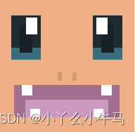
1.小火龙

charmander.html
<!DOCTYPE html>
<html lang="en">
<head>
    <meta charset="UTF-8">
    <title>charmander</title>
    <link rel="stylesheet" href="charmander.css">
</head>
<body>

<div class='pokemon'>
    <div class='fire' id='charmander'>
        <div>
            <div></div>
        </div>
        <div>
            <div></div>
        </div>
        <div>
            <div></div>
        </div>
    </div>
</div>

</body>
</html>
charmander.css
@charset "UTF-8";
*, *:before, *:after {


    box-sizing: border-box; }

html, body {


    min-height: 100%; }

::selection {


    background: none; }

body {


    display: flex;
    align-items: center;
    font-family: -apple-system, BlinkMacSystemFont, "Segoe UI", Roboto, Oxygen-Sans, Ubuntu, Cantarell, "Helvetica Neue", Helvetica, Arial, sans-serif;
    font-size: 18px;
    overflow-x: hidden; }

main {


    display: none; }

.pokemon {


    display: flex;
    flex-flow: row wrap;
    align-items: center;
    align-content: center;
    justify-content: center;
    width: 100vw;
}


.pokemon > div {


    position: relative;
    flex-wrap: wrap;
    align-items: center;
    align-content: center;
    justify-content: center;
    width: calc(100vw / 10);
    height: calc(100vw / 10);
    overflow: hidden;
    background: #f1f1f1;
    }

.pokemon > div:before, .pokemon > div:after, .pokemon > div div:before, .pokemon > div div:after {


    content: "";
    display: block; }

#charmander {


    background: #efaf84; }
#charmander:before, #charmander:after {


    width: 3.13%;
    height: 6.25%;
    background: #d39873; }
#charmander:before {


    left: 42.97%; }
#charmander:after {


    right: 42.97%; }
#charmander:before, #charmander:after {


    position: absolute;
    top: 55.08%; }
#charmander > div:nth-child(1) {


    position: absolute;
    top: 12.89%;
    width: 21.88%;
    height: 33.2%;
    background: #1e2c31;
    padding: 7.42% 6.25% 5.47%; }
#charmander > div:nth-child(1) div {


    position: relative;
    width: 100%;
    height: 100%;
    background: #182226; }
#charmander > div:nth-child(1):before {


    position: absolute;
    left: 0;
    bottom: 0;
    width: 100%;
    height: 27.06%;
    background: #396d7e; }
#charmander > div:nth-child(1):after {


    position: absolute;
    top: 4.71%;
    width: 37.5%;
    height: 37.65%;
    background: white; }
#charmander > div:nth-child(2) {


    position: absolute;
    top: 12.89%;
    width: 21.88%;
    height: 33.2%;
    background: #1e2c31;
    padding: 7.42% 6.25% 5.47%; }
#charmander > div:nth-child(2) div {


    position: relative;
    width: 100%;
    height: 100%;
    background: #182226; }
#charmander > div:nth-child(2):before {


    position: absolute;
    left: 0;
    bottom: 0;
    width: 100%;
    height: 27.06%;
    background: #396d7e; }
#charmander > div:nth-child(2):after {


    position: absolute;
    top: 4.71%;
    width: 37.5%;
    height: 37.65%;
    background: white; }
#charmander > div:nth-child(1) {


    left: 9%; }
#charmander > div:nth-child(2) {


    right: 9%; }
#charmander > div:nth-child(2):after {


    left: 12.5%; }
#charmander > div:nth-child(1):after {


    right: 12.5%; }
#charmander > div:nth-child(3) {


    position: absolute;
    top: 64.45%;
    left: 11%;
    width: 78%;
    height: 24.22%;
    background: #a26f8e;
    padding: 11.33% 8.2% 0; }
#charmander > div:nth-child(3):before, #charmander > div:nth-child(3):after {


    width: 10.5%;
    height: 32.26%;
    background: white; }
#charmander > div:nth-child(3):before {


    left: 7%; }
#charmander > div:nth-child(3):after {


    right: 7%; }
#charmander > div:nth-child(3):before, #charmander > div:nth-child(3):after {


    position: absolute;
    top: 0; }
#charmander > div:nth-child(3) div {


    position: relative;
    width: 100%;
    height: 100%;
    background: #cb98c0; }
#charmander > div:nth-child(3) div:before, #charmander > div:nth-child(3) div:after {


    width: 11.25%;
    height: 48.48%;
    background: white; }
#charmander > div:nth-child(3) div:before {


    left: 6.25%; }
#charmander > div:nth-child(3) div:after {


    right: 6.25%; }
#charmander > div:nth-child(3) div:before, #charmander > div:nth-child(3) div:after {


    position: absolute;
    bottom: 0; }
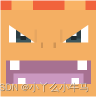
运行效果:
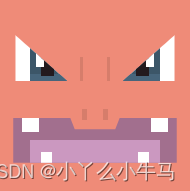
2.火恐龙
charmeleon.html
<!DOCTYPE html>
<html lang="en">
<head>
    <meta charset="UTF-8">
    <title>charmeleon</title>
    <link rel="stylesheet" href="charmeleon.css">
</head>
<body>

<div class='pokemon'>
    <div class='fire' id='charmeleon'>
        <div>
            <div></div>
        </div>
        <div>
            <div></div>
        </div>
        <div>
            <div></div>
        </div>
    </div>
</div>

</body>
</html>
charmeleon.css
@charset "UTF-8";
*, *:before, *:after {


    box-sizing: border-box; }

html, body {


    min-height: 100%; }

::selection {


    background: none; }

body {


    display: flex;
    align-items: center;
    font-family: -apple-system, BlinkMacSystemFont, "Segoe UI", Roboto, Oxygen-Sans, Ubuntu, Cantarell, "Helvetica Neue", Helvetica, Arial, sans-serif;
    font-size: 18px;
    overflow-x: hidden; }

main {


    display: none; }

.pokemon {


    display: flex;
    flex-flow: row wrap;
    align-items: center;
    align-content: center;
    justify-content: center;
    width: 100vw;
}


.pokemon > div {


    position: relative;
    flex-wrap: wrap;
    align-items: center;
    align-content: center;
    justify-content: center;
    width: calc(100vw / 10);
    height: calc(100vw / 10);
    overflow: hidden;
    background: #f1f1f1;
    }

.pokemon > div:before, .pokemon > div:after, .pokemon > div div:before, .pokemon > div div:after {


    content: "";
    display: block; }

#charmeleon {


    background: #ef8b78; }
#charmeleon:before {


    position: absolute;
    top: 29.69%;
    left: 42.185%;
    width: 15.63%;
    height: 12.5%;
    background: linear-gradient(to right, #d67d6b 10%, transparent 10%, transparent 90%, #d67d6b 90%); }
#charmeleon:after {


    position: absolute;
    top: 57.03%;
    left: 43.36%;
    width: 13.28%;
    height: 5.47%;
    background: linear-gradient(to right, #d67d6b 17.65%, transparent 17.65%, transparent 82.35%, #d67d6b 82.35%); }
#charmeleon > div:nth-child(1) {


    position: absolute;
    top: 18.36%;
    width: 26.95%;
    height: 23.83%;
    background: white; }
#charmeleon > div:nth-child(1):before {


    position: absolute;
    width: 15.94%;
    height: 68.85%;
    background: white;
    z-index: 1; }
#charmeleon > div:nth-child(1):after {


    position: absolute;
    top: 0;
    width: 24.64%;
    height: 88.52%;
    background: #231a1e; }
#charmeleon > div:nth-child(1) div {


    position: relative;
    width: 100%;
    height: 100%;
    background: #3c5668; }
#charmeleon > div:nth-child(1) div:before {


    position: absolute;
    bottom: 0;
    width: 100%;
    height: 16.39%;
    background: #47657b; }
#charmeleon > div:nth-child(2) {


    position: absolute;
    top: 18.36%;
    width: 26.95%;
    height: 23.83%;
    background: white; }
#charmeleon > div:nth-child(2):before {


    position: absolute;
    width: 15.94%;
    height: 68.85%;
    background: white;
    z-index: 1; }
#charmeleon > div:nth-child(2):after {


    position: absolute;
    top: 0;
    width: 24.64%;
    height: 88.52%;
    background: #231a1e; }
#charmeleon > div:nth-child(2) div {


    position: relative;
    width: 100%;
    height: 100%;
    background: #3c5668; }
#charmeleon > div:nth-child(2) div:before {


    position: absolute;
    bottom: 0;
    width: 100%;
    height: 16.39%;
    background: #47657b; }
#charmeleon > div:nth-child(1) {


    left: 8.59%; }
#charmeleon > div:nth-child(2) {


    right: 8.59%; }
#charmeleon > div:nth-child(1) {


    clip-path: polygon(0 0, 100% 100%, 0 100%); }
#charmeleon > div:nth-child(2) {


    clip-path: polygon(100% 0, 100% 100%, 0 100%); }
#charmeleon > div:nth-child(1) {


    padding-left: 7.81%; }
#charmeleon > div:nth-child(2) {


    padding-right: 7.81%; }
#charmeleon > div:nth-child(1):before {


    left: 39.13%; }
#charmeleon > div:nth-child(2):before {


    right: 39.13%; }
#charmeleon > div:nth-child(1):after {


    left: 49.28%; }
#charmeleon > div:nth-child(2):after {


    right: 49.28%; }
#charmeleon > div:nth-child(3) {


    position: absolute;
    top: 61.33%;
    left: 7.42%;
    width: 85.16%;
    height: 23.44%;
    background: #a26f8e;
    padding: 11.72% 8.6% 0;
    clip-path: polygon(37.61% 25.42%, 62.39% 25.42%, 65.14% 0, 100% 0, 100% 100%, 0 100%, 0 0, 34.86% 0); }
#charmeleon > div:nth-child(3):before, #charmeleon > div:nth-child(3):after {


    width: 10.1%;
    height: 31.67%;
    background: white; }
#charmeleon > div:nth-child(3):before {


    left: 5.5%; }
#charmeleon > div:nth-child(3):after {


    right: 5.5%; }
#charmeleon > div:nth-child(3):before, #charmeleon > div:nth-child(3):after {


    position: absolute;
    top: 0; }
#charmeleon > div:nth-child(3) div {


    position: relative;
    width: 100%;
    height: 100%;
    background: #cb98c0; }
#charmeleon > div:nth-child(3) div:before, #charmeleon > div:nth-child(3) div:after {


    width: 8.57%;
    height: 50%;
    background: white; }
#charmeleon > div:nth-child(3) div:before {


    left: 8.57%; }
#charmeleon > div:nth-child(3) div:after {


    right: 8.57%; }
#charmeleon > div:nth-child(3) div:before, #charmeleon > div:nth-child(3) div:after {


    position: absolute;
    bottom: 0; }
运行效果:
3.喷火龙
charizard.html
<!DOCTYPE html>
<html lang="en">
<head>
    <meta charset="UTF-8">
    <title>charizard</title>
    <link rel="stylesheet" href="charizard.css">
</head>
<body>

<div class='pokemon'>
    <div class='fire flying' id='charizard'>
        <div>
            <div></div>
        </div>
        <div>
            <div></div>
        </div>
        <div>
            <div></div>
        </div>
        <div>
            <div></div>
        </div>
    </div>
</div>

</body>
</html>
charizard.css
@charset "UTF-8";
*, *:before, *:after {


    box-sizing: border-box; }

html, body {


    min-height: 100%; }

::selection {


    background: none; }

body {


    display: flex;
    align-items: center;
    font-family: -apple-system, BlinkMacSystemFont, "Segoe UI", Roboto, Oxygen-Sans, Ubuntu, Cantarell, "Helvetica Neue", Helvetica, Arial, sans-serif;
    font-size: 18px;
    overflow-x: hidden; }

main {


    display: none; }

.pokemon {


    display: flex;
    flex-flow: row wrap;
    align-items: center;
    align-content: center;
    justify-content: center;
    width: 100vw;
}


.pokemon > div {


    position: relative;
    flex-wrap: wrap;
    align-items: center;
    align-content: center;
    justify-content: center;
    width: calc(100vw / 10);
    height: calc(100vw / 10);
    overflow: hidden;
    background: #f1f1f1;
    }

.pokemon > div:before, .pokemon > div:after, .pokemon > div div:before, .pokemon > div div:after {


    content: "";
    display: block; }

#charizard {


    background: linear-gradient(to bottom, #f1633c 9.77%, #f4af63 9.77%); }
#charizard:before, #charizard:after {


    width: 22.27%;
    height: 9.87%;
    background: #f9b365; }
#charizard:before {


    left: 11.33%; }
#charizard:after {


    right: 11.33%; }
#charizard:before, #charizard:after {


    position: absolute;
    top: 0; }
#charizard > div:nth-child(1) {


    position: absolute;
    top: 25.39%;
    width: 26.95%;
    height: 18.36%;
    background: white; }
#charizard > div:nth-child(1):before {


    position: absolute;
    width: 21.74%;
    height: 63.83%;
    background: white;
    z-index: 1; }
#charizard > div:nth-child(1):after {


    position: absolute;
    top: 0;
    width: 21.74%;
    height: 87.23%;
    background: #1e2a2e; }
#charizard > div:nth-child(1) div {


    position: relative;
    width: 100%;
    height: 100%;
    background: #2b3c42; }
#charizard > div:nth-child(1) div:before {


    position: absolute;
    bottom: 0;
    width: 100%;
    height: 21.28%;
    background: #3c565d; }
#charizard > div:nth-child(2) {


    position: absolute;
    top: 25.39%;
    width: 26.95%;
    height: 18.36%;
    background: white; }
#charizard > div:nth-child(2):before {


    position: absolute;
    width: 21.74%;
    height: 63.83%;
    background: white;
    z-index: 1; }
#charizard > div:nth-child(2):after {


    position: absolute;
    top: 0;
    width: 21.74%;
    height: 87.23%;
    background: #1e2a2e; }
#charizard > div:nth-child(2) div {


    position: relative;
    width: 100%;
    height: 100%;
    background: #2b3c42; }
#charizard > div:nth-child(2) div:before {


    position: absolute;
    bottom: 0;
    width: 100%;
    height: 21.28%;
    background: #3c565d; }
#charizard > div:nth-child(1) {


    left: 8.6%; }
#charizard > div:nth-child(2) {


    right: 8.6%; }
#charizard > div:nth-child(1) {


    clip-path: polygon(0 0, 100% 100%, 0 100%); }
#charizard > div:nth-child(2) {


    clip-path: polygon(100% 0, 100% 100%, 0 100%); }
#charizard > div:nth-child(1) {


    padding-left: 7.81%; }
#charizard > div:nth-child(2) {


    padding-right: 7.81%; }
#charizard > div:nth-child(2) {


    padding-left: 3.91%; }
#charizard > div:nth-child(1) {


    padding-right: 3.91%; }
#charizard > div:nth-child(1):before {


    left: 44.93%; }
#charizard > div:nth-child(2):before {


    right: 44.93%; }
#charizard > div:nth-child(1):after {


    left: 44.93%; }
#charizard > div:nth-child(2):after {


    right: 44.93%; }
#charizard > div:nth-child(3) {


    position: absolute;
    top: 30.08%;
    left: 35.55%;
    width: 28.9%;
    height: 19.53%;
    display: flex;
    justify-content: space-between; }
#charizard > div:nth-child(3):before, #charizard > div:nth-child(3):after {


    width: 9.46%;
    height: 70%;
    background: #e7a660; }
#charizard > div:nth-child(3):before, #charizard > div:nth-child(3):after {


    position: relative;
    top: 0; }
#charizard > div:nth-child(3) div {


    position: absolute;
    left: 23%;
    bottom: 0;
    width: 54%;
    height: 30%;
    display: flex;
    justify-content: space-between; }
#charizard > div:nth-child(3) div:before, #charizard > div:nth-child(3) div:after {


    width: 15%;
    height: 100%;
    background: #d09454; }
#charizard > div:nth-child(3) div:before, #charizard > div:nth-child(3) div:after {


    position: relative;
    top: 0; }
#charizard > div:nth-child(4) {


    position: absolute;
    top: 62.5%;
    left: 5.86%;
    width: 88.28%;
    height: 24.22%;
    background: #a77191;
    padding: 13.67% 7.81% 0; }
#charizard > div:nth-child(4):before, #charizard > div:nth-child(4):after {


    width: 11.5%;
    height: 40.32%;
    background: white; }
#charizard > div:nth-child(4):before {


    left: 4.42%; }
#charizard > div:nth-child(4):after {


    right: 4.42%; }
#charizard > div:nth-child(4):before, #charizard > div:nth-child(4):after {


    position: absolute;
    top: 0; }
#charizard > div:nth-child(4) div {


    position: relative;
    width: 100%;
    height: 100%;
    background: #cb98c0; }
#charizard > div:nth-child(4) div:before, #charizard > div:nth-child(4) div:after {


    width: 11.29%;
    height: 55.56%;
    background: white; }
#charizard > div:nth-child(4) div:before {


    left: 6%; }
#charizard > div:nth-child(4) div:after {


    right: 6%; }
#charizard > div:nth-child(4) div:before, #charizard > div:nth-child(4) div:after {


    position: absolute;
    bottom: 0; }
运行效果:
四、杰尼龟
1.杰尼龟

squirtle.html
<!DOCTYPE html>
<html lang="en">
<head>
    <meta charset="UTF-8">
    <title>squirtle</title>
    <link rel="stylesheet" href="squirtle.css">
</head>
<body>

<div class='pokemon'>
    <div class='water' id='squirtle'>
        <div>
            <div></div>
        </div>
        <div>
            <div></div>
        </div>
        <div></div>
    </div>
</div>

</body>
</html>
squirtle.css
@charset "UTF-8";
*, *:before, *:after {


    box-sizing: border-box; }

html, body {


    min-height: 100%; }

::selection {


    background: none; }

body {


    display: flex;
    align-items: center;
    font-family: -apple-system, BlinkMacSystemFont, "Segoe UI", Roboto, Oxygen-Sans, Ubuntu, Cantarell, "Helvetica Neue", Helvetica, Arial, sans-serif;
    font-size: 18px;
    overflow-x: hidden; }

main {


    display: none; }

.pokemon {


    display: flex;
    flex-flow: row wrap;
    align-items: center;
    align-content: center;
    justify-content: center;
    width: 100vw;
}


.pokemon > div {


    position: relative;
    flex-wrap: wrap;
    align-items: center;
    align-content: center;
    justify-content: center;
    width: calc(100vw / 10);
    height: calc(100vw / 10);
    overflow: hidden;
    background: #f1f1f1;
    }

.pokemon > div:before, .pokemon > div:after, .pokemon > div div:before, .pokemon > div div:after {


    content: "";
    display: block; }

#squirtle {


    background: #84c5d6; }
#squirtle:before, #squirtle:after {


    width: 2.73%;
    height: 3.91%;
    background: #70a7b5; }
#squirtle:before {


    left: 44.53%; }
#squirtle:after {


    right: 44.53%; }
#squirtle:before, #squirtle:after {


    position: absolute;
    top: 60.56%; }
#squirtle > div:nth-child(1) {


    position: absolute;
    top: 23.44%;
    width: 21.88%;
    height: 30.47%;
    background: white; }
#squirtle > div:nth-child(1) div {


    position: relative;
    width: 100%;
    height: 100%;
    background: #331e29; }
#squirtle > div:nth-child(1) div:before {


    position: absolute;
    bottom: 0;
    width: 100%;
    height: 26.92%;
    background: #91526d; }
#squirtle > div:nth-child(1):before {


    position: absolute;
    top: 5.13%;
    width: 35.71%;
    height: 24.36%;
    background: white;
    z-index: 1; }
#squirtle > div:nth-child(1):after {


    position: absolute;
    top: 5.13%;
    width: 35.71%;
    height: 79.49%;
    background: black; }
#squirtle > div:nth-child(2) {


    position: absolute;
    top: 23.44%;
    width: 21.88%;
    height: 30.47%;
    background: white; }
#squirtle > div:nth-child(2) div {


    position: relative;
    width: 100%;
    height: 100%;
    background: #331e29; }
#squirtle > div:nth-child(2) div:before {


    position: absolute;
    bottom: 0;
    width: 100%;
    height: 26.92%;
    background: #91526d; }
#squirtle > div:nth-child(2):before {


    position: absolute;
    top: 5.13%;
    width: 35.71%;
    height: 24.36%;
    background: white;
    z-index: 1; }
#squirtle > div:nth-child(2):after {


    position: absolute;
    top: 5.13%;
    width: 35.71%;
    height: 79.49%;
    background: black; }
#squirtle > div:nth-child(1) {


    left: 7.81%; }
#squirtle > div:nth-child(2) {


    right: 7.81%; }
#squirtle > div:nth-child(1) {


    padding-left: 5.47%; }
#squirtle > div:nth-child(2) {


    padding-right: 5.47%; }
#squirtle > div:nth-child(1):before {


    left: 44.64%; }
#squirtle > div:nth-child(2):before {


    right: 44.64%; }
#squirtle > div:nth-child(1):after {


    left: 44.64%; }
#squirtle > div:nth-child(2):after {


    right: 44.64%; }
#squirtle > div:nth-child(3) {


    position: absolute;
    top: 64.45%;
    left: 6.64%;
    width: 86.72%;
    height: 15.23%;
    background: #994b78;
    clip-path: polygon(44.14% 30.77%, 55.86% 30.77%, 63.96% 0, 100% 0, 100% 100%, 0 100%, 0 0, 36.04% 0);
    padding: 7.42% 9% 0; }
#squirtle > div:nth-child(3):before {


    position: relative;
    width: 100%;
    height: 100%;
    background: #d084ad; }
运行效果:

2.卡咪龟
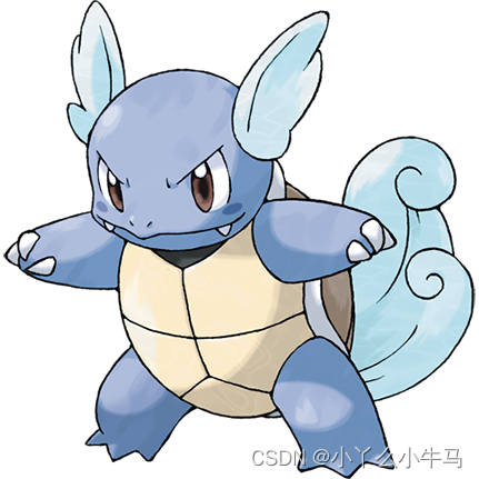
wartortle.html
<!DOCTYPE html>
<html lang="en">
<head>
    <meta charset="UTF-8">
    <title>wartortle</title>
    <link rel="stylesheet" href="wartortle.css">
</head>
<body>

<div class='pokemon'>
    <div class='water' id='wartortle'>
        <div>
            <div></div>
        </div>
        <div>
            <div></div>
        </div>
        <div></div>
        <div></div>
    </div>
</div>

</body>
</html>
wartortle.css
@charset "UTF-8";
*, *:before, *:after {


    box-sizing: border-box; }

html, body {


    min-height: 100%; }

::selection {


    background: none; }

body {


    display: flex;
    align-items: center;
    font-family: -apple-system, BlinkMacSystemFont, "Segoe UI", Roboto, Oxygen-Sans, Ubuntu, Cantarell, "Helvetica Neue", Helvetica, Arial, sans-serif;
    font-size: 18px;
    overflow-x: hidden; }

main {


    display: none; }

.pokemon {


    display: flex;
    flex-flow: row wrap;
    align-items: center;
    align-content: center;
    justify-content: center;
    width: 100vw;
}


.pokemon > div {


    position: relative;
    flex-wrap: wrap;
    align-items: center;
    align-content: center;
    justify-content: center;
    width: calc(100vw / 10);
    height: calc(100vw / 10);
    overflow: hidden;
    background: #f1f1f1;
    }

.pokemon > div:before, .pokemon > div:after, .pokemon > div div:before, .pokemon > div div:after {


    content: "";
    display: block; }

#wartortle {


    background: #75a4db; }
#wartortle:before {


    position: absolute;
    top: 51.17%;
    width: 100%;
    height: 5.86%;
    background: linear-gradient(to right, #6892c3 14.06%, transparent 14.06%, transparent 85.94%, #6892c3 85.94%); }
#wartortle:after {


    position: absolute;
    top: 61.33%;
    left: 45.31%;
    width: 9.38%;
    height: 4.3%;
    background: linear-gradient(to right, #6590c0 25%, transparent 25%, transparent 75%, #6590c0 75%); }
#wartortle > div:nth-child(1) {


    position: absolute;
    top: 25.78%;
    width: 26.56%;
    height: 31.25%;
    background: white; }
#wartortle > div:nth-child(1):before {


    position: absolute;
    top: 5%;
    width: 52.94%;
    height: 22.5%;
    background: white;
    z-index: 1; }
#wartortle > div:nth-child(1):after {


    position: absolute;
    top: 16.25%;
    width: 26.47%;
    height: 65%;
    background: #261915; }
#wartortle > div:nth-child(1) div {


    position: relative;
    width: 100%;
    height: 100%;
    background: #70473f; }
#wartortle > div:nth-child(1) div:before {


    position: absolute;
    bottom: 0;
    width: 100%;
    height: 27.5%;
    background: #7e4f47; }
#wartortle > div:nth-child(2) {


    position: absolute;
    top: 25.78%;
    width: 26.56%;
    height: 31.25%;
    background: white; }
#wartortle > div:nth-child(2):before {


    position: absolute;
    top: 5%;
    width: 52.94%;
    height: 22.5%;
    background: white;
    z-index: 1; }
#wartortle > div:nth-child(2):after {


    position: absolute;
    top: 16.25%;
    width: 26.47%;
    height: 65%;
    background: #261915; }
#wartortle > div:nth-child(2) div {


    position: relative;
    width: 100%;
    height: 100%;
    background: #70473f; }
#wartortle > div:nth-child(2) div:before {


    position: absolute;
    bottom: 0;
    width: 100%;
    height: 27.5%;
    background: #7e4f47; }
#wartortle > div:nth-child(1) {


    left: 8.2%; }
#wartortle > div:nth-child(2) {


    right: 8.2%; }
#wartortle > div:nth-child(1) {


    padding-left: 8.2%; }
#wartortle > div:nth-child(2) {


    padding-right: 8.2%; }
#wartortle > div:nth-child(1) {


    clip-path: polygon(0 0, 69.12% 0, 100% 100%, 0 100%); }
#wartortle > div:nth-child(2) {


    clip-path: polygon(30.88% 0, 100% 0, 100% 100%, 0 100%); }
#wartortle > div:nth-child(1):before {


    left: 47%; }
#wartortle > div:nth-child(2):before {


    right: 47%; }
#wartortle > div:nth-child(1):after {


    left: 57.35%; }
#wartortle > div:nth-child(2):after {


    right: 57.35%; }
#wartortle > div:nth-child(3) {


    position: absolute;
    top: 66.41%;
    left: 10.935%;
    width: 78.13%;
    height: 13.67%;
    background: #994b78;
    clip-path: polygon(43% 28.57%, 57% 28.57%, 61% 0, 100% 0, 100% 100%, 0 100%, 0 0, 39% 0);
    padding: 6.64% 12.89% 0; }
#wartortle > div:nth-child(3):before {


    position: absolute;
    top: 0;
    left: 3.5%;
    width: 93%;
    height: 48.57%;
    background: linear-gradient(to right, white 9.68%, transparent 9.68%, transparent 90.32%, white 90.32%); }
#wartortle > div:nth-child(3):after {


    position: relative;
    width: 100%;
    height: 100%;
    background: #d084ad; }
#wartortle > div:nth-child(4) {


    position: absolute;
    bottom: 0;
    width: 100%;
    height: 9.77%;
    background: #e1d1af;
    padding: 0 20%; }
#wartortle > div:nth-child(4):before {


    position: relative;
    width: 100%;
    height: 102%;
    background: #546165;
    clip-path: polygon(0 0, 100% 0, 93% 100%, 7% 100%); }
运行效果:

3.水箭龟
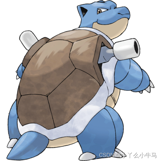
blastoise.html
<!DOCTYPE html>
<html lang="en">
<head>
    <meta charset="UTF-8">
    <title>blastoise</title>
    <link rel="stylesheet" href="blastoise.css">
</head>
<body>

<div class='pokemon'>
    <div class='water' id='blastoise'>
        <div>
            <div></div>
        </div>
        <div>
            <div></div>
        </div>
        <div>
            <div></div>
        </div>
        <div>
            <div></div>
        </div>
    </div>
</div>

</body>
</html>
blastoise.css
@charset "UTF-8";
*, *:before, *:after {


    box-sizing: border-box; }

html, body {


    min-height: 100%; }

::selection {


    background: none; }

body {


    display: flex;
    align-items: center;
    font-family: -apple-system, BlinkMacSystemFont, "Segoe UI", Roboto, Oxygen-Sans, Ubuntu, Cantarell, "Helvetica Neue", Helvetica, Arial, sans-serif;
    font-size: 18px;
    overflow-x: hidden; }

main {


    display: none; }

.pokemon {


    display: flex;
    flex-flow: row wrap;
    align-items: center;
    align-content: center;
    justify-content: center;
    width: 100vw;
}


.pokemon > div {


    position: relative;
    flex-wrap: wrap;
    align-items: center;
    align-content: center;
    justify-content: center;
    width: calc(100vw / 10);
    height: calc(100vw / 10);
    overflow: hidden;
    background: #f1f1f1;
    }

.pokemon > div:before, .pokemon > div:after, .pokemon > div div:before, .pokemon > div div:after {


    content: "";
    display: block; }

#blastoise {


    background: #94b7e1; }
#blastoise:before {


    position: absolute;
    bottom: 0;
    width: 100%;
    height: 25%;
    background: #e1d1af; }
#blastoise:after {


    position: relative;
    width: 51.56%;
    margin-left: auto;
    margin-right: auto;
    height: 8.2%;
    background: #a58b6d;
    clip-path: polygon(0 0, 100% 0, 96.2% 100%, 3.8% 100%); }
#blastoise > div:nth-child(1) {


    position: absolute;
    top: 22.66%;
    width: 29.3%;
    height: 21.48%;
    background: white; }
#blastoise > div:nth-child(1) div {


    position: relative;
    width: 100%;
    height: 100%;
    background: #635142; }
#blastoise > div:nth-child(1) div:before {


    position: absolute;
    bottom: 0;
    width: 100%;
    height: 16.36%;
    background: #7b6552; }
#blastoise > div:nth-child(1):before {


    position: absolute;
    width: 12%;
    height: 63.64%;
    background: white;
    z-index: 1; }
#blastoise > div:nth-child(1):after {


    position: absolute;
    top: 0;
    width: 16%;
    height: 90.91%;
    background: #312921; }
#blastoise > div:nth-child(2) {


    position: absolute;
    top: 22.66%;
    width: 29.3%;
    height: 21.48%;
    background: white; }
#blastoise > div:nth-child(2) div {


    position: relative;
    width: 100%;
    height: 100%;
    background: #635142; }
#blastoise > div:nth-child(2) div:before {


    position: absolute;
    bottom: 0;
    width: 100%;
    height: 16.36%;
    background: #7b6552; }
#blastoise > div:nth-child(2):before {


    position: absolute;
    width: 12%;
    height: 63.64%;
    background: white;
    z-index: 1; }
#blastoise > div:nth-child(2):after {


    position: absolute;
    top: 0;
    width: 16%;
    height: 90.91%;
    background: #312921; }
#blastoise > div:nth-child(1) {


    left: 7.81%; }
#blastoise > div:nth-child(2) {


    right: 7.81%; }
#blastoise > div:nth-child(1) {


    clip-path: polygon(0 0, 100% 100%, 0 100%); }
#blastoise > div:nth-child(2) {


    clip-path: polygon(100% 0, 100% 100%, 0 100%); }
#blastoise > div:nth-child(1) {


    padding-left: 11.72%; }
#blastoise > div:nth-child(2) {


    padding-right: 11.72%; }
#blastoise > div:nth-child(2) {


    padding-left: 6.64%; }
#blastoise > div:nth-child(1) {


    padding-right: 6.64%; }
#blastoise > div:nth-child(1):before {


    left: 45.33%; }
#blastoise > div:nth-child(2):before {


    right: 45.33%; }
#blastoise > div:nth-child(1):after {


    left: 50.67%; }
#blastoise > div:nth-child(2):after {


    right: 50.67%; }
#blastoise > div:nth-child(3) {


    position: absolute;
    top: 32.03%;
    left: 37.11%;
    width: 25.78%;
    height: 29.69%;
    display: flex;
    justify-content: space-between; }
#blastoise > div:nth-child(3):before, #blastoise > div:nth-child(3):after {


    width: 12.12%;
    height: 40.79%;
    background: #89acd3; }
#blastoise > div:nth-child(3):before, #blastoise > div:nth-child(3):after {


    position: relative;
    top: 0; }
#blastoise > div:nth-child(3) div {


    position: absolute;
    left: 8%;
    bottom: 0;
    width: 84%;
    height: 7.89%;
    background: #84a4c8; }
#blastoise > div:nth-child(3) div:before, #blastoise > div:nth-child(3) div:after {


    width: 23.64%;
    height: 100%;
    background: #7b9abd; }
#blastoise > div:nth-child(3) div:before {


    left: -11.82%; }
#blastoise > div:nth-child(3) div:after {


    right: -11.82%; }
#blastoise > div:nth-child(3) div:before, #blastoise > div:nth-child(3) div:after {


    position: absolute;
    top: -100%; }
#blastoise > div:nth-child(4) {


    position: absolute;
    top: 69.53%;
    left: 5.08%;
    width: 89.84%;
    height: 17.58%;
    background: #6b4b4a; }
#blastoise > div:nth-child(4):before, #blastoise > div:nth-child(4):after {


    width: 10%;
    height: 31.11%;
    background: white; }
#blastoise > div:nth-child(4):before {


    left: 11.74%; }
#blastoise > div:nth-child(4):after {


    right: 11.74%; }
#blastoise > div:nth-child(4):before, #blastoise > div:nth-child(4):after {


    position: absolute;
    top: 0; }
#blastoise > div:nth-child(4) div {


    position: absolute;
    bottom: 0;
    width: 100%;
    height: 46.67%;
    background: linear-gradient(to right, transparent 12.17%, #b76b7e 12.17%, #b76b7e 87.83%, transparent 87.83%);
    display: flex;
    justify-content: space-between;
    align-items: flex-end; }
#blastoise > div:nth-child(4) div:before, #blastoise > div:nth-child(4) div:after {


    width: 22.17%;
    height: 52.38%; }
#blastoise > div:nth-child(4) div:before, #blastoise > div:nth-child(4) div:after {


    position: relative;
    top: 0; }
#blastoise > div:nth-child(4) div:before {


    background: linear-gradient(to right, white 29.41%, transparent 29.41%, transparent 54.9%, white 54.9%); }
#blastoise > div:nth-child(4) div:after {


    background: linear-gradient(to right, white 45.1%, transparent 45.1%, transparent 70.59%, white 70.59%); }
运行效果:

五、胖丁
1.胖丁

jigglypuff.html
<!DOCTYPE html>
<html lang="en">
<head>
    <meta charset="UTF-8">
    <title>jigglypuff</title>
    <link rel="stylesheet" href="jigglypuff.css">
</head>
<body>

<div class='pokemon'>
    <div class='normal fairy' id='jigglypuff'>
        <div>
            <div></div>
        </div>
        <div>
            <div></div>
        </div>
        <div>
            <div></div>
        </div>
    </div>
</div>

</body>
</html>
jigglypuff.css
@charset "UTF-8";
*, *:before, *:after {


    box-sizing: border-box; }

html, body {


    min-height: 100%; }

::selection {


    background: none; }

body {


    display: flex;
    align-items: center;
    font-family: -apple-system, BlinkMacSystemFont, "Segoe UI", Roboto, Oxygen-Sans, Ubuntu, Cantarell, "Helvetica Neue", Helvetica, Arial, sans-serif;
    font-size: 18px;
    overflow-x: hidden; }

main {


    display: none; }

.pokemon {


    display: flex;
    flex-flow: row wrap;
    align-items: center;
    align-content: center;
    justify-content: center;
    width: 100vw;
}


.pokemon > div {


    position: relative;
    flex-wrap: wrap;
    align-items: center;
    align-content: center;
    justify-content: center;
    width: calc(100vw / 10);
    height: calc(100vw / 10);
    overflow: hidden;
    background: #f1f1f1;
    }

.pokemon > div:before, .pokemon > div:after, .pokemon > div div:before, .pokemon > div div:after {


    content: "";
    display: block; }

#jigglypuff {


    background: #f7d7df; }
#jigglypuff:before {


    position: absolute;
    top: 58.59%;
    left: 41.405%;
    width: 17.19%;
    height: 13.28%;
    background: linear-gradient(to bottom, #8a4041 79.41%, #ee8b9a 79.41%); }
#jigglypuff > div:nth-child(1) {


    position: absolute;
    left: 27.34%;
    width: 52.34%;
    height: 23.44%; }
#jigglypuff > div:nth-child(1):before {


    position: absolute;
    width: 86.57%;
    height: 100%;
    background: #e5c4cc;
    border-radius: 0 0 5% 5% / 0 0 15% 15%; }
#jigglypuff > div:nth-child(1):after {


    position: absolute;
    right: 0;
    width: 13.43%;
    height: 45%;
    background: #e5c4cc;
    border-bottom-right-radius: 50% 25%; }
#jigglypuff > div:nth-child(1) div {


    position: absolute;
    left: 8.21%;
    width: 84.33%;
    height: 70%;
    z-index: 1; }
#jigglypuff > div:nth-child(1) div:before {


    position: absolute;
    width: 83.19%;
    height: 100%;
    background: #f7d7df;
    border-radius: 0 0 5% 5% / 0 0 15% 15%; }
#jigglypuff > div:nth-child(1) div:after {


    position: absolute;
    right: 0;
    width: 16.81%;
    height: 35.71%;
    background: #f7d7df;
    border-bottom-right-radius: 25% 50%; }
#jigglypuff > div:nth-child(2) {


    position: absolute;
    top: 29.69%;
    width: 29.69%;
    height: 30.08%;
    background: white; }
#jigglypuff > div:nth-child(2) div {


    position: absolute;
    top: 10.39%;
    width: 77.63%;
    height: 76.62%;
    background: #017c96; }
#jigglypuff > div:nth-child(2) div:before {


    position: absolute;
    top: 10.17%;
    width: 32.2%;
    height: 30.51%;
    background: white; }
#jigglypuff > div:nth-child(2) div:after {


    position: absolute;
    bottom: 0;
    width: 100%;
    height: 23.73%;
    background: #01a3be; }
#jigglypuff > div:nth-child(3) {


    position: absolute;
    top: 29.69%;
    width: 29.69%;
    height: 30.08%;
    background: white; }
#jigglypuff > div:nth-child(3) div {


    position: absolute;
    top: 10.39%;
    width: 77.63%;
    height: 76.62%;
    background: #017c96; }
#jigglypuff > div:nth-child(3) div:before {


    position: absolute;
    top: 10.17%;
    width: 32.2%;
    height: 30.51%;
    background: white; }
#jigglypuff > div:nth-child(3) div:after {


    position: absolute;
    bottom: 0;
    width: 100%;
    height: 23.73%;
    background: #01a3be; }
#jigglypuff > div:nth-child(2) {


    left: 7.42%; }
#jigglypuff > div:nth-child(3) {


    right: 7.42%; }
#jigglypuff > div:nth-child(2) div {


    left: 14.47%; }
#jigglypuff > div:nth-child(3) div {


    right: 14.47%; }
#jigglypuff > div:nth-child(2) div:before {


    left: 40.68%; }
#jigglypuff > div:nth-child(3) div:before {


    right: 40.68%; }
运行效果:

2.胖可丁

wigglytuff.html
<!DOCTYPE html>
<html lang="en">
<head>
    <meta charset="UTF-8">
    <title>wigglytuff</title>
    <link rel="stylesheet" href="wigglytuff.css">
</head>
<body>

<div class='pokemon'>
    <div class='normal fairy' id='wigglytuff'>
        <div>
            <div></div>
        </div>
        <div>
            <div></div>
        </div>
        <div>
            <div></div>
        </div>
        <div>
            <div></div>
        </div>
    </div>
</div>

</body>
</html>
wigglytuff.css
@charset "UTF-8";
*, *:before, *:after {


    box-sizing: border-box; }

html, body {


    min-height: 100%; }

::selection {


    background: none; }

body {


    display: flex;
    align-items: center;
    font-family: -apple-system, BlinkMacSystemFont, "Segoe UI", Roboto, Oxygen-Sans, Ubuntu, Cantarell, "Helvetica Neue", Helvetica, Arial, sans-serif;
    font-size: 18px;
    overflow-x: hidden; }

main {


    display: none; }

.pokemon {


    display: flex;
    flex-flow: row wrap;
    align-items: center;
    align-content: center;
    justify-content: center;
    width: 100vw;
}


.pokemon > div {


    position: relative;
    flex-wrap: wrap;
    align-items: center;
    align-content: center;
    justify-content: center;
    width: calc(100vw / 10);
    height: calc(100vw / 10);
    overflow: hidden;
    background: #f1f1f1;
    }

.pokemon > div:before, .pokemon > div:after, .pokemon > div div:before, .pokemon > div div:after {


    content: "";
    display: block; }

#wigglytuff {


    background: #fadfe3; }
#wigglytuff:before {


    position: absolute;
    bottom: 0;
    left: 14.06%;
    width: 71.88%;
    height: 54.69%;
    background: #fbf5f7; }
#wigglytuff > div:nth-child(1) {


    position: relative;
    width: 48.44%;
    margin-left: auto;
    margin-right: auto;
    height: 14.45%;
    background: #e6c5cb;
    border-radius: 0 0 5% 5% / 0 0 20% 20%;
    padding: 0 3.91% 6.64%; }
#wigglytuff > div:nth-child(1) div {


    position: relative;
    width: 100%;
    height: 100%;
    background: #fadfe3;
    border-radius: 0 0 5% 5% / 0 0 20% 20%; }
#wigglytuff > div:nth-child(2) {


    position: absolute;
    top: 22.27%;
    width: 26.17%;
    height: 30.86%;
    background: white; }
#wigglytuff > div:nth-child(2) div {


    position: absolute;
    top: 12.66%;
    width: 77.61%;
    height: 73.42%;
    background: #0c7a96; }
#wigglytuff > div:nth-child(2) div:before {


    position: absolute;
    top: 5.17%;
    width: 34.62%;
    height: 27.59%;
    background: white; }
#wigglytuff > div:nth-child(2) div:after {


    position: absolute;
    bottom: 0;
    width: 69.23%;
    height: 18.97%;
    background: #6dabb6; }
#wigglytuff > div:nth-child(3) {


    position: absolute;
    top: 22.27%;
    width: 26.17%;
    height: 30.86%;
    background: white; }
#wigglytuff > div:nth-child(3) div {


    position: absolute;
    top: 12.66%;
    width: 77.61%;
    height: 73.42%;
    background: #0c7a96; }
#wigglytuff > div:nth-child(3) div:before {


    position: absolute;
    top: 5.17%;
    width: 34.62%;
    height: 27.59%;
    background: white; }
#wigglytuff > div:nth-child(3) div:after {


    position: absolute;
    bottom: 0;
    width: 69.23%;
    height: 18.97%;
    background: #6dabb6; }
#wigglytuff > div:nth-child(2) {


    left: 6.64%; }
#wigglytuff > div:nth-child(3) {


    right: 6.64%; }
#wigglytuff > div:nth-child(3) div {


    left: 0; }
#wigglytuff > div:nth-child(2) div {


    right: 0; }
#wigglytuff > div:nth-child(2) div:before {


    left: 40.38%; }
#wigglytuff > div:nth-child(3) div:before {


    right: 40.38%; }
#wigglytuff > div:nth-child(2) div:after {


    left: 17.31%; }
#wigglytuff > div:nth-child(3) div:after {


    right: 17.31%; }
#wigglytuff > div:nth-child(4) {


    position: absolute;
    top: 50%;
    left: 38.28%;
    width: 23.44%;
    height: 10.94%;
    background: #8a4041;
    padding: 3.91% 3.91% 0; }
#wigglytuff > div:nth-child(4) div {


    position: relative;
    width: 100%;
    height: 100%;
    background: #ee8b9a; }
运行效果:

总结
时间关系,先更这么多啦!如果大家喜欢,我就接着继续更。感谢支持!