目录
三.编码实现 (基于篇幅及可读性考虑,此处展示部分关键代码)
效果展示
1.动态实时更新数据效果图

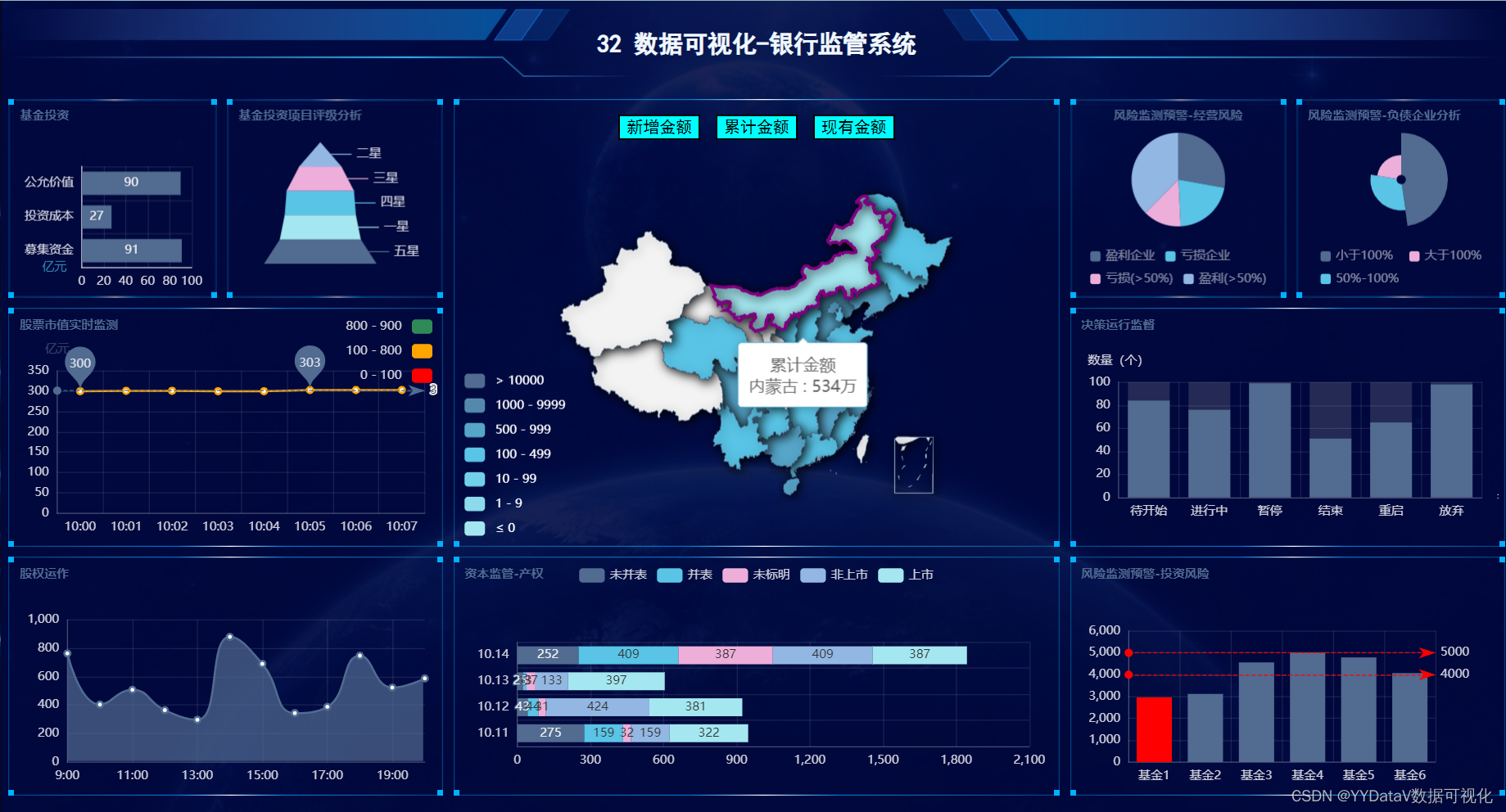
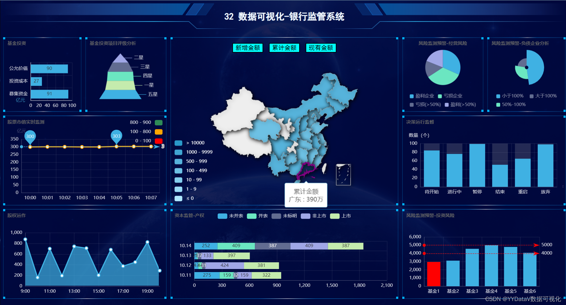
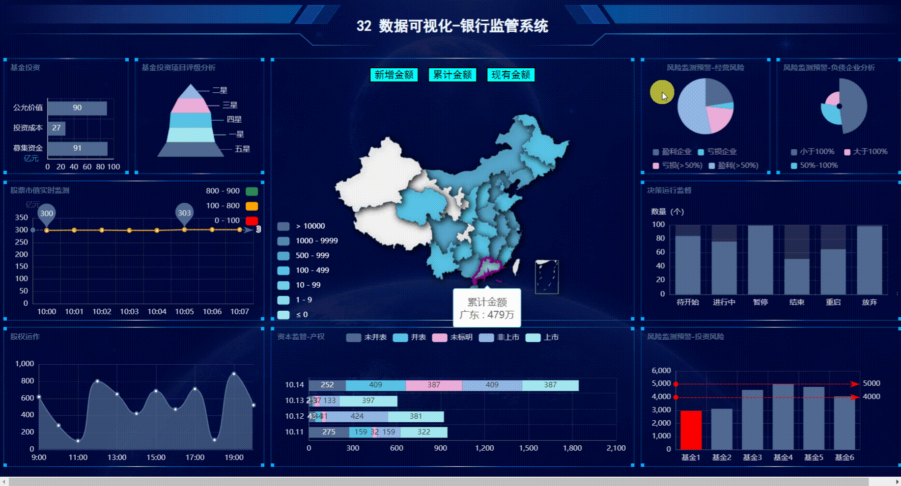
2.鼠标右键切换主题
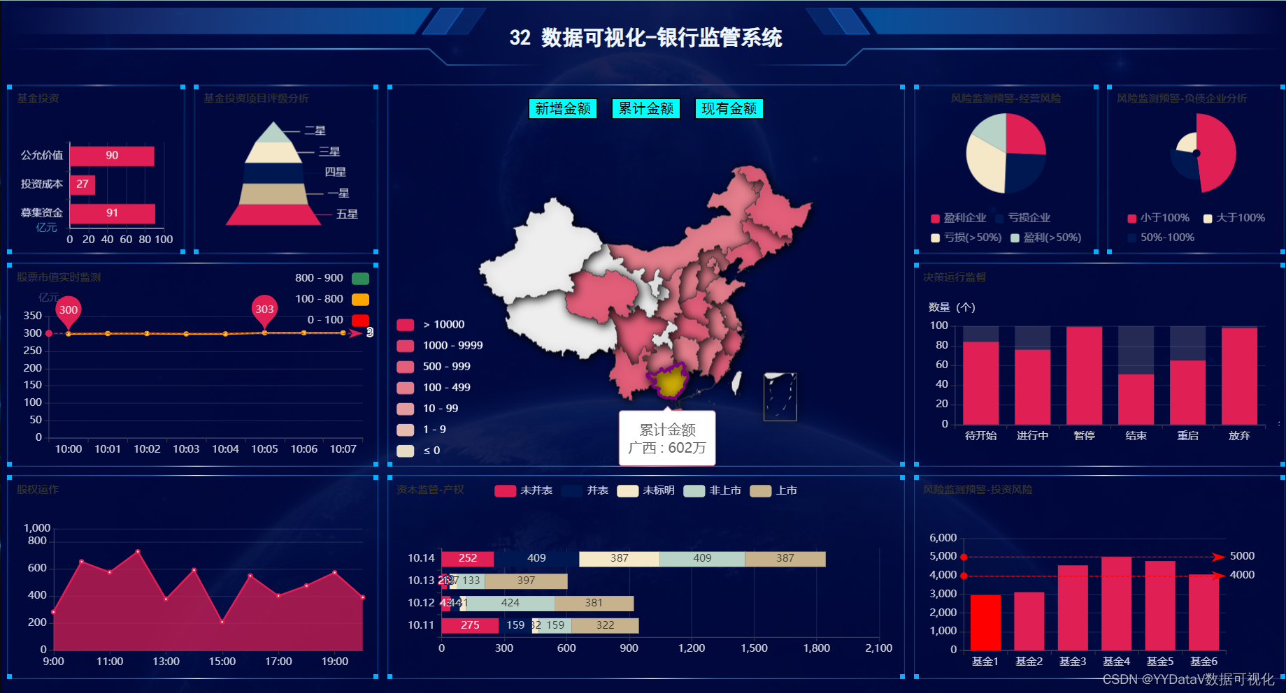

一. 确定需求方案
1. 屏幕分辨率
这个案例的分辨率是16:9,最常用的的宽屏比。
根据电脑分辨率屏幕自适应显示,F11全屏查看;
2. 部署方式
B/S方式:支持Windows、Linux、Mac等各种主流操作系统;支持主流浏览器Chrome,Microsoft Edge,360等;服务器采用python语言编写,配置好python环境即可。
二. 整体架构设计
- 前端Echarts开源库:使用 WebStorm 编辑器;
- 后端 http服务器:基于 Python 实现,使用 Pycharm 或 VSCode 编辑器;
- 数据传输格式:JSON;
- 数据源类型:JSON文件。实际开发需求中,支持定制HTTP API接口方式或其它各种类型数据库,如PostgreSQL、MySQL、Oracle、Microsoft SQL Server、SQLite、Excel表格等。
- 数据更新方式:采用http get 轮询方式 。在实际应用中,也可以视情况选择j监测后端数据实时更新,实时推送到前端的方式;
三.编码实现 (基于篇幅及可读性考虑,此处展示部分关键代码)
1. 前端html代码
本次页面布局使用H5的 grid 布局,代码简单易操作。
<div class="grid-container">
        <div id="lo_0">
            <h2>32 数据可视化-银行监管系统</h2>
        </div>
        <div id="lo_1">

        </div>
        <div id="lo_2">

        </div>
        <div id="lo_3">

        </div>
        <div id="lo_4">

        </div>
        <div id="lo_5">

        </div>
        <div id="lo_6">

        </div>
        <div id="lo_7">

        </div>
        <div id="lo_8">
            <div style="height: 10%;">
                <button
                    onclick="async_echart_china('container_8', 'map_china_map/map_china_map.json', 'confirmAdd')">新增金额</button>
                <button
                    onclick="async_echart_china('container_8', 'map_china_map/map_china_map.json', 'confirm')">累计金额</button>
                <button
                    onclick="async_echart_china('container_8', 'map_china_map/map_china_map.json', 'nowConfirm')">现有金额</button>
            </div>
            <div id="container_8" style="height: 90%;"></div>
        </div>
        <div id="lo_9">9</div>
        <div id="lo_10">10</div>
    </div>
grid-container 定义
.grid-container {
            display: grid;
            /* 6列,定义列宽 */
            grid-template-columns: 14% 14.5% 20% 20% 14.5% 14%;
            /* auto: 它用于自动设置行的高度,即取决于行中容器和内容的大小。 */
            grid-template-rows: 10% 25% 30% 30%;
            grid-gap: 10px;
            /* background-color: #2196F3; */
            padding: 0;
            width: 100%;
            height: 100%;
        }
对横跨多个行列的格子定义
  #lo_5 {
            grid-area: 3 / 1 / 4 / 3;
        }
2. 前端JS - echarts图表
function init_echart_line_visualMap(container) {
  // 基于准备好的dom,初始化echarts实例
  var myChart = echarts.init(document.getElementById(container), gTheme);
  option = {
    title: {
      text: "股票市值实时监测",
      // top: 0,
      // left: "center",
      textStyle: {
        // color: "#17c0ff",
        fontSize: "12",
      },
    },

    tooltip: {
      trigger: "item",
      formatter: "{a} <br/>{b}: {c} ({d}%)",
      position: function (p) {
        //其中p为当前鼠标的位置
        return [p[0] + 10, p[1] - 10];
      },
    },

    grid: {
      left: "3%",
      right: "3%",
      bottom: "3%",
      top: "25%",
      containLabel: true,
    },

    xAxis: {
      name: "名称",
      type: "category",
      data: [],
      axisLabel: {
        textStyle: {
          color: "rgba(255,255,255,.8)",
          //fontSize: 14,
        },
        // formatter: "{value}%",
      },
      axisLine: {
        lineStyle: {
          color: "rgba(255,255,255,.2)",
        },
      },
      splitLine: {
        lineStyle: {
          color: "rgba(255,255,255,.1)",
        },
      },
    },
    yAxis: {
      name: "亿元",
      type: "value",
      data: [],
      axisLabel: {
        textStyle: {
          color: "rgba(255,255,255,.8)",
          //fontSize: 14,
        },
        formatter: "{value}",
      },
      axisLine: {
        lineStyle: {
          color: "rgba(255,255,255,.2)",
        },
      },
      splitLine: {
        lineStyle: {
          color: "rgba(255,255,255,.1)",
        },
      },
    },
    visualMap: {
      top: "top",
      left: "right",
      textStyle: {
        color: "rgba(255,255,255,.8)",
        //fontSize: 14,
      },
      pieces: [
        {
          gt: 0,
          lte: 100,
          color: "#FF0000",
        },
        {
          gt: 100,
          lte: 800,
          color: "#FFA500",
        },
        {
          gt: 800,
          lte: 900,
          color: "#2E8B57",
        },
      ],
    },
    series: [
      {
        name: "年龄分布",
        type: "line",
        // stack: "total",
        // label: {
        //   show: true,
        // },
        // 使用系统函数
        markPoint: {
          label: {
            textStyle: {
              color: "rgba(255,255,255,.8)",
              //fontSize: 14,
            },
          },
          data: [
            { type: "max", name: "Max" },
            { type: "min", name: "Min" },
          ],
        },
        markLine: {
          data: [{ type: "average", name: "Avg" }],
        },
        // 自定义数据
        // markLine: {
        //   // 图形是否不响应和触发鼠标事件
        //   silent: true,
        //   label: {
        //     textStyle: {
        //       color: "rgba(255,255,255,.8)",
        //       //fontSize: 14,
        //     },
        //   },
        //   data: [
        //     {
        //       yAxis: 100,
        //       lineStyle: {
        //         color: "#FF0000",
        //       },
        //     },
        //     {
        //       yAxis: 800,
        //       lineStyle: {
        //         color: "#FFA500",
        //       },
        //     },
        //     {
        //       yAxis: 900,
        //       lineStyle: {
        //         color: "#2E8B57",
        //       },
        //     },
        //   ],
        // },
      },
    ],
  };

  // 使用刚指定的配置项和数据显示图表。
  myChart.setOption(option);
  window.addEventListener("resize", function () {
    myChart.resize();
  });
}

function getKeys(dataList) {
  var keys = [];
  var len = dataList.length;
  for (var i = 0; i < len; i++) keys.push(dataList[i].name);
  return keys;
}
3. 前端JS - 数据定时更新控制
支持在每个echarts图表中独立控制定时更新的间隔。
 // 定时1s执行数据更新函数
  setInterval(function () {
    async_echart_bar_horizontal(
      container,
      path_bar_horizontal + "bar_horizontal.json"
    );
  }, 1000);
4. 数据传输格式 - JSON 定义
[
    {
        "name": "10:00",
        "value": 300
    },
    {
        "name": "10:01",
        "value": 301
    },
    {
        "name": "10:02",
        "value": 301
    },
    {
        "name": "10:03",
        "value": 300
    },
    {
        "name": "10:04",
        "value": 300
    },
    {
        "name": "10:05",
        "value": 303
    },
    {
        "name": "10:06",
        "value": 303
    },
    {
        "name": "10:07",
        "value": 303
    }
]
5. 后端 flask 服务器
from flask import Flask
app = Flask(__name__, static_folder="static", template_folder="template")


# 主程序在这里
if __name__ == "__main__":

    # 开启线程,触发动态数据
    a = threading.Thread(target=asyncJson.loop)
    a.start()

    # 开启 flask 服务
    app.run(host='0.0.0.0', port=88, debug=True)
四. 启动命令
<!-- 启动server命令 -->
python main.py

<!-- 浏览器中输入网址查看大屏(端口为 main.py 中的 port 参数定义) -->
http://localhost:88/static/index.html

<!-- 更多资料参考我的博客主页  -->
https://yydatav.blog.csdn.net/

<!-- 更多案例参考 -->
https://blog.csdn.net/lildkdkdkjf/article/details/120705616

我的微信号:6550523  欢迎多多交流
五. 运行效果
六. 源码下载
32【源码】数据可视化:基于Echarts+PythonFlask动态实时大屏-银行监管系统.zip-企业管理文档类资源-CSDN下载
更多案例
YYDatav的数据可视化大屏《精彩案例汇总》(Python&Echarts源码)_YYDataV的博客-CSDN博客
《工厂订单出入库信息管理系统》完整案例详解(含演示网址账号)(Go&Vue源码)_YYDataV的博客-CSDN博客
本次分享结束,欢迎讨论!QQ微信同号: 6550523