Introduction
数据是美丽的,当然,如果你能真正理解它想告诉你的内容,还需要借助可视化的工具。
通过借助数据可视化的作品,将数据以视觉的形式来呈现,如图表或地图,以帮助人们了解数据的意义。通过观察数字、统计数据的转换以获得清晰的结论并不是一件容易的事。而人类大脑对视觉信息的处理优于对文本的处理,因此使用图表、图形和设计元素,数据可视化可以帮你更容易的解释数据模式、趋势、统计数据和数据相关性。
博主一些可视化作品见下面链接:
Python 画图,点线图;
Python 画图,柱状图;
python matplotlib 画图(柱状图)总结;
数据可视化之美-动态图绘制(以Python为工具)
这篇博客借助Python工具,展现一些可视化过程(包含源码),主要是点、线、面的组和。由于博主专业方向为地学相关,所以关注的方向主要为地学方面的文献、代码,其他专业方向也可借鉴。
精彩可视化作品展示
Example1:大气场的组合
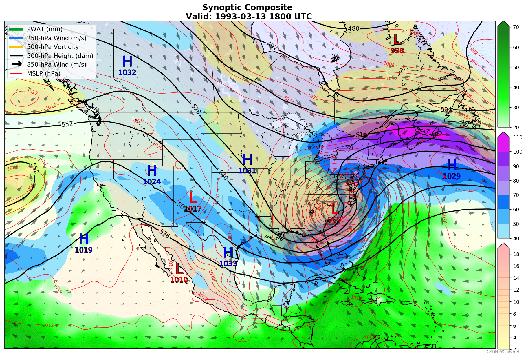
这是一幅非常综合的天气图,包含要素(MSLP:平均大气压强,红色线表示;850 hPa的风场,黑色箭头表示;500 hPa 的位势高度,黑线表示;还有三种颜色的 colormap 表示2种变量)
Example2:南海地形展现
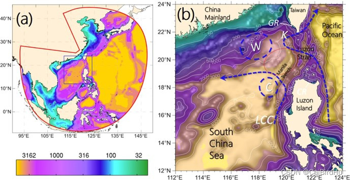
左图是南海包含西北太平洋的范围,colormap 显示的是水深;右图是范围缩小,南海区域,以及在图中用蓝色虚线表示南海内的环流。
Example3:小波分析图
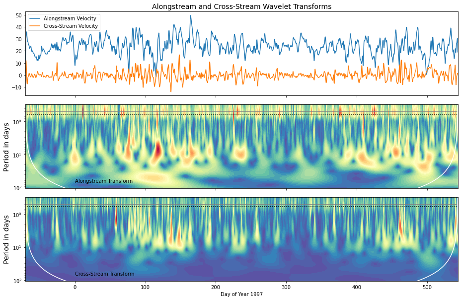
一般情况下,小波周期图水平轴对应原来时间序列的时间,垂直轴代表变化的周期,颜色代表变化周期的强度。该图里,黄色代表变化周期的高强度。在最上面的图中表示2个变量的时间序列(Alongstream Velocity、Cross-Stream Velocity),下面的2张图中为该2个变量的小波分析,随着时间序列的变化,变化周期的强度变化。
Example4:多图要素集合
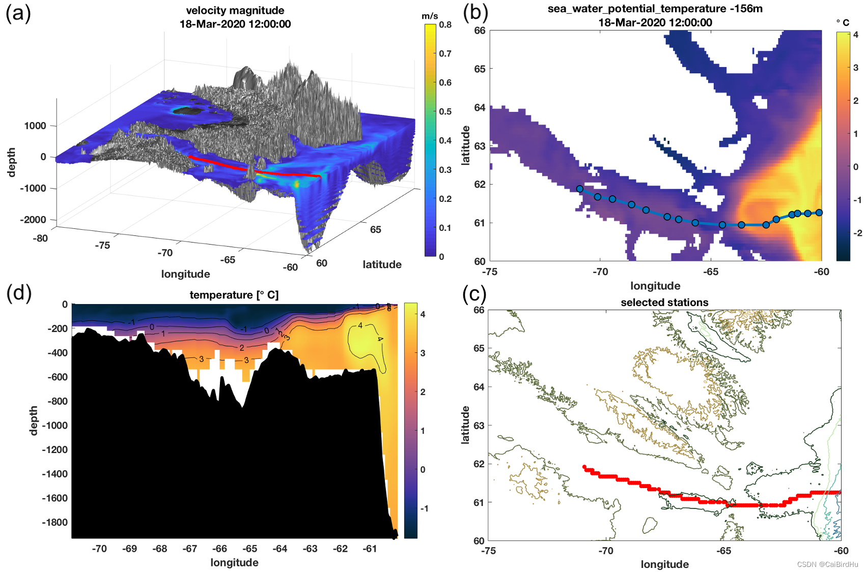

(a)图为利用模式输出数据绘制,模式结果分成(图中3D成图可明显看到分层)【PASS:三维成图后面的博客专门去讲,这次主要讲2D成图】;(b)表示海水位势温度(-156米处);(c)航迹的温度剖面(船行轨迹见a图);(d)航线的平面图
成图测试(包含代码、数据)
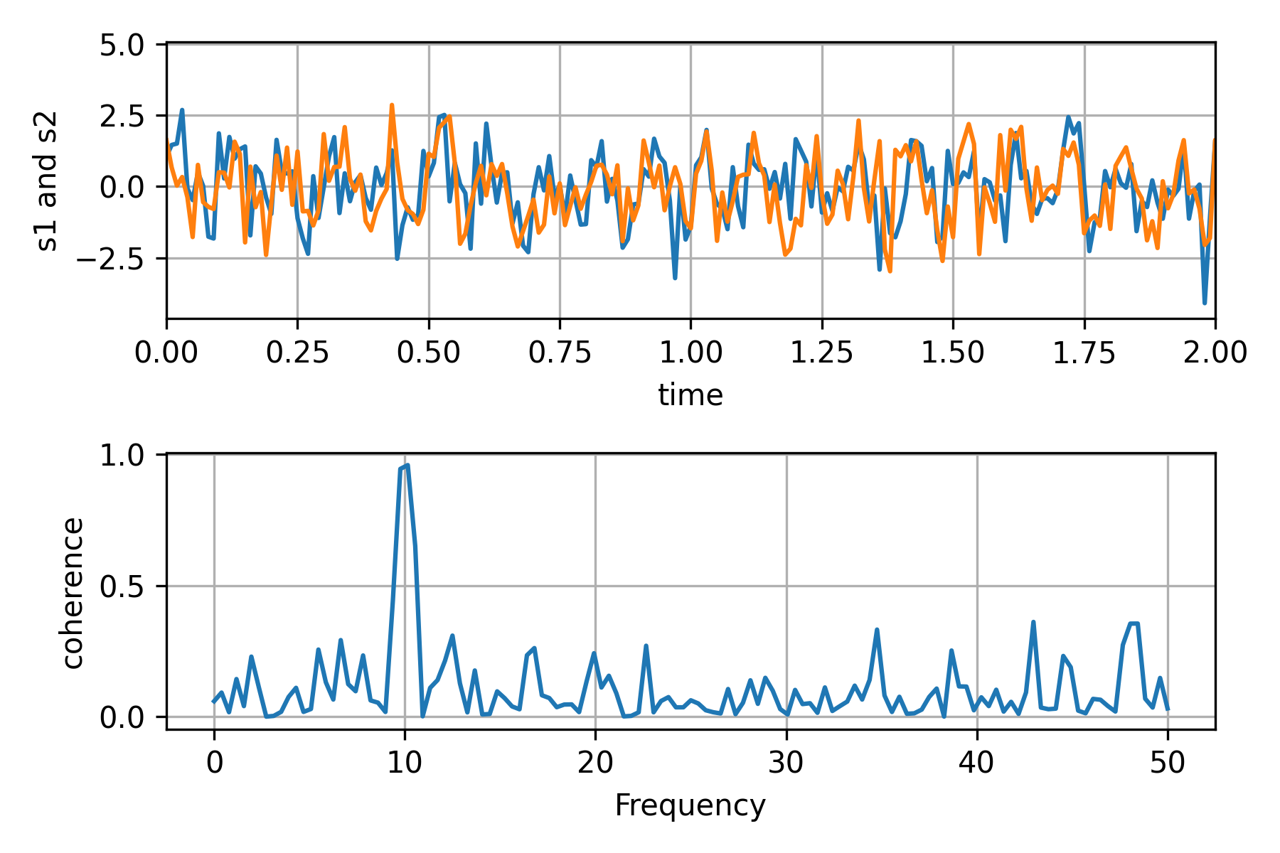
Test1:绘制2个信号的相干性
import numpy as np
import matplotlib.pyplot as plt

# Fixing random state for reproducibility
np.random.seed(19680801)

dt = 0.01
t = np.arange(0, 30, dt)
nse1 = np.random.randn(len(t))                 # white noise 1
nse2 = np.random.randn(len(t))                 # white noise 2

# Two signals with a coherent part at 10Hz and a random part
s1 = np.sin(2 * np.pi * 10 * t) + nse1
s2 = np.sin(2 * np.pi * 10 * t) + nse2

fig, axs = plt.subplots(2, 1)
axs[0].plot(t, s1, t, s2)
axs[0].set_xlim(0, 2)
axs[0].set_xlabel('time')
axs[0].set_ylabel('s1 and s2')
axs[0].grid(True)

cxy, f = axs[1].cohere(s1, s2, 256, 1. / dt)
axs[1].set_ylabel('coherence')

fig.tight_layout()
# plt.subplots_adjust(left=None,bottom=None,right=None,top=None,wspace=0.20,hspace=0.20)

plt.savefig(fname="./Test1.png", dpi=300)
plt.show()
Test2:小波分析
from __future__ import division
import numpy
from matplotlib import pyplot

import pycwt as wavelet
from pycwt.helpers import find

url = 'http://paos.colorado.edu/research/wavelets/wave_idl/nino3sst.txt'
dat = numpy.genfromtxt(url, skip_header=19)
title = 'NINO3 Sea Surface Temperature'
label = 'NINO3 SST'
units = 'degC'
t0 = 1871.0
dt = 0.25  # 获取NINO数据

# We also create a time array in years.
N = dat.size
t = numpy.arange(0, N) * dt + t0

p = numpy.polyfit(t - t0, dat, 1)
dat_notrend = dat - numpy.polyval(p, t - t0)
std = dat_notrend.std()  # Standard deviation
var = std ** 2  # Variance
dat_norm = dat_notrend / std  # Normalized dataset


mother = wavelet.Morlet(6)
s0 = 2 * dt  # Starting scale, in this case 2 * 0.25 years = 6 months
dj = 1 / 12  # Twelve sub-octaves per octaves
J = 7 / dj  # Seven powers of two with dj sub-octaves
alpha, _, _ = wavelet.ar1(dat)  # Lag-1 autocorrelation for red noise


wave, scales, freqs, coi, fft, fftfreqs = wavelet.cwt(dat_norm, dt, dj, s0, J,
                                                      mother)
iwave = wavelet.icwt(wave, scales, dt, dj, mother) * std

power = (numpy.abs(wave)) ** 2
fft_power = numpy.abs(fft) ** 2
period = 1 / freqs

signif, fft_theor = wavelet.significance(1.0, dt, scales, 0, alpha,
                                         significance_level=0.95,
                                         wavelet=mother)
sig95 = numpy.ones([1, N]) * signif[:, None]
sig95 = power / sig95

glbl_power = power.mean(axis=1)
dof = N - scales  # Correction for padding at edges
glbl_signif, tmp = wavelet.significance(var, dt, scales, 1, alpha,
                                        significance_level=0.95, dof=dof,
                                        wavelet=mother)

sel = find((period >= 2) & (period < 8))
Cdelta = mother.cdelta
scale_avg = (scales * numpy.ones((N, 1))).transpose()
scale_avg = power / scale_avg  # As in Torrence and Compo (1998) equation 24
scale_avg = var * dj * dt / Cdelta * scale_avg[sel, :].sum(axis=0)
scale_avg_signif, tmp = wavelet.significance(var, dt, scales, 2, alpha,
                                             significance_level=0.95,
                                             dof=[scales[sel[0]],
                                                  scales[sel[-1]]],
                                             wavelet=mother)

# Prepare the figure
pyplot.close('all')
pyplot.ioff()
figprops = dict(figsize=(11, 8), dpi=72)
fig = pyplot.figure(**figprops)


# First sub-plot, the original time series anomaly and inverse wavelet
# transform.
ax = pyplot.axes([0.1, 0.75, 0.65, 0.2])
ax.plot(t, iwave, '-', linewidth=1, color=[0.5, 0.5, 0.5])
ax.plot(t, dat, 'k', linewidth=1.5)
ax.set_title('a) {}'.format(title))
ax.set_ylabel(r'{} [{}]'.format(label, units))

# Second sub-plot, the normalized wavelet power spectrum and significance
# level contour lines and cone of influece hatched area. Note that period
# scale is logarithmic.
bx = pyplot.axes([0.1, 0.37, 0.65, 0.28], sharex=ax)
levels = [0.0625, 0.125, 0.25, 0.5, 1, 2, 4, 8, 16]
bx.contourf(t, numpy.log2(period), numpy.log2(power), numpy.log2(levels),
            extend='both', cmap=pyplot.cm.viridis)
extent = [t.min(), t.max(), 0, max(period)]
bx.contour(t, numpy.log2(period), sig95, [-99, 1], colors='k', linewidths=2,
           extent=extent)
bx.fill(numpy.concatenate([t, t[-1:] + dt, t[-1:] + dt,
                           t[:1] - dt, t[:1] - dt]),
        numpy.concatenate([numpy.log2(coi), [1e-9], numpy.log2(period[-1:]),
                           numpy.log2(period[-1:]), [1e-9]]),
        'k', alpha=0.3, hatch='x')
bx.set_title('b) {} Wavelet Power Spectrum ({})'.format(label, mother.name))
bx.set_ylabel('Period (years)')
#
Yticks = 2 ** numpy.arange(numpy.ceil(numpy.log2(period.min())),
                           numpy.ceil(numpy.log2(period.max())))
bx.set_yticks(numpy.log2(Yticks))
bx.set_yticklabels(Yticks)

# Third sub-plot, the global wavelet and Fourier power spectra and theoretical
# noise spectra. Note that period scale is logarithmic.
cx = pyplot.axes([0.77, 0.37, 0.2, 0.28], sharey=bx)
cx.plot(glbl_signif, numpy.log2(period), 'k--')
cx.plot(var * fft_theor, numpy.log2(period), '--', color='#cccccc')
cx.plot(var * fft_power, numpy.log2(1./fftfreqs), '-', color='#cccccc',
        linewidth=1.)
cx.plot(var * glbl_power, numpy.log2(period), 'k-', linewidth=1.5)
cx.set_title('c) Global Wavelet Spectrum')
cx.set_xlabel(r'Power [({})^2]'.format(units))
cx.set_xlim([0, glbl_power.max() + var])
cx.set_ylim(numpy.log2([period.min(), period.max()]))
cx.set_yticks(numpy.log2(Yticks))
cx.set_yticklabels(Yticks)
pyplot.setp(cx.get_yticklabels(), visible=False)

# Fourth sub-plot, the scale averaged wavelet spectrum.
dx = pyplot.axes([0.1, 0.07, 0.65, 0.2], sharex=ax)
dx.axhline(scale_avg_signif, color='k', linestyle='--', linewidth=1.)
dx.plot(t, scale_avg, 'k-', linewidth=1.5)
dx.set_title('d) {}--{} year scale-averaged power'.format(2, 8))
dx.set_xlabel('Time (year)')
dx.set_ylabel(r'Average variance [{}]'.format(units))
ax.set_xlim([t.min(), t.max()])

pyplot.savefig(fname="./wavelets.png", dpi=300)
pyplot.show()
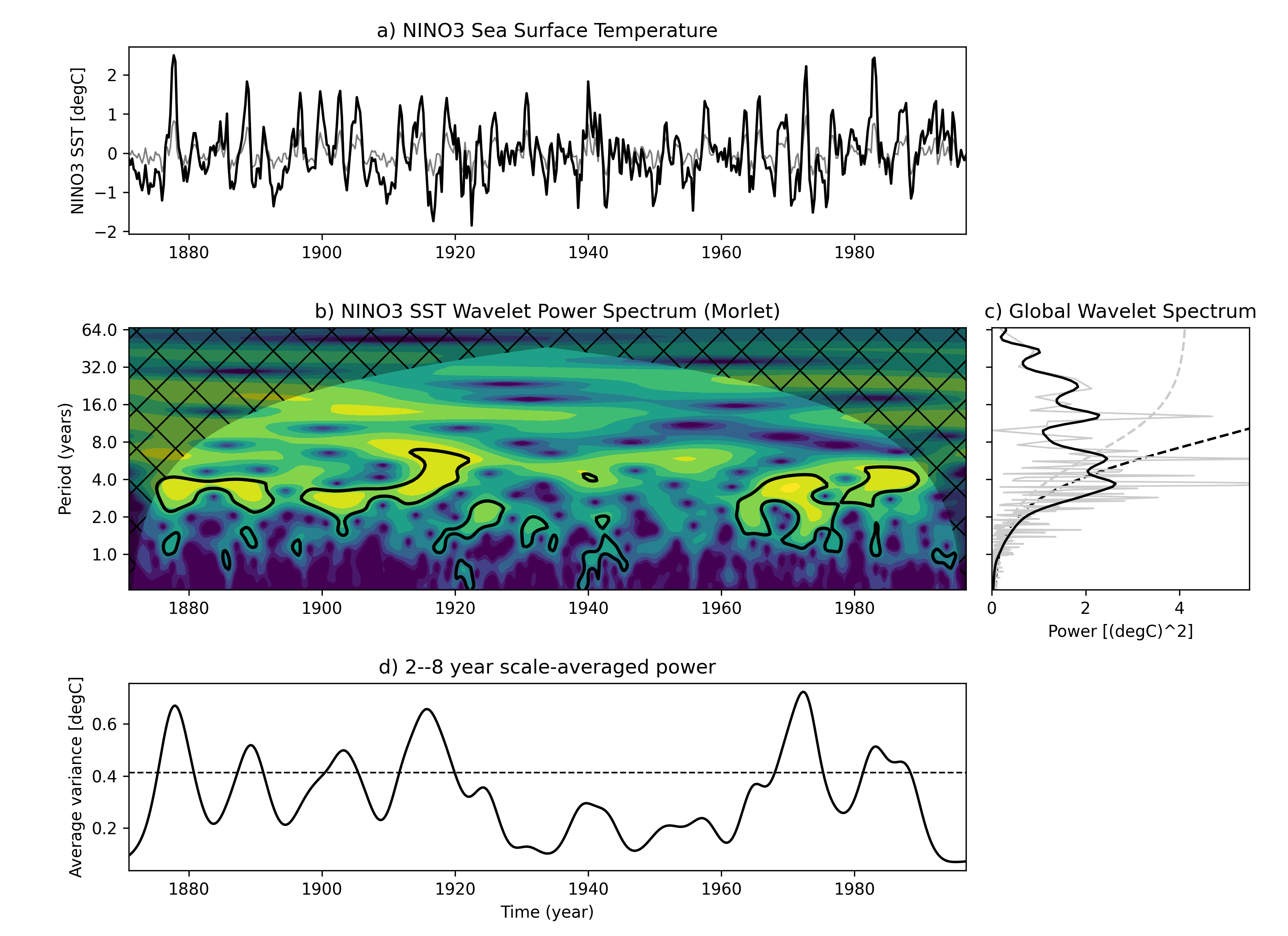
该图说明:最上面图形(a)是Nino3 区域的海水表面温度的时间序列(黑色)以及逆小波变换(灰色);(b)图为该Nino3 时间序列的小波周期图。(c) 全局小波功率谱(黑线)和傅里叶功率谱(灰线)。虚线表示95%置信水平。(d) 2-8年波段尺度平均小波功率(黑线)、功率趋势(灰线)。
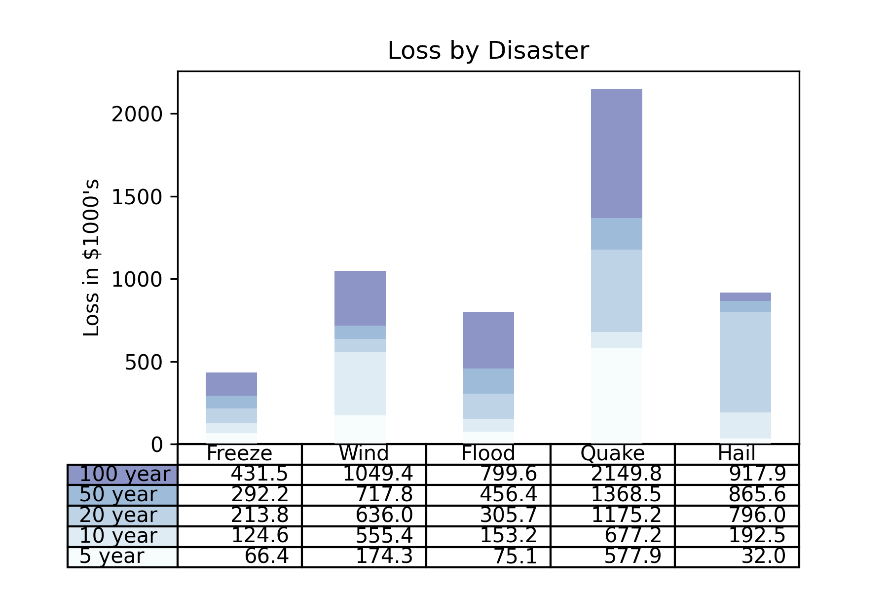
Test3:柱状图与图表结合
import numpy as np
import matplotlib.pyplot as plt

data = [[ 66386, 174296,  75131, 577908,  32015],
        [ 58230, 381139,  78045,  99308, 160454],
        [ 89135,  80552, 152558, 497981, 603535],
        [ 78415,  81858, 150656, 193263,  69638],
        [139361, 331509, 343164, 781380,  52269]]

columns = ('Freeze', 'Wind', 'Flood', 'Quake', 'Hail')
rows = ['%d year' % x for x in (100, 50, 20, 10, 5)]

values = np.arange(0, 2500, 500)
value_increment = 1000

# Get some pastel shades for the colors
colors = plt.cm.BuPu(np.linspace(0, 0.5, len(rows)))
n_rows = len(data)

index = np.arange(len(columns)) + 0.3
bar_width = 0.4

# Initialize the vertical-offset for the stacked bar chart.
y_offset = np.zeros(len(columns))

# Plot bars and create text labels for the table
cell_text = []
for row in range(n_rows):
    plt.bar(index, data[row], bar_width, bottom=y_offset, color=colors[row])
    y_offset = y_offset + data[row]
    cell_text.append(['%1.1f' % (x / 1000.0) for x in y_offset])
# Reverse colors and text labels to display the last value at the top.
colors = colors[::-1]
cell_text.reverse()

# Add a table at the bottom of the axes
the_table = plt.table(cellText=cell_text,
                      rowLabels=rows,
                      rowColours=colors,
                      colLabels=columns,
                      loc='bottom')

# Adjust layout to make room for the table:
plt.subplots_adjust(left=0.2, bottom=0.2)

plt.ylabel("Loss in ${0}'s".format(value_increment))
plt.yticks(values * value_increment, ['%d' % val for val in values])
plt.xticks([])
plt.title('Loss by Disaster')

plt.savefig(fname="./test3.png", dpi=300)
plt.show()
Test4:等值线图
import matplotlib.pyplot as plt
import matplotlib.tri as tri
import numpy as np

np.random.seed(19680801)
npts = 200
ngridx = 100
ngridy = 200
x = np.random.uniform(-2, 2, npts)
y = np.random.uniform(-2, 2, npts)
z = x * np.exp(-x**2 - y**2)

fig, (ax1, ax2) = plt.subplots(nrows=2)

# Create grid values first.
xi = np.linspace(-2.1, 2.1, ngridx)
yi = np.linspace(-2.1, 2.1, ngridy)

# Linearly interpolate the data (x, y) on a grid defined by (xi, yi).
triang = tri.Triangulation(x, y)
interpolator = tri.LinearTriInterpolator(triang, z)
Xi, Yi = np.meshgrid(xi, yi)
zi = interpolator(Xi, Yi)

# Note that scipy.interpolate provides means to interpolate data on a grid
# as well. The following would be an alternative to the four lines above:
# from scipy.interpolate import griddata
# zi = griddata((x, y), z, (xi[None, :], yi[:, None]), method='linear')

ax1.contour(xi, yi, zi, levels=14, linewidths=0.5, colors='k')
cntr1 = ax1.contourf(xi, yi, zi, levels=14, cmap="RdBu_r")

fig.colorbar(cntr1, ax=ax1)
ax1.plot(x, y, 'ko', ms=3)
ax1.set(xlim=(-2, 2), ylim=(-2, 2))
ax1.set_title('grid and contour (%d points, %d grid points)' %
              (npts, ngridx * ngridy))

# Tricontour

ax2.tricontour(x, y, z, levels=14, linewidths=0.5, colors='k')
cntr2 = ax2.tricontourf(x, y, z, levels=14, cmap="RdBu_r")

fig.colorbar(cntr2, ax=ax2)
ax2.plot(x, y, 'ko', ms=3)
ax2.set(xlim=(-2, 2), ylim=(-2, 2))
ax2.set_title('tricontour (%d points)' % npts)

plt.subplots_adjust(hspace=0.5)

plt.savefig(fname="./test4.png", dpi=300)
plt.show()
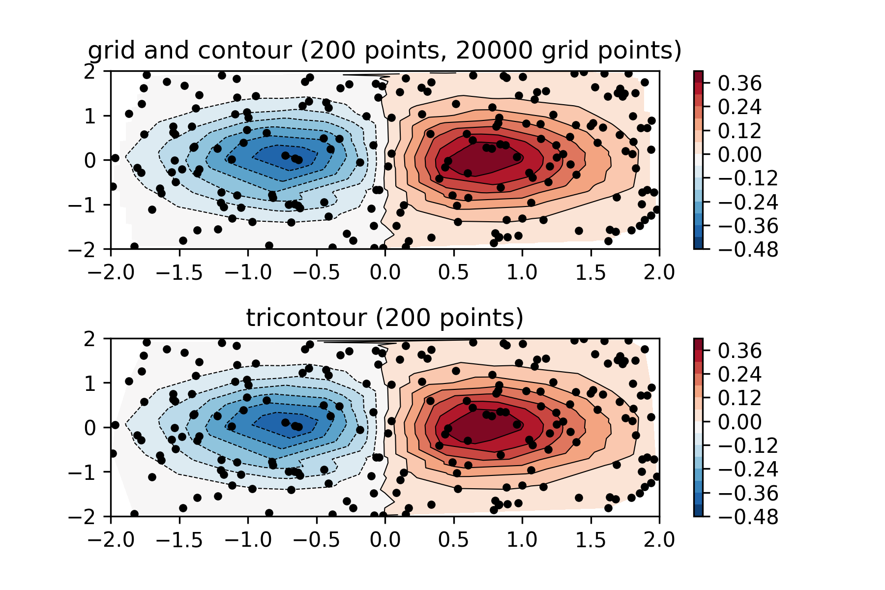
上面的图是先正交网格化,再将黑点的值插值在网格上,下面的图是三角网格插值。
Test5:散点图+直方图 (seaborn出图)
import pandas as pd
import matplotlib.pyplot as plt

# Import Data
df = pd.read_csv("https://raw.githubusercontent.com/selva86/datasets/master/mpg_ggplot2.csv")

# Create Fig and gridspec
fig = plt.figure(figsize=(16, 10), dpi= 80)
grid = plt.GridSpec(4, 4, hspace=0.5, wspace=0.2)

# Define the axes
ax_main = fig.add_subplot(grid[:-1, :-1])
ax_right = fig.add_subplot(grid[:-1, -1], xticklabels=[], yticklabels=[])
ax_bottom = fig.add_subplot(grid[-1, 0:-1], xticklabels=[], yticklabels=[])

# Scatterplot on main ax
ax_main.scatter('displ', 'hwy', s=df.cty*4, c=df.manufacturer.astype('category').cat.codes, alpha=.9, data=df, cmap="tab10", edgecolors='gray', linewidths=.5)


# histogram on the right
ax_bottom.hist(df.displ, 40, histtype='stepfilled', orientation='vertical', color='deeppink')
ax_bottom.invert_yaxis()


# histogram in the bottom
ax_right.hist(df.hwy, 40, histtype='stepfilled', orientation='horizontal', color='deeppink')


# Decorations
ax_main.set(title='Scatterplot with Histograms displ vs hwy', xlabel='displ', ylabel='hwy')
ax_main.title.set_fontsize(20)
for item in ([ax_main.xaxis.label, ax_main.yaxis.label] + ax_main.get_xticklabels() + ax_main.get_yticklabels()):
    item.set_fontsize(14)

xlabels = ax_main.get_xticks().tolist()
ax_main.set_xticklabels(xlabels)
plt.show()
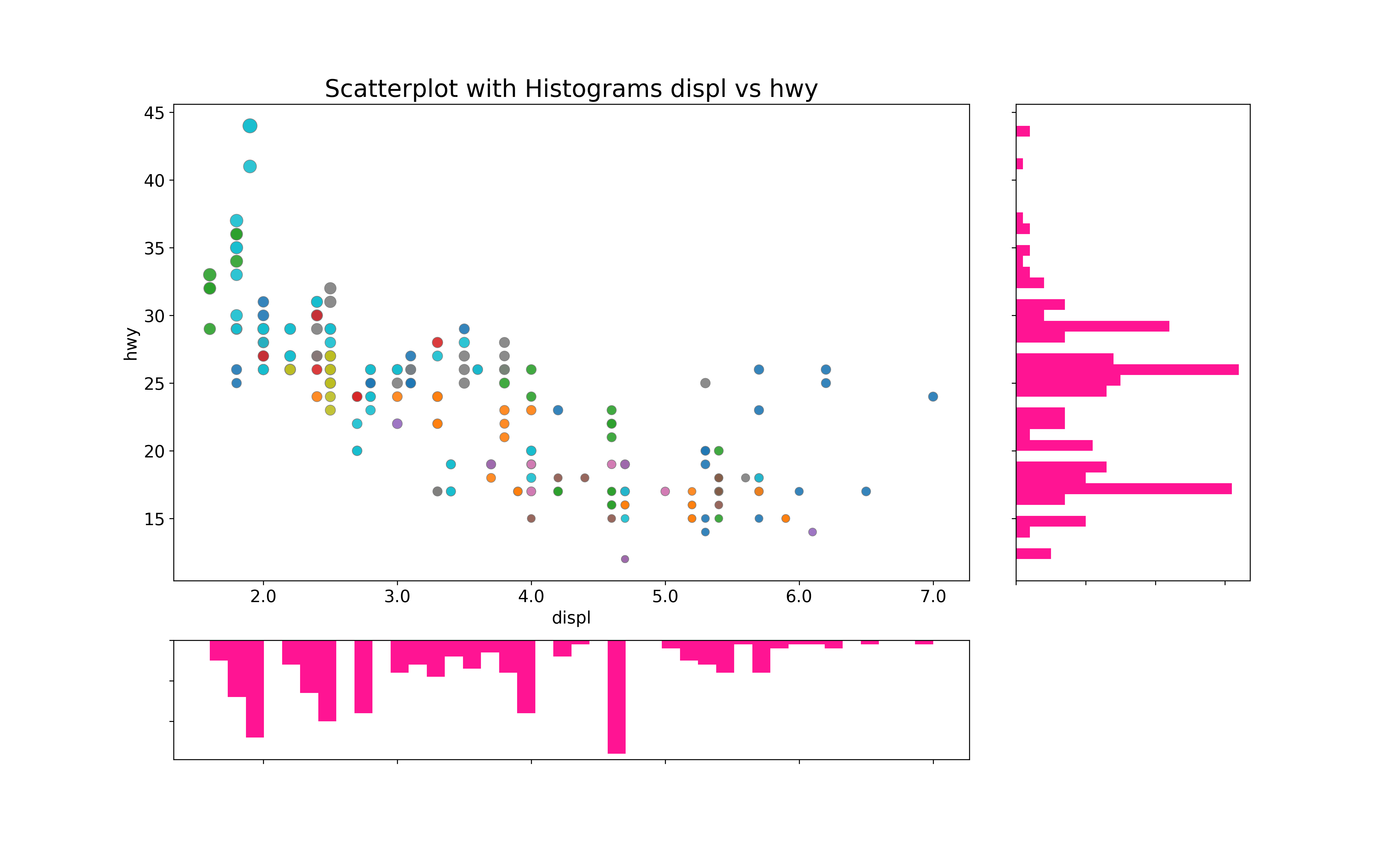
边缘直方图具有沿X和Y轴变量的直方图。这用于可视化X和Y之间的关系(中间的点图)以及单独的X和Y的单变量分布。该图如果经常用于探索性数据分析。该图中点的颜色不同表示类别。
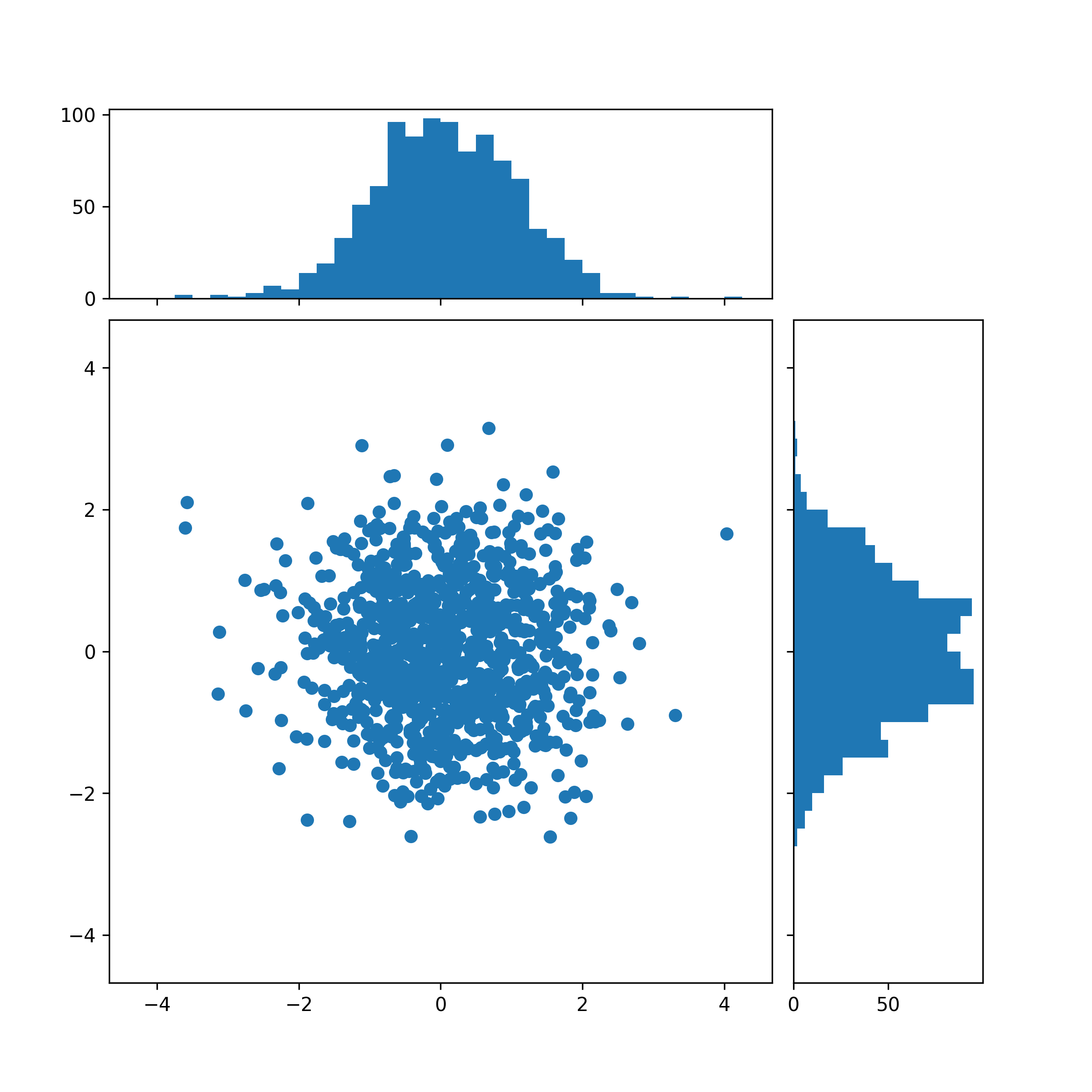
下面是另一种绘制方法:
import numpy as np
import matplotlib.pyplot as plt

# Fixing random state for reproducibility
np.random.seed(19680801)

# some random data
x = np.random.randn(1000)
y = np.random.randn(1000)

def scatter_hist(x, y, ax, ax_histx, ax_histy):
    # no labels
    ax_histx.tick_params(axis="x", labelbottom=False)
    ax_histy.tick_params(axis="y", labelleft=False)

    # the scatter plot:
    ax.scatter(x, y)

    # now determine nice limits by hand:
    binwidth = 0.25
    xymax = max(np.max(np.abs(x)), np.max(np.abs(y)))
    lim = (int(xymax/binwidth) + 1) * binwidth


    bins = np.arange(-lim, lim + binwidth, binwidth)
    ax_histx.hist(x, bins=bins)
    ax_histy.hist(y, bins=bins, orientation='horizontal')

# definitions for the axes
left, width = 0.1, 0.65
bottom, height = 0.1, 0.65
spacing = 0.005


rect_scatter = [left, bottom, width, height]
rect_histx = [left, bottom + height + spacing, width, 0.2]
rect_histy = [left + width + spacing, bottom, 0.2, height]

# start with a square Figure
fig = plt.figure(figsize=(8, 8))

# 添加统一的网格显示大小,不过在这里显示不明显

gs = fig.add_gridspec(2, 2,  width_ratios=(7, 2), height_ratios=(2, 7),
                      left=0.1, right=0.9, bottom=0.1, top=0.9,
                      wspace=0.05, hspace=0.05)

ax = fig.add_subplot(gs[1, 0])
ax_histx = fig.add_subplot(gs[0, 0], sharex=ax)
ax_histy = fig.add_subplot(gs[1, 1], sharey=ax)

# use the previously defined function
scatter_hist(x, y, ax, ax_histx, ax_histy)

plt.savefig(fname="./test5_v2.png", dpi=300)
plt.show()
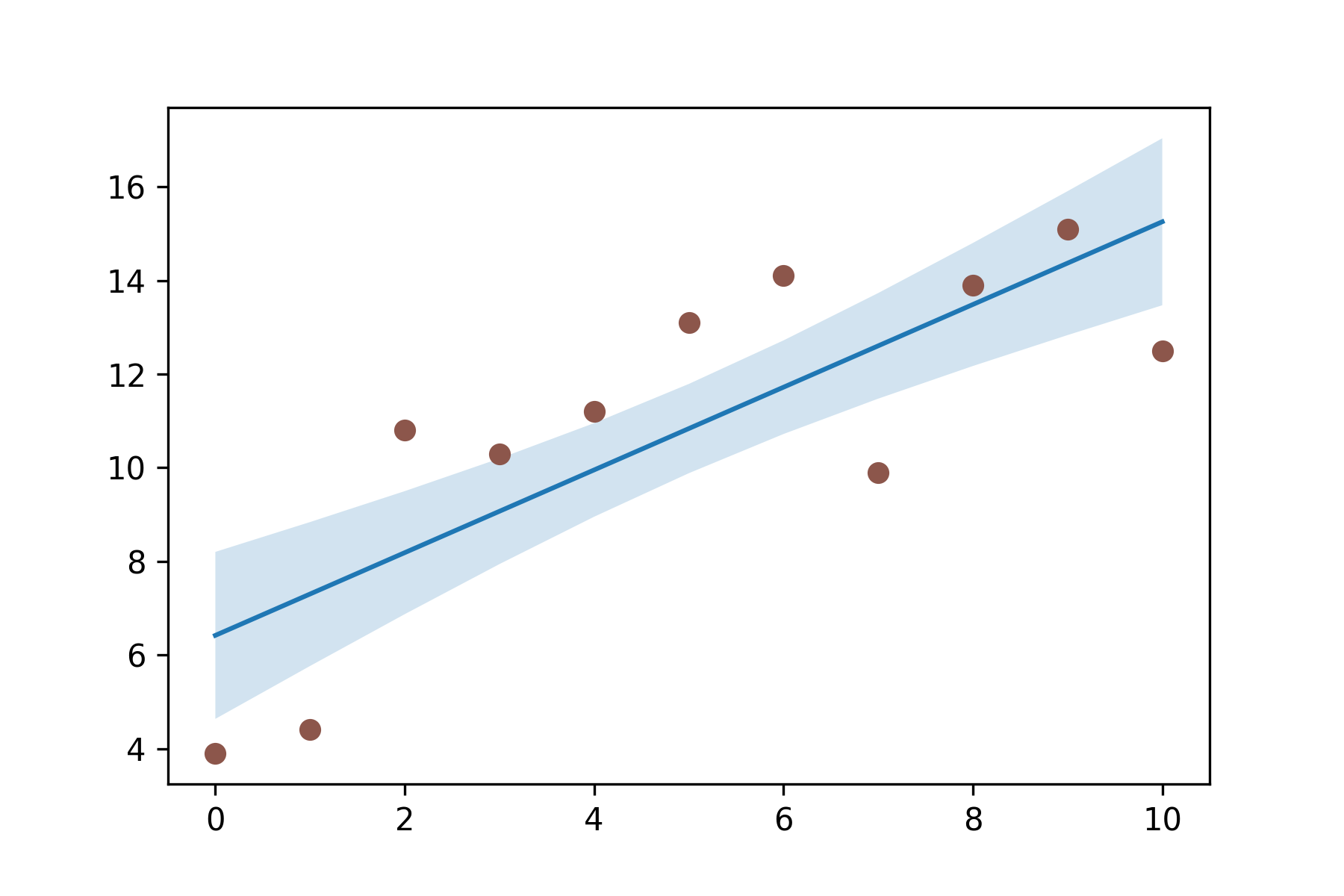
Test6:带线性回归最佳拟合线的散点图(seaborn出图)
import pandas as pd
import matplotlib.pyplot as plt
import seaborn as sns

# Import Data
df = pd.read_csv("https://raw.githubusercontent.com/selva86/datasets/master/mpg_ggplot2.csv")
df_select = df.loc[df.cyl.isin([4,8]), :]


# Plot
sns.set_style("white")
gridobj = sns.lmplot(x="displ", y="hwy", hue="cyl", data=df_select,
                     height=7, aspect=1.6, robust=True, palette='tab10',
                     scatter_kws=dict(s=60, linewidths=.7, edgecolors='black'))

# Decorations
gridobj.set(xlim=(0.5, 7.5), ylim=(0, 50))
plt.title("Scatterplot with line of best fit grouped by number of cylinders", fontsize=20)
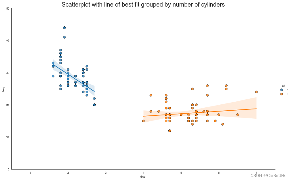
如果你想了解变量的变化趋势,那么最合适的方式就是画趋势线。上图显示了数据中各组之间最佳拟合线的差异(包含置信区间)。
下面是另一种绘制方法:
import numpy as np
import matplotlib.pyplot as plt

N = 21
x = np.linspace(0, 10, 11)
y = [3.9, 4.4, 10.8, 10.3, 11.2, 13.1, 14.1,  9.9, 13.9, 15.1, 12.5]

# fit a linear curve an estimate its y-values and their error.
a, b = np.polyfit(x, y, deg=1)
y_est = a * x + b
y_err = x.std() * np.sqrt(1/len(x) +
                          (x - x.mean())**2 / np.sum((x - x.mean())**2))

fig, ax = plt.subplots()
ax.plot(x, y_est, '-')
ax.fill_between(x, y_est - y_err, y_est + y_err, alpha=0.2)
ax.plot(x, y, 'o', color='tab:brown')

plt.savefig(fname="./test6_v2.png", dpi=300)
plt.show()