Sass用缩进来区别嵌套关系,而Scss用花括号,与css使用习惯相近,且看起来更清晰,因此文中使用的是Scss
更多Sass与Scss的区别与联系、Scss总结归纳,推荐好文:sass与scss的区别
安装
(全局)安装命令:npm install sass -g
编译命令:sass source-path/index.scss destination-path/index.css
(编译源路径下的.scss文件,保存到目的路径,编译后格式为.css)
嵌套语法
使用嵌套语法,可以帮我们省一些代码量
比如,为了权重和准确定位,在css中我们可能要写一长串前面的,然后才到要设置的class,而且可能要写很多遍;
但是用scss的嵌套语法,我们能够简明直观地描述包含关系,匹配到想要的元素,最后编译一下,就能得到css代码
html:
<div class="container">
    <p>我是一段话</p>
</div>
scss:
.container {


    margin: 20px auto;
    p {


        color: red;
    }
}
编译命令:sass ./src/sass/index.scss ./dist/index.css
编译后的./dist/index.css引入html文件
<link rel="stylesheet" href="./dist/index.css">
编译出来的index.css为:
.container {


  margin: 20px auto;
}
.container p {


  color: red;
}
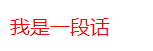
效果:样式生效,p中文字的颜色为红色(在此案例中减少了.container的重复书写)
父选择器
html:
<div class="container">
    <p>我是一段话</p>
</div>
scss代码:
div {


    &.container {


        width: 100px;
        height: 100px;
        border: 1px solid #ccc;
        margin: 100px auto;
    }
}
编译后:
div.container {


  width: 100px;
  height: 100px;
  border: 1px solid #ccc;
  margin: 100px auto;
}
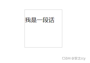
效果:在.container上生效
直接子选择器
先选择最靠近的那个子元素,如果这子元素符合匹配要求,则选中这个子元素
html:
<div class="container">
    <p class="p1">我是一段话</p>
    <p class="p2">我是一段话</p>
</div>
scss:
div {


    // 父选择器
    &.container {


        width: 100px;
        height: 100px;
        border: 1px solid #ccc;
        margin: 100px auto;
        // 直接子选择器
        >.p1 {


            color: red;
        }
    }
}
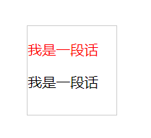
效果:只有.p1生效
模块使用
变量
全局变量 vs 局部变量
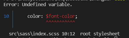
用$符号来标识一个变量,局部变量只能在离定义处最近的{}内有效,全局变量则全局有效
全局变量:
$font-color : red; // 全局变量
.container {


    margin: 20px auto;;
    p {


        color: $font-color;
    }
}
编译效果:
.container {


  margin: 20px auto;
}
.container p {


  color: red;
}
局部变量:
.container {


    $font-color : red; // 局部变量
    margin: 20px auto;;
    p {


        color: $font-color;
    }
}

span {


    color: $font-color; // 使用局部变量,在此无效
}
编译报错:span中不能使用$font-color变量
数据类型
在Sass(Scss)中,数据类型可以是:数字(包括像素值如10px、10pt等)、字符串、颜色值、布尔值、数组Lists、Maps
官网给出了归纳和举例:

就像这样,做一个小小的变量提取(此处提取颜色和数字):
$p-color : red;
$margin-tb : 20px;
.container {


    margin: $margin-tb auto;
    p {


        color: $p-color;
    }
}
编译后变成:
.container {


  margin: 20px auto;
}
.container p {


  color: red;
}
与前面一致
也可以把整个$margin-tb当作Lists来看待,不用一个个分开写。
$p-color : red;
$margin-tb : 20px auto; // Lists
.container {


    margin: $margin-tb;
    p {


        color: $p-color;
    }
}
编译结果与前一致
Lists就是一个组合数据类型,各项之间由空格隔开,如果每一项还是组合内容的话,可以用括号括起来。
$gradients : (to left top, blue, red) (to left top, blue, yellow); // Lists
Maps是键值对,也是组合型数据类型,类似js中的对象,但把对象的花括号改成了圆括号
就像这样:
$content : ("p":"padding", "m":"margin");
$direction :('t':"top", 'b':"bottom", "l":"left", "r":"right");
关于Lists和Maps的其他用法,在后面的“Lists和Maps的使用”部分会提到
@mixin语法
@mixin语法可以帮助我们复用一些功能相同的代码,设置默认样式,就像这样:
将字体颜色单独抽出来,保存在新文件_mixin.scss中:
// 以传递过来的color为底色,调节饱和度,默认调节比例为20%
@mixin font-color($color, $amount:20%) {


    color: saturate($color, $amount); // saturate为调节饱和度的Sass内置函数
}
在index.scss中引入并使用:
@import "./mixin";
.container {


    margin: 20px auto;;
    p {


        @include font-color(#464); // 复用一
    }
}

span {


    @include font-color(#333, 40%); // 复用二
}
编译结果:
.container {


  margin: 20px auto;
}
.container p {


  color: #337733;
}

span {


  color: #471f1f;
}
!default语法
可以在变量的结尾添加 !default 给一个未通过 !default 声明赋值的变量赋值,此时,如果变量已经被赋值,不会再被重新赋值,但是如果变量还没有被赋值,则会被赋予新的值。
背景:
在上一个小demo中,我们把_mixin.scss的变量引入到index.scss中
我们知道@import一般写在最前面,按顺序来看,会先解析import进来的样式,再解析index.scss的样式,存在覆盖样式的情况,但我们希望优先使用import进来的样式,此时,可以使用!default语法
ps:给某个变量设置!default,当import进来的代码里存在同名变量,优先使用import进来的,如果没有同名变量,就使用本文件中设置的
就像这样:
// _mixin.scss :设置与index.scss的同名全局变量
$fontSize : 20px;
// 以传递过来的color为底色,调节饱和度,默认调节比例为20%
@mixin font-color($color, $amount:20%) {


    color: saturate($color, $amount);
}
index.scss:
@import "./mixin";
$fontSize : 14px !default;
.container {


    margin: 20px auto;;
    p {


        @include font-color(#464); // 复用一
        font-size: $fontSize;
    }
}
编译后:字体size为_mixin.scss中设置的20px
.container {


  margin: 20px auto;
}
.container p {


  color: #337733;
  font-size: 20px;
}
函数
内置函数
Sass中有很多内置函数,在官网文档中有详细解释,此处仅列举几个
| 函数 | 功能 |
|---|---|
| adjust-hue($color, $degrees) //=> color | 将颜色color旋转某角度(色轮), degree为正数时代表按顺时针旋转, degree为负数时代表按逆时针旋转 |
| lighten($color, $amount) //=> color | 提高颜色亮度 |
| darken($color, $amount) //=> color | 降低颜色亮度 |
| saturate($color, $amount) //=> color | 提高颜色饱和度 |
| desaturate($color, $amount) //=> color | 降低颜色饱和度 |
$amount:百分比,范围:[0%, 100%]
案例:
.container {


    $font-color:#464; // 局部变量
    margin: 20px auto;;
    p {


        color: saturate($font-color, 20%); // 提高饱和度20%
    }
}
编译结果:
.container {


  margin: 20px auto;
}
.container p {


  color: #337733;
}
Lists和Maps的使用
使用Lists和Maps时,常常会用到以下语法,分别是:
- 字符串插值语法:#{}
- @if语法
- @for语法
- @each语法
- nth语法
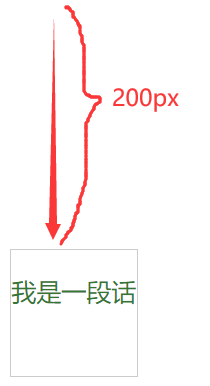
字符串插值语法:#{}
功能类似于es6中的模板字符串:反引号和${},就像这样:
html:
    <div class="container">
        <p>我是一段话</p>
    </div>
scss:
$fontSize : 14px !default;
$direction:"top";
.container {


    width: 100px;
    height: 100px;
    border: 1px solid #ccc;
    margin-#{

    $direction}: 200px; // 使用字符串插值
    p {


        font-size: $fontSize;
        @include font-color(#464);
    }
}
编译结果:
.container {


  width: 100px;
  height: 100px;
  border: 1px solid #ccc;
  margin-top: 200px; // 字符串插值生效
}
.container p {


  font-size: 20px;
  color: #337733;
}
效果:
@if语法
类似if…else语法
$fontSize : 22px;
.container {


    width: 100px;
    height: 100px;
    border: 1px solid #ccc;
    margin: 20px auto;
    p {


        // 如果指定的字号大小大于20px则用指定值,否则固定为16px
        @if ($fontSize > 20px){


            font-size: $fontSize;
        }
        @else {


            font-size: 16px;
        }
    }
}
编译结果:
.container {


  width: 100px;
  height: 100px;
  border: 1px solid #ccc;
  margin: 20px auto;
}
.container p {


  font-size: 22px; // 字号生效
}
@for语法
快速写出有规律的样式
.container {


    @for $i from 1 through 5 {


        .m-t-#{

    $i*5} {


            margin-top : $i*5px;
        }

    }
}
编译结果:
.container .m-t-5 {


  margin-top: 5px;
}
.container .m-t-10 {


  margin-top: 10px;
}
.container .m-t-15 {


  margin-top: 15px;
}
.container .m-t-20 {


  margin-top: 20px;
}
.container .m-t-25 {


  margin-top: 25px;
}
@each语法与nth语法
@each语法:遍历Maps或Lists中的每一项
nth语法:提取Maps或Lists中的第n项,n从1开始
用@each遍历Maps:
// 遍历Maps
.container {


    $direction :('t':"top", 'b':"bottom", "l":"left", "r":"right");
    @each $dir in $direction {

     // 遍历direction中的每一项
        @for $i from 1 through 3 {


            .m-#{

    nth($dir, 1)}-#{

    $i*5} {

     // nth取$dir的第1项,即t、b、l、r
                margin-#{

    nth($dir, 2)} : $i * 5px;
                // nth取第i个的第2项,即top、bottom、left、right
            }
        }
    }
}
编译结果:
.container .m-t-5 {


  margin-top: 5px;
}
.container .m-t-10 {


  margin-top: 10px;
}
.container .m-t-15 {


  margin-top: 15px;
}
.container .m-b-5 {


  margin-bottom: 5px;
}
.container .m-b-10 {


  margin-bottom: 10px;
}
.container .m-b-15 {


  margin-bottom: 15px;
}
.container .m-l-5 {


  margin-left: 5px;
}
.container .m-l-10 {


  margin-left: 10px;
}
.container .m-l-15 {


  margin-left: 15px;
}
.container .m-r-5 {


  margin-right: 5px;
}
.container .m-r-10 {


  margin-right: 10px;
}
.container .m-r-15 {


  margin-right: 15px;
}

/*# sourceMappingURL=index.css.map */
用@each遍历Lists:
// 遍历Lists
.container {


    $margin-data : 20px 20px 10px 10px;
    @each $data in $margin-data {


        /* #{$data} */
    }
}
编译结果:
.container {


  /* 20px */
  /* 20px */
  /* 10px */
  /* 10px */
}
用nth取Lists的第n项:
$gradients : (to left top, blue, red) (to left top, blue, yellow);
div {


    width: 100px;
    height: 100px;
    border: 1px solid #ccc;
    background: linear-gradient(nth($gradients, 2)); // 取第2项
    margin: 100px auto;
}
编译结果:
.container {


  width: 100px;
  height: 100px;
  border: 1px solid #ccc;
  background: linear-gradient(to left top, blue, yellow);
  margin: 100px auto;
}
效果:

案例
遍历得到padding和margin四方位的值(平常不建议这么写,可读性较差,起码加个注释)
// 遍历Maps
.container {


    $content : ("p":"padding", "m":"margin");
    $direction :('t':"top", 'b':"bottom", "l":"left", "r":"right");
    @each $cont in $content {

     // 遍历$content中的每一项
        @each $dir in $direction {

     // 遍历$direction中的每一项
            @for $i from 1 through 3 {


                .#{

    nth($cont, 1)}-#{

    nth($dir, 1)}-#{

    $i*5} {

     // nth取$dir的第1项,即t、b、l、r
                    #{

    nth($cont, 2)}-#{

    nth($dir, 2)} : $i * 5px;
                    // nth取第i个的第2项,即top、bottom、left、right
                }
            }
        }
    }
}
编译结果:
.container .p-t-5 {


  padding-top: 5px;
}
.container .p-t-10 {


  padding-top: 10px;
}
.container .p-t-15 {


  padding-top: 15px;
}
.container .p-b-5 {


  padding-bottom: 5px;
}
.container .p-b-10 {


  padding-bottom: 10px;
}
.container .p-b-15 {


  padding-bottom: 15px;
}
.container .p-l-5 {


  padding-left: 5px;
}
.container .p-l-10 {


  padding-left: 10px;
}
.container .p-l-15 {


  padding-left: 15px;
}
.container .p-r-5 {


  padding-right: 5px;
}
.container .p-r-10 {


  padding-right: 10px;
}
.container .p-r-15 {


  padding-right: 15px;
}
.container .m-t-5 {


  margin-top: 5px;
}
.container .m-t-10 {


  margin-top: 10px;
}
.container .m-t-15 {


  margin-top: 15px;
}
.container .m-b-5 {


  margin-bottom: 5px;
}
.container .m-b-10 {


  margin-bottom: 10px;
}
.container .m-b-15 {


  margin-bottom: 15px;
}
.container .m-l-5 {


  margin-left: 5px;
}
.container .m-l-10 {


  margin-left: 10px;
}
.container .m-l-15 {


  margin-left: 15px;
}
.container .m-r-5 {


  margin-right: 5px;
}
.container .m-r-10 {


  margin-right: 10px;
}
.container .m-r-15 {


  margin-right: 15px;
}

/*# sourceMappingURL=index.css.map */
注释
在scss文件中,允许两种注释,分别是 /**/ 和 //,前者在编译后依然保留,后者编译后不保留
scss:
/* 我是注释一,巴拉巴拉巴拉 */
.container {


    margin: 10px;
    // 我是注释二,巴拉巴拉巴拉
}
编译结果:
@charset "UTF-8";
/* 我是注释一,巴拉巴拉巴拉 */
.container {


  margin: 10px;
}

/*# sourceMappingURL=index.css.map */
只剩下注释一了
更多知识,请移步官网
官网文档链接:Sass中文网