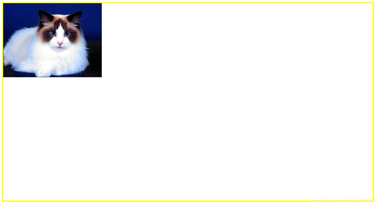
background属性
background是一种 CSS 简写属性,用于一次性集中定义各种背景属性。
.box {
width: 1200px;
height: 1500px;
border: solid 5px yellow;
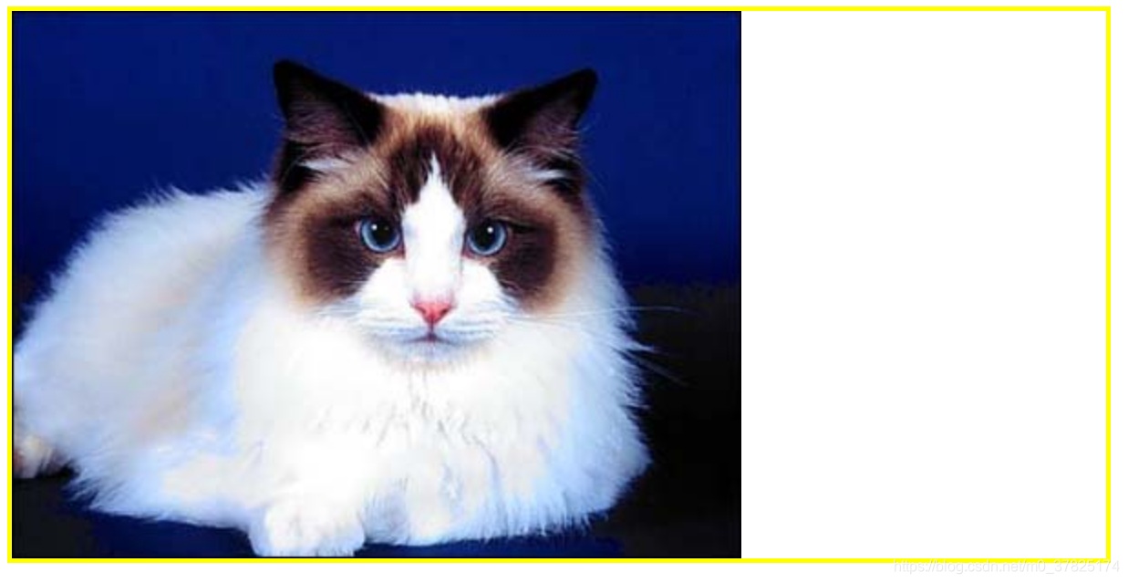
background: url(./0.jpg) repeat scroll 0 0 transparent;
/*背景图片,水平和垂直方向重复,随页面其他内容滚动而移动,水平和垂直方向尺寸为0,背景颜色透明*/
}
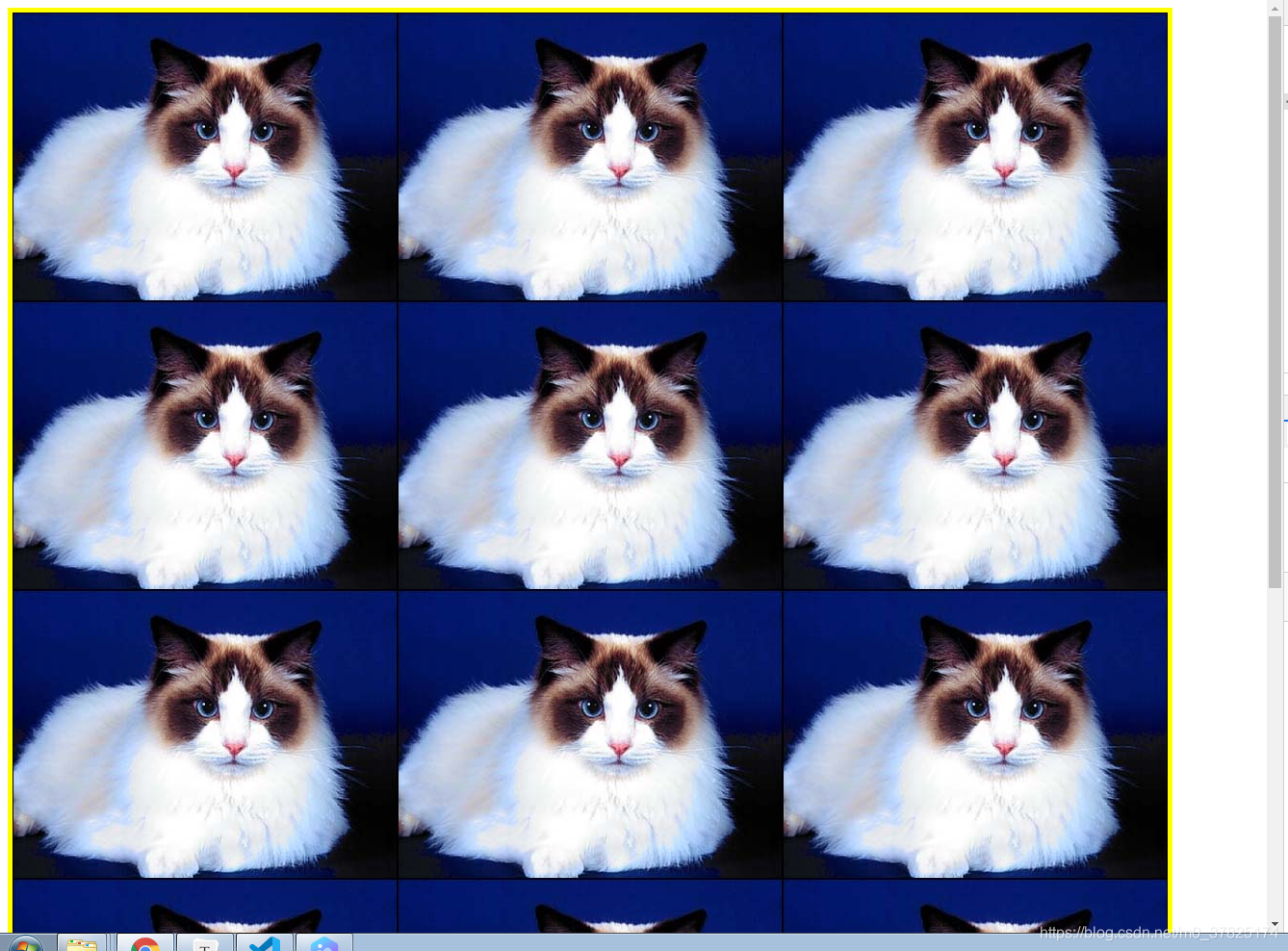
注:如果不设置其中的某个属性值,也不会出问题。
我们也可以单独设置某个属性:
background-color
background-color 会设置元素的背景色, 属性的值为color。
| 取值 | |
|---|---|
| 初始值 | transparent |
| 颜色名 | red、blue、green …… |
| 十六进制 | #ff3040 每一位的取值在(0-9 a-f) |
| rgb | rgb (255, 255, 255) 每一位的取值在( 0-255 ) |
| rgba | rgba(0, 0, 0, .5) 前面三个跟rgb一样,最后一位表示透明度,取值(0-1) |
实例
background-color: transparent;
background-color: #bbff00;
background-color: rgb(255, 255, 128);
Rgba(255,255,255,.5)	/*rgba最后的值代表透明度(取值0-1)*/
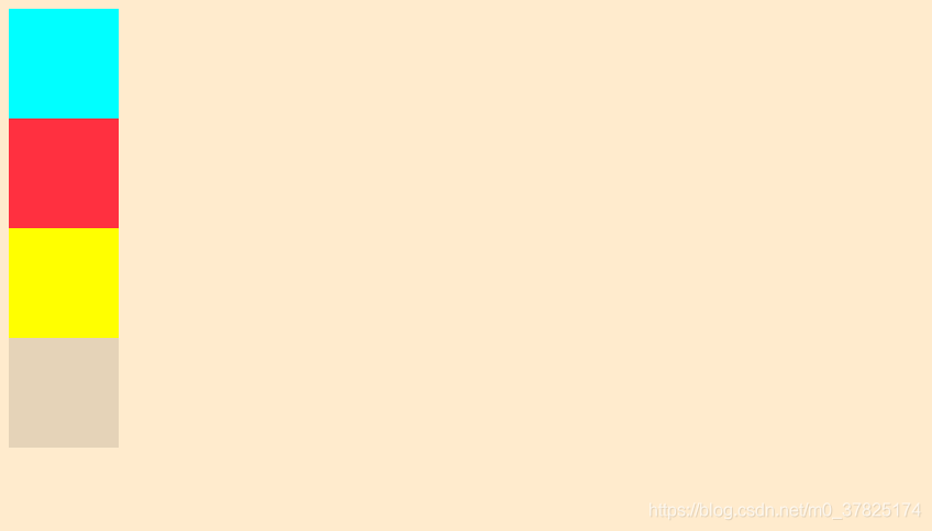
    <div class="box1"></div>
    <div class="box2"></div>
    <div class="box3"></div>
    <div class="box4"></div>
      div{


          width: 100px;
          height: 100px;
      }
      body{


        background-color:blanchedalmond;
      }
      .box1{


          background-color:aqua;
      }
      .box2{


          background-color: #ff3040;
      }
      .box3{


          background-color: rgb(255, 255, 0);
      }
      .box4{


          background-color:  rgba(0, 0, 0, .1);	/*设置黑色且透明度为0.1*/
      }
background-image
background-image 属性用于为一个元素设置一个或者多个背景图像。
	语法:background-img:url(...)

	如果一个指定的图像无法被绘制 (比如,被指定的 URI 所表示的文件无法被加载)
浏览器会将此情况等同于其值被设为 none。
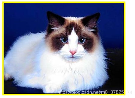
实例
<div class="box"></div>
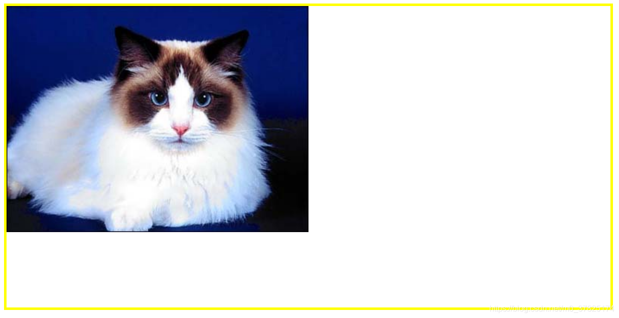
        .box {


            width: 400px;
            height: 300px;
            border: solid 5px yellow;
            background-image: url(./0.jpg);
        }
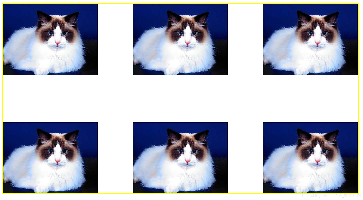
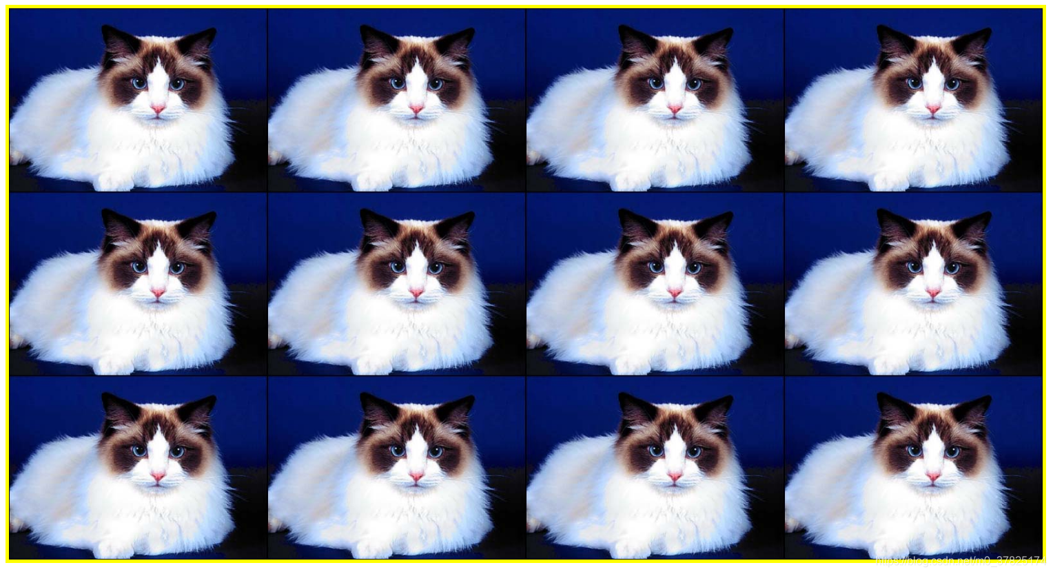
background-repeat
background-repeat 属性定义背景图像的重复方式。
语法:单值语法是 双值语法的简写:
| 单值 | 等价于双值 |
|---|---|
| repeat-x | repeat no-repeat |
| repeat-y | no-repeat repeat |
| repeat | repeat repeat |
| space | space space |
| round | round round |
| no-repeat | no-repeat no-repeat |
| 取值 | |
|---|---|
| 初始值 | repeat |
| repeat | 图像会按需重复来覆盖整个背景图片所在的区域. |
| no-repeat | 图像不会被重复 |
| space | 图像会尽可能得重复, 但是不会裁剪. 第一个和最后一个图像会被固定在元素的相应的边上, 同时空白会均匀地分布在图像之间. |
| round | 随着允许的空间在尺寸上的增长, 被重复的图像将会伸展(没有空隙), 直到有足够的空间来添加一个图像. |
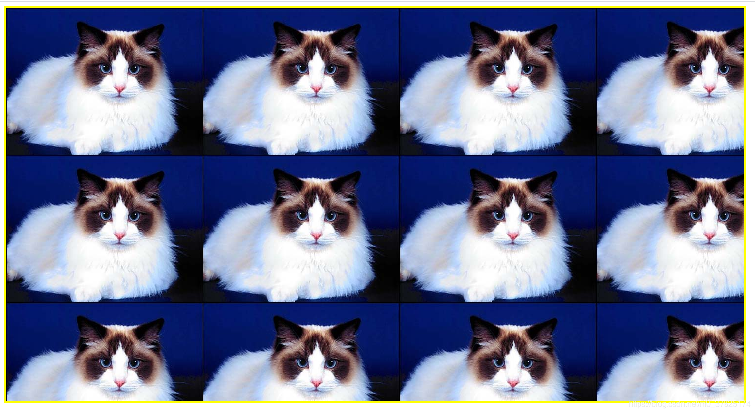
实例
<div class="box"></div>
        .box {


            width: 1500px;
            height: 800px;
            border: solid 5px yellow;
            background-image: url(./0.jpg);
            /*background-repeat		默认值repeat*/
            background-repeat: repeat;
        }
background-repeat: no-repeat;
background-repeat: space;
background-repeat: round;
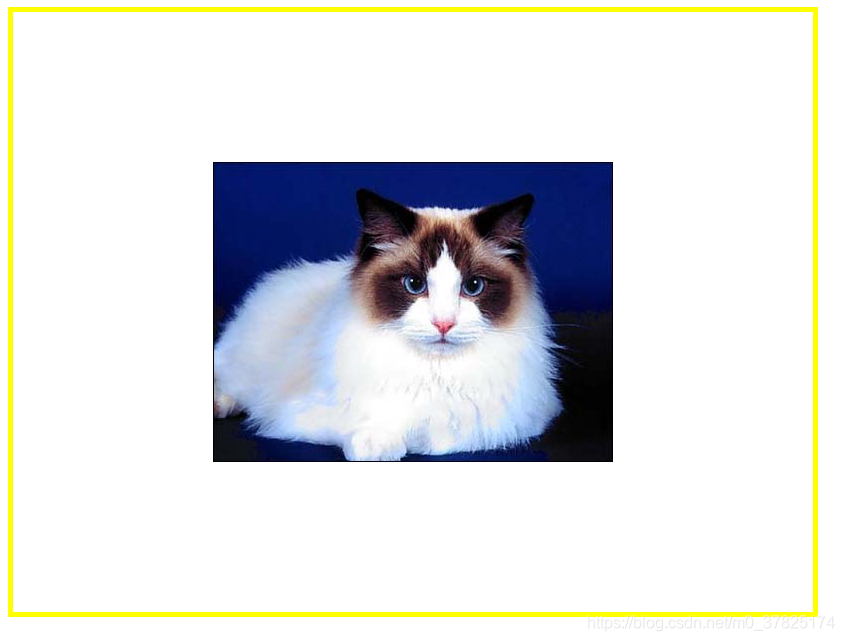
background-position
为每一个背景图片设置初始位置。
实例
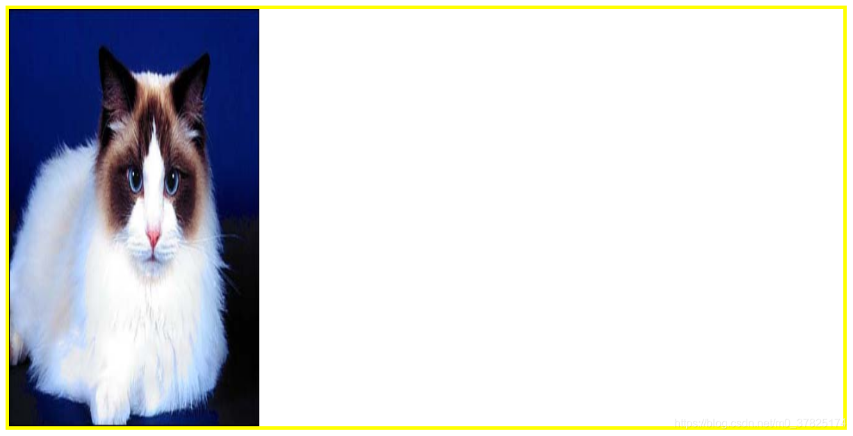
        .box {


            width: 1500px;
            height: 800px;
            border: solid 5px yellow;
            background: url(./0.jpg) no-repeat;
            background-position: center;
            /*background-position: top;		*/
            /*background-position: right;	*/
            /*background-position: bottom;	*/
            /*background-position: left;	*/
        }
        .box {


            width: 1500px;
            height: 800px;
            border: solid 5px yellow;
            background: url(./0.jpg) no-repeat;
            background-position: 25px 25px;
            /*background-position: x y;  x,y是距离左上偏移量 */
        }

background-size
background-size 设置背景图片大小。
实例
        .box {


            width: 1500px;
            height: 800px;
            border: solid 5px yellow;
            background: url(./0.jpg) no-repeat;
            background-size: contain;		/* 按比例纵向拉伸 */
            /* background-size: cover; */	/* 按比例横向拉伸 */
        }
        .box {


            width: 1500px;
            height: 800px;
            border: solid 5px yellow;
            background: url(./0.jpg) no-repeat;
            background-size: 50%;
        }
        .box {


            width: 1500px;
            height: 800px;
            border: solid 5px yellow;
            background: url(./0.jpg) no-repeat;
            background-size: 30% 100%;
            /* background-size: x y; */
        }
background-clip
设置元素的背景(背景图片或颜色)是否延伸到边框、内边距盒子、内容盒子下面。
| 取值 | |
|---|---|
| 初始值 | border-box |
| border-box | 背景延伸至边框外沿(但是在边框下层)。 |
| padding-box | 背景延伸至内边距(padding)外沿。不会绘制到边框处。 |
| content-box | 背景被裁剪至内容区(content box)外沿。 |
| text | 背景被裁剪成文字的前景色。 |
实例
    <p class="box1">Lorem ipsum dolor sit amet.</p>
    <p class="box2">Lorem ipsum dolor sit amet.</p>
    <p class="box3">Lorem ipsum dolor sit amet.</p>
    <p class="box4">Hello World</p>
      p{


          /* width: 100px; */
          /* height: 100px; */
          border: 5px solid rgba(0,0,0,.1);
          background-color: rgb(255,255,0);
          margin: 10px 0;
          padding: 10px;
      }
      .box1{


          background-clip:border-box;
      }
      .box2{


          background-clip:content-box;
      }
      .box3{


          background-clip:padding-box;
      }
      .box4{


          background-clip:text;
          -webkit-background-clip: text;    /* -webkit-  chrome私有属性*/
          color: rgba(0,0,0,.2);    /*文字颜色透明*/
      }