offset
offset翻译过来就是偏移量,我们使用offset系列的相关属性可以动态得到该元素的位置(偏移),大小等等
1.获得元素距离定位父元素的位置
2.获得元素自身的大小(宽度及高度)
注意:返回的数值不带单位
<!DOCTYPE html>
<html lang="en">
<head>
<meta charset="UTF-8">
<meta name="viewport" content="width=device-width, initial-scale=1.0">
<title>Document</title>
<style>
* {
margin: 0;
padding: 0;
}
.father {
position: relative;
width: 200px;
height: 200px;
padding: 50px;
background-color: blue;
margin: 200px;
}
.son {
position: absolute;
width: 100px;
height: 100px;
background-color: #008000;
}
</style>
</head>
<body>
<div class="father">
<div class="son"></div>
</div>
<script>
var father = document.querySelector('.father');
var son = document.querySelector(".son")
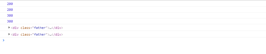
console.log(father.offsetLeft); //200
console.log(father.offsetTop); //200;
console.log(father.offsetWidth); //200;
console.log(father.offsetHeight); //200
console.log(son.parentNode) //father 获得最近的的父元素 不管父元素有没有定位
console.log(son.offsetParent) //father 获得最近的父元素 父元素必须要有定位,父元素如果没有定位,则以body为准
</script>
</body>
</html>
parentNode与offsetParent的区别
- parentNode:获得最近的的父元素 不管父元素有没有定位
- offsetParent:得最近的父元素 父元素必须要有定位,父元素如果没有定位,则以body为准
offset与style的区别
- offsetoffset可以得到任意样式表的样式值
- offset获取到的数值是没有单位的
- offsetWidth包含padding+border+width
- offsetWidth属性是只读属性,只能获取而不能赋值
所以,我们想要获取元素大小位置,用offset更合适
style
- style只能得到行内样式表的样式值
- style.width获得的是带单位的字符串
- style.width是可读写属性,可以获取也可以赋值
所以,我们想要给元素更改值,则需要用style来改变
<!DOCTYPE html>
<html>
<head>
<meta charset="utf-8">
<title></title>
<style>
* {
margin: 0;
padding: 0;
}
.box {
width: 200px;
height: 200px;
background-color: #000000;
}
</style>
</head>
<body>
<div class="box" style="width: 200px;"></div>
<script>
var box = document.querySelector('.box');
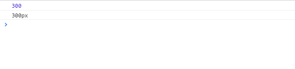
box.offsetWidth = '300px'; //不生效
box.style.width = '300px' //生效
console.log(box.offsetWidth); //300
console.log(box.style.width); //300px;
</script>
</body>
</html>
获取鼠标在盒子里面的坐标
我们在盒子内点击,想要得到鼠标距离盒子左右的距离
- 首先得到鼠标在页面中的坐标(e.pageX,e.pageY);
- 其次得到盒子距离页面中的距离(box.offsetLeft,box.offsetTop)
- 用鼠标在页面中的距离减去盒子距离页面的距离,即可得到鼠标距离盒子内的坐标
- 用鼠标移动事件,可以获取最新的坐标
<!DOCTYPE html>
<html>

<head>
    <meta charset="utf-8">
    <title></title>
    <style>
        * {
            margin: 0;
            padding: 0
        }

        div {
            width: 400px;
            height: 400px;
            background-color: blue;
            margin: 200px auto;
            color: white;
        }
    </style>
</head>

<body>
    <div></div>
    <script>
        var div = document.querySelector('div');
        div.addEventListener('mousemove', function(e) {
            var x = e.pageX - this.offsetLeft;
            var y = e.pageY - this.offsetTop;
            div.innerHTML = '距离盒子的宽' + x + "\n" + "距离盒子的高" + y
        })
    </script>
</body>

</html>

移动模态框
核心思路
- 第一步:给元素设置点击事件 点击隐藏或显示
- 第二步:获取鼠标按下事件 鼠标移动事件 鼠标松开事件
<!DOCTYPE html>
<html lang="zh">

<head>
    <meta charset="UTF-8">
    <meta name="viewport" content="width=device-width, initial-scale=1.0">
    <meta http-equiv="X-UA-Compatible" content="ie=edge">
    <title></title>
    <style>
        * {
            margin: 0;
            padding: 0;
        }

        p {
            font: bold normal 20px '楷体';
            text-align: center;
        }

        a {
            display: block;
            text-decoration: none;
            width: 200px;
            height: 45px;
            margin: 50px auto;
            text-align: center;
            line-height: 45px;
            color: black;
            border: 1px solid #CCCCCC;
        }

        .bth {
            position: absolute;
            top: -18px;
            right: 0;
            width: 40px;
            height: 40px;
            text-align: center;
            line-height: 40px;
            border: 1px solid #cccccc;
            border-radius: 50%;
        }

        .login {
            display: none;
            position: absolute;
            top: 50%;
            left: 50%;
            transform: translate(-50%, -50%);
            padding-top: 1px;
            width: 600px;
            height: 500px;
            text-align: center;
            font-size: 16px;
            box-shadow: 0px 0px 20px #DDDDDD;
        }

        #title {
            font-size: 30px;
            font-family: '楷体';
            margin-top: 40px;
            margin-bottom: 60px;
            cursor: move;
        }

        input {
            width: 400px;
            height: 40px;
            margin-top: 50px;
            padding-left: 20px;
        }
    </style>
</head>

<body>
    <p class="login-bth">弹出模态框</p>

    <div class="login">
        <div id="title">登陆会员</div>
        <span class="bth">关闭</span> <br />
        <p> 用户名:<input type="text" placeholder="请输入用户名"></p>
        <p>登陆密码: <input type="password" placeholder="请输入登陆密码"></p>
        <a href="javascript:;">登陆会员</a>

    </div>

    <script>
        var login_bth = document.querySelector('.login-bth');
        var login = document.querySelector('.login');
        console.log(login);
        var bth = document.querySelector('.bth');
        var title = document.querySelector('#title')

        login_bth.addEventListener('click', function(e) {
            login.style.display = 'block'
        })
        bth.addEventListener('click', function(e) {
            login.style.display = 'none'
        })
        title.addEventListener('mousedown', function(e) {
            var x = e.pageX - login.offsetLeft;
            var y = e.pageY - login.offsetTop;


            document.addEventListener('mousemove', move)

            function move(e) {
                login.style.left = e.pageX - x + "px";
                login.style.top = e.pageY - y + 'px';
            }

            document.addEventListener('mouseup', function() {
                document.removeEventListener('mousemove', move)
            })
        })
    </script>
</body>

</html>

放大镜效果(兼容性)
思路如下
1.先设置鼠标移入移出事件,移入的时候,遮挡层和大盒子的显示,移出的时候,遮挡层和大盒子消失
2.获取鼠标在盒子内的坐标,并把坐标赋值给mask遮挡层,并求出mak遮挡层的最大距离,进行判断
3.大图片移动的最大距离:大图片的宽度减去大图片的容器大盒子的宽度
4.得到大图片的移动距离:遮挡层移动距离*大图片的移动距离/遮挡层的最大移动距离:最后赋值即可
<!DOCTYPE html>
<html lang="en">
    <head>
        <meta charset="UTF-8">
        <title>Title</title>
        <style>
            * {
                margin: 0;
                padding: 0;
            }

            .prew_img {
                position: relative;
                width: 398px;
                height: 398px;
                border: 1px solid #CCCCCC;
                margin: 20px 0px 20px 20px;

            }

            .prew_img>img {
                width: 100%;
                height: 100%;
            }

            .mask {
                /* 默认隐藏 */
                display: none;
                position: absolute;
                top: 0;
                left: 0;
                width: 300px;
                height: 300px;
                background-color: yellow;
                opacity: 0.5;
            }

            .bg {
                display: none;
                position: absolute;
                left: 450px;
                top: 0;
                width: 500px;
                height: 500px;
                background-color: yellow;
                -webkit-border: 1px solid black;
                border: 1px solid black;
                overflow: hidden;
            }

            .bg .bg_img {
                position: absolute;
                top: 0;
                left: 0;

            }
        </style>
    </head>
    <body>
        <div class="prew_img">
            <img src="./img/samll.png">
            <div class="mask"></div>
            <div class="bg">
                <img src="img/big.jpg" class="bg_img">
            </div>
        </div>
        <script>
            // 获取事件源
            var prew_img = document.querySelector('.prew_img');
            var mask = document.querySelector('.mask');
            var bg = document.querySelector('.bg');
            var bg_img = document.querySelector('.bg_img')

            // 设置鼠标移入 移除事件
            prew_img.addEventListener('mouseover', function(e) {
                mask.style.display = 'block';
                bg.style.display = 'block'
            })

            prew_img.addEventListener('mouseout', function(e) {
                mask.style.display = 'none';
                bg.style.display = 'none'
            })

            // 获取鼠标在盒子内的坐标

            prew_img.addEventListener('mousemove', function(e) {
                var x = e.pageX - prew_img.offsetLeft;
                var y = e.pageY - prew_img.offsetTop;
                // mask移动的距离
                maskX = x - mask.offsetWidth / 2;
                maskY = y - mask.offsetHeight / 2;
                var maskMax = prew_img.offsetWidth - mask.offsetWidth;

                // 进行判断
                if (maskX <= 0) {
                    maskX = 0
                } else if (maskX >= maskMax) {
                    maskX = maskMax

                }

                if (maskY <= 0) {
                    maskY = 0
                } else if (maskY >= maskMax) {
                    maskY = maskMax
                }

                //进行赋值
                mask.style.left = maskX + "px";
                mask.style.top = maskY + "px"

                // 大图片的最大移动距离
                var big_max = bg_img.offsetWidth - bg.offsetWidth;

                var bigX = maskX * big_max / maskMax;
                var bigY = maskY * big_max / maskMax;

                bg_img.style.left = -bigX + "px"
                bg_img.style.top = -bigY + "px"


            })
        </script>
    </body>
    <script>

    </script>
</html>

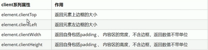
client
获取元素可视区的相关信息,通过client的相关属性可以动态得到该元素的边框大小,元素大小
<!DOCTYPE html>
<html>
<head>
<meta charset="utf-8">
<title></title>
<style>
* {
margin: 0;
padding: 0;
}
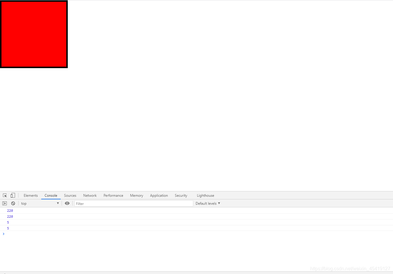
.box {
width: 200px;
height: 200px;
background-color: red;
padding: 10px;
border: 5px solid black;
}
</style>
</head>
<body>
<div class="box"></div>
<script>
var box = document.querySelector('.box');
console.log(box.clientHeight);//220
console.log(box.clientWidth)//220;
console.log(box.clientTop) //5;
console.log(box.clientLeft)//5
</script>
</body>
</html>
立即执行函数
创建一个独立的作用域 避免命名冲突
不需要调用,便可以立即执行的函数
使用方法
- 1.(funcion(){})();
- 2.(function(){}());
<!DOCTYPE html>
<html lang="en">
<head>
    <meta charset="UTF-8">
    <title>Title</title>
</head>
<body>

</body>
<script>
    // 第一种的立即执行函数
    (function(a,b){
        console.log(a+b)

    })(1,2)

    // 第二种的立即执行函数
    (function(a,b){
        console.log(a+b)

    }(20,50))
</script>
</html>
flexible分析
(function flexible(window, document) {
// 获取的html 的根元素
var docEl = document.documentElement
// dpr 物理像素比
var dpr = window.devicePixelRatio || 1
// adjust body font size 设置我们body 的字体大小
function setBodyFontSize() {
// 如果页面中有body 这个元素 就设置body的字体大小
if (document.body) {
document.body.style.fontSize = (12 * dpr) + 'px'
} else {
// 如果页面中没有body 这个元素,则等着 我们页面主要的DOM元素加载完毕再去设置body
// 的字体大小
document.addEventListener('DOMContentLoaded', setBodyFontSize)
}
}
setBodyFontSize();
// set 1rem = viewWidth / 10 设置我们html 元素的文字大小
function setRemUnit() {
var rem = docEl.clientWidth / 10
docEl.style.fontSize = rem + 'px'
}
setRemUnit()
// reset rem unit on page resize 当我们页面尺寸大小发生变化的时候,要重新设置下rem 的大小
window.addEventListener('resize', setRemUnit)
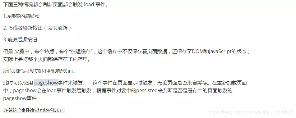
// pageshow 是我们重新加载页面触发的事件
window.addEventListener('pageshow', function(e) {
// e.persisted 返回的是true 就是说如果这个页面是从缓存取过来的页面,也需要从新计算一下rem 的大小
if (e.persisted) {
setRemUnit()
}
})
// detect 0.5px supports 有些移动端的浏览器不支持0.5像素的写法
if (dpr >= 2) {
var fakeBody = document.createElement('body')
var testElement = document.createElement('div')
testElement.style.border = '.5px solid transparent'
fakeBody.appendChild(testElement)
docEl.appendChild(fakeBody)
if (testElement.offsetHeight === 1) {
docEl.classList.add('hairlines')
}
docEl.removeChild(fakeBody)
}
}(window, document))
pageshow与onload的区别
<!DOCTYPE html>
<html>
    <head>
        <meta charset="utf-8">
        <title></title>
        <style>
            * {
                margin: 0;
                padding: 0;
            }
            .bth {
                display: block;
                text-decoration: none;
                width: 120px;
                height: 60px;
                border: 1px solid red;
                background-color: pink;
                text-align: center;
                line-height: 60px;
                margin: 200px auto;
            }
        </style>

    </head>
    <script type="text/javascript">
        window.addEventListener('pageshow', function() {
            alert('22')
        })
    </script>
    <body>
        <a href="https://segmentfault.com/u/yaozimo" class="bth">尧子陌的思否</a>
    </body>

</html>

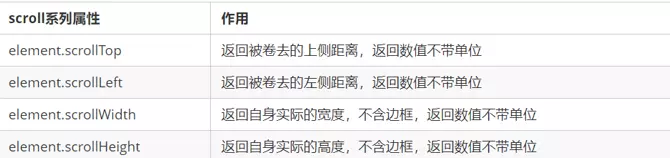
scoll
scoll:滚动 通过scoll的相关属性可以动态的得到元素的大小
<!DOCTYPE html>
<html>

    <head>
        <meta charset="utf-8">
        <title></title>
        <style>
            * {
                margin: 0;
                padding: 0;
            }

            .box {
                width: 200px;
                height: 200px;
                background-color: #0000FF;
                padding: 10px;
                border: 10px solid black;
                overflow: auto;
            }
        </style>
    </head>

    <body>
        <div class="box">
            hello word hello word hello word hello word hello word hello word hello word hello word hello word hello word hello
            word hello word hello word hello word hello word hello word hello word hello word hello word hello word hello word
            hello word hello word hello word hello word hello word hello word hello word hello word hello word hello word hello
            word hello word hello
        </div>
        <script>
            var box = document.querySelector('.box');
            console.log(box.scrollHeight);
            console.log(box.clientHeight);
            box.addEventListener('scroll', function() {
                console.log(box.scrollTop)
            })
        </script>
    </body>

</html>

仿淘宝固定栏
需要用到页面滚动事件 scroll  因为是页面滚动,所以事件源是document
滚动到某个位置,就是判断页面被卷去的上部值。
页面被卷去的头部:可以通过window.pageYOffset 获得  如果是被卷去的左侧window.pageXOffset
注意,元素被卷去的头部是element.scrollTop  , 如果是页面被卷去的头部 则是 window.pageYOffset
其实这个值 可以通过盒子的 offsetTop可以得到,如果大于等于这个值,就可以让盒子固定定位了
<!DOCTYPE html>
<html>
    <head>
        <meta charset="utf-8">
        <title></title>
        <style>
            * {
                margin: 0;
                padding: 0;
            }

            .slider-bar {
                position: absolute;
                top: 300px;
                left: 50%;
                margin-left: 600px;
                /* 版心的一半 */

                width: 200px;
                height: 180px;
                text-align: center;
                line-height: 180px;
                background-color: pink;
            }

            span {
                position: absolute;
                left: 50%;
                top: 50%;
                transform: translate(-50%,-50%);
                display: none;
            }

            .w {
                width: 1200px;
                font-weight: 700;
                color: #CCCCCC;
                margin: 20px auto;
                text-align: center;

            }

            .header {
                height: 120px;
                background-color: blueviolet;
            }

            .banner {
                height: 400px;
                background-color: red;
            }

            .main {
                height: 2000px;
                background-color: #008000;
            }
        </style>
    </head>
    <body>
        <div class="slider-bar">
            <span class="goBack">返回顶部</span>
        </div>
        <div class="header w">header</div>
        <div class="banner w">banner</div>
        <div class="main w">主体</div>
    </body>
    <script>
        //获取事件源
        var slider = document.querySelector('.slider-bar');
        var goBack = document.querySelector('.goBack');
        var header = document.querySelector('.header');
        var banner = document.querySelector('.banner');
        var main = document.querySelector('.main');
        var mainTop = main.offsetTop;
        var bannerTop = banner.offsetTop;
        var sliderbarTop = slider.offsetTop - bannerTop;
        // 绑定scroll事件
        document.addEventListener('scroll', function() {
            if (window.pageYOffset >= bannerTop) {
                slider.style.position = 'fixed'
                slider.style.top = sliderbarTop + "px"

            } else {
                slider.style.position = 'absolute';
                slider.style.top = "300px"

            }

            if (window.pageYOffset >= mainTop) {
                goBack.style.display = 'block'

            } else {
                goBack.style.display = 'none'
            }
        })
    </script>
</html>

总结
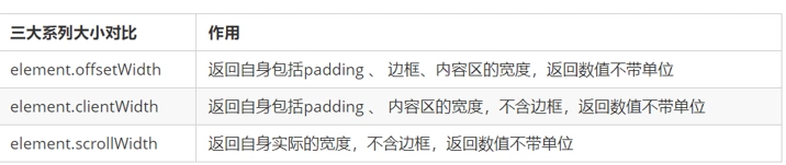
1.offset系列 经常用于获得元素位置 offsetLeft offsetTop
2.client经常用于获取元素大小 clientWidth clientHeight
3.scroll 经常用于获取滚动距离 scrollTop scrollLeft
4.注意页面滚动的距离通过 window.pageXOffset 获得
mouseover和mouseenter之间的区别
mouseover经过自身盒子会触发 经过父盒子还会触发
mouseenter只会经过自身盒子触发
mouseover会触发冒泡事件,而mouseenter不会

动画
动画封装函数
核心原理:通过定时器serInterval()不断移动盒子位置
实现步骤
- 获得当前盒子位置
- 让盒子在当前位置加上一个1个移动距离
- 利用定时器不断重复这个操作
- 加一个结束定时器的条件
- 注意此元素需要添加定位,才能使用element.style.left
<!DOCTYPE html>
<html>
    <head>
        <meta charset="utf-8">
        <title></title>
        <style>
            div {
                position: absolute;
                left: 0;
                width: 100px;
                height: 100px;
                background-color: #0000FF;
            }
        </style>
    </head>

    <body>
        <div></div>
        <script>
            var div = document.querySelector('div');
            var timer = setInterval(function() {
                if (div.offsetLeft >= 400) {
                    learInterval(timer)
                }
                div.style.left = div.offsetLeft + 1 + "px"
            }, 30)
        </script>
    </body>
</html>

动画函数给不同元素记录使用的计时器
核心原理:利用js是一门动态语言,可以很方便的当前对象添加属性
<!DOCTYPE html>
<html>
    <head>
        <meta charset="utf-8">
        <title></title>
        <style>
            div {
                position: absolute;
                left: 0;
                width: 200px;
                height: 200px;
                background-color: #0000FF;
            }
            span {
                position: absolute;
                top: 200px;
                left: 0;
                display: block;
                width: 200px;
                height: 200px;
                background-color: red
            }
        </style>
    </head>
    <body>
        <div></div>
        <span></span>
    </body>
    <script>
        // 获取元素
        var div = document.querySelector('div');
        var span = document.querySelector('span');

        function animate(obj,target){
            var timer = setInterval(function(){

                if(obj.offsetLeft>=target){
                    clearInterval(timer)
                }
                obj.style.left = obj.offsetLeft+1+"px";
            },30)
        }

        animate(div,300);
        animate(span,500)
    </script>
</html>

给不同的对象添加不同的定时器
<!DOCTYPE html>
<html>
    <head>
        <meta charset="utf-8">
        <title></title>
        <style>
            div {
                position: absolute;
                left: 0;
                width: 200px;
                height: 200px;
                background-color: #0000FF;
            }
            span {
                position: absolute;
                top: 200px;
                left: 0;
                display: block;
                width: 200px;
                height: 200px;
                background-color: red
            }
        </style>
    </head>
    <body>
        <button>点击span便动</button>
        <div></div>
        <span></span>
    </body>
    <script>
        // 获取元素
        var div = document.querySelector('div');
        var span = document.querySelector('span');
        var bth = document.querySelector('button')

        function animate(obj,target){
            // 清除以前定时器 只保留当前的一个定时器运行
            clearInterval(obj.timer)
            obj.timer = setInterval(function(){

                if(obj.offsetLeft>=target){
                    clearInterval(obj.timer)
                }
                obj.style.left = obj.offsetLeft+1+"px";
            },30)
        }

        animate(div,300);

        bth.addEventListener('click',function(){
            animate(span,500)
        })
    </script>
</html>
