边框滑动按钮
我们先来看看实现效果

html代码
<!DOCTYPE html>
<html lang="en">
<head>
    <meta charset="UTF-8">
    <meta http-equiv="X-UA-Compatible" content="IE=edge">
    <meta name="viewport" content="width=device-width, initial-scale=1.0">
    <title>第四天</title>
    <link rel="stylesheet" href="style.css">
</head>
<body>
    <a href="#" class="bt">this is a button</a>
</body>
</html>
css代码
*{


    margin: 0;
    padding: 0;
}
body{


    width: 100vw;
    height: 100vh;
    background-color: rgb(32, 87, 141);
    display: flex;
    justify-content: center;
    align-items: center;
}

a.bt{


    font-size: 24px;
    color: rgb(221, 230, 240);
    text-decoration: none;
    text-transform: uppercase;
    border: 4px solid;
    padding: 12px 24px;
    position: relative;
}

a.bt::before,a.bt::after{


    content: "";
    position: absolute;
    background-color: rgb(32, 87, 141);
    width: 12px;
    height: 4px;
    transform: skew(-30deg);
    transition: 0.2s linear;
}
a.bt::before{


    top: -4px;
    left: 20%;
}
a.bt::after{


    bottom: -4px;
    right:20%;
}
a.bt:hover::before{


    top:-4px;
    left: 80%;
}
a.bt:hover::after{


    bottom:-4px;
    right: 80%;
}
学习到的知识总结
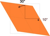
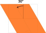
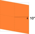
这个案例主要是学习:transform: skew(-30deg)配置。(也就是变成菱形)
| 标签 | 作用 |
|---|---|
| text-transform | 转换不同元素中的文本(uppercase为大写) |
| skew(-30deg) | 控制图像倾斜(详解请看下面图解) |
skew(-30deg) =skewX(30deg)
skew(10deg)=skewY(10deg)
skew(30deg,10deg)