记得早期做Android开发的时候总是能看到IOS的开发人员拖动布局,大大的提升了开发效率,那时候也是小小羡慕,殊不知Android其实也早有所行,只是潜心磨练而已 ~
2016年的Google IO 大会就已经推出了 ConstraintLayout 约束布局,并且可以最低兼容到API 9,但当时并没有推广普及且很少人会用到 ~
直到2018年在我印象中约束布局才开始慢慢出现到了大众面前,不过用此布局的开发人员还是很少 ~
最后2019开始Google为了让开发者使用约束布局,直接在我们每次新建XML的时候都默认使用了ConstraintLayout (好吧,其实我有时候还会将其直接替换成LinearLayout或RelativeLayout,毕竟用的比较顺手…)
虽然Andoird也有了类似IOS的约束布局,但是不建议直接视图拖动生成布局,因为当视图结构复杂时,如果你出错往往牵一发而动全身,作为一名过来人都会告诉你手写的是最靠谱的,排错也最便捷 ~
前情提要
在我的日常开发中涉及到大部分UI开发的时候,我一般都会频繁使用LinearLayout、RelativeLayout作为外层父布局或是嵌套布局 ~
- LinearLayout 线性布局
在项目质量要求不严谨时我个人其实用的最多的应该是 LinearLayout ,因为使用便捷,同时也能满足绝大部分UI的需求;但是它也有一定的缺点,当其作为根布局的时候,本身的视图深度就比相比布局要深,同时当多层嵌套的时候视图绘制耗时也会比相对布局要久,这一方面就涉及到了视图优化、内存优化方面 ~
- RelativeLayout 相对布局
在项目质量要求稍微严谨时(尤其是视图多层嵌套)我可能用的多点的就是RelativeLayout了,因为减少了视图绘制层次和不必要开销的内存,提升了绘制效率(不过使用相对布局时会产生很多的 视图id也就是用作定位的视图tag ~ )
- ConstraintLayout 约束布局
之所以在这里讲约束布局只是因为每次新建Activity时总会默认将ConstraintLayout作为根布局,同时Google推崇解决了多次嵌套的问题,所以在写项目时顺带学习使用后记录一番 ~
基础讲解
一般 ConstraintLayout布局主要是为了解决开中过于复杂的页面,如层级嵌套太多的问题,因为层次嵌套越多,绘制越久,在有些性能较差的手机上会造成卡顿,不流畅的感觉,比较影响用户体验 ~
在正式学习ConstraintLayout 时如果你已经有RelativeLayout 的基础,那么你绝对可以事倍功半,因为你会发现它和RelativeLayout一样有一堆视图tag - -
关于约束布局网上有很多的Bolg去介绍,但是权限点的还是去查看 ConstraintLayout 官方文档 比较靠谱
嘘 ~ 在我学完后发现这完全就是RelativeLayout和LinearLayout的综合体啊,所谓的扩展性完全是就是放开视图限制,把最原始的api让你自己组装啊 > < ~
因部分项目并未直接导入对应依赖,所以先行build引入三方库
Android
implementation 'com.android.support.constraint:constraint-layout:1.1.3'
Android - x
implementation 'androidx.constraintlayout:constraintlayout:1.1.3'
这这这!开始前请看一眼!!!
在使用ConstraintLayout定位视图时常用到 "parent"属性,这里要注意如果你的父布局不是ConstraintLayout,布局里的子控件的约束不能设置为 "parent",要设置@+id/父控件id(ConstraintLayout)
实战演练
首先了解一个视图位置的基本常识
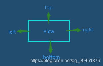
在正式开始前先简单分析一个定位语句
Meaning:当前视图的左侧在目标视图的右侧
layout_constraintLeft_toRightOf
这里进行语句拆分,分别为layout、constraintLeft、toRightOf
- layout 布局(通用解释,可忽略)
- constraintLeft
当前布局的相对位置 - toRightOf
目标布局的相对位置
demo effect
demo code
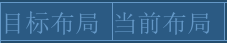
    <android.support.constraint.ConstraintLayout
        android:layout_width="match_parent"
        android:layout_height="wrap_content">

        <TextView
            android:id="@+id/self"
            android:layout_width="wrap_content"
            android:layout_height="wrap_content"
            android:text="目标布局" />

        <TextView
            android:layout_width="wrap_content"
            android:layout_height="wrap_content"
            android:text="当前布局"
            app:layout_constraintLeft_toRightOf="@+id/self" />
    </android.support.constraint.ConstraintLayout>
相对定位
用相对定位之前,首先要明白一个视图位置得基本标识
- layout_constraintLeft_toLeftOf
- layout_constraintLeft_toRightOf
- layout_constraintRight_toLeftOf
- layout_constraintRight_toRightOf
- layout_constraintTop_toTopOf
- layout_constraintTop_toBottomOf
- layout_constraintBottom_toTopOf
- layout_constraintBottom_toBottomOf
- layout_constraintStart_toEndOf
- layout_constraintStart_toStartOf
- layout_constraintEnd_toStartOf
- layout_constraintEnd_toEndOf
- layout_constraintBaseline_toBaselineOf
demo effect
demo code
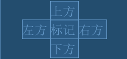
为了美观,我在基础定位的情况下加入了一些margin ~
    <android.support.constraint.ConstraintLayout
        android:layout_width="match_parent"
        android:layout_height="match_parent"
        android:paddingTop="20dp">

        <TextView
            android:id="@+id/self"
            android:layout_width="wrap_content"
            android:layout_height="wrap_content"
            android:layout_marginLeft="50dp"
            android:text="标记"
            app:layout_constraintLeft_toLeftOf="parent" />

        <TextView
            android:id="@+id/top"
            android:layout_width="wrap_content"
            android:layout_height="wrap_content"
            android:layout_marginLeft="50dp"
            android:text="上方"
            app:layout_constraintBottom_toTopOf="@+id/self"
            app:layout_constraintLeft_toLeftOf="parent" />

        <TextView
            android:id="@+id/bottom"
            android:layout_width="wrap_content"
            android:layout_height="wrap_content"
            android:layout_marginLeft="50dp"
            android:text="下方"
            app:layout_constraintLeft_toLeftOf="parent"
            app:layout_constraintTop_toBottomOf="@+id/self" />

        <TextView
            android:id="@+id/left"
            android:layout_width="wrap_content"
            android:layout_height="wrap_content"
            android:text="左方"
            app:layout_constraintRight_toLeftOf="@+id/self" />

        <TextView
            android:layout_width="wrap_content"
            android:layout_height="wrap_content"
            android:text="右方"
            app:layout_constraintLeft_toRightOf="@+id/self" />
    </android.support.constraint.ConstraintLayout>
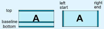
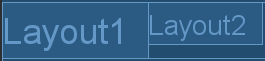
上面大部分的相对定位都是相通的,但是有一个有趣的属性也就是文本基线:layout_constraintBaseline_toBaselineOf
set before
set after
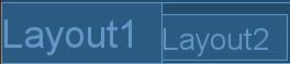
demo code
    <android.support.constraint.ConstraintLayout
        android:layout_width="match_parent"
        android:layout_height="wrap_content">

        <TextView
            android:id="@+id/layout1"
            android:layout_width="wrap_content"
            android:layout_height="wrap_content"
            android:text="Layout1"
            android:textSize="18sp" />

        <TextView
            android:id="@+id/layout2"
            android:layout_width="wrap_content"
            android:layout_height="wrap_content"
            android:text="Layout2"
            app:layout_constraintBaseline_toBaselineOf="@+id/layout1"
            app:layout_constraintLeft_toRightOf="@+id/layout1" />

    </android.support.constraint.ConstraintLayout>
边距
我们知道常规的边距,一般都分为内边距与外边距,这里的话外边距有俩种 ~
内边距
padding
在约束布局中padding的使用与平常使用并无出入
外边距
margin
常规API
- android:layout_marginStart
- android:layout_marginEnd
- android:layout_marginLeft
- android:layout_marginTop
- android:layout_marginRight
- android:layout_marginBottom
此处要注意如果你在ConstraintLayout中直接margin使用是无效的!!!
如使用 android:layout_marginLeft=“20dp” 时,需先声明当前控件的对parent的相对位置,如左边的外边距就需在当前控件内加入 app:layout_constraintLeft_toLeftOf=“parent”
<!--
  这里用的是左边距,所以声明左方相对位置为"parent",如果要设置其他方位的外边距,就要声明对应的相对位置
-->
<TextView
    android:id="@+id/text1"
    android:layout_width="wrap_content"
    android:layout_height="wrap_content"
    android:text="text1"
    android:layout_marginLeft="20dp"
    app:layout_constraintLeft_toLeftOf="parent"
/>
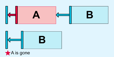
隐藏外边距
goneMargin 主要用于约束的控件可见性被设置为gone的时候使用的margin值
常规API
- layout_goneMarginStart
- layout_goneMarginEnd
- layout_goneMarginLeft
- layout_goneMarginTop
- layout_goneMarginRight
- layout_goneMarginBottom
demo:此处使用 layout_goneMarginLeft ,当t1隐藏时t2设置的goneMargin就会生效
<?xml version="1.0" encoding="utf-8"?>
<android.support.constraint.ConstraintLayout xmlns:android="http://schemas.android.com/apk/res/android"
    xmlns:app="http://schemas.android.com/apk/res-auto"
    xmlns:tools="http://schemas.android.com/tools"
    android:layout_width="match_parent"
    android:layout_height="match_parent"
    tools:context=".MainActivity">

    <TextView
        android:id="@+id/t1"
        android:layout_width="wrap_content"
        android:layout_height="wrap_content"
        android:text="A"
        app:layout_goneMarginLeft="50dp"
		android:visibility="gone"
		/>

    <TextView
        android:id="@+id/t2"
        android:layout_width="wrap_content"
        android:layout_height="wrap_content"
        android:text="B"
        app:layout_goneMarginLeft="10dp"
        app:layout_constraintLeft_toRightOf="@+id/t1" />

</android.support.constraint.ConstraintLayout>
居中与偏移
居中
父布局居中
  app:layout_constraintBottom_toBottomOf="parent"
  app:layout_constraintLeft_toLeftOf="parent"
  app:layout_constraintRight_toRightOf="parent"
  app:layout_constraintTop_toTopOf="parent"
水平居中
  app:layout_constraintLeft_toLeftOf="parent"
  app:layout_constraintRight_toRightOf="parent"
垂直居中
  app:layout_constraintBottom_toBottomOf="parent"
  app:layout_constraintTop_toTopOf="parent"
偏移
偏移范围在0-1之间,为0在布局的最左侧,为1在布局的最右侧,为0.5则水平居中,为0.3则更倾向于左侧,为0.8则更倾向于左侧
- layout_constraintHorizontal_bias
水平偏移:需先行设置水平居中属性 (居多)
  app:layout_constraintHorizontal_bias="0.3"
  app:layout_constraintLeft_toLeftOf="parent"
  app:layout_constraintRight_toRightOf="parent"
- layout_constraintVertical_bias 垂直偏移
垂直偏移:需先行设置垂直居中属性
  app:layout_constraintHorizontal_bias="0.3"
  app:layout_constraintBottom_toBottomOf="parent"
  app:layout_constraintTop_toTopOf="parent"
角度定位
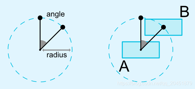
- layout_constraintCircle (1.1 版本中添加,相对控件的中心一个角度和距离上约束另外一个控件的能力)
- layout_constraintCircleRadius(距离)
- layout_constraintCircleAngle(角度)
demo:t2控件位于t1控件130度的100dp处
<android.support.constraint.ConstraintLayout xmlns:android="http://schemas.android.com/apk/res/android"
    xmlns:app="http://schemas.android.com/apk/res-auto"
    xmlns:tools="http://schemas.android.com/tools"
    android:layout_width="match_parent"
    android:layout_height="match_parent"
    tools:context=".MainActivity">

    <TextView
        android:id="@+id/t1"
        android:layout_width="wrap_content"
        android:layout_height="wrap_content"
        android:text="text1"
        />

    <TextView
        android:id="@+id/t2"
        android:layout_width="wrap_content"
        android:layout_height="wrap_content"
        android:text="text2"
        app:layout_constraintCircle="@id/t1"
        app:layout_constraintCircleAngle="130"
        app:layout_constraintCircleRadius="100dp"
        />
</android.support.constraint.ConstraintLayout>
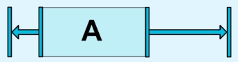
尺寸约束
约束方式有四种
- 指定尺寸(无区别)
- match_parent(官方建议使用ConstraintLayout时
采用0dp配置约束布局代替match_parent)
注意
当设置width为0dp时同步需要设置app:layout_constraintLeft_toLeftOf=“parent” 、app:layout_constraintRight_toRightOf=“parent”
当设置height为0dp时同步需要设置 app:layout_constraintTop_toTopOf=“parent”、
app:layout_constraintBottom_toBottomOf=“parent”
	<!--width为0-->
    <TextView
        android:id="@+id/t1"
        android:layout_width="0dp"
        android:layout_height="wrap_content"
        app:layout_constraintLeft_toLeftOf="parent"
        app:layout_constraintRight_toRightOf="parent" />
- wrap_content(根据内部数据,自动计算尺寸)
为wrap_content时可以 设置宽高阈值
//最大宽度
android:maxWidth
//最小宽度
android:minWidth
//最大高度
android:maxHeight
//最小高度
android:minHeight
PS:ConstraintLayout为1.1版本以下需加上强制约束
app:constrainedWidth="true"
app:constrainedHeight="true"
- 宽高比例
当宽或高至少有一个尺寸被设置为0dp时,可以通过属性layout_constraintDimensionRatio设置宽高比
    <TextView
        android:id="@+id/t1"
        android:layout_width="0dp"
        android:layout_height="wrap_content"
        app:layout_constraintDimensionRatio="1:1"
        app:layout_constraintLeft_toLeftOf="parent"
        app:layout_constraintRight_toRightOf="parent" />
除此之外,在设置宽高比的值的时候,还可以在前面加W或H(大小写均可),分别指定宽度或高度限制 ~
//高:宽=2:3
app:layout_constraintDimensionRatio="H,2:3"
//宽:高=2:3
app:layout_constraintDimensionRatio="W,2:3"
链
当多个控件在同一水平或垂直空间内可以采用链的形式进行组装,链头一般都在第一个控件进行设置 ~
链的形态有多种包含横、纵链,横、纵权重链,以下为官方图(下方有我具体的实操)
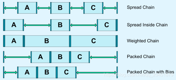
横、纵链
layout_constraintHorizontal_chainStyle
layout_constraintVertical_chainStyle
chainStyle主要有三种样式
- spread - 展开元素 (默认)
- spread_inside - 展开元素,但链的两端贴近parent
- packed - 链的元素将被打包在一起

demo code
    <!--spread-->
    <android.support.constraint.ConstraintLayout
        android:layout_width="match_parent"
        android:layout_height="wrap_content"
        android:paddingTop="20dp">

        <TextView
            android:id="@+id/sp1"
            android:layout_width="wrap_content"
            android:layout_height="wrap_content"
            android:text="昨天"
            app:layout_constraintHorizontal_chainStyle="spread"
            app:layout_constraintLeft_toLeftOf="parent"
            app:layout_constraintRight_toLeftOf="@+id/sp2" />

        <TextView
            android:id="@+id/sp2"
            android:layout_width="wrap_content"
            android:layout_height="wrap_content"
            android:text="今天"
            app:layout_constraintLeft_toRightOf="@+id/sp1"
            app:layout_constraintRight_toLeftOf="@+id/sp3" />

        <TextView
            android:id="@+id/sp3"
            android:layout_width="wrap_content"
            android:layout_height="wrap_content"
            android:text="明天"
            app:layout_constraintLeft_toRightOf="@+id/sp2"
            app:layout_constraintRight_toRightOf="parent" />
    </android.support.constraint.ConstraintLayout>

    <!--spread_inside-->
    <android.support.constraint.ConstraintLayout
        android:layout_width="match_parent"
        android:layout_height="wrap_content"
        android:paddingTop="60dp">

        <TextView
            android:id="@+id/in1"
            android:layout_width="wrap_content"
            android:layout_height="wrap_content"
            android:text="昨天"
            app:layout_constraintHorizontal_chainStyle="spread_inside"
            app:layout_constraintLeft_toLeftOf="parent"
            app:layout_constraintRight_toLeftOf="@+id/in2" />

        <TextView
            android:id="@+id/in2"
            android:layout_width="wrap_content"
            android:layout_height="wrap_content"
            android:text="今天"
            app:layout_constraintLeft_toRightOf="@+id/in1"
            app:layout_constraintRight_toLeftOf="@+id/in3" />

        <TextView
            android:id="@+id/in3"
            android:layout_width="wrap_content"
            android:layout_height="wrap_content"
            android:text="明天"
            app:layout_constraintLeft_toRightOf="@+id/in2"
            app:layout_constraintRight_toRightOf="parent" />
    </android.support.constraint.ConstraintLayout>

    <!--packed-->
    <android.support.constraint.ConstraintLayout
        android:layout_width="match_parent"
        android:layout_height="wrap_content"
        android:paddingTop="100dp">

        <TextView
            android:id="@+id/pa1"
            android:layout_width="wrap_content"
            android:layout_height="wrap_content"
            android:text="昨天"
            app:layout_constraintHorizontal_chainStyle="packed"
            app:layout_constraintLeft_toLeftOf="parent"
            app:layout_constraintRight_toLeftOf="@+id/pa2" />

        <TextView
            android:id="@+id/pa2"
            android:layout_width="wrap_content"
            android:layout_height="wrap_content"
            android:text="今天"
            app:layout_constraintLeft_toRightOf="@+id/pa1"
            app:layout_constraintRight_toLeftOf="@+id/pa3" />

        <TextView
            android:id="@+id/pa3"
            android:layout_width="wrap_content"
            android:layout_height="wrap_content"
            android:text="明天"
            app:layout_constraintLeft_toRightOf="@+id/pa2"
            app:layout_constraintRight_toRightOf="parent" />
    </android.support.constraint.ConstraintLayout>
横、纵权重链
layout_constraintHorizontal_weight
layout_constraintVertical_weight
使用权重链时layout_width一般设为0dp,之后设置layout_constraintHorizontal_weight的权重比(和LinearLayout的权重相似)

demo code
    <android.support.constraint.ConstraintLayout
        android:layout_width="match_parent"
        android:layout_height="wrap_content"
        android:paddingTop="20dp">

        <TextView
            android:id="@+id/sp1"
            android:layout_width="0dp"
            android:layout_height="wrap_content"
            android:text="昨天"
            app:layout_constraintHorizontal_weight="2"
            app:layout_constraintLeft_toLeftOf="parent"
            app:layout_constraintRight_toLeftOf="@+id/sp2" />

        <TextView
            android:id="@+id/sp2"
            android:layout_width="0dp"
            android:layout_height="wrap_content"
            android:text="今天"
            app:layout_constraintHorizontal_weight="3"
            app:layout_constraintLeft_toRightOf="@+id/sp1"
            app:layout_constraintRight_toLeftOf="@+id/sp3" />

        <TextView
            android:id="@+id/sp3"
            android:layout_width="0dp"
            android:layout_height="wrap_content"
            android:text="明天"
            app:layout_constraintHorizontal_weight="4"
            app:layout_constraintLeft_toRightOf="@+id/sp2"
            app:layout_constraintRight_toRightOf="parent" />
    </android.support.constraint.ConstraintLayout>
自带封装
很多人喜欢称为辅助工具,不过在我看来就是一些场景的封装使用 ~
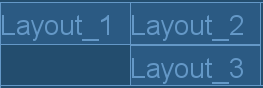
Guideline
辅助线/参考线(我把它当作style)
- android:orientation 垂直vertical,水平horizontal
- layout_constraintGuide_begin 开始位置
- layout_constraintGuide_end 结束位置
- layout_constraintGuide_percent 距离顶部的百分比(orientation = horizontal时则为距离左边)
demo effect
demo code
    <android.support.constraint.ConstraintLayout
        android:layout_width="match_parent"
        android:layout_height="wrap_content">

        <android.support.constraint.Guideline
            android:id="@+id/guideline"
            android:layout_width="wrap_content"
            android:layout_height="wrap_content"
            android:orientation="vertical"
            app:layout_constraintGuide_begin="20dp" />

        <TextView
            android:id="@+id/layout1"
            android:layout_width="wrap_content"
            android:layout_height="wrap_content"
            android:text="Layout_1"
            app:layout_constraintLeft_toLeftOf="@+id/guideline" />

        <TextView
            android:id="@+id/layout2"
            android:layout_width="wrap_content"
            android:layout_height="wrap_content"
            android:text="Layout_2"
            app:layout_constraintLeft_toLeftOf="@+id/guideline"
            app:layout_constraintTop_toBottomOf="@+id/layout1" />
    </android.support.constraint.ConstraintLayout>
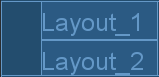
Barrier
栅栏 与 Guideline有类似效果,但是使用场景不同,个人认为优于guideline,目标视图宽度增加,当前视图会动态后移
- barrierDirection 所引用控件对齐的位置,可设值有 bottom、end、left、right、start、top
- constraint_referenced_ids 所引用的控件,多个控件引用可用 , 隔开
demo effect
这里Layout_2/3 左边距是通过Barrier进行设置的,关于Layout2_3的上下位置是我自行设置的
demo code
      <android.support.constraint.ConstraintLayout
          android:layout_width="match_parent"
          android:layout_height="wrap_content">

          <android.support.constraint.Barrier
              android:id="@+id/barrier"
              android:layout_width="wrap_content"
              android:layout_height="wrap_content"
              app:barrierDirection="left"
              app:constraint_referenced_ids="layout1,layout2" />

          <TextView
              android:id="@+id/layout1"
              android:layout_width="wrap_content"
              android:layout_height="wrap_content"
              android:text="Layout_1" />

          <TextView
              android:id="@+id/layout2"
              android:layout_width="wrap_content"
              android:layout_height="wrap_content"
              android:text="Layout_2"
              app:layout_constraintLeft_toRightOf="@+id/layout1"
              />

          <TextView
              android:id="@+id/layout3"
              android:layout_width="wrap_content"
              android:layout_height="wrap_content"
              android:text="Layout_3"
              app:layout_constraintLeft_toRightOf="@+id/layout1"
              app:layout_constraintTop_toBottomOf="@+id/layout2" />

      </android.support.constraint.ConstraintLayout>
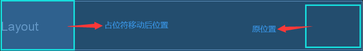
Placeholder
占位符,在Placeholder中可使用setContent()设置另一个控件的id,使这个控件移动到占位符的位置
demo effect
demo code
    <android.support.constraint.ConstraintLayout
        android:layout_width="match_parent"
        android:layout_height="wrap_content">

        <android.support.constraint.Placeholder
            android:id="@+id/placeholder"
            android:layout_width="wrap_content"
            android:layout_height="wrap_content"
            app:content="@+id/layout"
            app:layout_constraintLeft_toLeftOf="parent"
            app:layout_constraintTop_toTopOf="parent" />

        <TextView
            android:id="@+id/layout"
            android:layout_width="wrap_content"
            android:layout_height="wrap_content"
            android:padding="15dp"
            android:text="Layout"
            app:layout_constraintRight_toRightOf="parent"
            app:layout_constraintTop_toTopOf="parent" />

    </android.support.constraint.ConstraintLayout>
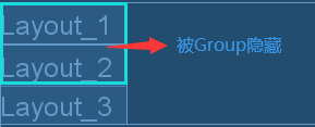
Group
主要将多个View归为一组, 用来View的可见性,如果View被多个Group控制,则以最后的Group定义的可见性为主
demo effect
demo code
    <android.support.constraint.ConstraintLayout
        android:layout_width="match_parent"
        android:layout_height="wrap_content">

        <TextView
            android:id="@+id/layout1"
            android:layout_width="wrap_content"
            android:layout_height="wrap_content"
            android:text="Layout_1" />

        <TextView
            android:id="@+id/layout2"
            android:layout_width="wrap_content"
            android:layout_height="wrap_content"
            android:text="Layout_2"
            app:layout_constraintTop_toBottomOf="@+id/layout1" />

        <TextView
            android:id="@+id/layout3"
            android:layout_width="wrap_content"
            android:layout_height="wrap_content"
            android:text="Layout_3"
            app:layout_constraintTop_toBottomOf="@+id/layout2" />

        <android.support.constraint.Group
            android:id="@+id/group"
            android:layout_width="wrap_content"
            android:layout_height="wrap_content"
            android:visibility="gone"
            app:constraint_referenced_ids="layout1,layout2" />

    </android.support.constraint.ConstraintLayout>
Optimizer
在看一篇bolg的时候有记录到此工具类,故此记录一下
使用 match_constraint时,ConstraintLayout 将对控件进行 2 次测量,
ConstraintLayout在1.1中可以通过设置 layout_optimizationLevel 进行优化,可设置的值有:
- none:无优化
- standard:仅优化直接约束和屏障约束(默认)
- direct:优化直接约束
- barrier:优化屏障约束
- chain:优化链约束
- dimensions:优化尺寸测量
课外读物
宽高权重
权重与LinearLayout权重效果相同,设置稍有稍有不同;主要分为水平权重与垂直权重,主要实现有以下步骤 ~
1.根据自身需求将当前的layout_width或layout_height设置为0dp
2.设置当前控件的layout_constraintWidth_default属性为percent
如需要在当前的权重内在此划分大小可通过:layout_constraintWidth_percent或layout_constraintHeight_percent 设为0-1以内的值
demo:宽度占parent的50%,取值范围是0-1
    <TextView
        android:id="@+id/t1"
        android:layout_width="0dp"
        android:layout_height="wrap_content"
        app:layout_constraintLeft_toLeftOf="parent"
        app:layout_constraintWidth_default="percent"
        app:layout_constraintWidth_percent="0.5" />
我项目中有一个分类效果,就是采用了约束布局的宽高权重
demo effect
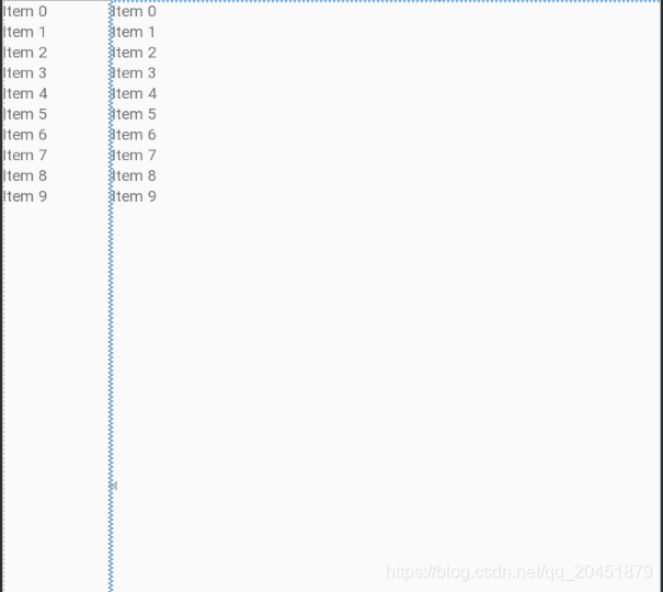
demo code
    <android.support.v7.widget.RecyclerView
        android:id="@+id/rv_classify"
        android:layout_width="100dp"
        android:layout_height="0dp"
        app:layout_constraintHeight_default="percent"
        />

    <android.support.v7.widget.RecyclerView
        app:layout_constraintWidth_default="percent"
        app:layout_constraintHeight_default="percent"
        android:id="@+id/rv_produce"
        app:layout_constraintHeight_percent=""
        app:layout_constraintTop_toBottomOf="@+id/cl_flow"
        android:layout_width="0dp"
        android:layout_height="0dp"/>
视图符号
在查看视图结构的时候,有一些控件大小的描述图,一共有三种模式可选,每种模式都使用了一种不同的符号表示,点击符号即可进行切换
-

表示wrap content,这个我们很熟悉了,不需要进行什么解释 -

表示固定值,也就是给控件指定了一个固定的长度或者宽度值 -

表示any size,它有点类似于match parent,但和match parent并不一样,是属于ConstraintLayout中特有的一种大小控制方式