css之图形大全
因为需要,所以整理出了一份全css的图形大全,供大家一起学习;
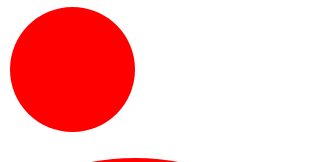
圆形:
#circle {
      width: 100px;
      height: 100px;
      background: red;
      border-radius: 50%
    }
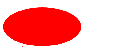
椭圆形:
#oval {
      width: 200px;
      height: 100px;
      background: red;
      /* border-radius: 100px / 50px; */
      border-radius: 50%;
    }
正三角:
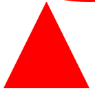
 #triangle-up {
      width: 0;
      height: 0;
       border-left: 50px solid transparent;
      border-right: 50px solid transparent;
      border-bottom: 100px solid red;
    }
倒三角:
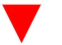
#triangle-down {
      width: 0;
      height: 0;
      border-left: 50px solid transparent;
      border-right: 50px solid transparent;
      border-top: 100px solid red;
    }
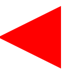
左边的三角:
 /* 三角形划分只需要记住,border是平分的 */
    #triangle-left {
      width: 0;
      height: 0;
      border-top: 50px solid transparent;
      border-right: 100px solid red;
      border-bottom: 50px solid transparent;
    }
右边的三角:
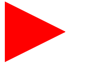
#triangle-right {
      width: 0;
      height: 0;
      border-top: 50px solid transparent;
      border-left: 100px solid red;
      border-bottom: 50px solid transparent;
    }
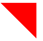
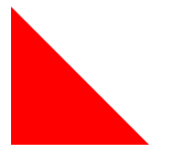
左上直角的三角:
  #triangle-topleft {
      width: 0;
      height: 0;
      border-top: 100px solid red;
      border-right: 100px solid transparent;
    }
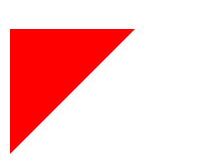
右下的三角:
#triangle-topright {
      width: 0;
      height: 0;
      border-top: 100px solid red;
      border-left: 100px solid transparent;
    }
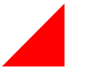
左下的三角:
#triangle-bottomleft {
      width: 0;
      height: 0;
      border-bottom: 100px solid red;
      border-right: 100px solid transparent;
    }
右下的三角:
  #triangle-bottomright {
      width: 0;
      height: 0;
      border-bottom: 100px solid red;
      border-left: 100px solid transparent;
    }
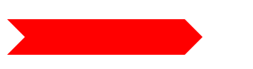
箭头:

/*箭头*/
    #curvedarrow {
      position: relative;
      width: 0;
      height: 0;
      border-top: 9px solid transparent;
      border-right: 9px solid red;
      transform: rotate(10deg);
    }
    #curvedarrow:after {
      content: "";
      position: absolute;
      border: 0 solid transparent;
      border-top: 3px solid red;
      border-radius: 20px 0 0 0;
      top: -12px;
      left: -9px;
      width: 12px;
      height: 12px;
      transform: rotate(45deg);
    }
梯形:
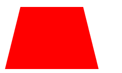
#trapezoid {
      border-bottom: 100px solid red;
      border-left: 25px solid transparent;
      border-right: 25px solid transparent;
      height: 0;
      width: 100px;
    }
平行四边形 :
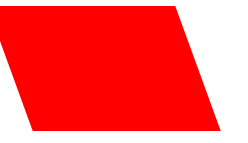
#parallelogram {
      width: 150px;
      height: 100px;
      transform: skew(20deg);
      background: red;
    }
六角星:
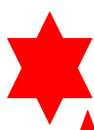
/*六角星  两个三角形*/
    #star-six {
      width: 0;
      height: 0;
      border-left: 50px solid transparent;
      border-right: 50px solid transparent;
      border-bottom: 100px solid red;
      position: relative;
    }
    #star-six:after {
      width: 0;
      height: 0;
      border-left: 50px solid transparent;
      border-right: 50px solid transparent;
      border-top: 100px solid red;
      position: absolute;
      content: "";
      top: 30px;
      left: -50px;
    }
五角星:

#star-five {
      margin: 50px 0;
      position: relative;
      display: block;
      color: red;
      width: 0px;
      height: 0px;
      border-right: 100px solid transparent;
      border-bottom: 70px solid red;
      border-left: 100px solid transparent;
      transform: rotate(35deg);
    }
    #star-five:before {
      border-bottom: 80px solid red;
      border-left: 30px solid transparent;
      border-right: 30px solid transparent;
      position: absolute;
      height: 0;
      width: 0;
      top: -45px;
      left: -65px;
      display: block;
      content: '';
      transform: rotate(-35deg);
    }

    #star-five:after {
      position: absolute;
      display: block;
      color: red;
      top: 3px;
      left: -105px;
      width: 0px;
      height: 0px;
      border-right: 100px solid transparent;
      border-bottom: 70px solid red;
      border-left: 100px solid transparent;
      transform: rotate(-70deg);
      content: '';
    }
五边形:
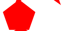
   /*五边形*/
    #pentagon {
      position: relative;
      width: 54px;
      box-sizing: content-box;
      border-width: 50px 18px 0;
      border-style: solid;
      border-color: red transparent;
    }
      #pentagon:before {
      content: "";
      position: absolute;
      height: 0;
      width: 0;
      top: -85px;
      left: -18px;
      border-width: 0 45px 35px;
      border-style: solid;
      border-color: transparent transparent red;
    }
六边形:
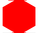
 /*六边形  长方形上下加三角形*/
    #hexagon {
  width: 100px;
  height: 57.735px;
  background: red;
  position: relative;
}
 #hexagon::before {
  content: "";
  position: absolute;
  top: -28.8675px;
  left: 0;
  width: 0;
  height: 0;
  border-left: 50px solid transparent;
  border-right: 50px solid transparent;
  border-bottom: 28.8675px solid red;
}
#hexagon::after {
  content: "";
  position: absolute;
  bottom: -28.8675px;
  left: 0;
  width: 0;
  height: 0;
  border-left: 50px solid transparent;
  border-right: 50px solid transparent;
  border-top: 28.8675px solid red;
}
八边形:
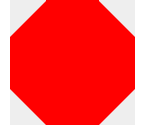
/*八边形 上下梯形中间放长方形*/
#octagon {
      width: 100px;
      height: 100px;
      background: red;
      position: relative;
    }
  #octagon:before {
      content: "";
      width: 42px;
      height: 0;
      position: absolute;
      top: 0;
      left: 0;
      border-bottom: 29px solid red;
      border-left: 29px solid #eee;
      border-right: 29px solid #eee;
    }
    #octagon:after {
      content: "";
      width: 42px;
      height: 0;
      position: absolute;
      bottom: 0;
      left: 0;
      border-top: 29px solid red;
      border-left: 29px solid #eee;
      border-right: 29px solid #eee;
    }
心形:
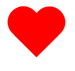
  /*心形  两个胶囊形状组成*/
    #heart {
      position: relative;
      width: 100px;
      height: 90px;
    }
    #heart:before,
    #heart:after {
      position: absolute;
      content: "";
      left: 50px;
      top: 0;
      width: 50px;
      height: 80px;
      background: red;
      border-radius: 50px 50px 0 0;
      transform: rotate(-45deg);
      transform-origin: 0 100%;
    }
   #heart:after {
      left: 0;
      transform: rotate(45deg);
      transform-origin: 100% 100%;
    }
无限符:
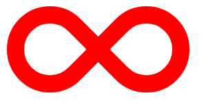
/*无限符号  左右各一半,通过after加旋转,*/
  #infinity {
      position: relative;
      width: 212px;
      height: 100px;
      box-sizing: content-box;
    }
    #infinity:before,
    #infinity:after {
      content: "";
      box-sizing: content-box;
      position: absolute;
      top: 0;
      left: 0;
      width: 60px;
      height: 60px;
      border: 20px solid red;
      border-radius: 50px 50px 0 50px;
      transform: rotate(-45deg);
    }
  #infinity:after {
      left: auto;
      right: 0;
      border-radius: 50px 50px 50px 0;
      transform: rotate(45deg);
    }
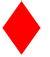
倒立的正方形:
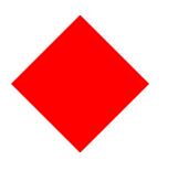
    #diamond {
      width: 0;
      height: 0;
      border: 50px solid transparent;
      border-bottom-color: red;
      position: relative;
      top: -50px;
    }
     #diamond:after {
      content: '';
      position: absolute;
      left: -50px;
      top: 50px;
      width: 0;
      height: 0;
      border: 50px solid transparent;
      border-top-color: red;
    }
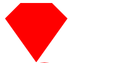
飞船的四边形:
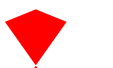
   #diamond-shield {
      width: 0;
      height: 0;
      border: 50px solid transparent;
      border-bottom: 20px solid red;
      position: relative;
      top: -50px;
    }
     #diamond-shield:after {
      content: '';
      position: absolute;
      left: -50px;
      top: 20px;
      width: 0;
      height: 0;
      border: 50px solid transparent;
      border-top: 70px solid red;
    }
倒立的平行四边形:
  #diamond-narrow {
      width: 0;
      height: 0;
      border: 50px solid transparent;
      border-bottom: 70px solid red;
      position: relative;
      top: -50px;
    }
    #diamond-narrow:after {
      content: '';
      position: absolute;
      left: -50px;
      top: 70px;
      width: 0;
      height: 0;
      border: 50px solid transparent;
      border-top: 70px solid red;
    }
真砖石形状
#cut-diamond {
      border-style: solid;
      border-color: transparent transparent red transparent;
      border-width: 0 25px 25px 25px;
      height: 0;
      width: 50px;
      box-sizing: content-box;
      position: relative;
      margin: 20px 0 50px 0;
    }
    #cut-diamond:after {
      content: "";
      position: absolute;
      top: 25px;
      left: -25px;
      width: 0;
      height: 0;
      border-style: solid;
      border-color: red transparent transparent transparent;
      border-width: 70px 50px 0 50px;
    }
鸡蛋形状
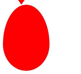
#egg {
      display: block;
      width: 126px;
      height: 180px;
      background-color: red;
      border-radius: 50% 50% 50% 50% / 60% 60% 40% 40%;
    }
吃豆人:
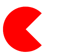
#pacman {
      width: 0px;
      height: 0px;
      border-right: 60px solid transparent;
      border-top: 60px solid red;
      border-left: 60px solid red;
      border-bottom: 60px solid red;
      border-top-left-radius: 60px;
      border-top-right-radius: 60px;
       border-bottom-left-radius: 60px;
      border-bottom-right-radius: 60px;
    }
聊天形状:
#talkbubble {
      width: 120px;
      height: 80px;
      background: red;
      position: relative;
      -moz-border-radius: 10px;
      -webkit-border-radius: 10px;
      border-radius: 10px;
    }
    #talkbubble:before {
      content: "";
      position: absolute;
      right: 100%;
      top: 26px;
      width: 0;
      height: 0;
      border-top: 13px solid transparent;
      border-right: 26px solid red;
      border-bottom: 13px solid transparent;
    }
rss图形:

 #rss {
    width: 20em;
    height: 20em;
    border-radius: 3em;
    background-color: #ff0000;
    font-size: 14px;
  }
 #rss:before {
    content: '';
    z-index: 1;
    display: block;
    height: 5em;
    width: 5em;
    background: #fff;
    border-radius: 50%;
    position: relative;
    top: 11.5em;
    left: 3.5em;
  }
  #rss:after {
    content: '';
    display: block;
    background: #ff0000;
    width: 13em;
    height: 13em;
    top: -2em;
    left: 3.8em;
    border-radius: 2.5em;
    position: relative;
    box-shadow:
      -2em 2em 0 0 #fff inset,
      -4em 4em 0 0 #ff0000 inset,
      -6em 6em 0 0 #fff inset
  }
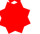
十二个角的形状:

#burst-12 {
      background: red;
      width: 80px;
      height: 80px;
      position: relative;
      text-align: center;
    }
 #burst-12:before,
    #burst-12:after {
      content: "";
      position: absolute;
      top: 0;
      left: 0;
      height: 80px;
      width: 80px;
      background: red;
    }

    #burst-12:before {
      transform: rotate(30deg);
    }
     #burst-12:after {
      transform: rotate(60deg);
    }
八个角的形状:
#burst-8 {
      background: red;
      width: 80px;
      height: 80px;
      position: relative;
      text-align: center;
      transform: rotate(20deg);
    }
    #burst-8:before {
      content: "";
      position: absolute;
      top: 0;
      left: 0;
      height: 80px;
      width: 80px;
      background: red;
      transform: rotate(135deg);
    }
太极图案:
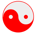
  #yin-yang {
      width: 96px;
      box-sizing: content-box;
      height: 48px;
      background: #eee;
      border-color: red;
      border-style: solid;
      border-width: 2px 2px 50px 2px;
      border-radius: 100%;
      position: relative;
    }
  #yin-yang:before {
      content: "";
      position: absolute;
      top: 50%;
      left: 0;
      background: #eee;
      border: 18px solid red;
      border-radius: 100%;
      width: 12px;
      height: 12px;
      box-sizing: content-box;
    }
     #yin-yang:after {
      content: "";
      position: absolute;
      top: 50%;
      left: 50%;
      background: red;
      border: 18px solid #eee;
      border-radius: 100%;
      width: 12px;
      height: 12px;
      box-sizing: content-box;
    }
锁的形状:

 #lock {
    font-size: 8px;
    position: relative;
    width: 18em;
    height: 13em;
    border-radius: 2em;
    top: 10em;
    box-sizing: border-box;
    border: 3.5em solid red;
    border-right-width: 7.5em;
    border-left-width: 7.5em;
    margin: 0 0 6rem 0;
  }
  #lock:before {
    content: "";
    box-sizing: border-box;
    position: absolute;
    border: 2.5em solid red;
    width: 14em;
    height: 12em;
    left: 50%;
    margin-left: -7em;
    top: -12em;
    border-top-left-radius: 7em;
    border-top-right-radius: 7em;
  }
#lock:after {
    content: "";
    box-sizing: border-box;
    position: absolute;
    border: 1em solid red;
    width: 5em;
    height: 8em;
    border-radius: 2.5em;
    left: 50%;
    top: -1em;
    margin-left: -2.5em;
  }
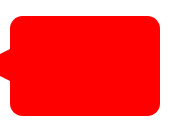
人形横道:
  /*指针*/
  #pointer {
      width: 200px;
      height: 40px;
      position: relative;
      background: red;
    }
    #pointer:after {
      content: "";
      position: absolute;
      left: 0;
      bottom: 0;
      width: 0;
      height: 0;
      border-left: 20px solid white;
      border-top: 20px solid transparent;
      border-bottom: 20px solid transparent;
    }
     #pointer:before {
      content: "";
      position: absolute;
      right: -20px;
      bottom: 0;
      width: 0;
      height: 0;
      border-left: 20px solid red;
      border-top: 20px solid transparent;
      border-bottom: 20px solid transparent;
    }
房子的形状:
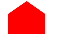
  #base {
      background: red;
      display: inline-block;
      height: 55px;
      margin-left: 20px;
      margin-top: 55px;
      position: relative;
      width: 100px;
    }
    #base:before {
      border-bottom: 35px solid red;
      border-left: 50px solid transparent;
      border-right: 50px solid transparent;
      content: "";
      height: 0;
      left: 0;
      position: absolute;
      top: -35px;
      width: 0;
    }
十字架:
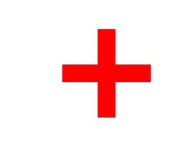
   #cross {
      background: red;
      height: 100px;
      position: relative;
      left:50%;
      width: 20px;
    }
    #cross:after {
      background: red;
      content: "";
      height: 20px;
      left: -40px;
      position: absolute;
      top: 40px;
      width: 100px;
    }
旗形:

    /*旗形*/
    #flag {
      width: 110px;
      height: 56px;
      box-sizing: content-box;
      padding-top: 15px;
      position: relative;
      background: red;
      color: white;
      font-size: 11px;
      letter-spacing: 0.2em;
      text-align: center;
      text-transform: uppercase;
    }
    #flag:after {
      content: "";
      position: absolute;
      left: 0;
      bottom: 0;
      width: 0;
      height: 0;
      border-bottom: 13px solid #eee;
      border-left: 55px solid transparent;
      border-right: 55px solid transparent;
    }
月牙形:

   #moon {
      width: 80px;
      height: 80px;
      border-radius: 50%;
      box-shadow: 15px 15px 0 0 red;
    }
放大镜的形状:
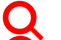
   #magnifying-glass {
      font-size: 10em;
      display: inline-block;
      width: 0.4em;
      box-sizing: content-box;
      height: 0.4em;
      border: 0.1em solid red;
      position: relative;
      border-radius: 0.35em;
    }
    #magnifying-glass:before {
      content: "";
      display: inline-block;
      position: absolute;
      right: -0.25em;
      bottom: -0.1em;
      border-width: 0;
      background: red;
      width: 0.35em;
      height: 0.08em;
      transform: rotate(45deg);
    }
徽章的图形:

    /*徽章的图形*/


    #badge-ribbon {
      position: relative;
      background: red;
      height: 100px;
      width: 100px;
      border-radius: 50px;
    }
    #badge-ribbon:before,
    #badge-ribbon:after {
      content: '';
      position: absolute;
      border-bottom: 70px solid red;
      border-left: 40px solid transparent;
      border-right: 40px solid transparent;
      top: 70px;
      left: -10px;
      transform: rotate(-140deg);
    }

    #badge-ribbon:after {
      left: auto;
      right: -10px;
      transform: rotate(140deg);
    }
外星人:
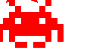
  #space-invader {
      box-shadow: 0 0 0 1em red,
      0 1em 0 1em red,
      -2.5em 1.5em 0 .5em red,
      2.5em 1.5em 0 .5em red,
      -3em -3em 0 0 red,
      3em -3em 0 0 red,
      -2em -2em 0 0 red,
      2em -2em 0 0 red,
      -3em -1em 0 0 red,
      -2em -1em 0 0 red,
      2em -1em 0 0 red,
      3em -1em 0 0 red,
      -4em 0 0 0 red,
      -3em 0 0 0 red,
      3em 0 0 0 red,
      4em 0 0 0 red,
      -5em 1em 0 0 red,
      -4em 1em 0 0 red,
      4em 1em 0 0 red,
      5em 1em 0 0 red,
      -5em 2em 0 0 red,
      5em 2em 0 0 red,
      -5em 3em 0 0 red,
      -3em 3em 0 0 red,
      3em 3em 0 0 red,
      5em 3em 0 0 red,
      -2em 4em 0 0 red,
      -1em 4em 0 0 red,
      1em 4em 0 0 red,
      2em 4em 0 0 red;
      background: red;
      width: 1em;
      height: 1em;
      overflow: hidden;
      margin: 50px 0 70px 65px;
    }
电视屏幕:

    /*电视屏幕的形状*/
    #tv {
      position: relative;
      width: 200px;
      height: 150px;
      margin: 20px 0;
      background: red;
      border-radius: 50% / 10%;
      color: white;
      text-align: center;
      text-indent: .1em;
    }
人行道:
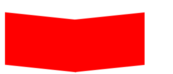
  /*人行道图案*/
  #chevron {
      position: relative;
      text-align: center;
      padding: 12px;
      margin-bottom: 6px;
      height: 60px;
      width: 200px;
    }
    #chevron:before {
      content: '';
      position: absolute;
      top: 0;
      left: 0;
      height: 100%;
      width: 51%;
      background: red;
      transform: skew(0deg, 6deg);
    }
    #chevron:after {
      content: '';
      position: absolute;
      top: 0;
      right: 0;
      height: 100%;
      width: 50%;
      background: red;
      transform: skew(0deg, -6deg);
    }
facebook图标:

  /*fancebook图标*/
  #facebook-icon {
      background: red;
      text-indent: -999em;
      width: 100px;
      height: 110px;
      box-sizing: content-box;
      border-radius: 5px;
      position: relative;
      overflow: hidden;
      border: 15px solid red;
      border-bottom: 0;
    }
    #facebook-icon:before {
      content: "/20";
      position: absolute;
      background: red;
      width: 40px;
      height: 90px;
      bottom: -30px;
      right: -37px;
      border: 20px solid #eee;
      border-radius: 25px;
      box-sizing: content-box;
    }
    #facebook-icon:after {
      content: "/20";
      position: absolute;
      width: 55px;
      top: 50px;
      height: 20px;
      background: #eee;
      right: 5px;
      box-sizing: content-box;
    }
扇形:

    #cone {
      width: 200px;
      height: 200px;
     transform: rotate(45deg);
      border-radius: 200px 0 0;
      background: red;
      margin-bottom: 20px;
    }
英语原文:
https://css-tricks.com/the-shapes-of-css/
里面有几个错误,被我改了…
后续有时间会陆续增加…