<!DOCTYPE html>
<html>
	<head>
		<meta charset="utf-8">
		<title></title>

		<link rel="stylesheet" type="text/css" href="../fonts/iconfont.css"/>
		<style type="text/css">
		      *{


				  margin: 0;
				  padding: 0;
				  box-sizing: border-box;
			  }
			  body{


				  /* background-color: #4f478b; */
				  background-image: url(../img/海之蓝.jpg);
				  background-repeat: no-repeat;
				  background-size: cover;
			  }
			  #pd-box{


				  position: relative;
				  left: 50%;
				  margin-left: -300px;
				  top: 600px;
				  width: 600px;
				  height: 60px;
				  border-radius: 0px 0px 15px 15px;
				  overflow: hidden;
				  background-color: #aaffff;
			  }

			  #pd-bg{


			  	 display: inline-block;
			  	 width: 490px;
			  	 height: 20px;
				 margin: 20px 80px ;
				 overflow: hidden;

				 background-color: #d5ead5;
			  }

			  #progress-bar{


				  position: absolute;
				  width: 10px;
				  height: 20px;
				  background-color: #ff5500;
				  overflow: hidden;
				  outline: none;
			  }

			  #play {


				  position: absolute;
			      margin-left: 10px;
				  margin-top: 30px;
				  outline: none;
				  color:white;
				  background-color: orange;
			  }
			  #play:hover{


				  color:black;
				  cursor: pointer;
			  }
			  #pause {


			  		position: absolute;
			        margin-left: 10px;
					margin-top: 5px;
					outline: none;
					color:white;
					background-color: #ff5500;
			  }
			  #pause:hover{


				  color: black;
				 cursor: pointer;
			  }
			  #carToon{


			     position: absolute;
				 left: 50%;
				 border-radius: 15px;
				 top: 100px;
				 margin-left: -300px;
				 width:600px;
				 height: 530px;
				 background-color:#35fff9;
				 background-color: rgba(53,255,549,0.6);
			  }
			  #mv{


				  position: absolute;
				  left: 50%;
				  margin-left: -75px;
				  top: 200px;
				  width:150px;
				  height: 150px;
				  border-radius: 50%;
				  background-image: url(../img/小马嚎叫.jpg);
				  background-size: 150px 150px;
				  border: 2px solid #ffffff;
				  animation-timing-function: linear;
				  animation-name:roll ;
				  animation-duration: 5s;
				  animation-iteration-count: infinite;
			  }
			  #mv:hover{


				  box-shadow: #9e9e9e 1px 1px 10px 5px ;
				  cursor: pointer;

			  }
			  @keyframes roll{


			  	10%{


					transform: rotateZ(45deg);
				}
				30%{


					transform: rotateZ(135deg);
				}
				50%{


					transform: rotateZ(200deg);
				}
				80%{


					transform: rotateZ(300deg);
				}
				100%{


					transform: rotateZ(360deg);
				}
			  }
			  div.iconfont{


				  font-size:50px;
				  text-align: center;
				  line-height: 50px;
				  color: #85ffe5;
			  }
			  #iconPlay{


				  position: absolute;
				  width: 50px;
				  height:50px;
				  top:251px;
				  left: 277px;
			  }
			  #iconPlay:hover{


				  cursor: pointer;
			  }
		</style>
	</head>
	<body>
	 <script type="text/javascript">
        const audio = document.getElementById('audio');
		const progressBar = document.getElementById('progress-bar');
		const pg = document.getElementById('pd-bg');
		const play = document.getElementById('play');
		const pause = document.getElementById('pause');
		var swap = document.getElementById('iconPlay');
		//播放按钮监听
		play.addEventListener('click',function(){


			audio.play();
		},false);
		//暂停按钮监听
		pause.addEventListener('click',function(){


			audio.pause();
		},false);
		//icon切换
	    swap.addEventListener('click',function(){


			if(swap.className == 'iconfont icon-z') {


				swap.setAttribute('class','iconfont icon-bofang');
				audio.play();
			}
			else{


				swap.setAttribute('class','iconfont icon-z');
				audio.pause();
			}
		},false);
		//进度条控制
		audio.addEventListener('timeupdate',function(){


			var currTime = audio.currentTime;
			var duration = audio.duration;
			var playPercent = (currTime/duration * 100 ) + '%';
			progressBar.style.width = playPercent;
		},false);
	    //跳播功能
		pg.addEventListener('click',function(event){


			// Specifies the x-coordinate (in pixels) of the mouse relative to the object that is firing the event.
			// 获取鼠标点击处,相对于该元素内部左边界的位移量
			var currentbar = event.offsetX;
			var totalbar = this.offsetWidth;

			var jumpPercent = currentbar/totalbar  ;
			var newTime = jumpPercent * audio.duration;

			//修改进度条时间
			audio.currentTime = newTime;
		},false);
	</script>
</html>
audio标签属性:
// 1.controls:显示控制面板
// 2.autoplay:开启自动播放
// 3.muted: 静音播放
// 4.loop:循环播放
//相关事件
// 1.canplay: 4
// *触发时机:视频加载完毕(页面打开一次就执行一次,重复刷新页面就不执行)
// *应用场景: 获取视频长度
// *触发次数: 触发一次
// 2.timeupdate
// *触发时机:音频播放中
// *触发次数:多次
// *应用场景:更新进度条
// 3.ended:
// *触发时机:音频播放结束
// *触发次数:1次
// *应用场景:自动播放下一个音频
// 4.volumechange:
// *触发时机:音量改变
// *触发次数:若干次
//相关方法:
// *pause():暂停播放 * play():开始播放
//相关属性:
// 1.currentTime:获取当前已经播放的时长
// 2.duration: 音频总时长
// 3.volumn: 音量大小(最大值为1)
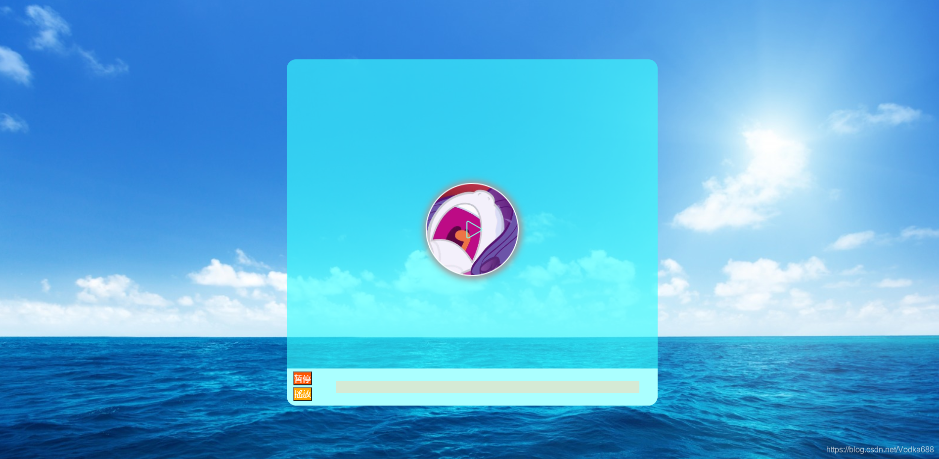
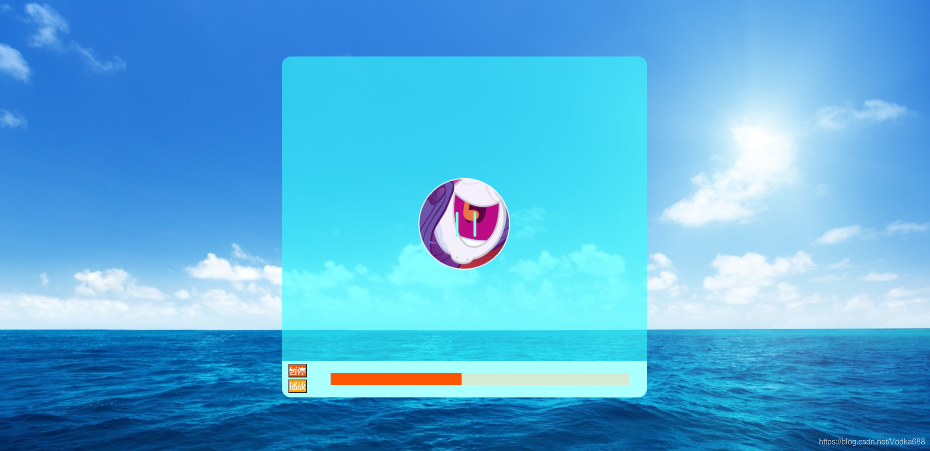
效果如图: