此文章继续测试jQuery Mobile的工具列(toolbar)制作方式,本系列之前的文章参考:
# jQuery Mobile的学习笔记(一):环境配置与页面结构
# jQuery Mobile的学习笔记(二):按钮
工具列是按钮的延伸应用,主要的功能是导览,换页,对话,或提交表单等。jQuery Mobile的工具列主要是指放在页面的标题列(Top)与注脚列(页尾)的按钮,分组按钮或表单元素(如下拉式选单等):
标题列:
只能在标题文字的左边与右边各放一个按钮,并且按钮会与标题文字同一列,但分区按钮上方与标题文字分列放置。
注脚列:
按钮会依串联方式,逐行分开,不限制放置注脚文字左右两边,如果文字用区块元素如p或div替代则注脚文字会单独一列放置。
内容区:
内容区的按钮可以利用网格布局。
工具列除可单纯使用按钮外,更常使用控制组(data-role =“ controlgroup”)与导览列(data-role =“ navbar”)来使介面外观更像是原生App。
一。标题列上的按钮:
在上一篇的按钮范例1中已测试过在标题列放置按钮的作法,不管是一般的换页按钮还是Back按钮,其位置都只能放在标题文字的左与右两一个而已,且按钮按钮与标题文字相同列。按钮的左右位置可用样式类别class =“ ui-btn-left”与class =“ ui-btn-right”指定,若不指定会自动以先左后右顺序排列,例如:
测试1-1: 标题列的超连结按按钮(1)
<!DOCTYPE html>
<html>
  <head>
    <title> </ title>
    <meta charset =“ utf-8”>
    <meta http-equiv =“ cache-控制” content =“ no-cache”>
    <元名称=“ viewport”
    <script src =“ https://code.jquery.com/jquery-1.11.1.min.js”> </ script>
    <script src =“ https://code.jquery.com/mobile/1.4.5 /jquery.mobile-1.4.5.min.js“> </ script>
    <link href =” https://code.jquery.com/mobile/1.4.5/jquery.mobile-1.4.5.min.css “ rel =” stylesheet“>
  </ head>
  <body>
    <!-第一页页面->
    <section data-role =” page“>
      <header data-role =” header“ >
        <a href =” #“ data-icon =” gear“>设置</a>
        <h1>标题列的按钮</ h1>
        <a href="#" data-icon="info">关于</a>
      </ header>
      <article data-role =“ content”>
        <p>内容</ p>
      </ article>
      <footer data-role =“ footer”>
        <h3>页尾</ h3>
      </ footer>
    </ section>
  </ body>
</ html>
此例在标题文字前后各放置一个按钮,未指定样式类别class =“ ui-btn-left”与class =“ ui-btn-right” ,则jQuery Mobile会按照出现顺序放置放,前者在左,顶部在右,结果如下:

可见标题列的按钮会与标题文字自动放在同一列。
甚至将标题文字放在前面,jQuery Mobile还是会自动将其放置中,如下示例所示:
测试1-2: 标题列的超连结按钮(2)
<!DOCTYPE html>
<html>
  <head>
    <title> </ title>
    <meta charset =“ utf-8”>
    <meta http-equiv =“ cache-control” content =“ no-cache”>
    <meta name =“ viewport” content =“ width = device-width,initial-scale = 1“>
    <script src =” https://code.jquery.com/jquery-1.11.1.min.js“> </ script>
    <script src =” https:/ /code.jquery.com/mobile/1.4.5/jquery.mobile-1.4.5.min.js“> </ script>
    <link href =” https://code.jquery.com/mobile/1.4.5 /jquery.mobile-1.4.5.min。css“ rel =” stylesheet“>
  </ head>
  <body>
    <!-第一页页面->
    <section data-role =“ page”>
      <header data-role =“ header”>
        <h1>标题列的按钮</ h1>
        <a href="#" data-icon="gear">设置</ a >
        <a href="#" data-icon="info">关于</a>
      </ header>
      <article data-role =“ content”>
        <p>内容</ p>
      </ article>
      <页脚数据-role =“ footer”>
        <h3>页尾</ h3>
      </ footer>
    </ section>
  </ body>
</ html>
可见排在第一的标题文字仍然自动被放在两个按钮中间,放在后面的“设定”按钮在左,“关于”按钮则在右,结果与上面一样。
如果有使用样式类别class =“ ui-btn-left”与class =“ ui-btn-right”指定按钮摆放位置,则超连结的前后顺序就无关紧要了,亦即有class =“ ui-btn -right“样式的超连结可放在前,有class =” ui-btn-left“样式的超连结可放在后,前后顺序不会影响左右位置,完全由样式类别决定,例如:
测试1- 3: 标题列的超连结按钮(3)
<!DOCTYPE html>
<html>
  <head>
    <title> </ title>
    <meta charset =“ utf-8”>
    <meta http-equiv = “缓存控制” content =“ no-cache”>
    <元名称=“ viewport” content =“ width = device-width,initial-scale = 1”>
    <script src =“ https://code.jquery.com /jquery-1.11.1.min.js“> </ script>
    <script src =” https:// code。jquery.com/mobile/1.4.5/jquery.mobile-1.4.5.min.js“> </ script>
    <link href =“ https://code.jquery.com/mobile/1.4.5/jquery.mobile-1.4.5.min.css” rel =“ stylesheet”>
  </ head>
  <body>
    <!-第一页页面->
    <section data-role =“ page”>
      <header data-role =“ header”>
        <h1>标题列的按钮</ h1>
        <a href =“#” data-icon =“ info“ class =” ui-btn-right“ >关于</a>
        <a href="#" data-icon="gear" class="ui-btn-left">设置</a>
      </ header>
      <article data-role =“ content”>
        <p>内容</ p>
      </ article>
      <footer data-role =“ footer”>
        <h3>页尾</ h3>
      </ footer>
    </ section>
  </ body>
</ html>
此例指定了按钮位置的样式类别,虽然“关于”按钮在前,但因其要式类别被指定为class =“ ui-btn-right”而被放置右边;“设定”按钮在后,但因其要式类别被指定为class =“ ui-btn-left”而被放在左边,结果与上面两个范例一样。
注意,标题列中的超连结按钮必须是“裸”的,亦即不可再加入div等元素,否则jQuery Mobile不会自动将其放置为按钮,而是以超连结原型绘制,例如:
测试1 -4: 标题列的超连结按钮(4)
<!DOCTYPE html>
<html>
  <head>
    <title> </ title>
    <meta charset =“ utf-8”>
    <meta http-equiv =“ cache-control” content =“ no-cache”>
    <元名称=“ viewport” content =“ width = device-width,initial-scale = 1”>
    <script src =“ https://code.jquery。 com / jquery-1.11.1.min.js“> </ script>
    <script src =” https://code.jquery.com/mobile/1.4.5/jquery.mobile-1.4.5.min.js“ > </ script>
    <link href =“ https:// code。jquery.com/mobile/1.4.5/jquery.mobile-1.4.5.min.css“ rel =” stylesheet“>
  </ head>
  <body>
    <!-第一页页面->
    <section data-role =“ page”>
      <header data-role =“ header”>
        <h1>标题列的按钮</ h1>
        <div>
          <a href =“ #“ data-icon =” info“>关于</a>
          <a href="#" data-role="button"  data-icon="gear">设置</a>
        </ div>
      </ header>
      <article data-role =“ content”>
        <p>内容</ p>
      </ article>
      <footer data-role =“ footer”>
        <h3>页尾</ h3>
      </ footer>
    </ section>
  < / body>
</ html>
此例在标题列超连结按钮外再用div插入,这样闭必须加上data-role =“ button”才会以按钮替换(例如“设定”按钮),否则以超连结原型进行布局(例如“关于”按钮),结果如下:
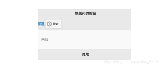
可见的div的结果,必须存在data-role =“ button”属性才行;而且标题文字与工具列按钮会分两列隔开。
会以div纳入超连结,通常是引入超连结打包成控制分区按钮(用data-role =“ controlgroup”属性),若舍弃标题文字即可将标题列完全作为工具列使用,例如:
测试1-5: 标题列的超连结按钮(5)*
<!DOCTYPE html>
<html>
  <head>
    <title> </ title>
    <meta charset =“ utf-8”>
    <meta http- equiv =“ cache-control” content =“ no-cache”>
    <元名称=“ viewport” content =“ width = device-width,initial-scale = 1”>
    <script src =“ https://code.jquery .com / jquery-1.11.1.min.js“> </ script>
    <script src =” https://code.jquery.com/mobile/1.4.5/jquery.mobile-1.4.5.min.js “> </ script>
    <link href =” https://code.jquery.com/mobile/1.4.5/jquery.mobile-1.4.5.min.css“ rel =” stylesheet“>
  </ head>
  <body>
    <!-第一页页面->
    <section data-role =“ page”>
      <header data-role =“ header”>
        <div data-role =“ controlgroup” >
          <a href =“#” data- role =“ button” data-icon =“ home”>首页</a>
          <a href="#" data-role="button" data-icon="star">收藏</a>
          <a href =“ #“ data-role =” button“ data-icon =” info“>关于</a>
          <a href="#" data-role="button" data-icon="gear">设置</a>
          < a href =“#” data-role =“ button” data-icon =“ search”>搜寻</a>
        </ div>
      </ header>
      <article data-role =“ content”>
        <p>内容</ p>
      </ article>
      <footer data-role =“ footer”>
        <h3>页尾</ h3>
      </ footer>
    </ section>
  </ body>
</ html>
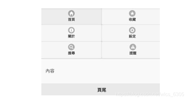
此例以具有data-role =“ control-group”的div将五个超连结按钮打包成一个按钮类别,注意每个超连结都必须有data-role =“ button”属性才会以按钮排列,结果如下:
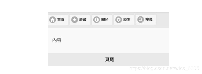
可见标题列整个变成由按钮组合组成的工具列了。
不过以手机浏览而言,需注意群组内最好不要放超过5个按钮,因为超过的会跳下一列显示,画面会引起不协调,例如:
测试1-6: 标题列的超连结按钮( 6)
<!DOCTYPE html>
<html>
  <head>
    <title> </ title>
    <meta charset =“ utf-8”>
    <meta http-equiv =“ cache-control” content =“ no -cache“>
    <meta name =” viewport“ content =” width = device-width,initial-scale = 1“>
    <script src =” https://code.jquery.com/jquery-1.11.1.min。 js“> </ script>
    <script src =” https://code.jquery.com/mobile/1.4.5/jquery.mobile-1.4.5.min.js“> </ script>
    <link href =” https://code.jquery.com/mobile/1.4.5/jquery。mobile-1.4.5.min.css“ rel =” stylesheet“>
  </ head>
  <body>
    <!-第一页页面->
    <section data-role =“ page”>
      <header data-role =“ header”>
        <div data-role =“ controlgroup”>
          <a href =“#” data-role =“ button” data-icon =“ home “>首页</a>
          <a href="#" data-role="button" data-icon="star">收藏</a>
          <a href =”#“ data-role =” button“数据- icon =“ info”>关于</a>
          <a href="#" data-role="button" data-icon="gear">设置</a>
          <a href =“#” data-role =“ button“ data-icon =” search“>搜寻</a>
          <a href =”#“ data-role =” button“ data-icon =”
alert“>提醒</a>         </ div>
      </ header>
      <article data-role =” content“>
        <p>内容</ p>
      </ article>
      <footer data-role =” footer“>
        <h3 >页尾</ h3>
      </ footer>
    </ section>
  </ body>
</ html>
此例标题列的按钮包含6个超连结按钮,第六个会被放在第二列,结果如下:

第六个按钮被放在加上的一列看来很突兀,只有在按钮数目为5的倍数时才不会有违和感。
上面两个范例中以控制类别制作的工具列,因为margin的关系看起来仍然是各别的按钮,如果用导览列()来做的话效果会更好,接近页面签的视觉效果。导览列的网页结构是一个具有data-role =“ navbar”属性的div元素所引用的无序清单,清单项目则是超连结按钮,例如:
<div data-role =“ navbar” >
  <ul >
    <li > <a href="#" data-role="button" data-icon="home">首页</a> </ li>
    <li> <a href =“#” data-role =“ button“ data-icon =” star“>收藏</a> </ li>
    <li> <a href="#" data-role="button" data-icon="info">关于</a> < / li>
    <li> <a href="#" data-role="button" data-icon="gear">设置</a> </ li>
    <li> <a href =“#”
<head>
    <title> </ title>
    <meta charset =“ utf-8”>
    <meta http-equiv =“ cache-control” content =“ no-cache”>
    <meta name =“ viewport” content =“ width = device-width,initial-scale = 1“>
    <script src =” https://code.jquery.com/jquery-1.11.1.min.js“> </ script>
    <script src =” https:/ /code.jquery.com/mobile/1.4.5/jquery.mobile-1.4.5.min.js“> </ script>
    <link href =” https://code.jquery.com/mobile/1.4.5 /jquery.mobile-1.4.5.min.css“ rel =” stylesheet“>
  </ head>
  <body>
    <!-第一页页面->
    <section data-role =” page“>
      <header data-role =“ header”>
        <div data-role =“ navbar” >
          <ul>
            <li> <a href="#" data-role="button" data-icon="home">首页</a> </ li>
            <li> <a href =“#” data-role =“ button “ data-icon =” star“>收藏</a> </ li>
            <li> <a href="#" data-role="button" data-icon="info">关于</a> </ li>
            <li> <a href="#" data-role="button" data-icon="gear">设置</a> </ li>
            <li> <a href =“#” data-role = “ button” data-icon =“ search”>搜寻</a> </ li>
          </ ul>
        </ div>
      </ header>
      <article data-role =“ content”>
        <p>内容</ p>
      </ article>
      <footer data-role =“ footer”>
        <h3>页尾</ h3>
      </ footer>
    </ section>
  </ body>
</ html>
此例将超连结按纽先用无序清单ul-li元素替换后,再用具有data-role =“ navbar”之div元素替换,结果如下:
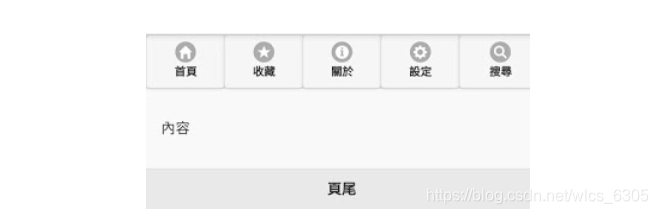
可见导览列的按钮没有边距,更接近页面签而不按钮外观。注意,navbar的按钮图标位置位置是靠上(data-iconpos =“ top”),因此按钮长度比较大,最好是设置靠左(left)或靠右(right)以节省版面空间为准。
与控制类别相同,按钮数量最好不要超过5个,超过的话navbar会以两栏多列方式排列,例如:
测试1-8: 标题列的超连结按钮(8)
<! DOCTYPE html>
<html>
  <head>
    <title> </ title>
    <meta charset =“ utf-8”>
    <meta http-equiv =“ cache-control” content =“ no-cache”>
    <meta name =“视口” content =“ width = device-width,initial-scale = 1”>
    <script src =“ https://code.jquery.com/jquery-1.11.1.min.js”> </ script>
    <script src =“ https://code.jquery.com/mobile/1.4.5/jquery.mobile-1.4.5.min.js”> </ script>
    <link href =“ https://code.jquery.com /mobile/1.4.5/jquery.mobile-1.4.5。min.css“ rel =” stylesheet“>
  </ head>
  <body>
    <!-第一页页面->
    <section data-role =“ page”>
      <header data-role =“ header”>
        <div data-role =“ navbar”>
          <ul>
            <li> <a href =“#” data-role =“ button” data-icon =“ home”>首页</a> </ li>
            <li> <a href="#" data-role="button" data-icon="star">收藏</a> </ li >
            <li> <a href="#" data-role="button" data-icon="info">关于</a> </ li>
            <li> <a href =“#” data-role =“按钮” data-icon =“ gear”>设置</a> </ li>
            <li> <a href =“#” data-role =“ button”data-icon =“ search”>搜寻</a> </ li>
            <li> <a href="#" data-role="button" data-icon="alert">提醒</a> </ li >
          </ ul>
        </ div>
      </ header>
      <article data-role =“ content”>
        <p>内容</ p>
      </ article>
      <footer data-role =“ footer”>
        <h3>页尾</ h3>
      </ footer>
    </ section>
  </ body>
</ html>
此例添加了第六个按钮,结果如下:
可见超过五个按钮后,导览列navbar会以2列n行的网格来放置按钮,对于手机萤幕有限的空间而言,这样不太经济。
从以上测试可知,页首标题列完全做按钮工具列使用时,不论是采用控制群组或导览列,按钮数目最好不要超过五个,才不会破坏整体视觉上的美观。
在一档多页(SPA)结构下除向导之外的列,标题文字列因为可以设置返回按钮,所以在标题中使用标题文字列+导览列是很方便操作的介面模式,例如:
测试1-9: 标题列的超连结按钮(9)
<!DOCTYPE html>
<html>
  <head>
    <title> </ title>
    <meta charset =“ utf-8”>
    <meta http-equiv =“ cache- control“ content =” no-cache“>
    <meta name =” viewport“ content =” width = device-width,initial-scale = 1“>
    <script src =” https://code.jquery.com/jquery- 1.11.1.min.js“> </ script>
    <script src =” https://code.jquery.com/mobile/1.4.5/jquery.mobile-1.4.5.min.js“></ script>
    <link href =“ https://code.jquery.com/mobile/1.4.5/jquery.mobile-1.4.5.min.css” rel =“ stylesheet”>
  </ head>
  <body>
    <!-第一页页面->
    <section data-role =“ page” id =“ page1”>
      <header data-role =“ header”>
        <h1>工具列测试</ h1>
        <a href =“#page2” class =“ ui-btn-right” >第二页</a>
        <div data-role =“ navbar” data-iconpos =“ left ”>
          <ul>
            <li> <a href =“#”数据角色=“ button” data-icon =“ home”>首页</a> </ li>
            <li> <a href =“#” data-role =“ button” data-icon =“ star”>收藏</a> </ li>
            <li> <a href =“#” data-role =“ button”数据图标=“ info”>关于</a> </ li>
            <li> <a href="#" data-role="button" data-icon="gear">设置</a> </ li>
            <li> <a href =“#” data-role =“ button “ data-icon =” search“>搜寻</a> </ li>
          </ ul>
        </ div>
      </ header>
      <article data-role =” content“>
        <p>第一页内容</ p >
      </ article>
      <footer data-role =“ footer”>
        <h3>页尾</ h3>
      </ footer>
    </ section>
    <!-第二页页面->
    <section data-role =“页面” id =“ page2”>
      <header data-role =“标头” data-add-back-btn =“ true” data-back-btn-text =“返回” >
        <h1>工具列测试</ h1>
        <div data-role =“ navbar” data-iconpos =“ left ”>
          <ul>
            <li> <a href="#" data-role="button" data-icon="home">首页</a> </ li>
            <li> <a href =“#” data- role =“ button” data-icon =“ star”>收藏</a> </ li>
            <li> <a href="#" data-role="button" data-icon="info">关于</ a> </ li>
            <li> <a href="#" data-role="button" data-icon="gear">设置</a> </ li>
            <li> <a href =“#” data-role =“ button” data-icon =“ search”>搜寻</a> </ li>
          </ ul>
        </ div>
      </ header>
      <article data-role =“ content”>
        <p>第二页内容</ p>
      </ art>>
      <footer data-role =“ footer”>
        <h3>页尾</ h3>
      </ footer>
    </ footer> </ footer> </ footer> </ footer> </ footer> </ footer> </ footer> </ footer> </ footer> </ footer> </ footer> </ footer> </ footer> </ footer> </ footer> </ footer> </ footer> section>
  </ body>
</ html>
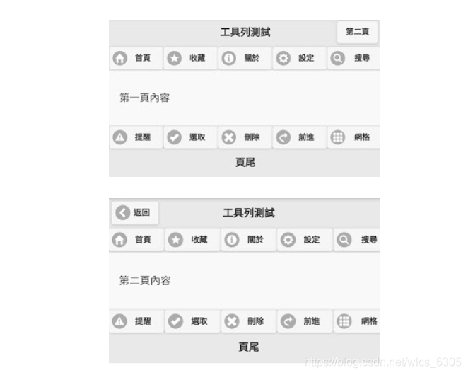
此例有两个页面,在标题里面有标题文字列与navbar导览列,首页的标题文字列右方有个按钮用来载入第二页页面。而在第二页则于header的div元素中以data-add-back-btn =“ true”开启标题文字列左方的Back(返回)按钮,注意,在jQuery Mobile v1.4以前这个属性放在data-role =“ page”的div或section元素,但1.4版后要放在data-role =“ header”的元素中才会有效。
其次-iconpos属性也可以放在data-role =“ navbar”的div元素中,这样就可以避免逐一设置超连结a元素(注意,controlgroup无此功能),结果如下:

二。注脚列的超连结按钮:
页尾注脚 列除标题文字外也可以放置按钮工具列,超连结按钮会按顺序排列流水式放置,但一列最多可放五个,超过会被排到下一列,且不需要特别加上data-role =“ button”属性也会自动被替换为成按钮外观,但与标题列上的按钮不同之处是,注脚文字会单独占一列,按钮不能透过class =“ ui-btn -right“与” ui-btn-left“属性把自己放在注脚文字的左右两边,但仍可使用此属性来控制按钮是靠左放还是靠右放,例如:
测试2-1: 注脚列的超连结按钮(1)
<!DOCTYPE html>
<html>
  <head>
    <title> </ title>
    <meta charset =“ utf-8”>
    <meta http-equiv =“ cache-control” content =“ no-cache”>
    <元名称=“ viewport” content =“ width = device-width,initial-scale = 1”>
    <script src =“ https://code.jquery.com/jquery-1.11。 1.min.js“> <

    <link href =“ https://code.jquery.com/mobile/1.4.5/jquery.mobile-1.4.5.min.css” rel =“ stylesheet”>
  </ head>
  <body>
    <!-第一页页面->
    <section data-role =“ page”>
      <header data-role =“ header”>
        <h1>注脚列的按钮</ h1>
      </ header>
      <article data-role =“ content “>
        <p>内容</ p>
      </ article>
      <footer data-role =” footer“>
        <a href="#" data-icon="home">首页</a>
        <a href =”# “ data-icon =” star“>收藏</a>
        <a href =”#“ data-icon =”info“>关于</a>
        <a href="#" data-icon="gear">设置</a>
        <a href="#" data-icon="search">搜寻</a>
        <a href =“#” data-icon =“ search”class =“ ui-btn-right” >搜寻</a>
        <h3>页尾</ h3>
      </ footer>
    </ section>
  </ body>
</ html>
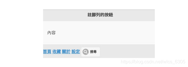
此例在注脚文字前放置了五个按钮,请记住它们都不需要使用data-role =“ button”属性,因为jQuery Mobile会在标题上与注脚列中的裸露一个元素自动替换成按钮。最后一个按钮“搜寻”被加上了class =“ ui-btn-right”属性,结果如下:

可见最后一个按钮是在按钮工具列中靠右放置(但高度似乎只有一些),而不是放在注脚文字列右边,注脚文字会单独替换一列,左右不能放按钮,这是与标题列不同之处。
按钮也可以用有data-role =“ controlgroup”属性的div元素打包为控制分区按钮,但由于不是页脚底下的子元素多个孙元素,jQuery Mobile不会自动将其放置为按钮,必须加上特别加上data-role =“ button”属性才行,例如:
测试2-2: 注脚列的超连结按钮(2)
<!DOCTYPE html>
<html>
  <head>
    <title> < / title>
    <meta charset =“ utf-8”>
    <meta http-equiv =“ cache-control” content =“ no-cache”>
    <meta name =“ viewport” content =“ width = device-width,initial- scale = 1“>
    <script src =” https://code.jquery.com/jquery-1.11.1.min.js“> </ script>
    <script src =” https://code.jquery.com/ mobile / 1.4.5 / jquery.mobile-1.4.5.min.js”> </ script>
    <link href =“ https://code.jquery.com/mobile/1.4.5/jquery.mobile-1.4.5.min.css” rel =“ stylesheet”>
  </ head>
  <body>
    <!-第一页页面->
    <section data-role =“ page”>
      <header data-role =“ header”>
        <h1>注脚列的按钮</ h1>
      < / header>
      <article data-role =“ content”>
        <p>内容</ p>
      </ article>
      <footer data-role =“ footer”>
        <div data-role =“ controlgroup” >
          <a href =“ #“ data-icon =” home“>首页</a>
          <a href="#" data-icon="star">收藏</a>
          <a href="#" data-icon="info">关于</a>
          <a href="#" data-icon="gear">设置</a>
          <a href="#" data-role="button" data-icon="search">搜寻</a>
        </ div >
      </ footer>
    </ section>
  </ body>
</ html>
此例的五个按钮被置于控制分区div元素里面,只有第五个按钮“搜寻”有加上data-role =“ button “才能被替换成按钮,其余四个还是超连结,结果如下:
从上面的测试1-9类别可知图标位置指定属性data-iconpos可以统一放在data-role =“ navbar”的div元素中,不需要在超连结上设置元素中逐一设定,但这种功能在controlgroup中却无效,如以下示例所示:
测试2-3: 注脚列的超连结按钮(3)
<!DOCTYPE html>
<html>
  <head>
    <title> </ title>
    <meta charset =“ utf-8”>
    <meta http-equiv =“ cache-control” content =“ no-cache”>
    <meta name =“ viewport” content =“ width = device-width,initial-scale = 1”>
    <脚本src =“ https://code.jquery.com/jquery-1.11.1.min.js”> </ script>
    <script src =“ https://code.jquery.com/mobile/1.4.5/ jquery.mobile-1.4.5.min.js“> </ script>
    <link href =“ https://code.jquery.com/mobile/1.4.5/jquery.mobile-1.4.5.min.css” rel =“ stylesheet”>
  </ head>
  <body>
    <!-第一页页面->
    <section data-role =“ page”>
      <header data-role =“ header”>
        <h1>注脚列的按钮</ h1>
      < / header>
      <article data-role =“ content”>
        <p>内容</ p>
      </ article>
      <footer data-role =“ footer”>
        <div data-role =“ controlgroup ” data-iconpos =“ right “ >
          <a href="#" data-role="button" data-icon="home">首页</a>
          <a href =”#“ data-role =” button“ data-icon =” star“ >收藏</a>
          <a href="#" data-role="button" data-icon="info">关于</a>
          <a href="#" data-role="button" data-icon="gear">设置</a>
          <a href="#" data-role="button" data-icon="search">搜寻</a>
        </ div>
      </ footer>
    </ section>
  </ body>
</ html>
此例在controlgroup中添加data-iconpos属性但无效,结果如下:

改用navbar按钮外观就接近原生App的效果,且可在navbar上统一设置data-iconpos属性:
测试2-4: 注脚列的超连结按钮(4)
<!DOCTYPE html>
<html >
  <head>
    <title> </ title>
    <meta charset =“ utf-8”>
    <meta http-equiv =“ cache-control” content =“ no-cache”>
    <meta name =“ viewport” content =“ width = device-width,initial-scale = 1“>
    <script src =” https://code.jquery.com/jquery-1.11.1.min.js“> </ script>
    <script src =” https: //code.jquery.com/mobile/1.4.5/jquery.mobile-1.4.5.min.js“> </ script>
    <link href =” https://code.jquery.com/mobile/1.4。 5 / jquery。mobile-1.4.5.min.css“ rel =” stylesheet“>
  </ head>
  <body>
    <!-第一页页面->
    <section data-role =“ page”>
      <header data-role =“ header”>
        <h1>注脚列的按钮</ h1>
      </ header>
      <article data-role =“ content”>
        <p>内容< / p>
      </ article>
      <footer data-role =“ footer”>
        <div data-role =“ navbar” data-iconpos =“ right” >
          <ul>
            <li> <a href =“#” data-role =“ button” data-icon =“ home”>首页</a> </ li>
            <li> <a href="#" data-role="button" data-icon="star">收藏</ a > </ li>
            <li> <a href="#" data-role="button" data-icon="info">关于</a> </ li>
            <li> <a href =“#” data-role =“ button “ data-icon =” gear“>设置</a> </ li>
            <li> <a href="#" data-role="button" data-icon="search">搜寻</a> </ li>
          </ ul>
        </ div>
      </ footer>
    </ section>
  </ body>
</ html>
此例在data-role =“ navbar”的div元素上添加data-iconpos属性,而不是在每个超连结a元素上,结果如下:

可见data-iconpos统一设定在navbar是有效的。
与标题列上的navbar一样,按钮数量不要超过5个,否则会以多列2栏网格来放置按钮,例如:
测试2-5: 注脚列的超连结按钮(5)
< !DOCTYPE html>
<html>
  <head>
    <title> </ title>
    <meta charset =“ utf-8”>
    <meta http-equiv =“ cache-control” content =“ no-cache”>
    <meta name = “视口” content =“ width = device-width,initial-scale = 1”>
    <script src =“ https://code.jquery.com/jquery-1.11.1.min.js”> </ script>
    <脚本src =“ https://code.jquery.com/mobile/1.4.5/jquery.mobile-1.4.5.min.js”> </ script>
    <link href =“ https://code.jquery。 com / mobile / 1.4.5 / jquery.mobile-1.4.5。min.css“ rel =” stylesheet“>
  </ head>
  <body>
    <!-第一页页面->
    <section data-role =“ page”>
      <header data-role =“ header”>
        <h1>注脚列的按钮</ h1>
      </ header>
      <article data-role =“ content”>
        <p>内容< / p>
      </ article>
      <footer data-role =“ footer”>
        <div data-role =“ navbar”  data-iconpos =“ left” >
          <ul>
            <li> <a href =“#” data-role =“ button” data-icon =“ home”>首页</a> </ li>
            <li> <a href="#" data-role="button" data-icon="star">收藏</ a > </ li>
            <li> <a href="#" data-role="button" data-icon="info">关于</a> </ li>
            <li> <a href =“#” data-role =“ button” data-icon =“ gear”>设置</a> </ li>
            <li> <a href="#" data-role="button" data-icon="search">搜寻</a> </ li>
            <li> <a href =“#” data-role =“ button “数据图标=”警报“>提醒</A> </ LI>
          </ UL>
        </ DIV>
      </页脚>
    </节>
  </ BODY>
</ HTML>
此例多加了一个警报按钮总共6个,navbar会以3列2行网格对按钮布局,结果如下:

可见3 * 2网格覆盖了萤幕相当大版面,而且这是添加data-iconpos =“ left”的结果,如果没有强制将图标靠左或靠右,则是靠上(top)占用面积更大。
将在上方测试1-9加上页尾工具列的整合范例如下:
测试2-6: 注脚列的超连结按钮(6)
<!DOCTYPE html>
<html>
  <head>
    <title> </ title>
    <meta charset =“ utf-8”>
    <meta http-equiv =“ cache-control” content =“ no-cache”>
    <meta name =“ viewport” content =“ width = device-width,initial -scale = 1“>
    <script src =” https://code.jquery.com/jquery-1.11.1.min.js“> </ script>
    <script src =” https://code.jquery.com /mobile/1.4.5/jquery.mobile-1.4.5.min.js“> </ script>
    <link href =” https://code.jquery.com/mobile/1.4.5/jquery.mobile-1.4 .5.min.css“ rel =”stylesheet“>
  </ head>
  <body>
    <!-第一页页面->
    <section data-role =“ page” id =“ page1”>
      <header data-role =“ header”>
        <h1>工具列测试</ h1>
        <a href =“#page2” class =“ ui-btn- right“>第二页</a>
        <div data-role =” navbar“ data-iconpos =”左“ >
          <ul>
            <li> <a href =”#“ data-role =” button“数据图标=“ home”>首页</a> </ li>
            <li> <a href="#" data-role="button" data-icon="star">收藏</a> </ li>
            <li > <a href="#" data-role="button" data-icon="info">关于</a> </ li>
            <li> <a href="#" data-role="button" data-icon="gear">设置</a> </ li>
            <li> <a href =“#” data-role =“ button “ data-icon =” search“>搜寻</a> </ li>
          </ ul>
        </ div>
      </ header>
      <article data-role =“ content”>
        <p>第一页内容</ p>
      </ art >>
      <footer data-role =“ footer”>
        <div data-role =“ navbar” data-iconpos =“ left “ >
          <ul>
            <li> <a href="#" data-role="button" data-icon="alert">提醒</a> </ li>
            <li> <a href =”#“数据-role =“ button” data-icon =“ check”>选取</a> </ li>
            <li> <a href="#" data-role="button" data-icon="delete">删除< / a> </ li>
            <li> <a href =“#” data-role =“ button”data-icon =“ forward”>前进</a> </ li>
            <li> <a href="#" data-role="button" data-icon="grid">网格</a> </ li>
          </ ul>
        </ div>
        <h3>页尾</ h3>
      </ footer>
    </ section>
    <!-第二页页面->
    <section data-role =“ page” id =“ page2”>
      <header data-role =“ header” data-add-back-btn =“ true” data-back-btn-text =“返回”>
        <h1>工具列测试</ h1>
        <div data-role =“ navbar” data-iconpos =“ left” >
          <ul>
            <li> <a href =“ #“ data-role =” button“ data-icon =” home“>首页</a> </ li>
            <li> <a href =”#“ data-role =” button“ data-icon =” star“ >收藏</a> </ li>
            <li> <a href =“#” data-role =“ button” data-icon =“info“>关于</a> </ li>
            <li> <a href="#" data-role="button" data-icon="gear">设置</a> </ li>
            <li> < a href =“#” data-role =“ button” data-icon =“ search”>搜寻</a> </ li>
          </ ul>
        </ div>
      </ header>
      <article data-role =“ content”>
        <p>第二页内容</ p>
      </ article>
      <footer data-role =“ footer”>
        <div data-role =“导航栏“ data-iconpos =” left“ >
          <ul>
            <li> <a href="#" data-role="button" data-icon="alert">提醒</a> </ li>
            <li> <a href="#" data-role="button" data-icon="check">选取</a> </ li>
            <li> <a href =“#” data-role =“ button”数据- icon =“ delete”>删除</a> </ li>
            <li> <a href="#" data-role="button" data-icon="forward">前进</a> </ li>
            <li> <a> href =“#” data-role =“ button “ data-icon =” grid“>网格</a> </ li>
          </ ul>
        </ div>
        <h3>页尾</ h3>
      </ footer>
    </ section>
  </ body>
</ html>
注意navbar的按钮图标设置为顶部,以便节省屏幕版面最好设置为left或right,结果如下: