常识简介
css概述
CSS(Cascading Style Sheet)层叠样式表是一种可控制网页样式并允许样式与内容相分离的技术
CSS作用
CSS能够对网页的布局,字体,颜色,背景等图文实现更精确的控制
CSS使得网页的体积更小,下载速度更快,且可以实现多个页面的自动更新
……………………
CSS代码主要组成部分
CSS代码主要由对象,属性,属性值三个基本部分组成。对象很重要,它指定了对哪些网页进行样式设置,在CSS中对象通过选择器(selector)选择
h1{


color:blue;
font-size:13px;
}
在页面中使用CSS
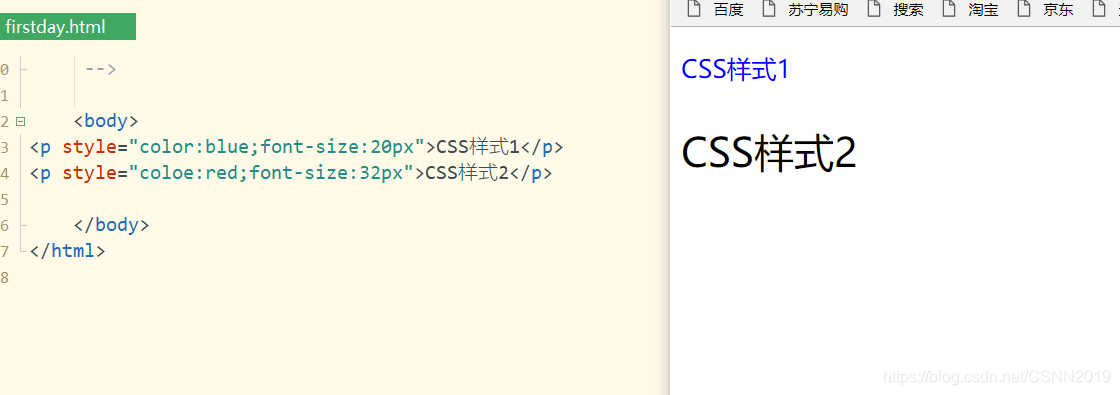
内联样式表
直接在HTML标签内使用style属性
<p style="color:blue;font-size:20px">CSS样式1</p>
<p style="coloe:red;font-size:32px">CSS样式2</p>


<!DOCTYPE html>
<html>
	<head>
		<meta   charset="utf-8">
		<title></title>
	</head>


	<body>
<p style="color:blue;font-size:20px">CSS样式1</p>
<p style="coloe:red;font-size:32px">CSS样式2</p>

	</body>
</html>
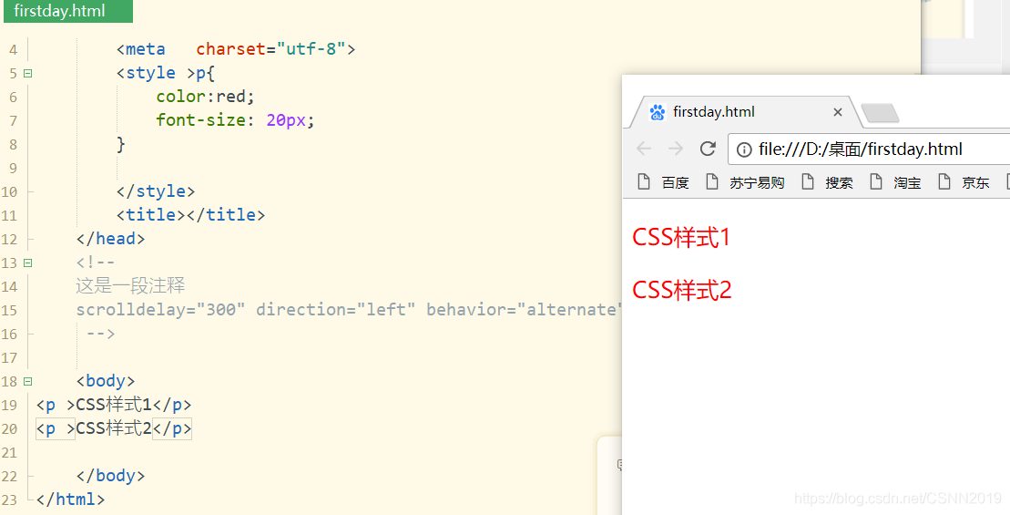
内部样式表
使用<style>标签在HTML文档头部定义
<!DOCTYPE html>
<html>
	<head>
		<meta   charset="utf-8">
		<style >
			p{


			color:red;
			font-size: 20px;
		}

		</style>

	</head>
	<body>
<p >CSS样式1</p>
<p >CSS样式2</p>

	</body>
</html>
注意
内联样式表优先级大于内部样式表
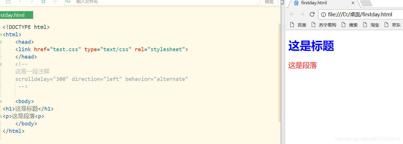
外部样式表
将CSS代码写入一个或多个文件后缀名为.css的文件中
- 定义独立的外部样式表
p{


color:red;
font-size:20px;
}
h1{


color:blue;
}
- 在页面中通过
<link>链接外部样式文件
<!DOCTYPE html>
<html>
	<head>
	<link href="test.css" type="text/css" rel="stylesheet">
	</head>

	<body>
<h1>这是标题</h1>
<p>这是段落<p>
	</body>
</html>

CSS选择器
元素选择器
选择HTML元素(标签),给选择的元素设置样式
<!DOCTYPE html>
<html>
	<head>

		<style type="text/css">
			div{

    background-color: gray;}
			p{

    background-color: #444;color:#fff;}
			*{

    color:red;}

		</style>
	</head>

	<body>
<div>元素选择器设置div样式</div>
<p>元素选择器设置p样式<p>
	</body>
</html>
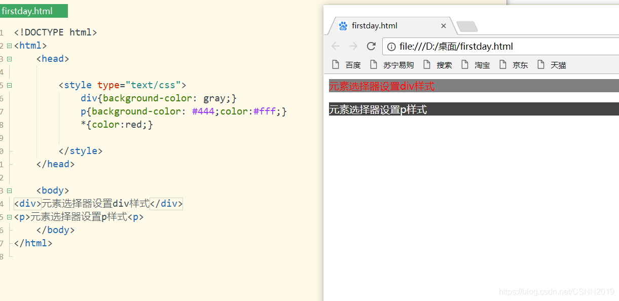
注意
*是通配符选择器,可以与任何元素匹配
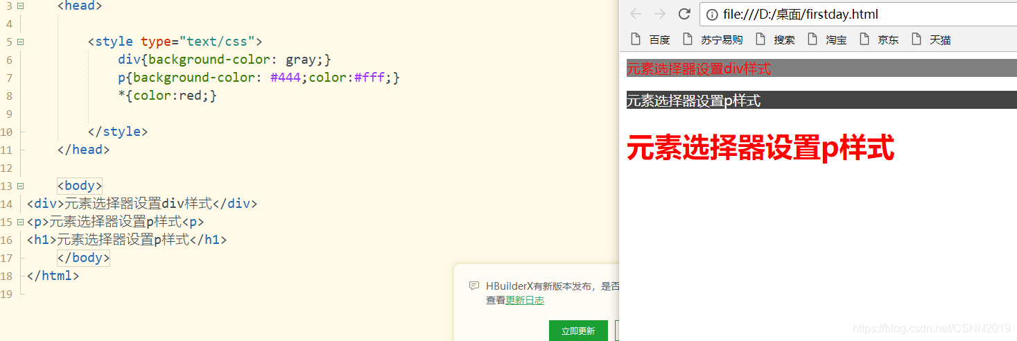
<h1>元素选择器设置p样式</h1>
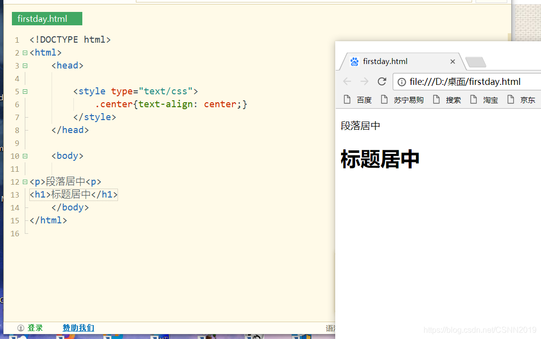
类(class)选择器
选择并设置一组元素的样式(以.开头,然后后面跟上类名)
<!DOCTYPE html>
<html>
	<head>

		<style type="text/css">
			.center{

    text-align: center;}
		</style>
	</head>

	<body>

<p>段落居中<p>
<h1>标题居中</h1>
	</body>
</html>
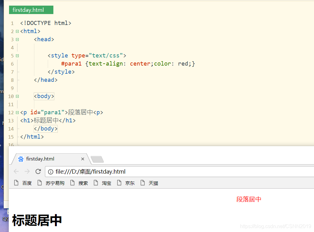
ID选择器
为标有特定的id的HTML元素设置样式
<!DOCTYPE html>
<html>
	<head>

		<style type="text/css">
			#para1 {text-align: center;color: red;}
		</style>
	</head>

	<body>

<p id="para1">段落居中<p>
<h1>标题居中</h1>
	</body>
</html>
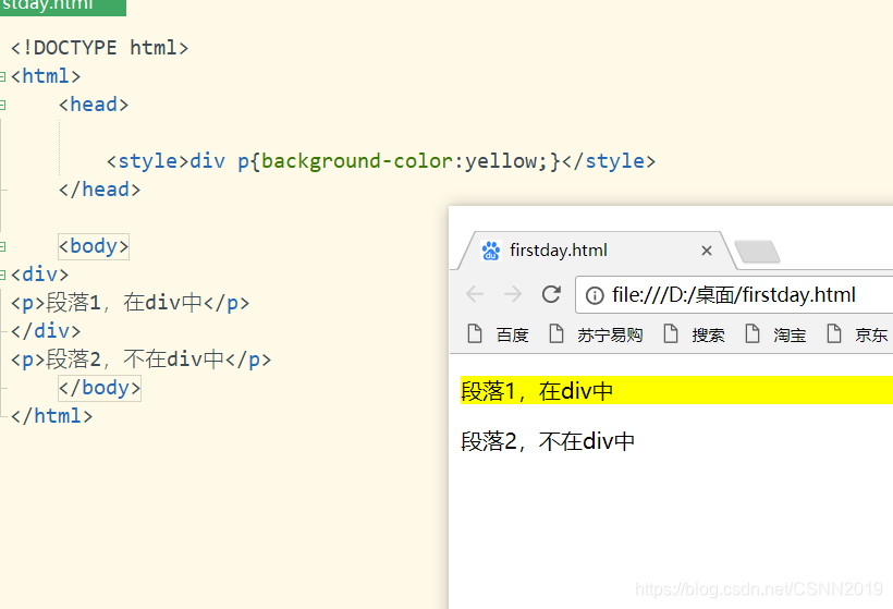
后代选择器
选择并设置一个元素后代的元素
<style>div p{

    background-color:yellow;}</style>
<body>
<div>
<p>段落1,在div中</p>
</div>
<p>段落2,不在div中</p>
</body>
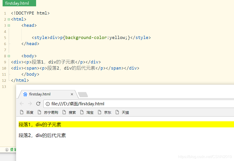
子元素选择器
只选择元素的子元素,不会扩大到任意的后代元素(用大于号进行子元素的选择)
<style>div>p{

    background-color:yellow;}</style>
<body>
<div><p>段落1,div的子元素</p></div>
<div><span><p>段落2,div的后代元素</p></span></div>
</body>
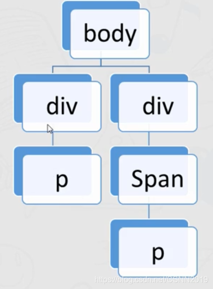
div的子元素span,span的子元素是p,所以呢,p就是div 的后代元素,并非子元素,设置的样式也就不会展现出来
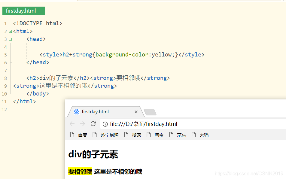
相邻兄弟元素选择器
选择紧接在另一个元素后的元素,且二者有相同的父元素(使用+进行编辑)
<!DOCTYPE html>
<html>
	<head>

		<style>h2+strong{

    background-color:yellow;}</style>
	</head>

	<h2>div的子元素</h2><strong>要相邻哦</strong>
<strong>这里是不相邻的哦</strong>
	</body>
</html>
兄弟元素选择器
选择一个元素后的元素,且二者有相同的父元素
<style>div~p{

    background-color:red;}</style>
<body>
<p>之前段落,不会添加背景颜色</p>
<div><p>段落1,在div中</p></div>
<p>段落3,不在div中</p><p>段落4,不在div中</p>
</body>
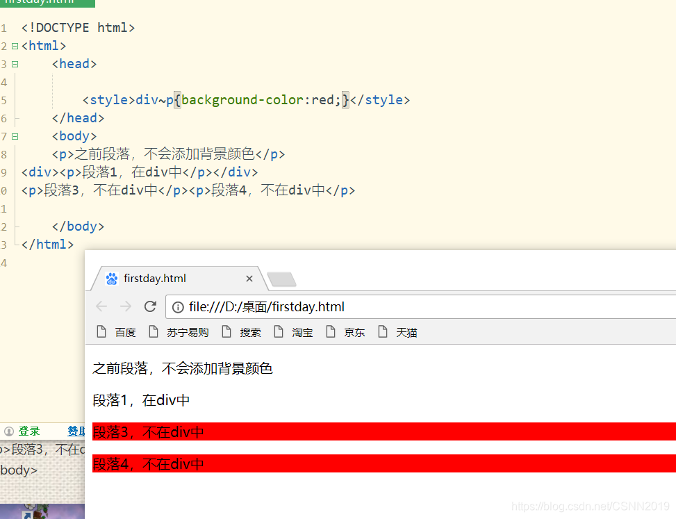
<div>后面的兄弟元素就会被进行相应的操作。
看完下面这个,会更清楚:
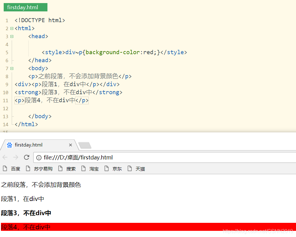
<!DOCTYPE html>
<html>
	<head>

		<style>div~p{

    background-color:red;}</style>
	</head>
	<body>
	<p>之前段落,不会添加背景颜色</p>
<div><p>段落1,在div中</p></div>
<strong>段落3,不在div中</strong>
<p>段落4,不在div中</p>

	</body>
</html>
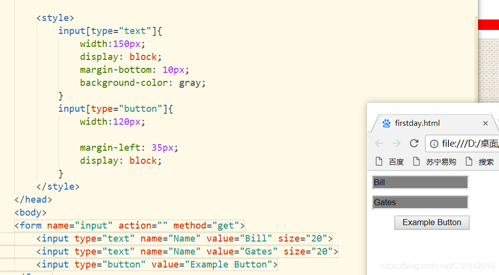
属性选择器
可以为拥有指定属性的HTML元素设置样式
| 选择器 | 描述 | 实例 |
|---|---|---|
| [attribute] | 用于选取带有指定属性的元素 | [title]{color:red;} |
| [attribute=value] | 用于选取带有指定的属性和值的元素 | [title=test]{color:red;} |
| [attribute~=value] | 用于选取属性值中包含指定词汇的元素 | [title~=hello]{color:red;} |
| [attribute | =value] | 用于选取带有以指定值开头的属性值的元素,该值必须是整个单词 |
| [attribute^=value] | 匹配属性值以指定值开头的每个元素 | [title^=hello]{color:red;} |
| [attribute$=value] | 匹配属性值以指定值结尾的每个元素 | [title$=hello]{color:red;} |
| [attribute*=value] | 匹配属性值中包含指定值的每个元素 | [title*=hello]{color:red;} |
<!DOCTYPE html>
<html>
	<head>

		<style>
			input[type="text"]{


				width:150px;
				display: block;
				margin-bottom: 10px;
				background-color: gray;
			}
			input[type="button"]{


				width:120px;

				margin-left: 35px;
				display: block;
			}
		</style>
	</head>
	<body>
	<form name="input" action="" method="get">
		<input type="text" name="Name" value="Bill" size="20">
		<input type="text" name="Name" value="Gates" size="20">
		<input type="button" value="Example Button">
	</form>

	</body>
</html>
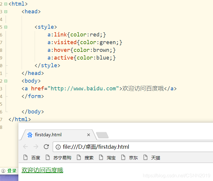
伪类选择器
伪类同一个标签,根据其不同的状态,定义不同的样式,常用伪类有:
:link,:visited,:hover,:active,:focus
a:link{color:red;}超链接点击之前是红色
a:visted{color:green;}超链接点击之后是绿色
a:hover{color:green;}鼠标悬停,放到标签上的时候
a:active{color:black;}鼠标点击链接,未松手的时候
<!DOCTYPE html>
<html>
<head>
<style>
a:link{
color:red;}
a:visited{
color:green;}
a:hover{
color:brown;}
a:active{
color:blue;}
</style>
</head>
<body>
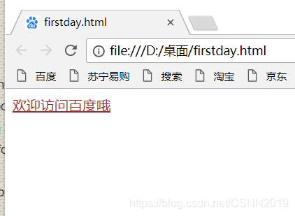
<a href="http://www.baidu.com">欢迎访问百度哦</a>
</form>
</body>
</html>
input:focus{color:white;background-color:#6a6a6a;}输入元素获取焦点时
伪类还可以与CSS类配合使用:
a.red:visited{

    color:red;}
<a class="red" href="#">CSS语法</a>
伪元素
原本不在DOM中的元素,伪元素是新创建的元素,常用伪元素有:
:before  ,
 :after ,:first-line,:first-letter
<style>
h1:before{


content:url(smile.png)
}
h1.after{


content:url(smile.png)
}
</style>
<body>
<h1>利用伪元素在标题前后插入图片</h1>
</body>
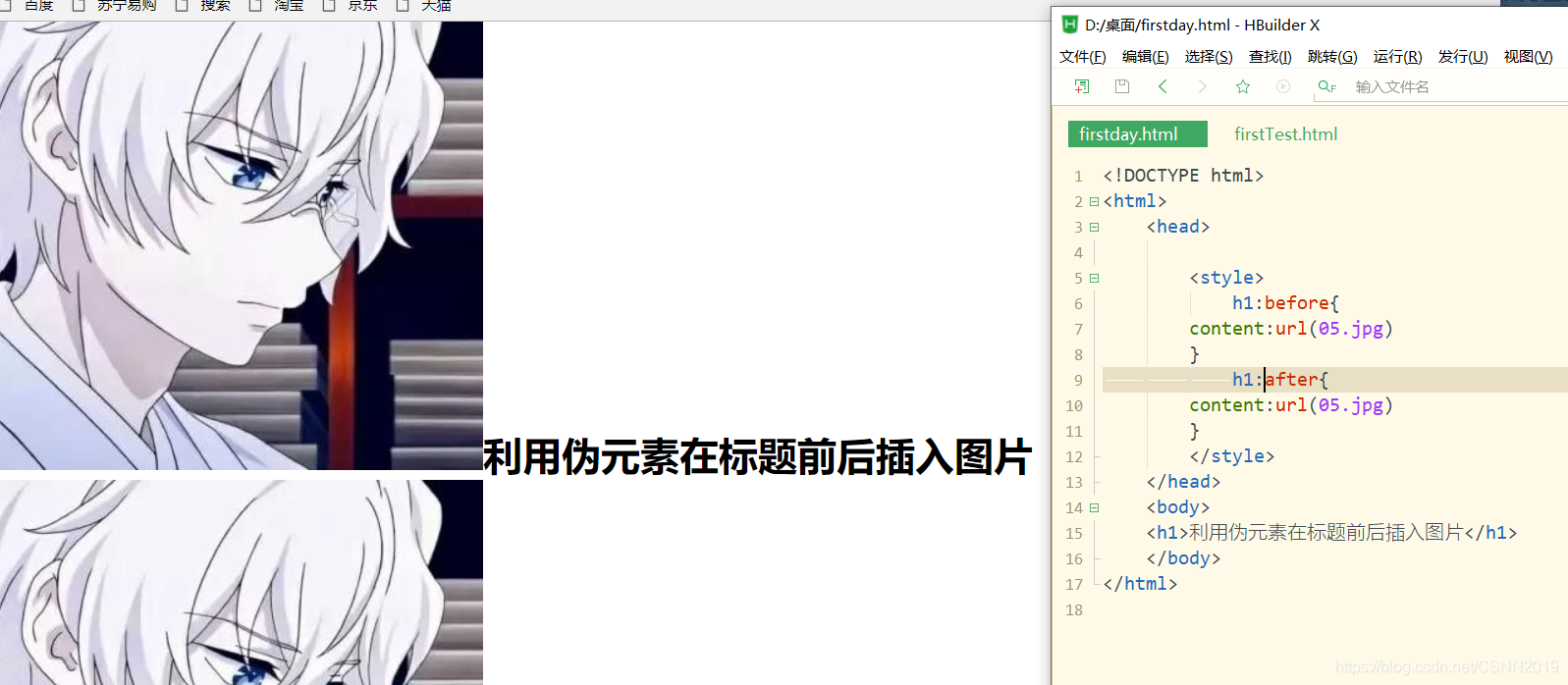
emmmmmmmm…只能说图片太大,不怪我。。。
CSS常用属性
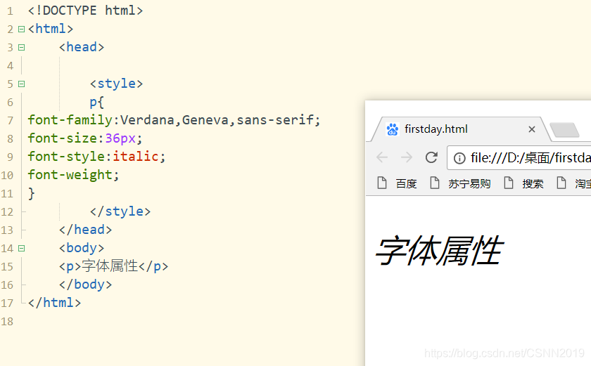
字体属性
用来定义文本所使用的字体系列,大小,粗细,样式等
| font-family | Times,Courier,宋体 | 设置文本的字体系列 |
| font-size | n(单位px),如16px | 设文本的字体大小 |
| font-style | normal|italic|oblique |
设置文本的字体样式 |
| font-weight | normal|bold|bolder|lighter或者数字值100~900 |
设置字体文本的粗细 |
<style>
p{


font-family:Verdana,Geneva,sans-serif;
font-size:36px;
font-style:italic;
font-weight;
}
</style>
<body>
<p>字体属性</p>
</body>
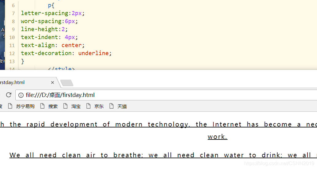
文本属性
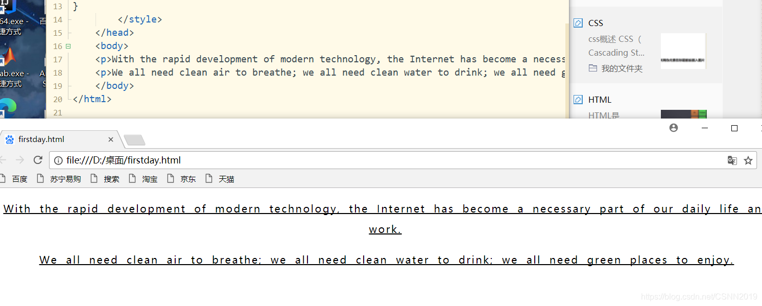
文本属性可定义文本的外观,进行段落排版。通过文本属性,可以改变文本的字符间距,对齐方式,修饰方式,文本缩进
| 属性 | 属性值 | 描述 |
|---|---|---|
| letter-spacing | normal|length|inherit |
设置字符间距 |
| word-spacing | normal|length|inherit |
设置单词间距 |
| line-height | normal|number|length|%|inherit |
设置行间的距离(行高) |
| text-indent | length|%|inherit |
设置文本的首行缩进 |
| text-align | left|right|center|justify|inherit |
设置文本的对齐方式 |
| text-decoration | underline|overline|line-through|none|inherit |
设置文字修饰 |
justify(两端对齐)
underline下划线 overline上划线 line-through删除线 none没有任何修饰
<!DOCTYPE html>
<html>
	<head>

		<style>
		p{


letter-spacing:2px;
word-spacing:6px;
line-height:2;
text-indent: 4px;
text-align: center;
text-decoration: underline;
}
		</style>
	</head>
	<body>
	<p>With the rapid development of modern technology, the Internet has become a necessary part of our daily life and work.</p>
	<p>We all need clean air to breathe; we all need clean water to drink; we all need green places to enjoy. </p>
	</body>
</html>
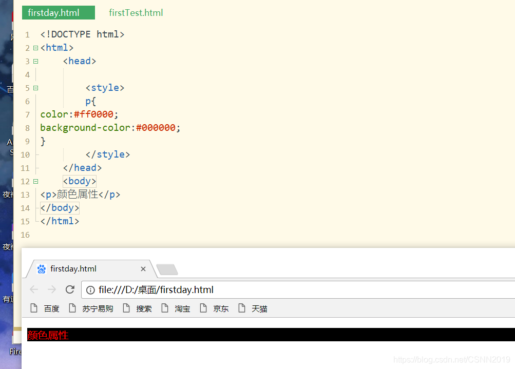
颜色和背景属性
| 属性 | 属性值 | 描述 |
|---|---|---|
| color | red|#ff0000|rgb(255,0,0) |
设置颜色 |
| background-color | red|#ff0000|rgb(255,0,0) |
设置背景颜色 |
| background-image | url('URL')|none|inherit |
设置背景图像 |
| background-repeat | repeat-x|repeat-y|repeat|no-repeat |
设置背景图像重复方式 |
| background-position | xpos ypos|x% y%|x y |
设置背景图像位置 |
| background-attachment | scroll|fixed|local |
设置背景图片是否固定 |
<style>
p{


color:#ff0000;
background-color:#000000;
}
</style>
<body>
<p>颜色属性</p>
</body>
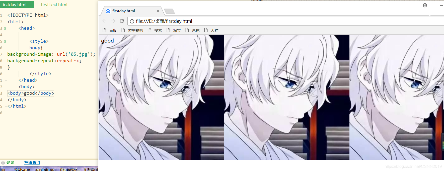
background-repeat属性用来设置是否及如何重复背景图像,默认设置属性值为repeat
<!DOCTYPE html>
<html>
	<head>

		<style>
		body{


background-image: url('05.jpg');
background-repeat:repeat-x;
}
		</style>
	</head>
	<body>
<body>good</body>
</body>
</html>
background-attachment:设置背景图像是否固定或随页面的其余部分滚动
| 值 | 说明 |
|---|---|
| scroll | 背景图片随页面的其余部分滚动,这是默认 |
| fixed | 背景图像是固定的 |
<!DOCTYPE html>
<html>
	<head>

		<style>
		body{


background-image: url('05.jpg');
background-repeat:no-repeat;
background-attachment: fixed;
		</style>
	</head>
	<body>
<body>
	<p>页面背景是固定的,尝试向下滚动页面</p>
	<p>页面背景是固定的,尝试向下滚动页面</p>
	<p>页面背景是固定的,尝试向下滚动页面</p>
	<p>页面背景是固定的,尝试向下滚动页面</p>
	<p>页面背景是固定的,尝试向下滚动页面</p>
	<p>页面背景是固定的,尝试向下滚动页面</p>
	<p>页面背景是固定的,尝试向下滚动页面</p>
	<p>页面背景是固定的,尝试向下滚动页面</p>
	<p>页面背景是固定的,尝试向下滚动页面</p>
	<p>页面背景是固定的,尝试向下滚动页面</p>
	<p>页面背景是固定的,尝试向下滚动页面</p>
	<p>页面背景是固定的,尝试向下滚动页面</p>
	<p>页面背景是固定的,尝试向下滚动页面</p>
	<p>页面背景是固定的,尝试向下滚动页面</p>
	<p>页面背景是固定的,尝试向下滚动页面</p>
	<p>页面背景是固定的,尝试向下滚动页面</p>
	<p>页面背景是固定的,尝试向下滚动页面</p>
	<p>页面背景是固定的,尝试向下滚动页面</p>
	<p>页面背景是固定的,尝试向下滚动页面</p>
	<p>页面背景是固定的,尝试向下滚动页面</p>
	<p>页面背景是固定的,尝试向下滚动页面</p>
	<p>页面背景是固定的,尝试向下滚动页面</p>
	<p>页面背景是固定的,尝试向下滚动页面</p>

</body>
</body>
</html>
background-positon要想有意义的话,那么background-attachment必须设置为fixed
background-positon属性设置背景图像的起始位置,取值有三种形式:
background-positon:xpos ypos | x% y%| x y
xpos ypos,表示使用预定义关键字定位,其中水平方向可取值left|center|right,垂直方向可选top|center|bottom
x% y%,表示水平位置和垂直位置的百分比,其中左上角是0% 0%,右下角是100% 100%
x y ,分别表示水平位置和垂直位置的像素值,其中左上角是0 0
列表属性
在CSS中,使用list-style设置列表样式,可以设置的属性包括:
| 属性 | 属性值 | 描述 |
|---|---|---|
| list-style-type | none|disc|circle|decimal|lower-alpha|upper-alpha|lower-roman|upper-roman |
设置列表项目的符号类型 |
| list-style-position | outside|inside |
设置列表项标记的位置 |
| list-style-image | URL|none |
设置图像作为列表项的标记 |
<!DOCTYPE html>
<html>
	<head>

		<style>
		ul li{


		border:1px solid #000000;
		list-style-type: square;
		list-style-position: inside;
}
		</style>
	</head>
	<body>
<ul>
	<li>苹果</li><li>香蕉</li><li>葡萄</li>

</ul>
</body>
</html>

具体情况可以各自拷贝代码更换属性,然后观察即可
表格属性
可以设置的属性包括:
| 属性 | 描述 |
|---|---|
| border-collapse | 设置是否把表格边框合并为单一的边框 |
| border-spacing | 设置分隔单元格边框的距离 |
| caption-side | 设置表格标题的位置 |
| empty-cells | 设置是否显示表格中的空单元格 |
| table-layout | 设置显示单元,行和列的方法 |
<!DOCTYPE html>
<html>
	<head>

		<style>
		#customers{


			width:100%;
			border-collapse: collapse;
		}
		#customers td,#customers th{


			font-size: 1em;
			border: :1px solid #98bf21;
		}
		#customers th{


			font-size: 1.1em;
			text-align: left;
			background-color: #A7C942;
			color:#ffffff;
		}
		#customers tr.alt  td{


			color:#000000;
			background-color: #EAF2D3;
		}
		</style>
	</head>
	<body>
<table id="customers">
	<tr>
		<th>Company</th>
			<th>Contact</th>
				<th>Country</th>
		</tr>
		<tr>
			<td>Apple</td>
			<td>Steven Jobs</td>
			<td>USA</td>
			</tr>
			<tr class="alt">
				<td>Baidu</td>
				<td>Li Yan Hong</td>
				<td>China</td>
				</tr>
				<tr>
					<td>Google</td>
					<td>Larry Page</td>
					<td>USA</td>
					</tr>
					<tr class="alt">
						<td>Lenovo</td>
						<td>Liu Chuanzhi</td>
						<td>China</td>
						</tr>
						</table>
</body>
</html>
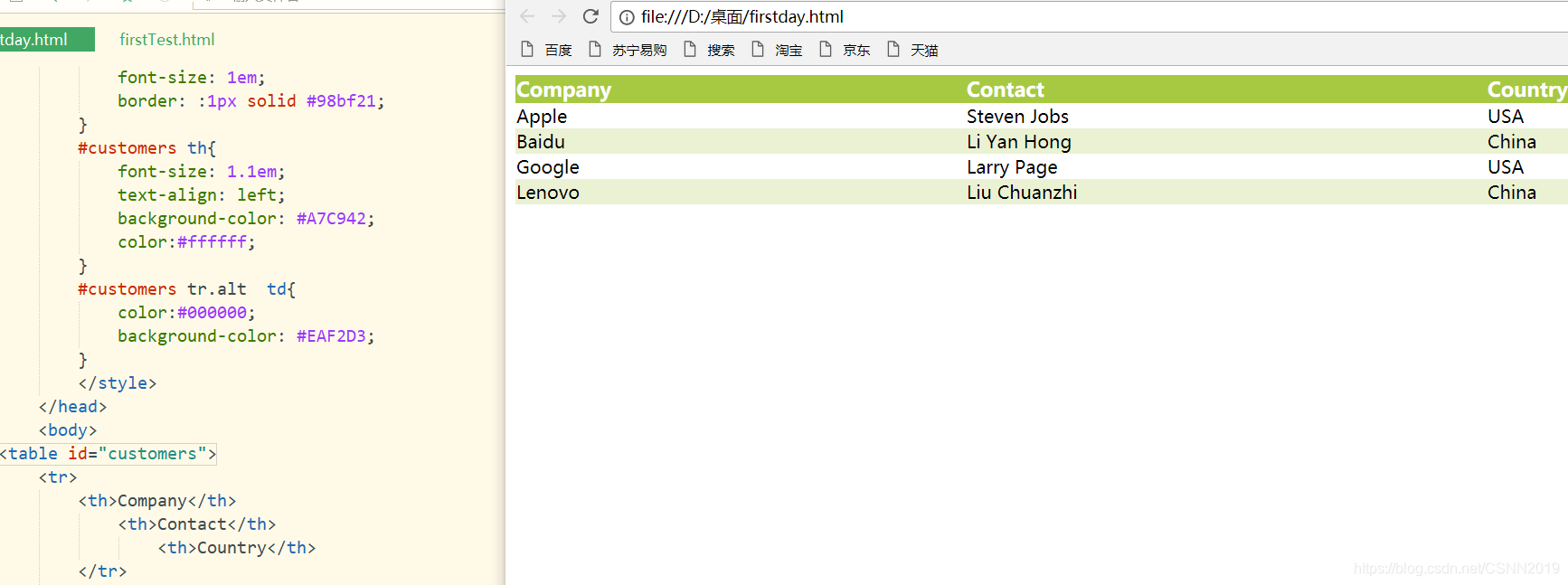
#customers td,#customers th{


			font-size: 1em;
			border: :1px solid #98bf21;
		}
这个是设置了表头和行内容属性
#customers th{


			font-size: 1.1em;
			text-align: left;
			background-color: #A7C942;
			color:#ffffff;
		}
这里单独设置了表头的属性
CSS盒子模型
所有的页面元素都可以看出一个盒子,它占据着一定的页面空间
盒子模型由内容(content),边框(border),内边距(padding),外边距(margin)4个部分
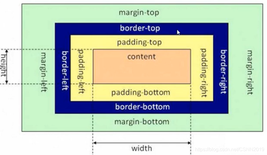
盒子的宽度=左边界+左边框+左填充+内容宽度+右填充+右边框+右边界
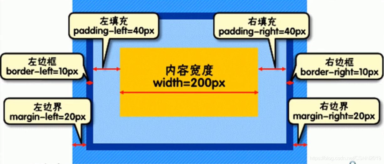
总宽度=20px+10px+40px+200px+40px+10px+20px
border
盒子边框,形成盒子的边界,一般用于分离元素
border的属性主要有三个:颜色(color),宽度(width),样式(style)
<style>
#div1{


border-color:#990000;
border-width:5px;
border-style:solid;
}
</style>
<body>
<div id="div1" >
设置border属性的盒子边框
</div>
</body>
<style>
#div1{


border-color:lightgrey;
border-width:300px;
border-style:5px solid green;
}
</style>
<body>
<div id="div1" >
这里是盒子内的实际内容,边框宽度为5个像素
</div>
</body>
注意:
border-style:5px solid green;这里是合并写法,注意顺序
给不同边框设置不同的属性值
#div2{


border-top:2px dotted #990000;
border-right:10px solid #3399ff;
border-bottom:2px dotted #00ff33;
border-left:10px solid #cc33ff;
}
#div3{


border-color:red blue;
border-width:2px 4px 2px;
border-style:dotted solid double dashed;
}
#div4{


border-top-color:blue;
}
<!DOCTYPE html>
<html>
	<head>

		<style  type="text/css">
		.textBorder{


			border-width: 1px;
			border-style: solid;
		}
		</style>
	</head>
	<body>
<form name="form1"  method="post" action="">
	<p>名字:
	<input name="frame" type="text" class="textBoreder"></p>
	<p>密码:
	<input name="pass" type="password" class="textBoreder" size="21"></p>
	</form>
</body>
</html>
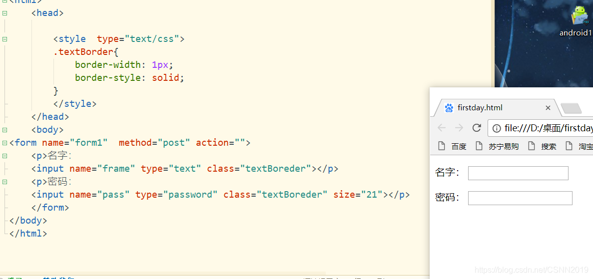
border-width: 1px; 边框宽度为1像素
border-style: solid;文本框为实线边框
padding
盒子的内边距,即边框和内容之间的空白区域
padding: 10px
padding:10px 5px
padding:10px 5px 20px
padding:5px 6px 7px 8px
设置1个属性值表示上下左右4个内边距的值;
设置2个属性值表示上下内边距和左右内边距的值;
设置3个属性值,前者表示上边距属性值,中间表示左右边距属性值,后者表示下内边距值
设置4个属性值,表示上,右,下,左内边距的值,呈顺时针方向
可以使用padding-top,padding-right,padding-bottom,padding-left单独设置某一方向的内边距
#div5 {


width:150px;
height:150px;
padding-top:10px;
padding-right:20px;
padding-bottom:30px;
padding-left:20px;
border-width:3px;
border-style:solid;
}
<div id="div5">
<img src="05.jpg" width="150px" height="150px">
</div>
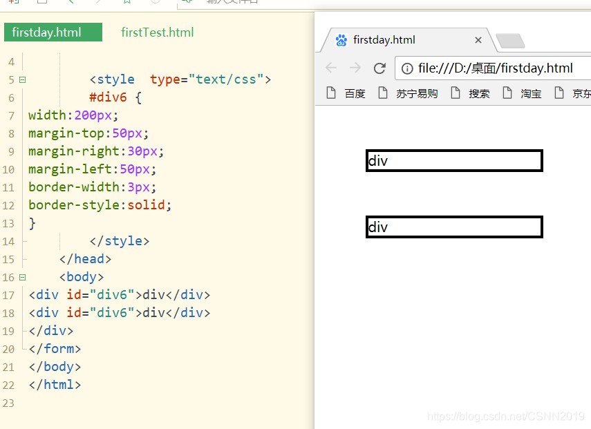
margin
盒子的外边距,即页面上元素和元素之间的距离:
#div6 {


width:200px;
padding-top:50px;
padding-right:30px;
padding-left:50px;
border-width:3px;
border-style:solid;
}
<div id="div6">div</div>
<div id="div6">div</div>
<!DOCTYPE html>
<html>
	<head>

		<style  type="text/css">
		#div6 {


width:200px;
margin-top:50px;
margin-right:30px;
margin-left:50px;
border-width:3px;
border-style:solid;
}
		</style>
	</head>
	<body>
<div id="div6">div</div>
<div id="div6">div</div>
</div>
</form>
</body>
</html>
CSS元素布局与定位
标准文档流是指不使用与布局和定位相关CSS规则时,页面元素默认的排列规则。
页面元素分为两类:
块级元素(block):左右撑满占据一行,和同级兄弟元素依次垂直排列,如div,li元素等
行内元素(inline):相邻元素之间横向排列,到文档右端自动换行,如span,a元素等
<div>div1</div>
<div>div2</div>
<span>span1</span>
<span>span2</span>
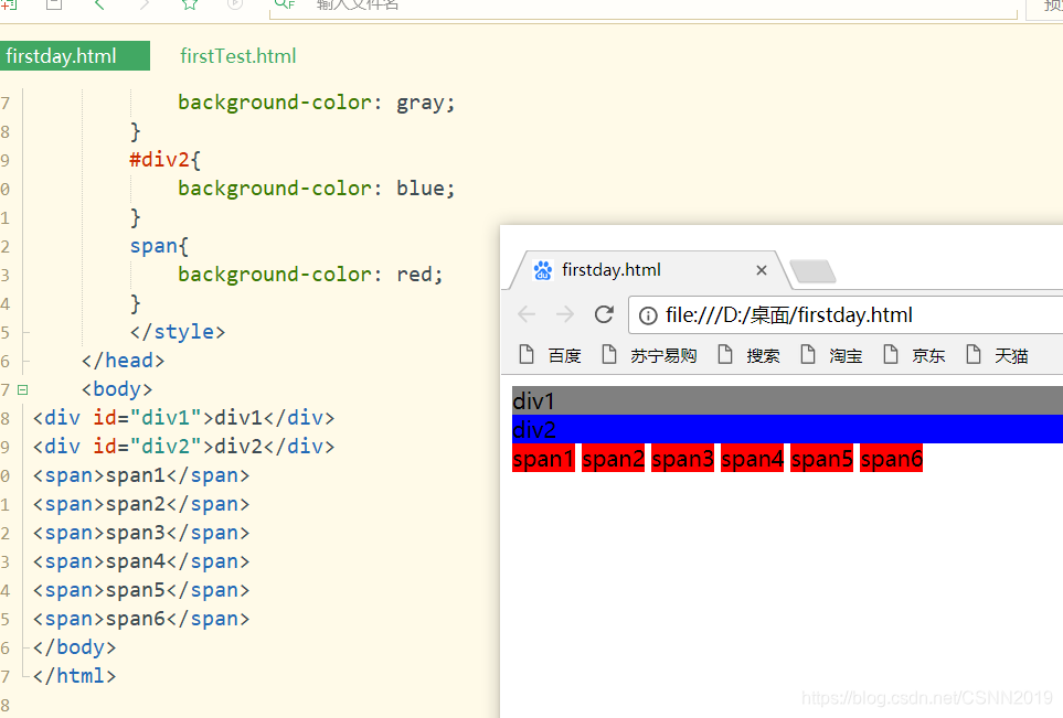
<!DOCTYPE html>
<html>
	<head>

		<style  type="text/css">
		#div1{


			background-color: gray;
		}
		#div2{


			background-color: blue;
		}
		span{


			background-color: red;
		}
		</style>
	</head>
	<body>
<div id="div1">div1</div>
<div id="div2">div2</div>
<span>span1</span>
<span>span2</span>
<span>span3</span>
<span>span4</span>
<span>span5</span>
<span>span6</span>
</body>
</html>
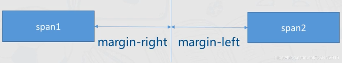
行内元素的水平间距是由这两个元素所在的盒子的外边距之和决定的。
<!DOCTYPE html>
<html>
	<head>

		<style  type="text/css">
		span.left{


			margin-right: 30px;
			background-color: #a9d6ff;
		}
		span.right{


			margin-left: 40px;
			background-color: #eeb0b0;
		}
		</style>
	</head>
	<body>
<span class="left"">span1</span>
<span class="right">span2</span>
</body>
</html>
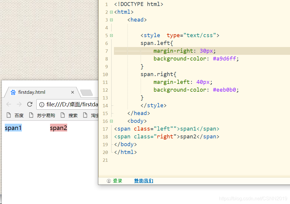
span1和span2水平间距是70px
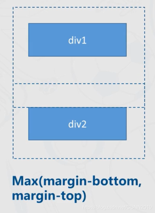
注意
两个块级元素之间的垂直距离不是第一个元素的margin-bottom加第二个元素的margin-top,而是两者之中较大者
<!DOCTYPE html>
<html>
	<head>

		<style  type="text/css">
		div.bottom{


			margin-bottom: 50px;
			background-color: #a9d6ff;
		}
		div.top{


			margin-top: 30px;
			background-color: #eeb0b0;
		}
		</style>
	</head>
	<body>
<div class="bottom"">块元素1</div>
<div class="top"">块元素2</div>
</body>
</html>
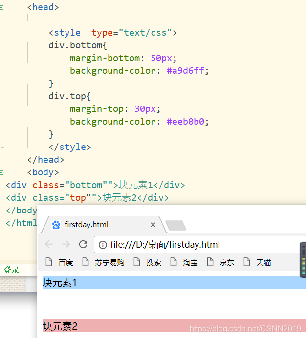
也就是说它俩的垂直间距是50px
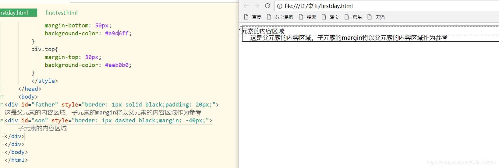
当一个元素包含另一个元素时,就形成父子关系,其中子元素的margin将以父元素的内容区域为参考
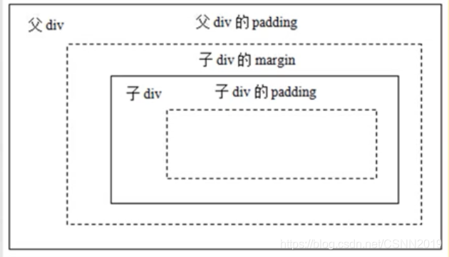
外层的虚线边框是父div的内容边框,子元素的margin以及其它部分都是从父元素的内容区域开始计算的
<!DOCTYPE html>
<html>
	<head>

		<style  type="text/css">
		div.bottom{


			margin-bottom: 50px;
			background-color: #a9d6ff;
		}
		div.top{


			margin-top: 30px;
			background-color: #eeb0b0;
		}
		</style>
	</head>
	<body>
	<div id="father" style="border: 1px solid black;padding: 20px;">
这是父元素的内容区域,子元素的margin将以父元素的内容区域作为参考
<div id="son" style="border: 1px dashed black;margin: 10px;">
	子元素的内容区域
</div>
</div>
</body>
</html>
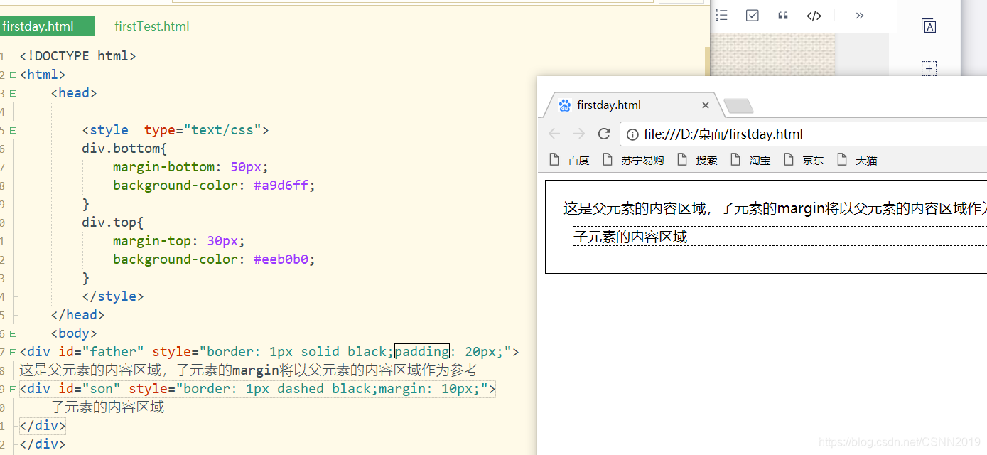
子元素的外边距是根据父元素的内容区来进行计算的。
当元素的margin设为负值时,会使元素所在的盒子向反方向移动,可能导致两个元素的重叠,产生一个元素覆盖在另一个元素上面的效果
<!DOCTYPE html>
<html>
	<head>

		<style  type="text/css">
		div.bottom{


			margin-bottom: 50px;
			background-color: #a9d6ff;
		}
		div.top{


			margin-top: 30px;
			background-color: #eeb0b0;
		}
		</style>
	</head>
	<body>
<div id="father" style="border: 1px solid black;padding: 20px;">
这是父元素的内容区域,子元素的margin将以父元素的内容区域作为参考
<div id="son" style="border: 1px dashed black;margin: -40px;">
	子元素的内容区域
</div>
</div>
</body>
</html>
元素的定位属性
元素通过positon属性实现定位,分为静态定位(static),相对定位(relative),绝对定位(absolute)和固定定位(fixed)四种定位方式
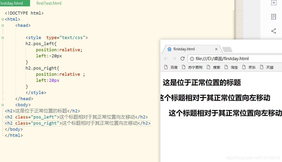
relative
元素的位置将相对其原本的标准位置偏移指定的距离
<!DOCTYPE html>
<html>
	<head>

		<style  type="text/css">
		h2.pos_left{


			position:relative;
			left:-20px
		}
		h2.pos_right{


			position:relative ;
			left:20px
		}
		</style>
	</head>
	<body>
<h2>这是位于正常位置的标题</h2>
<h2 class="pos_left">这个标题相对于其正常位置向左移动</h2>
<h2 class="pos_right">这个标题相对于其正常位置向左移动</h2>
</body>
</html>
<!DOCTYPE html>
<html>
	<head>

		<style  type="text/css">

		img.pos_right{


			position:relative ;
			left:300px
		}
		</style>
	</head>
	<body>

<img src="05.jpg" width="300" height="240">
<img  src="05.jpg" width="300" height="240" class="pos_right">
</body>
</html>
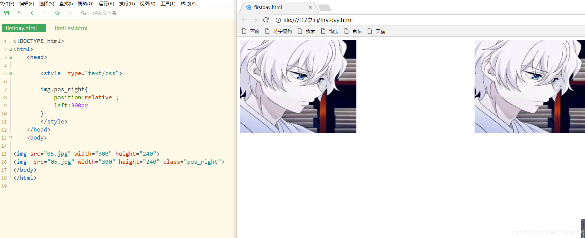
注意
img.pos_right这里pos_right前面得记得改成img,否则relative没法实现
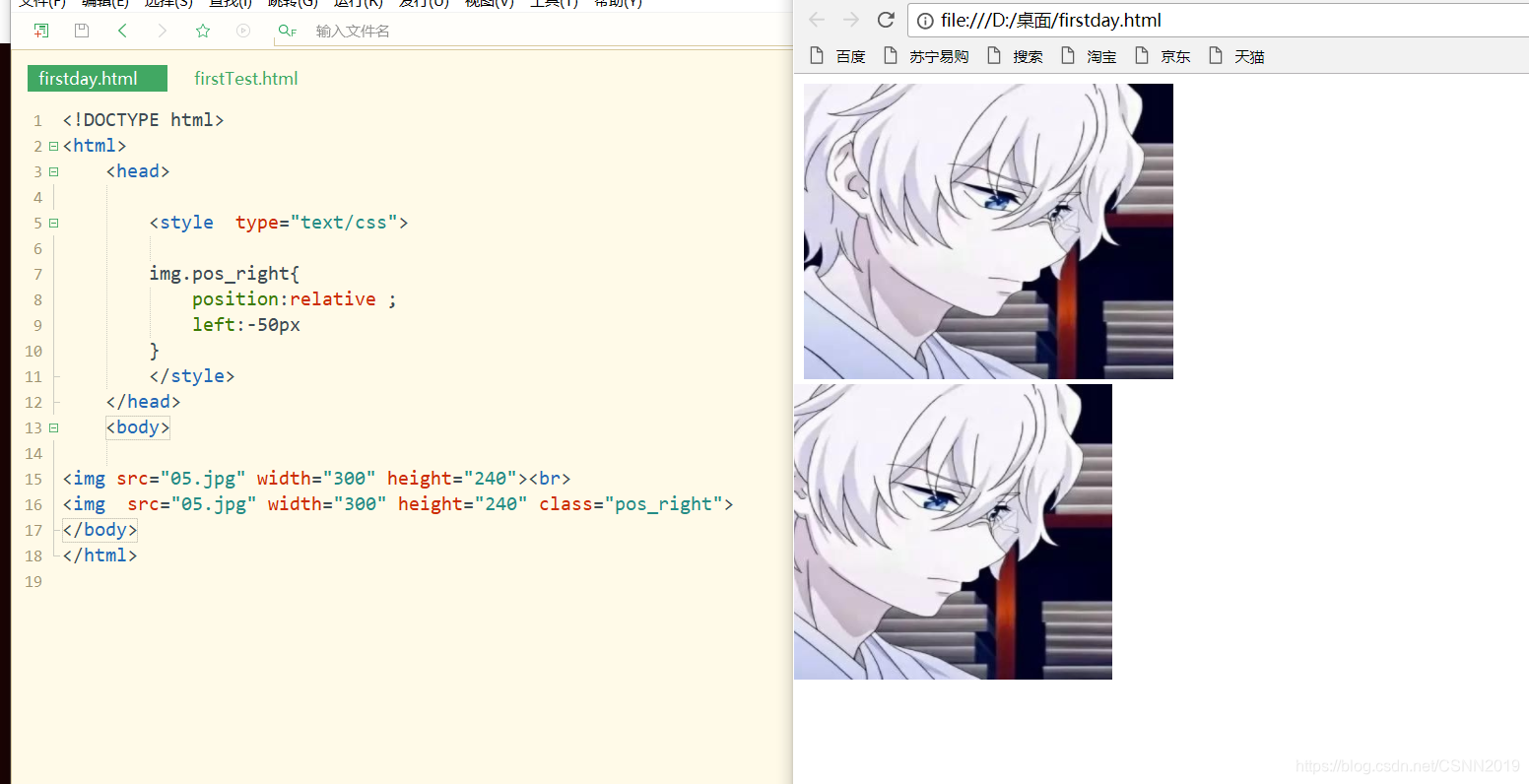
<!DOCTYPE html>
<html>
	<head>

		<style  type="text/css">

		img.pos_right{


			position:relative ;
			left:-50px
		}
		</style>
	</head>
	<body>

<img src="05.jpg" width="300" height="240"><br>
<img  src="05.jpg" width="300" height="240" class="pos_right">
</body>
</html>
绝对定位
absolute:元素可以放在页面上的任意位置,位置相对于最近已定位的父元素,如果元素没有已定位的父元素,那么它的位置相对于<html>
<!DOCTYPE html>
<html>
	<head>

		<style  type="text/css">

		#box3{


			width: 800px; height: 600px;
			position: relative;
		}
		#box4{


			width: 99%;position: absolute;
			top: 30px; left: 300px;
		}
		</style>
	</head>
	<body>
<div id="box3">
<img src="05.jpg" width="800px" height="600">
<div id="box4">
	二次元头像
</div>
</div>
</body>
</html>

这个文字的父元素也就是这个box3 子元素是absolute定位,父元素
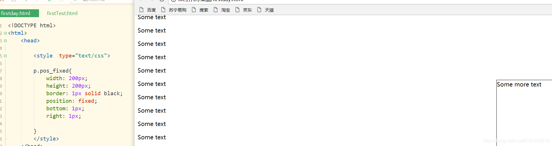
fixed
元素位置相对于浏览器窗口是固定位置,拖动滚动条时,元素位置不会发生变化
<!DOCTYPE html>
<html>
	<head>

		<style  type="text/css">

		p.pos_fixed{


			width: 200px;
			height: 200px;
			border: 1px solid black;
			position: fixed;
			bottom: 1px;
			right: 1px;

		}
		</style>
	</head>
	<body>
<p class="pos_fixed">Some more text</p>
<p>Some text</p><p>Some text</p><p>Some text</p><p>Some text</p><p>Some text</p><p>Some text</p><p>Some text</p><p>Some text</p><p>Some text</p><p>Some text</p><p>Some text</p>
<p>Some text</p><p>Some text</p><p>Some text</p><p>Some text</p><p>Some text</p><p>Some text</p><p>Some text</p><p>Some text</p><p>Some text</p>
<p>Some text</p><p>Some text</p><p>Some text</p><p>Some text</p><p>Some text</p><p>Some text</p><p>Some text</p><p>Some text</p><p>Some text</p>
<p>Some text</p><p>Some text</p><p>Some text</p><p>Some text</p><p>Some text</p><p>Some text</p><p>Some text</p><p>Some text</p><p>Some text</p>
<p>Some text</p><p>Some text</p><p>Some text</p><p>Some text</p><p>Some text</p><p>Some text</p><p>Some text</p><p>Some text</p><p>Some text</p>
<p>Some text</p><p>Some text</p><p>Some text</p><p>Some text</p><p>Some text</p>
</body>
</html>
元素的浮动属性
在标准流中,一个块级元素在水平方向会有自动伸展,知道包含它的父级元素的边界;在垂直方向与兄弟元素依次排列,不能并排
#div1{


background-color:red;
width:100px;
height:50px;
}
#div2{


background-color:green;
width:200px;
height:25px;
}
#div3{


background-color:yellow;
width:50px;
height:50px;
}
#div4{


background-color:blue;
width:150px;
height:75px;
}
<div id="div1">div1</div>
<div id="div2">div2</div>
<div id="div3">div3</div>
<div id="div4">div4</div>
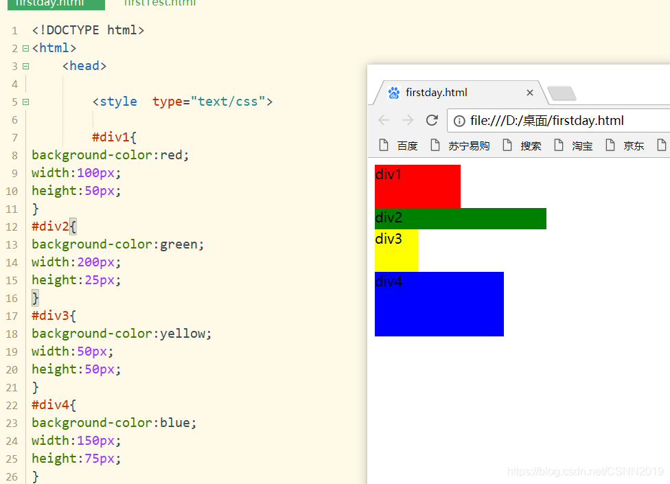
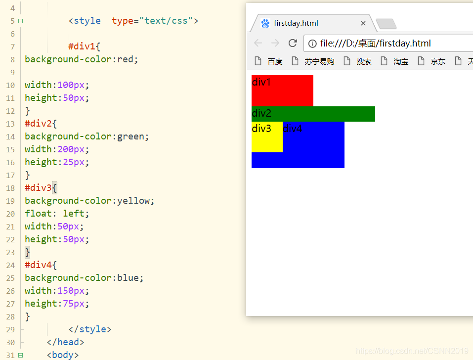
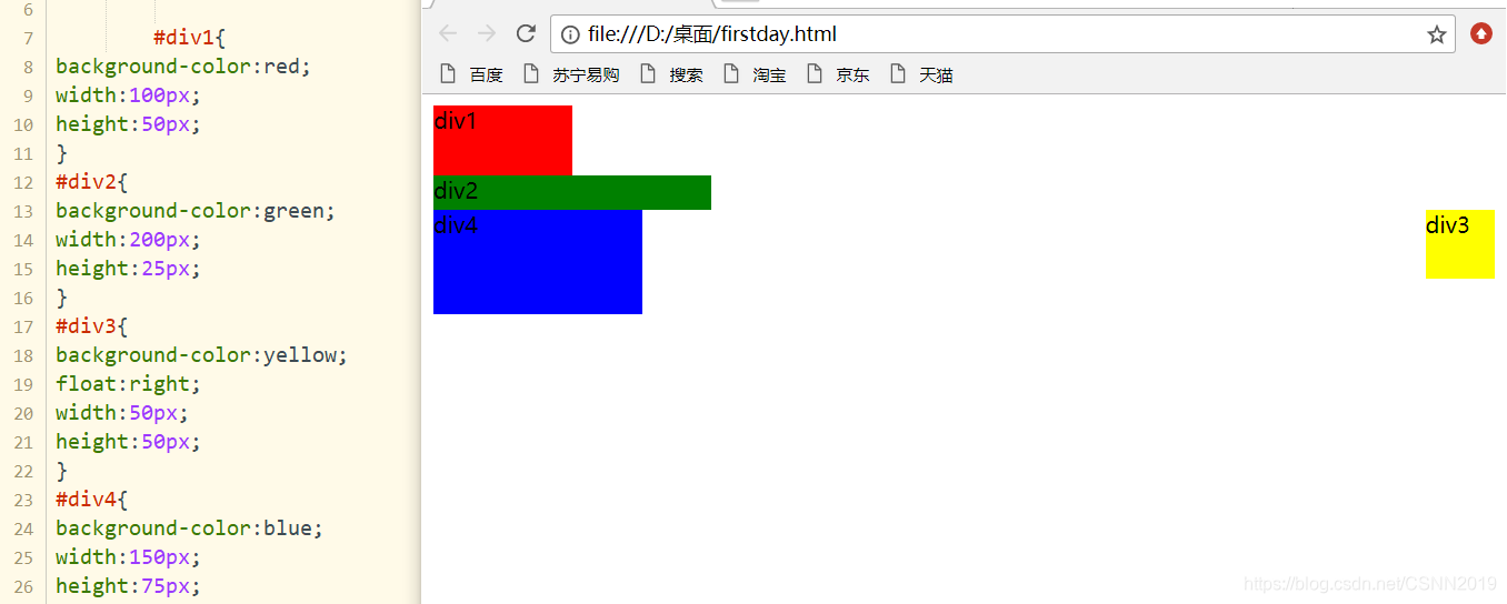
上图为标准流(div1 div2 div3 div4都在标准流中)
左浮动
如果将float属性设置为left或right,那么元素就会向其父元素的左侧或右侧靠紧,同时盒子的宽度不再伸展,将根据盒子中内容宽度决定其宽度
div1浮动
#div1{


background-color:red;
float: left;
width:100px;
height:50px;
}
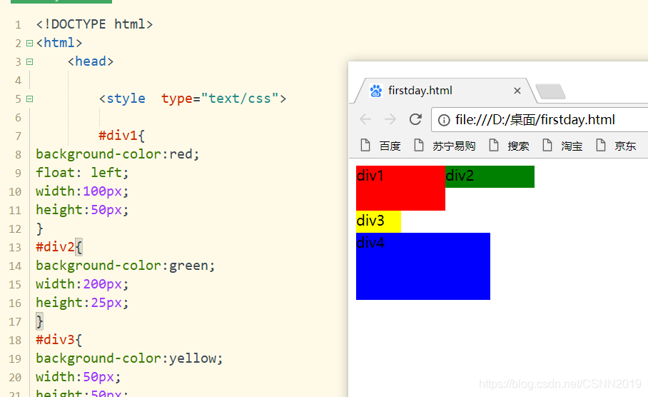
div1不再标准流中,标准流中有div2,div3,div4,div2的部分长度被div1覆盖(覆盖为什么不直接进行红色+绿色呢。。。hhhhh)
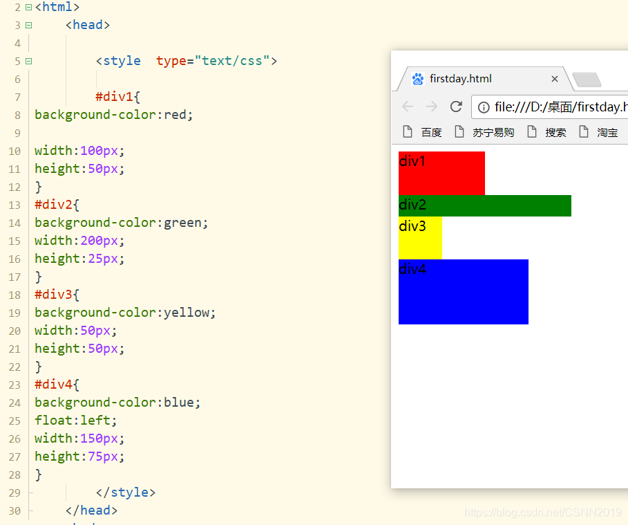
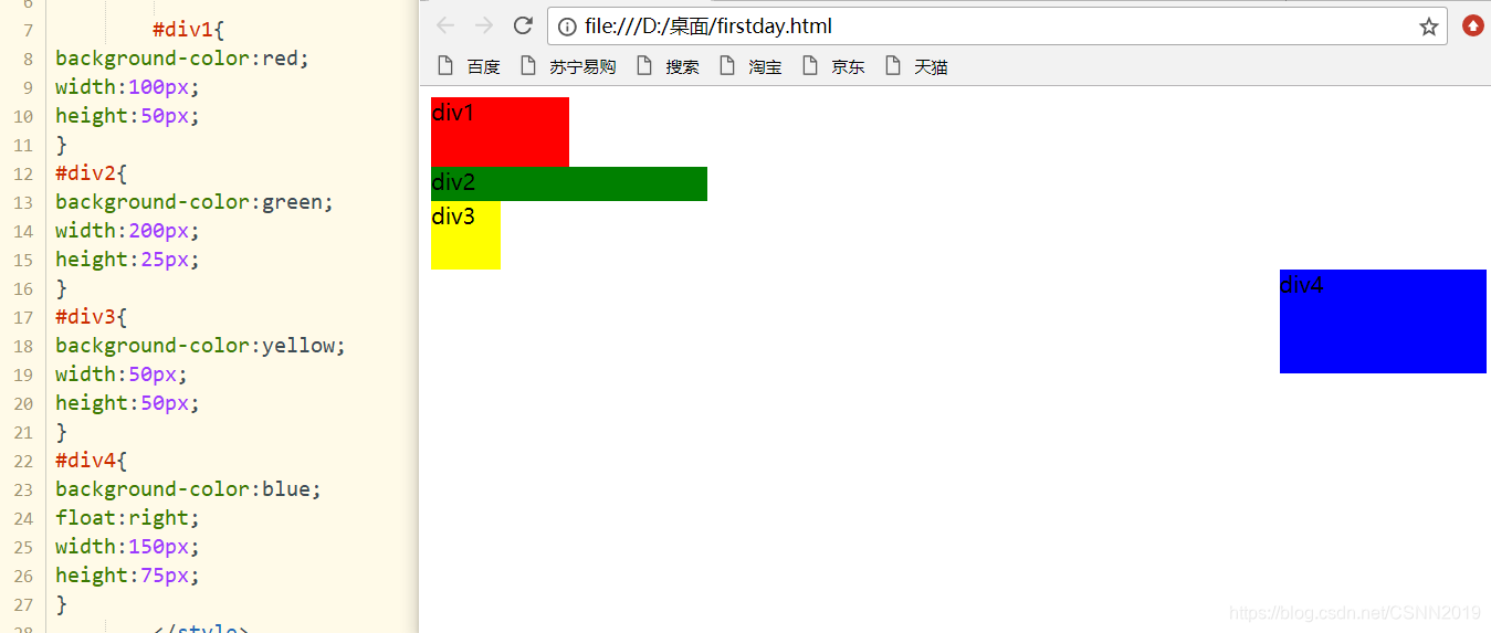
div2浮动
#div2{


background-color:green;
float: left;
width:200px;
height:25px;
}
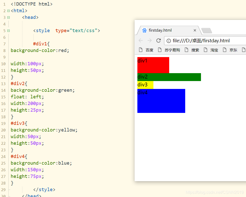
div1 div3 div4在标准流中,div2浮动出来了,div3的部分被div2覆盖了。。。。
div3浮动
#div3{


background-color:yellow;
float: left;
width:50px;
height:50px;
}
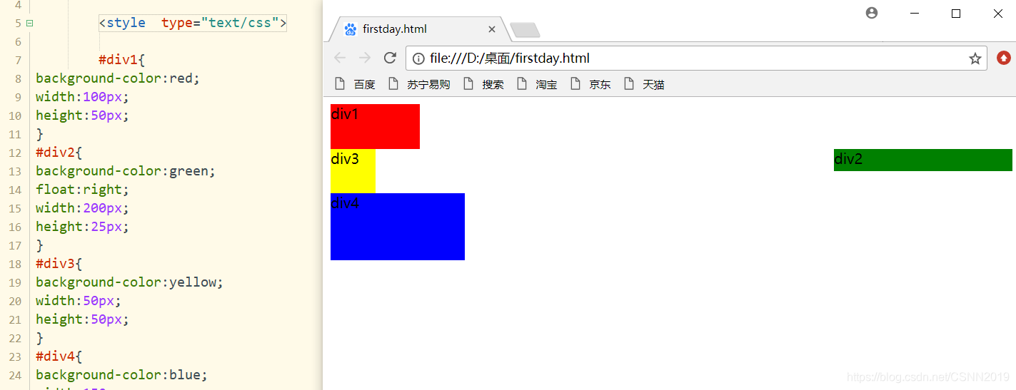
div1 div2 div4是标准的文档流,div3浮动出来,div4部分被div3遮挡
div4浮动
#div4{


background-color:blue;
float:left;
width:150px;
height:75px;
}
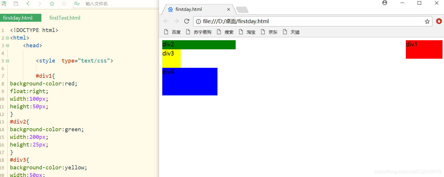
右浮动:
div1浮动
#div1{


background-color:red;
float:right;
width:100px;
height:50px;
}
div2浮动
#div2{


background-color:green;
float:right;
width:200px;
height:25px;
}
div3浮动
#div3{


background-color:yellow;
float:right;
width:50px;
height:50px;
}
div4浮动
#div4{


background-color:blue;
float:right;
width:150px;
height:75px;
}
清除浮动
clear:left|right|both|none
一个元素设置浮动属性后,会影响其相邻元素的布局,如果希望不影响相邻的元素,可以在相邻元素上设置相应的清除浮动效果
left:左侧抗浮动 right:右侧抗浮动 both:两侧抗浮动
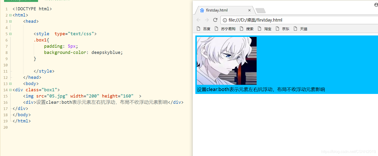
正常情况下:
<!DOCTYPE html>
<html>
	<head>

		<style  type="text/css">
		.box1{


			padding: 5px;
			background-color: deepskyblue;
		}

		</style>
	</head>
	<body>
<div class="box1">
	<img src="05.jpg" width="200" height="160"  >
	<div>设置clear:both表示元素左右抗浮动,布局不收浮动元素影响</div>
</div>
</body>
</html>
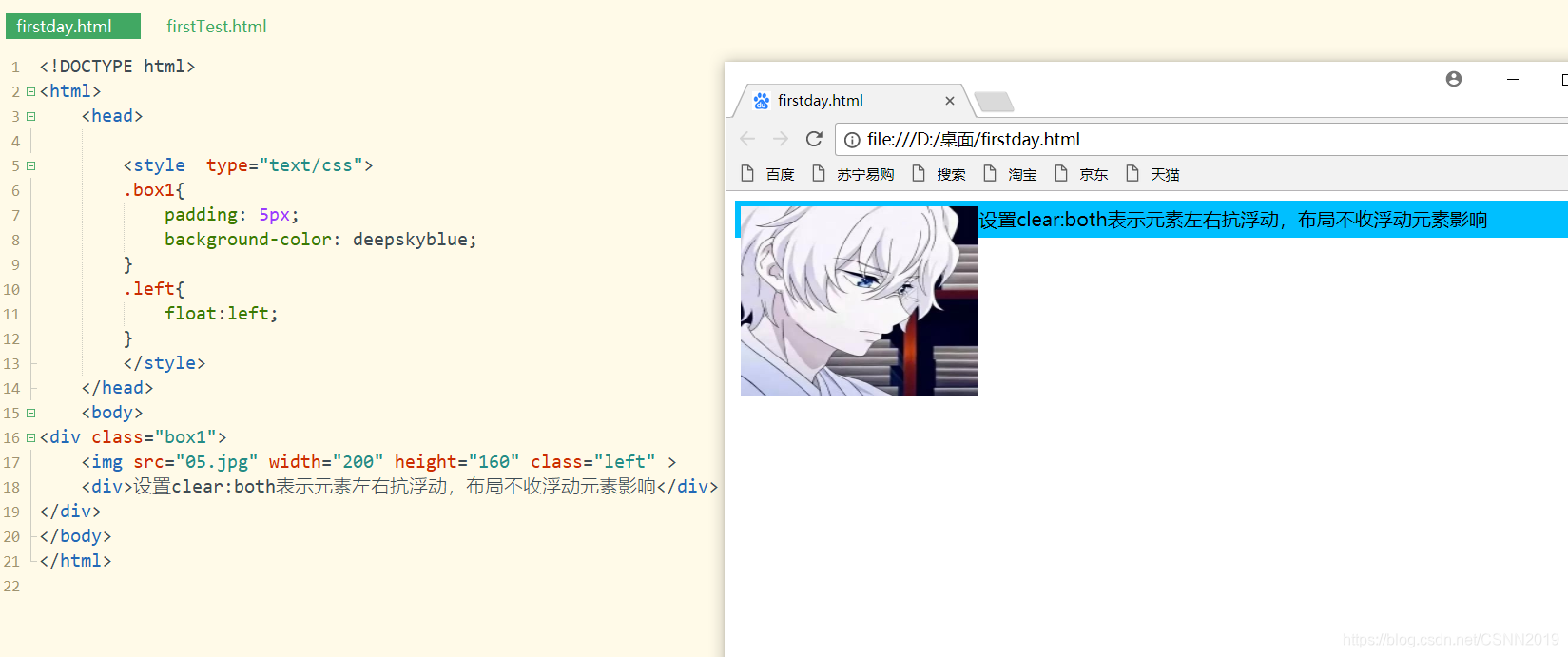
左浮动后:
<!DOCTYPE html>
<html>
	<head>

		<style  type="text/css">
		.box1{


			padding: 5px;
			background-color: deepskyblue;
		}
		.left{


			float:left;
		}
		</style>
	</head>
	<body>
<div class="box1">
	<img src="05.jpg" width="200" height="160" class="left" >
	<div>设置clear:both表示元素左右抗浮动,布局不收浮动元素影响</div>
</div>
</body>
</html>
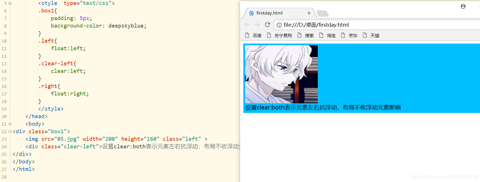
抗左浮动后:
<!DOCTYPE html>
<html>
	<head>

		<style  type="text/css">
		.box1{


			padding: 5px;
			background-color: deepskyblue;
		}
		.left{


			float:left;
		}
		.clear-left{


			clear:left;
		}
		.right{


			float:right;
		}
		</style>
	</head>
	<body>
<div class="box1">
	<img src="05.jpg" width="200" height="160" class="left" >
	<div class="clear-left">设置clear:both表示元素左右抗浮动,布局不收浮动元素影响</div>
</div>
</body>
</html>
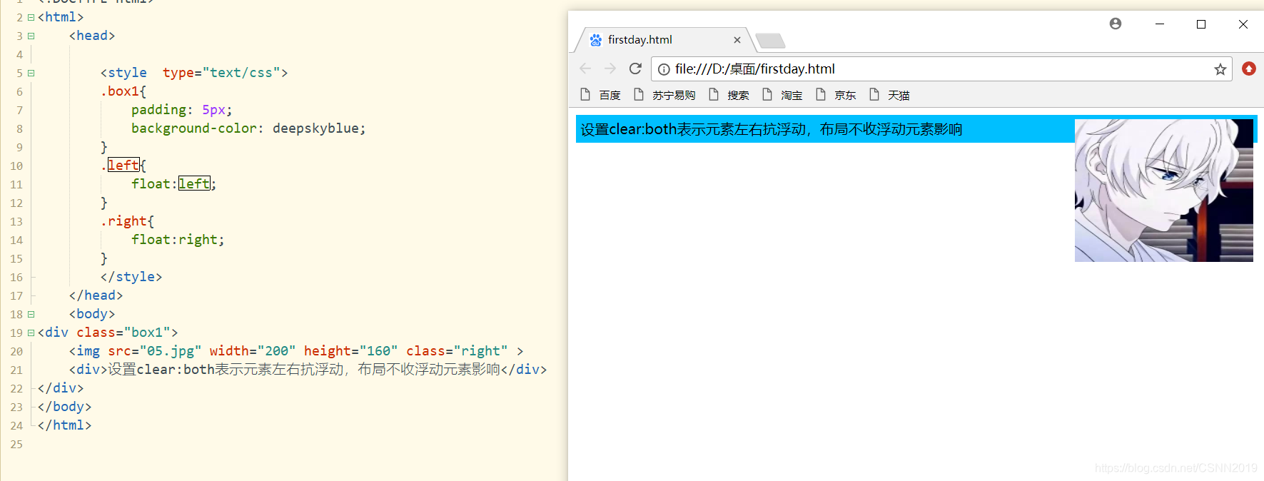
右浮动后:
<!DOCTYPE html>
<html>
	<head>

		<style  type="text/css">
		.box1{


			padding: 5px;
			background-color: deepskyblue;
		}
		.left{


			float:left;
		}
		.right{


			float:right;
		}
		</style>
	</head>
	<body>
<div class="box1">
	<img src="05.jpg" width="200" height="160" class="right" >
	<div>设置clear:both表示元素左右抗浮动,布局不收浮动元素影响</div>
</div>
</body>
</html>
抗右浮动后
<!DOCTYPE html>
<html>
	<head>

		<style  type="text/css">
		.box1{


			padding: 5px;
			background-color: deepskyblue;
		}
		.left{


			float:left;
		}
		.clear-left{


			clear:left;
		}
		.right{


			float:right;
		}
		.clear-right{


			clear:right;
		}
		</style>
	</head>
	<body>
<div class="box1">
	<img src="05.jpg" width="200" height="160" class="right" >
	<div class="clear-right">设置clear:both表示元素左右抗浮动,布局不收浮动元素影响</div>
</div>
</body>
</html>
注意:很多时候抗浮动都直接设置both
元素的显示属性
利用display属性既可以实现元素的隐藏,也可以实现块级元素和行内元素的 相互转换
| 属性值 | 描述 |
|---|---|
| none | 隐藏对象 |
| inline | 指定对象为内联元素 |
| block | 指定对象为块元素 |
| list-item | 指定对象为列表项目 |
| inline-block | 指定对象为内联块元素 |
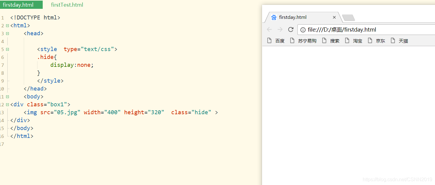
<!DOCTYPE html>
<html>
	<head>

		<style  type="text/css">
		.hide{


			display:none;
		}
		</style>
	</head>
	<body>
<div class="box1">
	<img src="05.jpg" width="400" height="320"   >
</div>
</body>
</html>
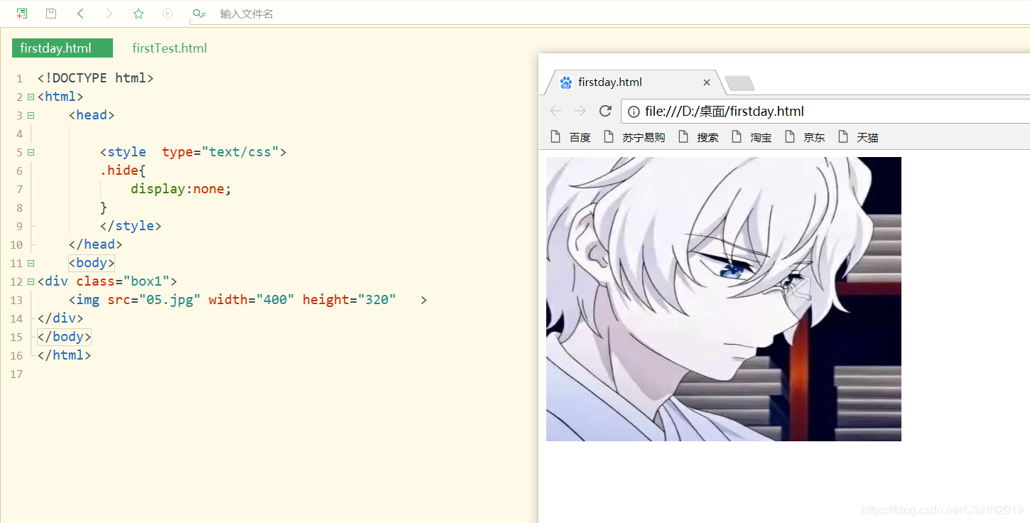
加上 class="hide"后:
设置display
块级元素转换为行内元素
inline可以将任意的块级元素转换为行内元素,此时元素将拥有行内元素的特性。
- 可以与其他行内元素共享一行,不会独占一行;
- 不能更改元素的height和width属性值,大小由内容撑开;
- 可以使用padding属性,设置上下左右值都有效;
- 使用margin属性时,仅left和right属性会产生边距效果,top和bottom属性没有任何效果
未转换:
<!DOCTYPE html>
<html>
	<head>

		<style  type="text/css">
		#div1{


			background-color: gray;

		}
		#div2{


			background-color: red;
		}
		#div3{


			background-color: green;
		}
		</style>
	</head>
	<body>
<div class="box1">
	<div id="div1">div1</div>
	<div id="div2">div2</div>
	<div id="div3">div3</div>
</div>
</body>
</html>
转换后:
<!DOCTYPE html>
<html>
	<head>

		<style  type="text/css">
		#div1{


			background-color: gray;
			display: inline;
		}
		#div2{


			background-color: red;
			display: inline;
		}
		#div3{


			background-color: green;
			display: inline;
		}
		</style>
	</head>
	<body>
<div class="box1">
	<div id="div1">div1</div>
	<div id="div2">div2</div>
	<div id="div3">div3</div>
</div>
</body>
</html>
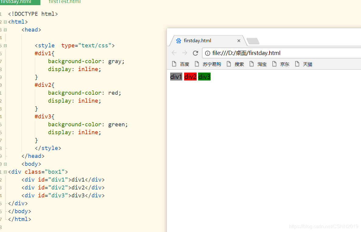
行内元素转换为块级元素
设置display:block可以将任意的行内元素转换为块级元素,元素将拥有块级元素的特性。
- 元素将独占一行,在不设置宽度的情况下,块级元素会默认填满父级元素的宽度
- 能够改变元素的height和width
- 可以设置padding,margin的各个属性值,top,left,bottom,right都能够产生边距效果
未转换:
<!DOCTYPE html>
<html>
	<head>

		<style  type="text/css">
		#span1{


			background-color: gray;

		}
		#span2{


			background-color: red;

		}
		#span3{


			background-color: green;

		}
		</style>
	</head>
	<body>
<div class="box1">
	<span id="span1">span1</span>
	<span id="span2">span2</span>
	<span id="span3">span3</span>
</div>
</body>
</html>
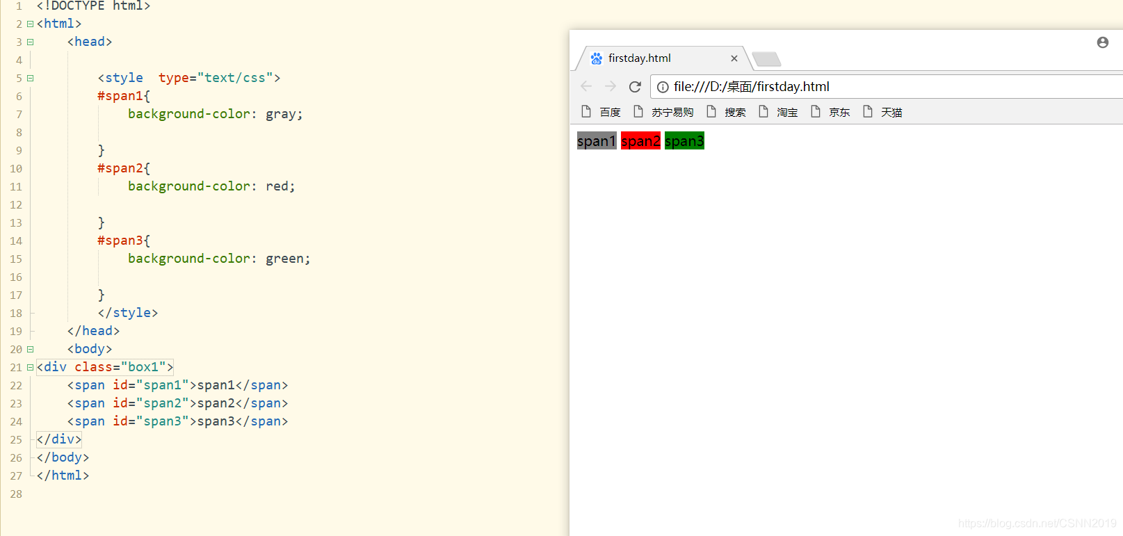
转换后:
<!DOCTYPE html>
<html>
	<head>

		<style  type="text/css">
		#span1{


			background-color: gray;
			display: block;
		}
		#span2{


			background-color: red;
		display: block;
		}
		#span3{


			background-color: green;
			display: block;
		}
		</style>
	</head>
	<body>
<div class="box1">
	<span id="span1">span1</span>
	<span id="span2">span2</span>
	<span id="span3">span3</span>
</div>
</body>
</html>
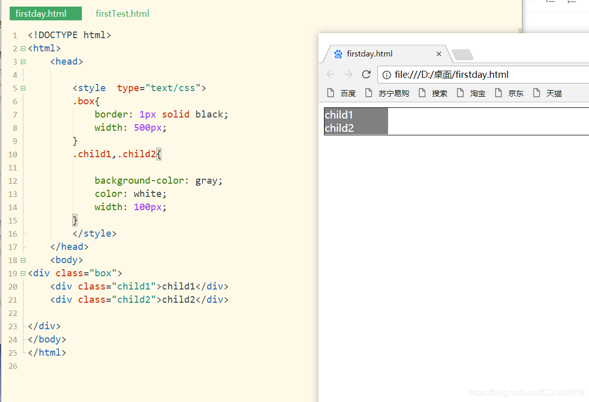
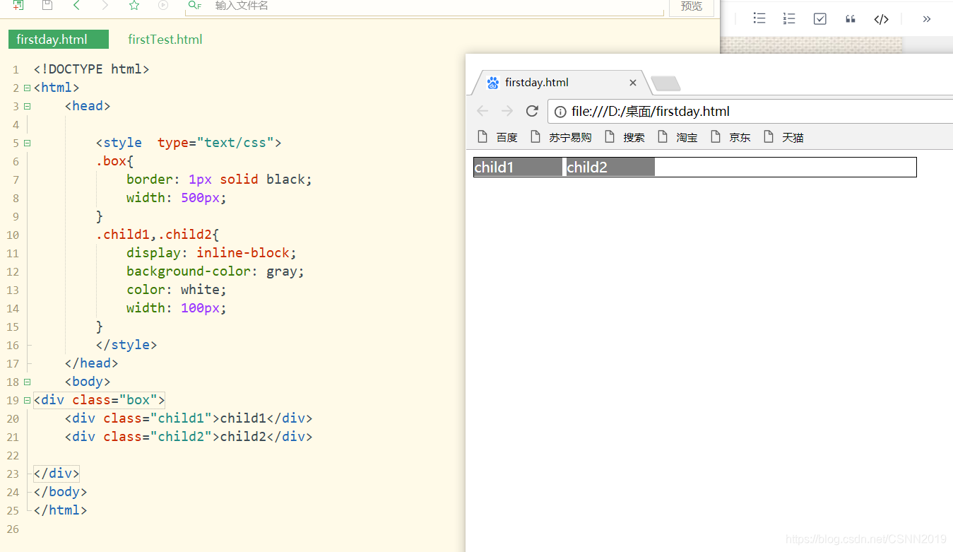
inline-block
在设计水平导航效果时,通常希望多个导航链接处于同一行,即呈现行内元素的特征。同时,还希望设置各个导航链接项的宽度和高度,即同时兼有块级元素的特征。此时,可以设置display属性值为inline-block,该属性值结合了inline与block的一些她点,使得块级元素不再独占一行
在元素的显示上,inline-block与浮动效果相似,但是两者又有着本质的区别。
设置前:
<!DOCTYPE html>
<html>
	<head>

		<style  type="text/css">
		.box{


			border: 1px solid black;
			width: 500px;
		}
		.child1,.child2{


			background-color: gray;
			color: white;
			width: 100px;
		}
		</style>
	</head>
	<body>
<div class="box">
	<div class="child1">child1</div>
	<div class="child2">child2</div>

</div>
</body>
</html>
设置后:
<!DOCTYPE html>
<html>
	<head>

		<style  type="text/css">
		.box{


			border: 1px solid black;
			width: 500px;
		}
		.child1,.child2{


			display: inline-block;
			background-color: gray;
			color: white;
			width: 100px;
		}
		</style>
	</head>
	<body>
<div class="box">
	<div class="child1">child1</div>
	<div class="child2">child2</div>

</div>
</body>
</html>
利用浮动实现child3 child4,对比child1 child2
<!DOCTYPE html>
<html>
	<head>

		<style  type="text/css">
		.box{


			border: 1px solid black;
			width: 500px;
		}
		.child1,.child2{


			display: inline-block;
			background-color: gray;
			color: white;
			width: 100px;
		}
		.child3,.child4{


			float: left;
			background-color: gray;
			color: white;
			width: 100px;
		}
		</style>
	</head>
	<body>
<div class="box">
	<div class="child1">child1</div>
	<div class="child2">child2</div>
</div><br>
<div class="box">
	<div class="child3">child3</div>
	<div class="child4">child4</div>
</div>
</body>
</html>
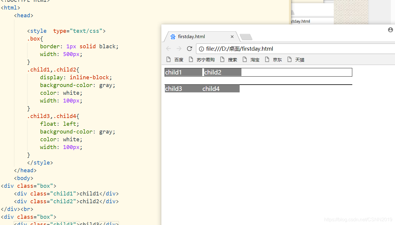
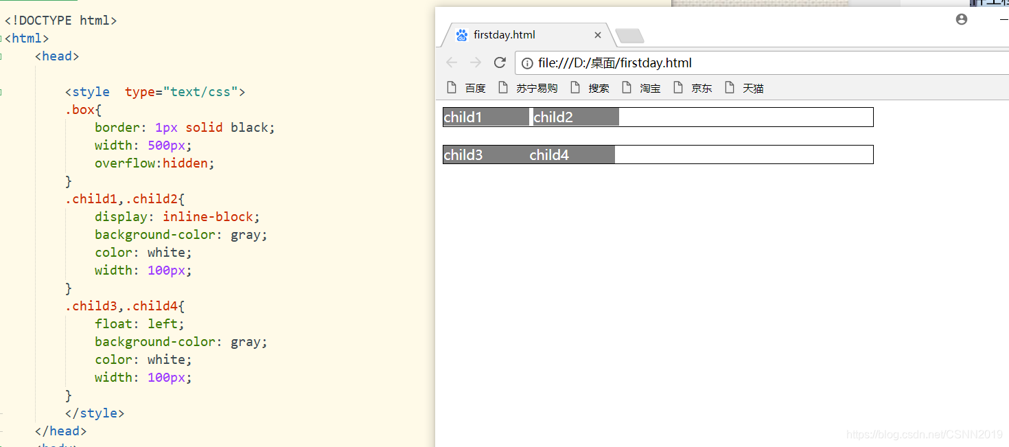
此时父类产生了塌陷,然后在.box中加一行overflow:hidden;
元素的可见性属性
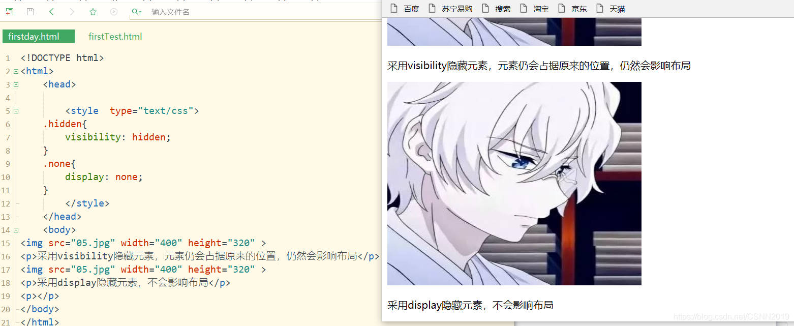
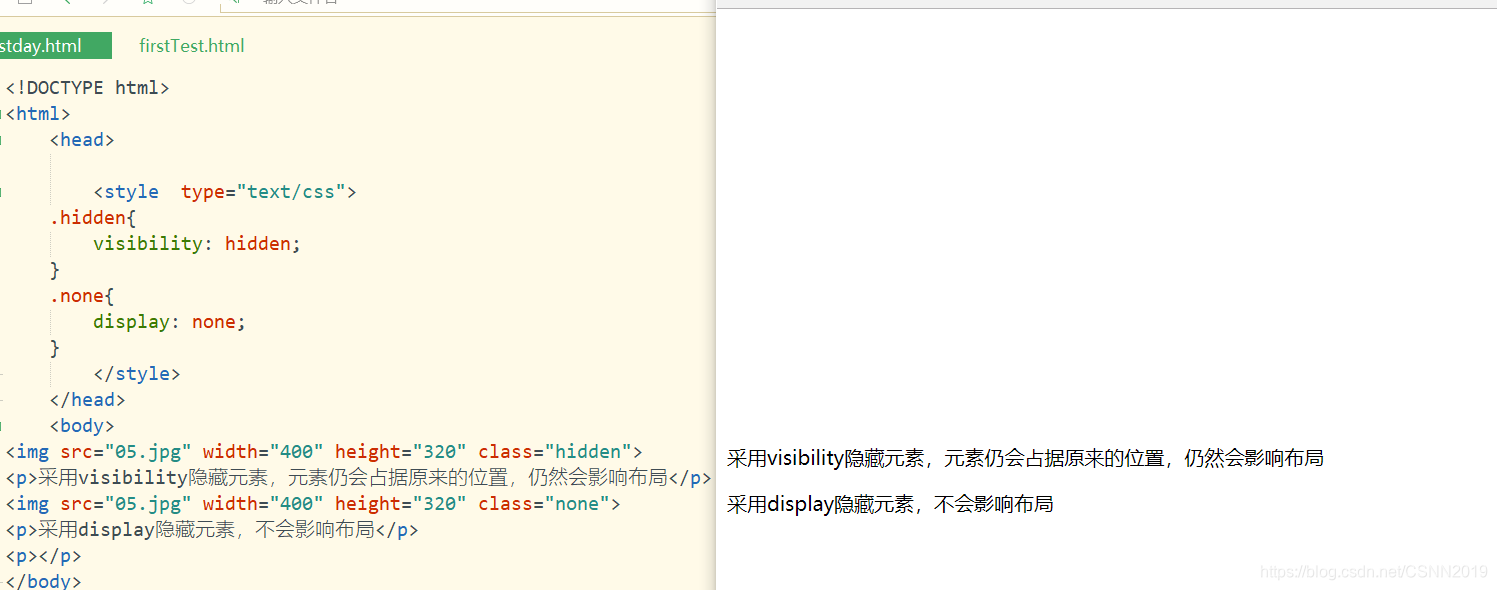
visibility属性用来指定一个元素是否可见。默认属性值为visible,表示元素可见;当属性值为hidden时,元素不可见,注意:元素虽然被隐藏,但仍占据原来所在位置,仍然会影响布局
display:none;设置元素不可见,元素隐藏后,不会影响布局
隐藏前:
<!DOCTYPE html>
<html>
	<head>

		<style  type="text/css">
	.hidden{


		visibility: hidden;
	}
	.none{


		display: none;
	}
		</style>
	</head>
	<body>
<img src="05.jpg" width="400" height="320" >
<p>采用visibility隐藏元素,元素仍会占据原来的位置,仍然会影响布局</p>
<img src="05.jpg" width="400" height="320" >
<p>采用display隐藏元素,不会影响布局</p>
<p></p>
</body>
</html>
隐藏后:
<!DOCTYPE html>
<html>
	<head>

		<style  type="text/css">
	.hidden{


		visibility: hidden;
	}
	.none{


		display: none;
	}
		</style>
	</head>
	<body>
<img src="05.jpg" width="400" height="320" class="hidden" >
<p>采用visibility隐藏元素,元素仍会占据原来的位置,仍然会影响布局</p>
<img src="05.jpg" width="400" height="320" class="none">
<p>采用display隐藏元素,不会影响布局</p>
<p></p>
</body>
</html>
元素的溢出处理属性
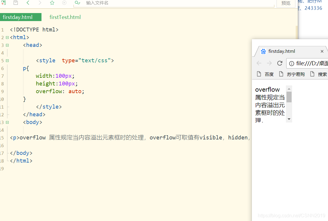
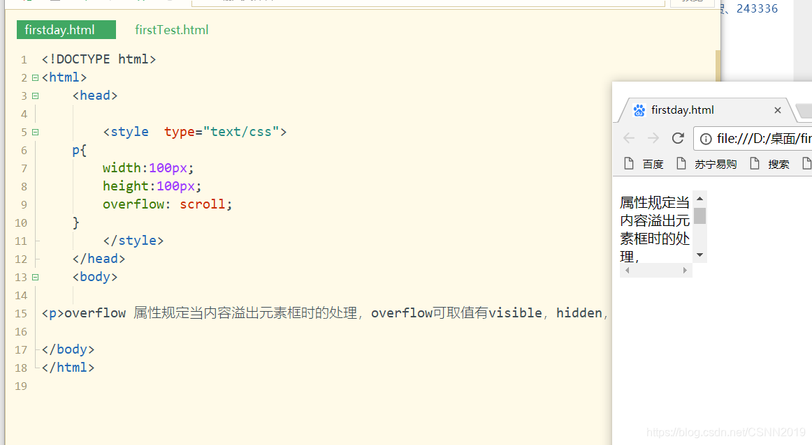
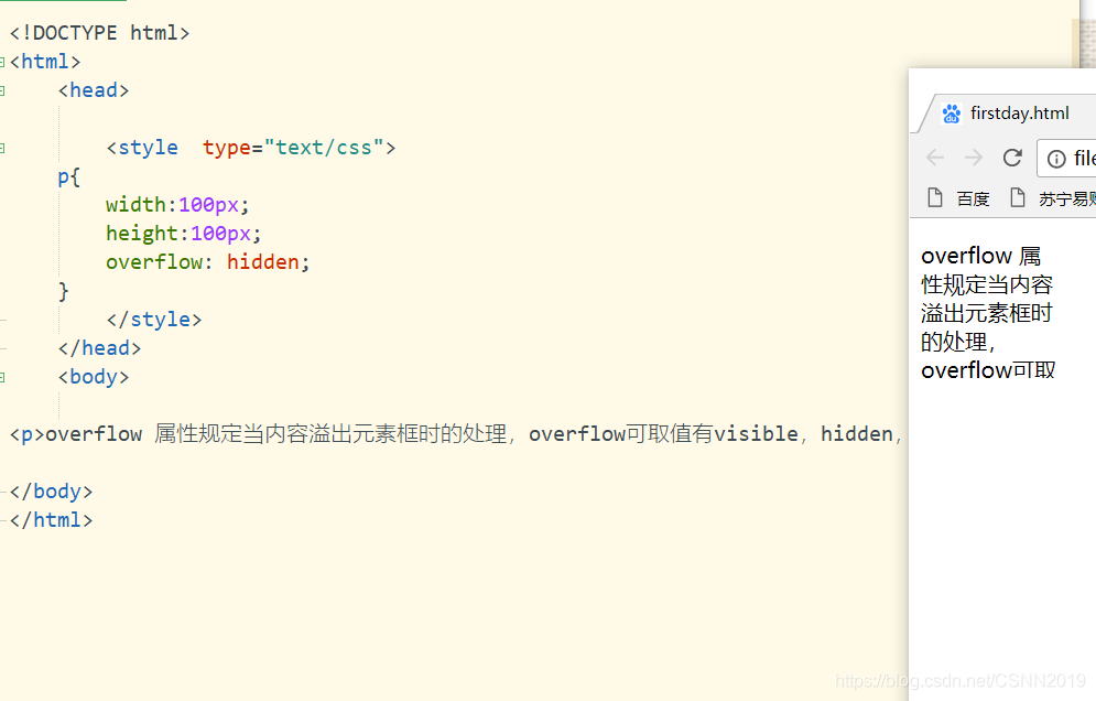
overflow属性规定当内容溢出元素框时的处理
overflow:visible|hidden|scroll|auto
| 值 | 描述 |
|---|---|
| visible | 默认值 |
| hidden | 内容会被修剪,并且其余内容是不可见的 |
| scroll | 内容会被修建,但是浏览器会显示滚动条以便查看其余的内容 |
| auto | 如果内容被修剪,则浏览器会显示滚动条以便查看其余的内容 |
| inherit | 规定应该从父元素继承overflow属性的值 |
scroll
hidden
auto