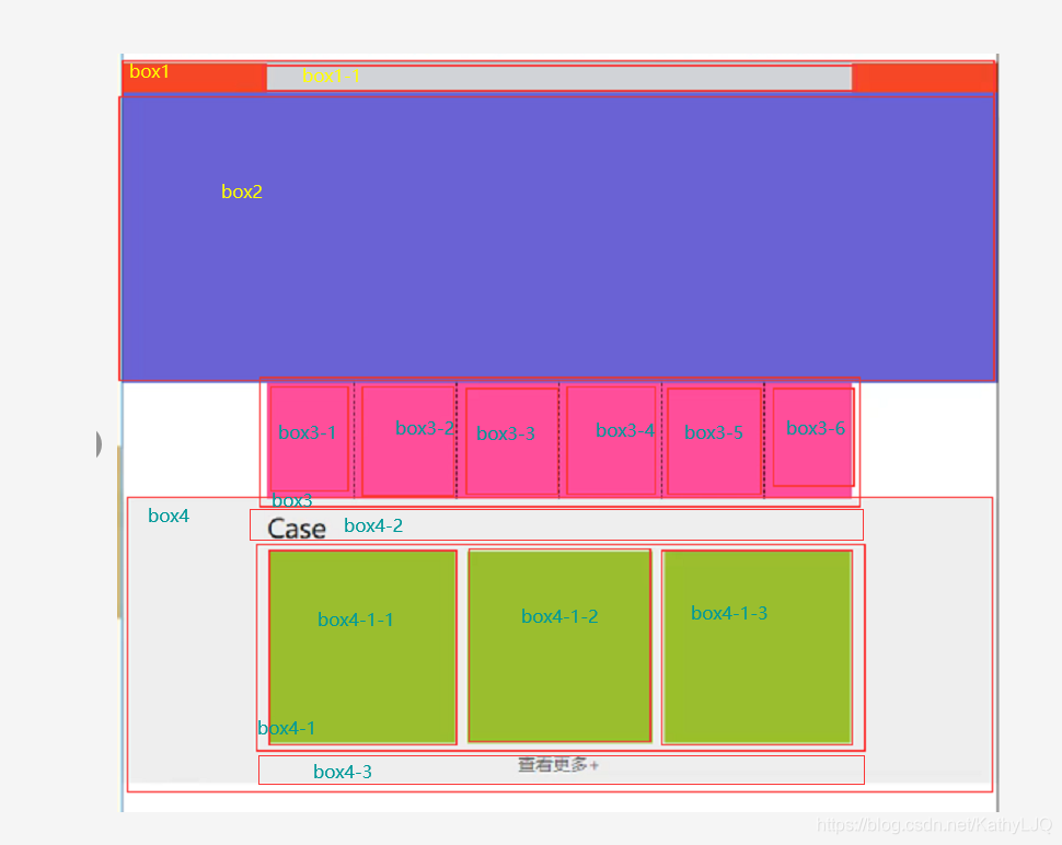
案例1-使用div元素构成简单网页布局
案例图:
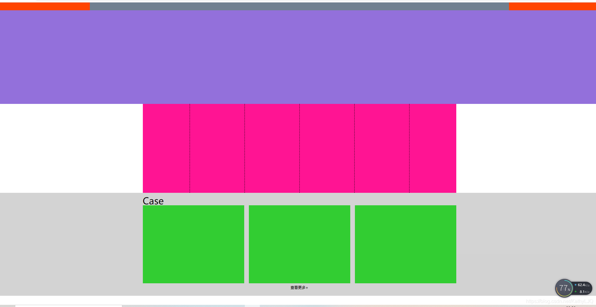
作成图:
<!DOCTYPE html>
<html>
	<head>
		<meta charset="utf-8">
		<title></title>
		<style type="text/css">
			*{


				margin: 0;padding: 0;
			}

			.head{


				height: 25px;background-color:orangered ;
			}
			.title{


				width: 70%;height: 25px;background-color: #708090;margin: auto;
			}

			.background_img{


				height:300px;background-color: mediumpurple;
			}
			.menu{


				width:1005px;height:285px;background-color: deeppink;margin: auto;
			}
			.menu .item{


				width:125px;height:250px; float: left;
				padding-left: 25px;padding-right: 25px;padding-top: 25px;padding-bottom:10px ;
				border-right: dashed 1px black;
			}
			.menu .item.first{


				padding-left: 0;
			}
			.menu .item.last{


				border-right: none;
				padding-right: 0;
			}
			.outter{


				height: 330px;background-color: #D3D3D3;
			}
			.case{


				width: 1005px;height:30px;text-align: left;font-size: 30px;margin: auto;padding-top: 5px;padding-bottom: 5px;
			}
			.case_wrapper{


				width: 1005px;height: 250px;background-color: white;margin: auto;
			}
			.case_wrapper .case_box{


				width:325px;height: 250px;background-color: limegreen;border-right: solid 15px #D3D3D3;float: left;
			}
			.case_wrapper .case_box.last{


				border-right: 0;
			}
			.find_more{


				width: 1005px;height:5px;text-align: center;font-size: 5px;margin: auto;
				padding-top: 5px;padding-bottom: 5px;
				}

		</style>
		<!--margin:auto 可让元素处于盒子中间-->
		<!--.menu .item计算公式:总宽度(1005px)=(每个元素宽度(125px)+每个元素padding(25*2px)+边框1px)*6-两边元素的padding(left25px+right25px)+右侧元素去掉的边框1px-->
	</head>
	<body>
		<div class="head">
			<div class="title">

			</div>

		</div>
		<div class="background_img">

		</div>
		<div class="menu">
			<div class="item first"></div>
			<div class="item"></div>
			<div class="item"></div>
			<div class="item"></div>
			<div class="item"></div>
			<div class="item last"></div>
		</div>
		<div class="outter">
			<div class="case">
				Case
			</div>

			<div class="case_wrapper">
				<div class="case_box"></div>
				<div class="case_box"></div>
				<div class="case_box last"></div>

			</div>
			<div class="find_more">
				查看更多+
			</div>

		</div>

	</body>
</html>