1.CSS基础提示框(Tooltip)
HTML) 使用容器元素 (like <div>) 并添加 "tooltip" 类。在鼠标移动到 <div> 上时显示提示信息。
提示文本放在内联元素上(如 <span>) 并使用class="tooltiptext"。
CSS)tooltip 类使用 position:relative, 提示文本需要设置定位值 position:absolute。 注意: 接下来的实例会显示更多的定位效果。
tooltiptext 类用于实际的提示文本。模式是隐藏的,在鼠标移动到元素显示 。设置了一些宽度、背景色、字体色等样式。
CSS3 border-radius 属性用于为提示框添加圆角。
:hover 选择器用于在鼠标移动到到指定元素 <div> 上时显示的提示。
<!DOCTYPE html>
<html lang="en">
	<head>
		<meta charset="utf-8" />
		<title>CSS简单学习</title>
		<style type="text/css">
			.tooltip {
				position: relative;
				display: inline-block;
				border-bottom: 1px dotted black;
			}
			.tooltip .tooltiptext {
				visibility: hidden;
				width: 120px;
				padding: 5px 0;
				border-radius: 6px;
				text-align: center;
				background-color: black;
				color: white;

				/* 定位,提示信息显示在右侧 */
				position: absolute;
				z-index: 1;
				top: -5px;
				left: 105%;
				/* 定位,提示信息显示在左侧
				position: absolute;
				z-index: 1;
				top: -5px;
				right: 105%; */
				/* 定位,提示信息显示在头部
				position: absolute;
				z-index: 1;
				bottom: 100%;
				left: 50%;
				margin-left: -60px; */
				/* 定位,提示信息显示在底部
				position: absolute;
				z-index: 1;
				top: 100%;
				left: 50%;
				margin-left: -60px; */
			}
			.tooltip:hover .tooltiptext {
				visibility: visible;
			}
		</style>
	</head>

	<body>
		<div class="tooltip">
			鼠标移动到这里
			<span class="tooltiptext">提示文本</span>
		</div>
	</body>
</html>
2.CSS提示工具中添加箭头
我们可以用CSS 伪元素 ::after 及 content 属性为提示工具创建一个小箭头标志,箭头是由边框组成的,但组合起来后提示工具像个语音信息框。
在提示工具内定位箭头: top: 100% , 箭头将显示在提示工具的底部。left: 50% 用于居中对齐箭头。
注意:border-width 属性指定了箭头的大小。如果你修改它,也要修改 margin-left 值。这样箭头在能居中显示。
border-color 用于将内容转换为箭头。设置顶部边框为黑色,其他是透明的。如果设置了其他的也是黑色则会显示为一个黑色的四边形。
<!DOCTYPE html>
<html lang="en">
	<head>
		<meta charset="utf-8" />
		<title>CSS简单学习</title>
		<style type="text/css">
			.tooltip {
				position: relative;
				display: inline-block;
				border-bottom: 1px dotted black;
			}
			.tooltip .tooltiptext {
				visibility: hidden;
				width: 120px;
				padding: 5px 0;
				border-radius: 6px;
				text-align: center;
				background-color: black;
				color: white;
				/* 顶部提示框/底部箭头 */
				position: absolute;
				z-index: 1;
				bottom: 150%;
				left: 50%;
				margin-left: -60px;
				/* 底部提示框/顶部箭头
				position: absolute;
				z-index: 1;
				top: 150%;
				left: 50%;
				margin-left: -60px; */
				/* 右侧提示框/左侧箭头
				position: absolute;
				z-index: 1;
				top: -5px;
				left: 110%; */
				/* 左侧提示框/右侧箭头
				position: absolute;
				z-index: 1;
				top: -5px;
				right: 110%; */
			}
			.tooltip .tooltiptext::after {
			    content: "";
			    position: absolute;
				/* 顶部提示框/底部箭头 */
			    top: 100%;
				left: 50%;
				margin-left: -5px;
				/* 底部提示框/顶部箭头
				bottom: 100%;
			    left: 50%;
			    margin-left: -5px; */
				/* 右侧提示框/左侧箭头
				top: 50%;
				right: 100%;
				margin-top: -5px; */
				/* 左侧提示框/右侧箭头
				top: 50%;
				left: 100%;
				margin-top: -5px; */
			    border-width: 5px;
			    border-style: solid;
				/* 顶部提示框/底部箭头 */
			    border-color: black transparent transparent transparent;
				/* 底部提示框/顶部箭头
				border-color: transparent transparent black transparent; */
				/* 右侧提示框/左侧箭头
				border-color: transparent black transparent transparent; */
				/* 左侧提示框/右侧箭头
				border-color: transparent transparent transparent black; */
			}
			.tooltip:hover .tooltiptext {
			    visibility: visible;
			}
		</style>
	</head>

	<body>
		<h2>顶部提示框/底部箭头</h2>
		<div class="tooltip">鼠标移动到这里
		  <span class="tooltiptext">提示文本</span>
		</div>
	</body>
</html>
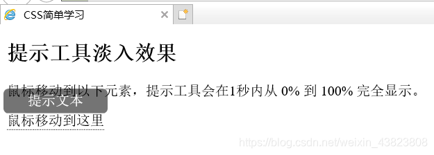
3.CSS提示工具的淡入效果
可以使用 CSS3 transition 属性及 opacity 属性来实现提示工具的淡入效果。
<!DOCTYPE html>
<html lang="en">
	<head>
		<meta charset="utf-8" />
		<title>CSS简单学习</title>
		<style type="text/css">
			.tooltip {
				position: relative;
				display: inline-block;
				border-bottom: 1px dotted black;
			}
			.tooltip .tooltiptext {
				visibility: hidden;
				width: 120px;
				padding: 5px 0;
				border-radius: 6px;
				text-align: center;
				background-color: black;
				color: white;
				position: absolute;
				z-index: 1;
				bottom: 100%;
				left: 50%;
				margin-left: -60px;

				/* 淡入 1秒内从 0% 到 100% 显示: */
				opacity: 0;
				transition: opacity 1s;
			}
			.tooltip:hover .tooltiptext {
				visibility: visible;
				opacity: 1;
			}
		</style>
	</head>

	<body>
		<h2>提示工具淡入效果</h2>
		<p>鼠标移动到以下元素,提示工具会在1秒内从 0% 到 100% 完全显示。</p>
		<div class="tooltip">鼠标移动到这里
		  <span class="tooltiptext">提示文本</span>
		</div>
	</body>
</html>