文章目录
python在不同的工具下的数据可视化,有些不同的地方。但是数据构建原理是相同的。这一部分的数据构建可以参考之前的方法。
绘图方式:
pyplot:经典高层封装(以下为pyplot的方式)
pylab:将Matplotlib和Numpy合并的模块,模拟Matlab的编程环境
面向对象(Object-Oriented):更为底层和基础的方式
// An highlighted block
import numpy as np
import matplotlib.pyplot as plt
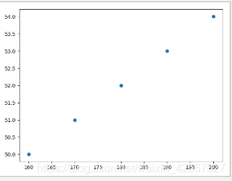
散点图
两个变量之间的相关性
绘图
// An highlighted block
height=[160,170,180,190,200]
weight=[50,51,52,53,54]
plt.scatter(height,weight)
plt.show()
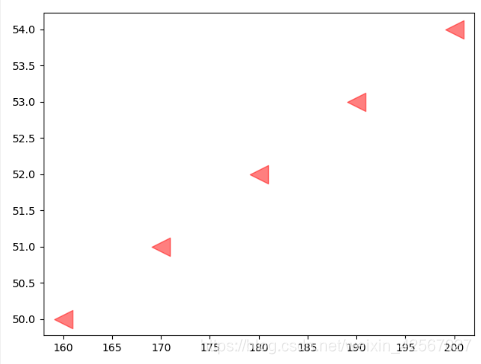
外观调整
c,点的大小:s(面积),透明度:alpha,点形状:marker
// An highlighted block
height=[160,170,180,190,200]
weight=[50,51,52,53,54]
plt.scatter(height,weight,s=300,c='r',marker='<',alpha=0.5)
plt.show( )
折线图
观察数据随时间变化的趋势
绘图
// An highlighted block
x=np.linspace(-10,10,5)
y=x**2
plt.plot(x,y)
plt.show()

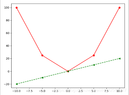
外观调整
同时实现两条线的绘制
线性:linestyle 颜色:color 点形状:marker
// An highlighted block
x=np.linspace(-10,10,5)
y=x**2
y1=x*2
plt.plot(x,y,linestyle='-',c='r',marker='o')
plt.plot(x,y1,linestyle='--',c='g',marker='<')
plt.show()
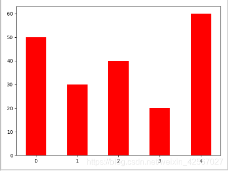
条形图
比较多个项目分类的数据大小,利用较小的数据集进行分析
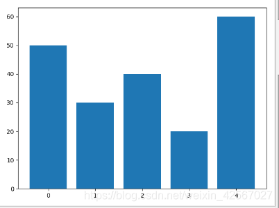
绘图
// An highlighted block
y=[50,30,40,20,60]
index=np.arange(5)
pl=plt.bar(x=index,height=y)
plt.show()
外观调整
带宽 width 颜色 color
// An highlighted block
y=[50,30,40,20,60]
index=np.arange(5)
pl=plt.bar(x=index,height=y,width=0.5,color='r')
plt.show()
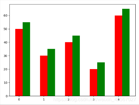
两个柱状图的绘制
// An highlighted block
y1=[50,30,40,20,60]
y2=[55,35,45,25,65]
index=np.arange(5)
p1=plt.bar(x=index,height=y1,width=0.3,color='r')
p2=plt.bar(x=index+0.3,height=y2,width=0.3,color='g')
plt.show()
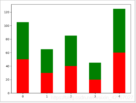
迭加
// An highlighted block
y1=[50,30,40,20,60]
y2=[55,35,45,25,65]
index=np.arange(5)
p1=plt.bar(x=index,height=y1,width=0.5,color='r')
p2=plt.bar(x=index,height=y2,width=0.5,color='g',bottom=y1)
plt.show()
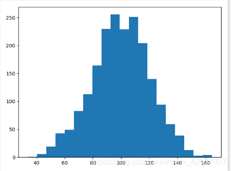
直方图
数据的分布情况
绘图
// An highlighted block
mu=100
sigma=20
x=mu+sigma*np.random.randn(2000)
#normed 标准化
plt.hist(x,bins=20)
plt.show()
外观调整
normed 标准化 color 颜色
// An highlighted block
mu=100
sigma=20
x=mu+sigma*np.random.randn(2000)
#normed 标准化
plt.hist(x,bins=20,color='green',normed=True)
plt.show()

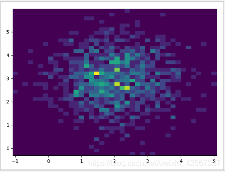
双变量直方图
// An highlighted block
x=np.random.randn(1000)+2
y=np.random.randn(1000)+3
plt.hist2d(x,y,bins=40)
plt.show()
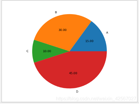
饼图
饼图中的数据点显示为整个饼图的百分比
绘图
// An highlighted block
labels='A','B','C','D'
fracs=[15,30,10,45]
plt.axes(aspect=1)
plt.pie(x=fracs,labels=labels,autopct='%0.2f')
plt.show()
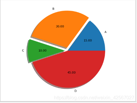
突出显示
突出显示图形中的‘B’,‘C’,explode控制图形到圆心的距离,shadow增加阴影
// An highlighted block
labels='A','B','C','D'
fracs=[15,30,10,45]
explode=[0,0.08,0.08,0]
plt.axes(aspect=1)
plt.pie(x=fracs,labels=labels,autopct='%0.2f',explode=explode,shadow=True)
plt.show()
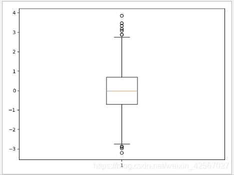
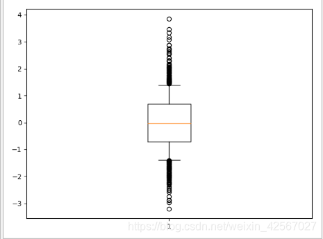
箱型图
显示数据的分散情况
由上边缘、上四分位数、中位数、下四位数、下边缘、异常值组成
绘图
// An highlighted block
np.random.seed(100)
data=np.random.normal(size=1000,loc=0,scale=1)
plt.boxplot(data)
plt.show()
外观调整
异常值点的形状,whis 虚值的长度:调整异常值的长度
// An highlighted block
np.random.seed(100)
data=np.random.normal(size=1000,loc=0,scale=1)
plt.boxplot(data,sym='o',whis=0.5)
plt.show()
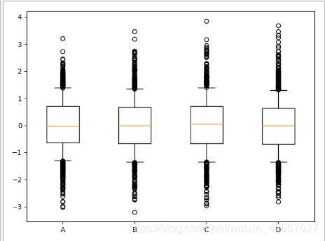
同时绘制多组数据
// An highlighted block
np.random.seed(100)
data=np.random.normal(size=(1000,4),loc=0,scale=1)
labels=['A','B','C','D']
plt.boxplot(data,labels=labels,sym='o',whis=0.5)
plt.show()
样式字符串
将颜色、点型、线型写成一个字符串,在绘图时很方便。
// An highlighted block
x=np.linspace(-10,10,5)
y=x**2
y1=2*x
plt.plot(x,y,'cx--')
plt.plot(x,y1,'mo:')
plt.show()
