css圣杯布局和双飞翼布局(前端面试重点)
1.圣杯布局:左右固定,中间自适应(中间先解析)
原理:1.大盒子里面有三个小盒子,左右两边盒子固定,中间的盒子宽度为100%,中间一定要先解析,放在最上面。
2.三个小盒子加浮动,左侧小盒子设置margin-left:-100%; 右侧小盒子设置margin-left:-自身宽度
3.大盒子设置左右的padding,左右两个小盒子用相对定位定位到两侧位置
<!DOCTYPE html>
<html lang="en">

<head>
    <meta charset="UTF-8">
    <meta name="viewport" content="width=device-width, initial-scale=1.0">
    <title>Document</title>
    <style>
        * {
            margin: 0;
            padding: 0;
        }
        /* 清除浮动 */

        .clearfix:after {
            display: block;
            clear: both;
            content: '';
        }

        .wrap {
            padding: 0 200px 0 300px;
        }

        .center {
            float: left;
            width: 100%;
            height: 200px;
            background-color: gold;
        }

        .left {
            position: relative;
            float: left;
            width: 300px;
            height: 200px;
            background-color: red;
            margin-left: -100%;
            left: -300px;
        }

        .right {
            position: relative;
            float: left;
            width: 200px;
            height: 200px;
            background-color: blue;
            margin-left: -200px;
            right: -200px;
        }
    </style>
</head>

<body>
    <div class="wrap clearfix">
        <div class="center">center</div>
        <div class="left">left</div>
        <div class="right">right</div>
    </div>
</body>

</html>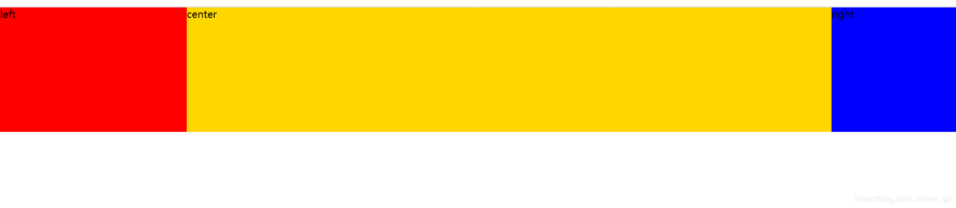
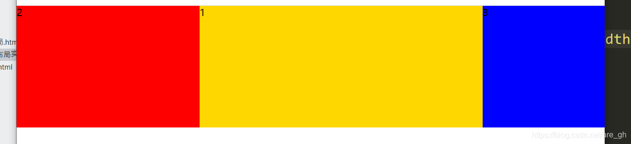
2.双飞翼布局:左右固定,中间自适应(中间先解析)
原理:1.大盒子里面有三个小盒子,左右两边盒子固定,中间的盒子宽度为100%,中间一定要先解析,放在最上面。
2.三个小盒子加浮动,左侧小盒子设置margin-left:-100%; 右侧小盒子设置margin-left:-自身宽度
3.中间内部嵌套一个子盒子,加左右外边距,
缺点:相对于圣杯布局。增加了结构代码。
<!DOCTYPE html>
<html lang="en">

<head>
    <meta charset="UTF-8">
    <meta name="viewport" content="width=device-width, initial-scale=1.0">
    <title>Document</title>
    <style>
        * {
            margin: 0;
            padding: 0;
        }

        .clearfix:after {
            display: block;
            clear: both;
            content: '';
        }

        .center {
            float: left;
            width: 100%;
            height: 200px;
            background-color: gold;
        }

        .left {
            float: left;
            width: 300px;
            height: 200px;
            background-color: red;
            margin-left: -100%;
        }

        .right {
            float: left;
            width: 200px;
            height: 200px;
            background-color: blue;
            margin-left: -200px;
        }

        .zi {
            margin: 0 200px 0 300px;
        }
    </style>
</head>

<body>
    <div class="wrap">
        <div class="center">
            <div class="zi">1</div>
        </div>
        <div class="left">2</div>
        <div class="right">3</div>
    </div>
</body>

</html>