
名词解释
AliOS Things: 阿里云智能IoT团队自研的物联网操作系统,目前已获得国家
HaaS:全称是Hardware as a Service,阿里云智能IoT团队基于AliOS Things系统推出的硬件即服务
HaaS UI:全称是Hardware as a Service User Interface,是源自AliOS Things操作系统上的一套应用&图形解决方案,支持C/C++和 JS两种开发语言
1、HaaS UI简介
HaaS UI是在AliOS Things操作系统上搭建的带屏应用框架,支持使用前端JS语言开发UI。HaaS UI的前端应用框架是基于Vue框架(V2.6版本)扩展的,利用前端技术在一定的限制子集(具体支持的基础组件和样式更详细的内容可参考后续文章)内来搭建页面。
前面文章已介绍过HaaS UI的开发环境搭建,本文主要介绍一下如何使用Vue以及一些基础组件来开发一个简单的页面。
2、Vue框架简介
Vue (读音 /vjuː/,类似于 view) 是一套用于构建用户界面的渐进式框架。与其它大型框架不同的是,Vue 被设计为可以自底向上逐层应用。Vue 的核心库只关注视图层,不仅易于上手,还便于与第三方库或既有项目整合。另一方面,当与现代化的工具链以及各种支持类库结合使用时,Vue 也完全能够为复杂的应用提供驱动。
也可以参考查阅Vue官网更详细的介绍:https://cn.vuejs.org/
入门:https://www.runoob.com/vue2/vue-tutorial.html
3、内置基础组件
HaaS UI框架已经内置支持的基础组件包括以下这些:
| 组件 |
描述 |
| <scroller> |
页面滚动组件 |
| <div> |
通用容器通用容器 |
| <text> |
文本组件 |
| <image> |
图片组件 |
| <slider> |
轮播组件 |
| <input> |
输入框组件 |
| <seekbar> |
用于滑动进度条的组件 |
| <canvas> |
画布组件 |
| <modal> |
浮窗组件 |
相关组件的详细介绍大家可以扫描文章最后的二维码进群咨询,下面就看一下如何基于这些基础组件搭建一个页面。
4、使用Vue开发一个HaaS UI页面
Vue的核心是一个允许采用简洁的模板语法来声明式地将数据渲染进 DOM 的系统。一个Vue组件或页面的基本结构,一般分为三个部分:HTML模板、js脚本和样式。按照这样的结构,先来搭第一个HelloWorld页面。
4.1、第一个页面
<template>
<!-- HTML模板 -->
<div><text class="text">{
{message}}</text></div>
</template>
<script>
// js脚本
export default {
name: "demo",
data() {
return {
message: 'hello world'
};
}
}
</script>
<style scoped>
/* 样式 */
.text {
font-size: 50px;
color: red;
}
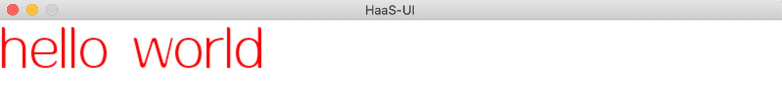
</style>搭建完用模拟器运行效果如下:
这样我们已经成功搭建了第一个HaaS UI页面。现在数据和 DOM 已经被建立了关联,所有东西都是响应式的。那如何确认响应式呢?我们只需在js里修改一下this.message,就能看到页面上相应的更新了。
4.2、响应式更新
<template>
  <!-- HTML模板 -->
    <div><text @click="click" class="text">{

   {message}}</text></div>
</template>
<script>
// js脚本
export default {
    name: "demo",
  data() {
    return {
      message: 'hello world'
    };
  },
  methods: {
    click() {
      // 修改this.message,界面自动更新
      this.message = 'text clicked.'
    }
  }
}
</script>
<style scoped>
/* 样式 */
.text {
  font-size: 50px;
  color: red;
}
</style>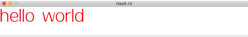
4.3、进阶
第一个页面搭建完成了,我们尝试用基础组件搭建更丰富的UI,以下的例子基本囊括了HaaS UI内置的基础组件。另外,如何基于基础组件扩展定制化的前端组件,会有后续文章再介绍。
<template>
<scroller>
<div style="padding:30px">
<div class="list-item">
<text class="list-item-title">Flex布局</text>
<div class="flex-container">
<div v-for="i of 7" class="flex-container-item" :key="i">
<text>{
{i}}</text>
</div>
</div>
</div>
<div class="list-item">
<text class="list-item-title">image组件</text>
<div style="flex-direction: row;">
<image style="width:100px;height:100px; margin:3px"
src="https://gd2.alicdn.com/bao/uploaded/i2/T14H1LFwBcXXXXXXXX_!!0-item_pic.jpg"/>
<image style="width:100px;height:100px; margin-right:5px"
src="https://gd1.alicdn.com/bao/uploaded/i1/TB1PXJCJFXXXXciXFXXXXXXXXXX_!!0-item_pic.jpg"/>
<image style="width:100px;height:100px; margin-right:5px"
src="https://gd3.alicdn.com/bao/uploaded/i3/TB1x6hYLXXXXXazXVXXXXXXXXXX_!!0-item_pic.jpg"/>
</div>
</div>
<div class="list-item">
<text class="list-item-title">slider组件</text>
<slider style="width:400px;height:150px" showIndicators="true" infinite="true">
<div v-for="i of 3" :key="i" :style="{'background-color':RGBS[(i-1)%3],'align-items':'center'}">
<text>{
{i}}</text>
</div>
</slider>
</div>
<div class="list-item">
<text class="list-item-title">seekbar组件</text>
<seekbar style="width: 300px;" handleColor="#108ee9"
handleInnerColor="#fff" handleSize="20" trackSize="10" />
</div>
<div class="list-item">
<div style="flex-direction: row;">
<text class="list-item-title">canvas组件</text>
<div class="button" @click="drawCanvas">
<text style="font-size:16px;">点我画圆</text>
</div>
</div>
<canvas ref="canvas" width="300" height="300" style="background-color:#ccc;margin-top:5px;"/>
</div>
<div class="list-item">
<text class="list-item-title" @click="toggleModal">Modal组件(点我弹出)</text>
<Modal ref="modal" :system="true">
<div class="modal-content">
<text style="text-align:center;">this is a system modal.</text>
<div class="button" @click="toggleModal"><text style="font-size:16px;">close</text></div>
</div>
</Modal>
</div>
<div class="list-item">
<text class="list-item-title">Buttons</text>
<div style="flex-direction: row;">
<div class="button" @click="buttonClick(1)"><text style="font-size:16px;">Button1</text></div>
<div class="button" @click="buttonClick(2)"><text style="font-size:16px;">Button2</text></div>
<div class="button" @click="buttonClick(3)"><text style="font-size:16px;">Button3</text></div>
</div>
</div>
</div>
</scroller>
</template>
<script>
import Modal from "../packages/modal/index.vue";
export default {
components: { Modal },
data(){
return {
RGBS: ['#f00','#0f0','#00f'],
};
},
mounted() {
this.drawCanvas();
},
methods: {
buttonClick(i) {
let modal = $falcon.jsapi.modal;
modal && modal.toast({
content: `Button${i} clicked.`,
duration: 1000,
});
},
drawCanvas() {
let ctx = createCanvasContext(this.$refs.canvas);
ctx.fillStyle = this.RGBS[Math.floor(Math.random()*3)];
ctx.beginPath();
ctx.arc(Math.floor(Math.random()*300),Math.floor(Math.random()*300),
Math.floor((Math.random()*20)+10),0,3.15*2);
ctx.fill();
},
toggleModal() {
this.$refs.modal.toggle();
},
},
}
</script>
<style scoped>
.list-item {
flex-direction: column;
margin-bottom: 30px;
}
.list-item-title {
font-size: 30px;
color: black;
margin-bottom: 5px;
}
.flex-container {
flex-direction: row;
flex-wrap: wrap;
align-items: center;
justify-content: center;
background-color: #888;
width: 600px;
}
.flex-container-item {
width: 100px;
height: 100px;
background-color: red;
margin: 5px;
align-items: center;
justify-content: center;
}
.button {
margin-right: 20px;
padding: 10px;
background-color: #888;
border-radius: 10px;
align-items: center;
justify-content: center;
}
.button:active {
background-color: #aaa;
}
.modal-content {
width: 290px;
height: 150px;
padding: 10px;
background-color: white;
border-radius: 20px;
align-items: center;
justify-content: center;
}
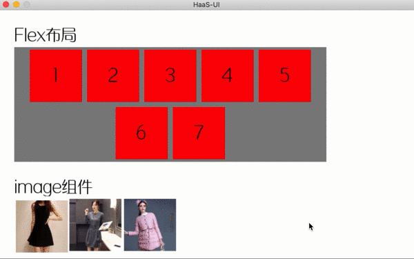
</style>以上页面基本囊括了HaaS UI内置的基础组件,在模拟器上的效果如下:
5、开发者技术支持
如需更多技术支持,可加入钉钉开发者群,或者关注微信公众号
更多技术与解决方案介绍,请访问阿里云AIoT首页https://iot.aliyun.com/