阅读目录

Bootstrap是一个简洁、直观、强悍的前端开发框架,让web开发更迅速、简单。是全球最流行的前端框架,用于构建响应式、移动设备优先的 WEB 站点。
入门Bootstrap4
布局
Container
Container(容器)是Bootstrap中最基本的布局元素,在使用bootstrap的默认网格系统时,容器是必需的。容器用于在其中容纳,填充和使内容居中。可以嵌套容器,但是大多数布局不需要嵌套容器。
Bootstrap带有三个不同的容器:
- .container: 它max-width在每个响应断点处设置一个
- .container-fluid: 这是width: 100%所有断点
- .container-{breakpoint}: width: 100%直到指定的断点为止
下表说明了每个容器max-width与原始容器.container以及.container-fluid各个断点之间的比较:
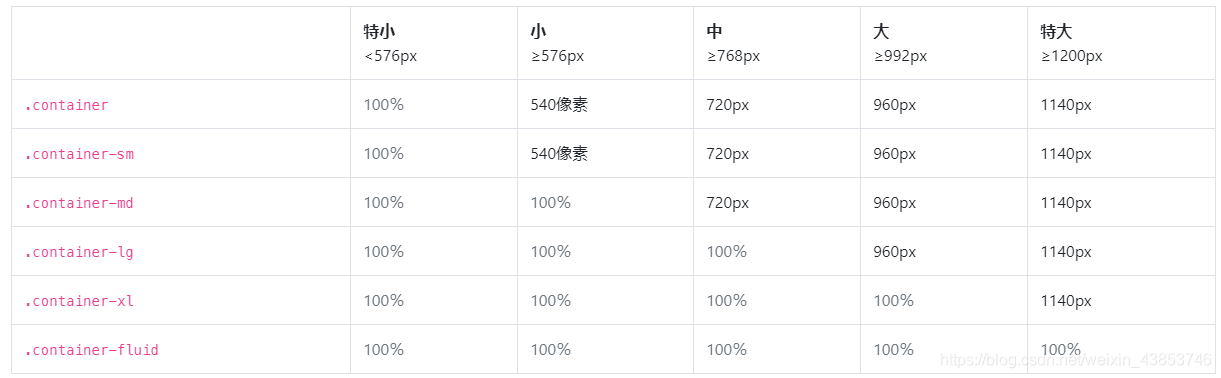
固定宽度的容器:
与bootstrap3一样,默认.container类是响应式,固定宽度的容器,这意味着它max-width在每个断点处都会更改。
<div class="container">
  <!-- 内容 -->
</div>
container-fluid:
使用.container-fluid了全宽的容器,跨越视口的整个宽度。
<div class="container-fluid">
  ...
</div>
响应 & 反应灵敏
响应容器是Bootstrap v4.4中的新增功能。它们允许您指定100%宽的类,直到达到指定的断点为止,此后,我们max-width对每个较高的断点应用。例如:.container-sm100%宽开始直到sm到达断点,在那里将扩大同md,lg和xl。
<div class="container-sm">100% 直到达到指定sm断点为止</div>
<div class="container-md">100% 直到达到指定md断点为止</div>
<div class="container-lg">100% 直到达到指定lg断点为止</div>
<div class="container-xl">100% 直到达到指定xl断点为止</div>
响应断点
由于Bootstrap首先开发为移动设备,其使用了少数媒体查询来为布局和界面创建合理的断点。这些断点主要基于最小视口宽度,并允许我们随着视口的变化按比例放大元素。
Bootstrap主要在源Sass文件中使用以下媒体查询范围(或断点)作为布局,网格系统和组件。
//超小设备  (手机 phones, 576px 起)
@media (min-width: 576px) {

     ... }

//小型设备  (平板电脑, 768px 起)
@media (min-width: 768px) {

     ... }

//中型设备  (台式电脑, 992px and 起)
@media (min-width: 992px) {

     ... }

//大型设备  (大台式电脑, 1200px 起)
@media (min-width: 1200px) {

     ... }
内容
页面默认值
在<html>和<body>元素更新,以提供更好的页面宽度默认值:
- 将box-sizing在全球范围内的每一个元素,包括设置*::before和*::after到border-box。这样可以确保不会由于填充或边框而超出元素声明的宽度。
- 没有
font-size在上声明任何基础<html>,而是16px假定的基础(浏览器默认设置)。font-size: 1rem在应用<body>,同时尊重用户的喜好,并确保一个更方便的方式通过媒体查询,方便响应式缩放。 - 该
<body>还设置一个全球性的font-family,line-height和text-align。稍后,某些表单元素会继承此格式,以防止字体不一致。 - 为了安全起见,
<body>已声明了background-color,默认为#fff。
字体
默认的Web字体(Helvetica Neue,Helvetica和Arial)已删除到Bootstrap 4中,并替换为“本机字体堆栈”,以在每个设备和OS上实现最佳文本渲染。
$font-family-sans-serif:
  // Safari for macOS and iOS (San Francisco)
  -apple-system,
  // Chrome < 56 for macOS (San Francisco)
  BlinkMacSystemFont,
  // Windows
  "Segoe UI",
  // Android
  Roboto,
  // Basic web fallback
  "Helvetica Neue", Arial,
  // Linux
  "Noto Sans",
  // Sans serif fallback
  sans-serif,
  // Emoji fonts
  "Apple Color Emoji", "Segoe UI Emoji", "Segoe UI Symbol", "Noto Color Emoji" !default;
这font-family会应用于,<body>并在整个Bootstrap中自动全局继承。要切换全局font-family,请更新$font-family-base并重新编译Bootstrap。
标题和段落
将所有标题元素(例如<h1>--<p>)重置为margin-top删除。argin-bottom: .5rem添加了标题和段落,margin-bottom: 1rem以方便分隔。

列表
- 所有列表
<ul>,<ol>和<dl>都已删除margin-top并且删除margin-bottom: 1rem。嵌套列表没有margin-bottom。 - 为了使样式更简单,层次结构清晰和间距更好,描述列表已更新margin。
<dd>重设margin-left到0和添加margin-bottom: .5rem。<dt>为粗体。
预格式化文字
<pre>重置该元素以删除其元素并为其margin-top使用rem单位argin-bottom。
.example-element {


  margin-bottom:1rem;
}
Tables表格
表格已针对样式<caption>进行了略微调整,并折叠了边框,并确保整体一致text-align。
//表格示例
Table heading	Table heading	Table heading	Table heading
Table cell	    Table cell	    Table cell	    Table cell
Table cell  	Table cell	    Table cell  	Table cell
Table cell	    Table cell	    Table cell	    Table cell
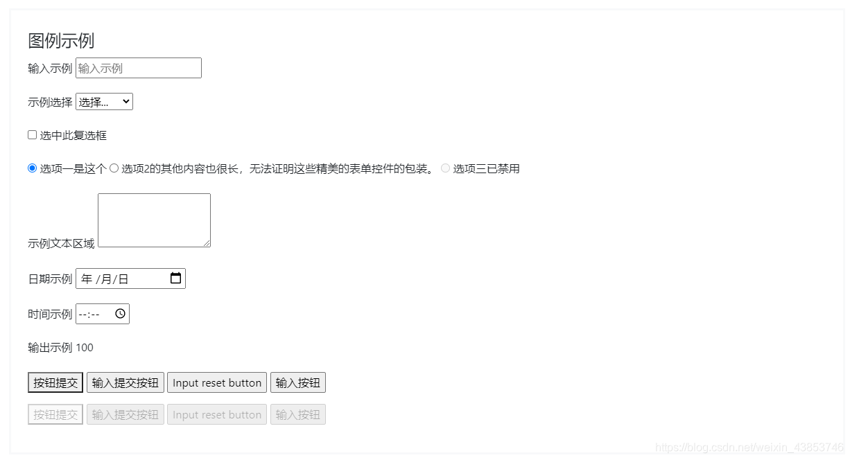
Forms表单
重新引导了各种表单元素,以简化基本样式:
<fieldset>没有边界,内边距或边距,因此可以轻松用作单个输入或一组输入的包装。<legend>与字段集一样,也已重新设置样式以显示为各种标题。<label>设置为display: inline-block允许margin应用。<input>,<select>,<textarea>和<button>主要由Normalize解决,但Reboot也删除了它们margin和设置line-height: inherit。<textarea>将修改为只能垂直调整大小,因为水平调整大小通常会“破坏”页面布局。<button>和<input>``button元素具有cursor: pointerwhen :not(:disabled)。
关于变化 官网示例:
鼠标效果
重新引导包括一项用于role="button"将默认光标更改为的增强功能pointer。将此属性添加到元素以帮助指示元素是交互式的。对于<button>自己cursor更改的元素,此角色不是必需的。
非按钮元素按钮
<span role="button" tabindex="0">Non-button element button</span>
其他元素
地址
该<address>元素被更新重置浏览器默认font-style的italic到normal。line-height现在也继承了,并margin-bottom: 1rem已添加。<address>用于显示最近(或整个作品)的联系信息。通过以结尾的行来保留格式<br>。
块引用
块margin引用的默认值为1em 40px,因此我们将其重置0 0 1rem为与其他元素更一致的名称。
内联元素
该<abbr>元件接收基本样式,以使它脱颖而出之间段落文本。
摘要
cursorsummary的默认值为text,因此我们将其重置pointer为传达可以通过单击进行交互的元素。
HTML5 [hidden]属性
HTML5添加了一个名为的新全局属性[hidden],其display: none默认样式为。[hidden] { display: none !important; }以帮助防止display意外覆盖它
<input type="text" hidden>
版式
Bootstrap排版的文档和示例,包括全局设置,标题,正文,列表等。
全局设置
Bootstrap设置基本的全局显示,版式和链接样式。
- 使用本机字体堆栈
font-family为每个操作系统和设备选择最佳字体。 - 对于更具包容性和可访问性的类型比例,我们假定浏览器为默认根目录
font-size(通常为16px),以便访问者可以根据需要自定义其浏览器默认值。 - 使用
$font-family-base,$font-size-base和$line-height-base属性作为我们的印刷基地应用于<body>。 - 通过设置全局链接颜色,
$link-color并仅在上应用链接下划线:hover。 - 使用
$body-bg设置background-color上<body>(``#fff默认)。 - 可以在中找到这些样式
_reboot.scss,并在中定义全局变量_variables.scss。确保设置$font-size-base为rem。
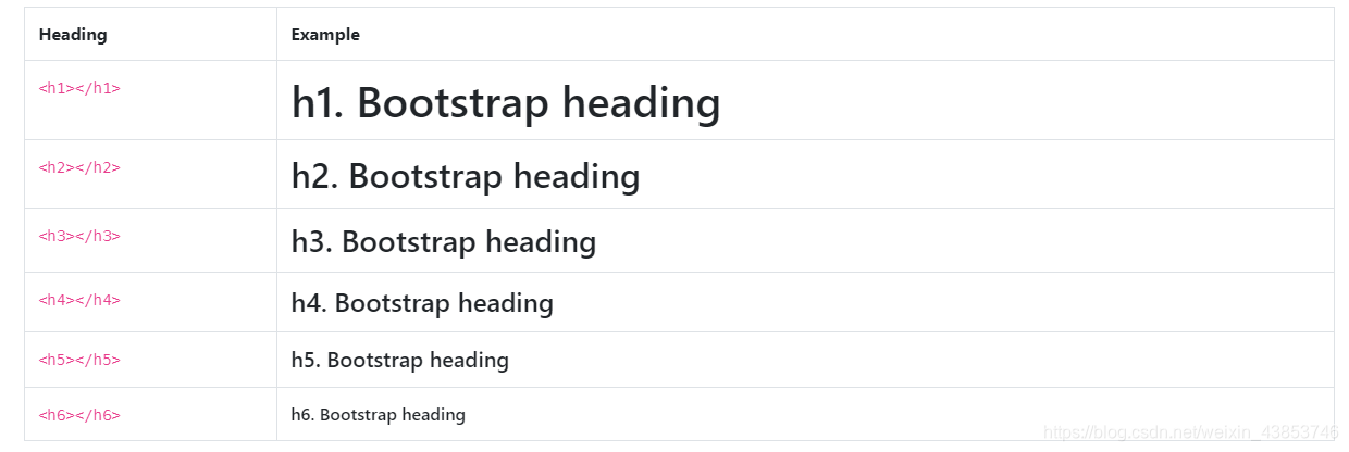
标题
<h1>通过<h6>提供所有HTML标题。
<h1>h1. Bootstrap heading</h1>
<h2>h2. Bootstrap heading</h2>
<h3>h3. Bootstrap heading</h3>
<h4>h4. Bootstrap heading</h4>
<h5>h5. Bootstrap heading</h5>
<h6>h6. Bootstrap heading</h6>
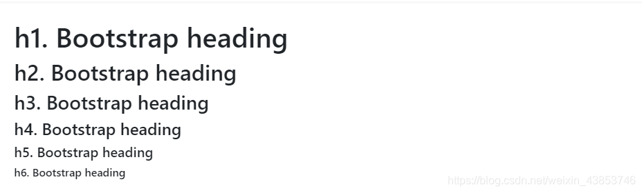
.h1.h6对于希望与标题的字体样式匹配但不能使用关联的HTML元素的类,也可以使用through 类。
<p class="h1">h1. Bootstrap heading</p>
<p class="h2">h2. Bootstrap heading</p>
<p class="h3">h3. Bootstrap heading</p>
<p class="h4">h4. Bootstrap heading</p>
<p class="h5">h5. Bootstrap heading</p>
<p class="h6">h6. Bootstrap heading</p>
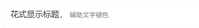
自定义标题
使用随附的实用程序类从Bootstrap 3重新创建小的辅助标题文本。
<h3>
  花式显示标题
  <small class="text-muted">辅助文字褪色
显示标题
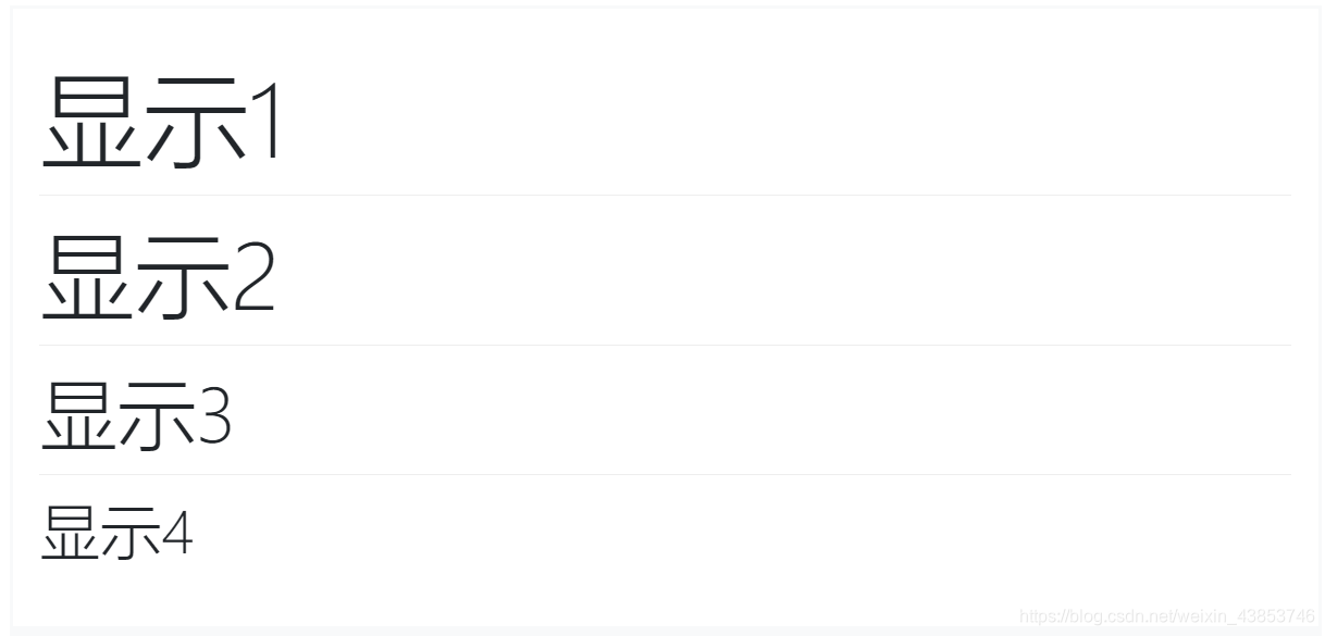
传统的标题元素旨在最有效地处理您页面内容的内容。当您需要一个标题来突出显示时,请考虑使用显示标题 -一种更大,更自觉的标题样式。请记住,这些标题默认情况下不响应,但可以启用响应字体大小。
<h1 class="display-1">显示 1</h1>
<h1 class="display-2">显示 2</h1>
<h1 class="display-3">显示 3</h1>
<h1 class="display-4">显示 4</h1>
段落
通过添加使段落突出.lead。
<p class="lead">
  Vivamus sagittis lacus vel augue laoreet rutrum faucibus dolor auctor. Duis mollis, est non commodo luctus.
</p>

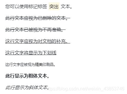
内联文字元素
常见的嵌入式HTML5元素的样式。
<p>您可以使用标记标签 突出 文本。</p>
<p><del>此行文本应视为已删除的文本。</del></p>
<p><s>此行文本已被视为不再准确。</s></p>
<p><ins>这行文字应视为对文档的补充。</ins></p>
<p><u>这行文字将显示为下划线</u></p>
<p><small>这行文字应被视为精美印刷品。</small></p>
<p><strong>T此行显示为粗体文本。</strong></p>
<p><em>此行显示为斜体文本。</em></p>
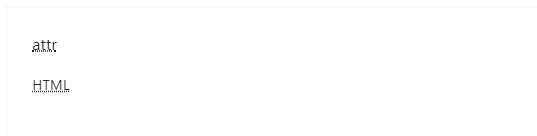
缩略语
HTML <abbr>元素的缩写和首字母缩略词的样式化实现,以显示悬停时的扩展版本。缩写带有默认下划线,并获得帮助光标,以提供有关悬停和辅助技术用户的其他上下文。
添加.initialism一个略小的字体大小的缩写。
<p><abbr title="attribute">attr</abbr></p>
<p><abbr title="HyperText Markup Language" class="initialism">HTML</abbr></p>
块引用
用于引用文档中其他来源的内容块。将<blockquote class="blockquote">任何HTML换行。
<blockquote class="blockquote">
  <p class="mb-0">用于引用文档中其他来源的内容块。将`<blockquote class="blockquote">`任何HTML换行。</p>
</blockquote>
命名来源
添加一个<footer class="blockquote-footer">用于标识来源。将源工作的名称包装在中<cite>。
<blockquote class="blockquote">
  <p class="mb-0">添加一个`<footer class="blockquote-footer">`用于标识来源。将源工作的名称包装在中`<cite>`。</p>
  <footer class="blockquote-footer">用于标识来源 <cite title="Source Title">将源工作的名称包装在中</cite></footer>
</blockquote>
对准
根据需要使用文本实用程序来更改块引用的对齐方式。
<blockquote class="blockquote text-center">
  <p class="mb-0">根据需要使用文本实用程序来更改块引用的对齐方式。
    根据需要使用文本实用程序来更改块引用的对齐方式。 </p>
  <footer class="blockquote-footer">用于标识来源  <cite title="Source Title">用于标识来源 </cite></footer>
</blockquote>
列表
无样式
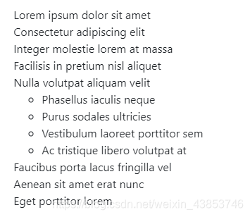
删除list-style列表项的默认和左页边距(仅适用于立即子级)。这仅适用于直接子级列表项,这意味着您还需要为任何嵌套列表添加类。
<ul class="list-unstyled">
  <li>Lorem ipsum dolor sit amet</li>
  <li>Consectetur adipiscing elit</li>
  <li>Integer molestie lorem at massa</li>
  <li>Facilisis in pretium nisl aliquet</li>
  <li>Nulla volutpat aliquam velit
    <ul>
      <li>Phasellus iaculis neque</li>
      <li>Purus sodales ultricies</li>
      <li>Vestibulum laoreet porttitor sem</li>
      <li>Ac tristique libero volutpat at</li>
    </ul>
  </li>
  <li>Faucibus porta lacus fringilla vel</li>
  <li>Aenean sit amet erat nunc</li>
  <li>Eget porttitor lorem</li>
</ul>
代码
使用Bootstrap显示内联和多行代码块的文档和示例。
内联代码
用来包装内联代码段<code>。确保逃脱HTML尖括号。
For example, <code><section></code> should be wrapped as inline.

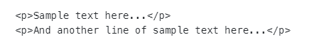
代码块
将<pre>用于多行代码。再一次,请确保转义代码中的所有尖括号以进行正确渲染。可以选择添加.pre-scrollable类,该类将设置340px的最大高度并提供y轴滚动条。
<pre><code><p>Sample text here...</p>
<p>And another line of sample text here...</p>
</code></pre>
变数
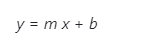
要指示变量,请使用<var>标签。
<var>y</var> = <var>m</var><var>x</var> + <var>b</var>
用户输入
使用<kbd>来指示通常通过键盘输入的输入。
ctrl + ,
要切换目录,请键入,<kbd>cd</kbd> 然后输入目录名称。<br>
要编辑设置,请按<kbd><kbd>ctrl</kbd> + <kbd>,</kbd></kbd>

样品输出
要指示程序的示例输出,请使用<samp>标签。
<samp>该文本应被视为计算机程序的示例输出。</samp>

图片
选择图像以响应行为的文档和示例(因此它们永远不会比其父元素大)并为它们添加轻量级样式(全部通过类)
响应式图像
Bootstrap中的图像通过进行响应.img-fluid。max-width: 100%;并height: auto;应用于图像,以便与父元素缩放。
<img src="..." class="img-fluid" alt="Responsive image">
注意:SVG图像和Internet Explorer
在Internet Explorer 10和11中,SVG图像的.img-fluid大小不成比例。要解决此问题,请在必要时添加width: 100%;或.w-100。此修复程序无法正确调整其他图像格式的大小,因此Bootstrap不会自动应用它。

图片缩略图
除了border-radius实用程序外,还可以用于.img-thumbnail为图像提供1px的圆形边界外观。
<img src="..." alt="..." class="img-thumbnail">
对齐图像
使图像与辅助浮动类或文本对齐类对齐。block-电平图像可以使用居中的.mx-auto余量工具类。
<img src="..." class="rounded float-left" alt="...">
<img src="..." class="rounded float-right" alt="...">
<img src="..." class="rounded mx-auto d-block" alt="...">

<div class="text-center">
  <img src="..." class="rounded" alt="...">
</div>

图片
如果使用元素为特定<picture>指定多个<source>元素<img>,请确保将.img-*类添加到<img>而不是<picture>标记中。
<picture>
<source srcset="..." type="image/svg+xml">
<img src="..." class="img-fluid img-thumbnail" alt="...">
</picture>
Tables/表格
例子
例子
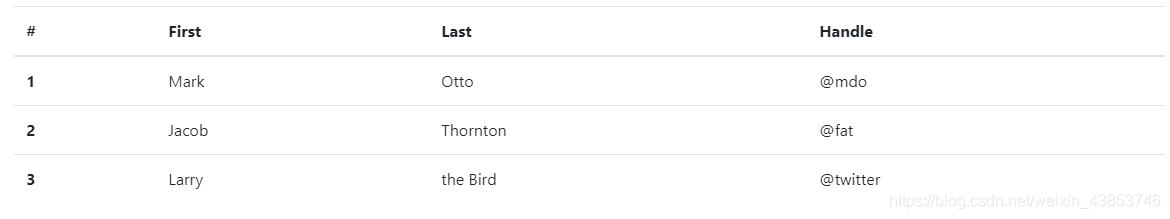
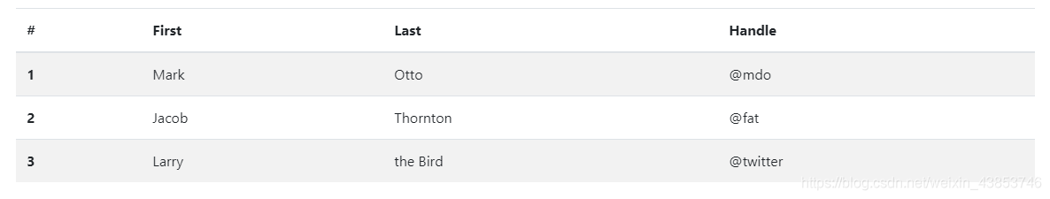
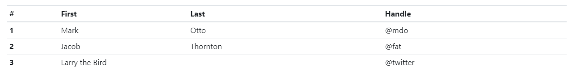
由于跨日历,日期选择器之类的第三方小部件广泛使用表格,因此我们将表格设计为“ 选择加入”。只需将基类添加.table到any<table>,然后使用自定义样式或我们包含的各种修饰符类进行扩展。
使用最基本的表标记,这是.table基于表的表在Bootstrap中的外观。所有表样式都在Bootstrap 4中继承,这意味着任何嵌套表的样式都将与父表样式相同。
<table class="table">
  <thead>
    <tr>
      <th scope="col">#</th>
      <th scope="col">First</th>
      <th scope="col">Last</th>
      <th scope="col">Handle</th>
    </tr>
  </thead>
  <tbody>
    <tr>
      <th scope="row">1</th>
      <td>Mark</td>
      <td>Otto</td>
      <td>@mdo</td>
    </tr>
    <tr>
      <th scope="row">2</th>
      <td>Jacob</td>
      <td>Thornton</td>
      <td>@fat</td>
    </tr>
    <tr>
      <th scope="row">3</th>
      <td>Larry</td>
      <td>the Bird</td>
      <td>@twitter</td>
    </tr>
  </tbody>
</table>
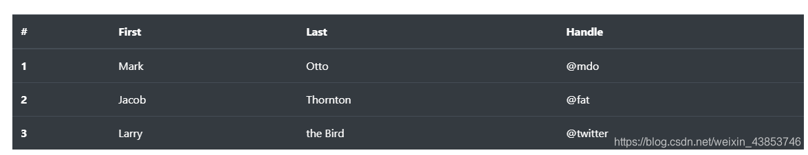
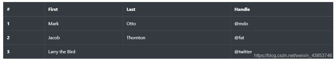
还可以使用.table-dark反转颜色(深色背景上的浅色文本)。
<table class="table table-dark">
  <thead>
    <tr>
      <th scope="col">#</th>
      <th scope="col">First</th>
      <th scope="col">Last</th>
      <th scope="col">Handle</th>
    </tr>
  </thead>
  <tbody>
    <tr>
      <th scope="row">1</th>
      <td>Mark</td>
      <td>Otto</td>
      <td>@mdo</td>
    </tr>
    <tr>
      <th scope="row">2</th>
      <td>Jacob</td>
      <td>Thornton</td>
      <td>@fat</td>
    </tr>
    <tr>
      <th scope="row">3</th>
      <td>Larry</td>
      <td>the Bird</td>
      <td>@twitter</td>
    </tr>
  </tbody>
</table>
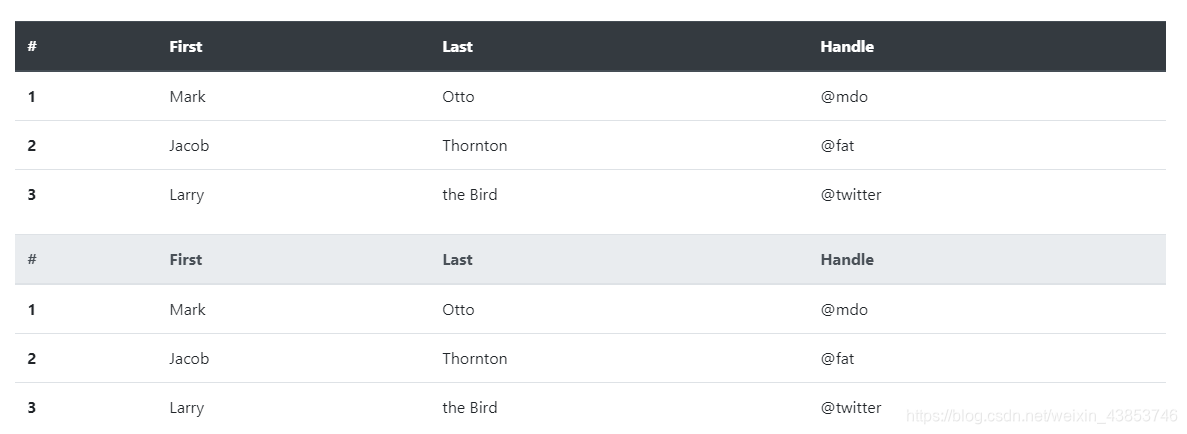
表头选项
与表和暗表类似,请使用修饰符类.thead-light或.thead-dark使<thead>呈现浅灰色或深灰色。
<table class="table">
  <thead class="thead-dark">
    <tr>
      <th scope="col">#</th>
      <th scope="col">First</th>
      <th scope="col">Last</th>
      <th scope="col">Handle</th>
    </tr>
  </thead>
  <tbody>
    <tr>
      <th scope="row">1</th>
      <td>Mark</td>
      <td>Otto</td>
      <td>@mdo</td>
    </tr>
    <tr>
      <th scope="row">2</th>
      <td>Jacob</td>
      <td>Thornton</td>
      <td>@fat</td>
    </tr>
    <tr>
      <th scope="row">3</th>
      <td>Larry</td>
      <td>the Bird</td>
      <td>@twitter</td>
    </tr>
  </tbody>
</table>

<table class="table">
  <thead class="thead-light">
    <tr>
      <th scope="col">#</th>
      <th scope="col">First</th>
      <th scope="col">Last</th>
      <th scope="col">Handle</th>
    </tr>
  </thead>
  <tbody>
    <tr>
      <th scope="row">1</th>
      <td>Mark</td>
      <td>Otto</td>
      <td>@mdo</td>
    </tr>
    <tr>
      <th scope="row">2</th>
      <td>Jacob</td>
      <td>Thornton</td>
      <td>@fat</td>
    </tr>
    <tr>
      <th scope="row">3</th>
      <td>Larry</td>
      <td>the Bird</td>
      <td>@twitter</td>
    </tr>
  </tbody>
</table>
条纹行
使用.table-striped到斑马条纹添加到任何表行内<tbody>。
<table class="table table-striped">
  <thead>
    <tr>
      <th scope="col">#</th>
      <th scope="col">First</th>
      <th scope="col">Last</th>
      <th scope="col">Handle</th>
    </tr>
  </thead>
  <tbody>
    <tr>
      <th scope="row">1</th>
      <td>Mark</td>
      <td>Otto</td>
      <td>@mdo</td>
    </tr>
    <tr>
      <th scope="row">2</th>
      <td>Jacob</td>
      <td>Thornton</td>
      <td>@fat</td>
    </tr>
    <tr>
      <th scope="row">3</th>
      <td>Larry</td>
      <td>the Bird</td>
      <td>@twitter</td>
    </tr>
  </tbody>
</table>
<table class="table table-striped table-dark">
  <thead>
    <tr>
      <th scope="col">#</th>
      <th scope="col">First</th>
      <th scope="col">Last</th>
      <th scope="col">Handle</th>
    </tr>
  </thead>
  <tbody>
    <tr>
      <th scope="row">1</th>
      <td>Mark</td>
      <td>Otto</td>
      <td>@mdo</td>
    </tr>
    <tr>
      <th scope="row">2</th>
      <td>Jacob</td>
      <td>Thornton</td>
      <td>@fat</td>
    </tr>
    <tr>
      <th scope="row">3</th>
      <td>Larry</td>
      <td>the Bird</td>
      <td>@twitter</td>
    </tr>
  </tbody>
</table>

边框表
.table-bordered在表格和单元格的所有边上添加边框。
<table class="table table-bordered">
  <thead>
    <tr>
      <th scope="col">#</th>
      <th scope="col">First</th>
      <th scope="col">Last</th>
      <th scope="col">Handle</th>
    </tr>
  </thead>
  <tbody>
    <tr>
      <th scope="row">1</th>
      <td>Mark</td>
      <td>Otto</td>
      <td>@mdo</td>
    </tr>
    <tr>
      <th scope="row">2</th>
      <td>Jacob</td>
      <td>Thornton</td>
      <td>@fat</td>
    </tr>
    <tr>
      <th scope="row">3</th>
      <td colspan="2">Larry the Bird</td>
      <td>@twitter</td>
    </tr>
  </tbody>
</table>

<table class="table table-bordered table-dark">
  <thead>
    <tr>
      <th scope="col">#</th>
      <th scope="col">First</th>
      <th scope="col">Last</th>
      <th scope="col">Handle</th>
    </tr>
  </thead>
  <tbody>
    <tr>
      <th scope="row">1</th>
      <td>Mark</td>
      <td>Otto</td>
      <td>@mdo</td>
    </tr>
    <tr>
      <th scope="row">2</th>
      <td>Jacob</td>
      <td>Thornton</td>
      <td>@fat</td>
    </tr>
    <tr>
      <th scope="row">3</th>
      <td colspan="2">Larry the Bird</td>
      <td>@twitter</td>
    </tr>
  </tbody>
</table>
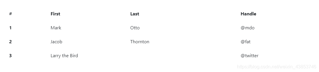
无边表格
添加.table-borderless一个无边界的表。
<table class="table table-borderless">
  <thead>
    <tr>
      <th scope="col">#</th>
      <th scope="col">First</th>
      <th scope="col">Last</th>
      <th scope="col">Handle</th>
    </tr>
  </thead>
  <tbody>
    <tr>
      <th scope="row">1</th>
      <td>Mark</td>
      <td>Otto</td>
      <td>@mdo</td>
    </tr>
    <tr>
      <th scope="row">2</th>
      <td>Jacob</td>
      <td>Thornton</td>
      <td>@fat</td>
    </tr>
    <tr>
      <th scope="row">3</th>
      <td colspan="2">Larry the Bird</td>
      <td>@twitter</td>
    </tr>
  </tbody>
</table>
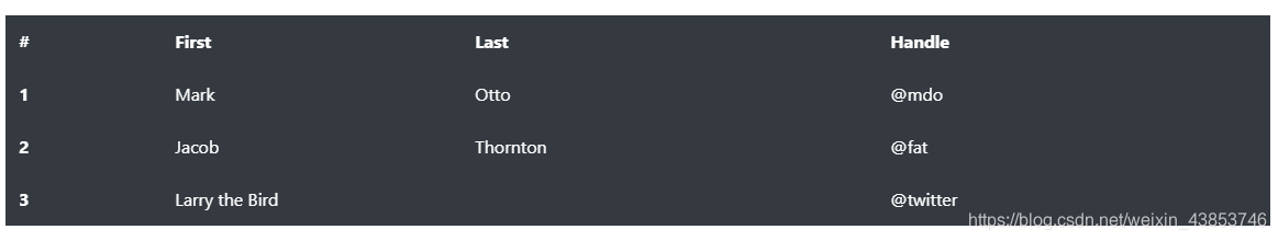
.table-borderless 也可以在深色表格上使用。
<table class="table table-borderless table-dark">
  <thead>
    <tr>
      <th scope="col">#</th>
      <th scope="col">First</th>
      <th scope="col">Last</th>
      <th scope="col">Handle</th>
    </tr>
  </thead>
  <tbody>
    <tr>
      <th scope="row">1</th>
      <td>Mark</td>
      <td>Otto</td>
      <td>@mdo</td>
    </tr>
    <tr>
      <th scope="row">2</th>
      <td>Jacob</td>
      <td>Thornton</td>
      <td>@fat</td>
    </tr>
    <tr>
      <th scope="row">3</th>
      <td colspan="2">Larry the Bird</td>
      <td>@twitter</td>
    </tr>
  </tbody>
</table>
悬停行
添加.table-hover以在中的表行上启用悬停状态<tbody>。
<table class="table table-hover">
  <thead>
    <tr>
      <th scope="col">#</th>
      <th scope="col">First</th>
      <th scope="col">Last</th>
      <th scope="col">Handle</th>
    </tr>
  </thead>
  <tbody>
    <tr>
      <th scope="row">1</th>
      <td>Mark</td>
      <td>Otto</td>
      <td>@mdo</td>
    </tr>
    <tr>
      <th scope="row">2</th>
      <td>Jacob</td>
      <td>Thornton</td>
      <td>@fat</td>
    </tr>
    <tr>
      <th scope="row">3</th>
      <td colspan="2">Larry the Bird</td>
      <td>@twitter</td>
    </tr>
  </tbody>
</table>

小尺寸表格
加入.table-sm使切削单元格填充一半表更加紧凑。
<table class="table table-sm">
  <thead>
    <tr>
      <th scope="col">#</th>
      <th scope="col">First</th>
      <th scope="col">Last</th>
      <th scope="col">Handle</th>
    </tr>
  </thead>
  <tbody>
    <tr>
      <th scope="row">1</th>
      <td>Mark</td>
      <td>Otto</td>
      <td>@mdo</td>
    </tr>
    <tr>
      <th scope="row">2</th>
      <td>Jacob</td>
      <td>Thornton</td>
      <td>@fat</td>
    </tr>
    <tr>
      <th scope="row">3</th>
      <td colspan="2">Larry the Bird</td>
      <td>@twitter</td>
    </tr>
  </tbody>
</table>
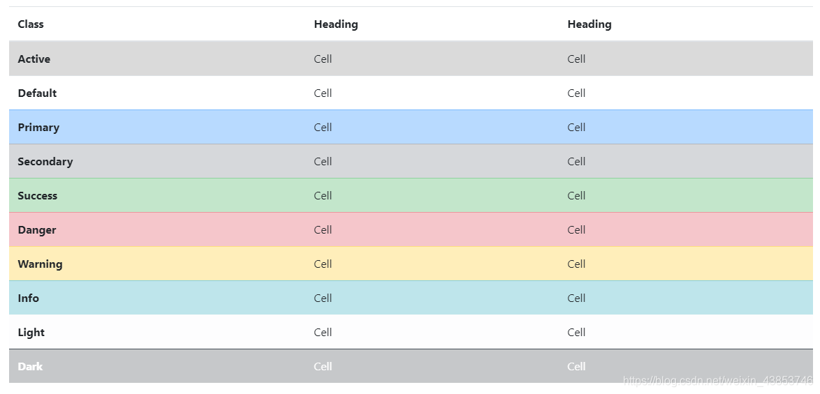
上下文类
使用上下文类为表格行或单个单元格上色。
<!-- On rows -->
<tr class="table-active">...</tr>

<tr class="table-primary">...</tr>
<tr class="table-secondary">...</tr>
<tr class="table-success">...</tr>
<tr class="table-danger">...</tr>
<tr class="table-warning">...</tr>
<tr class="table-info">...</tr>
<tr class="table-light">...</tr>
<tr class="table-dark">...</tr>

<!-- On cells (`td` or `th`) -->
<tr>
  <td class="table-active">...</td>

  <td class="table-primary">...</td>
  <td class="table-secondary">...</td>
  <td class="table-success">...</td>
  <td class="table-danger">...</td>
  <td class="table-warning">...</td>
  <td class="table-info">...</td>
  <td class="table-light">...</td>
  <td class="table-dark">...</td>
</tr>
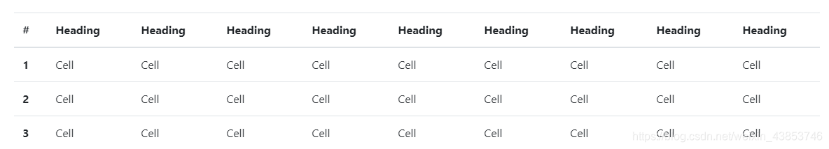
通过包装任何响应创建表.table用.table-responsive{-sm|-md|-lg|-xl},使表滚动水平在各max-width达的断点分别为(但不包括)576px,768px,992px和1120px。
字幕
一个<caption>功能,喜欢的表的标题。它可以帮助具有屏幕阅读器的用户查找表格并了解表格的内容,并决定是否要读取表格。
<table class="table">
  <caption>List of users</caption>
  <thead>
    <tr>
      <th scope="col">#</th>
      <th scope="col">First</th>
      <th scope="col">Last</th>
      <th scope="col">Handle</th>
    </tr>
  </thead>
  <tbody>
    <tr>
      <th scope="row">1</th>
      <td>Mark</td>
      <td>Otto</td>
      <td>@mdo</td>
    </tr>
    <tr>
      <th scope="row">2</th>
      <td>Jacob</td>
      <td>Thornton</td>
      <td>@fat</td>
    </tr>
    <tr>
      <th scope="row">3</th>
      <td>Larry</td>
      <td>the Bird</td>
      <td>@twitter</td>
    </tr>
  </tbody>
</table>

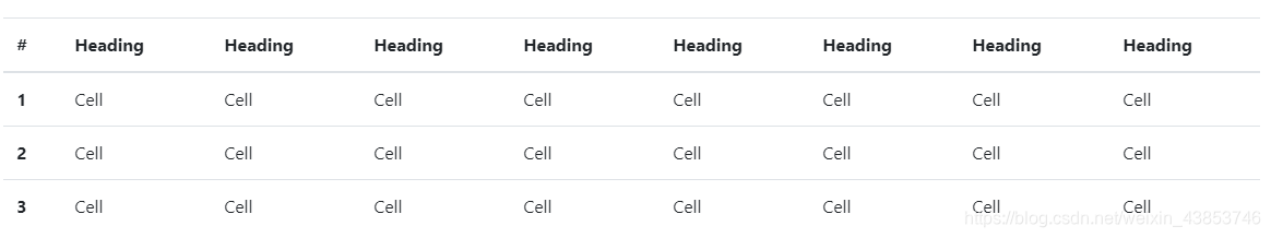
响应表
响应式表允许轻松地水平滚动表。通过将包裹起来,使所有表在所有视口中都.table具有响应能力.table-responsive。或者,通过使用来选择一个最大的断点,以使其具有响应表.table-responsive{-sm|-md|-lg|-xl}。
垂直裁剪/截断
响应式表格使用overflow-y: hidden,会剪裁超出表格底部或顶部边缘的所有内容。特别是,这可以剪切下拉菜单和其他第三方小部件。
始终响应
在每个断点处,.table-responsive用于水平滚动表。
<div class="table-responsive">
  <table class="table">
    ...
  </table>
</div>
特定于断点
.table-responsive{-sm|-md|-lg|-xl}根据需要使用它来创建响应表,直到特定的断点。从该断点开始,该表将正常运行并且不会水平滚动。
<div class="table-responsive-sm">
  <table class="table">
    ...
  </table>
</div>

<div class="table-responsive-md">
  <table class="table">
    ...
  </table>
</div>

<div class="table-responsive-lg">
  <table class="table">
    ...
  </table>
</div>

<div class="table-responsive-xl">
  <table class="table">
    ...
  </table>
</div>
数据
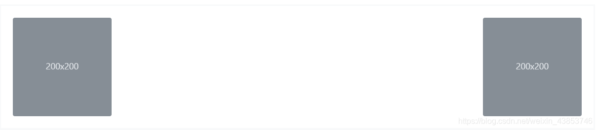
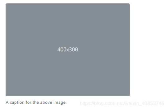
使用Bootstrap中的Figure组件显示相关图像和文本的文档和示例。
每当您需要显示内容(例如带有可选标题的图像)时,请考虑使用<figure>。
使用附带的.figure,.figure-img以及.figure-caption类提供了HTML5的一些基线的风格<figure>和<figcaption>元素。
图中的图像没有明确的大小,因此请确保将.img-fluid类添加到您的类中<img>以使其具有响应能力。
<figure class="figure">
  <img src="..." class="figure-img img-fluid rounded" alt="...">
  <figcaption class="figure-caption">A caption for the above image.</figcaption>
</figure>
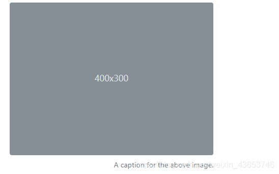
使用我们的文本工具可以很容易地将图形的标题对齐。
<figure class="figure">
  <img src="..." class="figure-img img-fluid rounded" alt="...">
  <figcaption class="figure-caption text-right">A caption for the above image.</figcaption>
</figure>
参考翻译自: bootstrap4官方文档