1.bootstrap4 中progress和tooltip
使用该插件我只是实现progress进度条功能,提示信息没有显示出来,原因可能是bootstrap和elementui插件混在一起优先级下降,或者是因为我是想在该页面中点击按钮弹出的模态框中显示的进度条,这样dom节点层级过高使用不便。
现在展示我实现的功能:
展示如下:

简单介绍一下bootstrap4中的progress和tooltip
官方中文手册
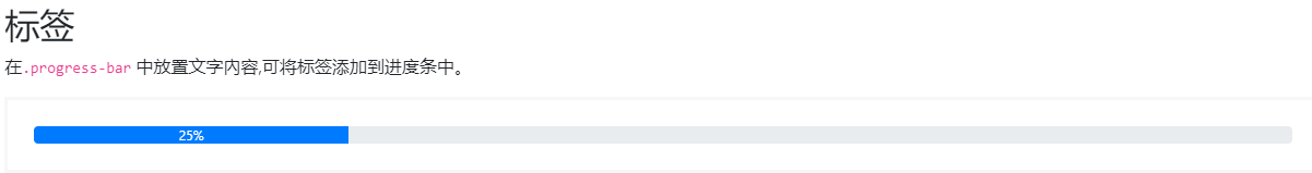
官方代码展示如下:
<div class="progress">
  <div class="progress-bar" role="progressbar"
  style="width: 25%;"
  aria-valuenow="25" aria-valuemin="0" aria-valuemax="100">25%</div>
</div>
官方样式展示如下:
这里要对进度条中的数值进行判断,方法很多我选择的是三目运算
- 绑定vue使用写法’v-bind==:’
- 三目运算,我的参数detail.h_r_score,、
如果参数:detail.h_r_score小于60分,增加一个class样式,
否则显示另一个class样式
:class="[ detail.h_r_score < 60 ? 'progress-bar bg-danger' : 'progress-bar bg-info' ]"
完整代码:
<table class="table card-table"  \:action="editPanel.action" >
    <thead>
       <tr>
         <th>课程标准名称</th>
         <th>成绩</th>
         <th>单个成绩所占比</th>
       </tr>
     </thead>
     <tbody>
        <tr v-for="detail in detailList" :key="detail.criteria_id">
           <td>{

   {detail.name}}</td>
           <td style="white-space:pre-wrap;">{

   {detail.h_r_score}}</td>
           <td style="white-space:pre-wrap;">
               <div class="progress" style="height:1.2rem">
                    <div :class="
                    [ detail.h_r_score < 60 ?
                    'progress-bar bg-danger' : 'progress-bar bg-info' ]"
                     role="progressbar"
                    :style="{

       width: detail.h_r_score + '%'}"
                    aria-valuenow="{detail.h_r_score}"
                    aria-valuemin="0" aria-valuemax="100"
                    data-toggle="tooltip"
                    data-placement="top"
                    title="{

     {detail.h_r_score}}"
                    >{

   {detail.h_r_score}}%</div>
                 </div>
           </td>
2.vue+elementUI中progress和tooltip
完成效果展示如下:

首先需要了解elementUI的组件中progress进度条和tooltip提示信息的使用方法
官方文档
progress官网代码
<el-progress :text-inside="true" :stroke-width="18" :percentage="0"></el-progress>
<el-progress :text-inside="true" :stroke-width="18" :percentage="70"></el-progress>
<el-progress :text-inside="true" :stroke-width="18" :percentage="100" status="success"></el-progress>
<el-progress :text-inside="true" :stroke-width="18" :percentage="50" status="exception"></el-progress>

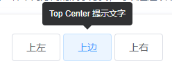
tooltip官网代码
<el-tooltip class="item" effect="dark" content="Top Center 提示文字" placement="top">
     <el-button>上边</el-button>
</el-tooltip>
- 结合
v-if根据不同分数展示不同颜色样式v-if="detail.h_r_score<=40" el-progress中:stroke-width="18"为进度条的宽度el-progress中:percentage="detail.h_r_score"绑定显示的进度条文本信息el-tooltip 中 :content="'总分:100,取得成绩:'+ detail.h_r_score + ''"el-tooltip 中 :content="detail.h_r_score + ''"
完整代码:
 <td>
     <el-tooltip class="item" effect="dark"
     :content="'总分:100,取得成绩:'+ detail.h_r_score + ''"
     placement="top">
        <div v-if="detail.h_r_score<=40">
            <#--  <el-progress :text-inside="true" :stroke-width="18"
            :percentage="0"></el-progress>  -->
            <el-progress :text-inside="true" :stroke-width="18"
            :percentage="detail.h_r_score" status="exception" ></el-progress>
        </div>
        <div v-else-if="detail.h_r_score > 40 && detail.h_r_score<=80">
             <el-progress :text-inside="true" :stroke-width="18"
             :percentage="detail.h_r_score"></el-progress>
		</div>
        <div  v-else>
             <el-progress :text-inside="true" :stroke-width="18"
             :percentage="detail.h_r_score" status="success"></el-progress>
        </div>
    </el-tooltip>
</td>
展示效果:
