详解自定义饼图的实现

文件目录

获取Echarts

引入Echarts
<!DOCTYPE html>
<html>
<head>
    <meta charset="utf-8">
    <!-- 引入 ECharts 文件 -->
    <script src="../incubator-echarts-5.0.0-alpha.2/dist/echarts.min.js"></script>
</head>
</html>
绘制图表
在绘图前我们需要为 ECharts 准备一个具备高宽的 DOM 容器
<body style="background: black;">
    <!-- 为 ECharts 准备一个具备大小(宽高)的 DOM -->
    <div id="main" style="width: 1710px; height: 670px"></div>
</body>
然后就可以通过echarts.init方法初始化一个 echarts 实例并通过setOption方法生成一个 自定义饼图
 <script type="text/javascript">
   // 基于准备好的dom, 初始化echarts实例
   var myChart = echarts.init(document.getElementById('main'));
   // 使用刚指定的配置项和数据显示图表
   myChart.setOption(option)
 </script>
代码步骤拆分
var option = {} // 指定图标的配置和数据
数据源
// 数据集
var dataList = [
  {

    name: '其他-累计充值金额', value: 44},
  {

    name: '当前-累计充值金额', value: 98}
]
自定义富文本样式
var rich = {


  otherCenter: {


    borderColor: "#6482FF",
    width: 0,
    align: "center",
    borderWidth: 1,
    height: 46
  },
  otherCenter1: {


    borderColor: "#6482FF",
    width: "100%",
    borderWidth: 1,
    height: 0
  },
  otherCenterNumColor: {


    color: "#6482FF",
    fontSize: '28',
    align: "left",
    lineHeight:38
  },
  otherCenterTextColor: {


    color: "#C2CBF2",
    fontSize: '24',
    align: "left"
  },
  center: {


    borderColor: "#25eaff",
    width: 0,
    align: "center",
    borderWidth: 1,
    height: 46
  },
  center1: {


    borderColor: "#25eaff",
    width: "100%",
    borderWidth: 1,
    height: 0
  },
  centerNumColor: {


    color: "#25eaff",
    fontSize: '28',
    align: "left",
    lineHeight:38
  },
  centerTextColor: {


    color: "#C2CBF2",
    fontSize: '24',
    align: "left"
  }
}
- label属性没有rich自定义富文本时


- label属性有rich自定义富文本时


rich属性具体详情请看:https://echarts.apache.org/zh/option.html#series-pie.label.rich
富文本标签:https://echarts.apache.org/zh/tutorial.html#富文本标签

title
title: {


  text: '充值数据',
  show: true,
  textStyle: {


    color: '#fff',
    fontSize: '36',
    fontFamily: 'Microsoft YaHei',
    fontWeight: 400
  },
  top: 42,
  left: 40
}

tooltip (提示框组件)
tooltip: {

     // 提示框组件
  show: false
}
series(系列列表。每个系列通过 type 决定自己的图表类型)
- 对象一
代码拆解:
第一步:
{


  type: 'pie',
  data: dataList.map((item,index) => {


    return {


    ...(item || {

    })
  };
  })
}


第二步:里面的具体属性还请看上面rich的链接
{


  type: 'pie',
  data: dataList.map((item,index) => {


    console.log({

    ...(item|| {

    })})
    return {


    ...(item || {

    }),
    label: {


      normal: {


        show: true,
        rich: rich,
        padding: [0, -103], // 文字块的内边距 padding: [3, 4, 5, 6]:表示 [上, 右, 下, 左] 的边距
        height: 213, // 文字块的高度。一般不用指定,不指定则自动是文字的高度  注意,如果不定义 rich 属性,则不能指定 width 和 height
        formatter: (params) => {


          if (index === 0) {


            return (
              `{otherCenterTextColor|其他-累计充值金额}` +
              "\n" +
              `{otherCenterNumColor|${

      Math.round(params.value)}}` +
              "\n{otherCenter1|}\n{otherCenter|}\n"
            );
          }
          return (
            `{centerTextColor|当前-累计充值金额}` +
            "\n" +
            `{centerNumColor|${

      Math.round(params.value)}}` +
            "\n{center1|}\n{center|}\n"
          );
        },
      },
    },
  };
  })
}


去掉padding,height时:

去掉formatter时:

第三步:
labelLine: {


  normal: {


    show: true,
    length: 100,
    length2: 135
  }
}


- 对象二
{


  type: 'pie',
  radius: ['50%', '58%'],
  data: dataList.map((item,index) => {


    return {


      ...(item || {

    }),
      itemStyle:{


        color: index == 0 ? '#1D2549' : '#224D72'
      }
    }
})
}

代码步骤
第一步:
{


  type: 'pie',
  data: dataList.map((item,index) => {


    return {


      ...(item || {

    }),
      itemStyle:{


        color: index == 0 ? '#1D2549' : '#224D72'
      }
    }
})
}


第二步:
{


  type: 'pie',
  radius: ['50%', '58%'],
  data: dataList.map((item,index) => {


    return {


      ...(item || {

    }),
      itemStyle:{


        color: index == 0 ? '#1D2549' : '#224D72'
      }
    }
})
}
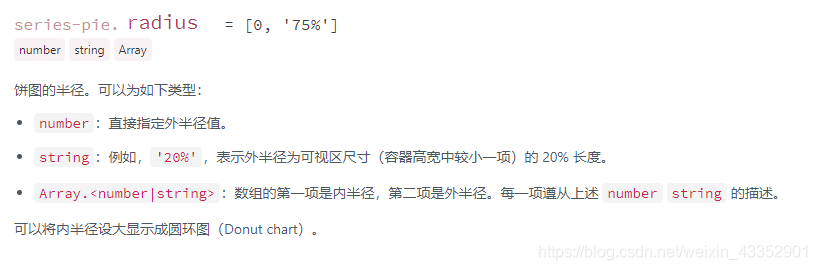

当 radius: [‘50%’, ‘70%’]
当 radius: [‘50%’, ‘55%’]
当 radius: [‘70%’, ‘58%’]
radius: [‘40%’, ‘58%’]


