小程序中经常会遇到点击从底部弹出一个框,并且框在底部的位置,假设多个页面都需要用到这种特效的话,建议是写成自定义组件会比较好(个人建议!!!)。直接看设计效果:
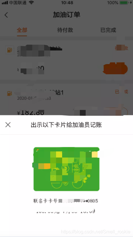
类似于这种情况的效果:点击按钮弹出一个框,显示相应的信息。框内的信息多种多样,为此我这里作成了插槽,用法类似于vue的slot。
bottomDialog.js
Component({


  /**
   * 组件的属性列表
   */
   /**
   *注:这里需要启用插槽
   */
  options: {


    multipleSlots: true
  },
  /**
   * 组件的初始数据
   */
  data: {


  },
  /**
   * 组件的方法列表
   */
  methods: {


    showModal() {


      var animation = wx.createAnimation({


        duration: 200,
        timingFunction: "linear",
        delay: 0
      })
      this.animation = animation
      animation.translateY(300).step()
      this.setData({


        animationData: animation.export(),
        showModalStatus: true
      })
      setTimeout(()=>{


        animation.translateY(0).step()
        this.setData({


          animationData: animation.export()
        })
      }, 200)
    },
    //隐藏对话框
    hideModal() {


      var animation = wx.createAnimation({


        duration: 200,
        timingFunction: "linear",
        delay: 0
      })
      this.animation = animation
      animation.translateY(300).step()
      this.setData({


        animationData: animation.export(),
      })
      setTimeout(()=> {


        animation.translateY(0).step()
        this.setData({


          animationData: animation.export(),
          showModalStatus: false
        })
      }, 200)
    }
  }
})
bottomDialog.json
{


  "components": true
}
bottomDialog.wxml
<view class="commodity_screen" bindtap="hideModal" wx:if="{

    {showModalStatus}}"></view>
<view animation="{

    {animationData}}" class="commodity_attr_box" wx:if="{

    {showModalStatus}}">
  <slot name="content"></slot>
</view>
bottomDialog.wxss
.commodity_screen {


  width: 100%;
  height: 100%;
  position: fixed;
  top: 0;
  left: 0;
  background: #000;
  opacity: 0.6;
  overflow: hidden;
  z-index: 1000;
  color: #fff;
}
/*对话框 */
.commodity_attr_box {


  height:auto;
  width: 100%;
  overflow: hidden;
  position: fixed;
  bottom: 0;
  left: 0;
  z-index: 2000;
  background: #fff;
  padding-top: 20rpx;
}
这样自定义弹框组件就完成了。使用自定义组件:
父组件中
引入自定义组件
"usingComponents": {


    "bottomDialog":"/pages/common/bottomDialog/bottomDialog"
  }
使用组件
<bottomDialog id="dialog">
  //自定义组件
  <view slot="content">
      <text class='evaluate-title'>出示以下卡片给加油员记账</text>
      <view class='evaluate-sep'></view>
      <view class="padding70 card-img-img"><image src="{

    {imgUrl}}"></image></view>
  </view>
</bottomDialog>
调用子组件方法=>弹起
showDialog(){


  this.selectComponent('#dialog').showModal()
}
搞定!如有不懂的可私聊我讨论。
本人微信:huang009516