本文内容概况:
1、主要总结一下几种常用的图,供自己学习使用
2、记录了本人学习matplotlib时找到的一些能解决相应问题的连接。
相关链接
学习Matplotlib时看到一位博主的讲解,非常详细的讲解:
https://www.jianshu.com/p/92e1a4497505
献上官方文档:
你想要的图,基本都能找到对应的~
https://matplotlib.org/api/_as_gen/matplotlib.pyplot.figure.html#matplotlib.pyplot.figure
双y轴绘制:
https://www.cnblogs.com/Atanisi/p/8530693.html
x轴标签旋转:
https://cloud.tencent.com/developer/article/1441795
绘制点线图(描点):
https://www.jianshu.com/p/82b2a4f66ed7
学习记录
图线图
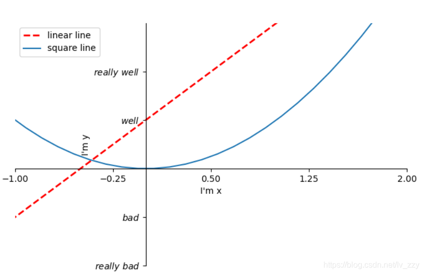
1、基本绘图
import matplotlib.pyplot as plt
import numpy as np
import pandas as pd

x=np.linspace(-3,3,50)#定义x的数据范围,50为生成的样本数
y1=2*x+1
y2=x**2
plt.figure(num=2,figsize=(8,5))#定义编号为2 大小为(8,5)
l1 = plt.plot(x,y1,color='red',linewidth=2,linestyle='--',label='linear line')#颜色为红色,线宽度为2,线风格为--
l2 = plt.plot(x,y2,label='square line')#进行画图
plt.xlim(-1,2)#设置坐标轴
plt.ylim(-2,3)
plt.xlabel("I'm x")
plt.ylabel("I'm y")
new_ticks=np.linspace(-1,2,5)#小标从-1到2分为5个单位
plt.xticks(new_ticks)#进行替换新下标
plt.yticks([-2,-1,1,2,],
           [r'$really\ bad$','$bad$','$well$','$really\ well$'])
ax=plt.gca()#gca=get current axis
ax.spines['right'].set_color('none')#边框属性设置为none 不显示
ax.spines['top'].set_color('none')
ax.xaxis.set_ticks_position('bottom')#使用xaxis.set_ticks_position设置x坐标刻度数字或名称的位置 所有属性为top、bottom、both、default、none

ax.spines['bottom'].set_position(('data', 0))#使用.spines设置边框x轴;使用.set_position设置边框位置,y=0位置 位置所有属性有outward、axes、data
ax.yaxis.set_ticks_position('left')
ax.spines['left'].set_position(('data',0))#坐标中心点在(0,0)位置

plt.legend(loc='best')#legend:展示数据对应的图像名称
#plt.legend(handles=[l1, l2], labels=['up', 'down'],  loc='best')
#loc有很多参数 其中best自分配最佳位置
'''
 'best' : 0,
 'upper right'  : 1,
 'upper left'   : 2,
 'lower left'   : 3,
 'lower right'  : 4,
 'right'        : 5,
 'center left'  : 6,
 'center right' : 7,
 'lower center' : 8,
 'upper center' : 9,
 'center'       : 10,
 '''
plt.show()
出来的图像是这样的:
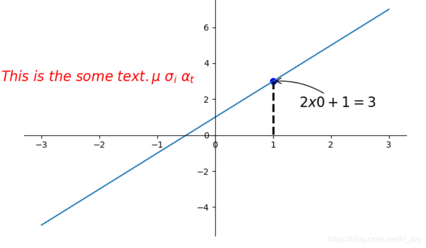
2、对图像进行标注
import matplotlib.pyplot as plt
import numpy as np
import pandas as pd

x=np.linspace(-3,3,50)
y = 2*x + 1
plt.figure(num=1, figsize=(8, 5))
plt.plot(x, y,)

#移动坐标轴
ax = plt.gca()
ax.spines['right'].set_color('none')
ax.spines['top'].set_color('none')
ax.xaxis.set_ticks_position('bottom')
ax.spines['bottom'].set_position(('data', 0))
ax.yaxis.set_ticks_position('left')
ax.spines['left'].set_position(('data', 0))

#标注信息
x0=1
y0=2*x0+1
plt.scatter(x0,y0,s=50,color='b') #描点
plt.plot([x0,x0],[y0,0],'k--',lw=2.5)#连接(x0,y0)(x0,0) k表示黑色 lw=2.5表示线粗细
#xycoords='data'是基于数据的值来选位置,xytext=(+30,-30)和textcoords='offset points'对于标注位置描述和xy偏差值,arrowprops对图中箭头类型设置
plt.annotate(r'$2x0+1=%s$' % y0, xy=(x0, y0), xycoords='data', xytext=(+30, -30),
             textcoords='offset points', fontsize=16,
             arrowprops=dict(arrowstyle='->', connectionstyle="arc3,rad=.2"))
#添加注视text(-3.7,3)表示选取text位置 空格需要用\进行转译 fontdict设置文本字体
plt.text(-3.7, 3, r'$This\ is\ the\ some\ text. \mu\ \sigma_i\ \alpha_t$',
         fontdict={'size': 16, 'color': 'r'})
plt.show()
出来的效果是这样的
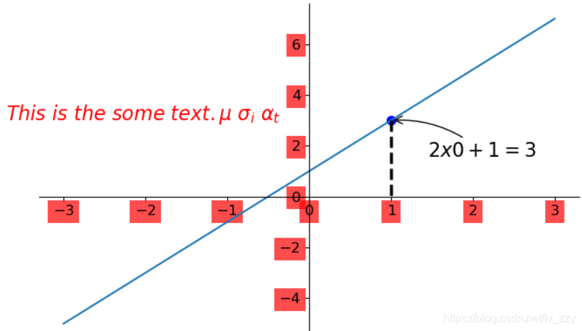
3、能见度调整
import matplotlib.pyplot as plt
import numpy as np
import pandas as pd

x=np.linspace(-3,3,50)
y = 2*x + 1
plt.figure(num=1, figsize=(8, 5))
plt.plot(x, y,)

#移动坐标轴
ax = plt.gca()
ax.spines['right'].set_color('none')
ax.spines['top'].set_color('none')
ax.xaxis.set_ticks_position('bottom')
ax.spines['bottom'].set_position(('data', 0))
ax.yaxis.set_ticks_position('left')
ax.spines['left'].set_position(('data', 0))

#标注信息
x0=1
y0=2*x0+1
plt.scatter(x0,y0,s=50,color='b') #描点
plt.plot([x0,x0],[y0,0],'k--',lw=2.5)#连接(x0,y0)(x0,0) k表示黑色 lw=2.5表示线粗细
#xycoords='data'是基于数据的值来选位置,xytext=(+30,-30)和textcoords='offset points'对于标注位置描述和xy偏差值,arrowprops对图中箭头类型设置
plt.annotate(r'$2x0+1=%s$' % y0, xy=(x0, y0), xycoords='data', xytext=(+30, -30),
             textcoords='offset points', fontsize=16,
             arrowprops=dict(arrowstyle='->', connectionstyle="arc3,rad=.2"))
#添加注视text(-3.7,3)表示选取text位置 空格需要用\进行转译 fontdict设置文本字体
plt.text(-3.7, 3, r'$This\ is\ the\ some\ text. \mu\ \sigma_i\ \alpha_t$',
         fontdict={'size': 16, 'color': 'r'})

#label.set_fontsize(12)重新调整字体大小 bbox设置目的内容的透明度相关参数 facecolor调节box前景色 edgecolor设置边框 alpha设置透明度 zorder设置图层顺序
for label in ax.get_xticklabels() + ax.get_yticklabels():
    label.set_fontsize(12)
    label.set_bbox(dict(facecolor='red', edgecolor='None', alpha=0.7, zorder=2))

plt.show()
出来的结果是这样的:
散点图
import matplotlib.pyplot as plt
import numpy as np
import pandas as pd
n=1024
X=np.random.normal(0,1,n)#每一个点的X值
Y=np.random.normal(0,1,n)#每一个点的Y值
T=np.arctan2(Y,X)#arctan2返回给定的X和Y值的反正切值
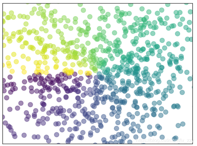
#scatter画散点图 size=75 颜色为T 透明度为50% 利用xticks函数来隐藏x坐标轴
plt.scatter(X,Y,s=75,c=T,alpha=0.5)
plt.xlim(-1.5,1.5)
plt.xticks(())#忽略xticks
plt.ylim(-1.5,1.5)
plt.yticks(())#忽略yticks
plt.show()
出来的结果是:
条形图
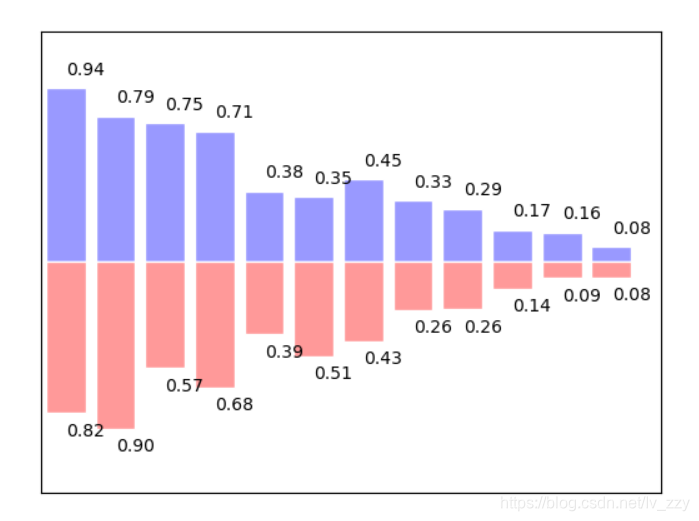
#基本图形
n=12
X=np.arange(n)
Y1=(1-X/float(n))*np.random.uniform(0.5,1,n)
Y2=(1-X/float(n))*np.random.uniform(0.5,1,n)
plt.bar(X,+Y1,facecolor='#9999ff',edgecolor='white')
plt.bar(X,-Y2,facecolor='#ff9999',edgecolor='white')

#标记值
for x,y in zip(X,Y1):#zip表示可以传递两个值
    plt.text(x+0.4,y+0.05,'%.2f'%y,ha='center',va='bottom')#ha表示横向对齐 bottom表示向下对齐
for x,y in zip(X,Y2):
    plt.text(x+0.4,-y-0.05,'%.2f'%y,ha='center',va='top')
plt.xlim(-0.5,n)
plt.xticks(())#忽略xticks
plt.ylim(-1.25,1.25)
plt.yticks(())#忽略yticks
plt.show()
出来的结果是这样哒:
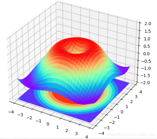
3D图像
import numpy as np
import matplotlib.pyplot as plt
from mpl_toolkits.mplot3d import Axes3D#需另外导入模块Axes 3D
fig=plt.figure()#定义图像窗口
ax=Axes3D(fig)#在窗口上添加3D坐标轴
#将X和Y值编织成栅格
X=np.arange(-4,4,0.25)
Y=np.arange(-4,4,0.25)
X,Y=np.meshgrid(X,Y)
R=np.sqrt(X**2+Y**2)
Z=np.sin(R)#高度值
#将colormap rainbow填充颜色,之后将三维图像投影到XY平面做等高线图,其中ratride和cstride表示row和column的宽度
ax.plot_surface(X,Y,Z,rstride=1,cstride=1,cmap=plt.get_cmap('rainbow'))#rstride表示图像中分割线的跨图
#添加XY平面等高线 投影到z平面
ax.contourf(X,Y,Z,zdir='z',offset=-2,cmap=plt.get_cmap('rainbow'))#把图像进行投影的图形 offset表示比0坐标轴低两个位置
ax.set_zlim(-2,2)
plt.show()
出来的结果是:
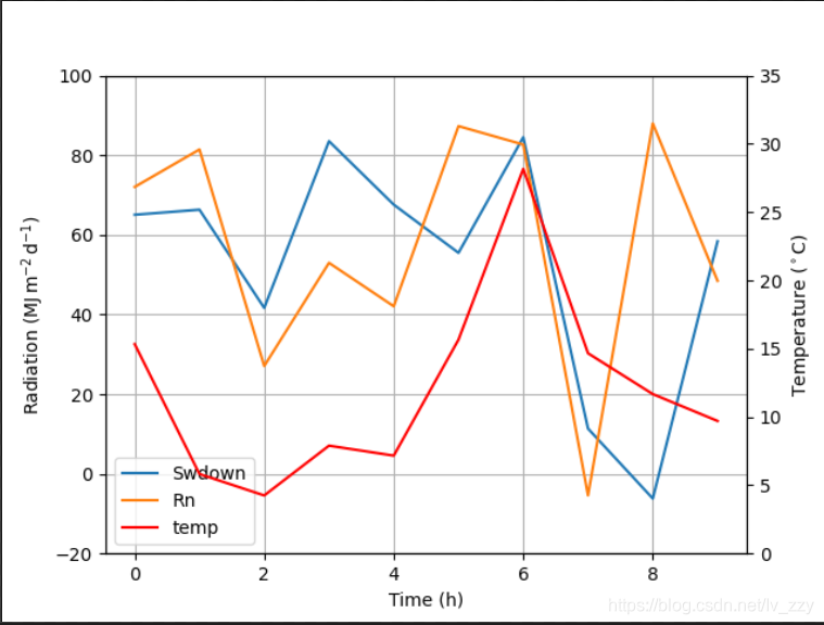
双y轴
 # -*- coding: utf-8 -*-
import numpy as np
import matplotlib.pyplot as plt
from matplotlib import rc
rc('mathtext', default='regular')

time = np.arange(10)
temp = np.random.random(10)*30
Swdown = np.random.random(10)*100-10
Rn = np.random.random(10)*100-10

fig = plt.figure()
ax = fig.add_subplot(111)

lns1 = ax.plot(time, Swdown, '-', label = 'Swdown')
lns2 = ax.plot(time, Rn, '-', label = 'Rn')
ax2 = ax.twinx()
lns3 = ax2.plot(time, temp, '-r', label = 'temp')

# added these three lines
lns = lns1+lns2+lns3
labs = [l.get_label() for l in lns]
ax.legend(lns, labs, loc=0)

ax.grid()
ax.set_xlabel("Time (h)")
ax.set_ylabel(r"Radiation ($MJ\,m^{-2}\,d^{-1}$)")
ax2.set_ylabel(r"Temperature ($^\circ$C)")
ax2.set_ylim(0, 35)
ax.set_ylim(-20,100)
plt.savefig('0.png')
给图标上相应的数据
1、对象为dataframe
df['resultRate'].plot(style='-.bo')
plt.grid(axis='y')
 #设置数字标签**
for a,b in zip(df['num'],df['resultRate']):
    plt.text(a, b+0.001, '%.4f' % b, ha='center', va= 'bottom',fontsize=9)
plt.show()
2、对象为list
# 设置数字标签
for a, b in zip(x1, y1):
    plt.text(a, b, b, ha='center', va='bottom', fontsize=20)

plt.legend()
plt.show()
或者
#添加数据标签
for x, y ,z in zip(x,y2,y1):
        plt.text(x, y+0.3, str(y), ha='center', va='bottom', fontsize=20,rotation=0)
        plt.text(x, z-z, str(int(z)), ha='center', va='bottom', fontsize=21,rotation=0)
我的绘图
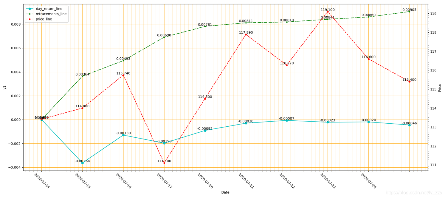
以上内容都是整理其他博主的相关知识点,下面是本人自己需要做的图:
如要执行代码,则需自行定义几个输入数据
result_log_path = "C:\\Users\\ASUS\\Desktop\\new\\painting\\asset_0.csv"
output_name = "C:\\Users\\ASUS\\Desktop\\new\\painting\\3_result.png"
data_process = CalculateTradeResult()
if(not data_process.load_trade_data(result_log_path)):
    print("Load Trade Data Fail")
else:
    #获取对应数据
    trade_date,day_return,sharp_result,retracements,max_retracements = data_process.calculate_trade_result()
    price = data_process.get_price()

    #图片窗口
    fig = plt.figure(figsize=(18,8))
    host = fig.add_subplot(111)
    host.set_xlabel("Date")
    host.set_ylabel("y1")

    par = host.twinx()
    par.set_ylabel("Price")

    #画线
    day_return_line, = host.plot(trade_date,day_return,'co-',label='day_return_line')
    retracements_line, = host.plot(trade_date,retracements,'g.-.',label='retracements_line')
    price_line, = par.plot(trade_date, price, 'r*--',label='price_line')
    # leg = plt.legend()
    plt.legend(handles=[day_return_line, retracements_line,price_line], labels=['day_return_line','retracements_line','price_line'], loc=2)

    #设置坐标轴
    host.set_xticklabels(labels=trade_date, fontsize=10,rotation=-45)

    #画网格
    ax = plt.gca()
    ax.xaxis.set_major_locator(plt.MultipleLocator(1.0))
    ax.xaxis.set_minor_locator(plt.MultipleLocator(.1))
    ax.yaxis.set_major_locator(plt.MultipleLocator(1.0))
    ax.yaxis.set_minor_locator(plt.MultipleLocator(.1))
    plt.tight_layout()#紧凑布局
    host.grid(which='major',axis="both",linewidth=0.75,linestyle='-',color='orange')
    host.grid(which='minor',axis="both",linewidth=0.25,linestyle='-',color='orange')

    # 设置数字标签
    for a, b in zip(trade_date, day_return):
        host.text(a, b, "%.5f" % b, ha='center', va='bottom', fontsize=10)
    for a, b in zip(trade_date, retracements):
        host.text(a, b, "%.5f" % b, ha='center', va='bottom', fontsize=10)
    for a, b in zip(trade_date, price):
        par.text(a, b, "%.3f" % b, ha='center', va='bottom', fontsize=10)

    plt.savefig(output_name)
出来的结果是这样的: